TripleA Logo TripleA Forum
    • TripleA Website
    • Categories
    • Recent
    • Popular
    • Users
    • Groups
    • Tags
    • Register
    • Login

    Toggle Flags and Toggle Highlight Movable Units Updates

    Scheduled Pinned Locked Moved Feature Requests & Ideas
    43 Posts 6 Posters 9.6k Views 5 Watching
    Loading More Posts
    • Oldest to Newest
    • Newest to Oldest
    • Most Votes
    Reply
    • Reply as topic
    Log in to reply
    This topic has been deleted. Only users with topic management privileges can see it.
    • HeppsH Offline
      Hepps Moderators
      last edited by

      A lot going on here. Some feverish back a fourth!

      I do not have a strong opinion either way since I feel like the entire UI could use an overhaul to allow the player the ability to expose much more map and expand and reduce windows when they want to. That being said... the discussion is very good and everything has to start somewhere.

      So here is some food for thought about how some of what we are talking about is actually displayed on the game screen. I am just throwing some stuff out there as I have no idea what is feasible.

      Current display

      Unit center existing.png

      Highlight All

      Highlight all proposed2.png

      Center on Units

      Unit center proposed.png

      So again just some mock ups related to what you guys are talking about.

      "A joyous heart sours with the burden of expectation"
      Hepster

      HeppsH 1 Reply Last reply Reply Quote 0
      • HeppsH Offline
        Hepps Moderators @Hepps
        last edited by Hepps

        @Hepps As far as the initial request...

        Flag & Move buttons example.png

        "A joyous heart sours with the burden of expectation"
        Hepster

        C 1 Reply Last reply Reply Quote 2
        • C Offline
          Cernel Moderators @Hepps
          last edited by

          @Hepps Good idea about the foot. Not sure if it is the best pick, but certainly much better of whatever the current thing is (I don't even understand).

          1 Reply Last reply Reply Quote 0
          • HeppsH Offline
            Hepps Moderators
            last edited by Hepps

            Lots of options...

            Flag & move buttons.png

            The only recommendation I would make is that whatever it is we want in these short cut icons is something our players universally need all the time.

            "A joyous heart sours with the burden of expectation"
            Hepster

            1 Reply Last reply Reply Quote 0
            • LaFayetteL Online
              LaFayette Admin
              last edited by

              Third option is a lantern, that's the same as the current icon : )
              That's what I thought made sense for highlight, an analogy of something that adds light.

              The white flag, I initially had one and it just looked like "surrender" to me. Hence the stylized flag, looks a bit less plain and less like surrender. I think once you get the surrender idea in your head, it's hard to shake.

              The only recommendation I would make is that whatever it is we want in these short cut icons is something our players universally need all the time.

              Generally agree. Should highlight units function during an opponents turn to highlight their units? If so, then it's a functionality that is available all the time.

              HeppsH 1 Reply Last reply Reply Quote 0
              • C Offline
                Cernel Moderators
                last edited by

                Really not important in practice, but TripleA lacks a "surrender" button. While the savegame proves that you won a game by reaching the victory conditions, there is no proof that you won any games by surrender.

                1 Reply Last reply Reply Quote 0
                • HeppsH Offline
                  Hepps Moderators @LaFayette
                  last edited by

                  @LaFayette Lantern... almost like I picked up on that. 😉

                  Yes I was not trying to say what is already suggested might not be considered universally helpful... but rather that it should be. Since I haven't used many of the functions available... I am not well versed at how helpful they might be to both novice as well as vetran players.

                  "A joyous heart sours with the burden of expectation"
                  Hepster

                  1 Reply Last reply Reply Quote 0
                  • F Offline
                    ff03k64
                    last edited by

                    Could a menu option with all of the hotkeys be put in on the top? Might not get used, but people might look at it to learn what they are.

                    LaFayetteL 1 Reply Last reply Reply Quote 0
                    • LaFayetteL Online
                      LaFayette Admin @ff03k64
                      last edited by

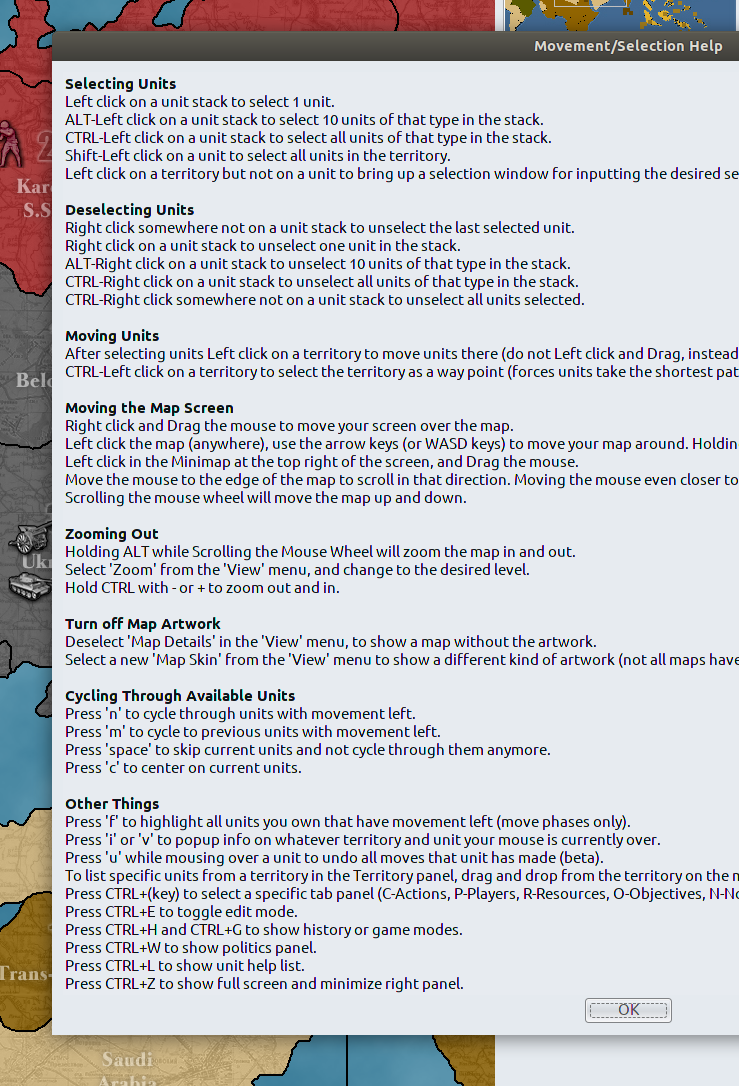
                      @ff03k64 The 'movement help' menu item under "help" is supposed to list all hotkeys. It's not cohesive to that menu item as the hotkeys are not all related to movement help. We also are missing the mention that "L" toggles flags.

                      I've been wondering if it makes sense to have a "hotkeys" menu item under "help". A good next step after doing that would likely be to make them configurable. A first step might be to simply break the help dialog out so it stands out and can cohesively capture all hotkeys.

                      Screenshot from 2019-08-29 09-00-57.png

                      1 Reply Last reply Reply Quote 3
                      • LaFayetteL Online
                        LaFayette Admin
                        last edited by

                        Wow, looking at that help menu, it suffers from a common developer problem where trying to solve one thing "people don't know about this" feature, the information is plastered in the wrong places. Most of those ctrl hotkeys can be seen by simply opening the menus and looking there. The 'turn off map artwork' is the same, just a restatement of menu options. The extra details about that do not belong here.

                        This is a bit of a UX issue, overloads unnecessary information on a user and out of context. The problem that creates is it detracts from the rest of the information that is present here.

                        Anyways, that is a digression. For now flags/highlight has a new home with the unit scroller for better or worse.

                        Further progress I would agree needs a bigger vision. For that we should know what more controls we are going to need and then work to create mock-ups of how they could be arranged. Follow up is in this thread: https://forums.triplea-game.org/topic/1525/ui-mockups-needed-unbury-the-controls

                        1 Reply Last reply Reply Quote 0

                        Hello! It looks like you're interested in this conversation, but you don't have an account yet.

                        Getting fed up of having to scroll through the same posts each visit? When you register for an account, you'll always come back to exactly where you were before, and choose to be notified of new replies (either via email, or push notification). You'll also be able to save bookmarks and upvote posts to show your appreciation to other community members.

                        With your input, this post could be even better 💗

                        Register Login
                        • 1
                        • 2
                        • 3
                        • 3 / 3
                        • First post
                          Last post
                        Copyright © 2016-2018 TripleA-Devs | Powered by NodeBB Forums