Achievable improvements to the Triplea User Interface
-
@butterw said in Achievable improvements to the Triplea User Interface:
@thedog said in Achievable improvements to the Triplea User Interface:
@butterw "There is currently no check on placement restriction"
Im not sure what the above means.
For example, in two of my maps I have placement restriction, an aircraft carrier cannot be placed or move into a river, whereas a Destroyer can.
Ideally, you would get a warning when you attempt to purchase more units than you are currently able to place because of placement restrictions.
For me, I think thats a very nice to have, not a must have function.
As your time is precious, I would prefer to have the ability to cycle round "Production" capable Units with a hotkey.
-
As your time is precious, I would prefer to have the ability to cycle round "Production" capable Units with a hotkey.
Probably the unitScroller would be the closest thing, but I haven't looked at the code.
The issue with cycling is that it works best when the list is short (2 or 3 entries)Alternatively, having a shortlist of favorite territories you can center the map on would be a good new feature
-
Yes that is a very good alternative. Its almost the same.
-
For reference, this is what the sidepanel ui looks like in v2.5 with 125% dpi:
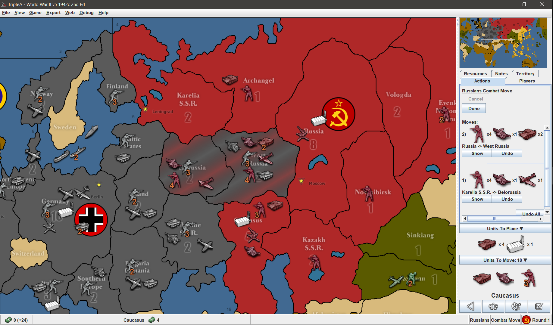
If more than 3 different unit types are involved in a move, it doesn't fit in the sidepanel horizontally.
-
Populating the Battle Calculator
@thedog said in Achievable improvements to the Triplea User Interface:
I used to be able to hover over a territory before a battle, press ctrl+b and it would populate the Battle Calculator with the units from the territory, this does not happen now. As mentioned it does not even detect the factions involved.
It works again when I re-add the corresponding button to the territory Panel. It comes down to the territory panel knowing the currentTerritory, and this info is required to be able to populate the panel.
EDIT: Apart from using up space, the issue with the Battle Calculator buttons in the territory panel is that they are also confusing. Using the buttons directly is difficult (you are really meant to use the hotkeys ?). The CTRL-A/D hotkeys only work when the Battle Calculator is open and doesn't have focus, it also not so easy to hover over a territory when the battle calculator fills the screen.
- In the territory panel, it would make more sense to only have 3 short buttons (CTRL+ B, A, D) on a single line with title tooltips.
- CTRL+A/D should be featured in the Battle Calculator rather than the territory panel and should be bound to the tripleaFrame. They should work even if the Battle Calculator has the focus.
The Battle Calculator is a fairly complex tool, am I missing something ?
-
@TheDog , @butterw
A suggestion for a possible space saving feature or just adding real estate efficiently.It probably was already mentioned previously, but not sure.
The toolbar at the bottom of the screen might be a nice place for tabs that are displayed as a drop down list (bottom left corner) with a down arrow clicker. When clicked on the down arrow to right side of currently displayed tab topic, the list offers more tabs.
Each tab can use the whole toolbar or just a majority of it so other information about current player, step, turn can still be displayed. Or not if the tab requires all space.
Default tab selection could be set in a properties file.
BTW, alot of horizontal space there.
-
@general_zod said in Achievable improvements to the Triplea User Interface:
@TheDog , @butterw
A suggestion for a possible space saving feature or just adding real estate efficiently.It probably was already mentioned previously, but not sure.
The toolbar at the bottom of the screen might be a nice place for tabs that are displayed as a drop down list (bottom left corner) with a down arrow clicker. When clicked on the down arrow to right side of currently displayed tab topic, the list offers more tabs.
Each tab can use the whole toolbar or just a majority of it so other information about current player, step, turn can still be displayed. Or not if the tab requires all space.
Default tab selection could be set in a properties file.
BTW, alot of horizontal space there.
@butterw said in Achievable improvements to the Triplea User Interface:
If more than 3 different unit types are involved in a move, it doesn't fit in the sidepanel horizontally.
-
@butterw @TheDog I found the previous discussion where this idea surfaced with some nice mockups too.
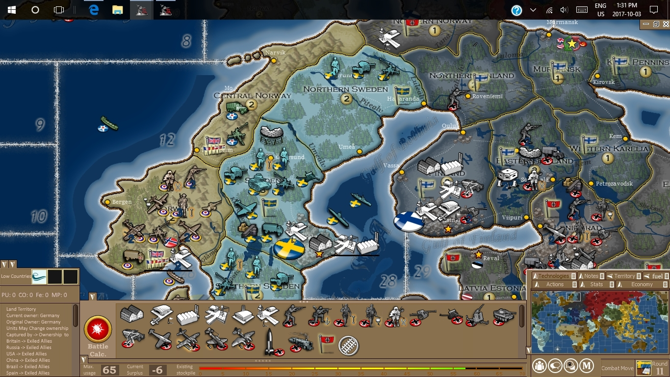
https://forums.triplea-game.org/topic/464/taking-your-suggestions-for-a-new-ui/138?page=7
-
@butterw said in Achievable improvements to the Triplea User Interface:
Populating the Battle Calculator
@thedog said in Achievable improvements to the Triplea User Interface:
I used to be able to hover over a territory before a battle, press ctrl+b and it would populate the Battle Calculator with the units from the territory, this does not happen now. As mentioned it does not even detect the factions involved.
It works again when I re-add the corresponding button to the territory Panel. It comes down to the territory panel knowing the currentTerritory, and this info is required to be able to populate the panel.
EDIT: Apart from using up space, the issue with the Battle Calculator buttons in the territory panel is that they are also confusing. Using the buttons directly is difficult (you are really meant to use the hotkeys ?). The CTRL-A/D hotkeys only work when the Battle Calculator is open and doesn't have focus, it also not so easy to hover over a territory when the battle calculator fills the screen.
- In the territory panel, it would make more sense to only have 3 short buttons (CTRL+ B, A, D) on a single line with title tooltips.
- CTRL+A/D should be featured in the Battle Calculator rather than the territory panel and should be bound to the tripleaFrame. They should work even if the Battle Calculator has the focus.
The Battle Calculator is a fairly complex tool, am I missing something ?
Yes the Battle Calculator is a complex and has these uses;
- A new player finds it invaluable to get an idea of if they have a chance of winning or losing a battle.
- A veteran player will still use it occasionally
- A map maker will always use it to help balance their units, they are also the ones that will add and subtract units.
- The Territory add and subtract units is for map makers to help balance their scenario.
The Battle Calculator works well if the variables are simple, ie. just attack and defence values with D6. But is less accurate when you have larger dice, territory effects, supportAttachment like Command, artillery support etc.
To sum up hover over a territory and ctrl+b is its main use, the rest is for the map maker.
Other readers please chime in if have other uses.
-
@butterw said in Achievable improvements to the Triplea User Interface:
For reference, this is what the sidepanel ui looks like in v2.5 with 125% dpi:
If more than 3 different unit types are involved in a move, it doesn't fit in the sidepanel horizontally.
Could the side bar units be say halved in size, that way you might get 6 in a row?
-
@general_zod
Thanks for the link, there are some solid ideas in there for sure. I would need to take a good look at the suggestions and see what can be done relatively easily.
Using bold text, different font size, icons instead of text (toolbars), scaling down the unit icons in the side panel (@87.5% would certainly work) would be very achievable.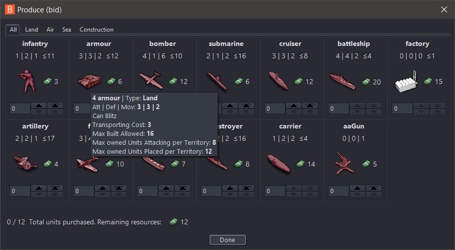
I'll put out a v3.5.1 patch for my build with the current minor fixes this week.
-
@butterw
Right hand panel space optimization
In your map example, the right hand panel there are;
Infantry x4, Artillery x1, Armour x2Those numbers (x4) could use the same method as on the main map, ie. overlaid over the top of Infantry, Artillery, Armour icons.
So even more unit icons can be displayed on a row.
Menu Bar
Still on the trail of removing the Menu Bar.
The game starts out with no Menu Bar.
By pressing the Alt key it appears as a pop up overlaying the main map and the top of the right hand panel.
The Alt+F V G E T H will be displayed and still work as now.For the above we need to tell the players before the game starts and perhaps at the start of each turn.
-
Here's the v2.5.31-bu.jar fix, which reverts Battle Calc change, improves the production panel display. For evaluation purpose, the sidepanel tab titles are cut down to 1 character (but it's not fully implemented, ex: history, edit tab keep full names, etc.) the goal is to simplify the interface and keep the tabs to 1 line.
Menu Bar
Still on the trail of removing the Menu Bar.
The game starts out with no Menu Bar.
By pressing the Alt key it appears as a pop up overlaying the main map and the top of the right hand panel.
The Alt+F V G E T H will be displayed and still work as now.For the above we need to tell the players before the game starts and perhaps at the start of each turn.
I am away for a while, but will look at implementing the hidden menubar feature when I get back. Keep the feedback coming.
- All hotkeys featured in the menu should remain active when the toolbar is hidden.
- Hidden toolbar would be a user interface preference configured in (Engine) Settings.
- Hotkeys would be listed in a dialog similar to MoveHelpMenu.
-
@butterw
NEW Status Bar move to the top of the screen, stops the eyes moving to the very bottom of the screen.
NEW Pressing ALT, popup of the menu bar, appears under the Status Bar . The File View Game Export Tools Help, overlays the main map and the right hand panel.Right Hand Panel Tabs
Action/Command Tab - In progress space saving
Players Tab - NEW remove Technology section as can have 16+ players with say 4+ Alliances, see Technology Panel below
Notes Tab - Removed in 2.6
Territory Tab -
History Tab - NEW was on the Left Hand Panel, now put in Right Hand Panel as a Tab.Pause Tab - NEW its not really a Tab, but a pause/restart button for the game, so you can look around the map, really useful for map-makers. This could be on the History Tab, but would prefer it as its own Tab, ie. with just 1 click.
Hot Territory Tab - NEW up to 4 territories can be defined on this Tab and pressing the [tab] key will cycle round these four, on the main map..
.
Technology Panel NEW
Game> Show Technology Panel (listed near the Show Politics Panel)
Was in Players Tab but can be a grid of 15 techs x 16+ nations, so needs its own menu panel, similar to the Politics panel.
The axis needs to be swapped, so say 16+ Player/Nations is on the Y axis, ie up & down, with technology on the x axis like;
superSub, jetPower, shipyards, aARadar, longRangeAir, heavyBomber, improvedArtillerySupport, rocket, paratroopers, increasedFactoryProduction, warBonds, mechanizedInfantry, destroyersCanBombard, reinforcedHulls, wolfPackTactics, could be 15 techs on the x axis.The order of the Player/Nations should as those listed on the Setup Panel (currently alphabetical).
.
.
map.properties Player/Nation colours as text or background colours, should be used in the following;- Players Tab, the text of the Player/Nation
- Territory Tab, the text of the Current, Original owner and Capital of...
- Technology Panel, Player/Nation text
- Politics Panel, Player/Nation text
- Game> Game Statistic, the Player/Nation graph colours
-
Territory Tab - replace with the following;
When you hover over a Territory you could get a pop-up giving;- The current Territory Tab info, as now, Current, Original, A Capital, A Victory Location, Production details etc
o but the pop-up might be really big with the unit types listed for both allied/enemy, display as say 75% and over say 4 rows
o the current method is poor if there is more than say 6 unit types as it difficult to scroll the Right Hand Panel
It could also include;
- List the territoryEffects
o combatOffenseEffect
o combatDefenseEffect
o noBlitz
o unitsNotAllowed - Trigger info
- The current Territory Tab info, as now, Current, Original, A Capital, A Victory Location, Production details etc
-
Battle list panel
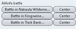
Above note the button [Center] is to the right
.
.
Placement panel
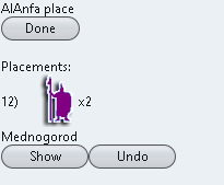
Above note the [Show] button is on the left.
For consistency the Center/Show button should be;
Both on the right or left, I prefer on the right
Both say the same Center/ShowBattle Screen suggested changes
the words [Battle in could be removed from every button, too reduce screen clutter and the word in put above the battles eg.
Faction battle in;The Button [Center] should be [Show] as on the edge of the map the battle will not center, but show the battle.
As mentioned before the x1 , x2, x3 etc units to place, could be displayed like on the main map with the number overlaid over the unit icon (where 1s are not shown but implied) and shown at say 75% size, too get more placements on a row.
-
@thedog
The unit count overlay is painted on top. This is more involved than just text in a label. In any case there will likely need to be some spacing between image icons, or the result will look squashed.
I will look into ways of making the unit display in the sidepanel a bit more compact. -
@thedog
The reason Battle is specified in the Battle List is because Air Battles are possible, These must be resolved before the regular battle.
A current issue is that the battles are in random order. I think Air battles should always be listed before the corresponding Battle. The word Battle could be removed from the button, as it doesn't provide any information. -
@butterw
I have been using 2.5.31-bu.jar, it is working very well.What are thoughts on
https://forums.triplea-game.org/topic/2798/achievable-improvements-to-the-triplea-user-interface/81?page=5and the next post.
Specifically the
- Technology panel
- Territory hover pop-up
as they are probably a lot of work?
-
@thedog
Even if the result is only a couple of lines of new code, most changes do require a fair bit of work.
An overhaul of the sidepanel/status bar is probably needed, but at this stage it is not very clear what it should be.
To make progress, I intend to build a (simplified) ui mockup of the tripleaFrame, which will make it easier to try out changes than with the full game app.

Hello! It looks like you're interested in this conversation, but you don't have an account yet.
Getting fed up of having to scroll through the same posts each visit? When you register for an account, you'll always come back to exactly where you were before, and choose to be notified of new replies (either via email, or push notification). You'll also be able to save bookmarks and upvote posts to show your appreciation to other community members.
With your input, this post could be even better 💗
Register Login