Flag Display, Tech/Stats window
-
I have a question about the flags which display in the stats window (players tab), namely if there is a way to get these to display in the order of turn sequence rather than alphabetically?
See the image below from the rebuilt World War II Global in UHD that I've been working on with Beelee...
You will notice that the tech flag images are displaying alphabetically, beginning with ANZAC, then Americans, British, Chinese etc. (I think ANZAC shows first cause of the all caps)
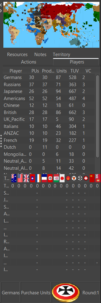
What I would like is to get these flags to display left to right following the actual turn order, so that the horizontal row of flags in the tech list will match the order listed in the vertical column for PUs, Production, Units, TUV, VCs etc. So 'Germans, Russians, Japanese, Americans' etc. As this in the only place in the game where the small flags graphics actually display (unless you turn view/show unit flags small to on) I would like it to look nice.
Here is a similar view showing when the Player tab window is manually extended. Notice that when expanded, tripleA will draw in some extra space between the graphics here. But the default is to display this window as narrow as possible, like the first image above.
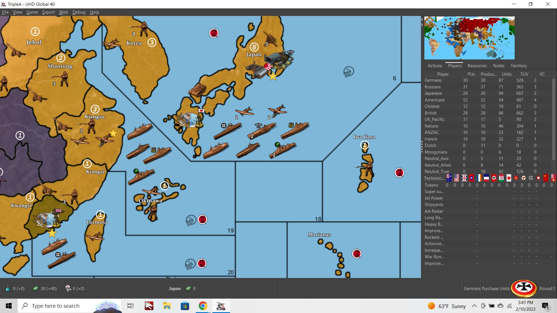
While working on this stuff, I noticed that the opening/window for the flags will display at about 13x21px, meaning the opening is taller than it is wide by default.
To me this recommended a vertical display for national banners, as if they were hanging on the wall rather than flying on the flag pole. Of course one can make the images wider, and this will display if the window is expanded, but the default shows a window roughly 13x21 or 14x22 (it fluctuates a bit.)
Also you will notice that the image in the lower right (current player) can also show dimensions greater than the 36px tall. That roundel puck by Frostion is 54 px tall for example, but the window itself is displaying a much larger image. The actual dimensions on that bit of screen is 81x91px.
But the image displayed will upscale or downscale to fit certain dimensions. These are not consistent. For example I can transform Frostion's puck to be exactly 81x91px, but then this is what happens...
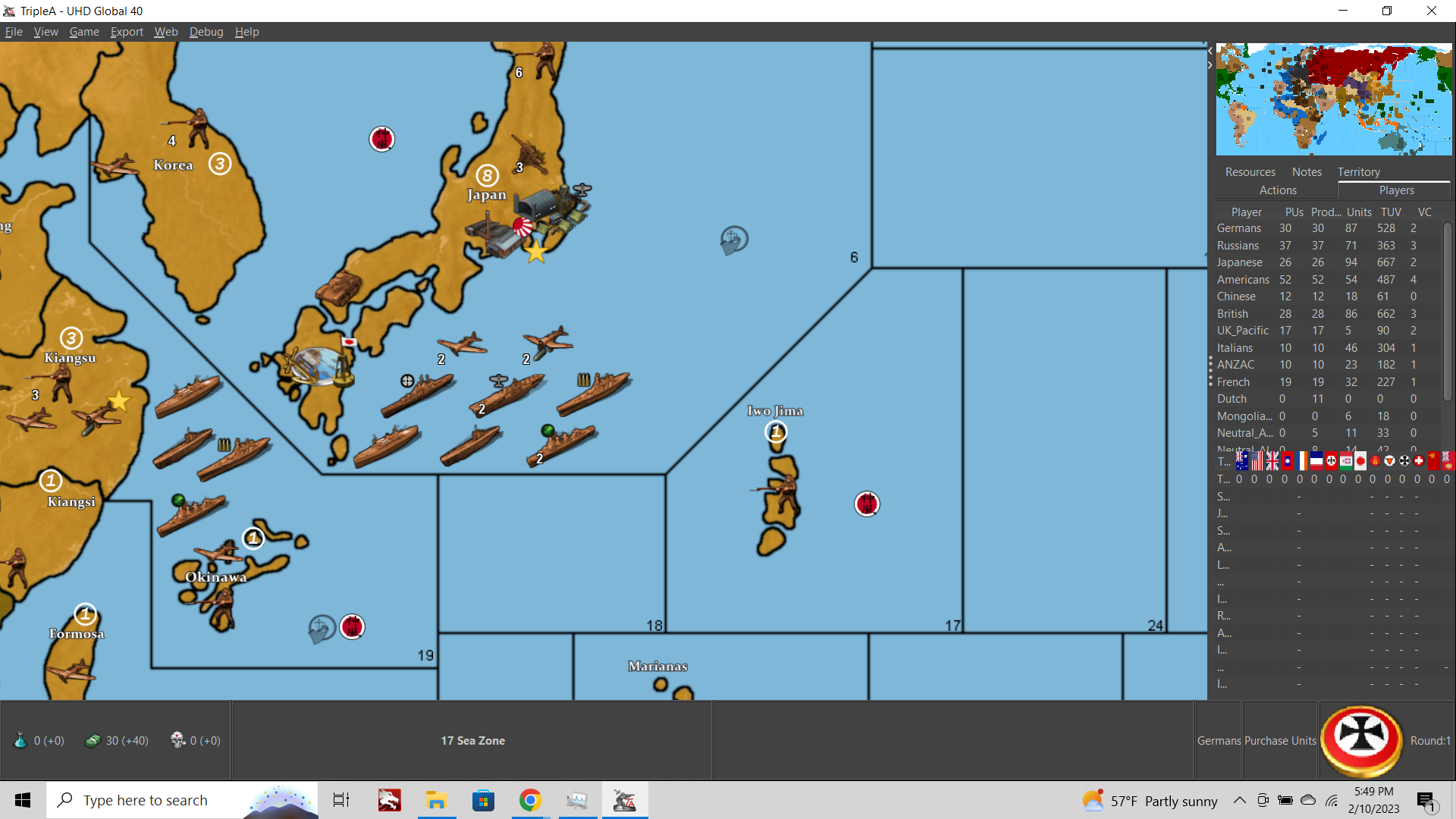
Rather than displaying the image at 81x91, tripleA upscales the image even further, now the display window is showing at 96x120px, and expanding the UI element to display the janky upscaled graphic.
For the life of me I can't figure out why tripleA is doing this, and why it isn't simply displaying the image at 1:1 with the graphic that has been provided in the map folder. In this case the images in the "flags" folder. I believe this same effect is happening in every menu screen within tripleA where a graphic is being displayed, outside of the map itself.
TripleA is uspcaling and downscaling the unit graphics in the purchase screen, the movement screen, the unit help screen, for all the flags. Basically everywhere, including the TripleA logo itself when you first launch the application. These will all show a significant reduction in image quality, regardless of the actual dimensions of the graphics you provide, or how clean you try to make them.
Is there anything that can be done about this? Cause the issue appears to be universal, on all maps. It happens with every tripleA game for any graphic that is displaying within a menu. Seems like a pretty significant issue that we should try to resolve if we can, cause it would make everything look better if we could get tripleA to just use the graphics it's given rather than manipulating or rescaling them in wonky ways. I couldn't find documentation for this stuff anywhere, so thought I'd ask.
-
ps. quick follow up Q
Does anyone know if it is possible to separate the flag and small flag used by tripleA for the unit flag displays from the images used in the menu displays?
Right now TripleA uses the same image for both the stats menu stuff and the unit flag display (if you turn that feature on). But it would be ideal if these could be separate images since their function's are pretty different. If we could use different sized graphics for each we could get the flag display options for the units to be more flexible.
Here's another example showing theFrostion roundel pucks for unit "flag display on = large."
I sized his puck at 36x52 for the Declaration of War screen (it is upscaling/compressing as mentioned in the post above for the menu type screens) but it would be nice if we could get a separate image for the unit flag display. Some example screens
DOW screen 36x58px flags
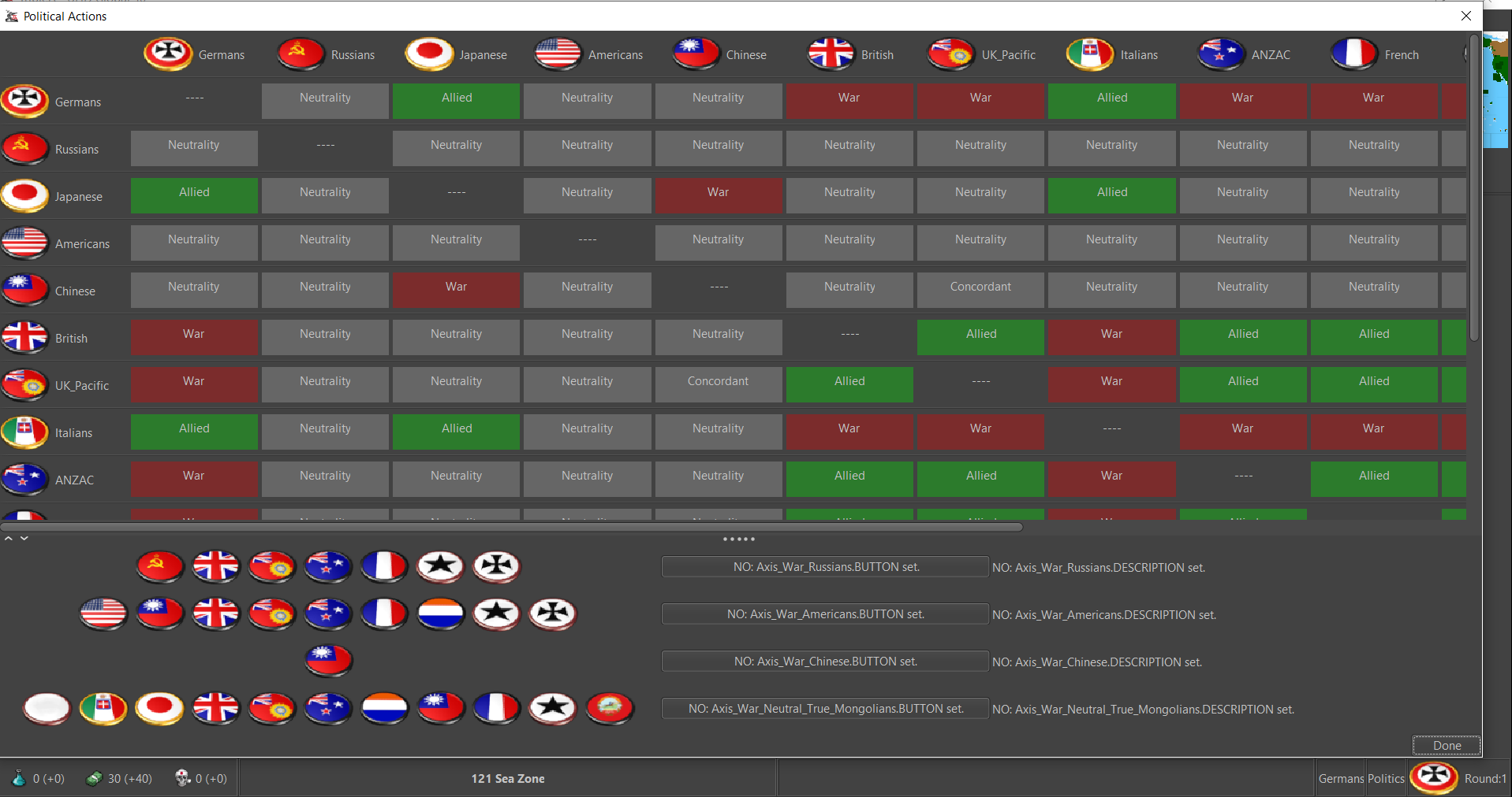
36x58px Unit Flags on Large, Unit view 100%
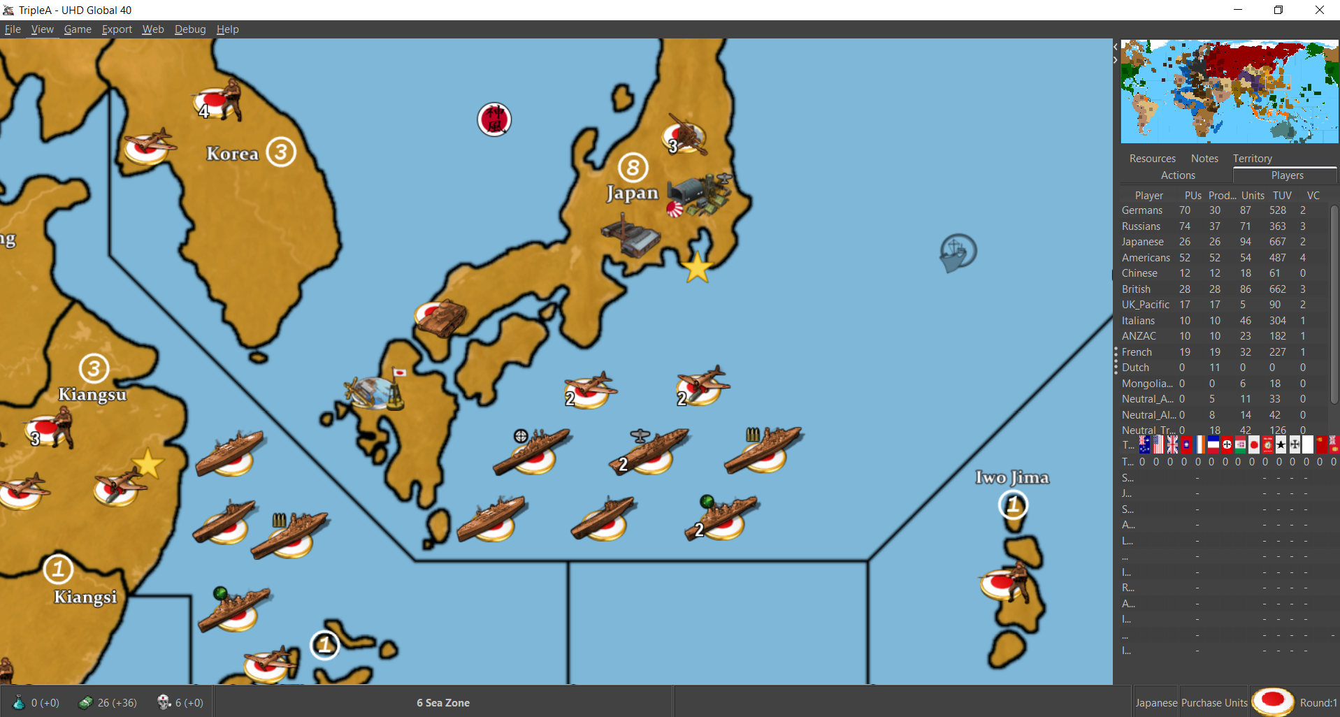
36x58px Unit Flags on Large, Unit view 125%
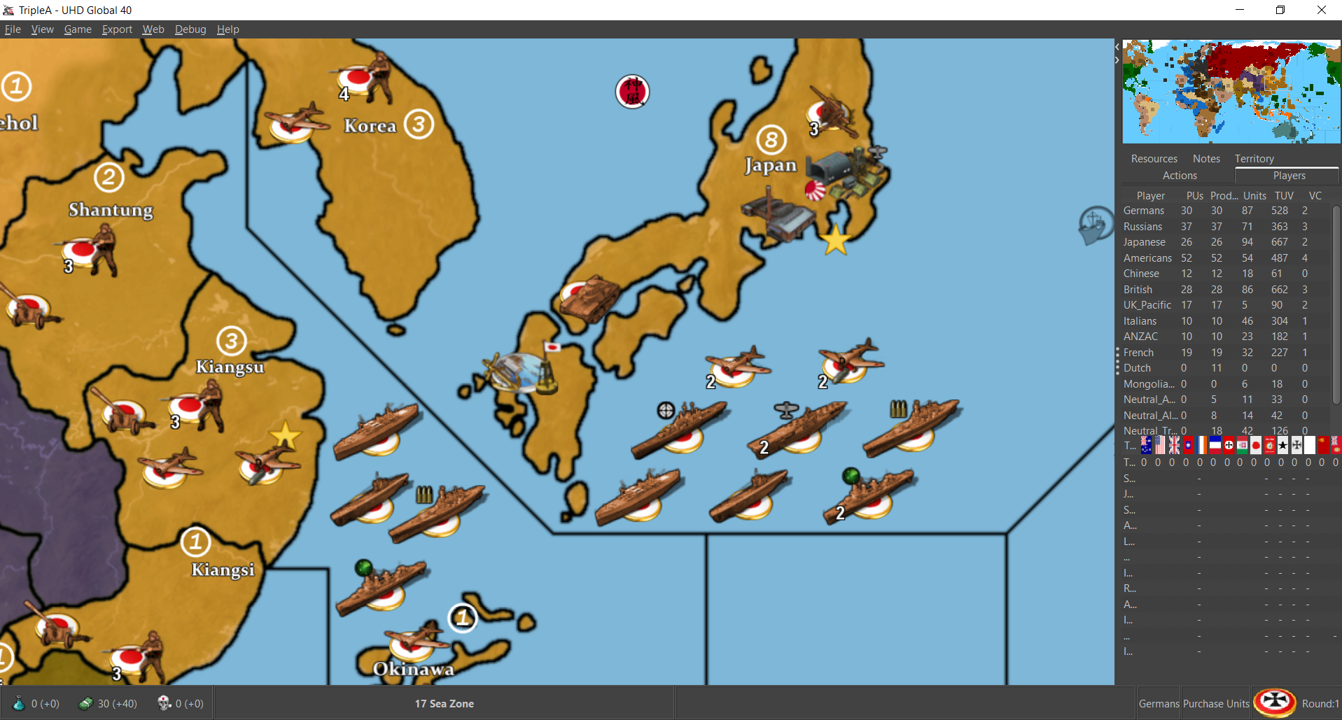
Small flags in Battle Calc, Unit flag on Large, Unit view 100%
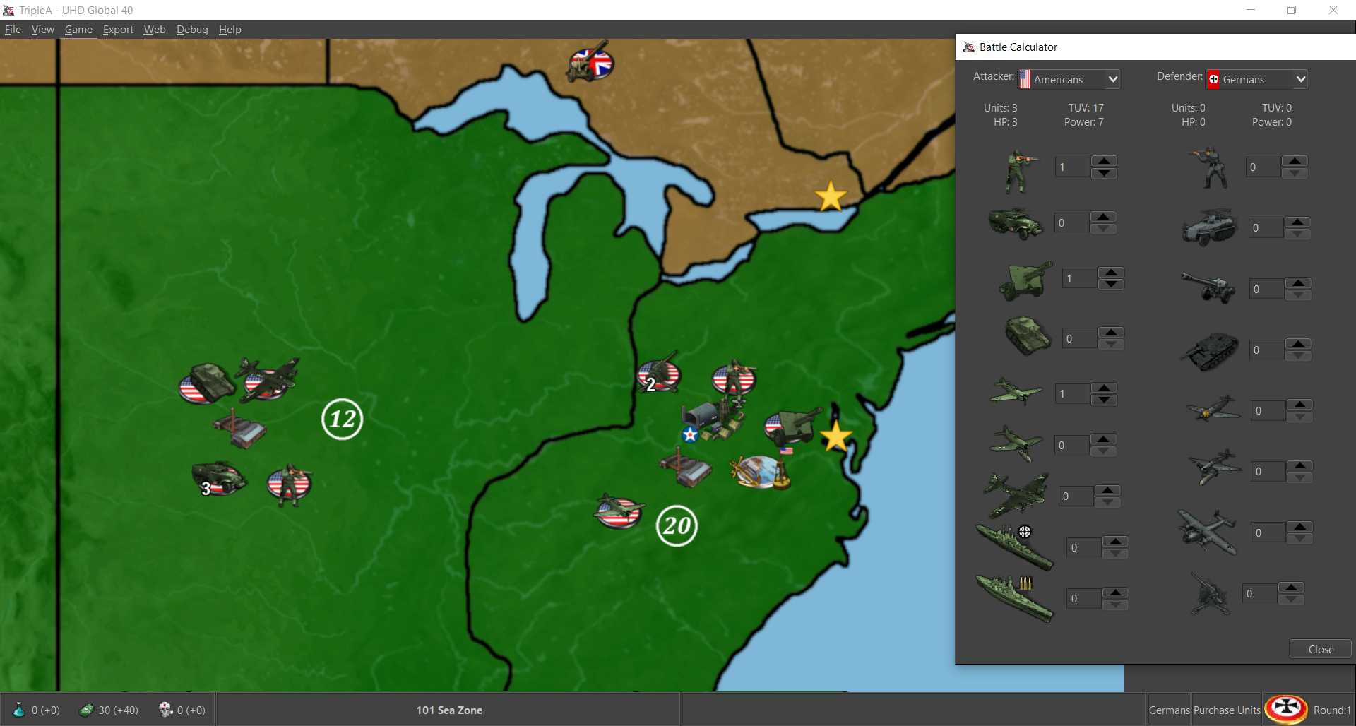
Unit flags on Small
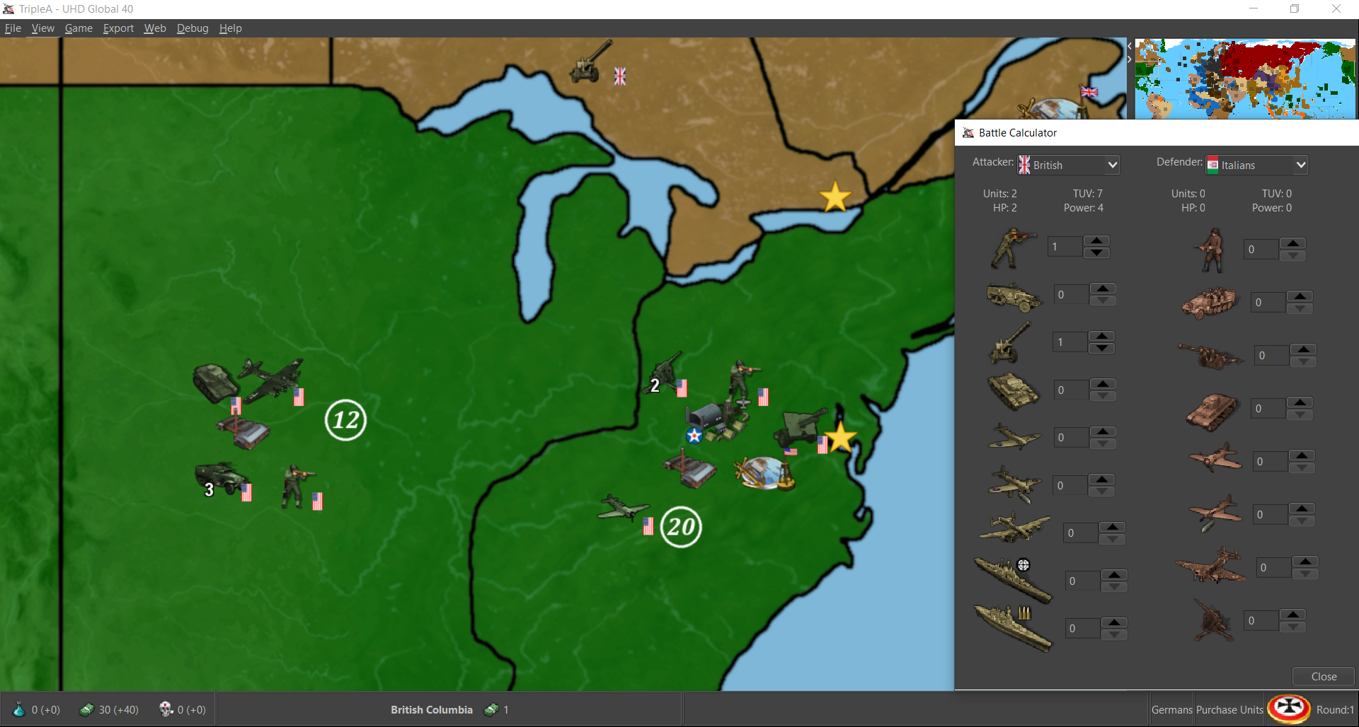
Ideally we'd want to pull a different image/size for the flag display options large and small on the units, than the graphics used in the stats and menu windows. Like a smaller puck say. But right now it pulls from the same graphics. I think it was probably to eliminate redundancy when tripleA was first built maybe? Or maybe the image compression thing is similar? but anyway, the file sizes of the images are rather small, and the utility of having more graphics options would be very nice, especially if trying to do a larger map/unit display. Any ideas on how to pull that off?