View > Map Font and Color kerning
-
I noticed a few things when playing around with this...
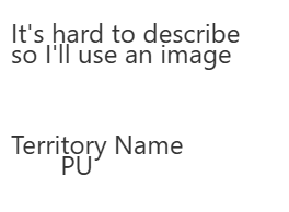
Currently when the Font Territory Name and PU display using the built-in method, the PU is displayed directly below the Territory Name and centered, but there is no offset for that.
It's hard to describe
so I'll use an imageTerritory Name
PU
Right now the PU part is default kerning like that
So if you choose an say Font 12 pt, and you want TripleA to display both Territory names and Resources PU, it's trying to do that 12 pixels, right on top of 12 pixels without enough space in between, to account for say lower case letters, say g j y etc that drop below the line. Or basically however tall the Text is about half that space again empty above/below the line. So that letters won't appear bunched up on top of each other vertically.
Right now PU and Labels are also controlled with the same Font size and color option, whereas it would be nice to have them handled separately. For example Larger PU, smaller Territory Name font size, or color.
It would also be cool to have the outline option, the way that the Unit stack Font and Color gives us options to have a black border there, or whatever second color.
Hello! It looks like you're interested in this conversation, but you don't have an account yet.
Getting fed up of having to scroll through the same posts each visit? When you register for an account, you'll always come back to exactly where you were before, and choose to be notified of new replies (either via email, or push notification). You'll also be able to save bookmarks and upvote posts to show your appreciation to other community members.
With your input, this post could be even better 💗
Register Login