TripleA Logo TripleA Forum
    • TripleA Website
    • Categories
    • Recent
    • Popular
    • Users
    • Groups
    • Tags
    • Register
    • Login

    Taking your suggestions for a new UI

    Scheduled Pinned Locked Moved Development
    183 Posts 18 Posters 167.1k Views 19 Watching
    Loading More Posts
    • Oldest to Newest
    • Newest to Oldest
    • Most Votes
    Reply
    • Reply as topic
    Log in to reply
    This topic has been deleted. Only users with topic management privileges can see it.
    • RoiEXR Offline
      RoiEX Admin
      last edited by

      @Hepps I meant the "letter" in the Icon. (Or at least I assume it's a letter).
      Yeah, I'm not too happy with this font either, it's too small for some labels and suffers in terms of readability in some points.

      HeppsH 1 Reply Last reply Reply Quote 0
      • RoiEXR Offline
        RoiEX Admin
        last edited by

        @Hepps Also we probably want to be consistent with the icon art style.
        So either all icons have this simplistic one color design, or all of them look "real"

        1 Reply Last reply Reply Quote 0
        • redrumR Offline
          redrum Admin @Hepps
          last edited by

          @hepps Impressive. Overall I love it though have a few questions/thoughts:

          1. Looks like you've kind of created a new 'icon' with the TripleA name. I'm open to honestly completely revamping things across the board though do like consistency. Thoughts on the existing icon we have on the forum/website with the infantry?

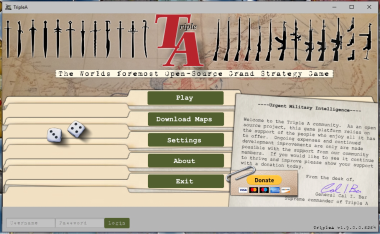
          2. Host/Join Networked Game - I pretty tempted to hide these options behind an advanced options menu or remove them all together. I don't think they are used that much though open to what people think. I'd like to have a more approachable main screen with only often used options and probably need a 'Settings' box.

          3. Color scheme - I'm interested/open to changing the color scheme entirely. I personally think the red is maybe a bit too jarring but would be interested in others' thoughts.

          I think my main point is if we are really going to go all in on a new UI then we should be open to completely changing things as what we have now leaves a lot to be desired...

          TripleA Developer with a Passion for AI: https://forums.triplea-game.org/topic/105/ai-development-discussion-and-feedback

          RoiEXR 1 Reply Last reply Reply Quote 0
          • RoiEXR Offline
            RoiEX Admin @redrum
            last edited by

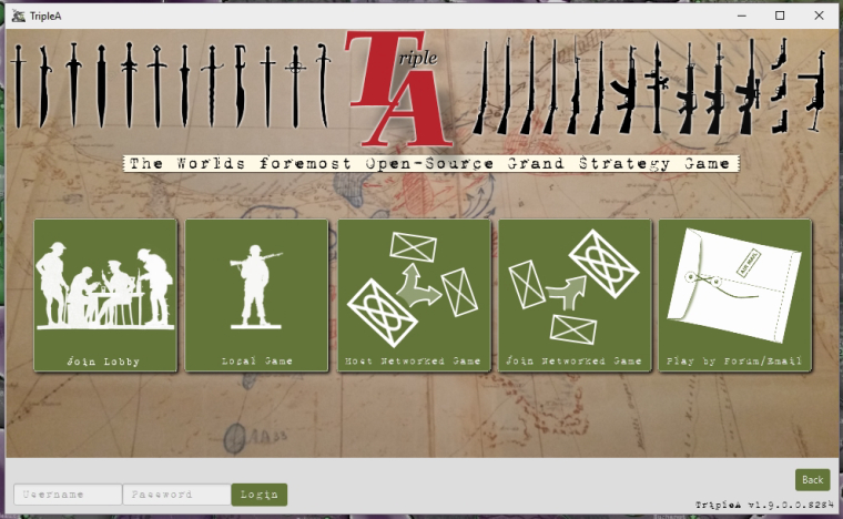
            @redrum This screen is actually the second screen, the game selection screen.
            The first screen can be seen in my original post.

            1 Reply Last reply Reply Quote 0
            • HeppsH Offline
              Hepps Moderators @RoiEX
              last edited by

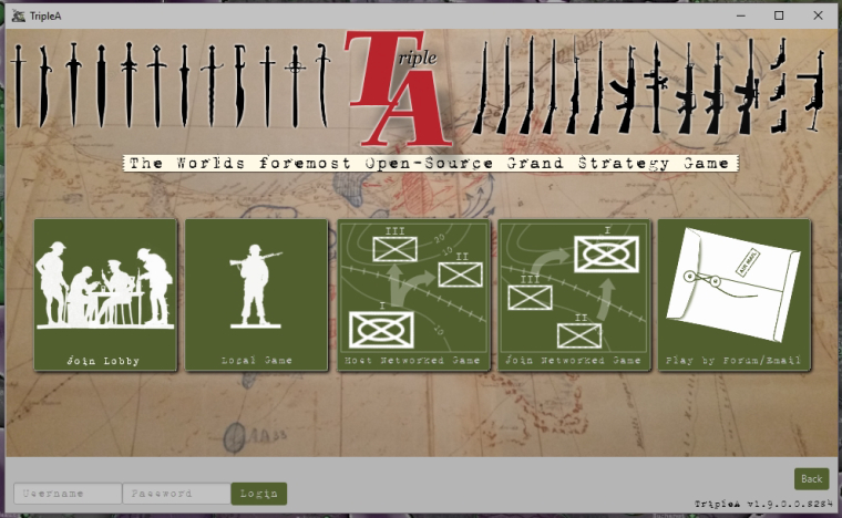
              @roiex Not sure what you mean.... there are no letters.

              the one box is the military map symbol for Mechanized Infantry and the other 2 boxes are the military map symbol for Infantry. The only other thing in the images is the arrows they use on military maps to show troop movements.

              "A joyous heart sours with the burden of expectation"
              Hepster

              RoiEXR 1 Reply Last reply Reply Quote 0
              • RoiEXR Offline
                RoiEX Admin @Hepps
                last edited by

                @hepps Ahh, that's what it's supposed to represent. I already assumed something along those lines ^^
                Let me clarify what I find a little bit odd about them: They look too perfect.
                So if it's possible to make it look a little bit more irregular without losing this simplistic style I'd go with that ^^

                HeppsH 1 Reply Last reply Reply Quote 0
                • HeppsH Offline
                  Hepps Moderators @RoiEX
                  last edited by

                  @roiex Sure... what I'd like to do is do the image for both with a hand drawn image. then scan it and digitize it... then colour it to match the 2 tone style.

                  "A joyous heart sours with the burden of expectation"
                  Hepster

                  1 Reply Last reply Reply Quote 0
                  • HeppsH Offline
                    Hepps Moderators
                    last edited by

                    The new logo was just me fucking around. Tried to make a logo that paid homage to the original one we have had for 12 years.

                    As far as colour.... I am currently testing what I wanted to go with... which is an Army olive green.

                    "A joyous heart sours with the burden of expectation"
                    Hepster

                    1 Reply Last reply Reply Quote 1
                    • RoiEXR Offline
                      RoiEX Admin
                      last edited by

                      Do as you prefer.
                      Just make sure the image resolution is high enough, if possible even high enough to look good on a 4K display in fullscreen mode.

                      redrumR 1 Reply Last reply Reply Quote 0
                      • redrumR Offline
                        redrum Admin @RoiEX
                        last edited by

                        @roiex I see. I do wonder whether 1 screen or 2 screens is better. Really depends on the number of options that we end up with I guess.

                        TripleA Developer with a Passion for AI: https://forums.triplea-game.org/topic/105/ai-development-discussion-and-feedback

                        1 Reply Last reply Reply Quote 0
                        • HeppsH Offline
                          Hepps Moderators
                          last edited by

                          Here is the same layout but with an army olive green for the icons.

                          0_1515798343374_UI design1B.jpg

                          "A joyous heart sours with the burden of expectation"
                          Hepster

                          1 Reply Last reply Reply Quote 1
                          • HeppsH Offline
                            Hepps Moderators
                            last edited by

                            Some slight alterations.

                            0_1515801440288_UI design1B.jpg

                            "A joyous heart sours with the burden of expectation"
                            Hepster

                            LaFayetteL 1 Reply Last reply Reply Quote 3
                            • LaFayetteL Offline
                              LaFayette Admin @Hepps
                              last edited by

                              @hepps nice : )
                              A question, how would 'login' and 'join lobby' differ, would 'login' open the lobby window?

                              HeppsH prastleP 2 Replies Last reply Reply Quote 0
                              • HeppsH Offline
                                Hepps Moderators @LaFayette
                                last edited by

                                @lafayette No idea. I'm just copying what is on the test UI when I open it.

                                That question is better directed @RoiEX

                                "A joyous heart sours with the burden of expectation"
                                Hepster

                                LaFayetteL 1 Reply Last reply Reply Quote 1
                                • LaFayetteL Offline
                                  LaFayette Admin @Hepps
                                  last edited by

                                  @hepps hah, nice work @RoiEX

                                  1 Reply Last reply Reply Quote 0
                                  • prastleP Offline
                                    prastle Moderators Admin @LaFayette
                                    last edited by

                                    @lafayette login would be forum
                                    join lobby would be lobby login
                                    hopefully one database for both eventually
                                    🙂

                                    If we open a quarrel between past and present, we shall find that we have lost the future! Sir Winston Churchill

                                    1 Reply Last reply Reply Quote 1
                                    • RoiEXR Offline
                                      RoiEX Admin
                                      last edited by

                                      @LaFayette My idea was to better integrate the lobby with the engine.
                                      So the login button at the bottom of the screen, would simply connect the user to the lobby, which enables the join lobby button. If we implement an Automated login at some point this first initial login step could be skipped.
                                      I'm going to move this login field to a dedicated screen though, it doesn't really fit on the start screen.

                                      1 Reply Last reply Reply Quote 0
                                      • alkexrA Offline
                                        alkexr
                                        last edited by

                                        With the white unit stack size indicator it's not always easy to tell the size of a stack at a glance.

                                        • The unit stack size indicator numbers should have an outline, maybe white font with black outline.
                                        • Alternatively, the number could be inside a circle of whatever color.
                                        • Or simply make it customizable for each map.

                                        Territory tab is really inconvenient, you sometimes have to make tricky maneuvers with your cursor. Also unit tooltips appearing in the middle of the map, blocking sight and action for a while is dumb.

                                        • Create a separate GUI where tooltips appear, maybe a sidebar.
                                        • If you hover over a territory or a unit for say 0.75 seconds (exact time could be engine settings customizable), the respective tooltip for that territory/unit would appear on this GUI and stay there until the user hovers over something else for the same amount of time.
                                        • Allow html format customization for the information displayed on this GUI. (Similar to the way unit tooltips are customizable.) So a map maker could decide to display e.g. photos of real combat scenes that happened on that territory, or a photo of the Brandenburg Gate for Berlin or etc. And also, the map maker could decide what information is relevant to that territory and display that, instead of a generic info dump. (For example, in Greyhawk Wars the only way to tell what sort of mercenaries you will get at each territory is to look up the trigger in the xml. It isn't overly important in this case, but this information could be displayed when hovering over the territory.)

                                        "For the world is changing: I feel it in the water, I feel it in the earth, and I smell it in the air."

                                        HeppsH 1 Reply Last reply Reply Quote 0
                                        • HeppsH Offline
                                          Hepps Moderators @alkexr
                                          last edited by

                                          @alkexr Not sure if you are aware, but you can change the colour and font size of the stack number.

                                          Love the idea of having the outline around the numbers and or a placard that automatically get placed under the number when there is more than 1 of any unit type.

                                          "A joyous heart sours with the burden of expectation"
                                          Hepster

                                          1 Reply Last reply Reply Quote 1
                                          • HeppsH Offline
                                            Hepps Moderators
                                            last edited by

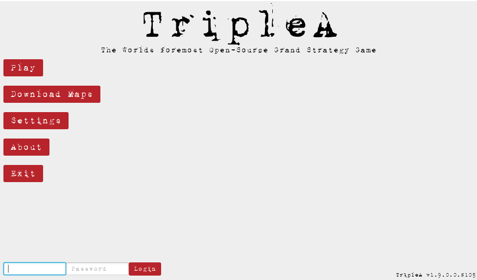
                                            So here is my attempt at the main login page.

                                            0_1515876600443_UI design 2A.jpg

                                            "A joyous heart sours with the burden of expectation"
                                            Hepster

                                            prastleP General_ZodG LaFayetteL B 4 Replies Last reply Reply Quote 5

                                            Hello! It looks like you're interested in this conversation, but you don't have an account yet.

                                            Getting fed up of having to scroll through the same posts each visit? When you register for an account, you'll always come back to exactly where you were before, and choose to be notified of new replies (either via email, or push notification). You'll also be able to save bookmarks and upvote posts to show your appreciation to other community members.

                                            With your input, this post could be even better 💗

                                            Register Login
                                            • 1
                                            • 2
                                            • 6
                                            • 7
                                            • 8
                                            • 9
                                            • 10
                                            • 10 / 10
                                            • First post
                                              Last post
                                            Copyright © 2016-2018 TripleA-Devs | Powered by NodeBB Forums