In-Game UI Revamp
-
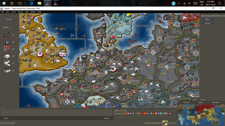
@redrum I would rather go with something like this:

Both side bars being shrinkable at will, also under the limits of the minimap and the writings.
The minimap shrinkable too, but keeping the X/Y ratio.
An option for forcing the two side bars to have the same wideness, in the menu.
The left side bar would be substituted by the history bar, when in history only.
Also, when you shrink the left bar (with the units), the units eventually zoom smaller when the sidebar is slimmed so much that they would otherwise be cut, so that you can have that left side bar, with the units, veeery slim (people don't like to lose board space).