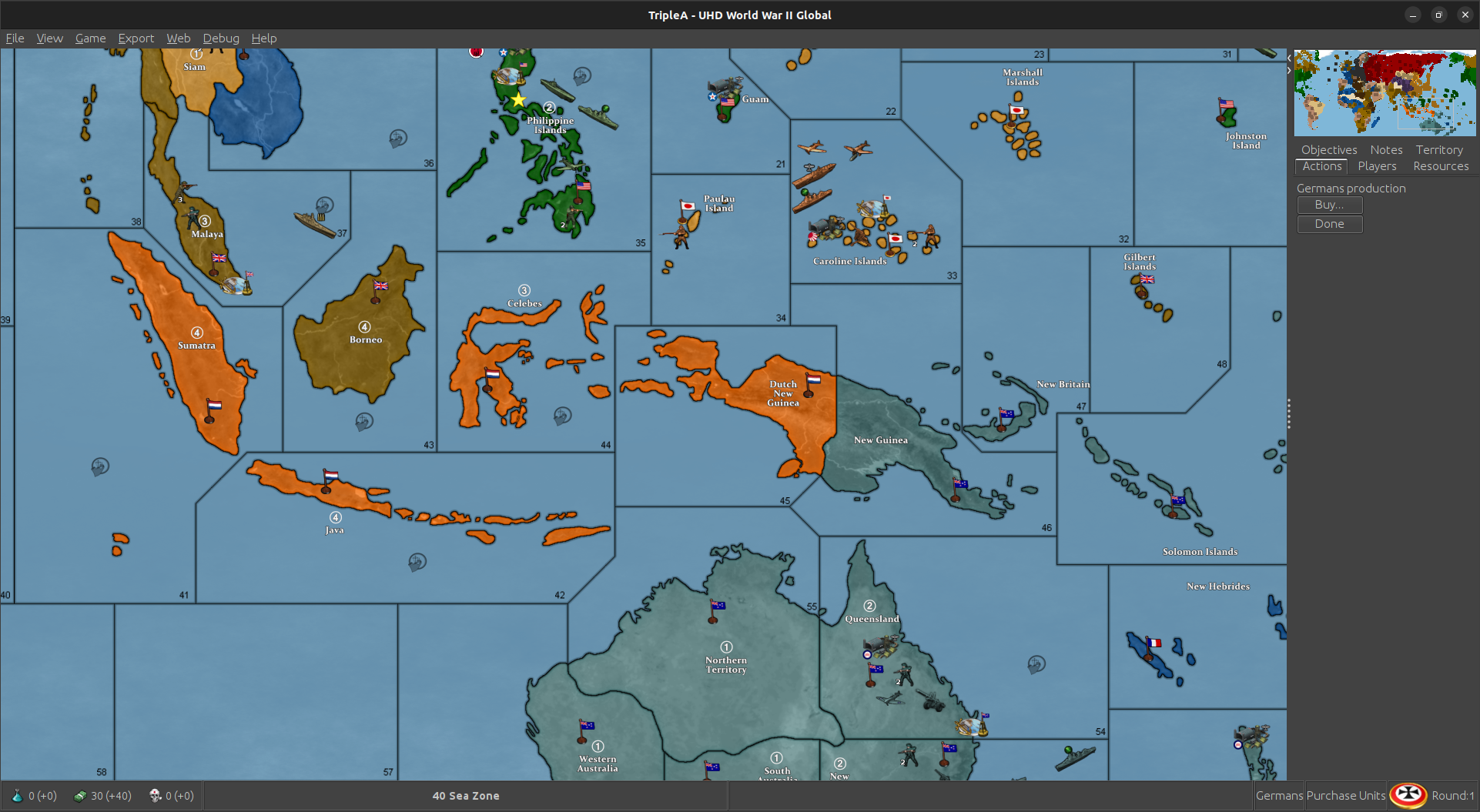
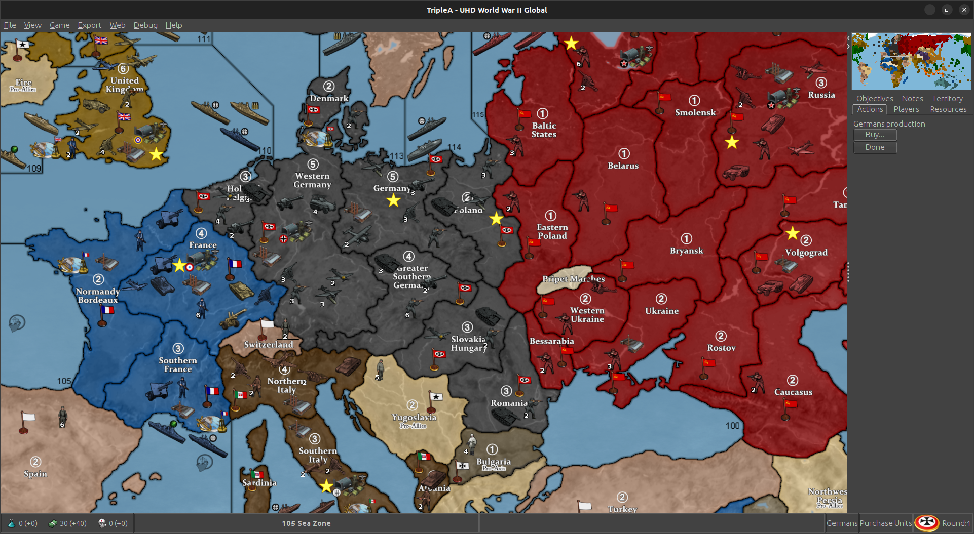
UHD World War II Global
-
@stohrm said in UHD World War II Global:
It's more about the reach of the planes than that of the naval vessels. Perhaps when the Game goes from UHD to 3D and sea zones are replaced by air zones for aircraft.
yea, so to expand a bit more, Oztea's 1941 Global Mod is available in Map/Game Options before Game Start.
Malta has a Airbase, 5 damage though
 but might be more what your looking for.
Actually, I think Oz's 41 is the best OOB Mod without adding anything other than start date and Units.
Edit
Just noticed a German placement error in Germany for Oz 41 Added 5 instead of removing. It's fixed for next update
-
@joseph-prince some more options ideas
-
add options for the other Oztea setups (1939 and 1942)
-
maybe add a 1943 scenario? https://axisandallies.fandom.com/wiki/Axis_%26_Allies_Global_1943_Variant
-
finally, just for the sake of completeness, June 1944 scenario (with timed victory conditions?) https://axisandallies.fandom.com/wiki/Axis_%26_Allied_Global_-_1944_Variant
and maybe even a January 1945 scenario (Germany and Japan are first in turn orders, you achieve a minor victory as axis if you still hold a capital by the end of turn 2, major if turn 3-4??) which is set (in pacific) after the american landing on Luzon and (in europe) after the German defeat in the battle of the bulge -
options to add various additional factions (namely the ones from here: https://forums.triplea-game.org/topic/2773/churchill-s-1939-thread-2/2
and others (like Canadians house rules, etc) making sure to keep the options seperate so players can pick which ones they want ingame (since they effectively take away from existing nations i.e CCP_Chinese weakens China, GEACPS weakens Japan, Canadians weaken British, Puppet_States weaken Germany, etc etc)
is there any tutorial topics on how to use the TripleA Github? just want to know
-
-
@beelee As someone who plays many different mods, I prefer to have a separate xml if you are going to have options that make for a significantly different game play situation. For me, options are for tweaking the scenario, like bids and low luck.
-
@rogercooper I agree, especially considering certain things don't work as options super well (like the Oztea setup requiring edit mode to set damages to infastructure and ships, while if it was a seperate xml it could simply use hitsTaken)
-
yea i did separate xmls for bungs map. Thought it might be easier just having it all in one this go around.
Yea, too bad hitsTaken isn't a attachment.
Probably do 39 next. Or maybe Canada.
-
Makes sense. I'd thoroughly pass the buck on getting whatever xmls dialed cause that's always been a big mystery black box to me for the most part hehe.
Like once something's in place I can kinda get a read on it, but not really my strong suit. For map adjustments (like the actual borders) baseline is relatively easy to adjust, it's just the relief that drags cause it's a noodling process for sure. It's simpler to sort of go in and do whatever at once, but I've just been making piecemeal corrections so that it would be analogous to OOB. Kinda supped in little ways that wouldn't actually effect the gameplay, but just be more for flourish. Stuff like Sakhalin or Aden or whatever that seemed easy enough to slide in for the visual, but could just attach to another nearby zone. That said if anyone wants to dive in and clean stuff or riff with mods that's always cool!
Just real quick for the HEX color thing this was what I meant in the post above. So if you navigate to this file and pop it open in notepad you'll see all the colors for the national displays (the color that paints across the land TTs).
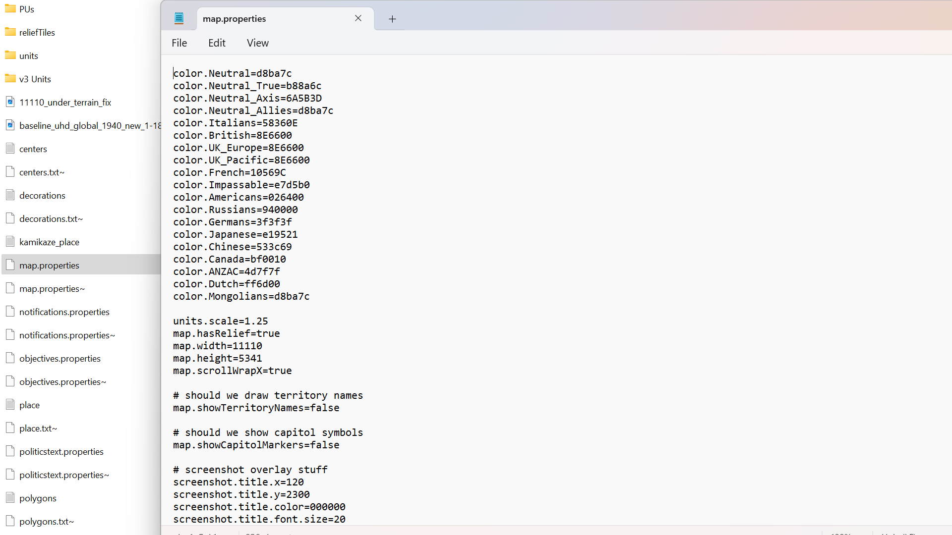
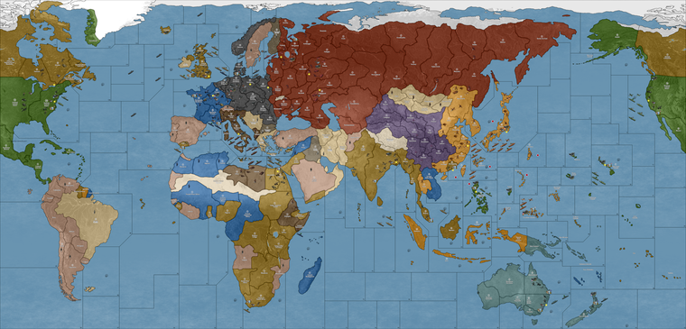
For that one I just picked 3 of the louder colors and dialed the vibrancy down like 25% so they'd be more muted, just to show how it works. The current default is like flashing lights at las vegas, so might catch the eyes or strain them, depending on your shades lol.
In this case the adjustments were to...
color.Americans=326100
color.Russians=831E00
color.Dutch=CF7E00with everything else left the same just to kinda see how a couple tweaks can push it ever so slightly. But you could hop around and tweak stuffthat way till the you get the right vibe you dig. Here's a quickie tool that just spits out the HEXs from the rainbow bar that you can plug in...
(for that you can drag around the palette, the number you want would be the topline 6 character hex by the pound # symbol.)
It's hopefully easy to change them on the fly, like by adjusting 1 color at a time or all of them to play around with that and get the desired look or overall palette, though I'm not sure how many players like going under the hood, that one is a pretty quick edit. You can just fire up the map.properties file in notepad, save new txt you changed then relaunch tripleA to see immediately your adjustments displayed.
It'd be cool if we had a maybe a basic web palette in-game, but right now gotta do it from the map.properties file. I'm not particular, hopefully the unit tints are serviceable since those take longer to adjust, but even then if it feels jank somewhere those can be tweaked too using that BIMP plugin to batch edit a bunch of images in GIMP or PS. Also if peeps got a spread that looks cool for that post what you like and then we can set up some alts. like especially if anyone is red/green colorblind and has something that feels good for that.
For the ocean blue, that's probably the next simplest edit to make, but it involves paintbucketing the baseline image and then running it back through the tilebreaker. Easiest there would probably just be to do a couple options for peeps to replace those tiles like how the old skins used to work. Doing it manually isn't ideal for the end user, but least it's workable. We can just like vote on the final look or toss out a couple defaults to choose from if the connects are all dialed now. I can give it a final pass to beef out whatever pixels for some of the stretches, but I'd redo that from the base probably first just to make sure before doing the relief, since the latter takes a fair bit longer. Anyhow, hopefully helps a bit
Have fun gang, happy Lupercalia! hehe
ps. oh also I think this one caught the slip somewhere from the darker value set.

pps. Oh and one more knock on thought, but just the idea of the 60 bid seems kinda badass to me for the vanilla. For a game vs the computer it would be clutch if the tripleA hardAI (maybe should be renamed?) might just rock a spread like that, or with 50-100 tuv with randomized unit placement, mainly to UK/China I guess? just to set something to keep it hot like that? Where the launch option just gave a bid spread to the computer general if playing team axis. Wouldn't need need to be perfect I don't think, just that idea of the big pile at the start to give it variability. Might be cool
-
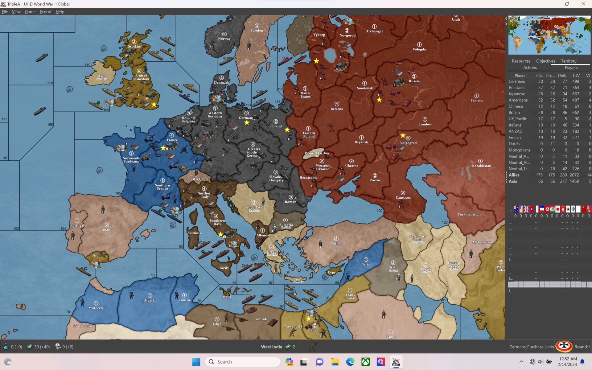
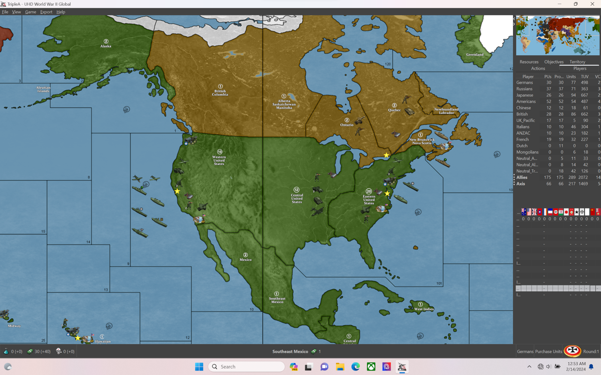
quick recap for stuff to comb over. I got notes to fix up the jank or clarify the connect in these spots basically for the final pass. Like least for the map...
Units probably need some attention just to tighten things up here or there or like with the tanks mentioned. How's the ocean blue treat you? I legit wear blue blocker glasses when playing tripleA or knock my gamma so maybe another reason I went all high vibrancy but I think maybe we just toss a few spreads and then whichever feels best run with that hehe. For the clean I up I got these from the above.
Pac/Asia side:
Korea-Amur drift the border left a few px to beef it out
Novos-Tsing border same deal drift a few px to the left.
Europe Atlantic side:
Syria-sz98 drift border down so looks more like Lebanon to beef it
France-N. Italy drift border left or carve into Switz a bit to beef it
Clean the jank off that line moved in sz123 from that earlier correction
Slide Malta again? Wasn't sure if I understood that as a mod or for the vanilla position
Take the Yemen/Oman/Kuwait concept under advisement. Could maybe use a border effect to indicate non connections but that seemed like it might just make it read busier to me. My thought was that anything not labelled would then just be understood as cosmetic basically. So like the Sakhalin thing wherever it goes down if it's not listed just part of a nearby tile not technically in play.
North America:
Maybe just the tangent on sz 1 where it hits the border to drift a few px?
Otherwise let me know. The less we gotta move the easier it'll be to pull off timely but I'll try to give it a whirl this weekend/next week if Minthara isn't taking up all my attention/free time like tends to happen lol
catch ya next round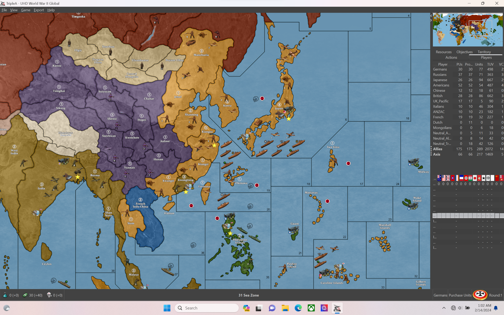
-
@black_elk if you decide todo anything with Malta, here's a shot of where were currently at.
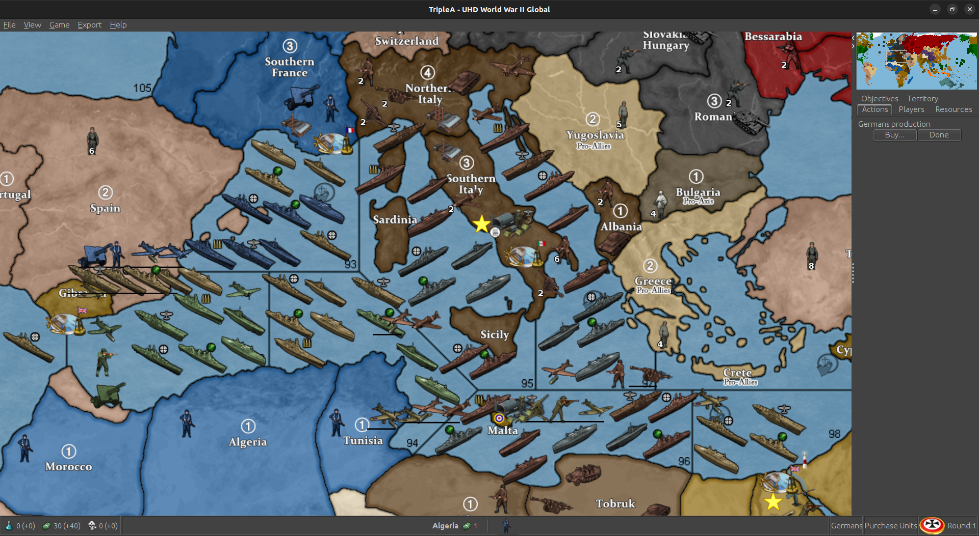
So 94 is probably the least used SZ. You could move west to where the Tunis coast starts moving north again. Keep the same angle you currently have. Basically cut that trprt in half.
I can fudge the trprt into Tunis a smidge and we'll only lose 1 place. Still have 9. Should usually be more than enough.
The BB is placing over western malta. That's why it only has 1 place. We should have room to move the BB off Malta and then give Malta another place.
Maybe make it slightly bigger ? Push the whole thing a tad west ?
I don't see much more than that really being feasible without dickin everything up. You have to keep 97, 95 and 92 as big as possible. You don't want to cut into 98 either.
Anyway, if you do change it, that's the way i'd go or just leave as is.
-
The above actually won't work. Tunis would be bordering 96 then. You could do it for a mod, but ... yea, it needs to stay as is.
-
I redid the place for Malta, Tunisia, 96, Tobruk and Libya.
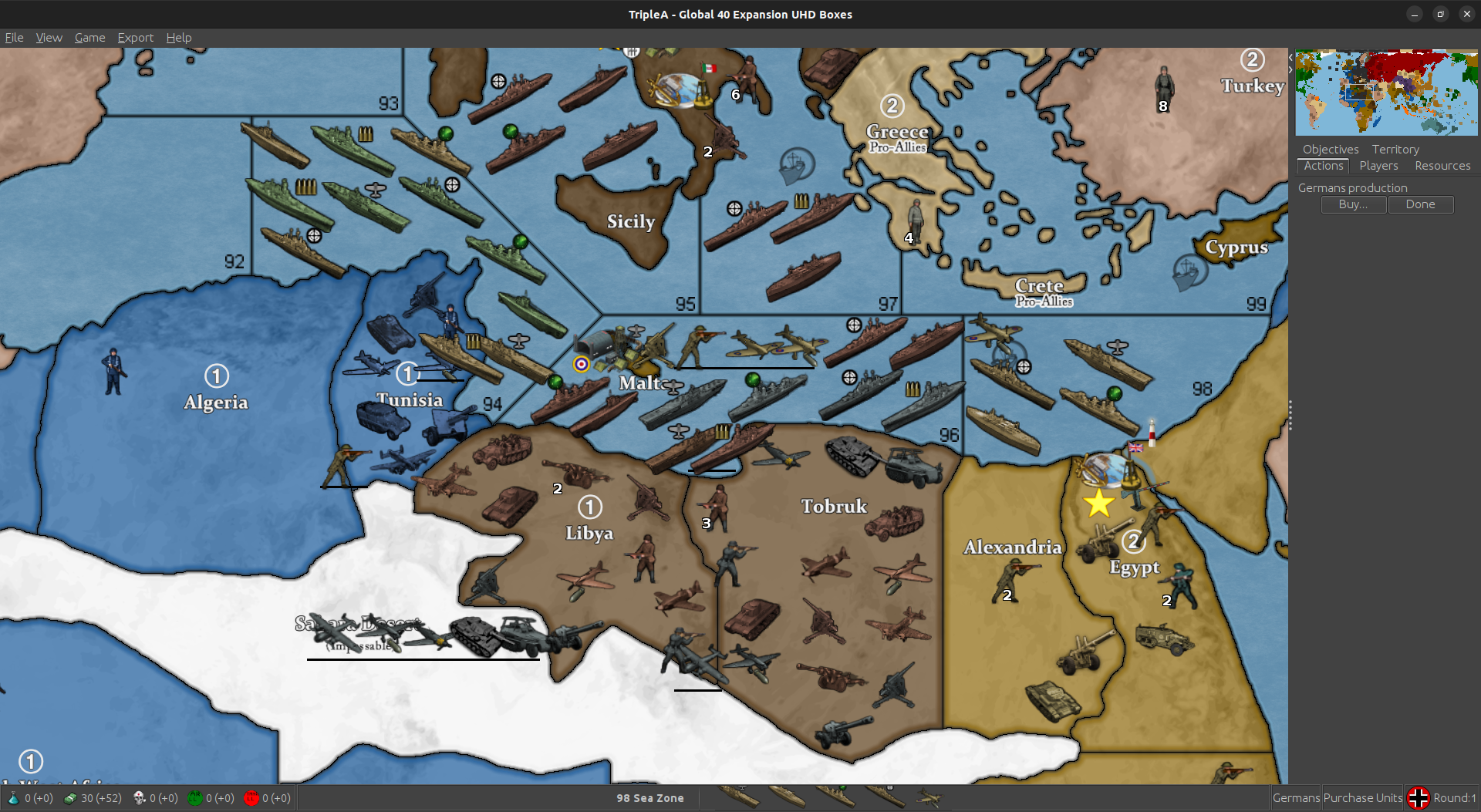
Removed the BB place in 96 and gave it to Malta, so Malta has 2 place and then overflow. Can place 5 total before it runs into anything in 96.
96 I squeezed in another place, so we still have 9 and reversed the flow into Tobruk.
Moved around the place order in Tunisia so 2nd to last gets hit with the flow first. Actually, all the flows work that way. Tried todo that for the whole map, but ...

Tweaked Libya and Tobruk place order as well. Looks as if we have room for one more in Tobruk. I'll add him too.
This will be in next update.
-
Here is a relief for the UHD global that just uses a very simple marbled pattern rather than a topographical vibe, for peeps who want it subtle.
https://drive.google.com/file/d/19mgiUmwoyg9R78d5OQLLmwOXytE_U5ao/view?usp=sharing
Couple screens to show how it presents...
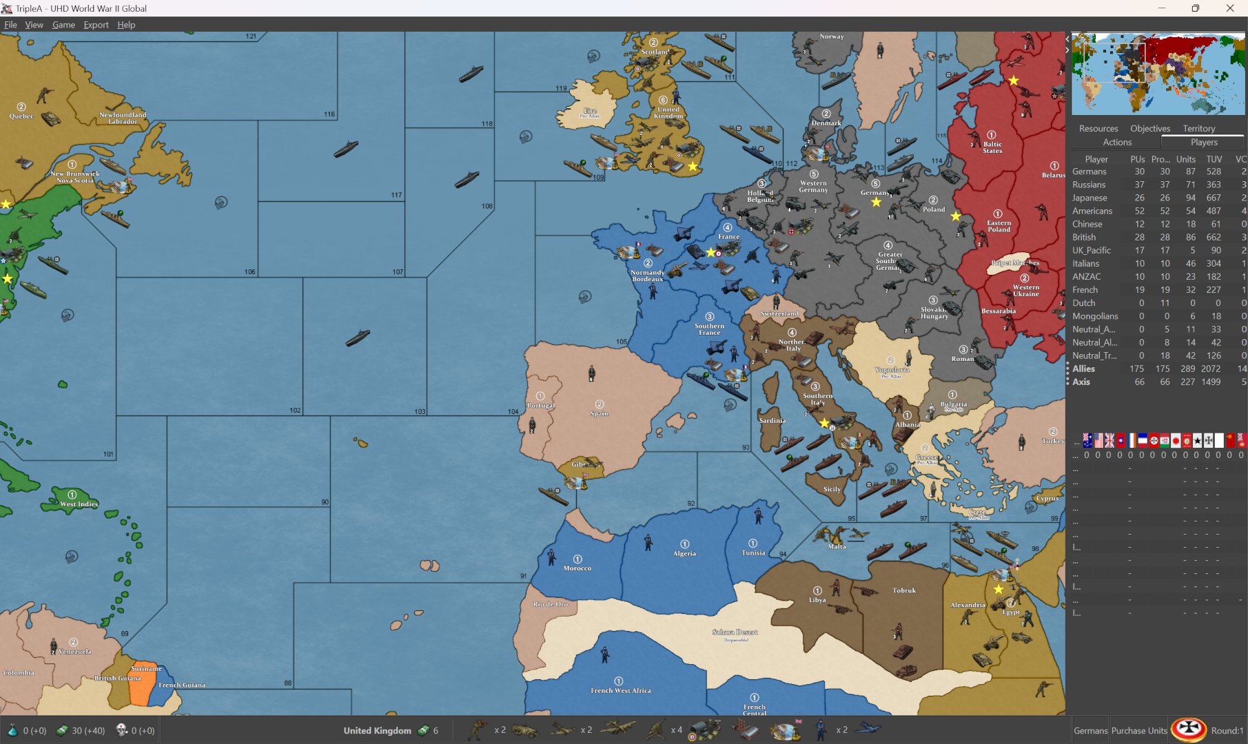
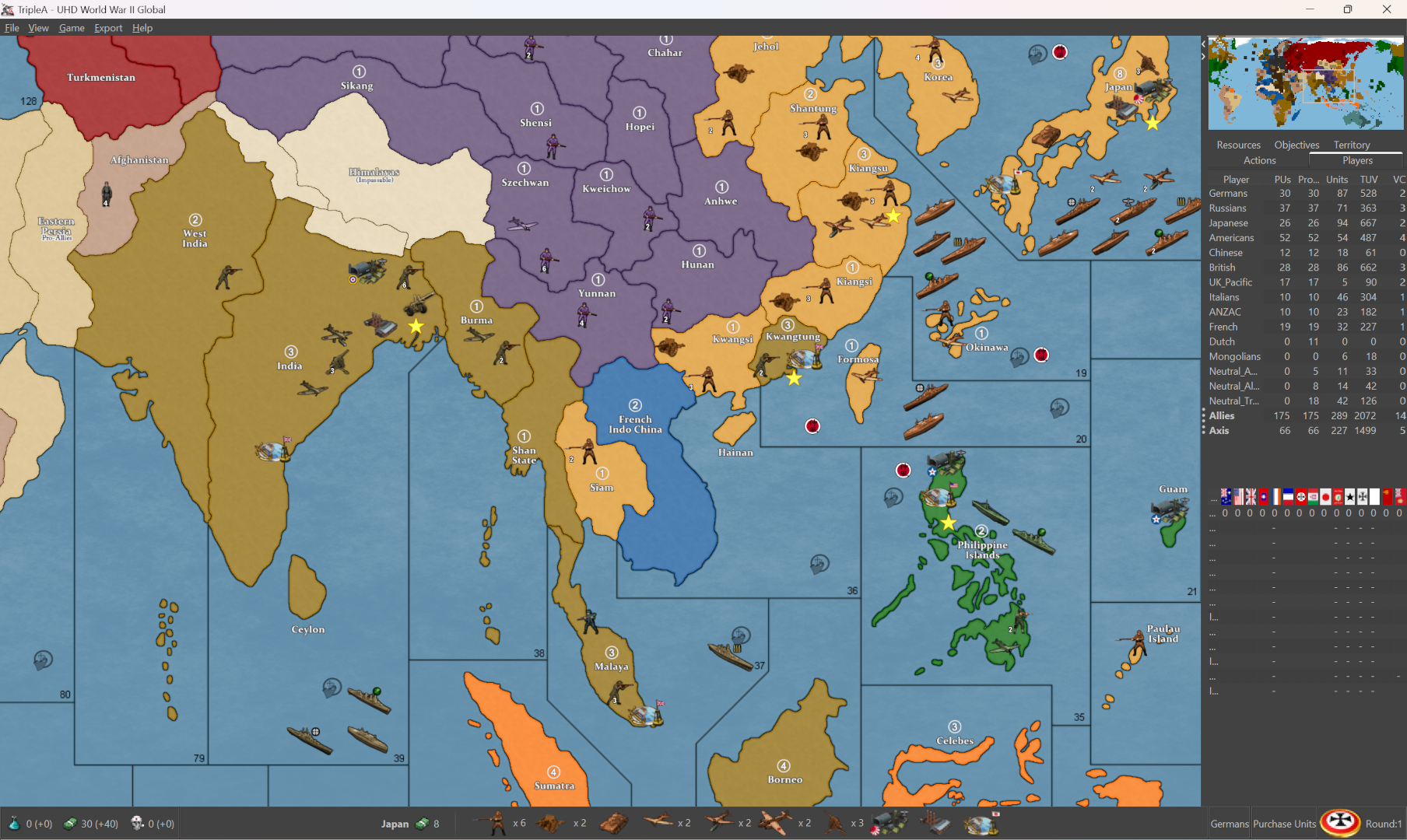
Nation colors can be changed via HEX in the map props. To change the blue of the ocean, I use the baseline to grab the selection on the relief, to isolate just those areas, then adjust. Here I just kept it the same as the default relief for simplicity, but you could insert graphics like WOPRs, change the clouds or add a glow, stuff like that. Hopefully works for most tastes. I tried to do a rail relief, but ended up looking kinda busy. Thought something like this would might be cleaner, and a bit easier to modify if peeps want to customize stuff. The templet there was GIMPs default marble pattern just to give an example.
Basically I used the baseline to grab the all the land tiles, reduce selection by 2px, edit>fill>pattern, then expand the selection by 1 px and hit it with some blur, so it just becomes like a texture.
You can do it with any image to make a pattern, but I figured that would be easy to reproduce. Then cut the entire selection (all the area in white from the base, but selected on the relief layer) paste that cutout portion with the pattern as a new layer on top, and reduce opacity of that layer to the desired level. Low opacity will give a color that is more true to HEX, higher opacity will mix that HEX color towards white, so you can basically control it that way towards more pastel.
For different borders, say using white, or blending the border in different ways, you can make a selection from the baseline 1 px then grow that selection add a little blend to the edge, paste it on top as a new layer. That way you can control the opacity there as well, for different border effects. Last step is to add the little canal graphics or whatever else. Here the 1px line shows through with just a bit of color pop at the edge, so it'd be easier to grab and to see what's going on there.
-
I like the other one better

-
Stupid question, why this?
    <attachment name="conditionAttachment_False" attachTo="Germans" javaClass="games.strategy.triplea.attachments.RulesAttachment" type="player">
      <option name="switch" value="false"/>
    </attachment>
It is used 262 times. 261 conditions/triggers that will never execute. Over 800 lines that should not be there.
I don't understand this.Cheers...
-
heh heh Idk. Probably because I didn't know what I was doing

-
LMAO... For real man. You made my day. I'm just rolling all over the floor. Just give me a minute!


Cheers...
-
Checking this xml to help @crockett36. There are some strange things here, but don't blame yourself cause the original ww2global40_2nd_edition.xml has some of the same code and I can't blame Bung or Veqryn.
Cheers...
-
Wow what a tangled mess. The "false" triggers are call by activateTrigger. This so that "removeUnits" can be done to one player while "placeUnits" can be handled by another player. But it uses a count of conditions/triggers. Are there 3 enemy units? Take one put one. Are there 2 enemy units? Take one put one. Is there one enemy unit? Take one put one. So, there are about 10 to 15 conditions/triggers for each such territory to count. Lots and lots of redundant coding. It seems that doing a change territory owner, then changing the unit's ownership to the new owner would be a fasters way of doing this because you don't have to count the number of units to change for each type of unit.
Might take a little time to test, but you could cut the code in half, and it should be simpler to read.
Just some thoughts.
Cheers...
-
yea i think that's probably for the Vichy code for the BM option. I'm not sure but I think it was done the way it was because the units weren't changing at the correct time.
I'm pretty sure redrum did the initial code for it or at least provided an example to the BM guys. I don't remember for sure.
-
I understand what is being done. It just feels like brute force. What happens if there are more than 3 units. Counting does not work. Plus, all the removeUnits, placement for each territory can be combined for each player.
There is a note telling players that if playing "Oztea 1941" change units to damaged units while damaged units can be placed and then replaced with undamaged units if necessary.
There just a lot here that seems over worked. I once took TWW xml from over 37,000 lines to just over 15,000.
Sometimes this stuff bugs me... I'm going back to watching Wednesday and then maybe some WFF.Cheers...
-
@wc_sumpton said in UHD World War II Global:
There just a lot here that seems over worked.
oh there absolutely is. A lot of room for improvement but it works.
Yes, have to have a different unit count for it to work. Think they went with the most likely combinations.
You should check out "Global 40 House Rules" if you really want to see a disaster. Back when I first started

Hello! It looks like you're interested in this conversation, but you don't have an account yet.
Getting fed up of having to scroll through the same posts each visit? When you register for an account, you'll always come back to exactly where you were before, and choose to be notified of new replies (either via email, or push notification). You'll also be able to save bookmarks and upvote posts to show your appreciation to other community members.
With your input, this post could be even better 💗
Register Login