Toggle Flags and Toggle Highlight Movable Units Updates
-
Looking at the code, I noticed that the "L" key toggles flags for a short duration. We also have the "F" key to highlight movable units.
Both of these are a bit "magic" as you either have to discover them or carefully read the game help.
I'd like to put some buttons on the right hand movement panel to represent these actions.
I'm thinking for flags rather than showing them briefly, the "L" key would toggle between, small flags, large flags, and no flags. Clicking the button would be the same as pressing the L key.
I do not plan to change the "F" key, highlight movable behavior, beyond adding a button that can be clicked instead of pressing the key.
@Hepps , @Cernel , or anyone that would like to add an icon, need two icons for the buttons that would do this. The flag icon probably should be a flag. The highlight icon is less obvious.
40x40 is roughly the desired size, transparent background preferred.
-
Prototype:
-
2nd variant:
-
-
-
@LaFayette I don't like it, mostly because I don't think that the lower horizontal bar should be a place for interacting. Also, I'm not a fan of the flags options, unless they get improved and refined in a number of ways, especially considering you can have maps (270BC...) that have flags as part of the units already.
-
@Cernel Any suggestions for a better location of the buttons?
The flags feature behind the view menu and "L" key is pretty hidden and having the flags show for a short amount of time is not terribly useful. Having a magic hotkey is not good, a UI control so that the feature can be discovered is pretty important; hence the button to cycle through the options. FWIW, the flags view is off by default and it's optional to turn it on (and for some maps it's reportedly useful)
-
Another note, it's probably going to be rare for anyone to actually click the buttons. They are more there for feature discovery, after then people will find out they can hit a hotkey instead of clicking the button.
I expect most will forget that "L" toggles flags (I forgot it was a hotkey until I saw it in the source code). Flags I suspect will get turned on for those that like it and probably rarely updated again.
Last comment, the locations of buttons is slightly civ inspired, but again, really curious if there are good suggestions for alternatives.
-
@LaFayette Maybe this time I'll just wait to see if I'm the only one that dislikes it.
-
@LaFayette I think it is a good idea to change the behaviour of the unit highlight feature to a "klick to toggle on"/"klick to toggle off" mode. Also I would not object to use the lower horizotal bar, as there is so much unused space today. Another idea would be to implement a button in the action tab during Combat Move Phase and Nocombat Move Phase. But I like the lower horizontal bar idea better.
I have no strong opinion on the flag feature, actually I have never used that in all those years. But another button in the lower horizontal bar would certainly increase awareness of this feature.
-
@Panther said in Toggle Flags and Toggle Highlight Movable Units Updates:
I have no strong opinion on the flag feature, actually I have never used that in all those years.
That feature, at its current state, can be useful only either for a minority of maps (like World At War, since 14 players plus neutral is a lot to be handled with colourization alone) or for people with poor eyesight. Still waiting to see what other people think on this feature proposal in particular, but, in general, I think anything showing up in main places should be at least something of value for the majority, and I cannot see this feature being used by people with decent eyesight for any of the "standard" games, up to and comprising WWII Global. On top of that, you have also games with flags in the unit images themselves, that would at least need a map option (maybe in map.properties) for avoiding this button showing up at all.
-
Not a big fan of the buttons on the bottom bar. I think they probably fit better in the action tab.
-
redrum
Not a big fan of the buttons on the bottom bar. I think they probably fit better in the action tab.Bottom bar does have unused space, hence it was attractive as a choice. The controls for 'Civ' are located along the bottom in a similar manner, slightly borrowed that design.
I can understand the concern. I don't know if there are other good locations.
I think perhaps one of the better UX treatments would be to add more of the map controls to the same bottom bar and then hide them behind a collapsible or sliding panel. Jumping to that treatment, right now, feels premature though.
The action tabs have some issues. The flag button does not fit with any of the existing tabs. It's not movement related, the hotkey is always active and so the button should always remain visible/active.
I'd be concerned too if we add a "map options" tab then we're increasing an already busy area of the game. Adding a whole tab for two buttons that are not completely related, with one disappearing when its not your turn, would not be very cohesive or well used IMO.
The highlight button could go on the movement tab, except:
- the movement tab is getting really busy/full. The highlight is not related to the scroller, it could be added to that area but I think it would be to the detriment of the reset of the controls.
- the highlight hotkey is active during non-movement phases, having the button not be available during those phases because there is no movement tab would be poor UX.
-
@Cernel said in Toggle Flags and Toggle Highlight Movable Units Updates:
That feature, at its current state, can be useful only either for a minority of maps (like World At War, since 14 players plus neutral is a lot to be handled with colourization alone) or for people with poor eyesight.
There are a lot of people with poor eyesight and/or colorblind.
It's the presence of a hotkey that makes the feature better as an icon. We could remove the hotkey and just leave the feature toggle in the menus or game settings. IMO that is not a good way to go:
- The view menus are not cohesive and too many, the options gathered there a bit of a hodge (many should go to the game settings window)
- Seems we are really burying the feature at that point. Is the icon that horrible to look at and just ignore? If bury the feature behind numerous menus and hide it amongst many other options and make it not readily accessible, we should reconsider if it's worth having.
that would at least need a map option (maybe in map.properties) for avoiding this button showing up at all.
This is problematic and ignores that clicking the button simply turns the flags off. Having a conditional flag to override a users preference and turn the feature off seems incorrect. Perhaps if this feature were around earlier then those maps would not have needed to put flags in the unit images. Regardless, we are where we are today.
-
@LaFayette The bottom bar doesn't have that much unused space for maps with multiple resources and territory effects. This is also separating flag settings from the rest of the settings (not clear why we would do that as you usually would only change the flag settings once per game). The flag settings should also really be per map (@Cernel has mentioned this a number of times in the past).
What I would like to move towards is actually changing the top settings bar into a modal window like most games do and then flip the bottom bar to the top (this is essentially the information bar). Once we do that then we can consider what to use the bottom area for.
-
The flag setting has a hotkey which distinguishes it from the other settings. It seems it was coded to have a use case where some users would want to turn it on temporarily. I'm not sure if that was perhaps overly optimistic.
-
@LaFayette I don't think that is a realistic use case. Usually you either want them on or off. It might vary by map but I don't see players toggling them on/off throughout a game.
-
@redrum There are times when it can be difficult to tell units. I think the idea behind the original feature (which I did not add or code up) was to temporarily to turn it on to double check and then turn it off again.
I think we're over-indexing on the flag feature. IMO our first goal should be to get rid of the magic hotkeys. Those represent usability problems. Once we've done that, finding a really good home for everything is then a good move. If we don't want to do it in that order, then removing the magic hotkeys and features behind is the way to go, but that seems unacceptable. Particularly for unit highlight, which I personally use all the time.
We've a number of questions before us, working alternatives are appreciated as the existing situation is not good, the incremental improvement still has its problems too.
We could:
- remove the hotkey for flags. In which case it's a good setting for the settings window. I'd be concerned though that the feature is too buried at that point and perhaps not worth having.
- find a new home for the controls so we do not have magic hotkeys. Until we have further additions, I don't know what those good locations would be (action tabs are not good for reasons stated already, which leaves us without many options). We could try placing them at the top of the window, or behind a sliding panel. The top of the window I think woudl be even worse than the bottom bar, sliding panel I don't think is a good choice for two 40x40 buttons.
-
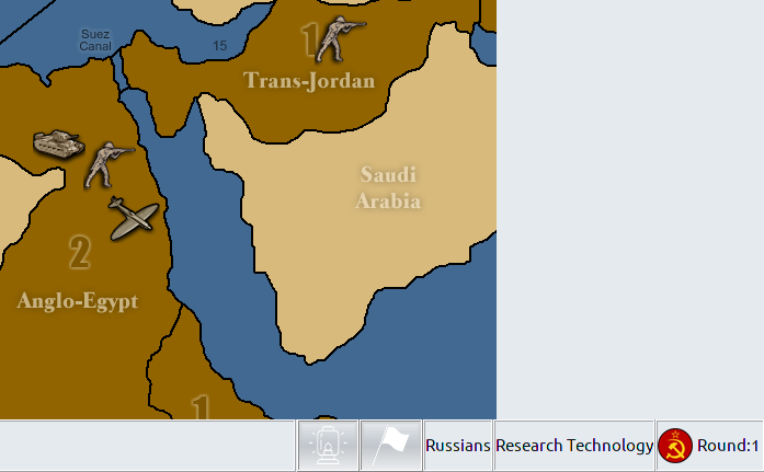
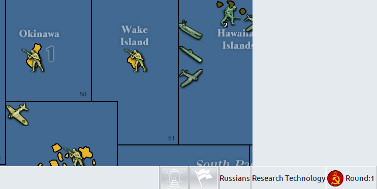
Checking maps with lots of resources and FX, the 80px is not very significant, still plenty of room:


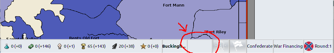
Though, there is a problem on narrow window, eg:
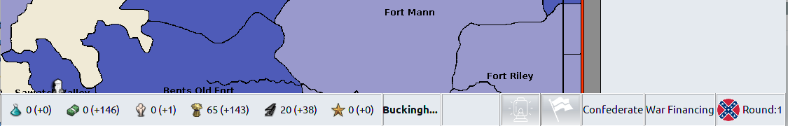
In that case though the problem is the blank panel that is taking up space and not necessarily the buttons:
-
@LaFayette So I agree we have too many 'hidden' hotkey functions but I think the 2 buttons you've initially chosen aren't even close to the most used functions and I'm concerned with putting more things into the bottom bar.
I'm fine removing the hotkey for flags. I actually don't even know what the hotkey is.
I'd like to have some sort of vision that we are incrementally working towards. Putting 2 buttons on the bottom bar doesn't seem like a good direction as we eventually then probably have 10+ buttons there. Also splitting up what is primarily a setting (unit flags) from the rest of the settings doesn't really make sense.
I would rather at this point put buttons along the right side of the top bar (lots of unused space there that also doesn't vary by map).
And yeah, as you can see if you are playing with a lower resolution width then you start to have issues if we add more things to the bottom bar. That space you point to is where movement validation messages appear.

Hello! It looks like you're interested in this conversation, but you don't have an account yet.
Getting fed up of having to scroll through the same posts each visit? When you register for an account, you'll always come back to exactly where you were before, and choose to be notified of new replies (either via email, or push notification). You'll also be able to save bookmarks and upvote posts to show your appreciation to other community members.
With your input, this post could be even better 💗
Register Login