Toggle Flags and Toggle Highlight Movable Units Updates
-
@Cernel said in Toggle Flags and Toggle Highlight Movable Units Updates:
That feature, at its current state, can be useful only either for a minority of maps (like World At War, since 14 players plus neutral is a lot to be handled with colourization alone) or for people with poor eyesight.
There are a lot of people with poor eyesight and/or colorblind.
It's the presence of a hotkey that makes the feature better as an icon. We could remove the hotkey and just leave the feature toggle in the menus or game settings. IMO that is not a good way to go:
- The view menus are not cohesive and too many, the options gathered there a bit of a hodge (many should go to the game settings window)
- Seems we are really burying the feature at that point. Is the icon that horrible to look at and just ignore? If bury the feature behind numerous menus and hide it amongst many other options and make it not readily accessible, we should reconsider if it's worth having.
that would at least need a map option (maybe in map.properties) for avoiding this button showing up at all.
This is problematic and ignores that clicking the button simply turns the flags off. Having a conditional flag to override a users preference and turn the feature off seems incorrect. Perhaps if this feature were around earlier then those maps would not have needed to put flags in the unit images. Regardless, we are where we are today.
-
@LaFayette The bottom bar doesn't have that much unused space for maps with multiple resources and territory effects. This is also separating flag settings from the rest of the settings (not clear why we would do that as you usually would only change the flag settings once per game). The flag settings should also really be per map (@Cernel has mentioned this a number of times in the past).
What I would like to move towards is actually changing the top settings bar into a modal window like most games do and then flip the bottom bar to the top (this is essentially the information bar). Once we do that then we can consider what to use the bottom area for.
-
The flag setting has a hotkey which distinguishes it from the other settings. It seems it was coded to have a use case where some users would want to turn it on temporarily. I'm not sure if that was perhaps overly optimistic.
-
@LaFayette I don't think that is a realistic use case. Usually you either want them on or off. It might vary by map but I don't see players toggling them on/off throughout a game.
-
@redrum There are times when it can be difficult to tell units. I think the idea behind the original feature (which I did not add or code up) was to temporarily to turn it on to double check and then turn it off again.
I think we're over-indexing on the flag feature. IMO our first goal should be to get rid of the magic hotkeys. Those represent usability problems. Once we've done that, finding a really good home for everything is then a good move. If we don't want to do it in that order, then removing the magic hotkeys and features behind is the way to go, but that seems unacceptable. Particularly for unit highlight, which I personally use all the time.
We've a number of questions before us, working alternatives are appreciated as the existing situation is not good, the incremental improvement still has its problems too.
We could:
- remove the hotkey for flags. In which case it's a good setting for the settings window. I'd be concerned though that the feature is too buried at that point and perhaps not worth having.
- find a new home for the controls so we do not have magic hotkeys. Until we have further additions, I don't know what those good locations would be (action tabs are not good for reasons stated already, which leaves us without many options). We could try placing them at the top of the window, or behind a sliding panel. The top of the window I think woudl be even worse than the bottom bar, sliding panel I don't think is a good choice for two 40x40 buttons.
-
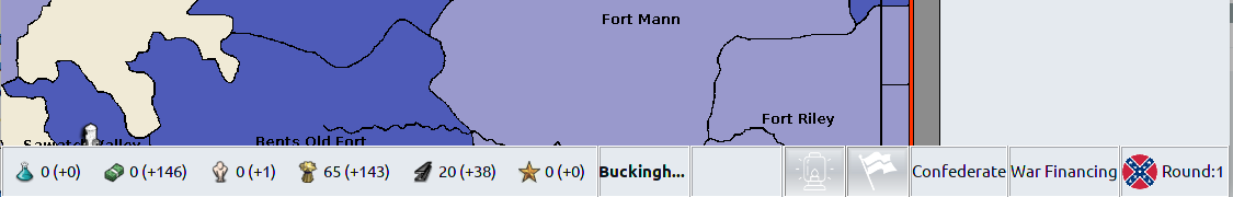
Checking maps with lots of resources and FX, the 80px is not very significant, still plenty of room:


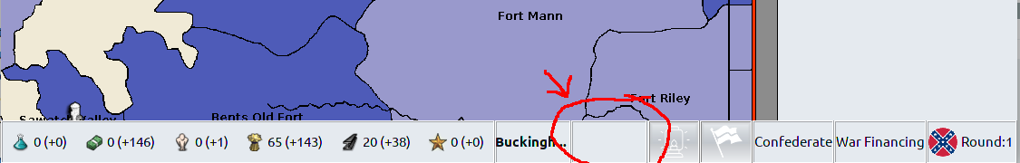
Though, there is a problem on narrow window, eg:
In that case though the problem is the blank panel that is taking up space and not necessarily the buttons:
-
@LaFayette So I agree we have too many 'hidden' hotkey functions but I think the 2 buttons you've initially chosen aren't even close to the most used functions and I'm concerned with putting more things into the bottom bar.
I'm fine removing the hotkey for flags. I actually don't even know what the hotkey is.
I'd like to have some sort of vision that we are incrementally working towards. Putting 2 buttons on the bottom bar doesn't seem like a good direction as we eventually then probably have 10+ buttons there. Also splitting up what is primarily a setting (unit flags) from the rest of the settings doesn't really make sense.
I would rather at this point put buttons along the right side of the top bar (lots of unused space there that also doesn't vary by map).
And yeah, as you can see if you are playing with a lower resolution width then you start to have issues if we add more things to the bottom bar. That space you point to is where movement validation messages appear.

-
@redrum said in Toggle Flags and Toggle Highlight Movable Units Updates:
So I agree we have too many 'hidden' hotkey functions but I think the 2 buttons you've initially chosen aren't even close to the most used functions and I'm concerned with putting more things into the bottom bar.
For highlight, I disagree. It is used all the time, at least personally for sure. On many maps it's how I learn the map as well. For example LOTR and even 270BC, it was not clear which units even belonged to which empires and took a while to even find where to start moving units. I'm of a very strong opinion there.
I think the 2 buttons you've initially chosen aren't even close to the most used functions and I'm concerned with putting more things into the bottom bar.
I don't think we have any many other magic hotkeys for map display. Zoom is the only thing I can think of that we're missing. The rest of the hotkeys are territory specific and not appropriate for a bottom bar (likely those would be good to have from a right click menu).
-
@LaFayette I think highlight unit function should belong with the new unit cycling functions.
The most used functions besides unit selection/movement, I would say are the battle calc, zoom, map search should become more used, show history, and highlight unit (potentially the new cycling).
TripleA Developer with a Passion for AI: https://forums.triplea-game.org/topic/105/ai-development-discussion-and-feedback
-
@redrum said in Toggle Flags and Toggle Highlight Movable Units Updates:
I would rather at this point put buttons along the right side of the top bar (lots of unused space there that also doesn't vary by map).
And yeah, as you can see if you are playing with a lower resolution width then you start to have issues if we add more things to the bottom bar. That space you point to is where movement validation messages appear.Top bar? Where is that exactly? The menu? AFAIK icons cannot be placed on it.
In the screenshot posted, there is a good bit of space to the right of 'blitz'. I'd agree there is not much more room, so more controls would not be good, but stating there is not 80px to spare I don't see.
I think we're over-indexing on flags, which seems to be a hated feature here. There's a reason nobody knows the feature exists and what the hotkey is, because it's hidden. Maybe we should reconsider that feature.
The highlight unit feature is significant though, forcing players to learn the hotkey for it is very poor, particularly how/where that information is located (it's the same place that describes the L key, not knowing that key makes it likely to not know the other; so again we have a hidden magic feature that players have trouble discovering).
Beyond that, we really don't have that many other magic hotkeys for controlling map display.
Even if a long-term vision is presented, 2 buttons is not worthwhile to add a lot of new UI components. I don't think we'd get to that long-term vision in one step either. Requiring we have a full architecture of Rome before we lay the first street is not appropriate for our dev capacity and desire to avoid large changes.
-
@LaFayette Another screenshot with longer movement error:

The flag feature isn't bad, its just a setting that should be based on the map. Its really useful for maps with many nations where colors are similar (WaW, etc) but you would just turn it on once.
TripleA Developer with a Passion for AI: https://forums.triplea-game.org/topic/105/ai-development-discussion-and-feedback
-
@redrum said in Toggle Flags and Toggle Highlight Movable Units Updates:
@LaFayette I think highlight unit function should belong with the new unit cycling functions.
The problem there is that highlight is available when the cycling is not visible.
The most used functions besides unit selection/movement, I would say are the battle calc, zoom, map search should become more used, show history, and highlight unit (potentially the new cycling).
This is a good list. Calc has a button for it already, the territory tab seems okay.
Zoom, map search having UI controls/icons would be good. Those could belong together.
-
@redrum There is too much space dedicated to the territory, 80px is available there. The message being that long is a problem. Placing it in the bottom bar might not have been a good original choice.
The flag feature isn't bad, its just a setting that should be based on the map. Its really useful for maps with many nations where colors are similar (WaW, etc) but you would just turn it on once.
Interesting, this is argument for the feature and an icon for it. The game settings menu I think is best for options that are global to all maps. A player digs through it once and sets it up how they like, and then it is left alone.
It is common for players to switch between maps.. A setting on the map itself seems to be presumptious and overrides a players decision. It would be odd for a setting to be turned off on a given map for an insistent player to then always need to go turn the setting on.
-
@LaFayette You can have fairly long territory names and multiple territory effects so actually isn't much space there either.
So there are already a number of per map settings which the map creator can then set defaults for and the player can override. An example of this is unit size and this setting is very similar to show unit flags. The map creator should be able to specify a good default while the player can override (Unit Size):
-
Playing around with the UX on middle earth:
- The 'C' key is crucial! The highlight units is really helpful and even then flags is also helpful as I have trouble telling the nations apart. Being able to cycle through the flags easily is really helpful for comparing how things look, and eventually I'd probably want to turn flags off or make flags small.
We could place all those buttons with the unit scroller, but we're back to the problem where then have hotkeys that are still active but the button mapping to that hotkey disappears.
I don't see the space issue as that significant. Maps that run out of space could benefit from other fixes and already have issues, the 80px is not adding to that problem in a significant way.
I think the choice is whether:
(1) we want to group the icons with the unit scroller at the cost of:- adding extra controls to the scroller, we're making it really busy and 'overloading' it with similar but not cohesive controls.
- again, we have problem of disappearing controls when the hotkey is active.
(2) Live with the buttons on the bottom bar for now until we have more iterations and more controls enabled through icons
I don't see any other good places to put the buttons that would not be worse than the bottom bar, the tabs are decent choice, but at a cost that I really don't see outweighing having two small buttons on the bottom bar.
So there are already a number of per map settings which the map creator can then set defaults for and the player can override. An example of this is unit size and this setting is very similar to show unit flags. The map creator should be able to specify a good default while the player can override (Unit Size):
Good call out. I think flags is so personal preference that it is a bit different. It's more useful for players new to a map, and even then they may find they want to turn it off after some time. Other players may hate how it looks and never want it on at all. Either way the map override setting is going to eventually badly conflict with the wishes of a player.
-
@LaFayette I'd like to go with option 1 for now and not do any unit flag button (leave that in its current menu, you can remove its hotkey if you want). I also think that unit scrolling and highlighting is really only relevant during movement phases. That would indicate that really those should be buttons in the action tab and only available during those phases (I don't think I'd ever want to unit scroll/highlight during purchase/battle/place/etc.
So the user's override for map default settings already saves per map. So for example, I load up dragon war and the default unit size is 100%. I decide I want them smaller so change it to 75%. Close and start a new dragon war game then it saved my preference of 75% (and this also has no impact on other maps). This is how it should work and really how unit flags should have been implemented.
-
Option 1 is okay. I do hate the idea of cluttering and dirtying up a new feature with inconsistent controls that work differently. I also do not like that we have existing problems with the bottom bar, but so be it.
The flag option is much better behind an icon. Have you play tested it on middle earth or other maps where it is useful? Seriously, I recommend giving it a try to help get over the initial abstract reaction. It really is night and day to be able to toggle through the flag options easily. That is reason for a hotkey, and with the hotkey we need an icon.
Getting more controls out of the menus and onto icons IMO is good, but it can't be done all at once, have to start somewhere. I started with the options that had hotkeys, the others do not. It's most important for the options that have hotkeys, bad UX to have magic hotkeys (it'd be like a keyboard with no labels on the keys).
The flag and highlight are actually pretty similar in their use (both answer the question of, "which units are mine?"). As mentioned, on middle earth, without center and highlight (and then flags helps), it's actually a guessing game which units can be moved. I had that same problem in 270bc.
TL:DR; option 1 is fine enough for now. Play test it and then let me know if you really think the flag icon is bad. The extra control there, given it's similar to highlight in purpose, is really not the end of the world and adds a lot of utility. Notably if the highlight and center are not enough, then the flag is a heavy handed way to tell which units belong to whom (so the 3 controls, center, highlight, flags, are related in a way).
-
Hmm, another concern, looking at the code updates - once the controls are moved I'd be afraid they would live with the unit scroller forever. It's an inertia that will build up, and future devs will be unlikely to want to change it, beyond the fact that users will get used to it and generate more inertia against moving it.. We do need that cohesive vision. Without that; we're going to be stuck with the problems we have grown accustomed to and the game just wont' be what it could be.
-
I sometimes used the highlight all years ago, but eventually stopped using it completely, as cycling units (that also specifically highlight) is just better, also since identifying units by highlighting them is not that great, if you want to be sure to spot them all. Just letting you know that those buttons are virtually useless to me, but, aside from not having a use for it as it is, I like the idea of having a switch for units flags, but it would need to be refined from the current raw and general state. I guess I can open a feature request about that, to be clearer.
-
@Cernel I often used the highlight all to help avoid forgetting units to move. I agree it's more useful when learning maps and eventually does not get used as much. That is in part why there are hotkeys. It's analogous to a keyboard, at first you are looking for a key and then pressing it. Eventually you learn where it is and you no longer look for it, you just press the right key without looking. Same thing for hotkeys and buttons. A new user will not know about the hotkey, they hover and learn that "Oh, 'F' will highlight all". They then stop using the button and instead use the hotkey. Flags having a hotkey is perhaps overkill, but play testing it, it does complement highlight-all.
@Cernel for a feature request, recommend waiting a few days for the new buttons to land and the updated flag behavior to be available in the prerelease. Please give it a try, and I'd be really happy to see any suggestions there.
Hello! It looks like you're interested in this conversation, but you don't have an account yet.
Getting fed up of having to scroll through the same posts each visit? When you register for an account, you'll always come back to exactly where you were before, and choose to be notified of new replies (either via email, or push notification). You'll also be able to save bookmarks and upvote posts to show your appreciation to other community members.
With your input, this post could be even better 💗
Register Login