Fixing Graphics Limitations: Unit Purchase Screen, Unit Help, Unit View
-
RESOLVED!
")
@thedog said in Fixing Graphics Limitations: Unit Purchase Screen, Unit Help, Unit View:
What are your screen settings?
Right click desktop
Display Settings
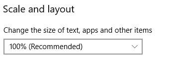
Have you got 100% ?
[Not a universal issue, just me being a dunce ctrl-mouse wheel in chrome. Woot!]
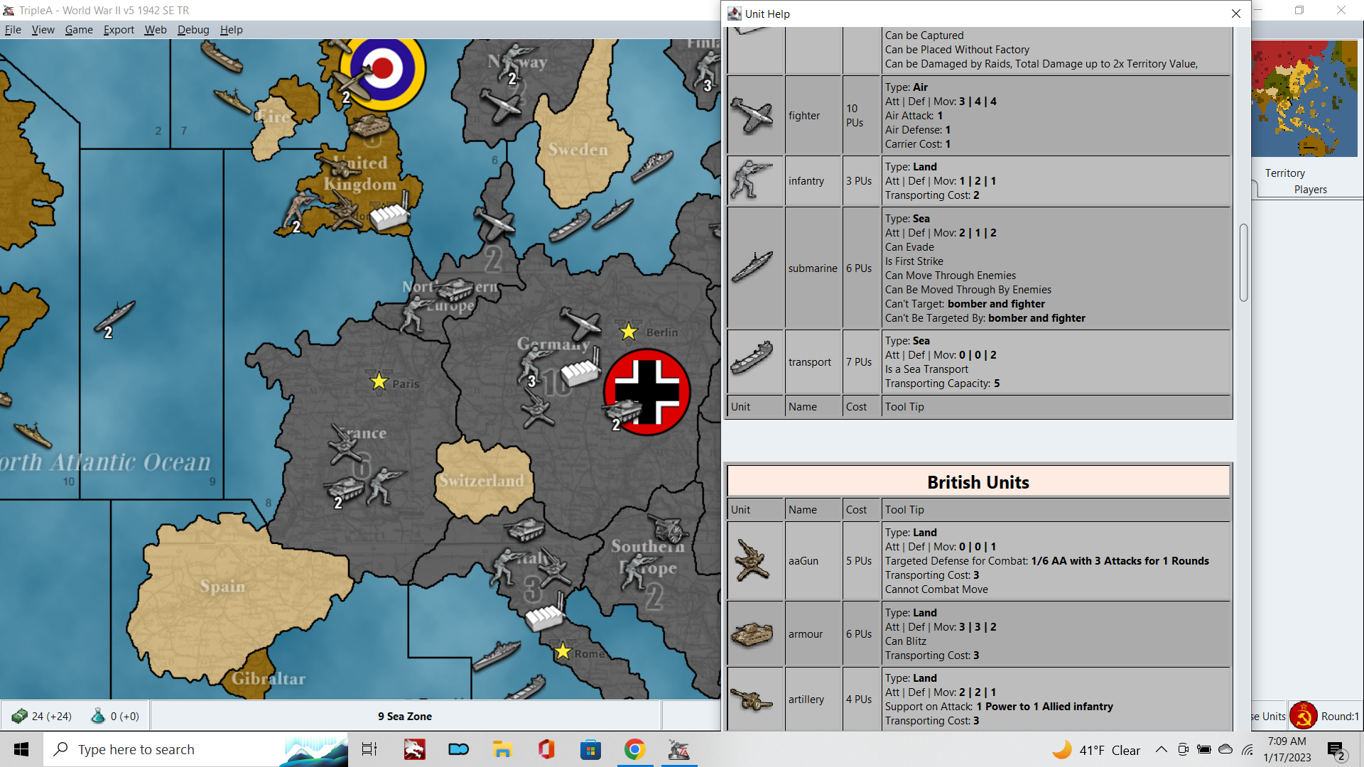
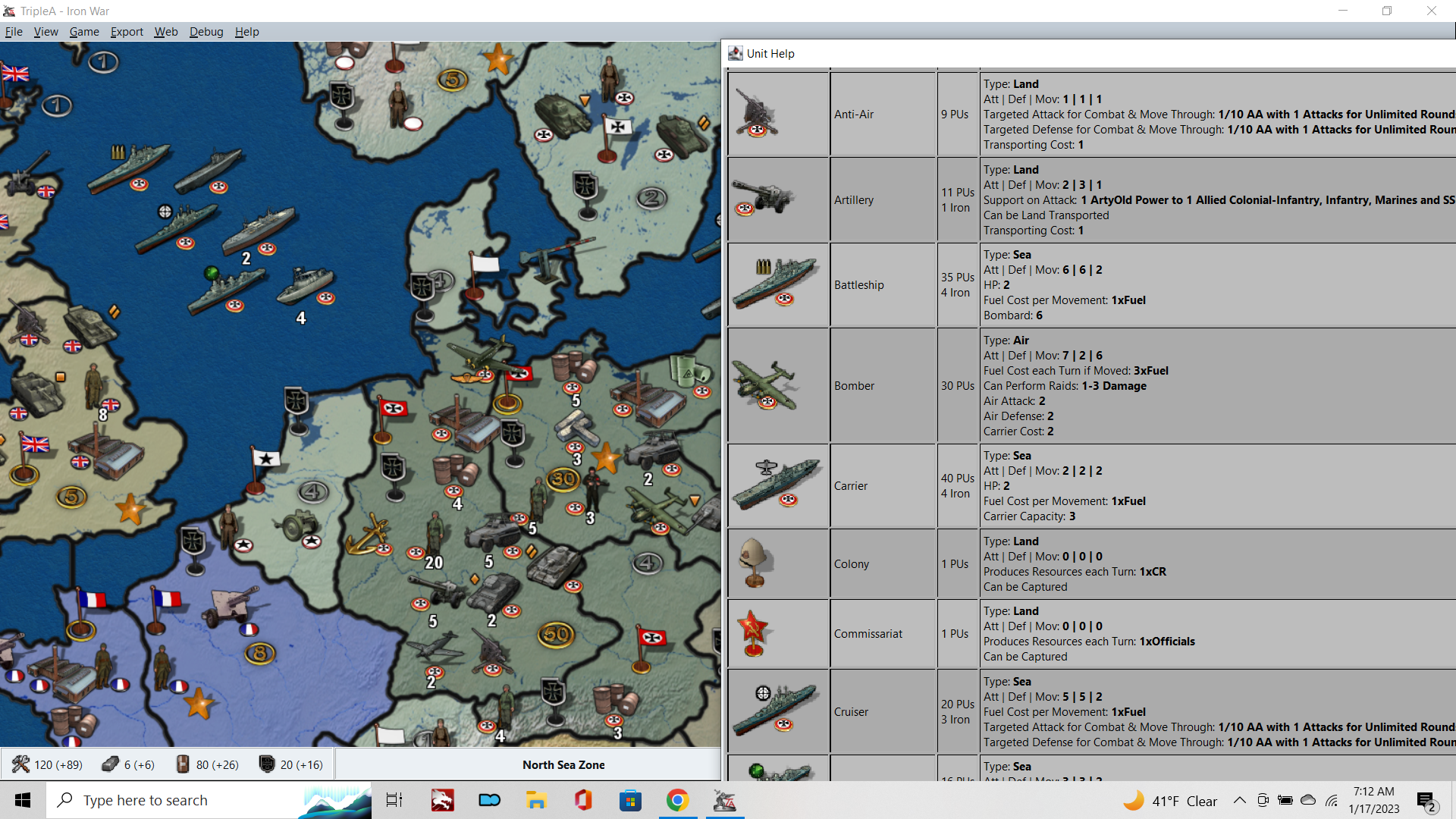
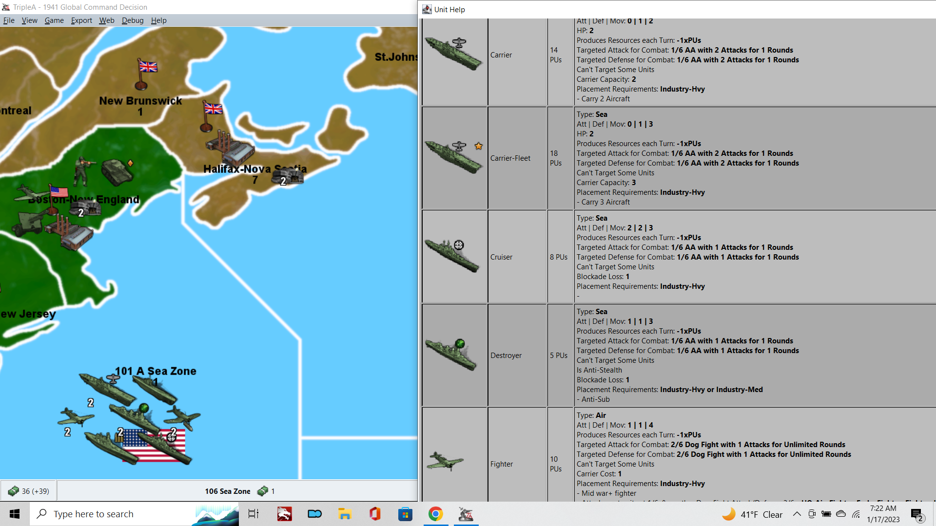
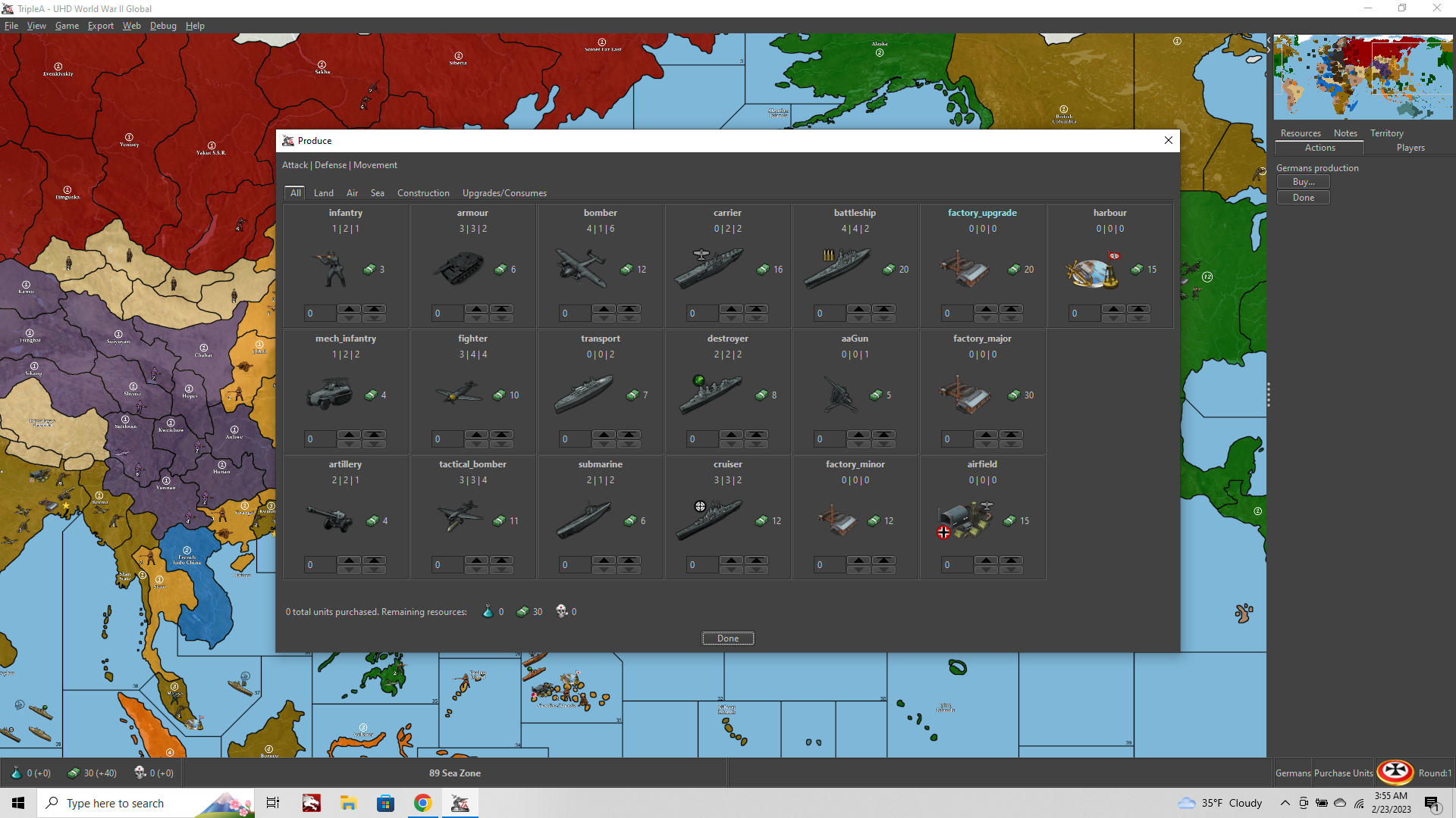
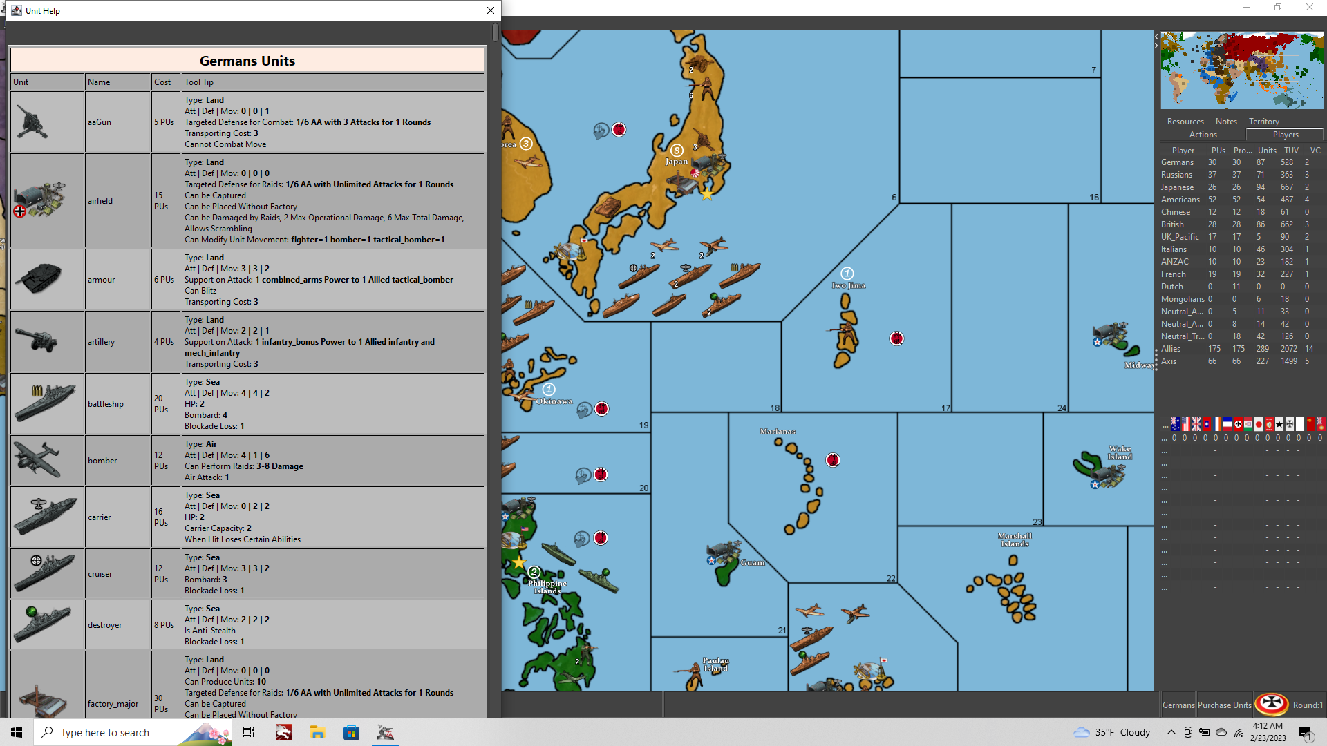
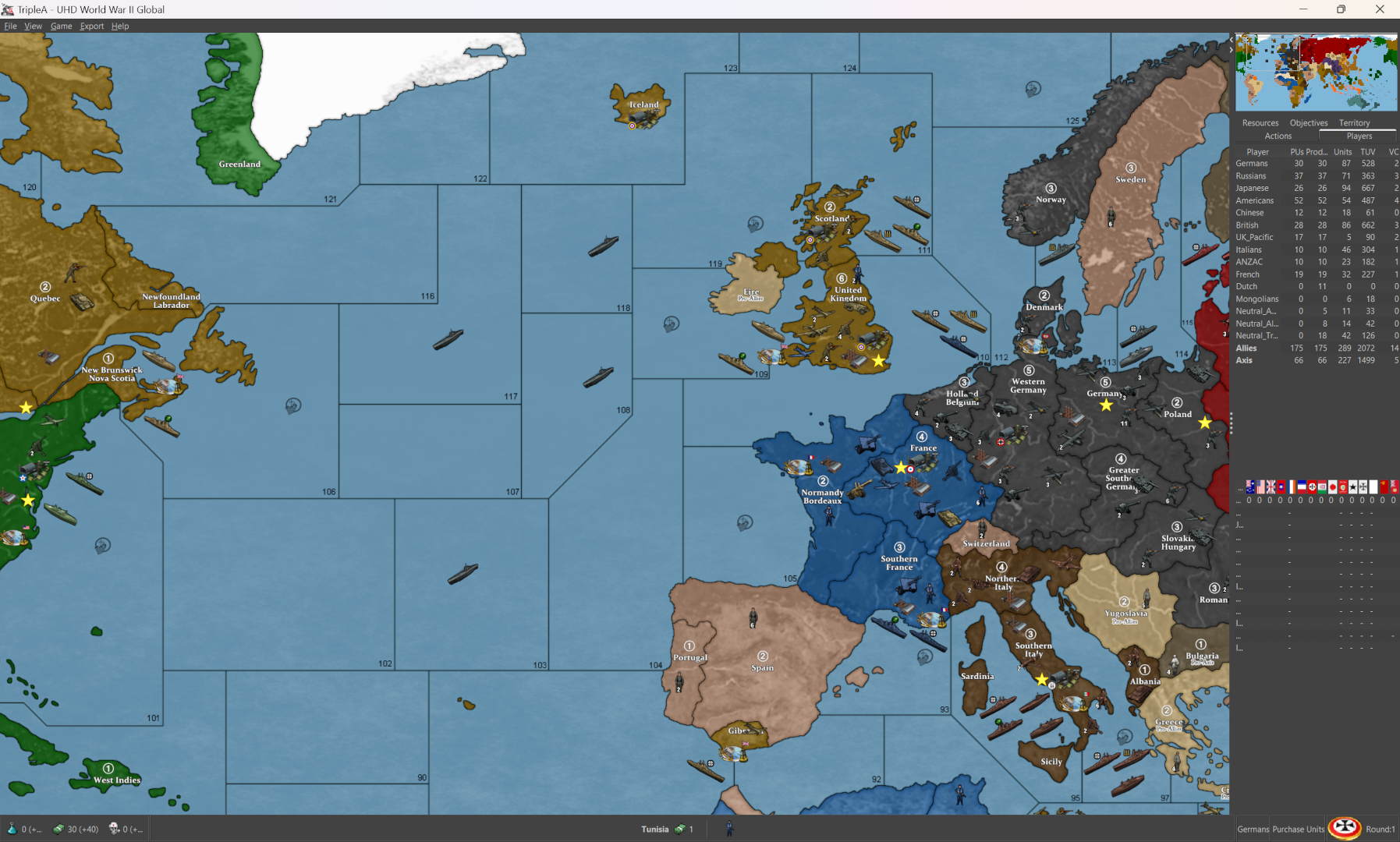
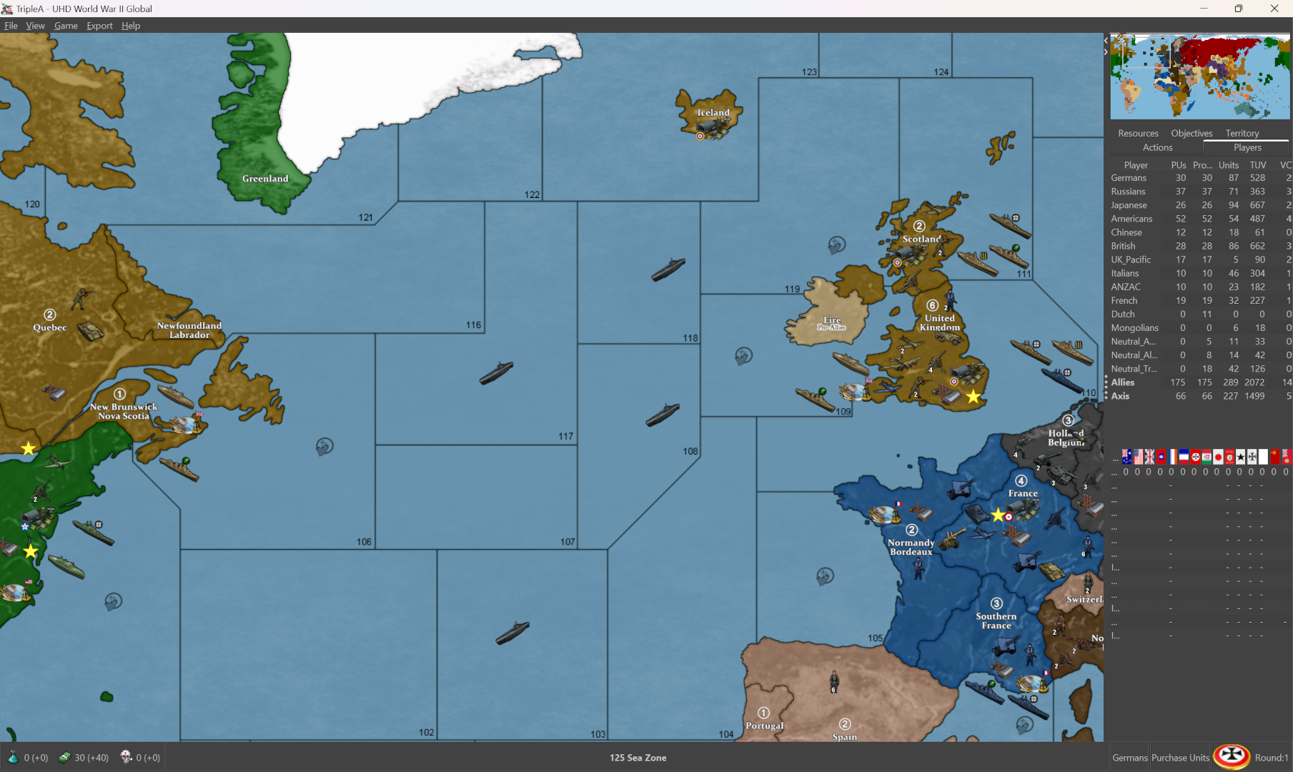
Right now the Unit Graphics on most screens/windows within tripleA are not displaying properly. This appears to be a universal issue, across all maps/games in TripleA
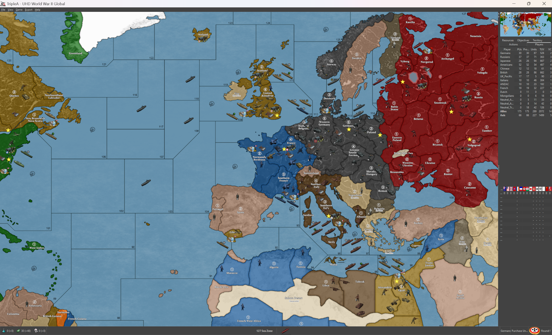
To see what I mean, open any map, and compare how the units are displaying on the Map at 100% vs how they appear in the Unit Help.
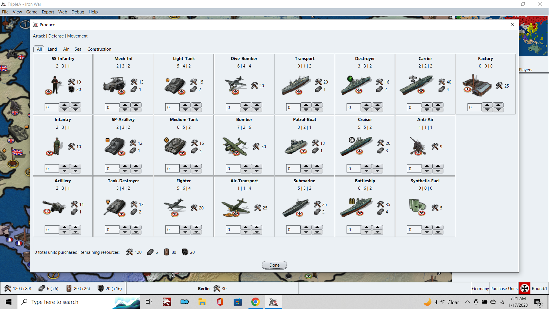
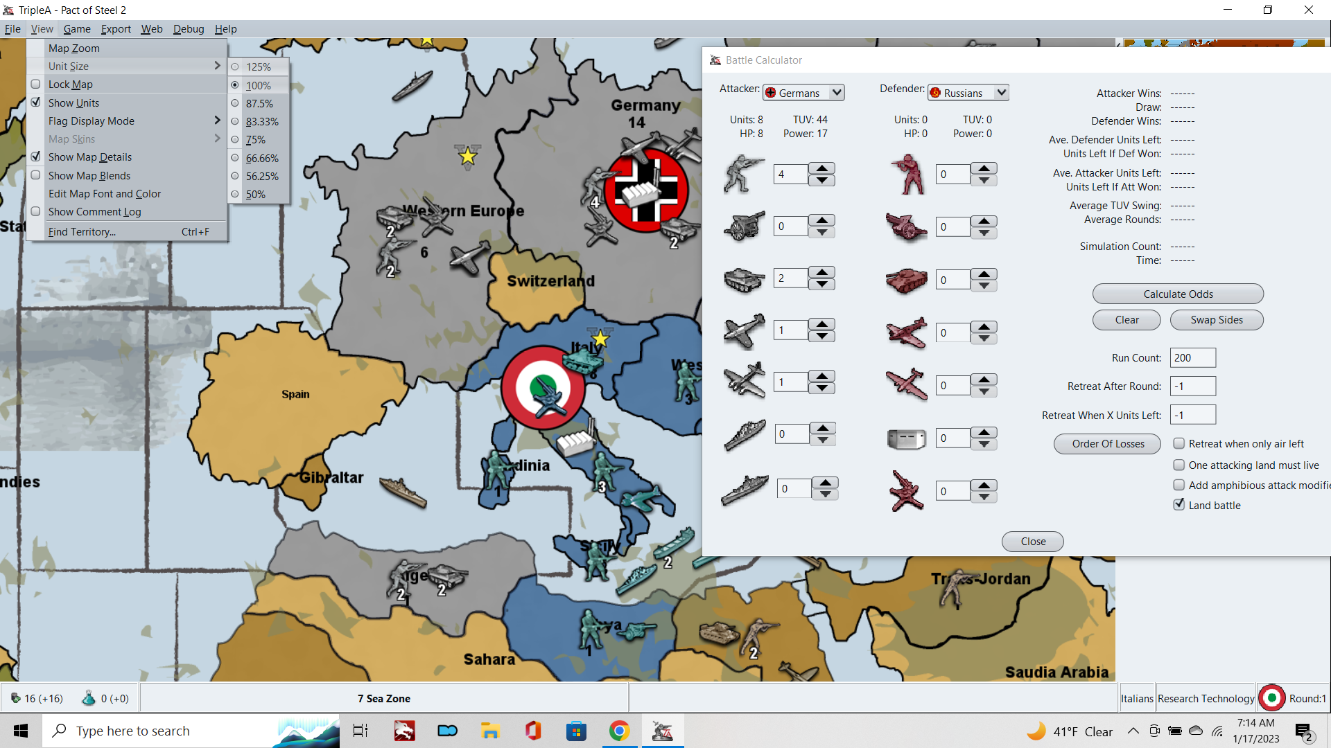
Compared to the regular units as displayed on the map itself, the units shown within the Purchase window, the Battle Calc/Battle windows, Movement Windows, and the Unit Help window are all displaying with a ton of image compression. Either these images are being rescaled or compressed, or I don't know what's going on really, but the overall visual effect is one where the units look pretty shoddy in most screens where the player will be interacting with them.
In the purchase window for example, units appear to have the Anti-Aliasing turned off and the blur becomes very pixilated.
Unlike other feature requests, for stuff that's more peripheral to the tripleA experience, this stuff is unavoidable and really in the foreground, as the player will be immediately confronted by this as soon as they make a purchase or try to move the units around.
I'm a visual person, so to me this should be like tip of the Top priorities, because it just looks so janky currently, and there doesn't appear to be anything I can do as the end user to address. It affects all games, so not like a special feature request really, this is for something that everyone and all games would benefit from fixing.
Also, while we're at it, can we get a Unit View option to upscale the Unit image graphics beyond 125%? Hehe
Up to 200% would make much more sense, so there's parity between scaling up and scaling down.
The Unit sizes are the main limitation that prevents larger scale maps with more beautiful graphics from being created. Right now the ceiling on that is 68 pixels, but this is fairly small for a modern display and even that is pushing it under the current build. Realistically the TripleA app seems designed for Unit graphics at 48px square, and anything much larger will show clipping or odd artifacts in the various game windows. From a map design standpoint this is a major impediment, and it's locking us into a scheme that just barely works for 1080p, but probably isn't going to work for anything beyond that, like 1440 or 4K. Like clearly the unit graphics in tripleA are geared towards Low Res era, like 720p and 4:3 desktop monitors, but that's probably cause it was made decades ago hehe. I think it could be much better for a modern display these days.
Right now, in my current project trying to develop of 4k map for G40, upscaling units to 150% or 200% would be the most helpful, since this is how units appear in the main map display, and that's still the most important, but I'd wish we could clean up how they look on all those other screens as well.
I'm not sure why TripleA isn't pulling the images 1:1 directly from the unit folder, but for some reason it's modifying the visual presentation there. Perhaps its the window scaling? or again, not really sure, but it's definitely off.
Here's an example. Note how pixelated the shadows/edges are for all units, compared to what you're seeing on the map itself...
-
Actually I think I would frame this not as a feature request, but as a bug hehe.
It's degrading the image quality of all the graphics in our game menus, and dragging down the overall visual presentation of the application.
The issue best as I can tell is this, the UI is upscaling generally and also dynamically rescaling graphics to accommodate changes in text length for game labels, like for the those UI windows to be resized continually as text changes.
So anywhere you got text in the UI bar, if there's an image in a neighboring window, the window/graphic will be rescaled (often by small amounts, just a few pixels or a characters in terms of the text). The flags for example, will shift based by 1 px based on the number of characters in the name/label of the current player. So "German" compared to "Russia" or the like. Or how many characters are in a number label in the stats menu. Probably the descriptions in the Unit Help or battle views for those images. But basically all over. It may be less noticeable in some spots, because it's hard to see when these windows are rescaling. But one place where you can see it clearly is if you include graphics to the bottom bar for cursor over.
Below you see the identical graphic displaying in the UI, and also how it is transformed to accommodate the neighboring text label. The same stuff happens with the flags (you can test that by making adjustments via edit mode and add extra 0s to the end of the PUs). I'm not sure about the Unit Help/Battle menus, DOW screen etc, but this one you can see pretty easily with the bottom bar, since we can control when it happens just by cursor over. This is the image at scale... like what tripleA is pulling from the folder...

Compare to how the image displays (lower left) in-game...


I think what is needed is some way to lock dimensions/aspects, or tell tripleA to not rescale the UI windows that are housing graphics. But I'm still not sure.
Rescaling the graphics would probably be fine, if tripleA was using some kind of interpolation for that, but it doesn't appear to be doing so, instead the image just gets super pixelated.
The fact that the tripleA logo has this going on gives me pause and makes me think the issue may go deeper.
I mean this one, which displays when you first launch the Application... with the fuzz along the edges, especially noticeable with the "A" in the red TA there.
Basically if we could get that guy to display more like this guy...

with no weird digital artifacts or fuzz from rescaling, and just extend that principle to all UI menus which a meant to house a graphic. But I have no idea where to even start.
Anyone got an ideas for this one?
-
Here is my screen grab from a 1600x900px laptop

It looks better than yours?
What percentage did you increase the screen grab images by?
-
Unreal, so then the issue that is affecting just my display. And I think Beelee's as well. Must be something else?
Well that makes me very very happy at least if it's just on my end then maybe I can finally fix this!!!
Now I'm wondering if it's my native display? TripleA has no easy to access graphics settings that I could find. How are you able to look so clean?
I've been struggling with this for months hahah
No increase to my grabs. That is how the game displays for me. I believe beelee as well. Cause neither of us could read your game notes initially. I thought it was the font choice, but it was just tripleA freaking out I guess. There must be a way to resolve the issue then. I just need to figure it out.
What does the Unit Help look like for you?
My goodness I'd love to get this sorted haha
-
How are you able to look so clean?
I only think good thoughts

What are your screen settings?
Right click desktop
Display Settings
Have you got 100% ?
-
BINGO!!!
OK so if you had this issue
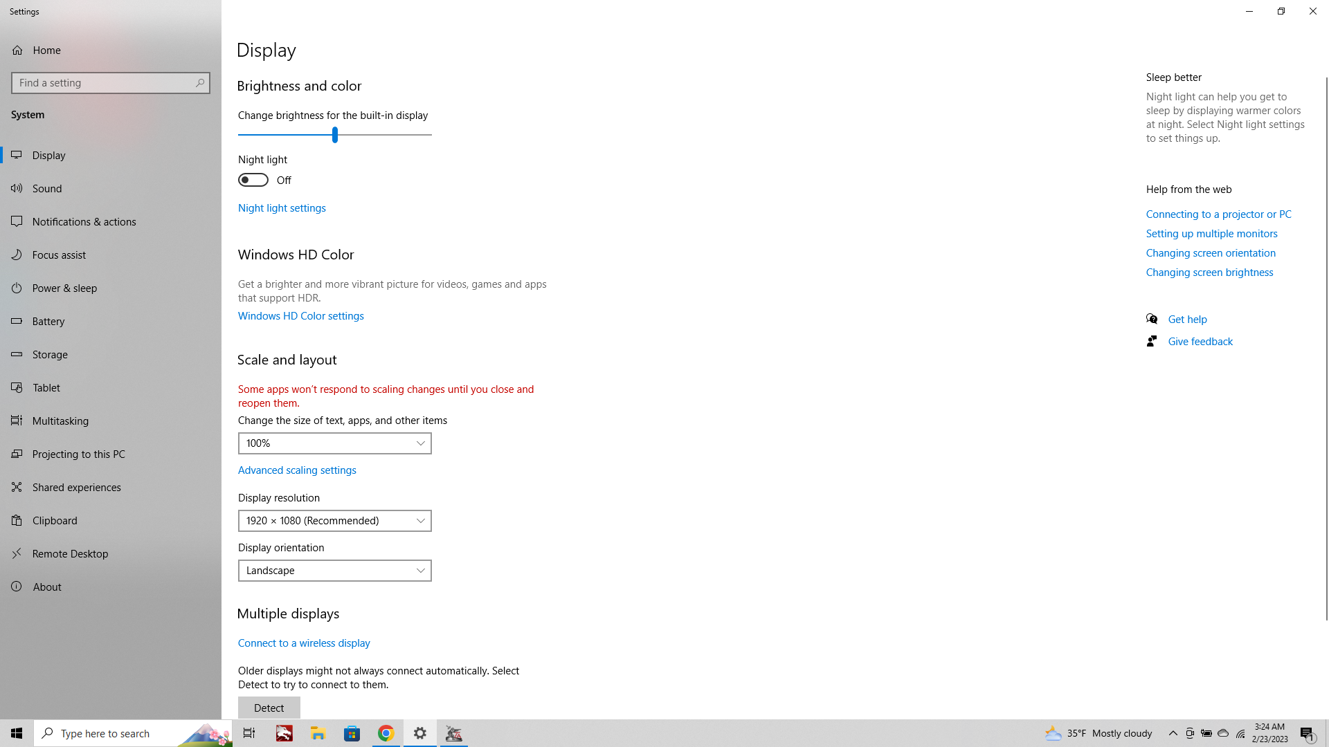
Text display 100% setting Somehow I had mine at 120% perhaps from browsing. But it was murdering TripleA. Crazy I didn't think it would nix the images.
Unbelievable! This brings me such joy hahah
OK well this can just live here now, as a quick fix for anyone who goofed like me and switched that. Unit Help is fixed, Flag screens fixed. All is well!
Aces! Thanks so much!
ps. back in business!!! Yes!!! I can't believe that's all it took. I have been staring at trash graphics for months on end lol. Units looking nice again! All the menus back to normal. It was almost certainly the mouse wheel.
 )
)
-
If you did not know, for browsing Chrome & Firefox both allow ctrl+mouse wheel to change the zoom level
-
When playing tripleA at 2560x1600p the UI font will scale properly (suggested for windows is 150% font upscale at that resolution) but all the images seem to upscale with a weird sort of interpolation going on. So like anything that's an image, say a flag or icon, a notes image, unit help etc, these will upscale showing a lot of pixilation with no blur applied to compensate for the images being enlarged by 150%.
The same would happen at 1440p upscaling the display font to 125%, or really doing any combination there that isn't keying off the normal 100% font size for a screen res at 1080/1200p.
I encountered this issue at 1080 like in the posts above, just by accidentally upscaling my font in the windows setting, but for screen resolutions higher than 1080/1200p I imagine most users would encounter the issue immediately. Without any font upscaling the all the tabs and windows in the UI screens are almost too small to be legible even with pretty decent eyes. With the font upscaled you'll get visual artifacts like all those screens above.
Right now I can't really see a strong reason to run tripleA at 1600p cause the font upscaling will produce a weaker overall visual presentation (all images in the UI becoming pixelated) vs simply downscaling your screen res back to 1080p. The entire screen will of course have more blur that way, but the graphical fidelity is higher overall than the UI upscaling via font scale in windows. This will be a limiting factor for tripleA, as more and more monitors and laptops push towards 1440p + as the new standard, the upscaling for those tinier images be kinda rough. Like just when you first launch the application. Maybe some kind of notation would be helpful there, just like some games have a setting in graphics, to just suggest screen resolution at 1080p?
Not sure what the best solution would be otherwise, except that there must be some sort of built-in image upscaling within tripleA that is using a rougher kind of interpolation. I'm not sure if it would be better perhaps if the images had no upscaling at all and simply reduced in scale relative to the surrounding text? Not sure how that would be done though. Seems like if it could just apply a more regular sort of cubic interpolation that all those tiny graphics would probably look fine even up to 200%, but that's not what's going on far as I can tell.
-
@Myrd
Regarding post above, is it worth raising on GitHub so that TripleA can use the new screen standards.2K, Quad HD, QHD.....2560 x 1440
4K, Ultra HD....................3840 x 2160 -
@thedog I think it makes sense to raise on GitHub, but not sure if anyone will work on it any time soon.
-
Yeah it's an interesting dilemma, and one that I didn't encounter until attempting to upscale a WW2 game for to play on a WQXHD screen (1600p). Standard QHD still works reasonably well, provided the map images themselves are large enough. It works alright at 1440 even with no upscaling of the font from 100% to 125%, cause the UI is still large enough there, and the actual font sizes in game can be increased within tripleA. But it gets harder as you go up in res.
This is one my favorite graphics on wikipedia
https://en.wikipedia.org/wiki/4K_resolution#/media/File:Vector_Video_Standards8.svgThe hard and fast rule is that the new standard will give 4x the size and 2x the resolution, over whatever previous standard. The previous standard in this case would be FHD at 1080p which most peeps still use for gaming, like especially on laptops. Also there are features like DLSS and whatnot to smooth over this transition in gaming, though obviously tripleA isn't the sort of game we're talking about there really.
Also, the issue is going to be less pronounced if one were say running tripleA through a giant TV or a projector which will soften the visual, as opposed to say a laptop or gaming monitor where the user is right up on top of the screen.
The issue is not for all images in tripleA, just the graphics inside the UI itself. So for example the map visualization (or anything displaying within the map field of view) this stuff all upscales normally. Using a higher resolution image for the map, you will see that scrolling around the map will be very clean. Just like watching a TV show at 4K or at a higher framerate, you'll see less motion blur when dragging around the map in the UI. This is actually pretty cool, and will instantly make the player feel the upgrade, but then the UI graphics works against that feel (map will look ultra clean, but UI will have that jank.)
Some of our larger maps (larger in terms of pixel height/width) should be fine. For example the UHD global map even at like 5K ultra wide or 5K UHD will still work, because the map image is tall enough that the player will still be able to zoom out to a 50% mapview at least. The text in the UI will also work fine at that scale, because of the way font scaling works (basically as vector for fonts) but the tiny images in the UI, say units or icons upscaling as raster, those will hit the ceiling very quickly when doubling like that.
Also maps which are not tall enough to allow any pulling out in mapview will become sort of unusable without an upscale to the map dimensions. So for example one of our smallest maps is v3, it was drawn back when many monitors where still at aspect 4:3, or when HD 720p and widescreen displays were still relatively new. If you imagine playing a map where the zoom is locked at max zoom-out, with no scrolling/dragging (no zoom in/out from there) you can get a feel for the issue. For the actual maps, we can deal with this by upscaling the map image (basetiles/relief) outside of tripleA to produce a larger/cleaner image, but for stuff like unit icons we're much more limited. 54px is a hard ceiling right now, we can provide a larger upscaled graphic with interpolation, but the game will simply crop it inside the UI.
To me the minimum for anything UHD inside tripleA is at least some give for the map zoom. It needs to have somewhere to go from 100% mapview there (e.g. the map image needs to be larger than the intended screen's display). If not, then the only real option there is to downscale the display resolution of your screen. We have a little play here, because tripleA 2.6 can zoom to 200% mapview now, but there's still an issue anytime the screen and the map image approach 1:1, since your zoom out will just be the map at scale taking up the entire screen at once. Ideally you'd want the map to be at least twice as tall as the intended display, so that the drag and zoom stuff feels normal, but this is limited by the UI upscaling. In short a UHD map would still be serviceable at much higher resolutions say 5K or 8K possibly (even if the map scaling range isn't nearly as broad) but the UI is going to get stuck (for anything other than Font), and start bumping heads on that ceiling.
-
I was playing around with my display at various resolutions, like letterboxing the screen scaling around to see how the UI holds up at different dimensions. Here's a thing I didn't quite notice before, but sorta related to the above.
So this is how tripleA presents at my native aspect 16:10 2560x1600px, with the display scale set at 100%, 125%, and 150% (recommended default in windows) with mapview at 50% in each instance, same orientation for the images...
100%
125%
150%
Those images are downscaled to attach here on the boards, but shows the gist.
In addition to the graphics within the UI upscaling (flags or icons in the stats bar, unit graphics in the purchase menus etc) the mapview also zooms by the same amount.
When this happens within the Mapview it's not all that noticeable, since that can scale dynamically (control+ mouse wheel, or via the tab in View) so basically the user would just zoom out further that way to achieve the same field of view with a similar pixel density in the ultimate presentation like what you're seeing on screen.
For the smaller graphics like say the flags, or screens with set dimensions like gamenotes images, the upscaling is more noticeable there, cause the interpolation seems more jank, like it shows heavier pixelation in the final images inside the UI.
Downscaling the resolution of the entire screen to 1080p at 16:9 or approximate (for me it'd be 1200p cause 16:10) isn't really ideal, cause that just kicks the fuzz across the whole display. Also since tripleA isn't like a full screen launch type game, with splash load screens or other things like that to sorta disguise the change in resolution when playing. Cause running it windowed mode like it does we'll feel the blur soon as we click away to another browser tab hehe. 1080p would probably be fine for me in the bubble, but modern displays are 1440 and up, so it's kinda awkward.
For borderlines on lower rez it'll show more dance esp in the sea zones or where the borders are more geometric straight line shapes (the lines appear to change thickness at various zoom levels.) It's more pronounced the further the map is zoomed out. Or similarly with map details off the 1px baseline will just start to disappear below 50% mapview, some lines breaking apart completely, usually starting with the thinner diagonals.)
The higher resolution maps, can go lower for the zoom out, down to say 25% maybe, before the same sorta thing starts to happen. Basically a lot more judder type stuff too at the lower rez, where some lines will appear to change width while panning/dragging the mapview around at different zooms.
Not really sure what all can be done about it. I think ideally we'd want the graphics in the UI to hold dimensions (in actual pixels) at 100% regardless, such that the UI graphics all just present somewhat smaller as you go up in resolution/pixel density, basically taking up less screen real estate within smaller windows/tabs/boxes. Or just having the font text/tables upscale separately from the graphics, but I think they're sorta both tied to each other right now. Not the in-game map/display font and color which can be controlled manually in the View tab, but the actual tripleA UI I mean like the setting from windows.
-
Perhaps a quick-ish TripleA engine fix, for 2K+ screens for the status bar and perhaps the side panel, is if the Flag height is 32px or less than x2 the status bar images and font(could be less), but requires a Dev and more players need to say they want it, to drive demand.
Currently in TripleA there is no way to cope with the new native hi res screens.
Have you looked at View> Map font & color I think the font size there will just change the pop size of text, so no real help.
-
Yeah I mean I guess that's the drill.
Currently seems like tripleA is kinda FHD limited there. A smaller sized display with higher pixel density doesn't give many options right now. It's basically a choice between enlarged text/tables in the UI for readability, or a loss in graphical fidelity for anything that isn't font. I can make a map for a QHD, UHD, 4K whatever, but it's limited by what the UI can do there for scaling, and also for the unit graphics dimensions/upscale.
1080 is still around for sure, like that snowboard was definitely built to last hehe. I was playing BG3 in 1080 for a while, but for tripleA it isn't like trying to find a buttery smooth framerate for animations and cutscenes, but just sorta just updating the dimensions of those little tab windows I guess, to raise the roof beyond the 54px limit, or to get some better interpolation going on there. Currently the same graphics shown on the map will a lot cleaner, even when at the same scale/same image as the UI element (like in the stats bars, purchase screen, combat windows etc.) you can kinda do the side by side, to see where the pixelation is coming in.
For now recommended settings for tripleA would be HD/FHD with a display scale at 100% I guess. For the 2K jump still pretty beta, needs more elbow grease hehe
Hello! It looks like you're interested in this conversation, but you don't have an account yet.
Getting fed up of having to scroll through the same posts each visit? When you register for an account, you'll always come back to exactly where you were before, and choose to be notified of new replies (either via email, or push notification). You'll also be able to save bookmarks and upvote posts to show your appreciation to other community members.
With your input, this post could be even better 💗
Register Login