Allow Option for Unit Overflow to Left Instead of Right
-
Often times it would be very useful for some territories to have unit overflow to the left instead of right.
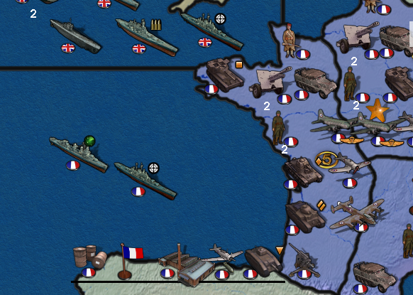
Here is an example where it would be much better to have Normandy's overflow into the ocean instead of how it is now and overlapping Vichy:

-
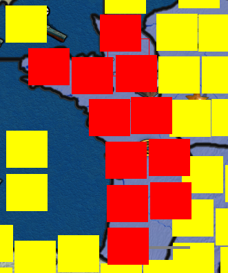
Placement Picker showing standard overflow to the right:

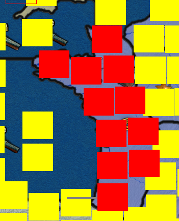
Now clicking "O" will toggle the overflow direction like this:

-
-
@redrum Actually, this is more than a feature request, but an actual issue, and it might even be considered a bug, if we define them broadly.
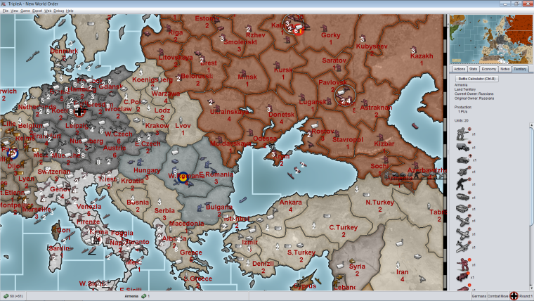
If you have a map that doesn't wrap on X axis, a predetermined overflow in a direction can make impossible to visualise all units. For example, if you have a slim territory on the right side of the map, then the units in the overflow line can easily go out of the border, thus being hidden from view completely.
On this regard, it may make sense that, for maps without X wrapping, all overflow from half the X of the map goes default to the left (so that it is nearly impossible they will go out of the map).Related to this, can you have all units placed in a bigger Y coordinate to always stay on top of the not overflowing units with a smaller Y coordinate, and the unit stack number always on top of any units image at all, for a cleaner view in case of basic overlapping?
-
@cernel I don't understand what you are getting at. Can you provide a screenshot and example?
-

-
@redrum To be clear, nothing important. It was just a side note.
-
@cernel I see. I can maybe look at the autoplacement algorithm to attempt to avoid that.
-
@redrum Wait, maybe you were asking about this?:
Related to this, can you have all units placed in a bigger Y coordinate to always stay on top of the not overflowing units with a smaller Y coordinate, and the unit stack number always on top of any units image at all, for a cleaner view in case of basic overlapping?
Well, this is a bit off topic. I just meant that now, when two units, not on overflow lines, overlap, it is not coordinate determined what overlaps what. Having the overlapping set based of the Y coordinates would allow a cleaner view for packed stuff (think about playing WAW setting the unit size higher) and even allow making specifically intended maps based on isometric projection.
And the units number should never be hidden by another unit, so I think that should always stay above not only the referring unit, but any other ones, as well.
-
@redrum Not biggie; as I said, a side note, I never opened an issue about that, either; so, you see, not like I'm bothered by it that much. It happens more consistently on a map I'm making, in which all units are 64x64 and 100% zoom but, since here you are allowing for defining where the overflow goes, that's not that much of an issue anymore.
I'm just mostly thinking that in maps that do not wrap on X, it would be cleaner if the default is just all overflow from half the X of the map onward goes default to the left.
Just throwing some minor ideas, while you're at it. -
Reposting here, since it fits this discussion.
@general_zod said in Group and Sort Units onto Placements Logically:
Can we have a mechanism that prevents overflow from being displayed completely in a given territory. (on map view only, but still displayed on territory tab).
So Instead of displaying the line of overflow units. It would display a single special unit depicting there is overflow. Ideally that unit would be clickable, to see the list of actual overflow units.
I'm leaning towards this being settable during the placement picker steps. Lets say a different color square or symbol (green) on last placement, indicating overflow wont display on map. Instead a special unit will display in the last position, representing that there is more overflow units.