Improve Resources Tab
-
-
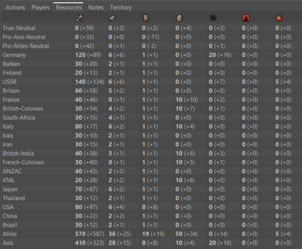
@redrum It looks definitely better, but I still think the two columns per each resource would be the best.

Otherwise, I guess also all what in stats and everywhere primary, even if alone, should be bold, for consistency, and not sure if that would be better. -
@cernel I'd rather move towards being consistent with how the bottom bar displays it with the +/- right next to the amount in parenthesis. So other areas in the UI could probably use bold text as well but gotta start somewhere.
