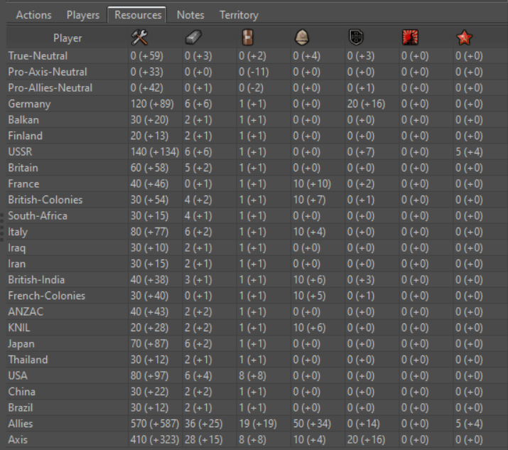
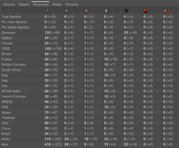
Improve Resources Tab
-
-
@redrum It looks definitely better, but I still think the two columns per each resource would be the best.
")
Otherwise, I guess also all what in stats and everywhere primary, even if alone, should be bold, for consistency, and not sure if that would be better. -
@cernel I'd rather move towards being consistent with how the bottom bar displays it with the +/- right next to the amount in parenthesis. So other areas in the UI could probably use bold text as well but gotta start somewhere.
Hello! It looks like you're interested in this conversation, but you don't have an account yet.
Getting fed up of having to scroll through the same posts each visit? When you register for an account, you'll always come back to exactly where you were before, and choose to be notified of new replies (either via email, or push notification). You'll also be able to save bookmarks and upvote posts to show your appreciation to other community members.
With your input, this post could be even better 💗
Register Login