WWII Revised - Facelift
-
Here's what it will look like with map details = off.
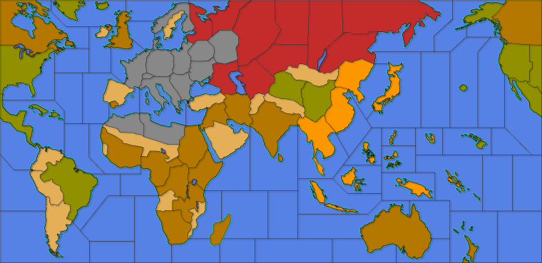
I suppose I can tweak japans color to be more yellow for traditional. The filters really changed the shade.
-
@general_zod I think the biggest difference is actually the color of the sea zones. As its much brighter in the new screenshots.
-
@redrum Over the years, I've noticed how greatly the brightness perception varies between users. Some would want TripleA maps being much brighter, and others have their eyes stressed by the brightness. I'm thinking older persons might see things darker (only some of them). I can't see how that is so much of a deal, as they could just adjust the general settings of their monitors or so, but maybe a per map setting to increase / decrease the brightness and the contrast (I would just increase / decrease both by the same amount, as that is about the best) might be good, tho personally I don't feel any popular TripleA maps being either too bright or too dark.
@General_Zod TripleA actually has a few raw "blends", some of them having the ability to darken all but the units images, by a set (in map.properties) amount. You can try it in "270BC Cernel Variant", via View/Show Map Blends (that one is really darkening a lot, to create a night-time effect, but you can set it more moderate).
Using the relief to brighten the map is definitely not what the relief are intended for (not saying it is wrong, just peculiar), tho I've actually made the opposite in Conquest of the World (but that was nothing serious). -
Ah.. A map (270bc cernel variant) where blend actually isn't broken. Every time in past (on various maps), blends just does something erratic or anomalous looking.
Also I've read somewhere in help doc or elsewhere that we don't use blends anymore. Is there a list/help for settings on the following or map.properties settings in general.
map.hasRelief=true
map.mapBlends=false
map.mapBlendMode=LINEAR_LIGHT
map.mapBlendAlpha=0.5f@redrum I can adjust the seas to a darker shade. My main thing is unit contrast. I'm trying to make map playable from zoomed in or out perspectives. The other alternative is to modify units, but that's sounds even more tedious. If some one wants to pitch in on that, would be great.
-
@Cernel Hmm... I may have to hijack the PU markers from 270bc. They might look nice on this map. I also like how they are located in fringe areas of the territories. Where units are less likely to be, thus not covering them.
-
@general_zod said in WWII Revised - Facelift:
Also I've read somewhere in help doc or elsewhere that we don't use blends anymore.
What? I hope you are wrong. That would be a bad decision. Was it at least discussed in forum?
-
@general_zod said in WWII Revised - Facelift:
@cernel
Is there a list/help for settings on the following or map.properties settings in general.There are some info in Napoleonic Empires map.properties.
For a peculiar example, you can see that in Conquest of the World the blends remove the coloured ownership display, as per traditional Risk. You can set it partially, in any case. There are a few different tipologies of blends; kind of long to explain, as some are a mix of different blending on different levels.
-
@general_zod said in WWII Revised - Facelift:
The other alternative is to modify units, but that's sounds even more tedious. If some one wants to pitch in on that, would be great.
There are programs to mass-apply same changes to a bunch of images. However, WWII Revised uses the units of the TripleA assets, and I would keep the practice, for all basic maps.
-
@cernel I will look around for that particular thing I read regarding blends not used anymore. I think it was one of the official map creating docs.
Anyways it is still supported so it's really a moot point.
It works on this map but makes it much darker. I could compensate with color manipulation if needed.
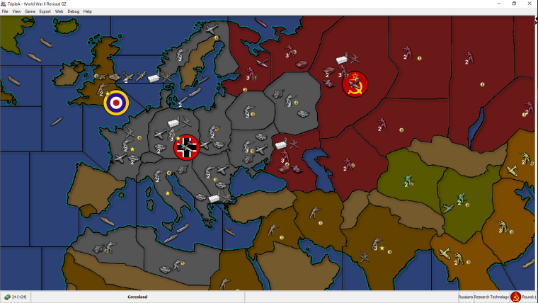
However since I haven't tried tweaking them yet (beyond this one setting). Do you recall what settings of blend will make it brighter, not darker?If you have the time maybe post those tipologies you mentioned.

Either way this is a cool tool for map making. Only thing is to get players to use it (game notes) on the maps, that utilize it correctly. Cause like I said ^^ many maps don't look correct when using blends.
-
Almost forgot. What's the program you mentioned for mass producing image changes?
-
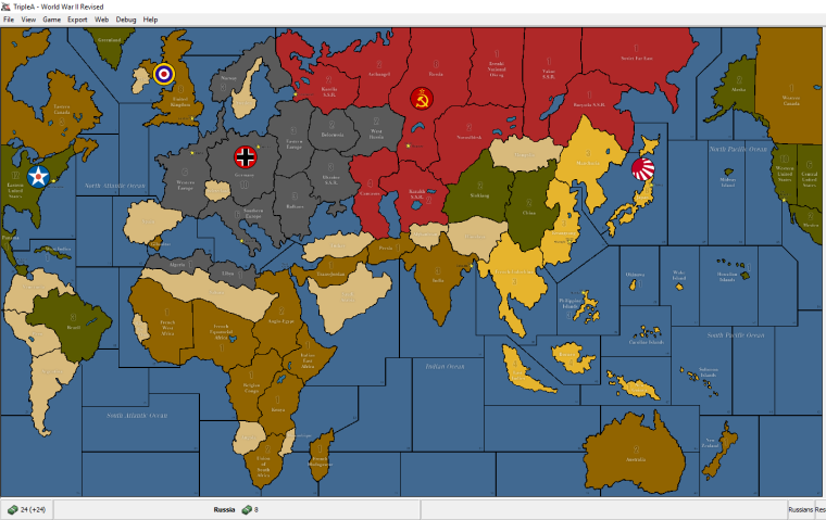
I picked this project up again. I changed the colors as suggested for Germany, Japan and oceans (and filtered rest). I also added some texture. Thanks to @Hepps for textures. I made them subtle so zoom in to see them in this image.
I didn't address the geometry because I have a few layers composing the relief image and I don't really want to redraw all of them. Plus this one isn't too shabby anyways.
If @Hepps is ok with it, I would love to use his TWW units here as well
 . But most likely without the roundels. Also I will update the game notes to be very noob friendly, since this map likely draws many TripleA first timers which may be looking for Axis & Allies emulations.
If any one has more suggestions, post them soon or forever hold your peace
 .
.My newest version.
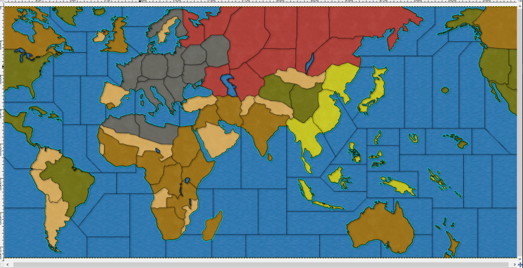
Btw, I don't intend this to replace the original map just nicer map skin really. Unless the units do get replaced then it is more than a map skin alternative.
My previous version for comparison.
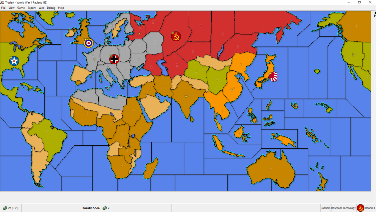
Original ww2 Revise map skin for comparison.
-
@general_zod GIMP doesn't have anything integrated for that, but you can do batch in a number of ways. What I use is this plugin made by Alessandro Francesconi:
https://alessandrofrancesconi.it/projects/bimp/ -
@cernel Cool, thanks this will come in handy.
-
@general_zod Don't you feel the Japanese lime green being too bright?
-
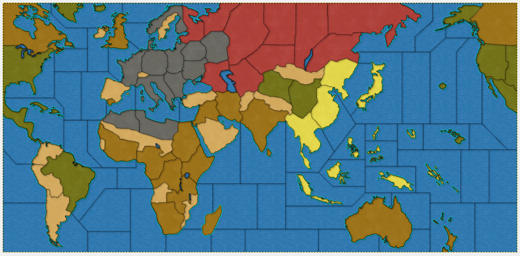
@cernel The filter changed the shade of the yellow below it. I can adjust it to be like original yellow in final product.
-
@cernel Here is the new yellow.
-
@general_zod Looks more yellow. Thumbs up.
-
It just dawned upon me that creating a stand alone duplicate of this map will be confusing for people playing each other. The 2 versions will not be compatible. Is there any objections to replace the original with this one?
Otherwise I might as well chalk this one up as a training exercise.
-
@general_zod Why can't you make a mapskin?
-
@general_zod In my opinion, the Japanese colour is still too bright, also relatively to the other ones. I'd suggest something like the Yamamoto colour of World At War, but a tad more saturated.