A brief guide to making Units (colorize, re-scale etc.)
-
Alright so I've been thinking on how to pull this off cause the topic is quite broad, but basically I just want to give a quick primer on how to colorize units, re-scale or transform units, how to quickly add cast shadows or contours (or how to remove them, not as quickly lol). Stuff of that sort. This will have to round out my trifecta of "a brief" guides, and serve as a catch all for explaining some common GIMP tools hehe.
The topic of making units is pretty expansive, and I know I can't really cover it all, so I just wanted to start with some simple stuff and explain how to do the transformations using GNU Image Manipulation Program (GIMP).
I tried to think of what seemed to be the more common changes people might want to make, and then just use this as a way to introduce some of the tools and tabs in GIMP that may be helpful. I'll do a walkthrough for each with a couple screens to show where the tools and such are located.
For an image we'll start with the dude in the tripleA logo, and just show how to do some quick stuff to him. I'll probably detour a little into ideas familiar from drawing or painting to help explain what's what and get our heads around it.
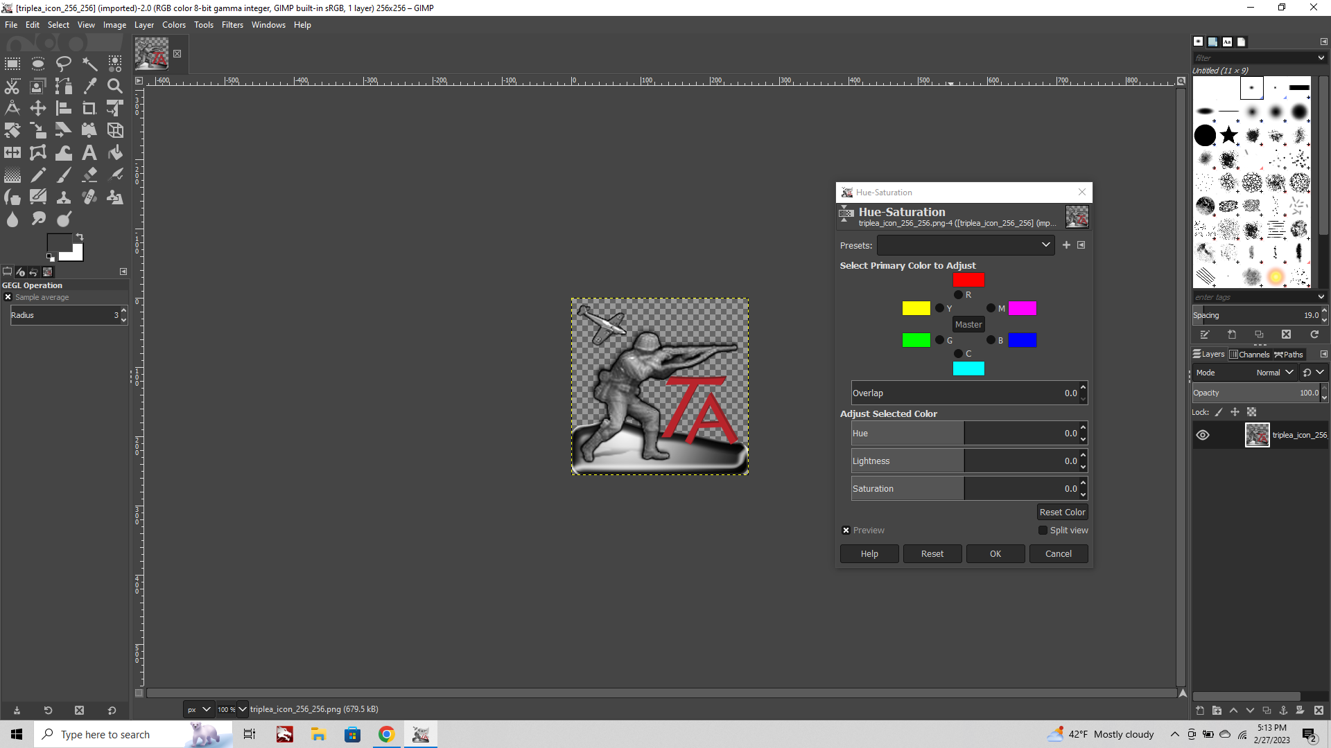
First some quick terms that will help when we go to manipulate the image in the sliders and such.
Opacity: this controls how transparent the image will appear. The starting point is always 100%, even if the original image includes some transparent areas. If you have a semi-transparent image, you can flatten it against a color (usually white or 50% gray or black to make it fully opaque). Or similarly you can do the reverse and make all the white stuff semi-transparent, by controlling the opacity levels. It's one of the main things we'll mess with both for units and maps, or really any graphic you want to overlay on top of another image.
Value Darkness/Lightness: two colors have the same value if they'd fall along the same place in a grayscale, like if the colors were turned into a black and white photograph, they'd be the same gray.
Saturation: how vibrant the color is, like how much it pops. Cranking saturation will light it up like a neon sign, whereas desaturating take you down to BW grayscale.
Hue: This is your rainbow spectrum, like the color wheel. Hue is just another way to say color in an older version of the language, but basically your ROYGBIV rainbow from elementary school. In this one the ranges are laid out RED ORANGE YELLOW GREEN CYAN BLUE MAGENTA, and the Hue slider from one into the other.
Brightness/Contrast: tweaking the above in unison to create a color which presents overall as lighter or darker.
Most of these are sliders, and can be found at the top of the screen in the tab called "Colors"
Other tabs we'll explore are:
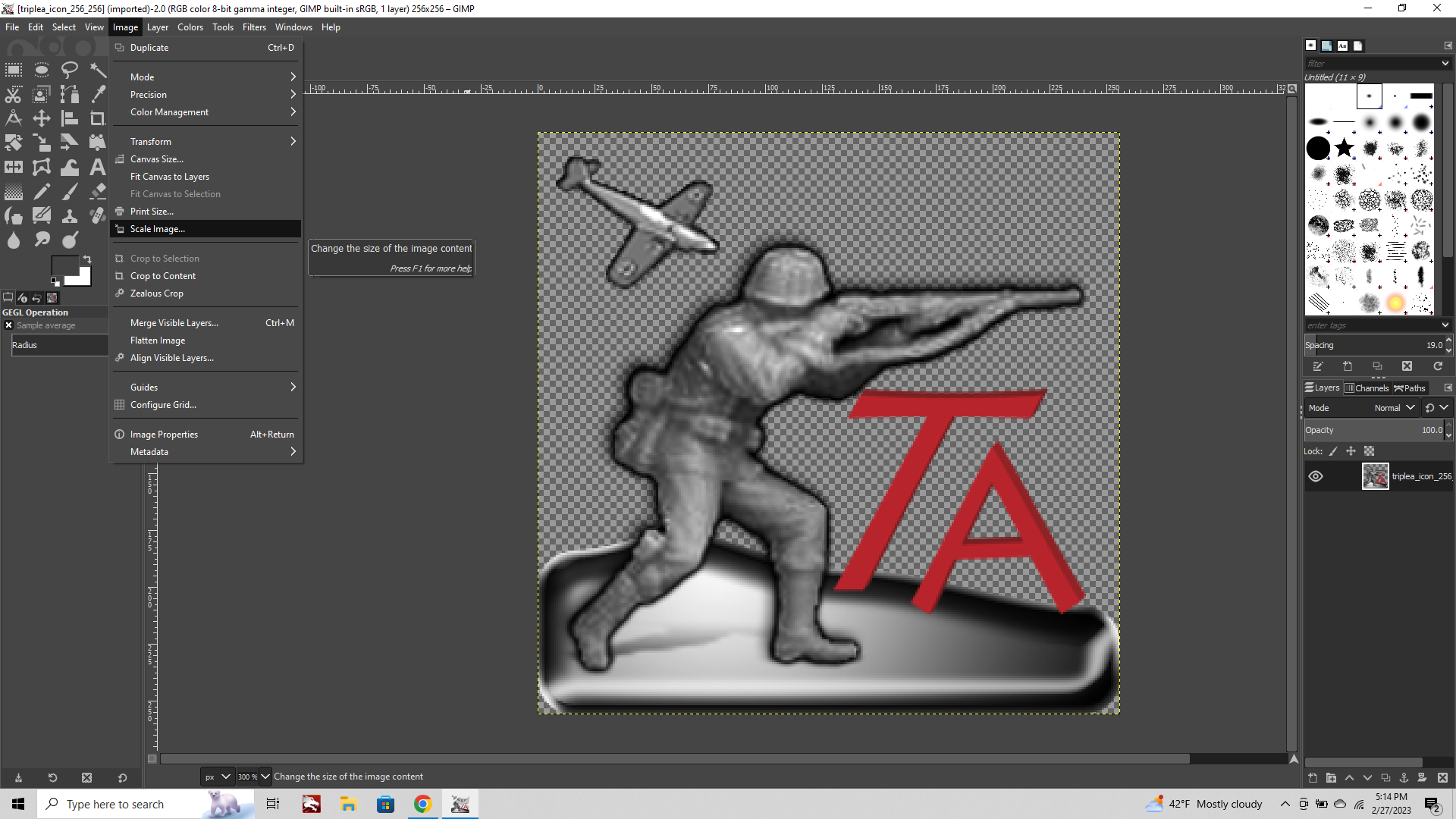
"Image" tab which we will use to scale or transform the image, or the transparent canvas
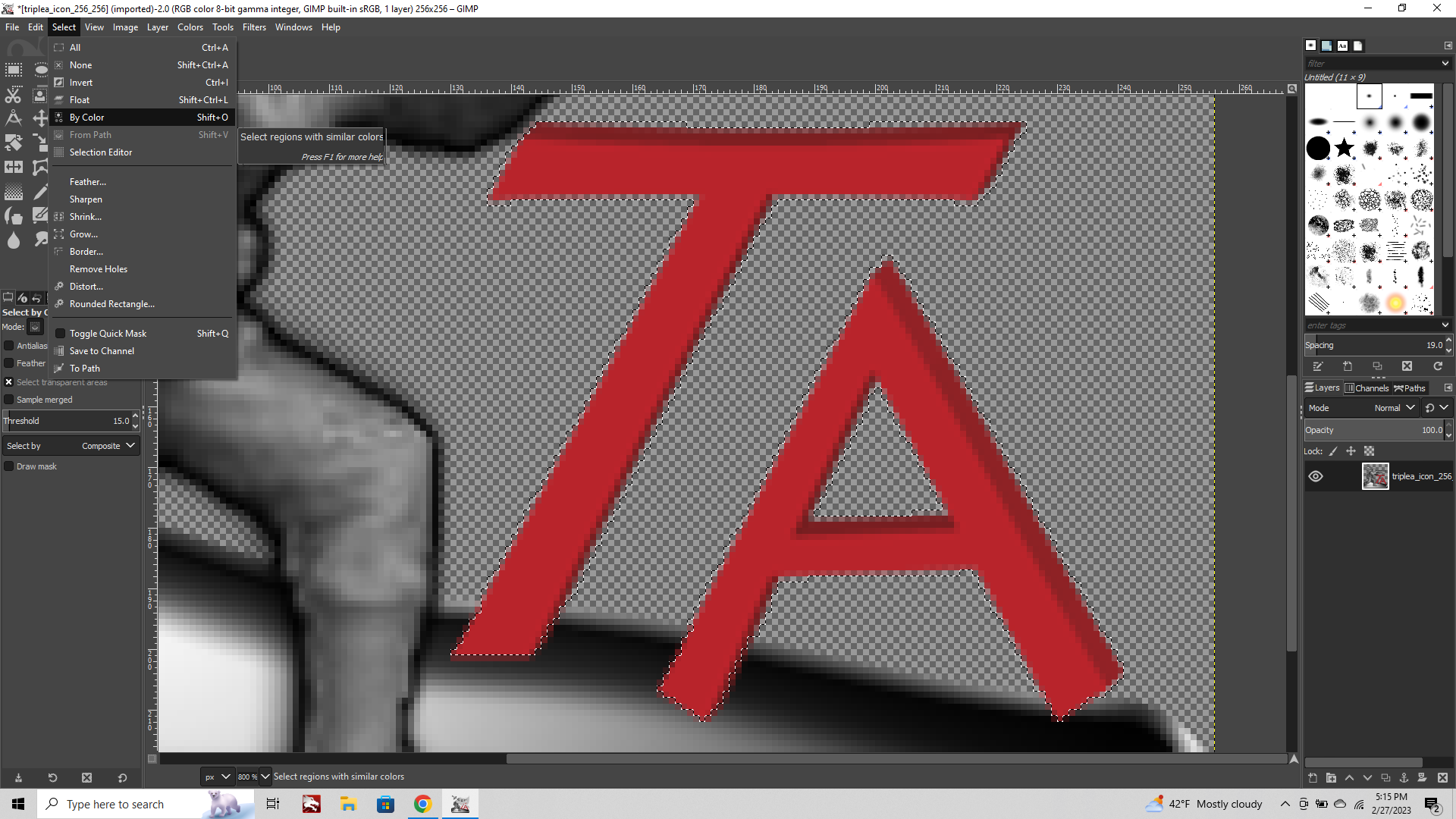
"Select" tab to isolate specific areas of the image by color, grow or shrink selection, and stuff like that to only have an effect apply to that selection instead of the whole image.
And importantly "Layers" which we can use for all sorts of stuff down the line, but mainly to add new layers or adjust copied "layers to image size" (which you can use to make sure pasted layers and canvas are the same size)
Getting Started:
To begin lets fire up GIMP and pull up the tripleA logo icon from the "assets" folder in the main directory. The one in your program files. Choose the biggest size (it's always good to start with the largest image you can, and then shrink it down a bit a later.)
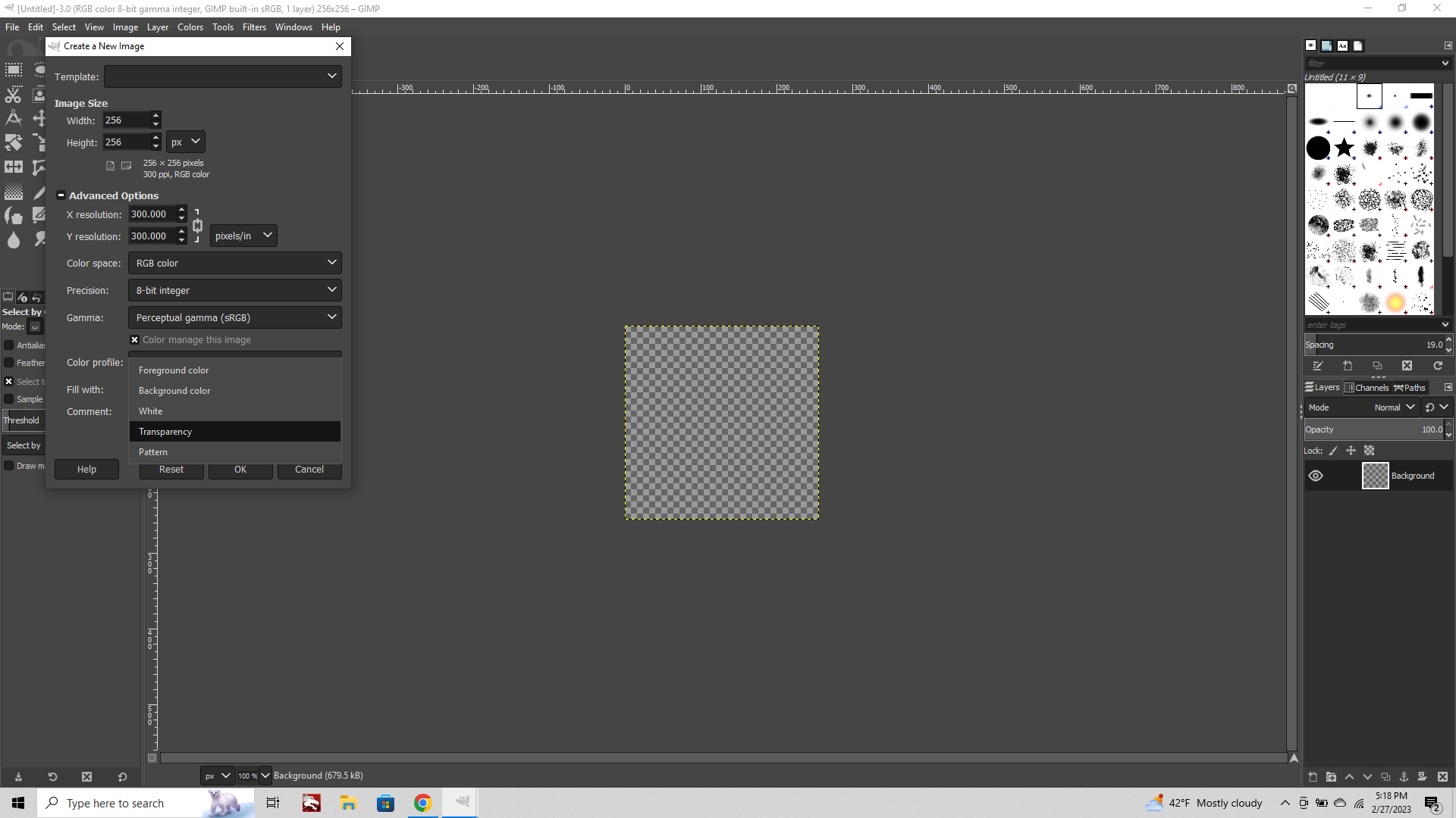
Once you have that open click File tab > New
The default size will be the same as the last image selected, so in this case 256x256, or just 1920x1080 if it's the first thing you do with no prior image opened. You can adjust the dimensions in px at the top.
The default canvas color will be whatever your chosen background color is, this will be White by default, but we'll want to change that from background color to "Transparency" in the drop down menu.
We'll use this as our blank slate and copy stuff over from the icon graphic to this new image.
Now that we've got the image open, and the blank transparent canvas. Take a look over the left hand side of the screen where all the tools are located.

The main tools we'll be using are the first Lasso (Free Select Tool) on the top line, the Magic Wand (Fuzzy Select Tool) right next to it. The Paintbush and Eraser, and also the Blur/Sharpen tool on the bottom left.
The Lasso can be used either like a stylus (where you draw holding down the cursor) or to make a selection using nodes, where each click will add a new node and connect to the last. If you hold/drag while clicking, then the last node will be removed, in case you misclick. Basically using smaller straight line segments instead of trying to draw the whole curve in one go. This can be easier especially when zoomed way in on the image. When you finish you can either click the starting node to complete the lasso, or switch to one of the other tools and your selection shape will light up the marquee.
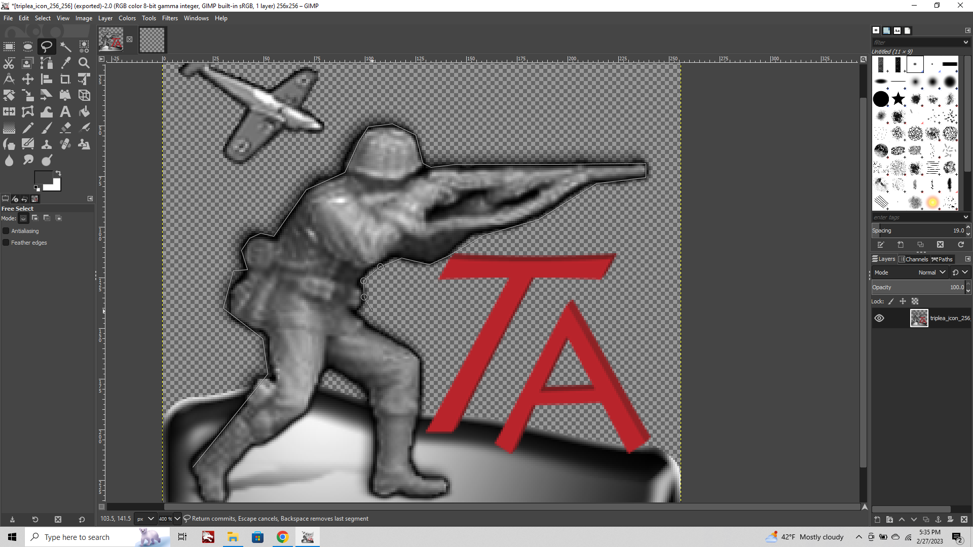

When you got it lit up the way you want, Edit Copy
Then Paste or Paste in Place into the new blank transparency we made.
Now your image has been isolated out with the extraneous background removed.
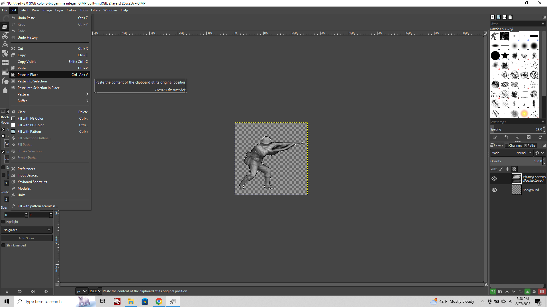
You'll notice that when we did our Free Select we went pretty hard and fast with it, so now there is a fair bit of cast shadow around the edges. This is creating what in drawing we'd call a contour line around the image when it's downscaled. Having a heavy/even line or hard edged contours will make an image appear more graphic by flattening it somewhat in the visual impression. In drawing this is called the cartoon, basically the blocked in shape defined by the contours. To give an image more depth or sense of dimensionality we can play with the contour line itself and achieve different weights, or we can play with the stuff inside the contour. If an image is very large, then it's nice to have soft/lost edges, but when the image is being reduced way down in scale, it can be helpful to have a thicker contour so it's not lost completely when reduced in size. The quick rule of thumb for our purposes is that it's pretty easy to add a contour using selection tools, but easier if the image we're starting with has the contour dialed back.
What we'll do here is switch over to the Magic Wand tool to select some of that heavy black shadow around the image, and delete it to clean things up.
Magic Wand: Fuzzy select tool.
This guy is very useful. It will select similar colored pixels near the area where you click. You can shift+click to add more similarly colored pixels to the selection. If you click-drag right the selection will expand to include more nearby stuff, drag left the selection wiil shrink. This will be one of the main ways we make selections on our image to either add/remove or apply an effect only to one area of the image. (We could have used this tool to do that first step with the Lasso as well, but I just wanted to show how they both work haha.) Fuzzy select is the workhorse though, cause it's easy to use. Start grabbing some of that heavy edge shadow with the shift+click wand and then hit delete to ditch it.
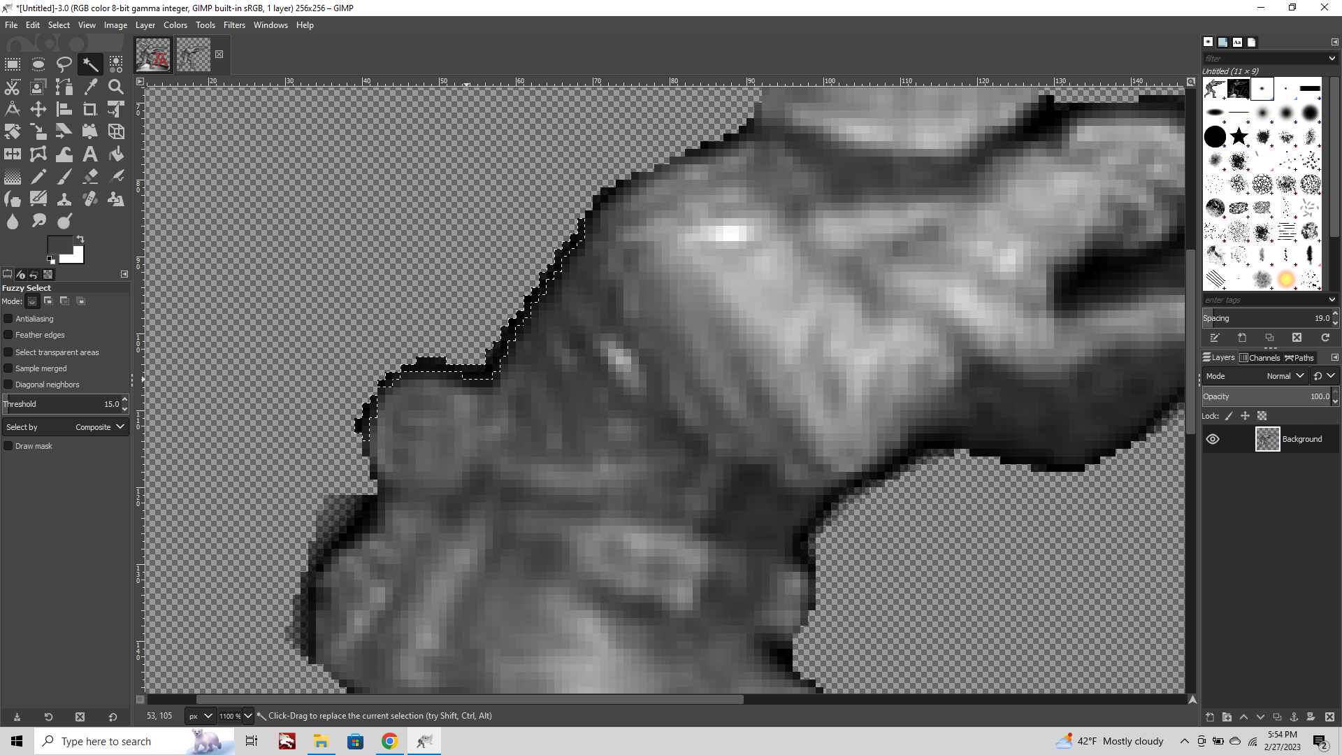
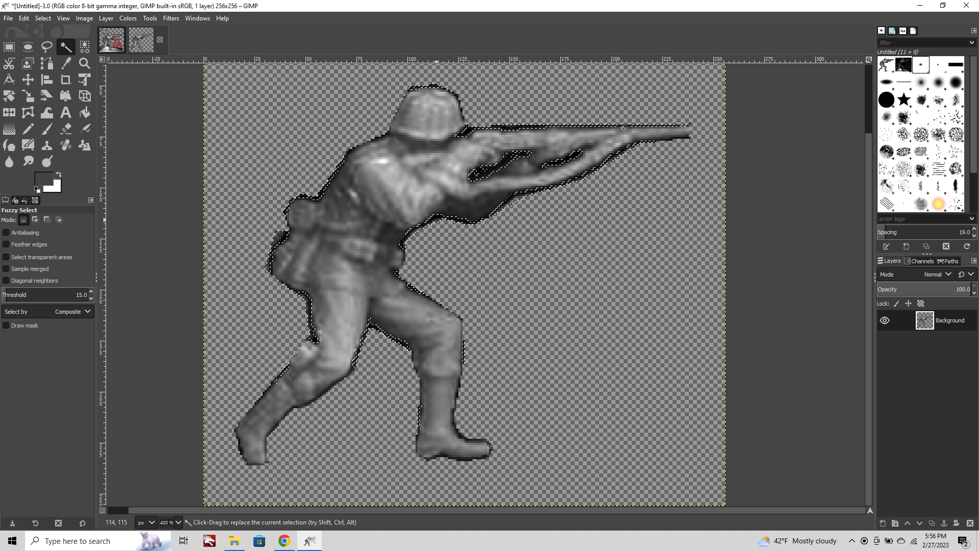
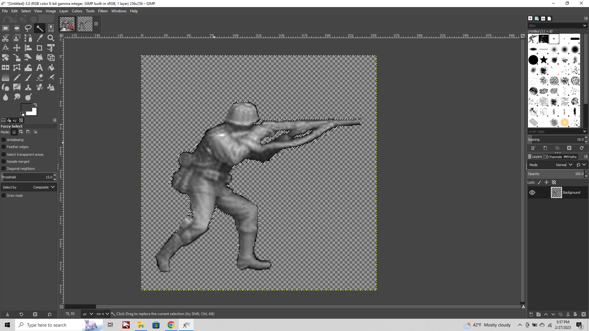
Now he's a looking a little cleaner, but the edges are sorta sharp.
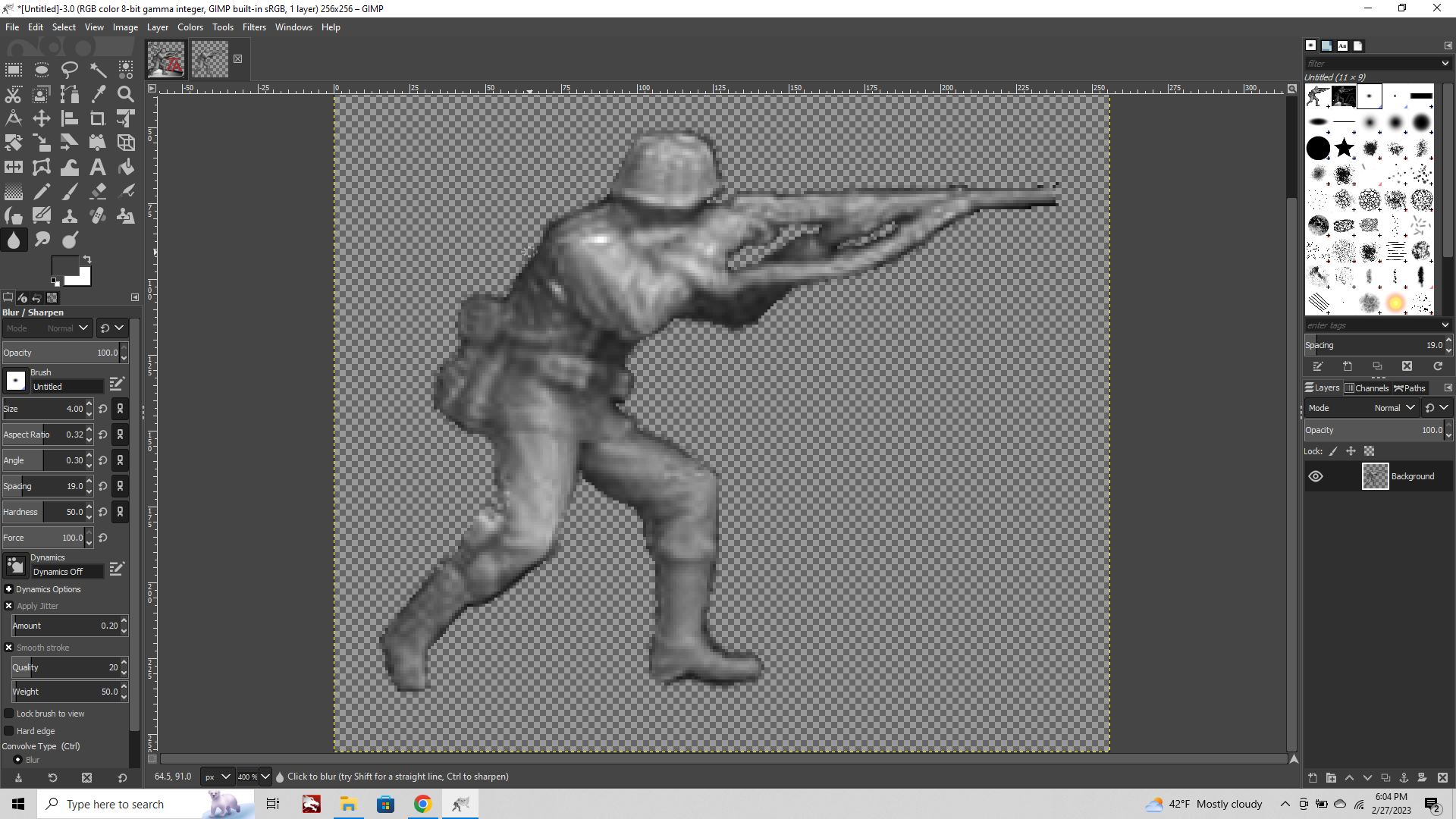
The hard fast delete gets us halfway there, but we need to smooth the edges a bit. We can do this either with the Eraser tool (reducing the opacity or hardness by removing stuff) or the Blur/Sharpen tool, which blends. Blur works pretty well I find. Basically we'll go over to that tool at the bottom left, maybe the cursor size a bit larger so it's blending across a couple pixels and then just sorta kiss the edges to knock em back a bit.
If we want to add a contour back in there are a few ways to do it, but a quick way is to go to the Filters tab > Light and Shadow > Drop Shadow
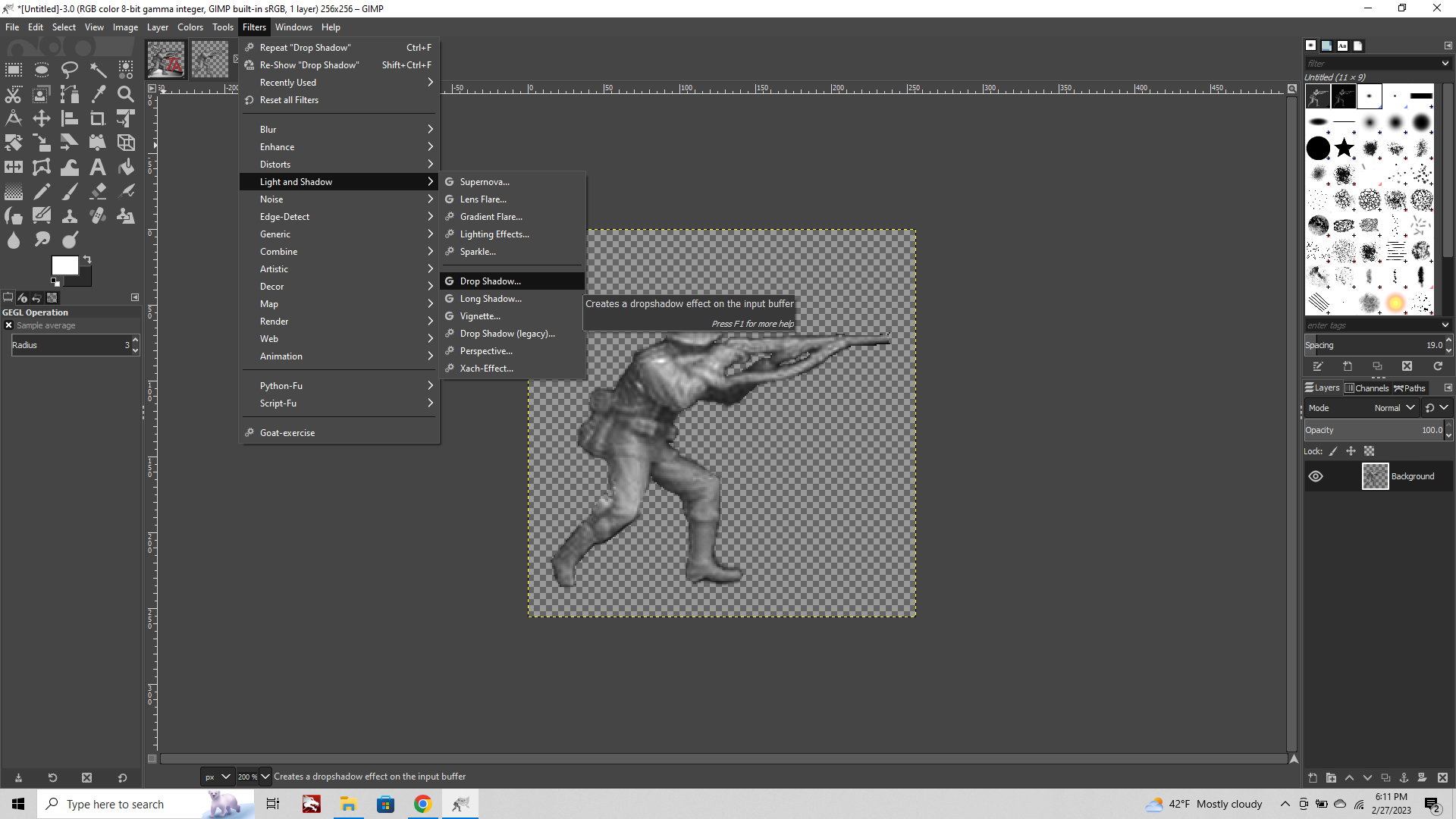
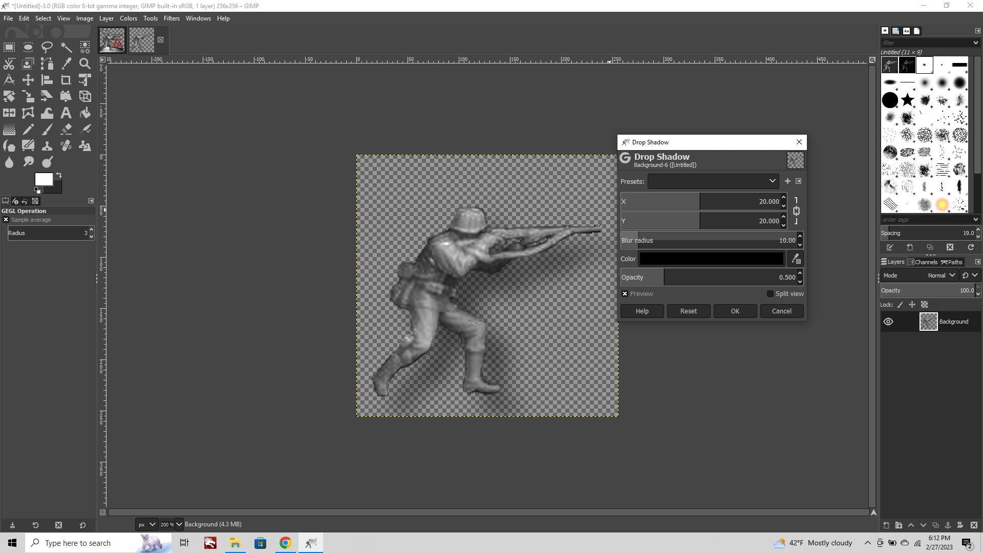
You will want to adjust the sliders to control where the shadow falls, how large the blur radius is, and how opaque/soft the shadow line appears. At this stage we don't really want a drop shadow(we can add that later if we want), instead we just want to create a subtle contour, so crank the opacity, bring the radius pretty tight, and then position the shadow pretty much right on the contour area you want to play up. You can see it's pretty similar to the shadow we removed, but a bit more consistent and a little tighter on the edge.
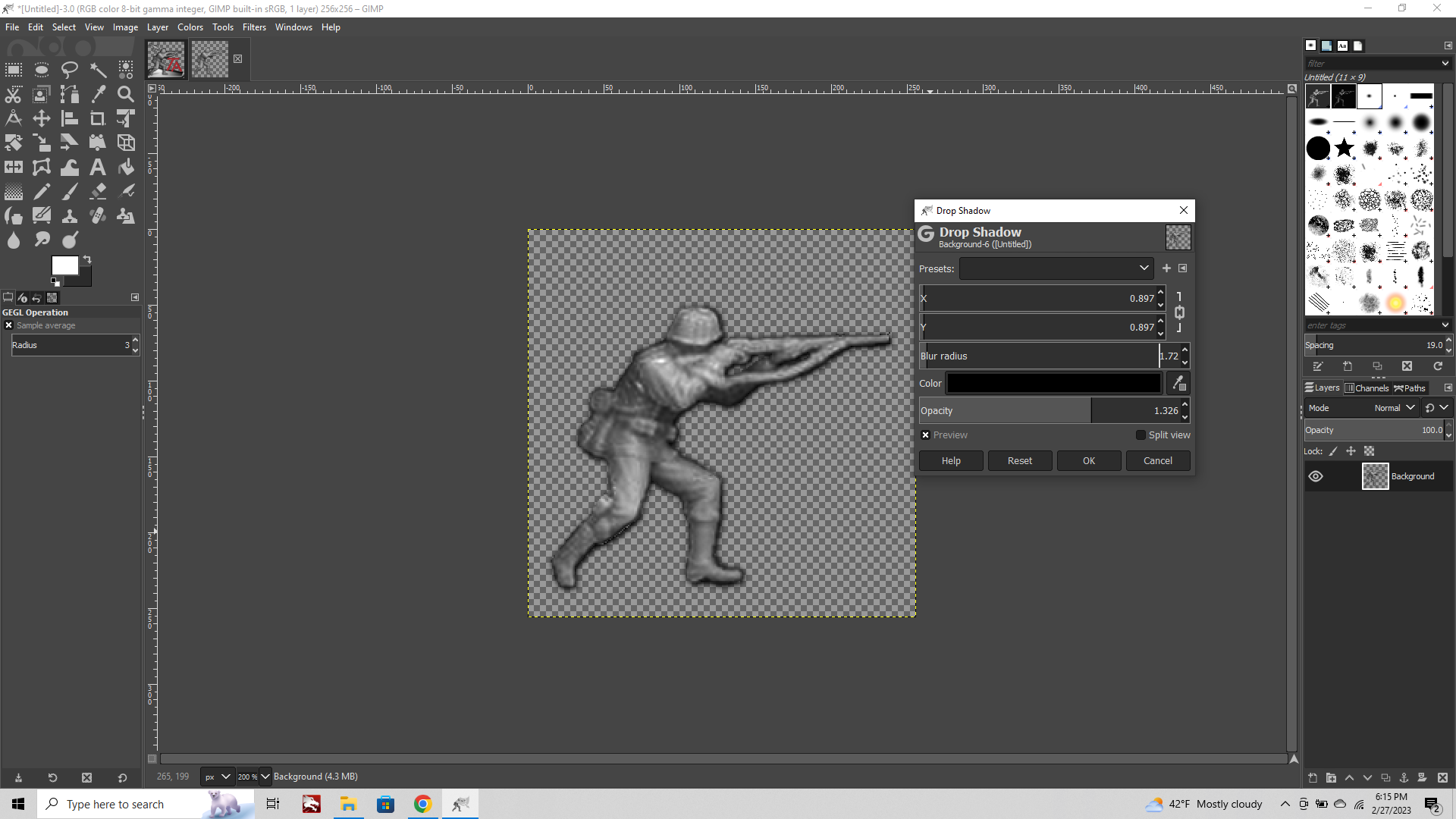
Now lets Colorize him!
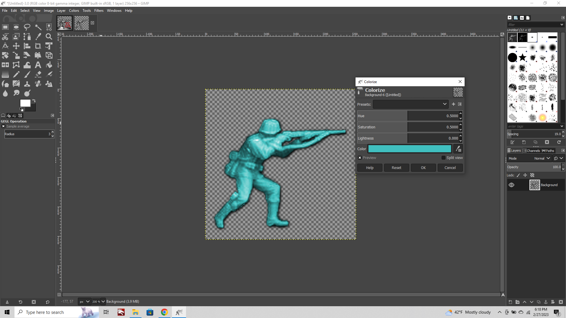
Go to the Color tab and select "Colorize" from the dropdown menu.
Default will be a Cyan blue, but we can control the tint by playing with different colors from the palette. Don't adjust any of the levels for now, instead click the big blue bar at the bottom to change the color of the tint.
When you find one you like you can add it to your list of swatches by clicking the little arrow button near the bottom of the Palette. Now this color will be easy to access the next time you go to colorize.
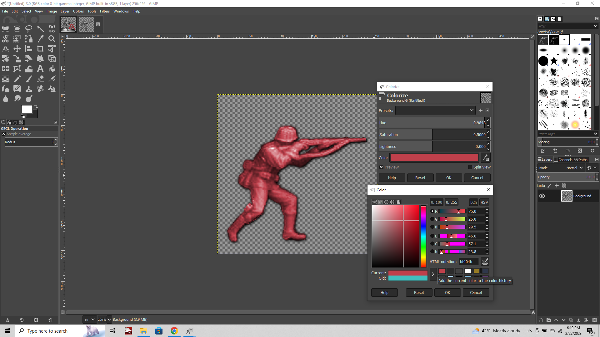
Ok not too shabby right, but now lets say we want the unit to look a bit more painterly. Maybe instead of a Red German, we just want to change a couple colors.
The way to do this is to use your Lasso or Magic Wand and select only a portion of the image. So lets undo and go back a step.
This time we're going to magic wand just the helmet and a few other spots and apply colorization to those areas separately.
Doing this you can noodle for a while. Here instead of using 1 color I used 4 to try and get something going. It's crude, but gives a vibe.
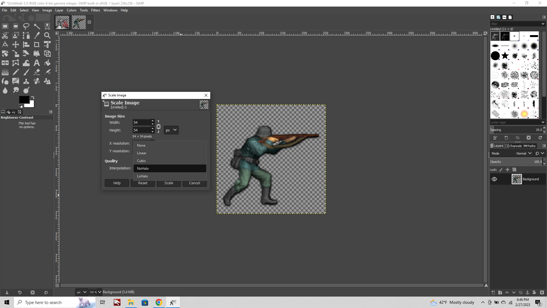
Now scale the unit by clicking Image tab > Scale image
Enter 54px and at the bottom where it says "Interpolation" instead of using the default which is cubic, choose No Halo.
For images that are very tiny, scaling up/down with "NoHalo" interpolation will produce a somewhat sharper image. It uses less blur than cubic, so your downscale/upscale will be less noticeable.
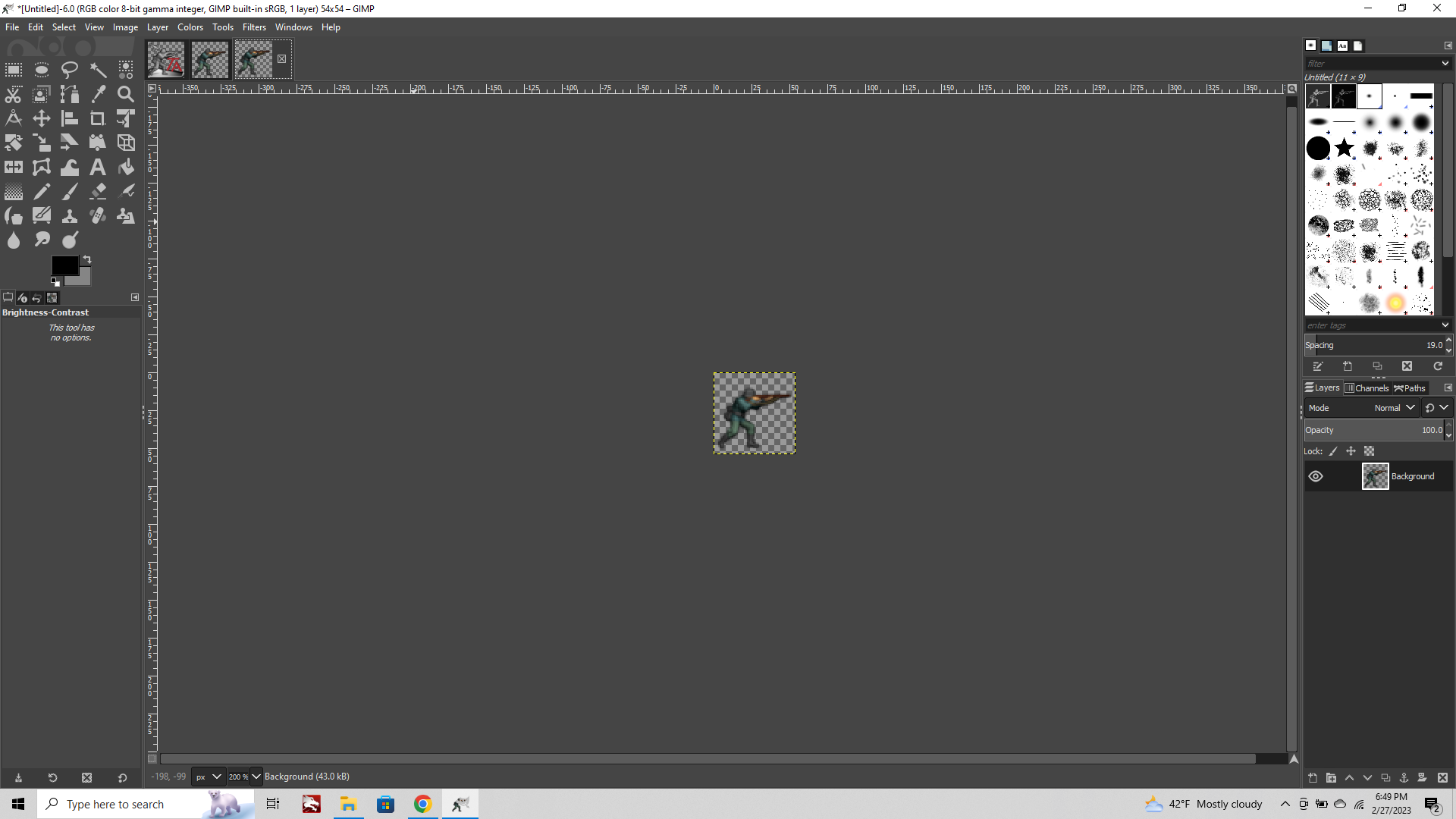
When you got him tiny, you might notice that some stuff may need a tweak. Perhaps punching up the brightness or contrast. You can also collapse the transparency to see how it would look against different background colors by choosing Image tab flatten image. (Just make sure to undo after you examine, so you don't lose the transparency.) It can be helpful to see how it looks against a midtone or a bright color just to make sure you got it dialed. Often you can use the Blur tool or paint in a little shadow with the paintbrush tool.
Then if you want to add more detail, say adding a more pronounced drop shadow, or some other effect, it can be easier to see how it applies when you have the image already reduced in scale. Just so you don't do a ton of work, only to have it all collapse into a single pixel ya know hehe. You can also play with the opacity if you want some color information from the background to bleed in at the edges. This can sometimes make the unit look a bit nicer on the background, but be careful not to go too crazy, or the unit will end up as a ghost hehe.

Using this method, you can also quickly tint units like damaged Battleships, without having to worry about the fire changing color, or same deal with radar symbols and such too. Just use the Free Select or Magic Wand to isolate only the stuff you want to colorize.
When I get some more time we can talk about how to warp the image, like say you want to stretch it or put it into some kind of perspective. Most of this stuff can be found in the Tools tab.
Tools > Transform Tools
Rotate is particularly handy, but just be aware that this will automatically apply cubic interpolation. So if you want to rotate or warp the unit, it's better to do this when it's larger, before you reduce in scale, just to avoid too much fuzz and having the unit be all blur when you rotate it a couple degrees. All this stuff works for flags as well, same principles.
Transform tools> Perspective is also very handy, but usually that stuff is better on things like Ships or Tanks than tiny humans, where transform weirdness may raise eyebrows hehe. But you can do simple stuff like making the unit taller by stretching or whatever. Just check out what's in the Tools tab to experiment.
OK not quite an exhaustive guide, but I figure this one will be more tips and tricks, since there are lots of things we can do to units haha. I'll add more stuff as it comes to me.
Oh also, if you want to apply a series of manipulations to a bunch of images at once, there is a plug-in for GIMP called BIMP. This will batch apply to stuff in bulk. Or you can use an app like pinetools. Depending on the units and the effects you're trying to achieve sometimes that can save a lot of time at the start. And then you can just focus on the finer details when you get to the paint out steps.
-
@black_elk that colored one is sick i have the layered original file for that if you (or anyone else) want(s) it
-
Haha thanks! He was a quickie. But to punch him up you could add more colors, and really finesse the contour part, spend a bit more time blending or creating contrast and such.
For sure! If you got him that'd be fun to see the starting point. The more visual information you find at the outset the more stuff can be noodled. Or if the starting image has a very different look, you can also adjust opacity/saturation or add a quick contour to carve it out. It's nice to start larger, just cause it's easier to make out what's there and to apply transformations when it's bigger so you don't get too much fuzz.
One thing I forgot to mention, basic but which is helpful is to leave a little room to play when you set your canvas sizing. This can help later if you need to add a thicker contour or want to light the unit like with actual shadows, so you don't clip at the edge of the canvas.
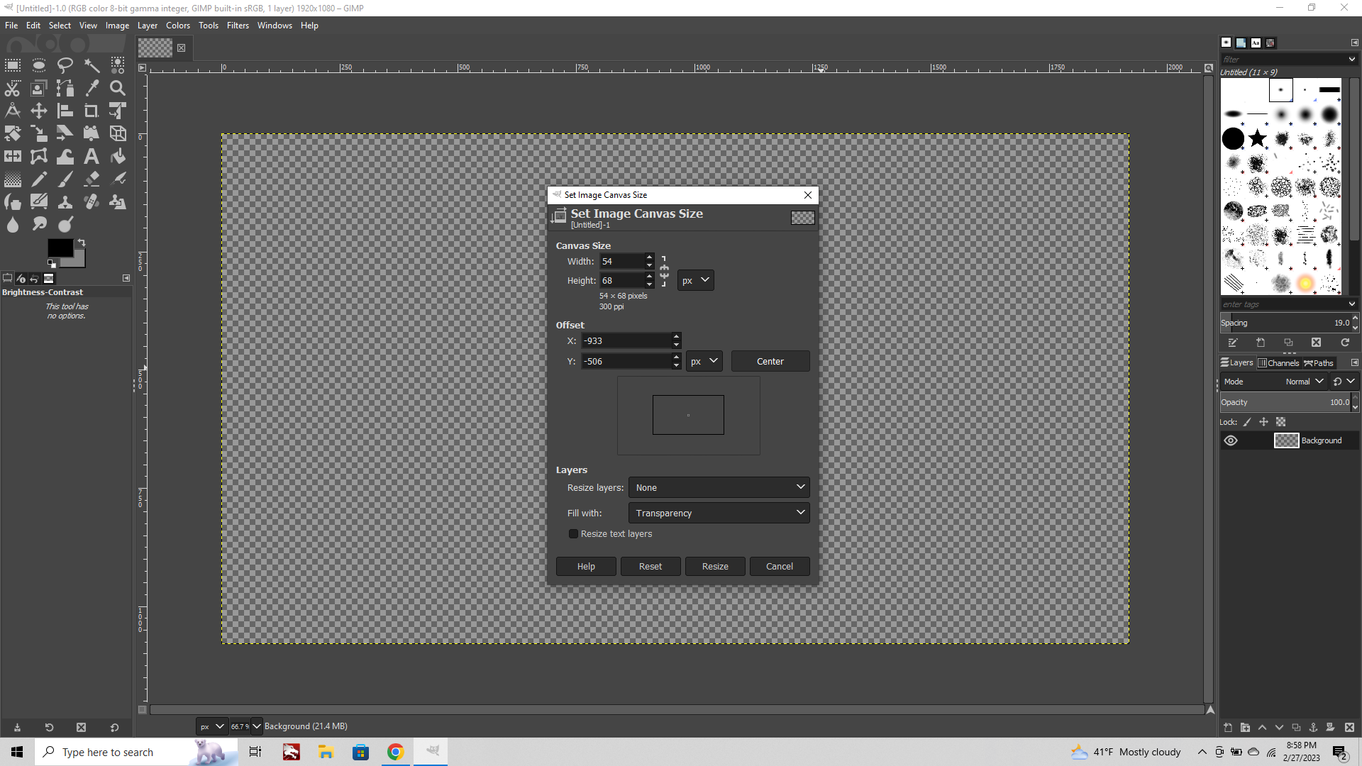
To extend the canvas go to
Image tab > Canvas
Here you can clip or expand the transparency. You can also position where the new canvas will be by centering or dragging the rectangle in the mini. This is also a quick way to control your crops by using the px entered. To cut canvas away rather than extending.
When you copy one image into another Layers at different sizes will show a yellow highlighted marquee where the edges are.
If you need to bring these back in line click
Layer > layer to image size

When you paste something into your image click the floating selection in the layer menu on the lower right, and choose "To New Layer" from the drop down menu to give it a home. I mentioned that in the other guide, but it's a good one to remember. Otherwise the new thing will paste into the current layer.
Layers can be raised or lowered, in order, or have different adjustments made to them. To select the layers go to the menu at the bottom right and select the images with the eyeballs next to them. Doing this you can apply color to only one layer at time.
To get extra fancy you can search alpha channels and color masks, to see how using the eraser/paintbrush to slowly change from one color to another can be done. Basically the same way people would digitally colorize a BW photo, WW2 in color style. Although for our purposes with images that are smaller using the selection tool and colorize can get you pretty close to that with fewer steps, so that's why I thought it made sense to begin with that.
Oh and one other cool trick for units
Transform > Flip Horizontal
This is the way to quickly see if the image is going to carry facing the opposite direction. Sometimes if you're adding in stuff with drawing, if you goof a hand or a boot or whatever, you will be able to tell more easily by doing the flip. Like holding up a drawing in the mirror, the stuff jumps out where it's wonky when you invert hehe.
And finally one quick mention, but it has a bit more to do with the placement of the unit. Or like if you're trying to combine multiple units together into a single graphic I guess. When putting stuff together it's usually more visually appealing when shapes strike each other in particular ways. Here's a quick guide that describes what tangents are and how to avoid them. https://emptyeasel.com/2008/11/18/avoiding-tangents-9-visual-blunders-every-artist-should-watch-out-for/ For our purposes this would be stuff like where one unit clips into another and dismembers it, or where two shapes touch along an edge in an awkward way, crowding essentially. So having a little bit of canvas can help for that. Then when you're doing the unit place it's less likely for one shape to run into another in ways that create visual confusion or a sense of unease.
Similarly when you set up the placement, you can do stuff like having the infantry be lower down within a tile, so that the larger type units like a big bomber or giant tank won't challenge the sense of perspective as much. Basically so it looks like the infantry guy is standing closer to the viewer and the big stuff is more behind him.
Other stuff you can do for consistency is to make units of the same type at the same size or same rotation/tilt, or using abstract shapes to help organize the look. Or basically to choose one dimension along which the units will look similar and keep that consistent (say the hue range of the tint) but then to play up some other element for the differences. Like a painted on roundel to the fighter's wings or just showing the faces and hands of the infantry but otherwise having them dress to color. Kinda like picking a major color and then a safety color. That sort of stuff.