Achievable improvements to the Triplea User Interface
-
This thread discusses the current user interface (UI) of Triplea and easy ways to improve it, without too much work or skill required.
Unofficial test build: v2.5-bu
current version v2.5.31
https://forums.triplea-game.org/post/50630
Next version: v2.5.40: next Week
Triplea Frame/Menu Mockup
It can be used for experimentation. The code should be easier to modify than triplea. It is user configurable via a ui.properties file.
The jar version v0.11 has now been uploaded:
https://github.com/butterw/ui/blob/main/code/MenuSwing.zipPresentation (this post will be updated)
TripleA is a multi-platform open source turn-based strategy game written in Java (v11). The graphical user interface uses the standard Java Swing Library which supports customizable Look and Feel.
After the game has been loaded using the launcher, Triplea uses a single application window with a menuBar, a map, a bottomBar and (resizable/hidable) panels.
Each Player turn consist in successive phases. They are currently driven and completed with 2 actionButtons located in the right sidePanel.- The menuBar has been used as an easy way to make new commands available with associated keybindings, but isn't in fact used much during the game.
- The bottomBar is currently only used to display a information (ressources, current player/game turn/phase).
- Visualizing and moving different units around the map is a key part of any TripleA game. As such, it is essential that the map area should be as large as possible and should be as easy to navigate as possible.
Gameplay loop:
Based on the current game/map situation, the player makes choices. The results are resolved based on the applied ruleset and dice rolls. After the player's turn ends, the other players play in the predetermined map order. After multiple turns one side wins based on victory conditions. -
Main issues with the UI:
-The map doesn't use enough of the screen space (scrolling the map can be tiring).
-The program asks for too many confirmations.
-There are number of tools available in the interface to help the player, but their integration is poor. >> Reorganizing Menus and replacing would help
-[Remember Players] The UI should remember the player configuration when you leave a local game to reload the map (ex: when you realize you forgot to configure a game option), it currently resets to map defaults.High Dpi, html rendering readability issues:
-Default (java11) high Dpi scaling produces ugly blurry images, there should be an option to disable the upscaling of images and configure text size.- Applied HiDpi factor should appear somewhere (no HiDpi: 100%).
- Help > Game Notes.html display is very difficult to read for basic notes (small text and headings, text is hard to read with a dark look and feel). UIManager.put("EditorPane.font", new Font( successfully overrides the font in Substance and Nimbus Look and Feel.
- default map unit count Font size should be increased to 24 (currently: 12)
-
@butterw scrolling can be tiring if you have a ways to go. I click on the mini map in the general area I want to go, if I'm not close by.
You can also click and hold anywhere on the mini map and then move where you want to be.
-
Feature: Making the right SidePanel hidable (Ctrl+X)
This simple modification was achieved by adding an entry to the gameMenu associated with the Ctrl+X hotkey, to toggle the right-sidepanel. The purpose is to make more of the map visible during the move phases. For now, it is functionally equivalent to clicking the show/hide arrows on the right-sidePanel, but this is very much superior from a usability perspective (the JSplitPane controls are small and tricky to click + on my system, it avoids interference from the windows taskbar situated on the right).
I would much prefer to have the JSplitPane completely hidden (like the History left-sidePanel) and use a button in the bottombar to display/hide it. The difficult to use JSplitPane controls waste 10pixels and make it difficult to use edge-scroll on the map with a small detection area (ex: 5).dealing with the Win10 Taskbar
The always top Windows taskbar is a big issue for Triplea on Win10, because it limits the space available for windowed applications. There is no simple way to disable it, though it is possible to set it to autohide in taskbar settings. However when the mouse reaches the edge of the screen the taskbar will automatically display. The correct solution for this would be to use fullscreen mode, which also has the benefit of hiding the window titlebar. The problem is that Triplea doesn't currently support this.
The simplest way to limit the nuisance caused by the Win10 Taskbar in this case is to set it to autohide then kill Explorer.exe, but this isn't for casual users. -
@beelee As you suggest, clicking (rather than dragging) the minimap is quite OK for navigation. But it's only when you've hidden the right sidePanel that the user experience significantly improves (there is so much more map space, you don't need to scroll).
Maybe the keyboard hotkeys to scroll the map should be user configurable so as to enable the use of WASD keys for the left-hand.
-
@butterw
Currently you can improve the default UI by selecting;Game> Engine Settings> UI Theme> Look and Feel = Substance Mist Silver
This gives me a brighter/cleaner UI.
I have not tested all the Look and Feel, what do others use?
-
@butterw said in Achievable improvements to the Triplea User Interface:
@beelee As you suggest, clicking (rather than dragging) the minimap is quite OK for navigation. But it's only when you've hidden the right sidePanel that the user experience significantly improves (there is so much more map space, you don't need to scroll).
Maybe the keyboard hotkeys to scroll the map should be user configurable so as to enable the use of WASD keys for the left-hand.
I thought they got rid of ctrl z with the last stable. you can still go full screen ?
-
@thedog Substance Dust would be my choice on Win10 for a light panel. What round button platform are you using ?
I've been using Substance Twilight for a dark panel. Html map notes using the default dark color for text display poorly, but otherwise it's fine.
Some layout imperfections do show up with this, notably a 1 pixel glitch at the bottom edge of the map. -
@butterw
Thanks for the suggestions.What round button platform are you using ?
Oh what is this, how do I change this?If people did not know, on the big map, you can right click hold and drag to move the map around.
-
@thedog There are a number of ways to change the map viewport.
- Clicking the mini-map to where you want to go as suggested by @beelee.
This does work, my issues with it:
- It requires to move the mouse from the map to the side-panel.
- Because the minimap is small, the result is imprecise and you en up needing additionnal fine-scrolling.
- dragging the minimap doesn't feel natural to me.
- Using the minimap, requires the right-side panel to be displayed, which reduces the screen space dedicated to the map, which then means you need to scroll more !
-
A possible alternative to the mini-map could be to use a modified CTRL+F territory finder. The idea would be to jump to India by pressing I.
-
Holding right-click and dragging the map. It's good for fine adjustments, but it gets tiring if you have to do it all the time.
-
Mouse Wheel Scroll. This is my preferred way of fine scrolling, but is only for vertical scrolling.
-
Keyboard Scroll (using arrow keys, +Ctrl for a larger move). I'm going to try out coding left-handed WASD bindings instead, so the right hand can stay on the mouse.
-
Edge Scrolling. Scroll by moving the mouse to the screen edge (no keyboard action required).
- This feature can be disabled. I would recommend reducing the detection zone so it doesn't interfere with normal operation, but It doesn't play well with the right-sidePanel border or the Win10 taskbar with autohide
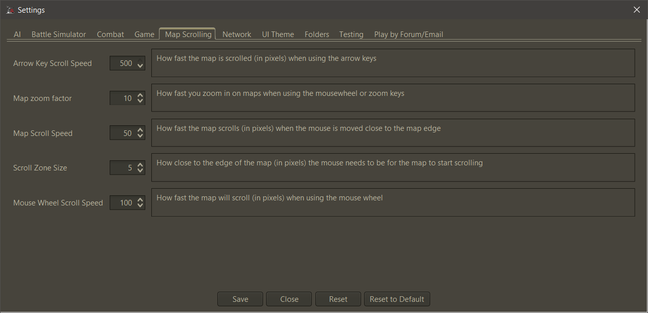
- Default scroll Settings can be changed in Engine Settings > Map Scrolling:
- Clicking the mini-map to where you want to go as suggested by @beelee.
-
What screen resolutions are you displaying TripleA at ?
-
Does anyone use 1440p or higher ? I would be interested in a Screenshot of the main interface.
-
Does anyone use less than 1080p ?
- With the Win10 taskbar displayed on the side, the space available for the Triplea window is only 1840x1080.
-
-
@beelee said in Achievable improvements to the Triplea User Interface:
I thought they got rid of ctrl z with the last stable. you can still go full screen
I don't know what you are referring to. Ctrl-z does nothing on v2.5.
Is there or was there ever a fullscreen mode in a version of tripleA ? -
@butterw
On my laptop I play 1600x900, on my desktop 1080p, in both cases I have the windows 10 task bar on show, but use "small taskbar buttons".
.One option
-
can the TripleA menu bar be merged onto the TripleA title bar?
-
can the TripleA status bar can be made narrower?
-
Remove the mini map
-
Make the right hand sidebar as narrow as possible
-
Add History to the tabs, remove Territory tab (see below)
The main map screen could be controlled by;- with the mouse scroll wheel for zoom in/out (currently has two other variants)
- left click hold and drag to move map
- right click on a territory/sea zone to show as a pop up the territory info
the above clicks are swappable for left and right handed players
-
Ctrl+F1 to Ctrl+F4, "mark" the map F1 to F4 returns the screen to those "marked" screens
-
F5 same as Ctrl+F find a territory
-
F6 cycles through all your Factories
-
F7+ etc
-
F11 Enter exit full screen mode
Edit:
A pause button, maybe F12, to stop TripleA from executing so you can look at what is happening, useful for debugging problems. -
-
@butterw said in Achievable improvements to the Triplea User Interface:
I don't know what you are referring to. Ctrl-z does nothing on v2.5.
Is there or was there ever a fullscreen mode in a version of tripleA ?@beelee Looking at Github, the Ctrl-Z hotkey to hide the (right) sidePanel was removed in v2.5, because it needed a fix. It was a hidden feature never mentionned in release notes, or even in the HelpMenu.
I just re-invented the feature, which suggests it wasn't such a bad idea after all. This isn't real fullscreen though.I'm realizing there are many hotkeys, some of them very useful but they are mostly hidden.
in ui/HelpMenuHelp > Movement/Selection Helpshould be renamed toHelp > Movement/Selection Hotkeysand needs to be made much more readable. I would suggest using a table per section and using larger text.WASD controls also existed but were removed, if I understand correctly because of the addition of the
Fkey. WASD wouldn't have been that useful for me, because I don't use a US Keyboard, but some left-handed control scroll key would be good to have as an option.To sum it up the Hotkeys are currently not user configurable, which leads to too many hotkeys, no single-list and hard to discover hotkeys. Streamlining hotkeys would significantly improve the ui.
-
@thedog said in Achievable improvements to the Triplea User Interface:
can the TripleA menu bar be merged onto the TripleA title bar?
That's likely difficult to do.
- can the TripleA status bar can be made narrower?
The player flag from the map is actually a sizing element. Assuming a 24x24 size player flag, the status bar ends up being about 30 pixels high, which is not unreasonable if its used as the main toolbar/info display.
-
@butterw said in Achievable improvements to the Triplea User Interface:
Assuming a 24x24 size player flag, the status bar ends up being about 30 pixels high
Ahh, that explains it, my flags are 32x32, I will shrink them to 24x24.
-
@butterw I would prefer to run TripleA (and most other applications) in windowed mode. I happily give a little screen space for easily switching programs.
-
@rogercooper Triplea will use windowed mode by default, a hotkey (F11) will allow to switch to fullscreen mode.
On windows you can switch applications with Alt-Tab or Win-tab.
-
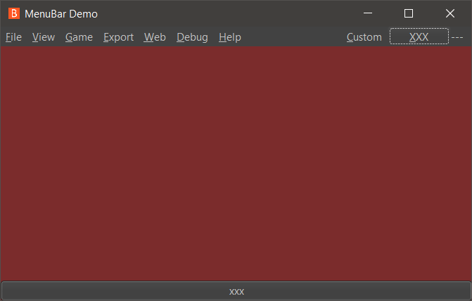
- It's possible to make use of spare space in the menuBar and Bottombar.
This is the default Substance Graphite LookandFeel on my system. I've added a "Custom" menu to the right and also a "xxx" button and a "---" Label.
-
@butterw
Or maybe remove the Menu Bar and replace with the main map screen?The menu bar could be activated with something like;
- A right click
- Left and a Right click held together.
- Alt+M
- or?
For a pop up menu?
Hello! It looks like you're interested in this conversation, but you don't have an account yet.
Getting fed up of having to scroll through the same posts each visit? When you register for an account, you'll always come back to exactly where you were before, and choose to be notified of new replies (either via email, or push notification). You'll also be able to save bookmarks and upvote posts to show your appreciation to other community members.
With your input, this post could be even better 💗
Register Login