Map Aspect Ratio, which is optimal for tripleA maps?
-
So I was mulling this over especially in light of some of the challenges with the older maps. In tripleA we have lots of different maps. We have some old maps that are vaguely 4:3, we have some wide maps at 2:1 (Bung's Global is even wider than that, 2.5 : 1, closer to Panavision I think?) then there are a few simple maps, some maps are squares 1:1. The current tutorial map for example uses Europe 1940, which is very tall relative to it's width, almost Movietone.
4:3 was the standard native resolution when tripleA was created, but the first map created for it was 16:9. Classic and Revised in tripleA both use a 16:9 game map.
The physical game boards are designed to somehow fit on a field that is 72 inches by around 30 inches, because those are the standard dimensions of 6 ft playing table. The larger jumbo neoprene rolling maps are at 84 inches cause they're made for 8ft tables. This can be slightly awkward, because standard banquet tables (at both 6ft and 8ft) tend to have the same depth, say somewhere between 30 and 40 inches. Depending on who makes the table, storage tends to require them being the same depth so they can stack and such for transport. This I know well, from many years in catering hehe. Main point though is that the maps almost never take up the entire surface area, but instead have to give a little room on the margins, or else they assume two tables used together for more depth.
TripleA can pillarbox when map scaling, but it can't really letterbox. What this means is that the map view area will always match height at max zoom out, but width usually needs some scroll in order to see the entire thing at a glance. You may have noticed if using the mapview feature, that most maps can use "fit height" but if you click "fit width" this generally doesn't work. The reason is because tripleA can't letterbox, it can only pillarbox, and most maps are wider than they are tall.
In other words it can give us bars on the side (or stretch the UI and mapview window to make that work) but it can't give black bars at the top/bottom for a widescreen. The image displayed when max zoomed out will key off the aspect ratio of the baseline map itself. If the map isn't wide enough relative to it's height, you will see a vertical crop at max zoom out.
Here is an image from the wiki that sorta shows the issue in a quick view.
https://en.wikipedia.org/wiki/Aspect_ratio_(image)#/media/File:Aspect_Ratio_Chart.svg
Since height to width will basically be locked when scaling out, it means tripleA can handle say 4:3 Fullscreen, or 3:2 35mm film, 16:9 or 2:1, 3:1 whatever, but there will always be some scroll there, unless you actually create a baseline at exactly 4:3 aspect I guess.
This is challenging because the gameboards tend to be much wider than they are tall. To fit a global board at 70x30 inches into a 4:3 window requires a lot of compression/distortion. This is what it would look like. So basically all the visual information in those gray pillarboxes would need to be compressed to fit into that black rectangle.

The mini map will stretch or compress the main map to fit within the minimap window, which will also define how wide the actual map view is going to be compared to the UI.
The images presented in both the gamenotes and the downloaded map preview also have display windows at different aspects. With different max heights vs widths. I think these are probably keying off whatever was in place when tripleA was first put together, but it's not entirely clear which size/dimensions are optimal in each case.
In addition to this stuff, there are also the UI graphics windows themselves, which tend to key off 48px squares and assume a standard resolution. This is off the font size in whatever browser window, but unlike font which scales as svg. the graphics are raster and these upscale without interpolation. Means that the graphics will appear more jagged/pixelated as the user increases the display size of the font in their browser beyond 100%. Probably because at one point tripleA had no such graphics and so it didn't matter cause the only thing being upscaled there was text/font. If instead we are using images, say tiny flags or units or whatever, those graphics just go kinda jank.
Not entirely sure where I'm driving with this, it's not really a feature request, cause I have no idea what feature I'd be requesting here. Somehow I don't think anamorphic map scaling is in the cards, so it's more just pointing this out for map makers. So they can take it into account when deciding how to draw their baselines, or choose what sort of compression or distortion to use for that, since it will carry over into these other display arenas. For example, most world maps you're going to find on wikipedia are showing the world at 2:1 or thereabouts. NASA's blue marble map from 2002 is basically at 2:1 all the WW2 timeline atlases on the wiki are at 2:1. There is some play if you want to go even wider, because most people I'd guess would just crop the Arctic/Antarctic, or stretch/compress the map itself to service the playscale. If the map is narrower than 4:3, say trying to make a square map, the user will not be able to "fit height" either and you will end up with a vertical scroll.
This is a kind of inverse letterboxing I suppose, but I think most players would find it incredibly awkward. From a map drawing standpoint this is pretty rough, since it limits the map zoom. I think most players would much prefer to drag left or right, rather than up and down to get their survey view. Dragging up and down almost always results in units getting missed, especially if they're near the bottom of the board. In short, I think it would maybe be a good idea to standardize somehow and try to avoid awkward Aspect Ratios where possible especially for anything that's meant to serve as a Tutorial map.
TLDR -
To see an example of what I'm talking about just load up the World War II Europe 1940 map in TripleA and attempt to scroll around and use the map zoom. You'll experience immediately the issue that I'm trying to highlight with the above rambles hehe
-
Right Arm ! Appreciate the time you put in to make triplea better

-
Hehe no worries. I probably explain it poorly, but it's just sorta down to the dimensions of the baselines. Oh also, so for maps that lock at the edges (wrap turned off in map properties) in that case 16:9 makes sense since it will give some drag left/right when at max zoom out.
I think that is preferable to the sort of claustrophobic thing that happens when max zoom out fits the 4:3 window exactly. Like you'd get that bit of play at least going 16:9.
If World War II Global was put together from 2 separate Europe/Pacific 1940 maps each at 16:9 then we'd have Global at 32:9 which could work on an modern ultrawide monitor if shown as a single image, say via export > export gameboard picture.
On a normal monitor it would just mean dragging the 4:3 window left/right per the usual, with a little bit of clip at the edges of either theater map. I don't know what approach would be best, but pretty much I think one would have to stretch and redraw the base for each board to be wider. Like at least 4:3 wide, probably 16:9 would be ideal.
Might make the world appear a bit stretched when viewed as a single image, but when you're on top of it probably would be the way to go. Current UHD Global is ballpark 2:1 not exactly but pretty close. Just cutting it in half you'd end up with sorta the same issue, cause each theater would be a square, that and the area where the boards come together is the region that has the most distortion to hit the TT connections. I don't think it matters so much, since the Global game is surely more popular, but I think if one wanted to redo Europe 1940 and Pacific 1940 16:9 would be optimal there, since both those boards have map wrap set to off and the edges are locked.
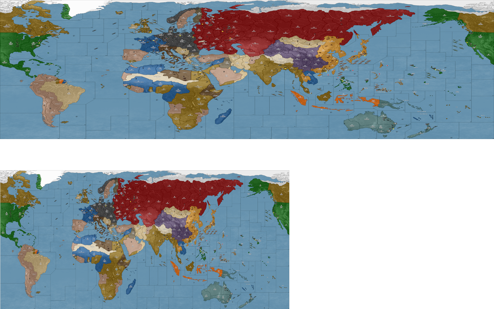
Here's how the current UHD would present if morphed to 32:9 Super Ultrawide, compared to the current at ~2:1

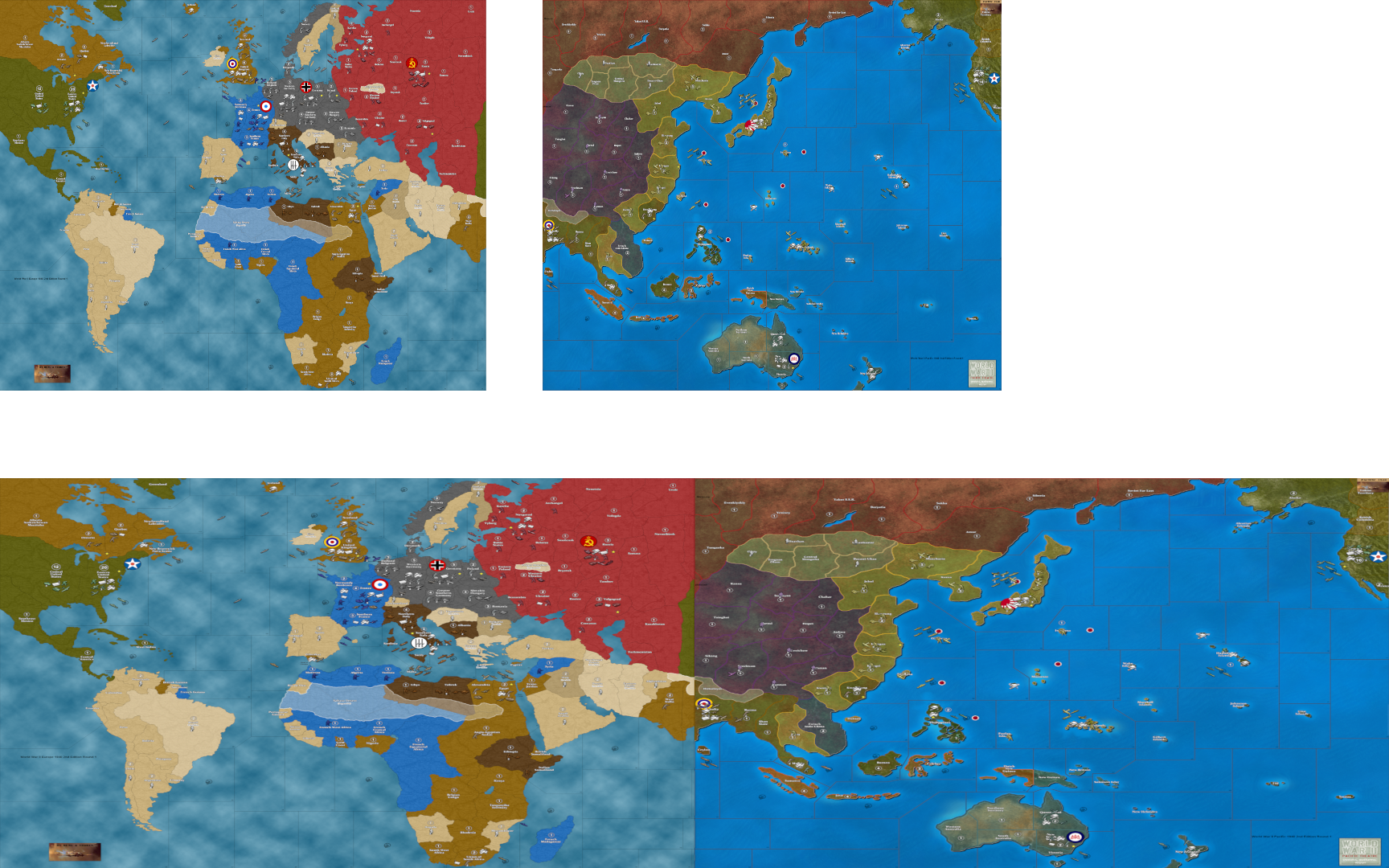
Here a similar image showing Bungs current. Then warped to 16:9 per theater/32:9 for Global

To give a sense for what the split might look like if trying to do each 1940 theater as a separate map, just so they have sufficient width for the map zoom to work right. I think anyway, I haven't tested it much. The mini is more flexible since it will stretch the image to fit into that window and scale the UI stats bar stuff on the righthand side to match. Like whatever sized swatch is being used for the minimap, it will stretch to fit. For the main maps though I think you'd want Europe 1940 and Pacific 1940 to be at least 4:3 wide, and ideally a little bit wider closer to 16:9 so they have a little play when cursoring to drag the view around?
We don't have to deal with tables in tripleA, but if we were, basically trying to get something going that is more like two tables set end to end, if that makes sense.
-
@black_elk ahh i see what you mean now. The wider ones look like there getting ready to make the jump to hyper space

-
@Black_Elk
So 2:1 ish appears to be the sweet spot?
But it can be 4:3 or anywhere between 2:1 and 4:3 is ideal? -
Yeah I think so. It's not the simplest thing to test, but I can take whatever existing map and extend the canvas horizontally or vertically. I think if the map is wider than 4:3 you'll get the horizontal pan, which to me feels pretty natural, like the map sorta behaving as I'd expect for the drag around survey view. If the map is narrower than 4:3 you'll get the vertical pan at max zoom out instead, and to me this feels sorta awkward and I can't quickly zoom out to scan and pan, but have to drag the cursor to see the bottom. The mouse wheel up/down scales the height. I'm not sure if there is a way to define the mapview window or the marquee rectangle on the mini as something other than 4:3 or whatever it's using for the actual field of view? I think if there is, it's within tripleA or if tripleA is carrying that over from windows, like the game engine rather than in the map.properties of whatever specific map?
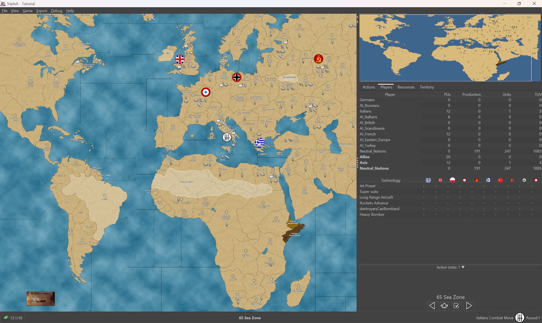
The Tutorial map is an interesting case, cause it shows the Bung World War II Europe 1940 map which has almost not pan at max zoom out. Like it is only just the tiniest bit wider than 4:3 so there is no play in the grab and drag unless you first zoom in. The minimap for the tutorial is a swatch at 2:1 currently. So the image shown in the mini is stretched. The map view holds at 4:3 but the dimensions of the minimap will change the shape of that rectangle as it's it's displayed on the mini. If the baseline and mini don't match, you will see a slightly different shaped rectangle on the mini, but really it's the 4:3 image being stretched. Here's a screen showing the current default for the map called "Tutorial"

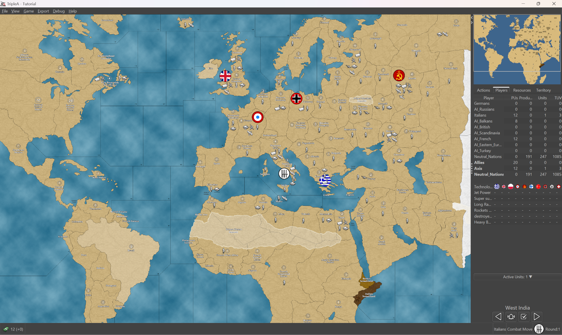
Here's how it looks when I replace the 2:1 smallMap image in the map folder with one that matches the aspect ratio of the Tutorial baseline. You can see the minimap rectangle is now displaying as normal and the main map has the vertical up/down drag. The field of view orients top right so the bottom of the board is cropped off at max zoom out.

I think the reason the mini is at 2:1 in the default is so that the map can zoom all the way out, even though it heavily distorts the mini to achieve that. The zoom for the field of view on the main map seems like it can be at least partial controlled by the smallMap that the minimap is using?
I've been saying 4:3 but it's kinda hard to tell honestly, my screen is at 16:10 so it could just be that is the display area and it's just the mini that's stretching, same as in the above. I guess someone could maybe confirm if your screen is at 16:9 and the rectangle on the mini matches that with a slightly wider view then I guess we'd know it's keying off the resolution screen size in windows for that?
But anyway, the idea would just be to make sure the baseline map is wider if you want a horizontal pan at max zoom out, like to fit the map by Height as opposed to Width. Otherwise you'll get a crop like in the Tutorial map, with the up/down drag. I think most players will play at some intermediate zoom, but then mouse wheel to max zoom out for the quick scan. That's what I do at any rate.
There aren't a whole lot of tripleA maps that have a square or vertical orientation rather than a horizontal orientation, but there are a couple. In some of the fantasy games, or simpler maps like chess or capture the flag etc those type games set in a square or taller. Maybe someone who has more experience with various maps could let us know how it feels for those. Mostly I've been playing tripleA maps that are wider than they are tall, like the World War II world maps. But I think anything too square-ish and you get a similar thing happening with the zoom.