UHD Domination NML Upscaled Baseline
-
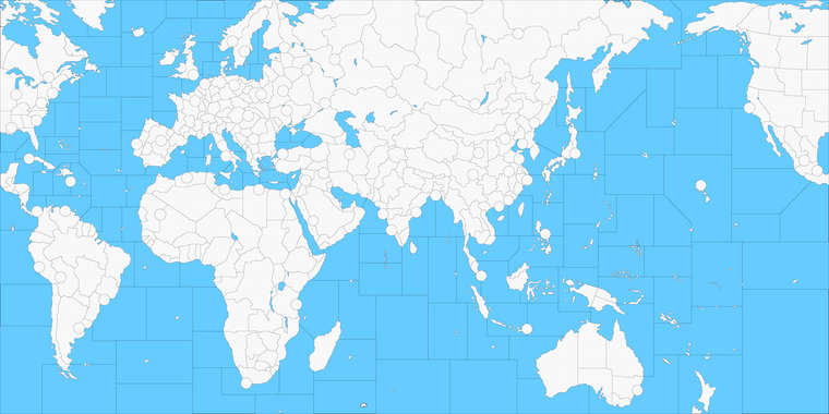
I thought I'd try the spotted cow trick to enlarge this one as well. Still a WIP clearly lol
It's a little rough around the edges, cause I didn't know if a map this large would actually work, so didn't want to go too nuts.
Tried for 20000px by 10000px for the baseline and just did a simple relief to knock the lines back with a basic pattern at like 35% opacity.
It's ballpark like four times as large as the current I think.
I didn't change the contours so it would hopefully still work with whatever scenarios, just kinda enlarged it. I changed the shape of the shanghai tile to make that 4 point less pronounced, but still same sorta deal there since I didn't want to bust the NML 1914 set up. Couple of the circles might need to be double checked, cause I had to expand the coastal area a few times, but otherwise I think should work for a dry run in the tools. Units could maybe use an upscale to the 54px or retinted if trying to do units at 125%, but should work ok with whatever 48px I'd imagine. Currently they're downscaled, so basically same idea for playscale except that the same units would display at a higher resolution (100%) for the same sorta map view scale. I tried to key it off 50% map view, like I did for the other larger maps.
Baseline WIP at 20000px
https://drive.google.com/file/d/1KiLJjhFUFsMeznS8AcqMN9mpqB60ifa0/view?usp=sharingQuick Relief at 20000px
https://drive.google.com/file/d/18Ooted4zkZXJT82VmoJLphXL-rbObGDS/view?usp=sharingNeeds to have the map.props for dimensions at 20000x10000, then the centers/polys re-run through the map tools for the bigger dimensions. Also the place.txt for the enlarged map with those coordinates etc.
The Relief laid over the Base looks like this right now, downscaled for the boards. So basically just needs to rework the sz lines at the edges, since it bounced around a bit when upscaling. Figured I'd just post the WIP, since not sure how far I can take it, but should be simpler to pick up from there if one wants to go jumbo for the NML 1914 stuff.
For the circles along the coast, the original idea was to have the relief design follow the continental coastlines (cutting into the circles more or less) and then maybe a lighter blue or whatever for the unit overflow area of those circles, maybe a zoom effect in the case of islands or peninsulas. Or similar to what Hepster and Redrum had going for the PoP 1914 scenario map, using a different patterns or design motifs for those sections of the relief. Here it's just the same as the current Dom though, cause I wasn't thinking too hard on it tonight hehe.

I didn't put together the NML scenario so not sure what all would be needed, but since I had the map thought I'd give it a whirl.
Also a couple cool lookin' Hepster units from the other thread that might work for CP techs hehe


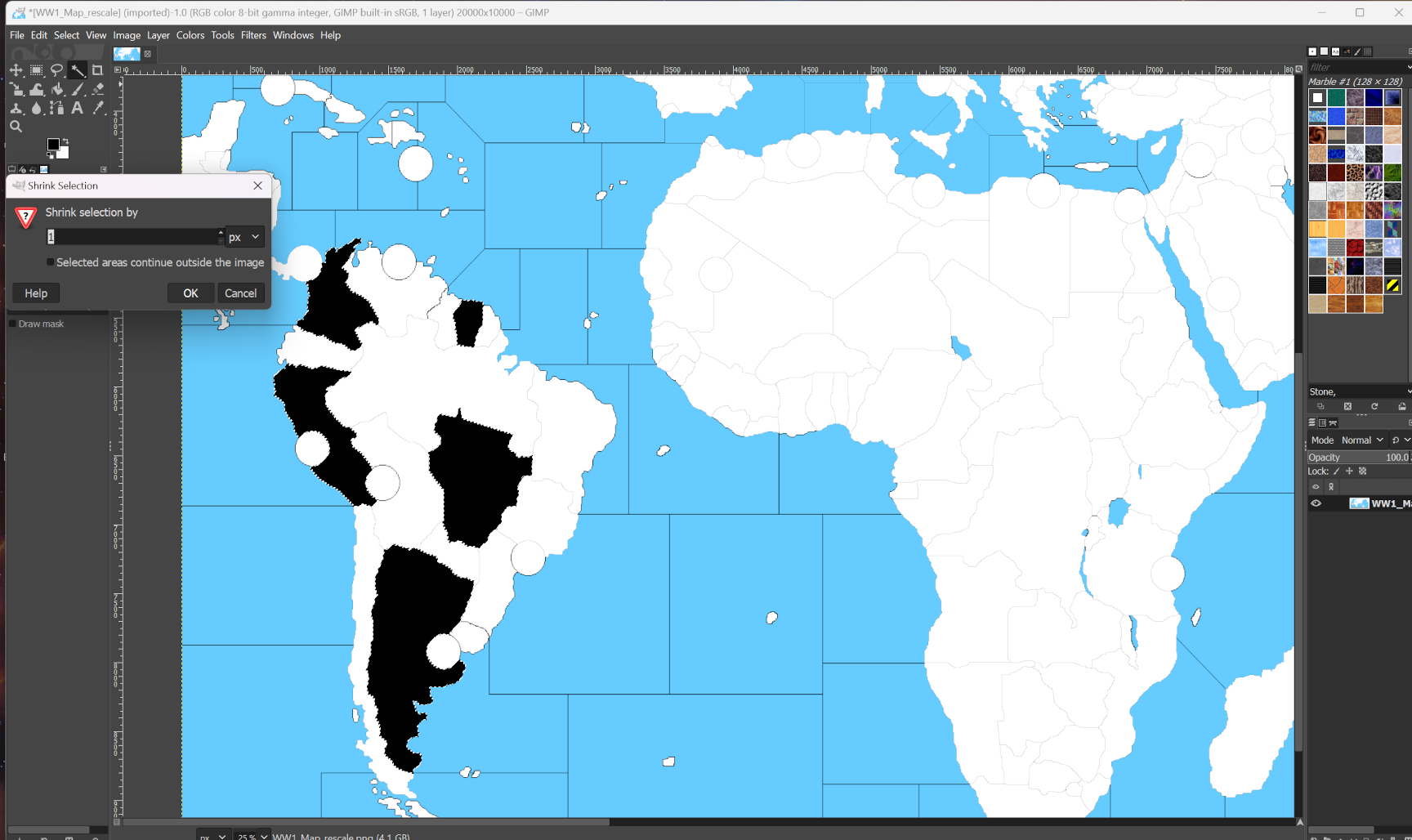
Anyhow, the original baseline map was itself an enlargement of the v3 map I did, so to get that 2px line down to 1px I used the magic wand tool in GIMP, grow selection by 6px (or whatever is needed to get around the chop) to fill with 100% black, then shrink selection 1 px fill with White.
To bang out a quick relief, you selected the white then fill with pattern (I used gimps default marble) then reduce the opacity of that portion/layer so it's semi transparent.
For the borderlines, use the color selection tool to grab all the black, expand the selection by like 2 px, fill with black, then expand again the selection another 2px and apply some gaussian blur to smooth it out.
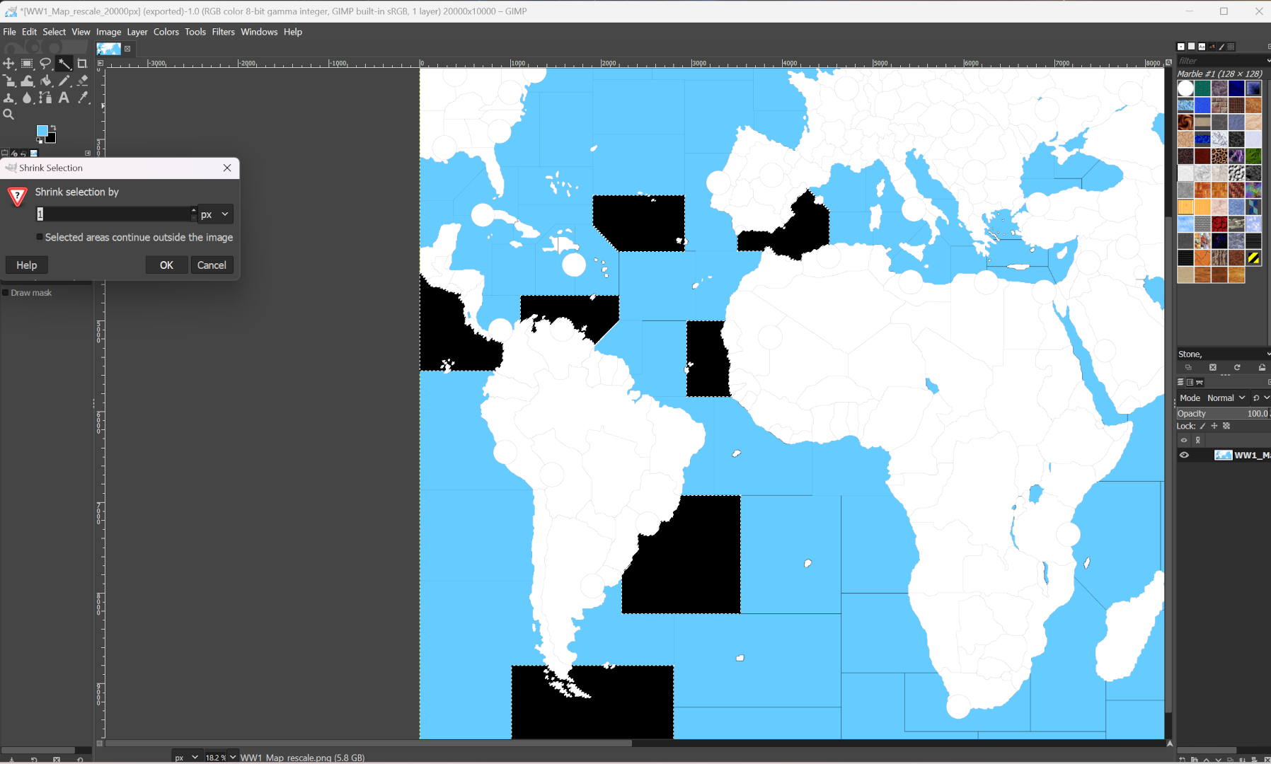
See zone boundaries or geometric shapes don't upscale very well that way, so it's easier to just redraw all those probably, or at least where the chop is noticeable, like on the diagonals especially. In the baseline map above I left it at that stage just to kinda show how that looks.
Here's an example screen from gimp using the wand and shift clicking to grab a few tiles at once to speed things up... basically just selecting non adjacent tiles to the grow/shrink fill thing to get the black boundary lines back down to size.


To me looks like a spotted cow when making the selections with the magic wand. Seemed to be the fastest way to get the lines back down to a working width at roughly 1px.
Anyhow, let me know if it seems worthwhile or if anyone is chomping at the bit to rework a bunch of centers for NML 1914 game. I figure it's easier to rework a few in the tiles for the polys once that part is done, since it takes forever hehe. Least all the entries are already typed out, XML should all work the same, just needs to have all the tiles reassigned since the coordinates would be all off. If anyone takes it for a spin through the map tools, you can see from the old centers the difference in scale for comparison.
-
@black_elk lookin good i dont play that map that often tho
-
@ubernaut hehe same boat over here honestly. I'm not familiar enough with the scenario to really go to town, but I figured an upscale kinda makes sense for how it's used. I think when I knocked out the first pass plan was basically a unit roster maybe had 3 types, say like the inf, cavalry or cannon from RISK style vibes, or maybe a couple ship types, but it's got a pretty deep roster for the NML one. Some units from the old great war but with additions. Larger map allows for more placements before the overflow so that's probably desirable. I think PoP 1914 was around 8000px or the larger 16000px WW2 one that could be carved up, but Dom already had a scenario I didn't want to mess around overmuch. Some things are simpler to adjust than others like widening the map say. I almost tried 32:9 stretch but it was kinda absurd and I think it would crash GIMP to try and make a relief for an image that large hehe. Anyway, strongarmed it some of the way, I there's some chop on a few tiles and those sea zones wobbled, but shouldn't be any breaks in the lines. Might tool around with it a bit later if there's an interest.
-
@black_elk Ahem.. sorry for sounding like a noob... but how can I try it out in the game engine? What file do i have to overwrite with the ones from your google drive?
-
@bret-hawkeye How's it going! No worries dude, we're all still sorta noobin' it here honestly, or at least I am hehe. Currently it's just a baseline. To make it into a functional tripleA map that we could actually edit in the game-engine we're still at the point where it needs the centers.txt and the map.properties etc.
It's a bit of challenge since basically what we're trying to do is upscale an existing map/scenario that already has an XML rather than creating an entirely new one. So taking the same Territories and Sea Zone tiles (same labels, nations etc) but where those polygons have new coordinates for a larger board. Everything else remaining the same. This is similar to the method used to make the UHD Global, where we take an existing game (the Standard Global by Bung & Veq) but using a new map for it.
Here's an example of something similar, using another larger scale map, but where the process is a bit further along. Just so you can see how it might potentially come together...
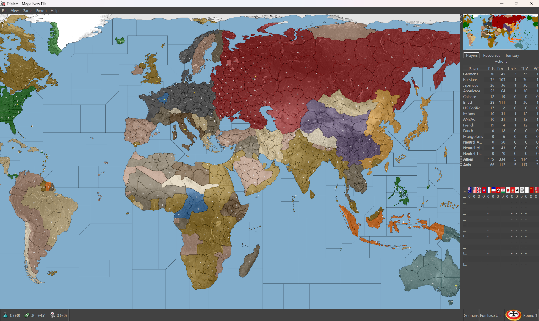
https://github.com/beelee1/mega_new_elk
That's a port of 1941 GCD gamemap, but using the UHD Global unit files/game XML etc. It's is just a skeleton of a game, there are no starting units yet, not actual scenario per se. Bill helped me throw it together, where we just grafted the latter onto the former to get a ball rolling. That one uses the 2.6 pre-release, so you'd just drop it into downloaded maps and should fire up as normal.
Here is the same, but with a quickie xml draft created using edit mode. So basically all territories with a production a floor at 1 PU, convoys blanked out, a couple capitals assigned and whatnot, just so it will launch within tripleA and look like something vaguely familiar for a G40 vibe. Again just as a jumping off point. From there you'd go in and adjust the production values of the territories or add starting units for a set up, come up with a turn order sequence or tech and stuff like that.
In that scenario, you can imagine maybe that the start date is right after the Fall of France (instead of before like regular G40). Maybe aircraft are evacuated from the Paris tile to England tile, on the first turn of the game to represent DeGaulle? Perhaps most of Vichy goes Pro Axis neutral, while Free France has their locus of power in Central Africa or a Government in Exile in London. Whatever, just a riff for a starting point and spitball idea. Might look something like this for a 1940 date, very rough draft...

In order to do something similar for the older WW1 map, it's a similar process a little bit simpler, since presumably players of that scenario would want to keep the game they play more or less unchanged, just with a beefier map. So starting with an existing game xml, same tech advances or whatever, but warping it to fit into a new larger map. In the case of 1914 NML, like using all those production values or units etc. Or one could use one of the larger maps and create a variant from there, but then that's like making a whole new game right lol. Little more involved hehe.
Anyhow not sure if that helps to clarify. It was pretty bare bones for the Domination stuff, last person to tool around there was Redrum I think? I wanted to make a WW2 customizers map that had sorta all the stuff in there, perhaps also with a playable scenario for a jumping off point, so I guess the idea would be roughly like that, just more WW1 themed?
Again not sure what all is grabbin' peeps these days or how much interest there'd be for it.