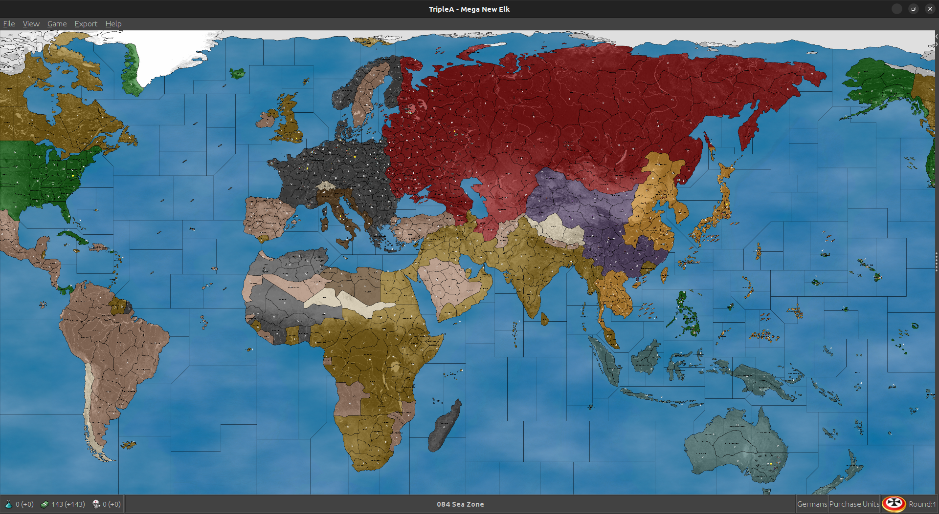
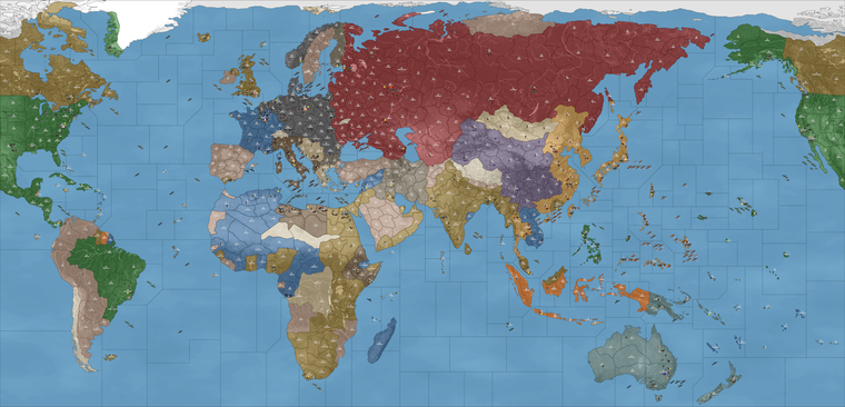
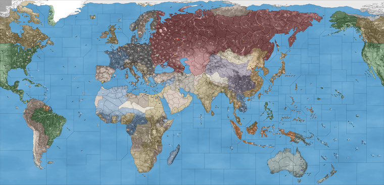
Mega New Elk WIP
-
ps. Oh cool! Using that one I was finally able to get computer Japan to go the full distance! hehe
Not bad for like only one iteration out.
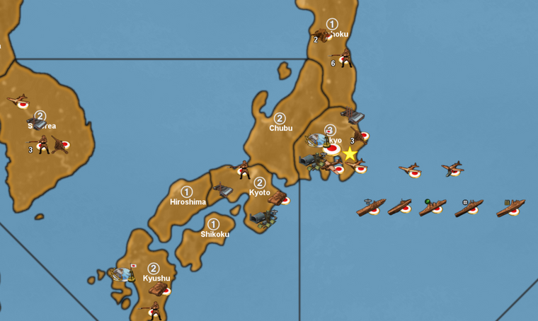
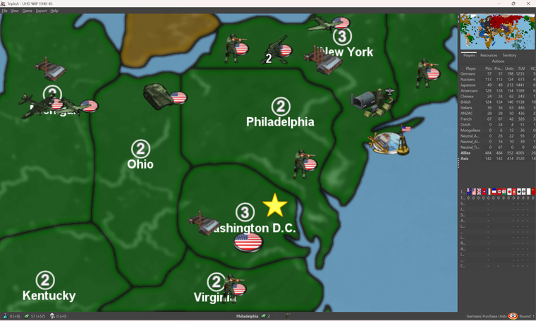
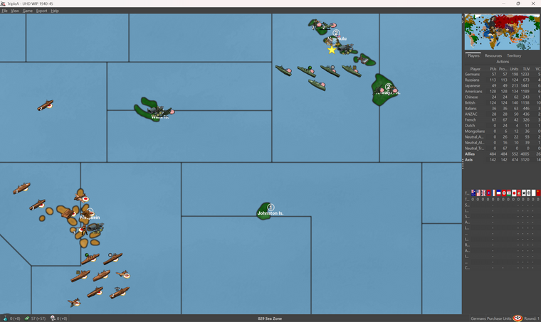
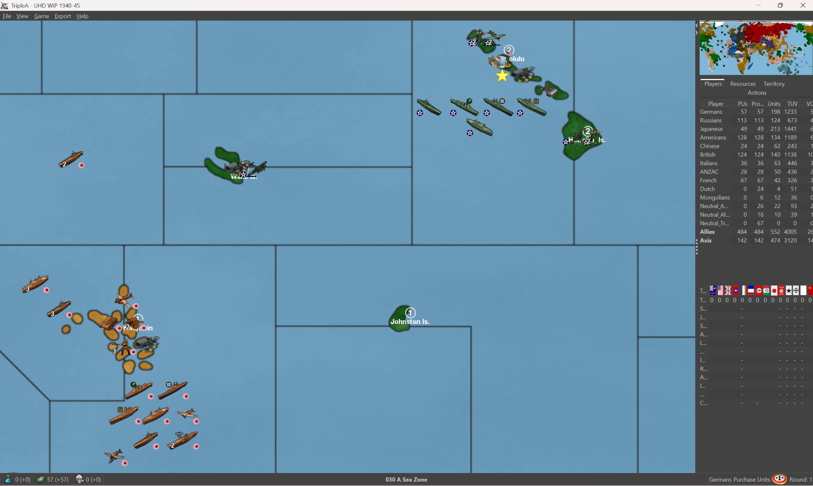
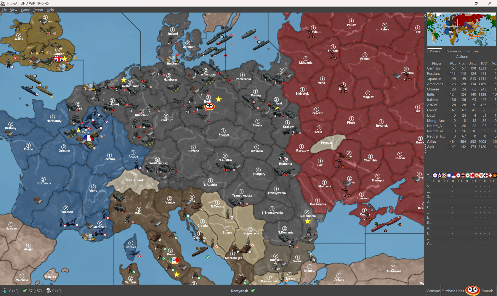
Hit on an idea to add some infrastructure to the Dutch East Indies, which I think might help Japan stabilize in the central Pacific. What tends to happen is the fleets will sort break apart and strand themselves, so I think having these extra spawn point will help them from getting overwhelmed by transport clips. Sorta works the same way for both sides eventually. I think It's pretty close at any rate. For the soviet far east I added back a pair of fighters so Japan has a bit more to hold the line vs counter. Didn't seem to add too much time to the calc as they just sorta use them forward. I removed 1 USA transport from Alaska so their push over isn't as immediate and dropped one more central closer to home. Few other minor tweaks, couple tanks to see if USA would drop into Morocco a round sooner, it tends to depend on some of the early casualties and how Paris shakes out I think. Anyhow, just sorta riffing but I think it was pretty nice hit on something that quickly. Took me like an hour last night to get them on Rabaul lol. Much steadier progress this time haha
")
Quick Edit save with those adjustments. I'll trial that one tomorrow see how it shakes out to 10 rounds.
-
Working with @beelee, but I have made your changes:
UHD WIP 1940-45 1.38.12.zipCheers...
-
Fantastic! Looks good!
I feel asleep on the couch running computer games last night lol. I did the whole like nod and yawn just straight into the full snooze.
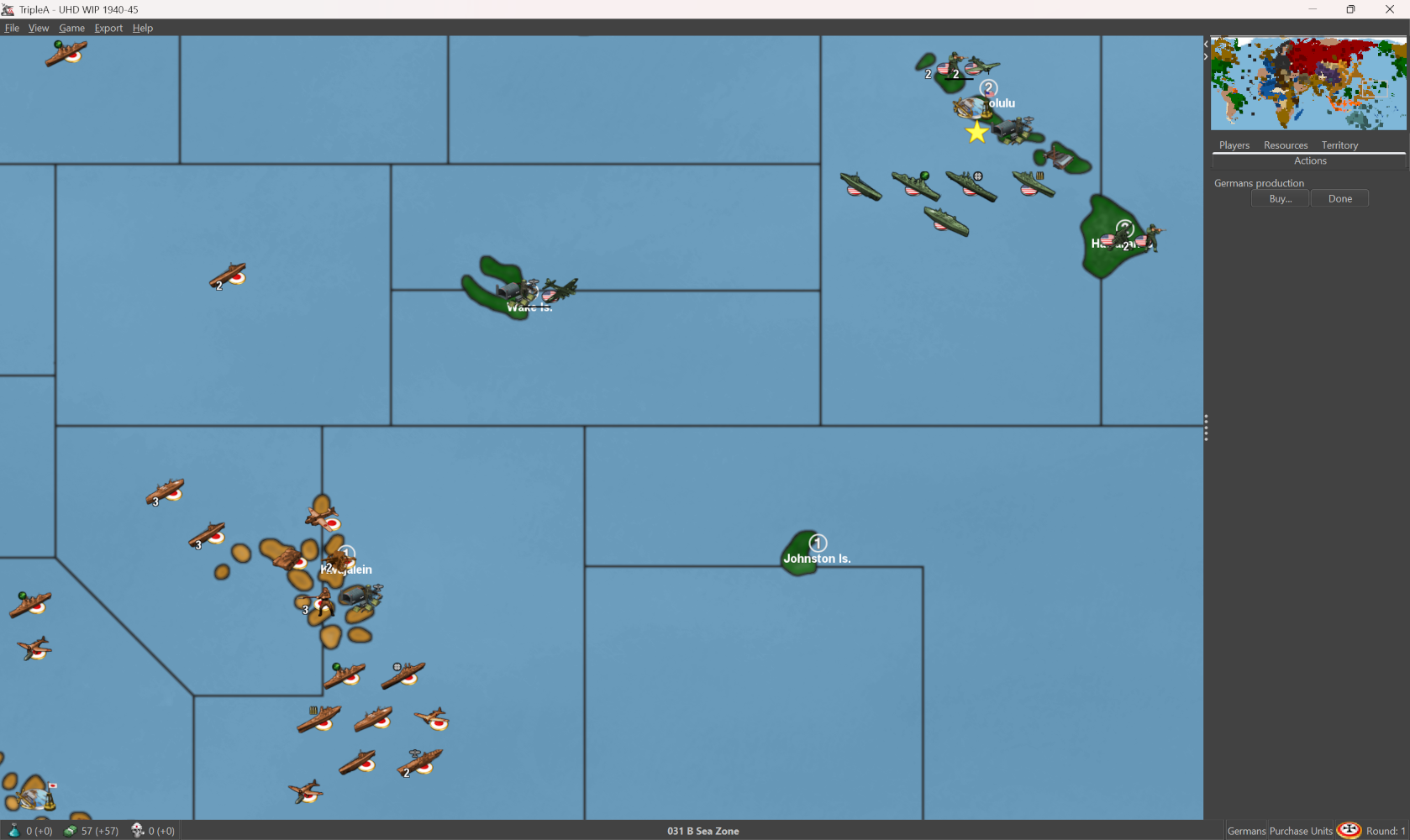
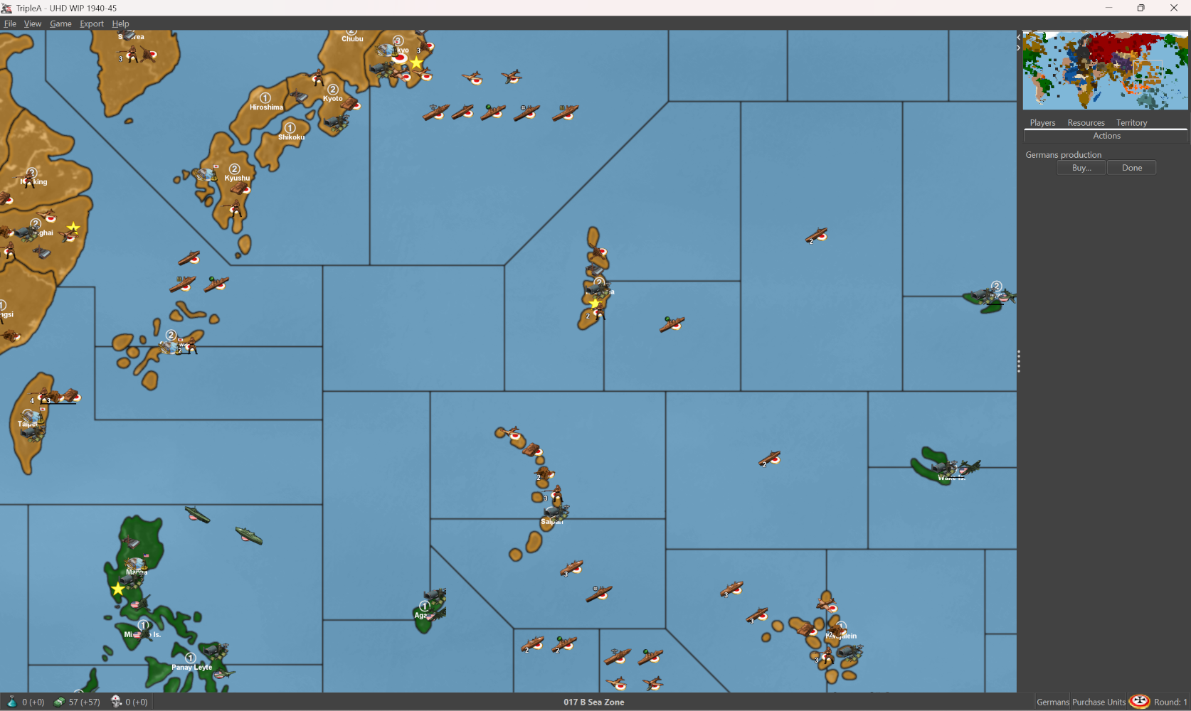
Running that last was pretty enjoyable. I feel like every iteration I learn a little bit more about what HardAI is trying to do for itself, or where it stalls out typically. Sometimes when I've tried this on more moderately scaled maps the puzzle is a bit of a black box. So I'll ask myself like ok 'is the reason HardAI does something consistently, because of the opposing TUV, distance from capital or production, something in the map design geometry, some other X factor, like a butterfly flapping it's wings air battle?' etc. hehe But since this map isn't tethered to an OOB and it's pretty easy to make adjustments on the fly, I've just been sorta running it all like a continuous experiment to see what can be achieved using very simple means.
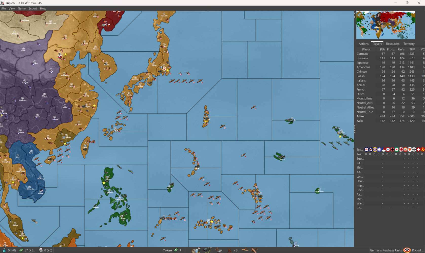
One behavior which seems fairly consistent across the board and regardless of faction, is that the computer really doesn't want to run a Naval battle and then an Amphibious assault as part of the same combat move (into the same sz). So where a human player might go for broke and do a joint naval/amphib action, the computer seems to really prefer only running the naval battle or only the amphib battle. It will wait until the lanes are cleared of ships before actually positioning it's transports more foreword vs the enemy. This means that a single enemy destroyer can deter the Computer from making an otherwise very sensible attack, say vs a starting factory territory. Or they'll clear a sea lane, then wait for a teammate to link up with them. This was a little tricky, because initially I wanted to use Destroyer blockers to limit fleet movements since it's the cheapest unit that will create a hostile sea zone, but the computer will get hung up, and often fail to run amphibs in round 1 under those conditions> It really wants a clear path for it's transports.
Similarly, I've noticed that when the computer manages to stalemate itself on the water, it can then fall into a pretty insane naval arms race, where amphib and airblitz starts to take a backseat, to like mass fleet spams. This is actually pretty interesting when it happens, since we then start to see a literal ton of naval TUV entering the fray each turn, but then what happens is the computer will move it's fleet away from coastal production and then get a bit marooned.
Sometimes having a starting factory near a main warfront, ends up complicating the logistics and working against the computer's play pattern. So this can also happen when a lot of naval TUV is staring the enemy down in a hotspot, that the computer will sorta foot drag and then get snafu'd by it's own purchase placement. To me it just indicates that I may need to give the Allies more/less naval TUV based less on the production capacity balance for reinforcement, and more on direct pressure from ships and air. So like rather than shortening the reinforcement logistics in a given spot, we may need to get an earlier breakthrough, or at least where that doesn't take dozen turns to materialize.
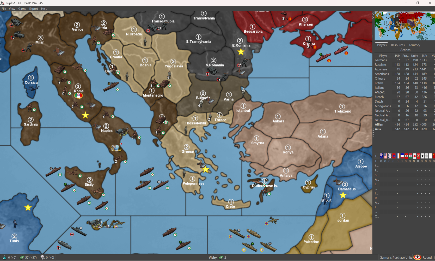
Here the balance in the Med and Baltic is particularly narrow, mainly on account of Germany now stepping into a Vichy-esque role for the Axis ships that coalesce in the Western Med. Vichy is hard to model under these very simplistic rules, because I think the basic game has that sorta angle where it wants to make Free France the deal, as opposed to France becoming a neutral Axis aligned power, which would be more accurate. I think it still works reasonably well, but I think the clapback vs North Africa needs to be a bit more immediate, just so USA doesn't get too hamstrung or where it's no longer building out the Eastern Seaboard for it's main push. I think after G1/J1, the timeline will become more extended. So maybe round 1 covers a full year, but then each year after that the actual timeline is much more flexible and based more on what players are doing, rather than an external clock keeping time per game round. I think ideally by round 5 we start to see some big maneuvers and the lines sorta 42/43 vibes where the Allies strike back.
Should be fun!
-
heh heh you actually slept. I haven't got around to it yet
-
@beelee Ok dude, check this out hehe
Just because I was like a gpu masochist last night and trying to see if I could run GIMP more intensively while the Machine beats up on itself in 10 round games.
What I wanted to do was clean up the unit graphic fields so that they will display nicely with Flag view On > Large. Mostly this meant just sorta noodling the field by like a couple pixels in either direction depending on the unit shape or its standard orientation. Goal was just to get the puck to look a bit better for that presentation. Should be pretty clean I think for players who like that look.
I started with Japan and USA just to see if I could get something cooking
It will end up looking more like this under that view... I still need to resize the USA subs, cruisers and transport etc, but gives a sense for where I was aiming. Basically for some beefier naval or ground units I just reduced the scale by a couple pixels and shifted a little till it would display to one side or the other rather than like behind the tank or battleship Should be able to see more of the flag at a glance once I dial em all up.
So just to get a little more of roundel to show behind the units at a glance. Should help I think in differentiate the units by nation if peeps need a quick survey or like to play more zoomed when multi national units are grouped together.
For the place optimal I think would be 96x62 to avoid clips, and so the overflow is ok with the slight extension of the fields. Some of the clips we see on occasion I think may just place overlaps, or where the place juts up against a tile division like from the base/relief tiles maybe. Not entirely sure, but it looks pretty good even with the current place, so that was the goal.
Probably will take a few days to do em all the factions, but then at least we'll have an easy option for that from the view tab
Should work for the UHDs as well I think, or if using the vanilla Flag roundels instead of the more elliptical ones. I'm trying to key it off the oval though since those give me a little more play in the width.
Just started in on Germany and USSR, I'll attached the unit folder zip once I get them all sorted
-
@black_elk said in Mega New Elk WIP:
Should work for the UHDs as well I think,
F yea ! I don't use the flags myself but most of the other UHD/Boxes guys do. They'd totally dig it
I wish i woulda kept the ones you did when we were first doing UHD but ...
-
@beelee I ran into a kink with the battle view menus. Using the method I was trying it's possible to extend the width of the canvas to the right pretty far so that the puck will offset. This won't show clipping if the player is attacker, but will if they are the defender, since it changes the orientation on screen it will clip. We don't really have a way to flip orientation on the fly, so I think that may be a bust. Like it looks ok on the map view, but in the battle window sorta janky.
The large flag display draws more centered and behind the unit, so it needs a bit deeper of an offset, the small flag uses the very tiny images which have the design more for the stats screen.
My initially plan was to double the canvas (only width since height will clip beyond the current, which is right at the ceiling) but the width is a little more flexible. To me if it clips at the stern that doesn't look too bad, but nobody likes a nose clip hehe. Sorta the issue with the tiny flags I think. Another possibility might something like redesign of the small flag to do something similar but those paint in front of the unit rather than behind which looks a bit off to me. Might have to backburner it for now till I can find a better solution. I tried a few different variants. Allies to me looked better this way I think for the unit orientation there.
I'll try to get it figured one of these days. BIMP doesn't work with the new GIMP 3.0 so I think I need to find a different solution, otherwise it was relatively simple to just expand all the canvases at once by some set amount say 100px or whatever. But then when units flips to defender position that will do a clip depending on the orientation of the unit, so sorta only really works right on the map view and not as well in the battle screen. Unit purchase/Notes still looks fine, it will just crop out the extra canvas, but battle menu has a different visual and that tight ceiling
ps. yeah not sure it's going to work. Probably the best I could do is provide a separate unit set that has them drawn on, but then those will also display in the battle screen, unlike if using the flags on/off option. In order to look decent the pucks sorta all have to be at the same height I think otherwise when they're on the overflow, it'll look weird with the pucks jumping up and down. Something like this I guess, but I had to those all manually which takes a while. Probably will have to table it until I get some kinda big burst of energy or can find a decent Bimp alternative to do it all as a batch thing, but even there I think it has to adjust per unit type depending on how wide the canvas can go, or where it crowds. I think it's more visually appealing if using these that they tuck up by the units but needs a pretty wide canvas to be serviceable for everything all at the same height. Anyhow I got through USA so might just bang it out at some point but for now I think the national tints will have to do.
-
ps. here's another option. I think I prefer this if going for a roundel style visualization...

Compared to the oval flag design feels a bit cleaner to me.
I'd just have to do something in that style for each faction, plus tech or optional variants. It doesn't take too long, but I think the key is to have them all on the same height line so when they line up the roundels all basically look identical in terms of their relative position on the canvas
-
some tech types and such, done up in the same way.


-
Here's a basic for USA


and then here's a basic for Japan


depending on whether you're viewing these on the the computer or the phone for the images attached on the boards, you may see what I mean about how the present in rows or columns with the roundel on the line at the same height. I think if all units had the same width like 98px it could be made to look consistent for either, but I think the height is the main one since that's the presentation for the unit overflows. I think mainly just looks best if it's at the bottom left or right, depending on which direction the units are facing.
Italians


Soviets


-
Here's some Brits


Then finally here's a quick set for the Germans with the same vibe going on...


For the current UHD which have a mixed orientation, the roundels for these would bunch up, with units are facing different directions and roundels on different. It's not too bad, but I think it may look nicer if I extend the field for all the units and then try to just get the roundel on the same side for all the units of a given faction. I think it would be a rectangle for the place at 54x98 since that's what the widest ships are at right now. That may give enough room to put the roundel on either side, even if the units are flipped to face opposite direction like the Germans/Anzac currently display.
I will put them all together in a single zip when I'm finished with all the factions and the tech alts, then if anyone wants to use those for the UHDs they can just do like a quick swap to get the more traditional roundels. Probably easier than trying to get the on/off flag thing to work.
-
ps. I haven't finished France and such yet, but here's a quick couple screens to show how it scales out. Even on the big one down to the normal mapviews 50% and out, I can still make them out reasonably well.
What I'd like to do for the units is to put a little more canvas so the unit number doesn't hit into the roundel. Or at least for the nations that have white in the roundel, since that can make it harder to make out the stack numbers say telling a if the roundel is tucked in too close. The number tends to position slightly lower and offset to the left.
It gives a pretty nice read though and isn't too distracting in the battle menu I don't think. Mainly the important thing is just to have all the roundels on the same side for the unit facing. If doing a roundel visual I would probably go all facing the same direction by team, as this will prevent the roundels from crowding when multinational stacks are on the same line, battle menu or overflow placement. If the canvas is large enough on either side though it's not too bad to do a mixed orientation. Just as long as they're not right on top each other seems to be fairly decent. I think I will do a sharpening pass like 5-10% for units upscaled to 120% since otherwise it kicks up a bit of blur, like on the purchase screen if playing at 1440p, but that should be easy to do once I have everything positioned on the canvas.
I think it looks kinda cool to have the Flag Puck oval in deep perspective for the Capital main map display, but then the more circular motif for the units on the board. Gives a nice little splash of color and makes it a bit easier to spot units at a glance. When I put them together I'll just do it for everything that I have that way it will be easy to swap for units with no flags, depending on player preference.
-
@black_elk
In map.properties
units.counter.offset.width=30
units.counter.offset.height=60These control where the stack counter numbers appear.
So no need for more canvas.
-
-
@beelee Yeah that's a P-51. I wanted to use it for their default fighter initially, just cause it's pretty badass with the style points there, but it really doesn't come online until 42/3 for the X prototypes. Similar to the Brit Spit fighter, I chose a design more in profile with the fuel tanks for the LRA types so it would be easy to spot. I use the term 'make' pretty lightly, I think that was like a Revell model. I'm partial to the stuff they had in the 80s the cool boxes like model kit bashing hehe. Similar to some of the extra tanks and such, I think sometimes the later designs are more iconic, but the 40/41 start date recommended something a little earlier. We have that graphic in the GCD, comes online sorta midgame to endgame.
I used the standard roundel for USA here, since it's more familiar from OOB. Sorta same deal for all the factions favoring the cardboard from the boxes. By 42 the red dot in the center of the Star roundel was removed in favor of a design blue and white, then with the yellow ring towards the end of the year Torch operation. Bars with the red outline were added in 43, then later in that year the red was dropped in favor of blue again for the outline, which is the one I associate most like with the Hollywood movies. The current design still in use is largely similar to that one, it just features a thin red stripe in the middle now, but that's more like postwar or pushing up into Korean era conflict. We also have a P-38 Lightning and a few others. Sometimes I used the method of doing a lighter tint color for tech advances, just to fill in the gaps.
@TheDog Oh cool! I forgot we had a way to shift the counter number for the stacks. That should help then, cause most units are more like 68-84px wide only the larger/fatter ships really need the 98px max on that.
I wonder is there a similar property we can set for the large/small flag display offset? Because unlike the puck in deep perspective the standard roundel can just paint into a corner and probably would look largely identical to me adding them into the graphic.
Flags on/off would be optimal, since that's a view tab setting and because when the units display in the battle view menu or the notes or purchase screen would display just the unit graphic in those UI windows. Also I think it has to be a universal like from top/bottom left or center for both sides, rather than alternating by side or attack/defender orientation. I think flips are similar right now, where I can set a flip in the map props, but then it just applies to everything instead of by nation/team. For me the circular roundel is just more appealing if we're going to see the motif repeated for all units, it's also easier to flip that than a national banner.
Also a problem I feel with using national banners is that when a flag displays at a unit's feet, to me that looks like it's laying on the ground, or like sinking into the ocean, about to get run over by tank tracks etc. Whereas the circular design is a bit more abstract so I think it just looks a bit cleaner if it's going to present beneath the unit, rather than above the unit, or somewhere at their knees or whatever. Plus just looks more familiar to me from like Iron Blitz for the callback hehe. Sorta always my goal, just to find something a bit more Iron Blitz-y for tripleA hehe
-
Here's the full set for Italy with all the tech stuff. I did a version of the commanders there at 54px, with like a 5-10% percent sharpening and some tweaks to the chroma. Seemed to hold up alright. Just to show how it would look and what the space would be, doing them for each faction.


-
Here's another reason why it would be advantageous to use the Flags on/off, if we could get them to orient dynamically by team/nation
Because it is possible to tell TripleA to draw the units at set dimensions, the game can transform the graphics to display within a square, even when the graphics provided have a different aspect. This will simply stretch or compress the images. This looks pretty decent generally, but not so much if the graphic includes geometric shapes, as these will compress or go oblong.
If the additional information of the roundel flag is added in after that transformation, with an offset, it will end up looking much cleaner. As opposed to a drawn on circular roundels becoming an oval, if that makes sense.
Here's a quick example of what I mean using the set from the post above...


-
ps. To experiment with the flag display, here is a quick roundel set at 20px.


Right now flag display small will work for the map display in the corner of the unit canvas, but the stats menus are also keyed for an image with that label by 12px so it may clip in the menu if doing it that way. But basically you can see what I mean. If all units were facing the same direction I suppose it would be less of an issue, but they often face each other in which case it would be nice to have the roundel alternate or flip on the fly. I'm not sure that's possible in the current, but we have graphics at least.
ps. here are the rest and some alts


pps. Here is a zip with all those flag roundels together. I moved the others to a subfolder called vertical flags. I think this is more expedient than doing the drawn on roundel thing. I will still comb over the units and check the canvases for sizing but it's just way easier I think to use these for that. It has the substitutions for size small made to the labels...
Looks like so...
Soviet Engineer

and Rachel Weisz
")


-
OK I found a batch editing solution for GIMP 3.0, I think it's comparable perhaps even better than BIMP for GIMP 2, but it's a bit of a pain to install manually right now. Similar to tripleA requires the downloading of zips and like saving stuff the right directories, as opposed to the super simple plug-in I was hoping for.
Ideally I would make a consistent edit to the entire collection of units all at once because it saves so much time on the backend, but I think for now it's probably more expedient to just deal with the more problematic units as needed. Example for units which use the 54x54px square, or the 54x60/72 px rectangle the drawn flag will sometimes clip into the leg, depends on the current canvas. So for Germany and Japan, they have a wider canvas on some units, their roundels hits a bit better for their Infantry units. For some of the others it's closer to Frostion's defaults there which are clipped to content typically right to the edge. If the units were flipped at whatever point that could be a factor as well since I often would try to arrange the unit towards an edge on the facing side, so the canvas might be longer on one side than the other. I think maybe to just go through and extend the canvas slightly for all units.
Also I think it might be worth doing a standard morph for all the ships so that the canvas is narrower. So say the current Battleship, Carrier, Cruiser etc use the full 98px, I think it would be better to warp those unit to something more like 84px and then extend the canvas back to 98px on either side. This will give some room for things like roundels or unit crowding/overflows, so the image isn't always right at the edge. Least for the width, height we can't really do much for that. Better probably to lock everything in at 54px there and just try to utilize as much of the canvas as possible for unit sizing the vehicles and such. Basically anything other than infantry can be warped slightly and the look tends to be unnoticeable, I mean as long as it's consistent.
In general for flips it's ideal if the unit image doesn't have directional information, so for example a symbol number/character which when flipped no longer conveys meaning, or essentially symbols that are asymmetrical or which look odd if displaying inverted as if in the mirror. This is why it's better I think for things like drawn on tech symbols (or drawn on flag roundels say) to use shapes that can easily invert, or morph and still look ok.
So for example USSR with the sickle/hammer motif or USA with stars in the upper left, when flipped those will give off a very backwards look. Whereas something like a star easier to flip. The alternative USSR symbol I threw together is a composite of the regular g40 chip, and a period image of the Sickle and Hammer since that design changed over time. Basically I yanked one from from the national banner. OOB doesn't use the star at the top but I kept it, since when reduced to the super tiny 20px scale it's more abstract. I don't see a real need for these beyond the 20px dimensions since the puck in deep perspective is pretty serviceable as the Capital marker and current turn. It also allows Large Flag on to give a different presentation, even if I think it's a bit rough on account of how those center inside the canvas.
Anyway, I will try to knock something out just because it effects the unit place the width of the canvas and how that's set. For now I'd just look to see where the units with the 20px roundel like clip off a leg or things of that sort, and then just extend the canvas for those units to the next up, so like if inf standard 54, then they become 68 or whatever for some room on either side. It'd be nice to get the roundels for the battleships and such not to be all right on the nose, but for that I think they'd have to warp a little.
Here's an example less extreme than putting them into squares, but sorta the same principle going on. As long as the morphs are consistent, so it produces a similar angle. Here's an example using USA and USSR battleship and transportsOr like one time when Rachel Weisz defected and met up with the USA engineer I guess hehe. Basically the side on which a tech or unit type symbol is placed would sorta key up to leave on empty spot on whatever side, depending on how the unit is facing...


-
For the canvas and flip etc stuff
Maybe for some tech variant units having brightness applied would probably the simplest. Basically the stuff covered in the pos props. Then for the canvas stuff to work with the flips, basically I was just trying to get something that would play alright with this part...
#units.transform.brightness.<player> (optional) allows the brightness (-100 to 100) to be adjusted when units.transform.color is set
#units.transform.brightness.Russians=25
#units.transform.flip.<player> flips the player's units horizontally
#units.transform.flip.Russians=true
#units.transform.ignore provides a comma delimited list of units that aren't impacted by the above units.transform properties
#takes the unit's name and applies to all images shown for that unit including damaged or tech improved images
#units.transform.ignore=factory,fighterFor the blend options available I think alpha f2 was alright for something subtly lower contrast
map.mapBlendAlpha=0.2f
That's a pretty easy one to add, like just from editing a line in the map props, but sorta the rationale behind choosing those pretty high saturation defaults for the hexes and such. I can't remember what the default is no blends, but it's basically similar to alpha f5 I think maybe?
For tripleA to do all units as a square, say 54x54 px applied to everything pretty sure there is a way to do in the props or game, but I can't remember what exactly it's called. I've done it by accident before where everything will go to the 48px default size, or I think if the graphic is way oversized it may then morph it to fit the standard square, but couldn't figure out just now when messing around lol.
Pretty sure there's a way though if one wanted to do a standard warp for all the units at once, though it's not a view setting on the fly.
Anyway I think should be enough room for the flags on/off option to show alright if I just add a sliver of canvas for some of the narrower units, like if clips too hard into the unit, but for the most part seems to work ok.
ps. Just to further clarify. If we include the Alpha channel blend this can be used to make the map more/less pastel incrementally. Example alpha 0.02f shown above that can be set 1-10 so 0.0f or 0.1f look very close to the default (highest saturation.)
0.2f or say 1.5 f or 2.5f those will pass through white making it more pastel. 3-5f is brighter etc. In the PoS2 props the first mentioned is linear light, but linear light is effectively a monitor setting now, I mean it's just reducing the brightness bascially. Alpha channel blend is more modular and more useful. I think the only other candidate worth the mention is overlay.
Overlay will essentially double the opacity while preserving the brightness. Multiply will do the same but reduce the brightness, they're largely similar. These are not really set to be modular in the way the alpha channel is though, so you can't really increase or reduce the "pastel" effect with the different integers there. The image produced is also quite different, because it's taking the relief layer and essentially layering that again on top of itself a second time. Here is the resulting image for that...
It's kinda cool, but I don't know if most would prefer that. To choose a blend, this would be an entry in the map properties txt. Like just added to the bottom. I would add the Alpha in as the default. This means user can click blends and it will show a slightly lighter version of the default. And if users wants it more low contrast they can increase the Alpha channel to crank that, basically like adding white in heavier amounts to the colors as they paint.
oh here's that one dude for Japan just so I don't forget added him to the big folder


Hello! It looks like you're interested in this conversation, but you don't have an account yet.
Getting fed up of having to scroll through the same posts each visit? When you register for an account, you'll always come back to exactly where you were before, and choose to be notified of new replies (either via email, or push notification). You'll also be able to save bookmarks and upvote posts to show your appreciation to other community members.
With your input, this post could be even better 💗
Register Login