Mega New Elk WIP
-
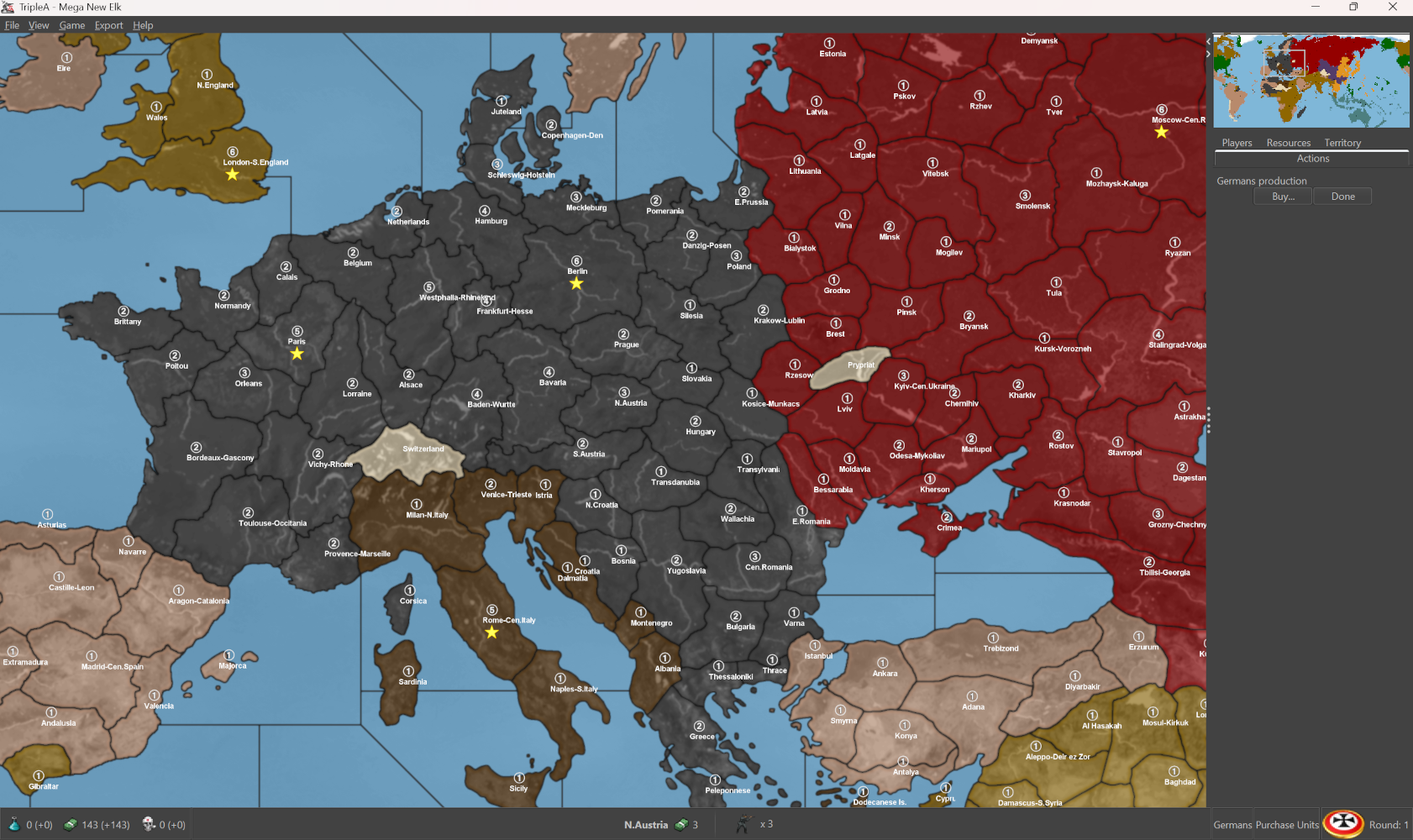
Looking cool! I would just call those marshes Pripet for simplicity, might have been a typo when flying to knock out that original key.
I wish I could offer more guidance on the labels, but I think short and sweet makes sense, since the space is at a premium. There is some awkwardness in that Hepster's initial draft (that I built from) alternated between regional labels and then metro labels. So sometimes you'd have one territory named for say a province or a state, other times for a major city or geographical feature, and it's not terribly consistent there. I also wasn't considering the actual display in GCD, since we knew there that they'd only display during the mouse over with the cursor. Then there are some instances where it seemed to make sense to use a more generic name, like North X, East X, South X, West, Central X, whatever, just to try and be more catch-all and since those were easier to simplify N.W.S.E. Cen. Though I'll admit I find that a bit lackluster at times, since it's rather less useful as an educational tool or as an aid to memory. I feel like it's just this endless can of worms though, where it's pretty hard to find a satisfactory compromise, and people will of course have opinions on it all. On the one hand there's some definite jingoism in defaulting to English conventions, but I feel like this is unavoidable if we want it feel consistent across the board, or especially if using Abbreviations for stuff. Anyhow, if something seems questionable, I would default to whatever seems most familiar to you. We can always go back and make adjustments for that stuff later on. Whatever is easy
Nice work!
-
heh heh yea I'm just kinda winging it on the names. Figure if I can undertand it, most others can.
It's a pretty low bar
")
Well gonna git and then Scandanavia. Still need N Africa but w/e it can wait lol
Gotta reup
back in a fewEdit
Updated to git https://github.com/beelee1/mega_new_elk/pull/15 -
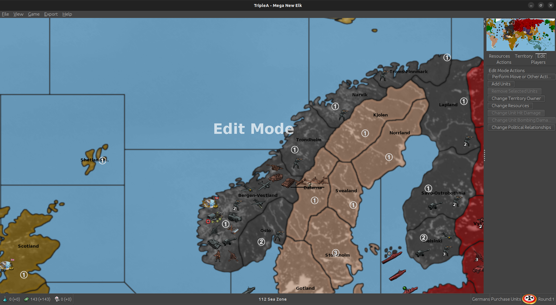
Struggled hard with Bergen-Vestland lol took an hour lol
It'd be nice to move the Names. Well, we can deal with it in the future
-
@beelee said in Mega New Elk:
It'd be nice to move the Names. Well, we can deal with it in the future
Create a new folder called "territoryNames". Select "Map Creator Tools" and set the map folder. Next select "Step 2: Map Utilities". Then select "Run The Decoration Placer" and select pu_place to start, after the PUs are loaded on the screen select "Save Current and Keep Them On The Map and Load New File" and select name_place for the next file. Make sure you select "Text File Full of Points" because the default will be "Folder Full of Images". It should load a default "TerritoryName" image. This will show you where all the territory name are being printed on the map and also where you place the PUs marker. Move the names at your leisure. Do not reload the PUs because things will start getting confusing. Save, quit then reload. If you want to do PUs, load territory names first and then load PUs.
Hope this is helpful.
Cheers...
-
@wc_sumpton said in Mega New Elk:
"Text File Full of Points" because the default
hmm ... I'm not familiar with that. Will check it out
-
When you created the pu_place "Text File Full of Points" was the default selection. You are creating the name_place the same way, just creating a text file with points. Without the png for all the names the xml/stored text name will be used at the selected location.
Take your time, since both files can be loaded, you can compare the location of both. Just remember that only the last selection can be moved on the map. That is why I advise saving and exiting before changing the locations of PUs/Territory Names.
Cheers...
-
@wc_sumpton said in Mega New Elk:
That is why I advise saving and exiting before changing the locations of PUs/Territory Names.
yea that's how I'm doing it. Struggling in Scandinavia
Thanks for the help
-
Love it!
This is surely the hardest part for me honestly. Carving up the board is entertainment, but then working up the coordinates in the place is like the stuff of mini nightmares hehe.
Hopefully gets somewhat easier the more it gets it blocked in. Upside is that I made this one more or less in the following sequence, over the course of about 10 years or so: Great War, Domination with surtur, v3 with zero pilot etc, then that same projection again for PoP 1914 with hepps, then reworked for the GCD 1941 with the dog, but the basic projection is very similar. So by making all the little tile blocks across a couple timelines for the contours it becomes easier for me to sorta ballpark where everything might go.
I mean they're all very comparable in the sweep and so stuff can sorta slot in or break apart along similar lines. Takes a small eternity to actually assign all the connections and rework the place though, like when the overall dimensions of the board change in each upscale, say from like v3 or the Dom, to something larger/taller/longer in terms of the overall pixel count, then the place has to be entirely redone each time. This latest iteration is at the very high end for a display resolution, meaning about as large as I could manage in GIMP, and based on the unit size somewhat wider 54 tall up to about twice the width of the standard 48px square at 96px for say the longer ships. I think it's a decent scale for a board that's pretty carved up with units at that size. I mean of course it's easier to add in new divisions and such once something is in place and sorta rocking along.
I still like the idea of eventually getting around to another WW1 themed map, or an interwar type map maybe. Also cold war 1950's ish, since it's not too hard to get there from something like this. Or to something that might work for other periods as well. But I mean who knows where it ends up when all is said and done. I think UFO's and such could be a winning angle too or zombies for the afterlife lol
If someone wanted to try WW1 style labeling or divisions they could key it off the PoP 1914 which was the Hepster take on the Dom project. Similar sweep for the map projection there, but different time period.
But yeah, sorta the idea just to have a framework for a similarly carved up beast, except with a more late 30s into the 40s or beyond type board. Could probably service a HBG style 1936-9 vibe as well, following a similar warp. I can see a few different options there, but in any case hopefully fairly adaptive for different purposes.
I can tap back in when we get to the point where map or graphics type tweaks are required for whatever else, or just to tool around with the scenarios and riff.
Nice work
Have a blast!
ps. Just fired it up what was on the GIT. Killer!
https://drive.google.com/file/d/1chi-BgJJhbJ54Vl3cr1HbGw2sHJlBrW1/view?usp=sharing
-
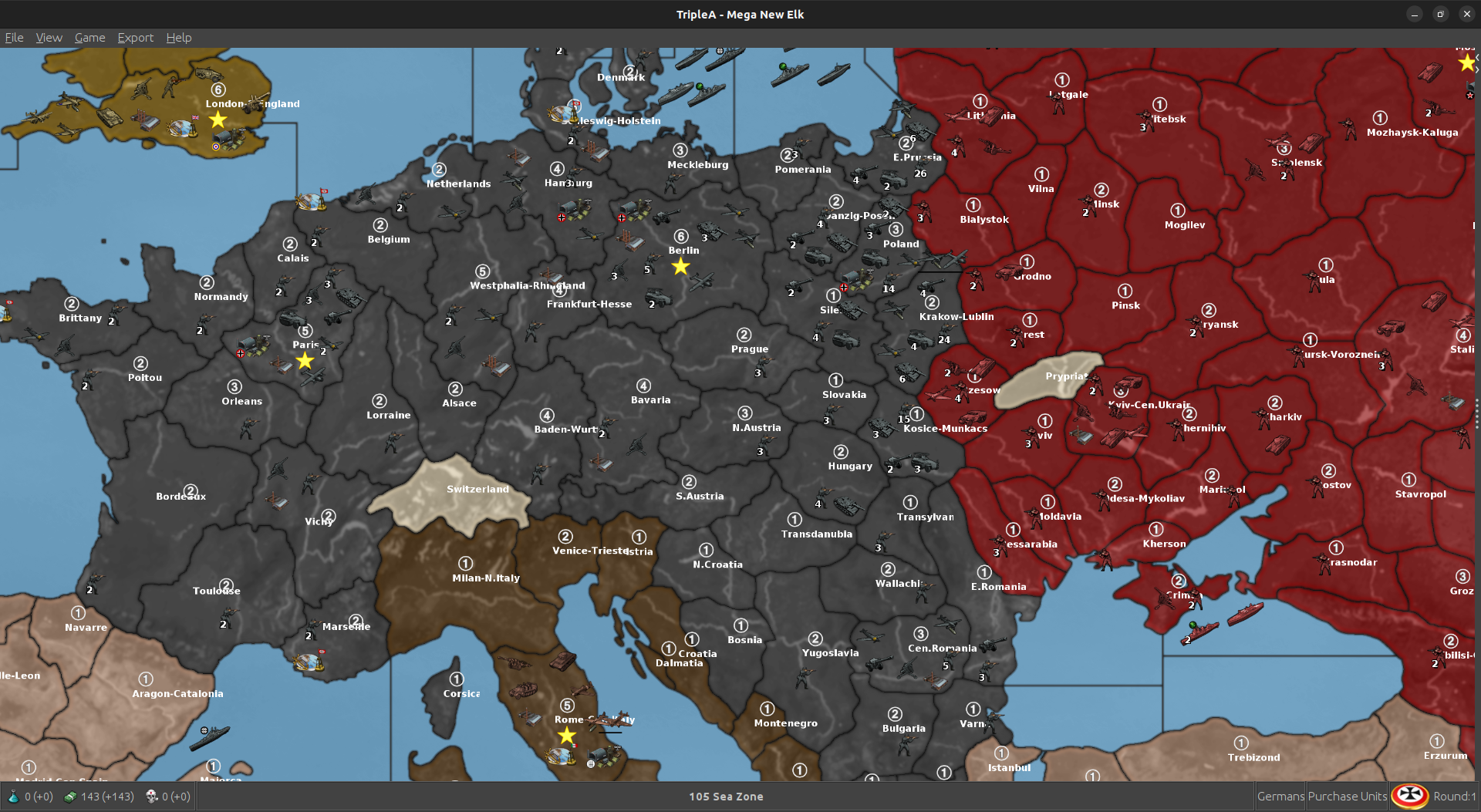
@beelee
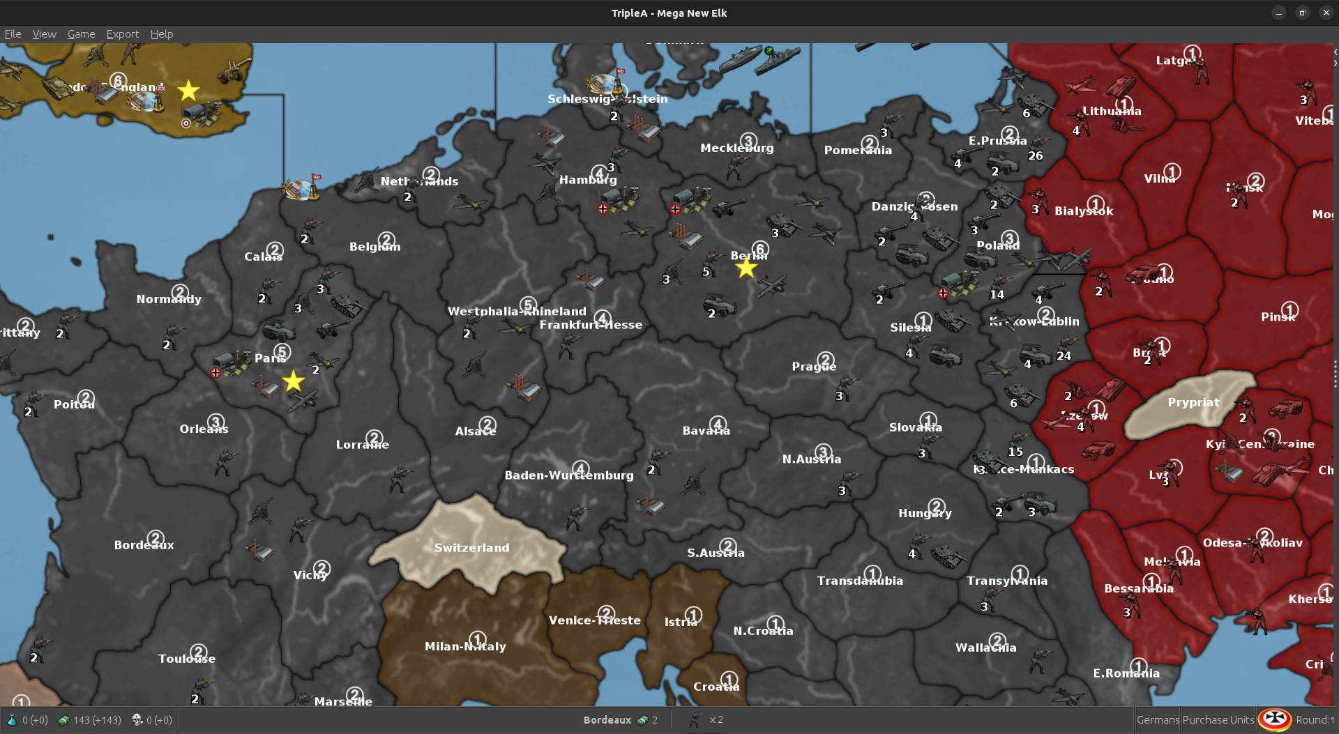
On your eastern front & GCD, it is very crowded and to speed up the AIs first turn I put all/most of the move 2+ units back one TT from the front line.Also early on in GCD development I decided not to show TT / SZ names, to reduce map clutter.
I also wanted NOT to show PU values in a TT, but Black_Elk persuaded me to show them. (Im a bit of a minimalist as both are on the status bar)

Keep up the good work!

-
yea that's a good idea on the M2 dudes. Victory did the setup mostly. And Elk a little bit. I gave the capitals some dudes when I started. I just try and make the dudes show up without running in to each other.
Your work on GCD is definitely a godsend. It's basically the blueprint
-
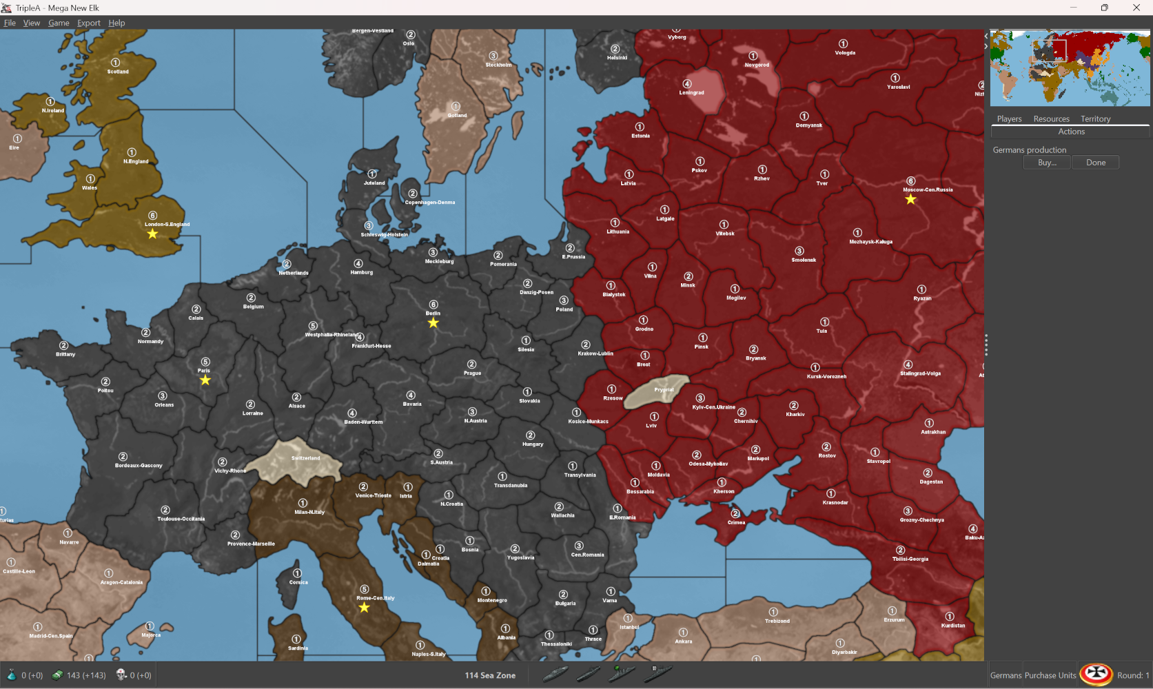
Yea the white names look better. Idk if I can make it a default. Gotta change it under "View" map font and color.
Forgot Wallachia. Never heard of it. Not real familiar with eastern euro
-
Got Wallachia dialed in. Thought they could pull a fast one on the reich. That's not how they roll though. Everybody has got to be in line lol
-
Cool digs
I think it should be something in the map.properties. Saying something like text color = 00000 (for black) where you'd want it to say color = FFFFFF (for white) not sure what to type out, or if it'd need to be added in, or maybe under some other heading.
The hex colors for the national colors are usually at the top, but I'd guess that would go somewhere near the bottom. I wouldn't know what I'm looking for though, other than the Hex colors there. For that # 00000 is 100% black, # FFFFFF is 100% white and something like font or text or territory name
-
For the amount of elbow grease it will take I might try to ballpark it by first removing the PU folder and the PU_place txt. Or you can just rename them with something like "PU_backup" or "PU_place_backup." Then launch the map to see how that presents.
This will show you where your 'Territory Name and PU' label centers are actually going by default. Currently the map Font and Color is 18 pt, and the labels are black. I would suggest changing that to white, like you did, to match the UHD.
You will notice if doing this, that the position of the Territory Name/PU label will shift position depending on the Font size chosen. The Length of the label (how many characters make up a given name) will also be a factor. Basically what it's doing is trying to center the text as best it can based on the shape or dimensions of the Polygon that the name is drawing into. I believe there is a way to lock the center though, so that the label will not jump to a totally new center when rescaled. I haven't been able to determine how to do this though. I mean in a way that still allows for the View tab Font and Color stuff to work via the players inputs there. The strongarm solution was like one size fits all, which was to set up separate PU graphics, but then those can't really be changed on the fly without an image processing application.
To me it's hella awkward from a visual design standpoint to have the Labels all moving around the board when resized in the View settings "Map Font and Color", or at least it'd be nice not to have the labels making such dramatic moves. Simply going from 18pt font to 20pt font in the View tab, that can totally change the center of a label's display coordinates to a pretty extreme degree. It may completely reposition depending on the shape of the polygon it's drawing into. Say jumping up 100 pt or more along the Y axis coordinate or whatever, in which case probably striking into a unit place that would otherwise have looked fine at a smaller Font size.
I think we'd want the label text to remain in-line with the established center, not like trying to recenter or change coordinates within the tile, based on the dimensions of the now upscaled label/font, if going from say 18pt font to 20pt font or whatever. Font at any pt, has the advantage that the player can scale this in-game via the View settings. I mean we can have defaults, but the player can tweak that with one click. People can spec it to suit their eyes, or especially for the visually impaired. If we use graphics, pngs in a folder rather than built-in font, those are locked in at whatever dimensions the PU image is set at in those folders.
If we use the built-in text it's much more modular. For example, it should be possible to use TripleA map.props settings to set an alpha.transparency for Territory Name font, so that instead of displaying at 100% white, it will show like a semi transparent number/label keying off the national Hex colors. Or displaying through those colors basically. Or similarly you could make them off-white or some kind gray, or 2 toned (Bung's Global is 2 tone White with a black border actually, though for UHD I just made the PU graphic 100% white with the circular deal going on.) Many of the things for overall color grading, say dark vs light map can also be handled that way, but for now I'd prob just be more concerned about a clean read for the info that displays by default.
GCD is using a PU graphic at dimensions 27px by 16px (they're the graphics from WOPR's update to my v3 map.) Bung's G40 uses a different set of PU graphics which are Circular/Square dimensions. I tried to replicate these for the UHD Global using graphics at 54 px which was our unit standard field. The actual image is smaller closer to 36px, but it's on a 54px field. What this all means is that the kerning for those PUs is going to look different in the PU place, than whatever was set up for the other map.
I would maybe prioritize the Label first (if intending to display them), so the territory name and PU first, along with the VCs, then the Unit place dancing around that other stuff. First units in the place I think would be the static units which never move, say Factories or Bases in the case of G40, then the units which can actually move around the board. I think that's coming from the order listed in the game files for units.
For tangents, that's just like trying to avoid a situation where two labels strike into each other, or the Territory name strikes into the PU label or graphic, or where the little dudes obstruct information (least when the map is first opened, like for the round 1 starting unit place.) Once stuff is moving around and overflow lines are involved it's a bit unavoidable, but more just to have something look nice when the player first opens the map and scans around. To me it's nice, if including stuff like labels as an aid to memory or for educational purposes, to have the kerning look nice. So more to do with the relative position of Font characters, or graphics, than the design of those graphics per se. In other words the relative position the images to each other (text in this case) is sorta more important, than the specific visual design of the images chosen. If they're spaced evenly, it's always going to make anything look better.
When tripleA auto-does it's thing, the kerning will be consistent, whereas if it's done by hand that will almost always be off by a few pixels, or could be very extreme, off by several hundred pixels. Since I'm not a graphic designer, I'd probably use the machine for it, since we know it will give consistent results there. Easier to make slight adjustments afterwards if it looks off somewhere.
-
Here this may help a lot, unzip this and drop the content into your map folder
https://drive.google.com/file/d/1vMYjz-tsM_SVWORuIBBQrzxXBj2bavzr/view?usp=sharing
What I did: so lets say you want the Text that displays on the map not to move, or to move not so much when font size is changed. Easy way to ballpark that is to take the txt file you have called "centers" then copy that file, rename it "name_place" txt.
Now when you rescale the Font in "View> Map font and Colors > Font size" instead of recentering the label at each Font size, that label will be stuck in the same spot, using the same coordinates as the center.
Now take that same file, copy again, rename to "PU_place"
Now all your Territory names and PUs will have a fixed center, same coordinates for each.
Now if you put that PU folder with images, back into the mapfolder (rename it from PU_backup to PU again or whatever) it'll show you where the UHD bung style graphics land. They'll be slightly offset, probably too close to the label to look good. But you'll have a fixed set off coordinates there relative to where the Name is going.
Now it's easier to say, move every Label or PU some set number of pixels in whatever direction from the center, by adding 50 pts along the Y axis coordinates, or 50 pts right on the X axis etc, whatever is required to get them back to looking smooth, all in one go.
What I did here, quick method, was to just raise the PU graphic on the 54px field, so it'd land slightly above the Name label, when using the same center. Probably not the most awesome solution but ballpark. Hopefully makes it easier to see what's going down
If you want the territory Names to write from the center out, instead of from left to right (using the center as the leftmost coordinate) I believe that is something can switch in the map.props. I can't remember exactly what it's called, but basically then the Name Labels will all shift slightly to the left from their current position.
Right now looks like so (with unit view off)... You can see that a couple centers, with long labels sorts strike too far to the right. It's because the Name_place is writing as if the center was the leftmost point. PU graphic shows closer to where the center is but it's a graphic. I raised the circle within the field to be like 20 pixels above where the center is so it'd display slightly above the label. But the label center itself my be better in a different location.
Now you can change the Font size from say 22 to 18 or whatever, and the label will not reorient within the polygon.
It'll use that fixed center point and scale from it instead. The centers for the name place can be moved using the map tool, sorta same way as changing where a unit might go, but then all your PU's will be in the same position relative to the label, just wherever that center is located. This is the same thing with Font size 18.
You can see that the center for a spot like Westphalia hangs way over, because it's such a long label and writing from the left, so it's bumping into a neighbor. That sort of thing I'd just maybe move the center point for those spots, then have the PU and Name_place key off whatever that new center would be.
Once those are all set in place, or with the VCs as well, idea would be to dance the unit place around the PU label, so it remains empty of Unit place. Reason is so that the player has a ready spot for their cursor to click the All-units, instead of accidentally clicking an individual unit. If each spot as a ready click zone to bring up all units, that is helpful I think. Then idea would be to ensure that unit overflow line in the place, isn't directly on top of that area, or running across a label. Idea being that if player wants to bring up all units within the Territory at a one click, they click the PU number and bang, now they got the all units within territory view instead.
-
@black_elk so I can move the names in name_place and that won't jack the font thingy ? Or do i have to move the center and then change the name_place to the same ?
-
-
@beelee Ah yeah, that's right. So I think this might be because when I was eyeballing it, I had my screen at 1600p with font in windows at 150%, but we need to get it dialed for 1080p with font at like 100%, or ideally for both. I can fire it up this weekend and noodle around. Basically should be more straightforward with the Name place having some set coordinates to riff from, before it was just sorta jumping around cause we didn't have one. Original display didn't have the labels so didn't matter there, but here it would make a difference for sure. I'll knock something out and hit you up when I get done running some errands
-
Name and Place were capitalized so now I get this
should be a little easier to work with. Looks as if the names will have to slide left as you were saying
-
@beelee Oh yeah I forgot the caps thing, that'd do it. I was using windows haha. Go figure!
For the screen rez thing, long as it looks good on your end should end up fine on mine. There can be sorta subtle changes in how a set graphic displays, like going higher rez the image may be slightly smaller, so I thought it was that, but prob just the capitalization thing