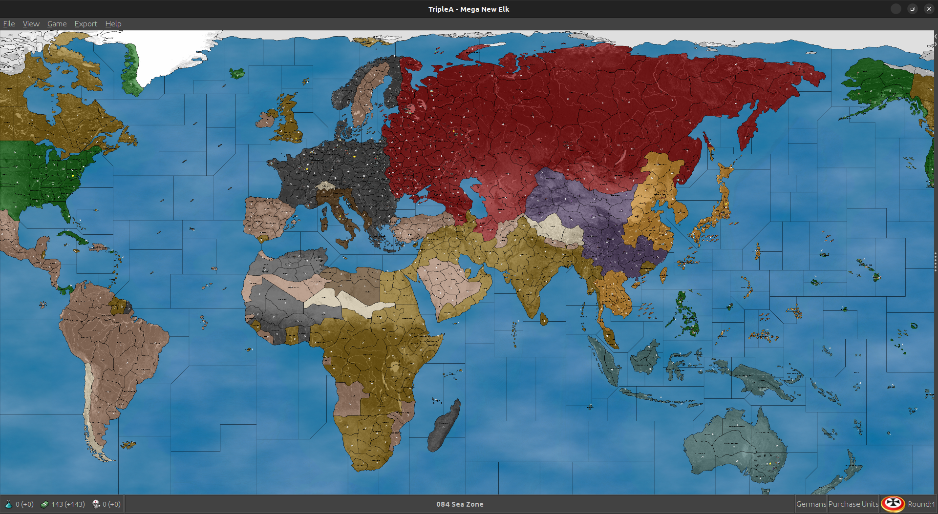
Mega New Elk WIP
-
Looks cool
")
When we get the M+1 factories stuff in place and the Territories at the lower values ala that trick WC did for the production/cash, I think we could rename the previous 41/2 themed iteration 'WIP 42' or something similar (come back to it later). We can have the 40 up as the default for now, since that's what I'll use.
For the tanks at M3 off the factory spots, works for the player currently with that last one (though the production values/cash were the highball there). Right now though in the one I fired up, the computer will still only use it's tank/mech for maneuvers at m2 distance, even if starting from the factory territory. Not sure what controls that one, but maybe we can get them going the full distance somehow with a bit of legwork. Might just be from how the blitz is pegged for tank m2 units normally. Computer doesn't seem much interested in purchasing new factories, so it might make sense to add a minor or two where we want them, or for producing/moving consistently. In any case, I can easily imagine it coming together here. I think using the Fast/HardAI behavior as the guide we try to peg an opener just using a few extra pocket forces here and there to get a nice scale up going for the playpattern.
Cool digs! Great work
-
Some observations while watching the computer open for the last couple hours.
Currently Japan won't advance into French Indo China or any of the Dutch starting territories. Not sure there what could be the deal. Curiously, when I switched these same spots to Pro-Allied neutral, then Japan did overrun French Indo China, but they still avoided the Dutch islands - even though though these are relatively productive.
Using different starting units for Japan will give different results but for the most part regardless of starting position to other places, they will almost always just attack Philippines, maybe Singapore and Hong Kong as well, seemed to be the most common. Then they advanced mostly against China/USSR. Trying to locate starting TUV targeting more central Pacific they would typically pull back towards Coastal China or Philippines, sorta just what they would do. The do seem more inclined to make attacks with a few extra tanks though, so I think that could be a decent way to set things up for them. Similar to how infantry function in classic, the computer/player would want to reposition them and make efficient use of the transports to potentially grab some high value starting TUV that way but where it is more out of position from the mainland contest, where it invariably will end up. I mean computer just sorta does what a player might in that respect. It pulls everything back to stack into China more or less, then pushes across the middle if it can.
For the neutrality stuff in other areas, I saw that if a territory was Pro-Side the computers behavior towards it will be somewhat inconsistent. For example Germany will advance into Finland and pick up those unit, but then sorta ignores Bulgaria. If Bulgaria is made Pro-Allies instead of Pro-Axis then computer Germany/Italy would attack and press into unoccupied enemy tiles. Similar Britain would not advance into say Persia when set as Pro-Allies, but if set as Pro-Axis then it would. This seems to be fairly consistent where everyone will try to kill the Pro-Neutrals of the opposing team, but won't reliably bring a neutral of their own team into the mix. Another example was Greece, where Italy would attack if Pro-Allies but Britain would not activate them as Pro-Team. If instead I made Greece Pro-Axis then Italy would say home, and Britain would attempt to invade. So basically sort the exact opposite of what one might expect from the computer behavior, compared to player. All this makes me think that some simplified handling for neutrals may be desirable.
For the basic attack pattern and purchasing behavior, this is somewhat down to the individual nation, but what I was seeing with the lower Cash map, USA will mostly continue to spam transports and fleet while wheeling around across the ocean, usually to the North in the Pacific and then more towards the South in the Atlantic. They would only pick up Mexico or Brazil, if I set those spots to Pro Axis rather than pro Allies again a bit odd, but even without the cash, USA tended to end up in Africa without too much of a delay.
The idea of a pocket force in China seemed to work reasonably well. More of a delay than anything, but least gave the Allies a few more things to think about on that front.
Russia, like all nations, tends to buy many bombers, which can feel a bit odd. I think it is just any time a nation has high cash, and somewhat limited production, they will spam the bombers. This wouldn't be so bad, but then the Computer player will tend to stack them all into a single pile. So instead of 2 groups of 6 bombers in different parts of the map, AI will group them all dozen together. After a few rounds they can be into the 20s with these which is very extreme. I think lower cash will help.
Infantry stacks likewise trend pretty large when they consolidate but the factory m+1 does seem to encourage them to move forward more as opposed to just stacking up. Hopefully more fall to attrition with the movement at +1 from factories.
I have been trying both HardAI and FastAI just to see what sorts of things it would do. Here is one of the savegames I kept using Edit, just to play around and see what the AI does. This is not like a set set up, but just what I was using to experiment. I tried to give token forces is spots which made sense to me, but to keep it somewhat smaller just to see how things scale up from different starts.
Here's a save using the xml from earlier tonight, the low production spread (didn't have the m3 when I started just ballparking). It was pretty trick to watch though!
2025-3-6-Mega-New-Elk-1940_wip.tsvg
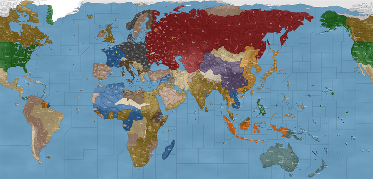
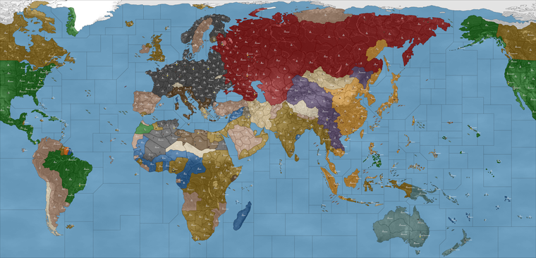
Here's a quick image of what I was up to...
https://drive.google.com/file/d/1LMJROYSMUINHyGlC2JgFFrkNyS7IcKRK/view?usp=sharing
I can tinker a bit more tomorrow
-
Ps. Here was an interesting glimpse into the computer running against itself. After 7 rounds the AI's playpattern was like this...
2025-3-6-Mega-New-Elk-1940_wip_round_7.tsvg
At the the regular M1/M2 distance Germany didn't quite have the juice to make it to Moscow, but they still managed reasonably well and even made for some naval fireworks off Jutland last round hehe.
The Africa pocket for Axis held up pretty well too. Allies ended up going after France, rather than pushing up on Italy, though just now finally made a press back into the Med.
Japan and Russia held balance pretty well. It wasn't until Japan completed the conquest of China that they started to flex up that direction. Could be that a few more artillery will do the trick there, or another couple Russian tanks.
You can see computer Japan didn't go after any of the French or Dutch territory, which was a bit sad, but despite that they still put up a pretty good show on their main warfront. I think the Italian's must have somehow rolled radar, not sure there. I'd imagine a no tech game to start just cause who knows what the computer will get up to otherwise lol.
All told though I was pleased with what I was seeing thus far. I think with the M+1 in effect it will work somewhat better, but even here I'm already liking what I'm seeing.
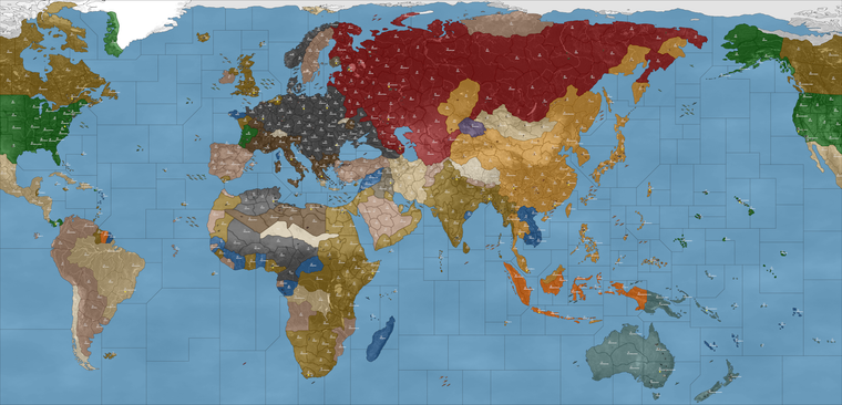
Here's a quick image from the round when China finally got dropped and Allies made their landing in Europe.
https://drive.google.com/file/d/1rS9RmzHiwUSX38ca8B34Ep-r_o8xikaO/view?usp=sharing
-
Sorry for the delay. I do not like "isSub", "isFactory", "isAA". So I redid the factories, factory_upgrade works as an upgrade.
Cheers...
-
@wc_sumpton Right on just tried it. Saw the Factory M3 working there too.
One thing I just noticed though, when Germany bombed the French Factory at Marseille, it showed a little colored square (blue/orange) rather than the graphic with the damage.
It would be cool to see the computer buying factories, I wonder which if any things may help for that. Thus far hadn't seen that happen in the other one when they were still moving M1/2, so I just added a few here and there to see what the computer would do with those. I gotta dip out to run some errands but I'll keep tabs and cruise back by in a couple hours. Catch you guys then
-
@black_elk said in Mega New Elk WIP:
One thing I just noticed though, when Germany bombed the French Factory at Marseille, it showed a little colored square (blue/orange) rather than the graphic with the damage.
There are only _hit graphics. According to what I have read, these units can be disabled but not destroyed. There are no _disabled for factories, thus the colored square.
Cheers...
P.S '40 1.35.2 Returns AAA capabilities back to structures. aaGun/submarine reworked.
Cheers...
-
@wc_sumpton Oh good to know. So basically I just need a duplicated graphic with that other label, like for when the factory is at that level of damage? If so I can just copy whatever image over again.
I recall the damaged factories graphics being by far the most annoying in the g40 folder hehe. Since they each had multiple tech variants (rockets/radar etc) that all needed their own 'hit' versions too. Same deal with the bases, although the tech variants were fewer with those, still quite a few graphics. Probably some not too inconsequential portion of the overall file size in the unit's folder is just Factory and Base images being repeated a dozen times each lol. Probably with only very minor differences in the visualization, say an air roundel or the flag buoy, but with a unique label/distinct image nonetheless. I gather that I'll just need to do a copy paste on that with '_disabled' versions along with the others in the unit subfolder. Shouldn't take too long. I'll try to get that sorted tomorrow
Good looking out!
Any ideas on why the Dutch and French Indo China spots aren't being targeted by Japan? I was wondering if that's maybe cause I edited the control of those TTs over from whatever they assigned as starting in the other scenario. Anzac and Japan I think maybe there. In any case worked on the Europe side where everyone was eager to take over the French land, but for some reason Japan declined the invitation hehe. Anyway I'm sure we can figure it out before all is said and done. So for so good! Excellent job
-
@black_elk said in Mega New Elk WIP:
Any ideas on why the Dutch and French Indo China spots aren't being targeted by Japan? I was wondering if that's maybe cause I edited the control of those TTs over from whatever they assigned as starting in the other scenario. Anzac and Japan I think maybe there. In any case worked on the Europe side where everyone was eager to take over the French land, but for some reason Japan declined the invitation hehe. Anyway I'm sure we can figure it out before all is said and done.
Both Dutch and French (French Indo China) are considered neutral to Japanese, so it will take a lot for them to attack. Could try setting them too Unfriendly Neutral to see what happens.
As to the graphics, the structures could be reset to let them be destroyed, like G40.
Cheers...
-
@wc_sumpton Sounds good, I was hoping it might be something like that, like a setting that was off. Cause the computer Japanese were definitely going out of their way to avoid attacking those spots haha
Ok so using that last map file and xml I went ahead and added in a couple of what I think would be good locations for the minor factory springboards at M+1.
Basically went around adding the minor factories in each major warfront region, along with a few starting forces repositioned, and a few token forces added in. I think it's giving a pretty good opener thus far, aside from the neutrality stuff on the Pacific side. I think this would be ok for a templet.
I started relatively small so we could continue to add where needed. Goal was to make sure everyone had enough coastal production, and a few forces to try and jumpstart the playpattern round 1 into round 2 or thereabouts. I think it will probably take a bit more to get Germany marching towards Moscow consistently after G1, but we can always keep adding until they do the right sort of stuff. Currently now it depends a bit on whether they take that easy get at Finland, sometimes they will do that, other times they sorta delay. Probably will hum a bit more once the neutrality thing is figured for the optimal levels of aggression there and with more tanks most likely.
Anyhow quick savegame from Edit Mode for a gist
-
MNE '40 version 1.35.3
New starting placement
Remove starting grant of PUs because new PUs initialize section was included.Cheers...
-
@wc_sumpton said in Mega New Elk WIP:
As to the graphics, the structures could be reset to let them be destroyed, like G40.
Hi guys just getting up to speed. A little sore today , with another half a foot on it's way
At least I get a recovery day heh hehYea in G 40 the Fctrys and Bases just get max damage but not destroyed. So should be able to use the damaged icons for them.
I'll head over to git and see what's happening in New Elk. @Black_Elk maybe we should switch to your preferred final name ?
I just used New Elk as a working name. Although it sounds kinda cool
-
Since I'm not making any graphical changes, I'm just uploading the xml's here quick. No since in downloading the whole package just for a new xml. By the way I updated the MNE with the working factory_upgrade. Requires factory_minor and will be destroyed after it creates a factory_major.
Cheers...
-
right arm. Sounds good
-
Fantastic! I love waking up this way with little stuff to look forward to hehe
Just grabbed that new zip, gave it a quick scan. Looks cool!
I'm notorious for choosing goofy names with goofier acryonyms lol, Pact of Steel becomes PoS, PoS2, Domination becomes Dom. If this one sticks I would just use whatever. MNE is kinda cool, it reminds me of memory and mnemonic devices. MNE Wip in this case I suppose, for work in progress at the end there will be my mental shorthand for now lol.
I'm really not particular on the name, I just like the idea of having a year or a date, or some period specific/era designation either as a prefix or at the end. Just so that it's easier to tell what the map is all about. I do like the idea of a more collective style ownership in the name though, since then I think that comes across a bit more friendly. Like 'come on, go ahead and mod me' hehe
Also, just so we're not making too many redundancies, I can use whatever is currently on GIT and that latest XML posted above to use edit mode and create a save game the additional starting Factories right?
We definitely need some more factories on the board at the outset and some new forces as well, since that first pass at a G40 templet did not include some of the necessary coastal production spots yet, or the big TUV drops to get the general playpattern jump started. Many factions in that first templet didn't have the Minor included since I was experimenting, but now that it's more or less working I need to get us that updated templet I've been using with some more starting stuff laid down. I saved some pictures for myself so it would be easier to remember which adjustments I need to make. I was just waiting until the various versions were more synced up since it takes me an hour or so to make all those starting unit edits from whichever xml/map to get the save saved out hehe.
Had planned to bang out those factory graphics tonight, but it's a little tedious and a bit boring, so I'm trying to drum up some enthusiasm for myself to copy/paste the graphics. I think the easiest way would be for me to just update/upload the entire unit folder zipped, as opposed to just providing the new images, cause they'd need to go in each units subdirectory for every playable nation we include.
Was a little confused about how to make 'unfriendly neutrals' since I'm not sure how to do that, or what entry needs to be changed for them to behave more like the standard attackable neutrals (from various game) or the pro-side neutrals of G40. My suggestion would be to make all the current True Neutral tiles into impassable neutrals with those rules, no entry or fly over.
All the current Pro-Side neutrals or Dutch (the actual belligerents) to be whatever is needed for the Computer AI to reliably target them. No need for politics I think in this scenario, so none of the main belligerents should treat each other as neutral for the purposes of where they can move/attack, but just treat them as part of the opposing team.
Think for France to be credible or interesting, they must have a way to place at least some units per turn, otherwise really no point even including them. I would rather include France for a 1940 game, so I think either all nations need to be able to Collect income (after the capital falls) or they need to use the China rules (after the capital) falls, something like that so that France can be viable as an independent Faction, as opposed to just a mechanism for opening battle randomization and as a way to give Germany a big pile of cash on G1. To me including France at this scale, means giving them enough to do so that's they're interesting or at least somewhat more dynamic than they are in normal G40 play.
I feel this way about Italy, China and Anzac as well, where they each need to have enough to do in order to be interesting and worthwhile playing, if going through the motions. Otherwise everything could just be handed over to Brits or USA like Classic A&A, to me if they're included they need to have some more juice to work at this scale.
Right now I think the blitz at +1 gets a little peculiar, because blitz is a technical capability of Tanks, or mech when paired with tanks. Infantry for example cannot blitz right now at the M+1 distance, since they can't blitz generally. Somehow we need to get the movement bonus to apply there, otherwise it's sorta hamstrung at that closer distance of only M2 (like standard tanks/mechs blitzing.) Then the FastAI/HardAI will push it's stacks more credibly in the opener, and in each subsequent turn from those factory rail spots. Or at least that would be the hope.
I would consider at some point here, making adjustments to a couple sea zone polygons. I think it might be wise for example to attach the Bosporus Poly, to the nearest Black Sea Zone and just warp that connect. Right now the place is very tight, and Italy will hide there trying to avoid Allied Aircraft. Similarly we might need another break sea zone for the Atlantic to put more distance between USA and coastal France.
Been holding off on this for now because I want to see what can be achieved just via starting unit placement and the M+1 from Bases and such. It is possible to insert an interrupt tile making the distance between from USA/UK to Bordeaux one move further than it would take for the Allies to reach say Morocco or French West Africa. This would be to encourage the Computer to advance vs Africa and Italy/Med initially, as opposed to just dead dropping into France constantly. Although we know that Brit/USA computer standard behavior will have them constantly trading in coastal France. I think this needs to be understood more abstractly, like contesting the sphere of influence. Sorta same deal vs any border skirmishes between say USSR and Germany early on, or between USSR and Japan in China and the Far East.
Currently China rules don't seem to have them anchored to their starting territories. Also territories after being conquered and then liberated will go to the liberator currently. This can be a little weird in China where Brits or Russians might end up controlling that territory. It does work, just might create some weird patchboarding/checkerboarding as territories change hands. I think the board will work better mechanically if USA/Britain can take over French production when liberated, but for them to do this with USSR land is a bit weird. Or similarly when a VC or Capital is liberated, I think players would expect the control to be restored there, but it always works awkwardly for France. Ends up with a situation where players don't want to conquer particular spots for fear of activating a tile for one of the more powerful factions to take over. This will need a consistent handling of some sort, though right now it's sorta not particularly dialed.
In GCD hidden capitals were used to 'encourage' the AI to push it's stacks in particular directions. I'm not sure if we can use those, while also still retaining some form of Capital capture = steal the enemy purse mechanic, though it would be nice to find some kind of hybrid, which allows for capitals to be targeted and produce a big get if captured, but also where the faction can somehow still be involved in the fight from there, just at some reduced/smaller scale. That was the idea at any rate, though I don't think the current would reflect this, as we were just sorta doing the copy/paste to get it fire up and work initially hehe.
-
@black_elk said in Mega New Elk WIP:
Also, just so we're not making too many redundancies, I can use whatever is currently on GIT and that latest XML posted above to use edit mode and create a save game the additional starting Factories right?
Continue to do as you have. Grab the latest zip/xml create your setup, then post the savegame. It takes me only a few minutes to create a new xml from that save.
Speaking of new xmls, MNE WIP '40 version 1.35.4
G40 canals added
Improved_Mech_Inf changed if tactical_bomber, mech_infantry and armour are attacking together mech_infantry may (depends on the present of artillery) receive a bonus and armour will receive a bonus.
Germany granted Improved_Mech_InfHave loads of fun!!
Cheers...
-
@wc_sumpton Wow so fast! That's incredible!
Ok I'll be playing around all night again, for sure! Killer work
-
-
Ok so using my notes from last night and the new files I quickly put this together for my next round of experimentation.
2025-3-6-Mega-New-Elk-1940.tsvg
The experiment this time around was just to see if I could get Japan to target the Dutch and French territories in the Pacific if I changed their starting control to British or Pro-Allies. This worked reasonably well. J1 is basically an attack on Philippines, so this is a bit of an anachronism. I'm really not sure it's avoidable though, and so I feel like while the start of the game is on G1 1940-ish, by the time Japan is up in the sequence the timeline is considered to have advanced to essentially a 1941 timeline.
This is a bit of a puzzle, especially for the suspension of disbelief, but I actually think it is much more flexible if we maintain a total war type start.
I imagine it something like this... in my best HBO show announcer voice hehe
"Next Week on the Pacific..."
So basically J1 = the Japan 1941 highlight teaser trailer. Japan's first turn in the first round is essentially like the preview of next week's episode, if that makes sense lol
Then for Italy's first turn, maybe you can imagine that like... "Previously, on Italy" and it shows sort of a 1939-40-ish vibe, cause Italian Somaliland/Ethiopia and such is still going on. That episode may be a bit like a Fellini flick where we're not super sure of the timeline but it's got the right vibes. Now perhaps G2 is more like "Last Season on the Eastern Front" cause even though we've already watched Japan's episode on J1 by that point, here we're sorta flashing back to 1940 again.
In this way the whole 'First season' eg round 1, is basically intercut to give a recap of the war to that point. Round 2 on the timeline becomes a bit more fixed and it takes off from there. At various points, when certain thematic things happen, players can interpret this as the montage or flashback multi-episode arc, that covers whatever is going on, whenever it happens to be going on. So for example, when D-Day invasion occurs or Invasion of Italy etc, we just sorta assume that this reflects a timeline that makes sense for what's happening on each region of the board. Doesn't need to totally sync in every particular, but as long as the overall playpattern feels familiar and recognizable as WW2, I think that should be the aim.
With that in mind I put this together. Idea was that if I could get France falling just so, and Barbarossa to kick off reasonably well in the second turn, then have Japan do a more standard J1 sprawl, that things might start falling into place.
Japan did eventually start targeting the Dutch lands (when those were assigned to Britain instead) so that helped I think. It added more starting production to UK, which I think would be better to avoid, but in a pinch least Japan made some moves. It's possible they might eventually have went after the Dutch islands if I'd made those Pro Allies (like I did for French Indo), but in any case seemed to work ok for a test run. Not sure if bases for TUV might help tempt them. Or couldn't tell really what draws them more now, but they seemed to start things off on J2 there with a bit more island hop hop.
To get the USA more on board, I just assigned Mexico/Brazil etc to USA at the start. This also is an anachronism, but the handling was much simpler. USA doesn't get distracted trying to take it over on their first turn, like when I tried assigning all that stuff pro axis. I suppose it would be familiar anyway from say v3 or Classic, and was expedient for the test so I ran em that way.
Here if anyone wanted to double check the computer behavior, you can say assign all nations to HardAI and take control of France just to give an interrupt turn there by round.
Currently the HardAI/FastAI will move at the M+1 but they tend to do this mainly on Non Combat. This also works reasonably well though, since they can still push their stacks. Thematically I suppose it might make sense, so sorta like you can put your dudes on the trains, or you can rush them into combat, but can't really do both at the same time. In this way the player could just restrict themselves to the normal distances on combat move say. Just depends what the computer will do I think, if we can get them attacking at say M3 for Armor then that's different, but even if computer is moving M3 that way only on non com they still manage to get out a bit stronger. In any even it was fun enough for me to watch and eat popcorn while I try to dig up graphics for damaged bases hehe.
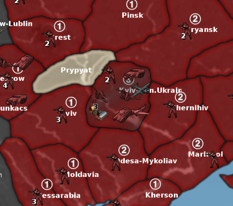
Here's a quick screen, just so you can see how I approached the starting control and what all I added. Basically I gave G about a dozen more tanks for their press to East on G2. And for Japan another pocket fleet near the Marshall Is just to see where they'd send them. Plan was to just keep going in this way, until the G1/J1/Italy pattern feels like something we can call home hehe
https://drive.google.com/file/d/1GMgxLUlM1mjjArjSvDuIA5jWvtPiVOax/view?usp=sharing
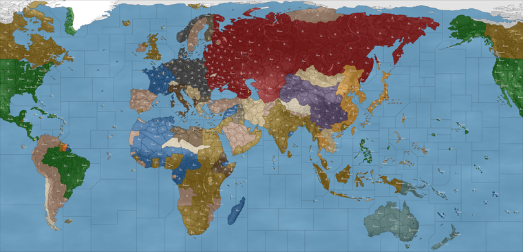
Plan was to build up from there an iterate. So you can see I added a bit more to Germany and Japan starting TUV to see where they will move now. I'll keep laying like that until we can get something that mirrors somewhat the G40 start, or familiar patterns as we go round the map in sequence.
-
idky it doesn't work for the damaged Fctry icon to show up. If I change the xml to "isFactory" it does.
But doesn't with your latest. According to POS2 what you have should be the same as "isFactory"
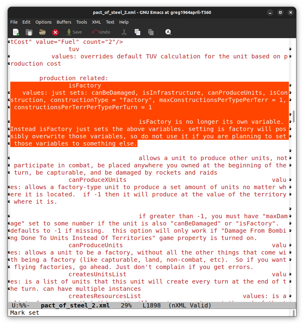
Idk if the last part about the variables screws it up or not. I don't understand those very well.
Maybe it's a bug ?
Anyway, it works with "isFactory" but not without it.
Edit
The units folders are the same, so all images present -
@beelee I'm not sure, but I suspect it was on me when I first transferred over the 48px units graphics, and replaced with the newer tinted 54px.
I'm pretty sure it might just be missing these in the Unit folders...

"factory_disabled" (v3/v5 compatible)

"factory_major_disabled"

"factory_minor_disabled"
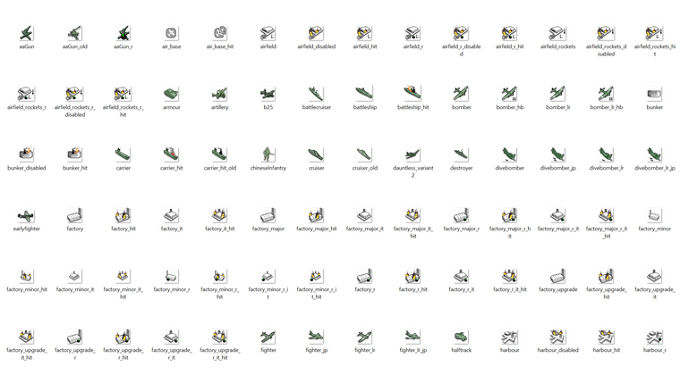
That last pair following the world_war_ii_global labelling. But then because G40 handled a lot of the tech from Bases/Factories, it needed variant labels for each of those techs, rockets, radar etc. for each nation even though the graphic would be identical to _hit it still needed the _disabled copy. In the v3 system it uses AAguns for that stuff.
Basically we had this...
and then I made this...
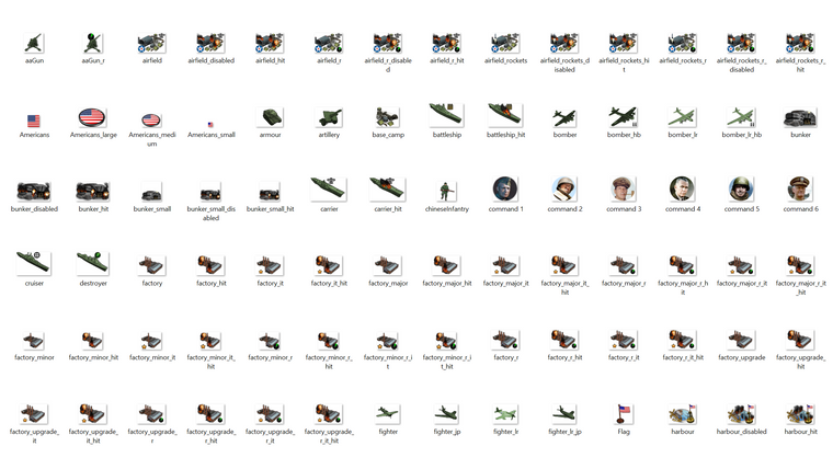
You can see how many of the images are dedicated to factory/base graphics. It's the majority of graphics for each nation's unit folder, least in the global. I think I just must have forgotten one of those many duplicates when I was copy/pasting with the labels. So many that one must have given me the slip.
Thankfully, unlike the airfields and harbours where I did national flare, the factories are just generic. I gather that when the whole isfactory whatever is going on that it sorta skips over the missing graphic and called up the other one, but if switching that maybe just needs those 3 dropped into each nation's folder?
ps. For the mad experiments, the Fast/HardAI test runs of last night went pretty well. Once I switched the neutrals to another other faction's starting control, Japan was more active in the central Pacific.
Obviously it would be preferable if Dutch/France could just be used since it's a better visual and doesn't need more Brit production assigned for the totals. Perhaps it's because of some politics artifacts there, not sure, but if we can get everyone targeting everyone properly should work well.
I think for this map to function the way I want we need to give each player nation a way to collect income after their capital falls. Then next turn (even if the main capital is not liberated yet) in order for a Solo to support the deep endgame there. In a PvP this issue would be much less pronounced since presumably the player who gets their capital sacked may just quit at that point and conceded defeat. In a solo it's ideal to play on and have the vanquished nation recalibrate. My first proposal there was to use china unit placement rules at that point, ie player just spawns infantry on remaining tiles, with those totals determined by the TT count (same way as China works currently.) The theme there would be that China's 'original' capital was sacked by Japan prior to the start date. Or similarly that each nation which has multiple VCs or factory spots, that their backup capital might be considered the secondary VC under those conditions. The basic idea being to give the player/computer a way to play on, but in a lesser state of play. So sorta limping until their team can recover their home spots.
Here's a quick screen, from a couple rounds before computer Germany took Moscow from computer Russia. I believe it was turn 4 there for the screen, controlling France and just clicking done, to keep track round per round.
You can see the Chinese were sorta roving around and managed to take FIC and fly their fighters, something that in the global they'd be sorta restricted against doing, since China has to operate within it's sphere there. Otherwise though gave a pretty nice press, when I added whatever it was, I think about a dozen armor and probabaly as many mech to G's starting units. I think the best one could hope for is that the computer just does passing fair for the first few rounds. It'll never match the player, but with a bid, ai bonus stuff, or a resource modifier type thing going on, it should be possible to create a reasonably entertaining way to play the game solo. While waiting to take turns in a PvP game perhaps, or just as a fun distraction to learn the ropes and paint the map one's own colors. Anyhow, let me know what you guys think. The secondary capital or just some way to get the players still collecting income/placing into the endgame - after the capitals start trading hands. I think some form of purse stealing dynamic remains ideal, because it's a driver and helps push the game towards resolution. But it's also nice if factions still have some way to keep playing even if it's only a couple pips per round. Some of the VC and starting TUV can be recalibrated around how the HardAI is performing. I've been defaulting to HardAI since I imagine that would be more common, and right now computer still takes it's turns pretty quickly. I've been running till like round 10 usually then restart just to see which play patterns the computer is adopting based on what it's given.
Hello! It looks like you're interested in this conversation, but you don't have an account yet.
Getting fed up of having to scroll through the same posts each visit? When you register for an account, you'll always come back to exactly where you were before, and choose to be notified of new replies (either via email, or push notification). You'll also be able to save bookmarks and upvote posts to show your appreciation to other community members.
With your input, this post could be even better 💗
Register Login