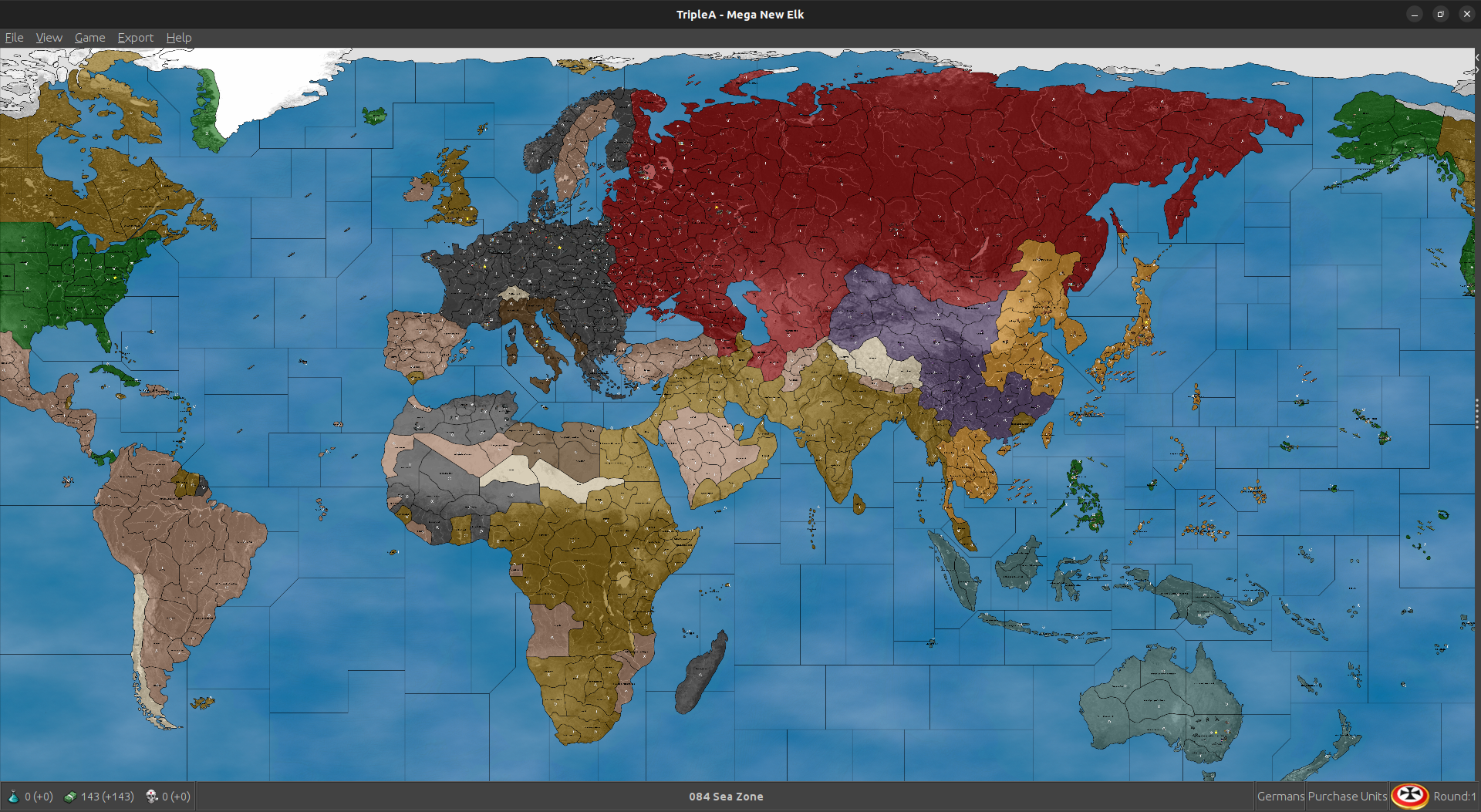
Mega New Elk WIP
-
Good morning, all.
The factories, airfields can be left in the "units" folder. This way each player will share these graphics and only one set needs to be made. This will also decrease the download size.
MNE WIP '40 version 1.35.5
New unit starting setup
Adjustments to Improved_Mech_Inf
Japanese are friendly neutral to Dutch and French(MNE WIP '40 version 1.35.5 zip removed)
Cheers...
MNE WIP '40 version 1.35.6
Dutch and French territory ownership returned.Cheers...
-
If you load this, the French still collect their income.
Cheers...
-
@wc_sumpton Worked like a charm!
")
Computer Japan was back in action now vs FIC and the Dutch! Excellent
I think this should hold up pretty well now, least gives France something to do as a player. I can try restoring the Gabon Minor to give them that Free France hub. Should be pretty clean too, giving Axis or Allies a reason to keep playing if USSR or Britain should fall, or like Italy hanging around in some form after Rome falls. I'll run a bunch more tonight and see how they play out. So far it's pretty entertaining. Computer definitely non coms at the M+1 distance on the ground, so we still get that extra bit of dynamism in the movement. I dig it -
Still working. When a player loses their capitol, all 2+ PUs territories can be scanned for major/minor factories. If now factories exist, but the player does have ownership of at least one 2+ PUs territory, then they can be given a factory_minor to place. If the do not own such a territory, then they should be able to recruit infantry like G50 China. But still working on this.
Cheers...
-
@wc_sumpton Sounds killer!
Here was a fun save from a little earlier. It had the Gabon factory added back in instead of the pocket force just to see what Computer France would build. I just set them to HardAI and let it run for 5 rounds, then checked back in with them.
2025-3-7-Mega-New-Elk-1940_France_5.tsvg
Computer Germans in that one decided to build fleet and invade Scotland!
Allies did their Torch press and Japan went after the islands again so pretty solid. Should be pretty close. I was curious if the Normandy minor would be a draw for the Allies, but here Germans just sorta used it to stack, so that one might get nixed next time. Not sure yet, it played a bit different depending on what G did with their ships vs the last out. Japan was maneuvering to take the Dutch islands now so that felt pretty solid for 5 rounds with no hand on wheel lol.
I wonder if the friendly/unfriendly neutral thing could be what's keeping Allies from taking Brazil, Persia and those other spots which are Pro Allies? France did move on Belgian Congo, so works for them. I imagine they'd get greedy and start using their transports to take Brazil in this one. Though that hasn't happened yet hehe
-
Interesting, look at Italians turn 2, specifically the non-combat movement and territories Bulgaria and Varna. Italy takes both territories. So yes, the AI can conquer (neutral allied aligned) territories during non-combat. It just has to be pushed that way. These neutral territories are considered allied/friendly. The AI needs a push to get there. If there are no capitals, no enemy units, etc.. then the AI 'sees' no reason to 'attack/trespass' over allied/friendly territories. A VC in Central America another in the middle of Brazil may help!
Cheers...
-
Sounds good. Probably just cause Finland/Bulgaria is more on the natural path, like where the computer wants to advance on non com already anyway.
I think this is a situation where need to just assign Mexico/Central America/Brazil to USA for simplicity. That follows the Global visualization, so probably better for that anyway. Brazil has a different treatment in G40, but this is still pretty similar to every other global scale A&A board if just going to USA starting control (understood more as sphere of influence I suppose). Not a strict timeline there of when say Mexico or Brazil joined team Allies. Having them neutral and needing USA to move down there to make it happen, might be overly involved for what it is. Once Axis is in a position to threaten, they'd probably target South America either way, but that's less likely.
Otherwise I think it felt pretty nice. I watched the fireworks for a few more rounds, then started to tinker with Japan. I think they just need to have a little flashy Pearl Attack on J1, to match everything else that's happening on J1 (invasion of Philippines, Japan advancing into FIC and vs Brits/Dutch and such), so if all that is going down it's basically 41 on that side of the board for the opener. Taken together the first round is 40-41 ish, but to me it's more important that the play pattern be suggestive of WW2 generally, like round to round, rather than just having it be a one off for the starter. I think whatever light naval exchange is needed to set the tone on the Pacific side at Pearl will be fine. I'm working it up now to be not too involved.
France was working pretty well I thought. Their income was relatively high from the far flung territories they still control, but their placement is very low, so the impact is minor. I think they should function pretty well at this scale, some entertainment value there if the Player wanted to play as France just for kicks.
I'll give it another pass tomorrow and see what feels fun, but big strides! This has been a riot hehe
-
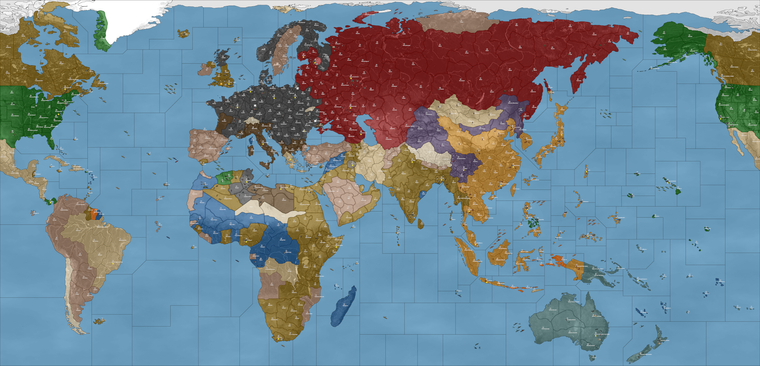
@black_elk Where is the mod available for download? I want to verify the territory names.
-
On the GIT beelee put one up here so I could grab it more easily.
https://github.com/beelee1/mega_new_elkThen was using that last xml that wc provided with it
-
@black_elk You have many territories with redundant names like "Philadelphia-Pennsylvania". These should be changed to the name of the region alone. I could supply a list if you like.
Some other problems are:
- Juteland should be Jutland
- The geography of the Carpathian basin is distorted.I would suggest
Cen.Romania -> S.Romania
Wallachia -> S.Transylvania
Transylvania -> N.Transylvania - Southern Africa has wrong names. The Cape of Good Hope is inside the city of Capetown.
Cape of Good Hope -> Cape Colony
Natal -> Transvaal
Praetoria -> Rhodesia - Northwester Iran
Lorestan -> Hamadan
Kurdistan -> Tabriz - Korea and Chosen are the same thing.
N.Korea-Chosen -> N.Korea
S.Korea-Chosen -> S. Korea - Corregidor is on Luzon
Corregidor-Mindoro Is. -> Mindoro Is. - Tokyo
The city of Tokyo is not showing up in the Tokyo territory
-
@Black_Elk, @beelee
And with thanks to @RogerCooperMNE WIP version 1.35.1 and '40 version 1.35.7
centers, place, name_place, pu_place and polygons have been updated with @RogerCooper naming and hopefully Tokyo has been repositioned.Cheers...
-
@rogercooper Thanks Roger! Good eye and good suggestions
You can probably tell that in the process of porting the Domination map to PoP 1914, Hepps made several tweaks, sometimes adding in a larger tile for some Metro area by telescoping it, other times bending some contours to say add an impassible geographical feature, or some way to split the tiles into choke points. Sometimes here you will have a redundant label, and in most cases this was me trying to get a name onto an existing tile, with two options sometimes to choose from, so as not to completely rework the projection from that point. Although I did ultimately end up having to make many adjustments along the way, removing certain terrain features like mountains for example.
In general I would say that naming by Province/Region/State etc is more reliable than labelling by Metro, since States are larger than cities, so for for example the whole State of Pennsylvania makes sense for that contour shape provided, whereas some other spot might be more suited for the metro. Or if it appears that two regions were joined together into a single tile, sometimes I'd put two states. Often times I would just add a city name, with the idea that it might be somewhere as a decorative label, though not necessarily the name of a given tile in-game. Sometimes as in the case of Chosen, if there was a double name option this may have been a solution for trying to deal with multiple time periods or Japanese renaming.
My first iteration was trying to cover an early colonial period like 1600s all the way to something in the 1950s, and that is essentially an impossibility in terms of consistent labels hehe. I believe I had something like Hanguk-S. Chosen but then that got changed to just S. Korea or whatever somewhere along the way. Issues like that, as the map morphed from a sort of colonial era thing to a more modern era thing. Or similarly like where the need to have the Dutch in South Africa for some sort of Boer conflict became less relevant to the map. Pretty sure I had originally put E. Cape Colony, as opposed to Cape of Good Hope, which made somewhat more sense for the larger zone at that time. All issues arising from trying to use different periods basically, and tiles that became a little larger with some distortions, or where we figuratively 'moved mountains' to get back to something that seemed sensible. Some solutions were less than ideal, though I think most problems can be solved with the whole 'what's in a name' approach, where we just choose a label based on the tile that currently exists, rather than reshaping the contours to match labels which may have been arbitrary or inaccurate.
I think in general I'd prefer to find labelling solutions rather than map redrawing solutions, as the later takes significantly longer and requires me to make adjustments to the relief which requires a fair bit of energy once a spot is in place for the base.
I think the Tokyo center was moved by accident when trying to move some of the PU displays the other week, and probably in a few spots where a label or PU seemed to have drifted a few pixels. Hopefully at any rate, fingers crossed.
-
Do you have an opinion on Kosice-Munkacs ?
These are the names from GCD but the Dog doesn't have them place as the default. Elk said they go "city-state" in their naming, so I have been deferring to the "state" (wow that sounds bad lol) for names I don't recognize.
Anyway, I'm shortening the names as I move the PU place and adjust place so they're not on top of names.
I'm gonna update both New Elk and 1940 until I get through eastern Euro. Then just do 40.
39 can be updated when a final name thingy is done.Updating multiple xmls at the same time is not ideal imo but that's how we're gonna roll for now.
I will post a update to git after I do any signifigant changes. I will try to do them after wc has gone to bed, so we don't need to redo our work too much.
There is probably a better way to do it, but every name change requires a xml change and every xml change then makes the previous xml obsolete.
As this is a wip, some names will be changed in the future. I'm working on shortening names if needed and adjusting placement for where the PU total and name show up.
Just a heads up on the process.
Edit
I'm going with Kocice for now. It's a little shorter and Munkass seems like a stupid name to me. I'm sure the locals would argue otherwise.Anyway it's next on the map so Kocice for now. Any big name change charachter wise will mess up place so ... just something to keep in mind.
Most of Euro done, rest of map isn't.
Edit 2
I changed my mind and am going with munkass -
@beelee said in Mega New Elk WIP:
I will try to do them after wc has gone to bed
It's the weekend! Wife said I can stay up all night! (Not...)
Bedtime is in about an hour. Party on!
on!Cheers...zzzz
-
heh heh just finished lunch
-
Yea, Idk the best way to do this, but name changes derail everything. Ideally, the names would all be done and then finish everything up, but that's not the case.
Well, I'm just gonna continue on and sadly we'll lose some work. I think a list of proposed names such as Roger did is fine but when they hardwire into the xml, none of the other stuff will work .
So, I'd hold off on any future name changes for now.
-
@beelee said in Mega New Elk WIP:
I think a list of proposed names such as Roger did is fine but when they hardwire into the xml, none of the other stuff will work .
I really did not understand this. Name changes seem to be an ongoing process. Any help should be welcome. Myself, because l mainly work on the XML, rarely view the whole process. So, this has been very educational for me!
Cheers...
-
yea, so when names change, as you know, you have to update the xml, name_place, polygons, centers, pu_place and place or the game won't fire.
So, when I do any work, the game won't fire unless it's all the same. If we don't change names, the xml will still fire and game starts.
Idk the best way to do this, as I've said before
but I take your latest xml and work off it and then update what I did.Obviously there is a better way but ...
-
I think it's best just to make a branch or fork or w/e it's called at the git repo, do your changes, then make a PR and merge it and then delete branch anytime you do an update.
So it would be a branch. Anyway, I think when the PR get's merged, it'll just add the new stuff from that branch, so if other stuff had already changed, it won't affect it.
I am not entirely sure about that though. I guess we can test as we learn together
I will post how i do it on the next one
-
hehe I think this last bit encapsulates very well some of the dilemmas we've faced along the way at various points/hand offs of the baton. Sometimes the readiest solution was something like 'Well this is working, lets go' and I think because labelling is particularly laborious and somewhat intractable, perhaps not the most thrilling aspect of scenario design, so I think the idea was to use what was sorta in place. Any snafus surely on me, just from banging out that initial key and not exactly double checking it for all the particulars. I have difficulty viewing the scenario from the perspective of the xml and the many txt files, coordinates and code. Though I do appreciate that in xml can hopefully be elegant and clean, in the same way that like a graphic design problem might have different solutions. For me tripleA is like inherently collaborative, in part from my attention deficit, and to just get it done, but also cause everyone brings their strengths and helping hands. Work flows tend to be the toughest, since most game development is done with that dance between the team and the individual, tripleA leans hard on the individual. For me the typography and text stuff is a real weakness. Like I'm incredibly error prone and often redundant - like where my Y axis invert brain is sorta everywhere, prob showing itself for all to see with labels hehe. I say go with whatever is easiest for the flow.
Hopefully though it's easier once that step is sorta locked down and everyone reasonably happy that it's sensible or at least not glaringly in error (again prob on me for that in early steps). I think what happens is that, as the map design visualization goes from more abstract to somewhat more realistic in the contours little thing anomalous things jump out more. In that sense I consider it a minor triumph that the map is recognizable enough that people can even recognize when stuff is off or I goofed something. Taking minor wins where I can haha
Hello! It looks like you're interested in this conversation, but you don't have an account yet.
Getting fed up of having to scroll through the same posts each visit? When you register for an account, you'll always come back to exactly where you were before, and choose to be notified of new replies (either via email, or push notification). You'll also be able to save bookmarks and upvote posts to show your appreciation to other community members.
With your input, this post could be even better 💗
Register Login