WWII Revised - Facelift
-
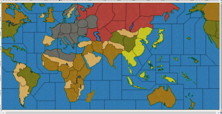
Here's how the map skin is coming along.
New
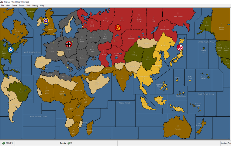
OriginalUnless, some one has some constructive suggestions, this will be the final version once territory names, PU values, sea zone names, vc, capital markers are all positioned.
And maybe I can redo some of the auto placements, since some are really bad.
-
@general_zod Out of curiosity: What is your reason for turning away from the more decent color scheme?
-
@panther Those color schemes are nearly exactly same as units. The units don't have very much contrast if placed on indentical colors.
However, the original color scheme will be available with map details off.
-
@panther It's not a big deal as, involving no game's changes, they all can be made into alternative skins (a really neat and much under-utilized feature, I best most people don't even know about).
A good idea, when a new original skin is made, is to keep the old one available in download list as a mapskin, and opening a poll about if the old one is preferred.
Maybe the poll should be made before changing the original skin, but I'm guessing it's hard to get enough people to give their opinion, if you don't throw the new version at their faces first.
Not being a Revised player, I'd abstain on this one. -
@cernel I'm not sure, but I think it's possible to place all map skins in one game folder. But the zip will be much larger since it will have double the files.
Since xml is same, unless I tweak game notes for noobs.
I ve done multiple map skins in one folder in past. But they were all the same base image files.
-
@cernel Indeed, good point. I would very much welcome keeping the old (=today's) skin aside (not a habit, but my eyes prefer more decent colors). More then ever in case the new look should become a prototype for all the other wwII-maps.
-
@panther No worries, for colors. The original color scheme will be available too.
-
Colour scheme being what it is.... and I understand your reasoning.
I like the fact that you made many land features far more recognizable and realistic. One question. Why are so many of the territory dividing lines now so geometric? It feels much more blocky now. The old version the lines were more organic. It made them feel more natural.
-
Yeah I used more straight borders than my previous attempts (^^). They just looked like something was badly skewed in that area. So I tried to fix that skew and during the process it seemed that the adding curves here and there was causing it.
So figured. I'd give something more basic a try. That also was supported by the reasoning to just go for maximum placement space in that, most active area of the map.
The territories that looked strange no matter what I did were, Germany, Belorussia and West Russia. And actually those still pop out, hehe. To make those look nicer (more curves) in proportion to rest of the map, seemed to leave those territories on the small side. Because my continent proportions are more in line with real world than the original map, space is at a premium in that area.
Since the graphics process is extremely tedious, I really don't wanna reshape continents or enlarge the map on this project. But I am open to changing those inside borders if you have a drawing.
0_1522350905168_World.War.II.Revised_new.base.image_3773x1830_v.1.0.0.0.13.0.0.7.zip
On the colors, I do use the original colors so I can have the map with 2 color schemes. Traditional scheme with map details=off and vivid scheme with map details=on.
Aesthetically, it seems to give a nice friendly board game feel as is. It seems to say... hey, try me, "I'm easy and put out on the first date. Haha
")
-
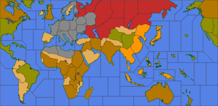
Here's what it will look like with map details = off.
I suppose I can tweak japans color to be more yellow for traditional. The filters really changed the shade.
-
@general_zod I think the biggest difference is actually the color of the sea zones. As its much brighter in the new screenshots.
-
@redrum Over the years, I've noticed how greatly the brightness perception varies between users. Some would want TripleA maps being much brighter, and others have their eyes stressed by the brightness. I'm thinking older persons might see things darker (only some of them). I can't see how that is so much of a deal, as they could just adjust the general settings of their monitors or so, but maybe a per map setting to increase / decrease the brightness and the contrast (I would just increase / decrease both by the same amount, as that is about the best) might be good, tho personally I don't feel any popular TripleA maps being either too bright or too dark.
@General_Zod TripleA actually has a few raw "blends", some of them having the ability to darken all but the units images, by a set (in map.properties) amount. You can try it in "270BC Cernel Variant", via View/Show Map Blends (that one is really darkening a lot, to create a night-time effect, but you can set it more moderate).
Using the relief to brighten the map is definitely not what the relief are intended for (not saying it is wrong, just peculiar), tho I've actually made the opposite in Conquest of the World (but that was nothing serious). -
Ah.. A map (270bc cernel variant) where blend actually isn't broken. Every time in past (on various maps), blends just does something erratic or anomalous looking.
Also I've read somewhere in help doc or elsewhere that we don't use blends anymore. Is there a list/help for settings on the following or map.properties settings in general.
map.hasRelief=true
map.mapBlends=false
map.mapBlendMode=LINEAR_LIGHT
map.mapBlendAlpha=0.5f@redrum I can adjust the seas to a darker shade. My main thing is unit contrast. I'm trying to make map playable from zoomed in or out perspectives. The other alternative is to modify units, but that's sounds even more tedious. If some one wants to pitch in on that, would be great.
-
@Cernel Hmm... I may have to hijack the PU markers from 270bc. They might look nice on this map. I also like how they are located in fringe areas of the territories. Where units are less likely to be, thus not covering them.
-
@general_zod said in WWII Revised - Facelift:
Also I've read somewhere in help doc or elsewhere that we don't use blends anymore.
What? I hope you are wrong. That would be a bad decision. Was it at least discussed in forum?
-
@general_zod said in WWII Revised - Facelift:
@cernel
Is there a list/help for settings on the following or map.properties settings in general.There are some info in Napoleonic Empires map.properties.
For a peculiar example, you can see that in Conquest of the World the blends remove the coloured ownership display, as per traditional Risk. You can set it partially, in any case. There are a few different tipologies of blends; kind of long to explain, as some are a mix of different blending on different levels.
-
@general_zod said in WWII Revised - Facelift:
The other alternative is to modify units, but that's sounds even more tedious. If some one wants to pitch in on that, would be great.
There are programs to mass-apply same changes to a bunch of images. However, WWII Revised uses the units of the TripleA assets, and I would keep the practice, for all basic maps.
-
@cernel I will look around for that particular thing I read regarding blends not used anymore. I think it was one of the official map creating docs.
Anyways it is still supported so it's really a moot point.
It works on this map but makes it much darker. I could compensate with color manipulation if needed.
However since I haven't tried tweaking them yet (beyond this one setting). Do you recall what settings of blend will make it brighter, not darker?If you have the time maybe post those tipologies you mentioned.
Either way this is a cool tool for map making. Only thing is to get players to use it (game notes) on the maps, that utilize it correctly. Cause like I said ^^ many maps don't look correct when using blends.
-
Almost forgot. What's the program you mentioned for mass producing image changes?
-
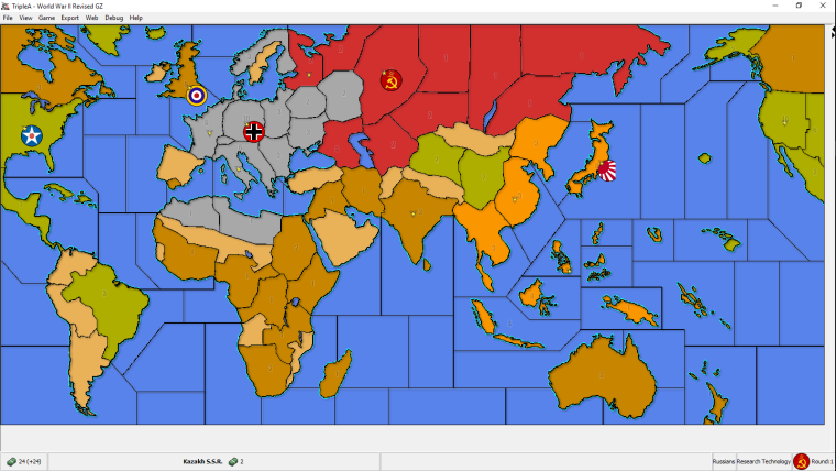
I picked this project up again. I changed the colors as suggested for Germany, Japan and oceans (and filtered rest). I also added some texture. Thanks to @Hepps for textures. I made them subtle so zoom in to see them in this image.
I didn't address the geometry because I have a few layers composing the relief image and I don't really want to redraw all of them. Plus this one isn't too shabby anyways.
If @Hepps is ok with it, I would love to use his TWW units here as well
. But most likely without the roundels. Also I will update the game notes to be very noob friendly, since this map likely draws many TripleA first timers which may be looking for Axis & Allies emulations.If any one has more suggestions, post them soon or forever hold your peace
") .
.My newest version.
Btw, I don't intend this to replace the original map just nicer map skin really. Unless the units do get replaced then it is more than a map skin alternative.
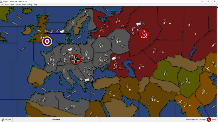
My previous version for comparison.
Original ww2 Revise map skin for comparison.
Hello! It looks like you're interested in this conversation, but you don't have an account yet.
Getting fed up of having to scroll through the same posts each visit? When you register for an account, you'll always come back to exactly where you were before, and choose to be notified of new replies (either via email, or push notification). You'll also be able to save bookmarks and upvote posts to show your appreciation to other community members.
With your input, this post could be even better 💗
Register Login