My map editor for TripleA
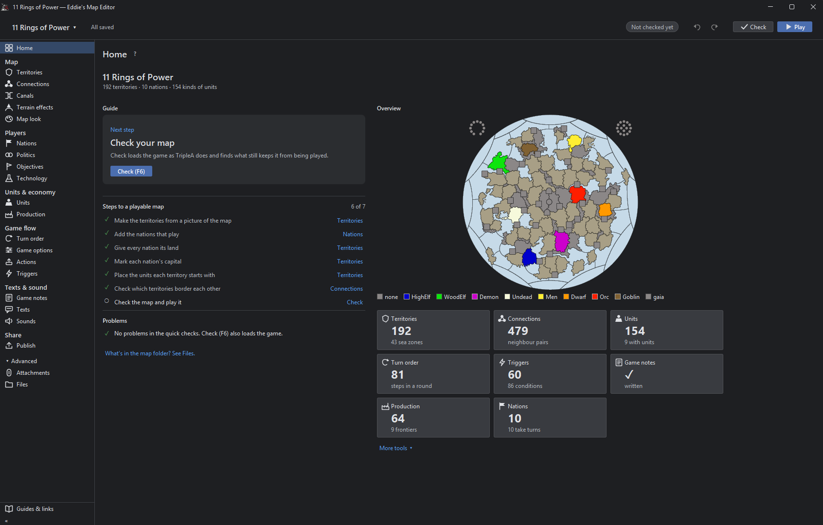
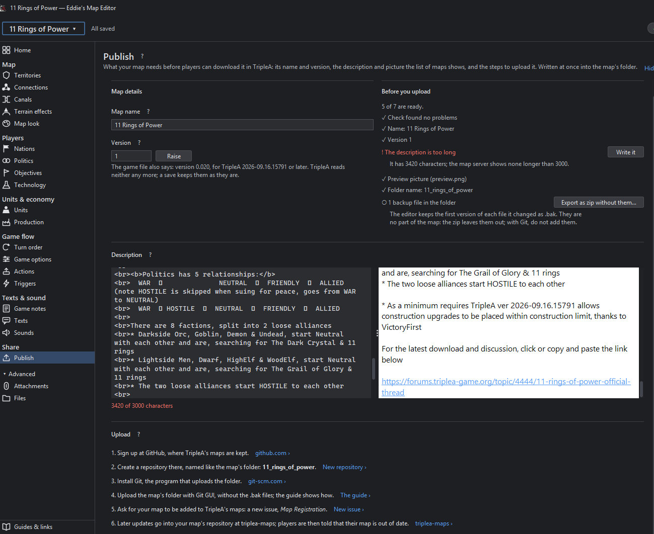
-
@Cernel
yes-
Established convention: Hearts of Iron, Europa Universalis and Victoria all use "nation" despite featuring multinational empires and other unconventional political entities.
-
Clear distinction: A player controls a nation, while nations form alliances. This avoids confusing the controller with the controlled entity.
-
Political identity: Unlike "faction", which can imply a subdivision of a larger group, "nation" conveys an independent collective political identity.
-
Broad applicability: Under its civic and political definitions, a nation does not require ethnic, linguistic or cultural homogeneity.
-
Accessibility: "Nation" is more immediately understandable to casual players than "polity" and more immersive than "participant" or "member".
-
Neutrality: Unlike "power" or "belligerent", it does not necessarily imply geopolitical influence or participation in a war.
Ultimately, my priority is intuitive, familiar terminology rather than exhaustive political-scientific accuracy.
-
-
Update 0.2.4
We're gonna ignore the fact that the version number jumped

BUT!
I managed to create an MSI installer, which is now available on the GitHub page. The editor now automatically checks for updates once a day. You can also manually check for updates by clicking File > Look for new version and install the latest version directly from the editor.
@thedog
Furthermore, I should have fixed the placement misalignment now, for real this time! -
@xxxeddiexxx
Looking good for PU placement on top of Flags, thanks! -
@xxxeddiexxx
version 0.2.5
Using 11 Ring of PowerMenus are inconsistent
Notice View Game drop down menu, does not appear in the other 2 options
Personally View Game should be removed and replaced with its 6 options
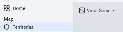
.
Connections is duplicated vertically and horizontally.
When Game is pressed, it overwrites the connection image, it should merge the two ?
The same for Owners, Politics, Values, Units ?
Connections should not be displayed as it has no function
.
This option works as intended, Canals are merged with other options.
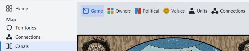
Personally I will not be using these merged views above.
Also it might be confusing for the novice, I would move them to the left pane and keep it simple, one view, one display..
On Territories and selecting Values and Places> PUs it displays the same info, however;
Values uses center.txt
PUs uses pu_place.txt
Although confusing to the novice the distinction should be shown.
Only the advanced mapmaker would use pu_place.txt
So Im not sure what is best, probably leave as is, but show the distinction..
Units
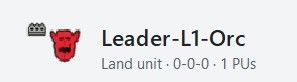
Missing costs 5:Fame – Units can also cost Resources, only PU is currently shown in the Header and in Column list.
Extra resources can be 0-2 other types it might even be 0-3
.
Also note the Atk-Def-Mov are 0 they should be 4-4-0 with 2HP

Value
Is this tuv? If so in the hover text it should say so.
Also in the hover text, should be some help like;
If cost is 0-1 then tuv should be set, if cost is 2+ usually do not set, leave Value blank
As a guide to valuing TUV=(Attack+Defense+Movement) for 1HP -1 for A&A style units
A more complicated version is;
(Attack x no of Attack dice)+(Defense x no of Defense dice)+Movement+EXTRAS) x ((HP+1)/2)
Where EXTRAS are Atk+Def supports, +1 for extra abilities like AA, Bombard, isDestroyer, these extras are subjective and depend on the maps flow.Notice the Value has greyed text what is this?
.
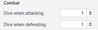
Combat Dice
These could go underneath the current Attack & Defence fields?
However, it does complicate the main stat block, for rarely used option.
.
Units
The More options should be in a different color, Orange maybe, as this shows that what follows is not core but expanded options.I think a restructure might be in order, especially for newbies.
Currently
Combat
Gives Support
Movement
Transport and carrier
Miscellaneous
Sea
Air and anti
Production and infrastructure
Bombing
SpecialProposed
-- Combat related
Combat
Gives Support
Air and anti-air
Bombing
Sea
--- Movement related
Movement
Transport and carrier
--Misc group
Miscellaneous
Production and infrastructure
Special.
Production> Buy Tab(already selected)>Orc
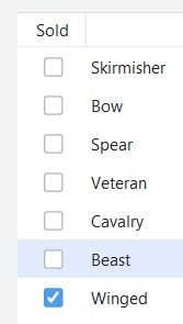
Deselect 5-6 options in quick succession and there is an unacceptable delay in them being UNTICKED. The reverse is also true, for being TICKED.
.
Better with Unit icons against each line listed, here
.
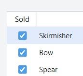
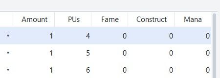
Resource Icons above each Resource text, here
.
The above is poorly formatted and the columns could be narrower, but more importantly the numbers better positioned or even centered within the column. -
Update 0.2.6
Hey,
today was pretty productive.
Got to test all these changes in detail in addition i provided a new User Manual.
https://xxeddiexxx.github.io/eddies-map-editor/Have fun with it

Fixed
- Units showed 0-0-0 for unit types whose options the game file writes in a loop
(foreach), as 11 Rings does. They show their real numbers now. Those options are
greyed out in Units, say why, and link to Attachments, where the loop is changed
for all its units at once. - Ticking units in Production > Buy reacted slowly, and so did every change on a big
map. A change that took over half a second now takes about a tenth. - Units shows a unit's full cost: "1 PU + 5 Fame", and "uses 2 Material" for units
that use up other units when placed. - Moving and ordering rules in Production (the arrows and the sort button) now shows
in the table at once. - Production tab shows the correct Unit icons for each nation.
Changed
- One view button, "View: Game", in every tool, with Game, Owners, Political and
Values. Connections always shows its lines. - Units: the option sections come as battle, movement, the rest. Bombing shows for
air units. The Value field says it is the TUV and has a short guide behind its "?". - Production: unit pictures on the buy rows, as the list's nation shows them, and
resource icons above the columns of the starting resources. - Tool tips show sooner.
Open issues can be found here
- Units showed 0-0-0 for unit types whose options the game file writes in a loop
-
@xxXEddieXxx
Territories> Places> Units
This is actually Place.txt boxes, this would be better to display starting units on/off.
This is a duplicate of Reload places from files (This is only from place.txt), it is not file(s). -
I'll rename it to "Unit places" and look into a separate switch to show and hide the starting units. https://github.com/xXEddieXxx/eddies-map-editor/issues/54
what do you mean with your second point?
-
@xxXEddieXxx
Pedantically it is not multiple files, but a singular file, place.txt, so remove the 's' from files. -
Renaming existing units from within the editor could go on the enhancements list. Would also have to rename the unit images they're currently using, including any of the tech variant ones.
-
@xxXEddieXxx
version 0.2.6
Using 11 Ring of PowerUnits
When you hover over a unit icon the current Tooltip popup activates. This is a quick way of viewing the current stats of the unit in a familiar format.
Text and Sounds
Game Notes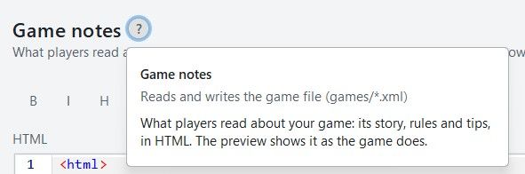
.
It used to read the *.xml
Now if there are html style comments they also get written to
games/map_name/.notes.html
So there can be a duplication.
The xml version should be deleted.
As the new way is games/map_name.notes.html only.
So the file changed is only games/map_name.notes.htm not *.xml
Texts
These 5 tabs should be in the left hand pane. Saving space by removing them for each tab.
They are so distinct they don’t need to be grouped together as tabs.
Also by removing sounds (left pane) and adding it to Messages like Messages & Sounds as sounds are directly paired with Messages/notifications they should be treated together and on the same pane..

Text> Unit tool tips
As these are units add in Units icon, also add in hover Tooltips, as this would help fill in the current tool tips..
The tool tip of
Duplicated & clutter text, is not needed, please remove. the tool tip of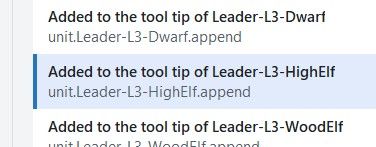
.
Please add a Partially formatted text box, between Text box (raw as written in Tooltip.txt) and the Preview box.Partially formatted text box
Takes the text from text box above and for every <br> and <p style, partially formats the text by placing it on a new line. This will encourage Novice, Advanced and me to use this as faffing about with unformatted text is a pain and time consuming.Maybe just remove the Text box option?
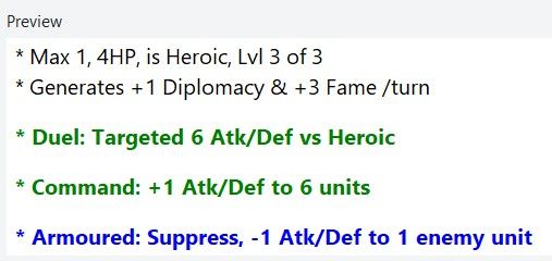
eg. leadr-L3-HighElf would look like this
* Max 1, 4HP, is Heroic, Lvl 3 of 3
<br> * Generates +1 Diplomacy & +3 Fame /turn
<br><b><p style="color:green;"> * Duel: Targeted 6 Atk/Def vs Heroic</p></b>
<b><p style="color:green;"> * Command: +1 Atk/Def to 6 units</p></b>
<b><p style="color:blue;"> * Armoured: Suppress, -1 Atk/Def to 1 enemy unit</p></b>
A save would reassemble the broken lines into one line.
.
Preview - Display/Formating is off
From TripleA
.
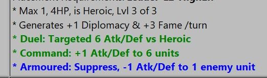
.
From Map Editor
Note the extra spacing
.
You might want to put some help text on the right panel to aid with the tooltip text ?
Here is mine to myself from 1941_global_command_decision# <br> forces a line break in text (carriage-return) # <b> Bold </b> # <i> Italics </i> # non-breaking space, used for lots of extra spaces # Colored Text, supports one line HTML <br> <b><p style="color:green;"> * Rail links to move land units upto 3 territories, depending on terrain effects</p></b> # Pumpkin Orange #FF7518 hex color # LightSeaGreen #20B2AA hex color - good for matching cyan color of Construction/consume by # Red - Combat additions # Orange - Warning or notification, usually to say what can be targeted or not # Blue - Suppression (-1) off enemy Attack or Defense # Green - Movement or transport # image source must be in /map/doc/images - they will be for all factions unless make tooltip & faction image.png unique for EACH faction # tooltip.unit._Dev-Armor-Inf= <br/><img src="Armor-Inf.png"/> <br> * Develop <b>Armor-Inf </b> Type:Land. Cost ??pu <br> * Att | Def | Mov: 3 3 1 <br> * PTo complete, place on a Territory with: <b>Industry-Hvy</b>
Text> Political actions
There is no way that a map maker will use this pane as it requires too many repetitive entries.
eg. 11 Rings of Power has 2240 entries with multiple fields per entry.
I have a crude parameter driven program, to generate the notifications.properties lines, that you can have, just say?
Then you can take its crudeness and turn it into something a novice can use?Maybe this is for a much latter version as it will require lots of testing and time?
There appear to be 7 elements to the Political Action, these would be better displayed in the right hand pane. This would mean a more complicated right hand pane, but all of the Political Action text is well laid out and easier to read.
Text> Objectives
Using Greyhawk Wars as an example
Please add a Partially formatted text box, below Text box (raw as written in Tooltip.txt).Partially formatted text box
Takes the text from text box above and for every <br> and <p style, partially formats the text by placing it on a new line. This will encourage Novice, Advanced and me to use this as faffing about with unformatted text is a pain and time consuming.Maybe just remove the Text box option?
.
Missing objectiveValue
The command for Objectives is usually an <option name="objectiveValue" value="2"/>
This could/should be read only as the focus of this panel is the text of the objectives.txtMissing uses field
Another useful display only function is how many uses the Trigger has.
<option name="uses" value="1"/>
Text> User Action
Using Greyhawk Wars as an example, the app lists 984 instances, I question this number.
Searching for UserActions this counts 181 instances
I think the number is closer to 181.There appear to be 6 elements to the User Action, these would be better displayed in the right hand pane. This would mean a more complicated right hand pane, but all of the User Action text is well laid out and easier to read.

Hello! It looks like you're interested in this conversation, but you don't have an account yet.
Getting fed up of having to scroll through the same posts each visit? When you register for an account, you'll always come back to exactly where you were before, and choose to be notified of new replies (either via email, or push notification). You'll also be able to save bookmarks and upvote posts to show your appreciation to other community members.
With your input, this post could be even better 💗
Register Login