@xxXEddieXxx
version 0.2.6
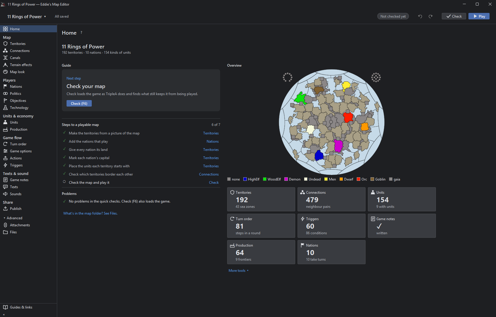
Using 11 Ring of Power
Units
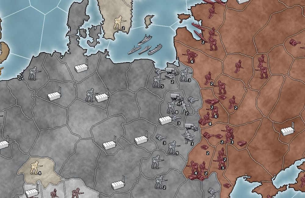
When you hover over a unit icon the current Tooltip popup activates. This is a quick way of viewing the current stats of the unit in a familiar format.
Text and Sounds
Game Notes
[image: image.jpeg]
.
It used to read the *.xml
Now if there are html style comments they also get written to
games/map_name/.notes.html
So there can be a duplication.
The xml version should be deleted.
As the new way is games/map_name.notes.html only.
So the file changed is only games/map_name.notes.htm not *.xml
Texts
These 5 tabs should be in the left hand pane. Saving space by removing them for each tab.
They are so distinct they don’t need to be grouped together as tabs.
Also by removing sounds (left pane) and adding it to Messages like Messages & Sounds as sounds are directly paired with Messages/notifications they should be treated together and on the same pane.
.
[image: image.jpeg]
Text> Unit tool tips
As these are units add in Units icon, also add in hover Tooltips, as this would help fill in the current tool tips.
.
The tool tip of
Duplicated & clutter text, is not needed, please remove. the tool tip of
[image: image.jpeg]
.
Please add a Partially formatted text box, between Text box (raw as written in Tooltip.txt) and the Preview box.
Partially formatted text box
Takes the text from text box above and for every <br> and <p style, partially formats the text by placing it on a new line. This will encourage Novice, Advanced and me to use this as faffing about with unformatted text is a pain and time consuming.
Maybe just remove the Text box option?
eg. leadr-L3-HighElf would look like this
* Max 1, 4HP, is Heroic, Lvl 3 of 3
<br> * Generates +1 Diplomacy & +3 Fame /turn
<br><b><p style="color:green;"> * Duel: Targeted 6 Atk/Def vs Heroic</p></b>
<b><p style="color:green;"> * Command: +1 Atk/Def to 6 units</p></b>
<b><p style="color:blue;"> * Armoured: Suppress, -1 Atk/Def to 1 enemy unit</p></b>
A save would reassemble the broken lines into one line.
.
Preview - Display/Formating is off
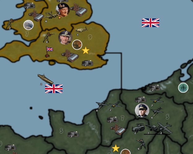
From TripleA
.
[image: image.jpeg]
.
From Map Editor
Note the extra spacing
.
[image: image.jpeg]
You might want to put some help text on the right panel to aid with the tooltip text ?
Here is mine to myself from 1941_global_command_decision
# <br> forces a line break in text (carriage-return)
# <b> Bold </b>
# <i> Italics </i>
# non-breaking space, used for lots of extra spaces
# Colored Text, supports one line HTML <br> <b><p style="color:green;"> * Rail links to move land units upto 3 territories, depending on terrain effects</p></b>
# Pumpkin Orange #FF7518 hex color
# LightSeaGreen #20B2AA hex color - good for matching cyan color of Construction/consume by
# Red - Combat additions
# Orange - Warning or notification, usually to say what can be targeted or not
# Blue - Suppression (-1) off enemy Attack or Defense
# Green - Movement or transport
# image source must be in /map/doc/images - they will be for all factions unless make tooltip & faction image.png unique for EACH faction
# tooltip.unit._Dev-Armor-Inf= <br/><img src="Armor-Inf.png"/> <br> * Develop <b>Armor-Inf </b> Type:Land. Cost ??pu <br> * Att | Def | Mov: 3 3 1 <br> * PTo complete, place on a Territory with: <b>Industry-Hvy</b>
Text> Political actions
There is no way that a map maker will use this pane as it requires too many repetitive entries.
eg. 11 Rings of Power has 2240 entries with multiple fields per entry.
I have a crude parameter driven program, to generate the notifications.properties lines, that you can have, just say?
Then you can take its crudeness and turn it into something a novice can use?
Maybe this is for a much latter version as it will require lots of testing and time?
There appear to be 7 elements to the Political Action, these would be better displayed in the right hand pane. This would mean a more complicated right hand pane, but all of the Political Action text is well laid out and easier to read.
Text> Objectives
Using Greyhawk Wars as an example
Please add a Partially formatted text box, below Text box (raw as written in Tooltip.txt).
Partially formatted text box
Takes the text from text box above and for every <br> and <p style, partially formats the text by placing it on a new line. This will encourage Novice, Advanced and me to use this as faffing about with unformatted text is a pain and time consuming.
Maybe just remove the Text box option?
.
Missing objectiveValue
The command for Objectives is usually an <option name="objectiveValue" value="2"/>
This could/should be read only as the focus of this panel is the text of the objectives.txt
Missing uses field
Another useful display only function is how many uses the Trigger has.
<option name="uses" value="1"/>
Text> User Action
Using Greyhawk Wars as an example, the app lists 984 instances, I question this number.
Searching for UserActions this counts 181 instances
I think the number is closer to 181.
There appear to be 6 elements to the User Action, these would be better displayed in the right hand pane. This would mean a more complicated right hand pane, but all of the User Action text is well laid out and easier to read.