TripleA Logo TripleA Forum
    • TripleA Website
    • Categories
    • Recent
    • Popular
    • Users
    • Groups
    • Tags
    • Register
    • Login

    Fuel Enhancements

    Scheduled Pinned Locked Moved Feature Requests & Ideas
    234 Posts 10 Posters 221.4k Views 10 Watching
    Loading More Posts
    • Oldest to Newest
    • Newest to Oldest
    • Most Votes
    Reply
    • Reply as topic
    Log in to reply
    This topic has been deleted. Only users with topic management privileges can see it.
    • General_ZodG Offline
      General_Zod Moderators @redrum
      last edited by

      @redrum Definitely better. Looks great.

      1 Reply Last reply Reply Quote 1
      • FrostionF Offline
        Frostion Admin
        last edited by Frostion

        I posted a reply in the other thread 😁 Hope you find it.
        ( https://forums.triplea-game.org/topic/583/image-icons/111 )

        Map maker of: Star Wars: Galactic War + Star Wars: Tatooine War + Caribbean Trade War + Dragon War + Age of Tribes + Star Trek: Dilithium War + Iron War + Iron War: Europe + Warcraft: War Heroes

        1 Reply Last reply Reply Quote 0
        • redrumR Offline
          redrum Admin
          last edited by

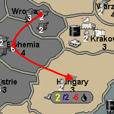
          So the first take at looking at unit movement fuel consumption:
          0_1519749793890_9cb5fa47-58cc-4ffd-b3d6-310b084765bf-image.png

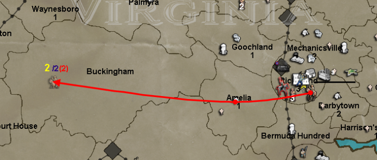
          This is very similar to what @Frostion originally posted (https://github.com/triplea-game/triplea/issues/1310) except now that we have total resources displayed in the bottom bar, the red number instead shows how much fuel the given move is consuming as that should be more useful.

          So given that you can potentially have multiple resources for fuel cost, the next step is to try to add resource images and multiple numbers. So that instead of just "(2)" you could have say "2<supply_image> 4<industry_image>".

          Thoughts and feedback welcome.

          TripleA Developer with a Passion for AI: https://forums.triplea-game.org/topic/105/ai-development-discussion-and-feedback

          HeppsH 1 Reply Last reply Reply Quote 3
          • HeppsH Offline
            Hepps Moderators @redrum
            last edited by

            @redrum Great initiative!

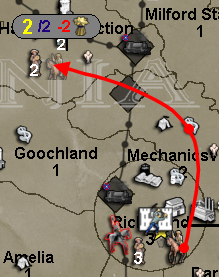
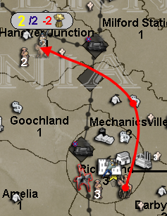
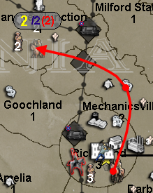
            One of the things I have noticed (especially given the example you used) is that while moving on maps with smaller territory sizes there is often a tendency to not be able to see or distinguish the information being presented due to the clutter of everything in the destination terr.

            Example...

            0_1519751665835_Move Example 1.png

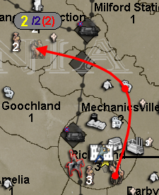
            Now... and this has been mentioned before by members of our community.... is there the possibility to create a "canvass" onto which this information can be rendered?

            Example...

            0_1519751768361_Move Example proposed.png

            "A joyous heart sours with the burden of expectation"
            Hepster

            General_ZodG redrumR 2 Replies Last reply Reply Quote 2
            • General_ZodG Offline
              General_Zod Moderators @Hepps
              last edited by General_Zod

              @hepps @redrum
              Having control over colors of numbers might be helpful. A map maker could chose colors that pop and or don't blend with backgrounds as much.

              As fuel number goes, the brackets seems like they not needed. Maybe just use the / to divide or a -. Although I understand the brackets imply minus too. The fuel image is weird too. Again different colors may work well instead of images . Just game notes would need to specify what colors are if changed from default or if multiple fuel resources are used.

              Or a letter in place of image. eg 2/4/F1/F2 or 2/4-f1-f2 or 2/4/-f1/-f2

              HeppsH 1 Reply Last reply Reply Quote 1
              • HeppsH Offline
                Hepps Moderators @General_Zod
                last edited by Hepps

                @general_zod Consistency from game to game is probably very desirable for the main components of gameplay.

                If you start allowing map makers to start changing the colours of things like movement used, movement outstanding, fuel cost, unit quantities etc... it would probably lead to a great deal of issues for players trying to learn/play different maps if each individual map had its own hard coded presets.

                Potentially adding this type of customization would be best executed by adding the other display categories to the "View Tab" in a game under the "Edit map Font and Color" window.

                That way once a player set all the parameters it would be consistent game over game. The map maker could then make recommendations in the game notes specifying what he feels is the best settings based on the map design, while still allowing the player to decide what is preferable based on individual taste.

                "A joyous heart sours with the burden of expectation"
                Hepster

                General_ZodG 1 Reply Last reply Reply Quote 1
                • General_ZodG Offline
                  General_Zod Moderators @Hepps
                  last edited by General_Zod

                  @hepps Yeah, that works too. As long as can choose colors for each number.

                  Btw, I do like your canvas idea, a semi transparent might be nice. But in addition to above.

                  1 Reply Last reply Reply Quote 2
                  • redrumR Offline
                    redrum Admin @Hepps
                    last edited by

                    @hepps @General_Zod Anything is possible...

                    No Transparency
                    0_1519757328955_45193786-6bc8-46b8-81f5-0c9a03800fb9-image.png

                    Some Transparency
                    0_1519757236215_da211e14-09ab-4db3-b2a6-2c2992121316-image.png

                    More Transparency
                    0_1519757408243_40562acb-af56-47b3-b55c-bc3310c305ca-image.png

                    TripleA Developer with a Passion for AI: https://forums.triplea-game.org/topic/105/ai-development-discussion-and-feedback

                    HeppsH 1 Reply Last reply Reply Quote 1
                    • HeppsH Offline
                      Hepps Moderators @redrum
                      last edited by

                      @redrum Not sure semi transparency is the way to go... just seems to add more muddiness. Since this would only during the movement itself I would recommend a solid background.

                      "A joyous heart sours with the burden of expectation"
                      Hepster

                      redrumR 1 Reply Last reply Reply Quote 0
                      • redrumR Offline
                        redrum Admin @Hepps
                        last edited by redrum

                        @hepps Yeah. From the samples I took, I would agree that solid looks the best.

                        Thoughts on colors, size, etc for either the "canvas" or movement/fuel numbers?

                        Other Suggestions:

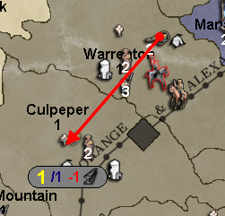
                        1. Probably better to always display the max movement number (the blue one). It seems that if you move further than your max then it disappears.

                        TripleA Developer with a Passion for AI: https://forums.triplea-game.org/topic/105/ai-development-discussion-and-feedback

                        HeppsH 1 Reply Last reply Reply Quote 0
                        • HeppsH Offline
                          Hepps Moderators @redrum
                          last edited by Hepps

                          @redrum Yah, when you move beyond the units max range the blue number disappears and is replaced by am "X" icon which appears to have a fixed placement relative to the cursor location (down X pixels and right by x pixels) rather than relative to the location of the move number (yellow number) which continues to be displayed and who's placement is relative to the horizontal plain from where the unit originated (if you are moving above the original location of the unit the number is displayed above the transparent unit.... if you are moving below the original location of the unit the number is displayed below the transparent unit). Ideally that red X icon would be placed in lieu of the blue number... relative to the yellow number... rather than relative to the cursor location on the screen.

                          As far as colours.... I am indifferent. I have no issue with the current colour scheme.

                          "A joyous heart sours with the burden of expectation"
                          Hepster

                          1 Reply Last reply Reply Quote 0
                          • FrostionF Offline
                            Frostion Admin
                            last edited by

                            That background gery was a great idea @Hepps , and really incredible that @redrum could just make it happen like that 😄 I like the idea about the fuel(s) used are displayed as icons. And no transparency seems best.

                            Map maker of: Star Wars: Galactic War + Star Wars: Tatooine War + Caribbean Trade War + Dragon War + Age of Tribes + Star Trek: Dilithium War + Iron War + Iron War: Europe + Warcraft: War Heroes

                            HeppsH 1 Reply Last reply Reply Quote 1
                            • HeppsH Offline
                              Hepps Moderators @Frostion
                              last edited by

                              @frostion Who is this "gery" you speak of? 😃 😉

                              "A joyous heart sours with the burden of expectation"
                              Hepster

                              FrostionF 1 Reply Last reply Reply Quote 1
                              • General_ZodG Offline
                                General_Zod Moderators
                                last edited by

                                Yeah the solid canvas looks cool too. Also nicer with less stuff going on the canvas.

                                So a thought on the fuel figures. So if you stuck on 1/2(#) format. (which is ok, except need space after the 2, imo) Maybe for more consistency and enhanced clarity. Add the minus - sign (and space). eg 1/2 (-#). To be consistent since we the use a (+#) sign in resource info bar.

                                HeppsH 1 Reply Last reply Reply Quote 2
                                • HeppsH Offline
                                  Hepps Moderators @General_Zod
                                  last edited by

                                  @general_zod Agree. If we are going to put a plus sign to indicate increases.... we should do the same for consumption and add a minus sign.

                                  Good call.

                                  "A joyous heart sours with the burden of expectation"
                                  Hepster

                                  1 Reply Last reply Reply Quote 2
                                  • FrostionF Offline
                                    Frostion Admin @Hepps
                                    last edited by

                                    @hepps
                                    Gery is an form of evil grey plankton:
                                    0_1519766137207_Plankton_PNG.png I thought you were inspired by this plankton when you made the GREY background 😉

                                    Map maker of: Star Wars: Galactic War + Star Wars: Tatooine War + Caribbean Trade War + Dragon War + Age of Tribes + Star Trek: Dilithium War + Iron War + Iron War: Europe + Warcraft: War Heroes

                                    1 Reply Last reply Reply Quote 3
                                    • redrumR Offline
                                      redrum Admin
                                      last edited by redrum

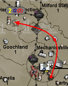
                                      The following are some examples. Any thoughts?

                                      0_1519766779006_18f719fa-b1c7-4034-b1d9-40df178a4edd-image.png

                                      0_1519766812452_23a9db15-12c3-4179-ac7e-1d084d06bd8e-image.png

                                      0_1519767096539_a92d236f-ee61-456b-a230-1f9ea2091433-image.png

                                      TripleA Developer with a Passion for AI: https://forums.triplea-game.org/topic/105/ai-development-discussion-and-feedback

                                      HeppsH 1 Reply Last reply Reply Quote 0
                                      • HeppsH Offline
                                        Hepps Moderators @redrum
                                        last edited by Hepps

                                        @redrum Thoughts? Yes I have many...

                                        If the strength of an ant could be scaled to a human sized genetically enhanced breed of mule-octopus hybrid.... that feeds on carbon dioxide for energy.... we could solve a lot of the worlds problems.

                                        "A joyous heart sours with the burden of expectation"
                                        Hepster

                                        redrumR 1 Reply Last reply Reply Quote 0
                                        • redrumR Offline
                                          redrum Admin @Hepps
                                          last edited by

                                          @hepps Guess I should have been more specific... Any useful thoughts related to the above images showing resource fuel costs during unit movement?

                                          Also here is a lighter gray canvas:
                                          0_1519767417743_f80ad6fb-63bb-4eff-b464-ee690f837c29-image.png

                                          TripleA Developer with a Passion for AI: https://forums.triplea-game.org/topic/105/ai-development-discussion-and-feedback

                                          1 Reply Last reply Reply Quote 1
                                          • FrostionF Offline
                                            Frostion Admin
                                            last edited by Frostion

                                            @redrum
                                            I have always wondered why the movement info text is so pixilated? Its like the rest of the game uses antialiasing with text, just not the movement text.

                                            How will this colored text on light grey background look if the player uses another UI theme than SubstanceGraphite?
                                            And is the grey background made up by fixed or resizable images? Or how? I can se the grey background with thin black outline also looks pixilated and not smooth and antialiased.

                                            EDIT: Lighter grey looks better, as the red number is more readable on lighter grey.
                                            EDIT 2: But at the same time, the yellow number is now a little less readable 😕

                                            Map maker of: Star Wars: Galactic War + Star Wars: Tatooine War + Caribbean Trade War + Dragon War + Age of Tribes + Star Trek: Dilithium War + Iron War + Iron War: Europe + Warcraft: War Heroes

                                            HeppsH redrumR 2 Replies Last reply Reply Quote 1

                                            Hello! It looks like you're interested in this conversation, but you don't have an account yet.

                                            Getting fed up of having to scroll through the same posts each visit? When you register for an account, you'll always come back to exactly where you were before, and choose to be notified of new replies (either via email, or push notification). You'll also be able to save bookmarks and upvote posts to show your appreciation to other community members.

                                            With your input, this post could be even better 💗

                                            Register Login
                                            • 1
                                            • 2
                                            • 6
                                            • 7
                                            • 8
                                            • 9
                                            • 10
                                            • 11
                                            • 12
                                            • 8 / 12
                                            • First post
                                              Last post
                                            Copyright © 2016-2018 TripleA-Devs | Powered by NodeBB Forums