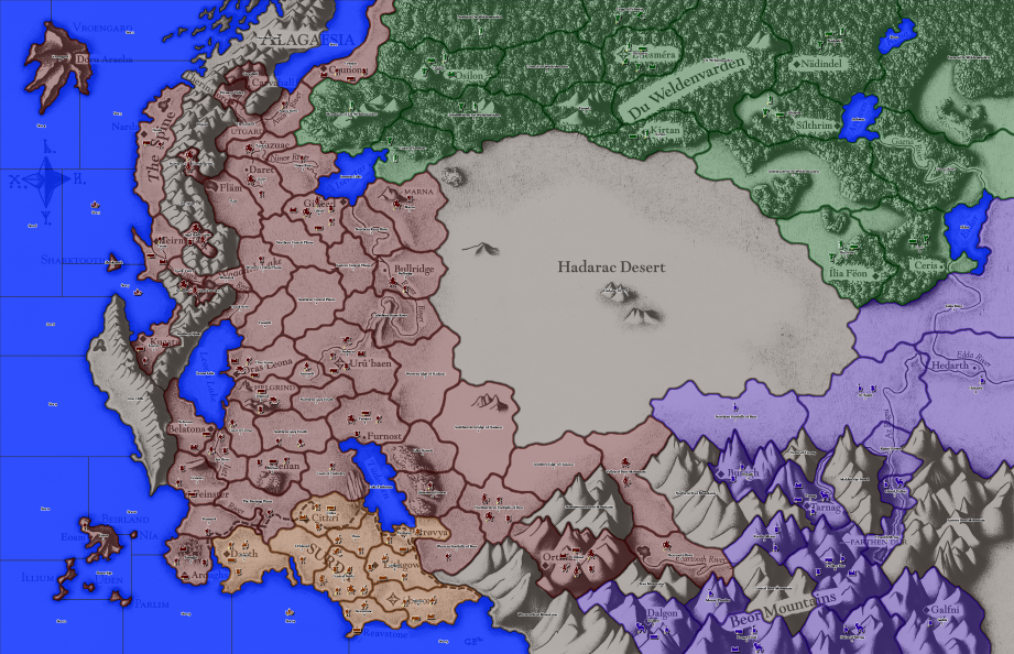
Alagaësia

-
Ok I uploaded to sendspace again. https://www.sendspace.com/file/ih90jk
This version allowed him to distinguish between reds and greens. I think.
-
New version uploaded. Improved game notes, added unit tooltips. Tweaked @General_Zod's colors a bit as per the previous changes to improve unit and stack number visibility. This should probably be version 1.0; if there are no bugs, it will go to the map repository.
"For the world is changing: I feel it in the water, I feel it in the earth, and I smell it in the air."
-
@alkexr I had a look and my horrible eyes can see it fine ty.
-
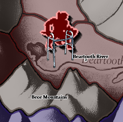
@alkexr Referring to the latest version, I suggest switching the colours (for both ownerships and units) of Surda and Empire. The Empire was the one that used to be red, anyways, and maroon is what is closest.
-
@cernel I suspect it is harder for @prastle to tell the maroon and the Elvish green apart. At least that's why I think @General_Zod switched the colors. Because now if these two colors are anywhere near each other, the game is probably already over.
 Maybe too much mindreading on my behalf, or attempt thereof
-
You mind reading abilities are on the right track.
 :winking_face:
The issue was between elves and empire from my understanding.
-
Easy fix. Just add this to the units when Prastle is playing the game.
-
@alkexr gigglez
-
Version 1.0 released, uploaded to map repository. Updated the first post in this thread to reflect this.
Hello! It looks like you're interested in this conversation, but you don't have an account yet.
Getting fed up of having to scroll through the same posts each visit? When you register for an account, you'll always come back to exactly where you were before, and choose to be notified of new replies (either via email, or push notification). You'll also be able to save bookmarks and upvote posts to show your appreciation to other community members.
With your input, this post could be even better 💗
Register Login