Add Unit Count and Damage Display Outline

-

This has come up many times over the years and is likely a pie in the sky idea. Not really sure whether something like this would even be possible... but it would certainly be a huge step forward from a UI standpoint.
Just putting it out here for posterity.
")
After the changes:


-
If I remember any of the conversations clearly, I don't think anything like this could be achieved with the resources available through Java... but I was wondering if it could be achieved in the same way we have done the "Flag Display Mode" or many of the other graphical processes for rendering images?
If the game had a separate folder for "Stack Numbers"... and the Map Properties file had a line that defined whether the game used "Stack Numbers"... something like this...
units.counter.offset.width=0
units.counter.offset.height=52
units.counter.stacknumbers=trueThen we could build a folder for the game assets that had a set of numbers designed along the lines of the above example. Additionally this would then allow a map maker to build a custom set (if anyone other than me had the audacity to do so) and place that in their own map folder.
If the map properties folder did not have the setting to true then it would default to the current method. Or if numbers were missing from the "UnitStack" folder then it would default to the current method.
If this were a viable way to achieve this... I would be more than happy to volunteer to make numbers from 2- 1000 for the game engine assets. (Not that I think 1000 is really necessary... realistically I think more like 2-300 would suffice)
-
@hepps I just designed one number. Saved as a jpeg it is 1.35KB. So if I did separate images for 2-300 it would add 403.5 KB to the engine assets. I'm no techie... but that doesn't sound like a lot.
-
I would suggest considering separate images for digits instead of numbers. While that complicates calculating display coordinates, it has the great advantage of requiring 10 images instead of infinitely many. Though then you couldn't have Roman numerals for 270 BC, which would be a shame, really.
-
@alkexr I'm easy. I do not profess to know the best way to handle this from a technical standpoint. All I know is that after rendering a near infinite number of trees, hills, mountains and houses.... I can probably design as many numbers as we could possibly need.
-
@hepps we allllll know YOUR EASY!
") nice ideas
nice ideas -
@prastle You only know that because we've been on a date. If you hadn't been swept off your feet by my rugged good looks and charm... you'd have not idea.
-
@hepps ROFL!
yes dear -
@Hepps So is the main point having a nice outline for the unit numbers? If so I'd probably want to consider doing it without images first before falling back to that option. But what you propose should be theoretically doable and I'd probably agree with @alkexr to draw each digit so less images are needed.
Also the benefit of figuring out how to do it programmatically is we keep the font size options. Though I guess in theory you could do something with image sizing.
TripleA Developer with a Passion for AI: https://forums.triplea-game.org/topic/105/ai-development-discussion-and-feedback
-
@redrum I am open to all kinds of options... fast and loose that's how I like to play it.
")
I guess just working on a couple different maps lately I started to really see how the monochrome pixilated numbers are a huge opportunity for maps. And while antialiasing alone would be an improvement, it by no means solve the issue of maps with a variety of unit and territory colours, shading, reliefs, unit colours.....
So while pondering it I thought the best would be a outline. the reason I suggested an image is really a by-product of two things...
First I thought an outlined number was not possible to render currently. (as a font)
Second I thought if they were images then it allows the creative juices to just flow, since you could do all kinds of wonderful things both with numbers as well as backgrounds.
-
@redrum said in Inception: A dream within a dream (Unit stack numbers display):
figuring out how to do it programmatically
In C# what I would do is to draw the number (string) to a Bitmap first (don't know java equivalent). Then for each pixel P, you take the maximum of (alpha of pixel Q * strength - Euclidian distance(P, Q) * sharpness) over all pixels Q on the bitmap, this will be the alpha of the outline. Then you overlay the original bitmap over the outline. (Strength and sharpness are parameters.) If you only take the maximum over pixels Q within a radius of (255 * strength - sharpness), then you get the same result in O(n^2) relative to the height/width of the bitmap.
"For the world is changing: I feel it in the water, I feel it in the earth, and I smell it in the air."
-
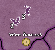
Just outlining the current numbers would be a great improvement! The default white numbers can be hard to see and distinguish on bright territory backgrounds. (Yes, I know that I can change colors... But I don't want to
 )
) -
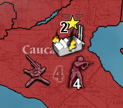
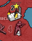
So here a first go at it:
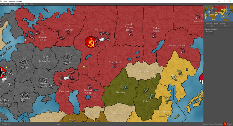
And with a large number of units:
Before:
-
@redrum How is that possible? How was this able to be done so quickly?
-
@alkexr That's a bit more graphics kungfu then I'm doing at the moment. Initially, I'm just outlining the text by first drawing it at the 1 pixel over northwest, southwest, northeast, and southeast positions with the outline color and then drawing the text in the center with the text color. As well as enabling anti-aliasing.
-
@redrum All good. I just thought this would be a much bigger undertaking...
"To the uninitiated everything appears to be made of magic"
-
@hepps Well, my pretty simple approach took about 5 minutes. Ask and thou shall receive
Open to trying some other ideas if folks want. Probably gonna at least add an option to set the outline color as well.
-
@redrum That was my very next question.
I'm going to use inception more often. It appears to be highly effective as a title.
-
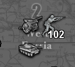
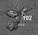
And did unit and bombing damage as well:
-
And the update font preferences:
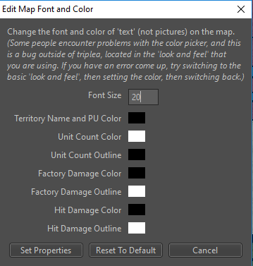
Any thoughts on defaults? Unit color/outline as white/black seems good. But black numbers with white outline are a bit jarring. Maybe do a gray for default outline for hit and bombing damage? Also should the default font size be a bit bigger? 12 seems really small on most screens/maps.
Current defaults:
private static final int MAP_FONT_SIZE_DEFAULT = 12;
private static final Color TERRITORY_NAME_AND_PU_AND_COMMENT_COLOR_DEFAULT = Color.BLACK;
private static final Color UNIT_COUNT_COLOR_DEFAULT = Color.WHITE;
private static final Color UNIT_COUNT_OUTLINE_DEFAULT = Color.BLACK;
private static final Color UNIT_FACTORY_DAMAGE_COLOR_DEFAULT = Color.BLACK;
private static final Color UNIT_FACTORY_DAMAGE_OUTLINE_DEFAULT = Color.LIGHT_GRAY;
private static final Color UNIT_HIT_DAMAGE_COLOR_DEFAULT = Color.BLACK;
private static final Color UNIT_HIT_DAMAGE_OUTLINE_DEFAULT = Color.LIGHT_GRAY;TripleA Developer with a Passion for AI: https://forums.triplea-game.org/topic/105/ai-development-discussion-and-feedback
Hello! It looks like you're interested in this conversation, but you don't have an account yet.
Getting fed up of having to scroll through the same posts each visit? When you register for an account, you'll always come back to exactly where you were before, and choose to be notified of new replies (either via email, or push notification). You'll also be able to save bookmarks and upvote posts to show your appreciation to other community members.
With your input, this post could be even better 💗
Register Login