Proposal: Always-shown "Purchased Units" panel
-
Hey all,
I've coded up a UI change that I'd like to get feedback on. This is for the current UI, not for the pie-in-the-sky future UI that there are some discussions around on these forums.
The idea is after the purchase phase, to show a panel with the units that were purchased. This would be akin to the physical board game, where the purchased units are set aside and always visible to the player, without having to remember - and useful for decision making (e.g. where to reinforce, etc).
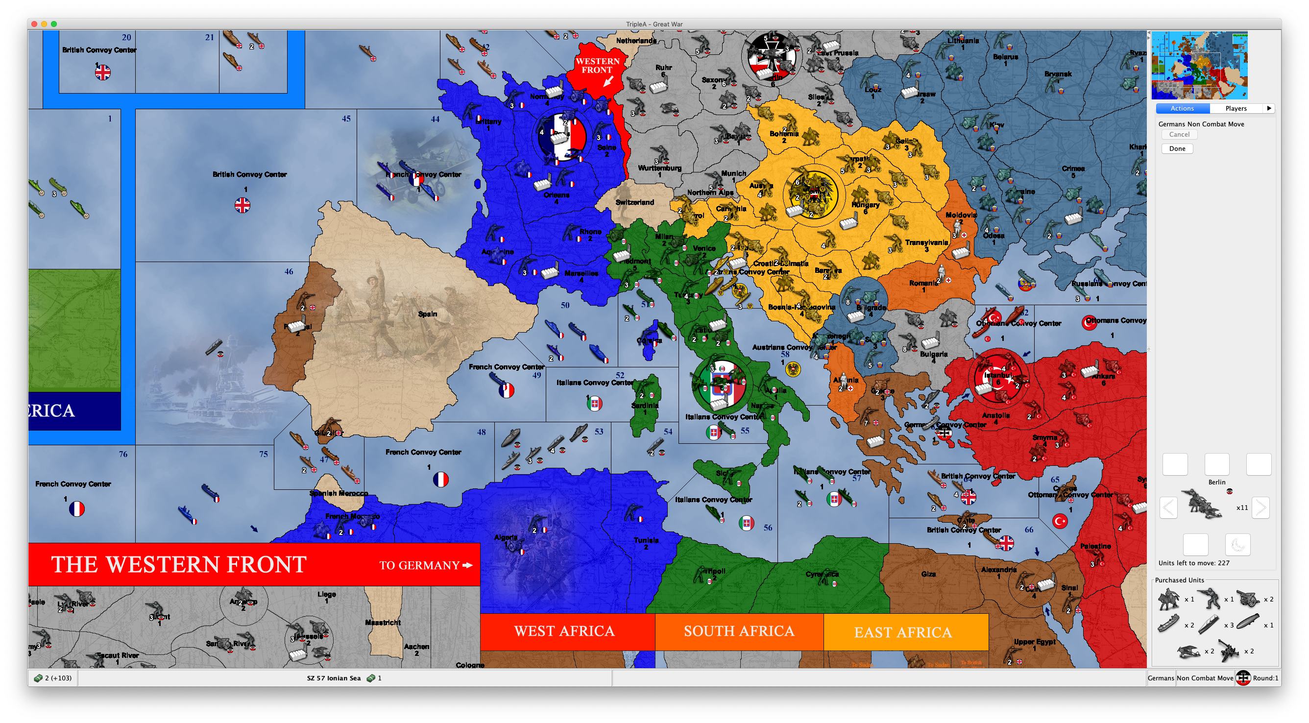
Anyway, without further ado, this is what my prototype looks like right now:
Note the panel at the bottom right. (Just to be clear, the other UI above it is unrelated - and there's a display bug there, but that's a different topic.)
In terms of UI, the panel should automatically size itself to the purchase (i.e. it will just be a single row if there's fewer units purchased, or taller if there are more.)
I have the code working for this, just need to clean it up and submit a PR if people think this is a good addition.
-
This would be a great feature and is something I've been thinking about. I can't tell you how many time I have to go to history mode to review purchase. It's really most common when you have the OMG that was an unexpected battle outcome and need to try and re-plan.
Potential requirement (A): I think it would be useful as well for spectactors to have access to the same data, I've had cases where watching an opponent during live play that I've wanted to review their purchase.
I've been thinking this might do well as a tab. A 'slide-out' menu of some sort would perhaps be cool for this too. This is a really interesting one, I certainly would like to see it added. I'm pretty excited to hear about ideas of how to render this, whether tucking it below unit scroller, a tab, or some other kind of 'fly-out' component.
-
@Alexei-Svitkine As per in your example, and as I believe it would be anyways preferable first Combat Moving, then Purchasing, this feature would apply only to Non Combat Move, for all the maps having such phase order.
It would be better having integrated phases, in which you can both purchase and combat move (as a single phase), then both place and non combat move (as a single phase) (of course, newly placed units would be immobile).
Missing that, this seems a nice feature, but it should have its own tab (also to allow anyone else to see it), rather than cutting space out of the action one (I suggest this tab showing all unplaced units, even though, normally, only the turn player will have any (somebody could make a game in which you purchase on a round and place on the next one)).
-
@Alexei-Svitkine That's a good idea, indeed, as in the original A&A boardgames purchased units are placed in the "mobilization zone" and thus are visible there until placement.
-
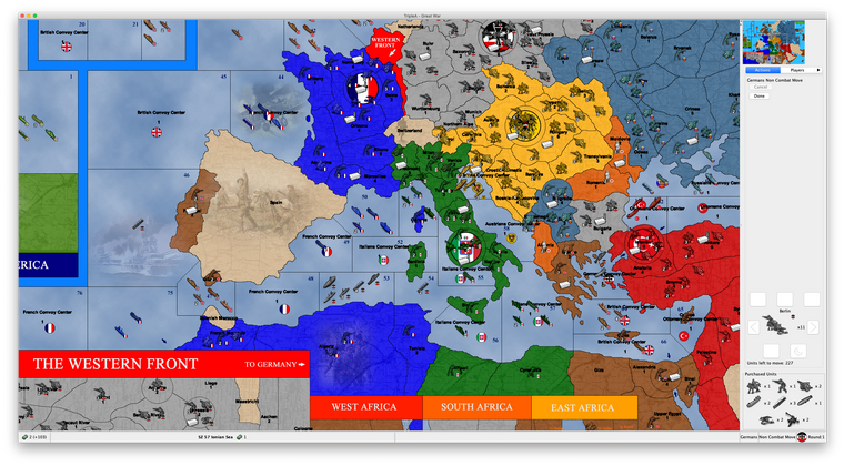
For me, having it be its own tab is not as useful as always showing it. For one, with Mac UI, because of the limited space, you have to cycle through all the tabs to switch to the one you want (you can see how it looks in the screenshot).
But even non-Mac, having it in its own tab makes it so you can't see it at the same time as your normal combat movement and requires an extra action to see. So I strongly prefer for it to be shown at the same time as other tabs.
(I agree that in ideal world, we could have some sort of slider UI - or a more customizable UI, where different tabs can be dragged off and be panels - but would be a lot of work.)
-
I'd prefer to see it as a separate tab or part of a different tab than the action tab. That or make it so it can be minimized.
-
Okay, so my suggestion is if we want to ability to hide it, we can have a View menu option to toggle showing/hiding it. Because I do think having it always shown is a valuable - something that is not achieved by having it in a tab.
However, my suggestion is to first land it as-is and have everyone try it out, before making the decision for adding an extra UI option. This way, if it turns out that people don't mind it showing all the time once they've tried it (and not just made a decision based on a screenshot), then we don't need to add the extra menu option (since accumulating lots of options is not necessarily the best approach - since it doesn't scale).
So to summarize, my proposal is:
- Land the code with it always shown.
- Let people try it out (before the 2.0 release).
- If people still feel like they'd like the ability to hide it, we add a menu option for it.
-
@Alexei-Svitkine great STUFF! But yes I agree it has to be able to be hidden from the view tab.
-
@Alexei-Svitkine I'm good with that. The only ask I'd have is let's make sure we test it on a few different maps as some maps have a lot more unit types than others.
The one downside I do see that I think was already mentioned is that lobby opponents and observers don't see the action tab so won't be able to see the purchased units like the current player would. Not the end of the world but something to think about.
-
The one downside I do see that I think was already mentioned is that lobby opponents and observers don't see the action tab so won't be able to see the purchased units like the current player would. Not the end of the world but something to think about.
I agree that ideally it can be shown for opponents' purchases and for observers. It's true that my current implementation does not support that, but I think it makes sense to add a TODO to look into supporting it. I don't think from the UI point of view, there's any issue into making that work - it would just be a matter of the plumbing behind-the-scenes to notify the UI of purchases.
-
I'm not sure what's the big deal about a tab. Especially in busy maps, you ofter hover a territory and look at its units in the "Territory" tab, while making your moves. Beside the new scroller, the action tab is really only for undo your moves, not for ever looking at them otherwise. And the units in what would be the "mobilization zone" are a concept so alike to the units you see in the "Territory" tab, that, if not its own tab, I would rather argue this feature should be part of that one.
I see that you are using a resolution bigger than the full HD. I think that the usual 48x48 units TripleA features are already pushing the limit of smallness in full HD. So, unless you are playing TripleA on a 48 inches monitor, if you are testing on maps with 48x48 pixels units, I think it would make sense to use no more than full HD resolution.
I actually believe that 48x48 pixels units is really limited, and TripleA maps should rather go for 64x64 pixels ones, but that's my opinion.
Anyways, don't forget that reducing the space for moves in the action tab is going to much reduce the usability of the undo feature, as it will be harder to sort out your movements. And with over 48x48 pixels units and many units type here you definitely need some limits and scroll bars, as I can see you will be easily pushed being able to display only 1 move at the time.
p.s.: You can use this map (not available in download list) to test with a unit much bigger than the usual 48x48 pixels.
https://github.com/triplea-maps/conquest_of_the_worldp.p.s.: This one is a map I'm making that is not available at all, but that it can show how the action tab is already pretty filled up if only you are using 64x64 pixel units on a full HD display (not that much bigger than the usual 48x48 pixels ones). Also the new units scroller is way too big (the right button is completely unavailable), but I've no idea how this feature could fit if you would have a dozen types of those units waiting for placement (assuming I want to keep a 200 pixels wide small map, not to take away too much board view).
-
My 2 cents/comments:
- tab solves problem of visibility to all players
- I do not think players want to see it all the time. It's a pretty discrete action when I'm playing and am like "oh, what did I purchase??" Having the tab be always visible of course solves this, but the purchase is not necessarily that salient where I want to actually see it all the time.
In terms of 'hiding' the display, I would not go for a menu option. IMO menu options are more for options that are 'set-and-forget'. The purchase panel perhaps would get in the way, so you'd want to hide it in case you want to review the units that have moved or find one to undo. My thinking for 'hiding' the panel would be a sliding panel 'JSplitPane'. This would be something available perhaps on the edge of the map and slide out horizontally. If displayed, it would reduce the amount of map visible, clicking the slider hides/reveals it, and dragging would increase/decrease it's size (a bit similar to how the download maps window has a download progress area in a split pane, though the panel would be available instead as a brand new tab on the edge of the map). IMO I suspect going with a classic new tab is probably the easiest route for now.
-
@LaFayette said in Proposal: Always-shown "Purchased Units" panel:
In terms of 'hiding' the display, I would not go for a menu option. IMO menu options are more for options that are 'set-and-forget'.
Also this should not be a menu option if the default would be having it, as many people (I would bet the majority of users) will just not see they have this option (you may have a map with huge unit pictures and many units, for which this option may be bad). It may be reasonable if the default would be not having it, but this way I think most people will not realize they can enable this feature.
-
@Alexei-Svitkine I hear you on how tabs are not ideal on Mac. We over-use tabs as well IMO in general, the players vs economy tabs showing (almost) the same data has bothered me for some time.
The unit scroller ate up a lot of space, we used to be able to view a solid 5-10 moves in the move tab, we're down to 3-6 or so now. Dropping all the way down to 1 or 2 seems to be past a tipping point.
I think the kind of slider I was talking about is maybe called a 'fly-out tab'.
I think we may need to be creative to place all the components properly. I'm thinking a bottom-bar of some sort would be the way to go. We could have the unit scroller in the center of that, a mini-map in the lower right, and fly-out tabs for the different view options. That of course is not feasible for a short-term solution.
Maybe we could put the unit scroller and purchase panel in a tabbed panel of itself, so a user could flip between the two. That's my best idea for you.
2.0 is hopefully around the corner, a naive solution of adding a new tab might be justified so we can get the feature landed in some form, even if not fully ideal, the tabbed panel for unit scroller and purchase IMO is not a bad option. In part the Mac tabs are 'bad' because there are too many and you have to click through to find the right ones. Having just the two tabs for 'unit scroller' vs 'purchases' would always be visible and pretty easy to toggle back and forth. We'd have to come up with a better tab label then 'unit scroller', but it could be a viable option/compromise.
-
@LaFayette That's not a bad idea, although there is a bit of complexity involved. First, the unit scroller is only shown on the unit movement screen, whereas the intention of this panel is to be shown during all phases after purchase. So if we have a new set of tabs, then we'd want to only have an active unit scroller during a certain phase, and inactive otherwise. We also need to have logic of when to show this tabbed pane at all - for example, we could show it only if there are tabs to show, and not show otherwise. Or we can show always and just keep tabs empty/disabled when in the wrong phase. And we may want to persist the user's preference about their last active tab there, so that it will be remembered.
Anyways, stepping back a bit, let me summarize the options:
- Panel is unconditionally shown after purchase, with no way to hide.
- An option in the View menu is added to hide/show the panel.
- It's instead a normal Tab along other tabs. This doesn't allow it to always be shown without user action.
- There's a split pane component, which allows easily minimizing the panel.
- There's a new tabbed pane at the bottom right corner with tabs for Unit Scroller and Purchased Units.
- A combination of the previous two ideas could be to have the new tabbed pane be insider a split pane, so it could be hidden altogether.
There's also additional open questions:
- Does it work well on all maps, especially with a lot of units? I welcome suggestions on which to test - or when we get a prerelease build out with this change, people can try it out too.
- How does it work with large unit icons? Something to also try out once we have a prerelease build with it.
Finally, I believe that everyone is in agreement that it would be good to have this be visible for opponents moves. This can be supported with any of the UI options.
-
We have a prerelease to try with this feature implemented:
https://github.com/triplea-game/triplea/releases/tag/2.0.16238To enable this, set "Show Beta Features" to "True" under "Engine Settings" -> "Testing".
Please try it out and play with it and let me know how it feels. Thanks!
-
@Alexei-Svitkine said in Proposal: Always-shown "Purchased Units" panel:
We have a prerelease to try with this feature implemented:
https://github.com/triplea-game/triplea/releases/tag/2.0.16238To enable this, set "Show Beta Features" to "True" under "Engine Settings" -> "Testing".
Please try it out and play with it and let me know how it feels. Thanks!
This feature is not working for me. In all games I tested it, it just shows an empty "Purchased Units" thing at the bottor of the action tab.
Also, if the "Purchased Units" is showing any unplaced units that you have, not only those that you purchased, it should be called otherwise (I get that in all the standard games you can only have unplaced units if you purchased them, but, even in this case, strictly speaking any units that you didn't start with is purchased, no matter if also placed). It also feels weird and wrong to me to see an empty "Purchased Units" thing at the bottom of the action tab, while you are in the placement phase.
-
@Cernel Can you provide a screenshot? Which maps?
-
@Alexei-Svitkine Any games I tried that is available in download list. The situation is just as I pictured.
(I purchased 3 infantries and 3 armours) -
Thinking over it, I see "unplaced units" as a resource you have, thus conceptually similar to displaying resources. This is so especially if you consider that in a game like WW2v3 Chinese will get directly infantry; so, for such a player, receiving infantry units to place is substantially like for everyone else collecting production units (PUs).
Or you can even have games in which you always and only "collect" new units (like Risk, or likely most games in which you have only 1 unit type), for example (albeit unavailable):
https://github.com/triplea-maps/conquest_of_the_world/archive/master.zip
Thus you could have all unplaced units you have displayed in the bottom bar, next to the resources you have, but with a divide in between (not to confuse resources stock with unplaced units stock). However, this would present the challenge that usually the bottom bar is thinner than what would be needed to fully display the units (for example, in the TripleA assets the normal flags are 32 pixels high, while the units are 48 pixels high).
Hello! It looks like you're interested in this conversation, but you don't have an account yet.
Getting fed up of having to scroll through the same posts each visit? When you register for an account, you'll always come back to exactly where you were before, and choose to be notified of new replies (either via email, or push notification). You'll also be able to save bookmarks and upvote posts to show your appreciation to other community members.
With your input, this post could be even better 💗
Register Login