Two proposals to give more default screen to games
-
-
Replacing medium flags from bottom right with their smaller versions.
-
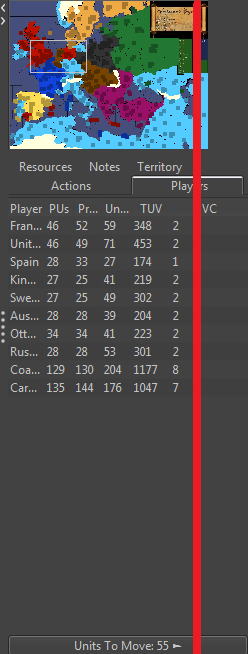
200 minimum wide pixel limit can be safely %20 decreased to 160. I know it had been discussed before but I would like to present my proposal as well. Lets take a look Napoleonic Empires which has the smallest right bar.

I'd say %20 of right bar unnecessarily occupy %90 of maps even in Napoleonic empires its totally unneeded. The player names could be replaced with their small flags as well. If maps needed bigger right bar they can already do that but the opposite one is not possible.
While its possible to play without the right bar but personally I would feel very uncomfortable without it hence I would want to decrease its minimum wideness requirement.
-
-
I'm curious how this would look with movement history, particularly when multiple types of units are moving.
What impact would this have on the unit scroller?
The country names being cut-off is not great, though some flags really similar to one another. I think that makes it a bit of a toss-up.
-
If there will be a concern then the current one could be kept as default but allowing map makers to shrink it a bit more.
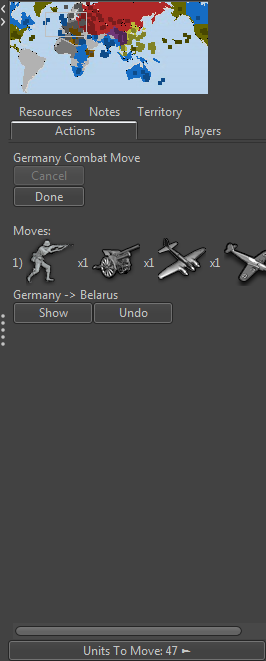
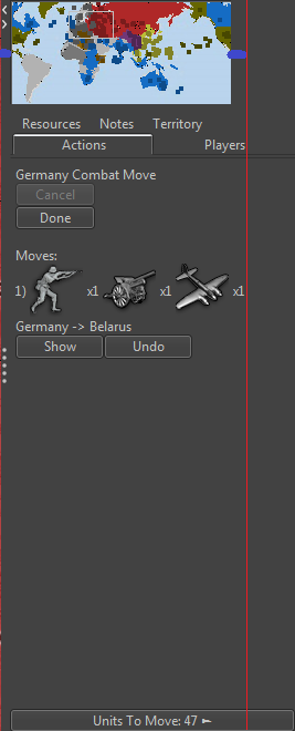
Currently its possible to track 3 different type of units with their amounts if they move together assuming the right bar shrinked in its maximum capacity like it is in NAP. But its still possible to track them while allowing map makers to shring it a little bit.
For example:

Its the most shrinked one as seen and its not possible to see the amount of 4.th units hence I could assume that the most important one in here is being able to check three units .

In this case there would be more space for gameplay without any lose plus the discances which shown as blue in right and left side would be more balanced and looked better.
-
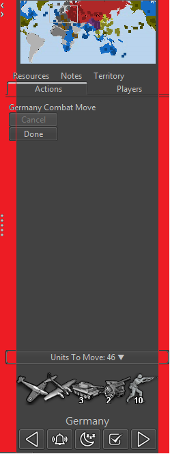
What would happen to the unit scroller? Would that get squished beyond usability? With fewer buttons on it, I think it's more tractable to reduce the min.
-
It would be still fully functional.

I couldn't really see any downside in here. In this example total 30-40 pixel wideness (approximately %15-%17) could have been used for the screen.
-
Also I think the Notes tab is not need and can be removed to save space.
- As some map makers including me have their Notes as images, so need a much bigger space
- Those that use text the rendering in such a small space is poor.
The game notes are also duplicated in the menu under Help> Game Notes, I feel this is the best place.
-
I agree the 'Notes' tab being in the 'action panel' is very questionable.
Funny enough the min is set to 240px. Swing layout is an odd beast, there is invisible padding that needs to be available. With a more narrow unit scroller now, fewer buttons, that looks okay. The 'player' stats table has issues though and becomes difficult to read. Below is a sampling when setting the min to 200:

Hello! It looks like you're interested in this conversation, but you don't have an account yet.
Getting fed up of having to scroll through the same posts each visit? When you register for an account, you'll always come back to exactly where you were before, and choose to be notified of new replies (either via email, or push notification). You'll also be able to save bookmarks and upvote posts to show your appreciation to other community members.
With your input, this post could be even better 💗
Register Login