Proposed Map: Domination 1941
-
@thedog said in Proposed Map: Domination 1941:
Thinking about Sea Zones, Convoy routes etc and how to represent them on the map.
In my games I give the Sea Zones, 0-2PU values, this is meant to represent trade/fishing and the take over of those trade routes. (So no Convoy route circles)
For this map we could make each sea zone in the North Atlantic British owned. Each American Coastal sea Zone would still be American. When a U-Boat, enters the Sea Zone, it is just like a land TT, 0-2pu to Germany -PU to Britain.
(xml-wise we might be able to make the taken over Sea-Zone neutral and therefore not a gain for Germany)If an American ship moves into a German own Sea Zone it reverts to being British.
Does the above work or should we stick to circular Convoy route zones?
@thedog yeah it's an interesting Q. I think attaching money directly to Sea Zones is the easiest way to get the naval game out from under the ground game, so that everything there isn't just subordinated to the transporting dynamic. The standard sort of convoy feature is a bit of a relic though, cause it's based on the older theater games from 2000. I can't remember the exact release order there for tripleA, but it's an early feature, that's been around since before Revised even. None of the later 'official' post v3 World War II maps make use of it however, so it's in a bit of an odd place for general familiarity. Still, compared to how Convoy Raiding works in Global, I think the older system is a lot simpler.
Like this is a very clear example of what I meant in that previous post, about being able to parse the visual information at a glance. In A&A Pacific (2000) you can just look at the map and get a pretty quick read, to know what's going on there and what's at stake, whereas in A&A Pacific 1940 (2009) you're doing a lot of bean counting and tracking and prognosticating on probabilities. Convoys in Global are just confusing I think, even with markers on the board, to have the totals there based on the adjacent land TTs and the economic damage calculated in that much more laborious way. I prefer the earlier conception myself, but it's still sort of limited, since SZ control or 'ownership' still works a bit differently than it would on land. Thematically in the earlier games Convoys were more about denying money to the opponent, with that sort of vibe, but I don't know that that's any better than just assigning a value to every SZ tile, so that's it's more consistent with how stuff works on land. The kink is that SZ 'ownership' can't really be graphically represented in the same way that land TT ownership can (with a color change), so you really need the roundels to step up and serve that purpose. I suppose the same could be achieved with a colored border, though I don't know if that makes oceans a bit too busy/colorful? Probably why the circular motif was adopted, just to set those zones apart somehow visually, or for less roundel clutter maybe? Not sure which approach is best. I'd definitely start with the land, and come back to the SZ boundaries later once the land stuff is all done. Least for the baseline, it makes sense for me to stage it like that probably.
-
@black_elk Is there any program that can subtly alter the size of continents and land masses?
I think distortion is still a necessary evil to fit more units in some territories. But it should not be too excessive otherwise world map would look like too ugly and unrealistic.
Europe, Mediterranean, Baltic Sea, English Channel and Pacific islands definitely should be bigger. North and South America, Africa, Asia and Oceans can be shrinked subtly.
-
@schulz said in Proposed Map: Domination 1941:
Is there any program that can subtly alter the size of continents and land masses?
Yes Inkscape, because its vector based with layers you can pick say just South America or Africa and shrink it or stretch or resize it. There are limitations but it is a lot easier than using a raster program.
-
@black_elk
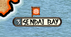
Below is an orange Mon/Flag from our Shogun game it is a _convoy flag and can be any size, this is 40x40px. So bigger WW2 flags can be used to denote SZ ownership.
.
Here it is in game
-
@black_elk Hey Brother ! Good Action Here ! You gonna bust out a Big Bad Ass Global Map and let people fill in the Blanks ? Do the xml how they want accordingly ?
Or do we still need to crunch some stuff out how it's all gonna work first ?
Wish I could help
 but I'm stoked you're into it because your Maps ROCK !!!


-
@thedog said in Proposed Map: Domination 1941:
@black_elk
Below is an orange Mon/Flag from our Shogun game it is a _convoy flag and can be any size, this is 40x40px. So bigger WW2 flags can be used to denote SZ ownership.
.
Here it is in game

Is this for a unit as opposed to the map ?
Edit
Ahh Flag not unit. Seems they work similar to units. I thought Schultz was asking about changing the map. Sorry if I'm clueless here. Just stoked on the idea of a new map
-
@schulz Oh the Dog beat me to it haha. Yeah I was going to say, so in Inkscape for that equirectangular wiki map I posted earlier, you can morph the individual territory tiles if you want by just selecting them, or a group of them together (more likely). I'm sure you can achieve a similar stretch in say GIMP, but it's a little easier/quicker to do in Inkscape with a vector if you just want to stretch say Europe or France or whatever. To create v3 or the domination one that's basically what I did, just using photoshop. So I stretched out the European landmass and the South Pacific, compressed and titled Asia, tried to carve out some of North Africa so the Med could be larger, shrank the Americas and generally just warped it all around with the transformation tools in PS till I had something that seemed like an alright compromise. Then I redrew all the borders in MS paint zoomed in at like 400% or whatever hehe. My first pass for v3 was pretty tiny, I really wanted v3 to display more of the World at a glance, so the baseline was quite a bit smaller than even Revised or Pact of Steel at 100%. Map scaling was pretty rough back then, so I figured to draw something the would look alright more panned out that way. The idea being to use default unit sizes at like 75% or whatever and tighten up the centers since that was a newer feature, but basically just to avoid so much patch pan and drag. 4k resolution wasn't even on my radar, since that was almost 20 years ago lol.
@TheDog yeah, using a flag is prob the best way to go, I think it defaults to the roundel even just with the standard oldschool convoys and it's fairly easy to track that way. I kinda went crazy with the Great War, trying to include as many convoys as I thought I could get away with in that one, but that map was made before reliefs were a thing, so it has a bunch of weird extraneous stuff drawn into the tiles. I was checking out the Shogun map last night. Looks pretty clean!
@beelee said in Proposed Map: Domination 1941:
@black_elk Hey Brother ! Good Action Here ! You gonna bust out a Big Bad Ass Global Map and let people fill in the Blanks ? Do the xml how they want accordingly ?
Or do we still need to crunch some stuff out how it's all gonna work first ?
Wish I could help
 but I'm stoked you're into it because your Maps ROCK !!!


Hey dude! Yeah that was kinda my thought. I mean knowing myself I'll go hot for like 6 weeks on enthusiasm and then burn out in the new year haha. If I think too far in advance it just never gets done lol. I'll bang out a couple maps in svg when I can, cause I like that idea to have some vectors that others could use, and then pass the baton most likely hehe.
-
I Dig It

-
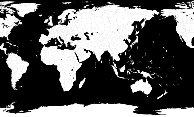
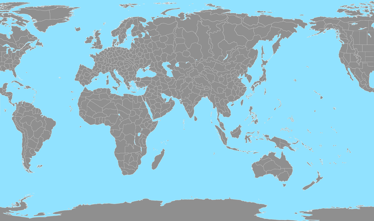
Ok so this a rough pull for like a working draft... It'll need to be cleaned up some more, but I kept basically all the work that Hepp's had added, just upscaled as a vector for the 4K idea. I added back in the Arctic and Antarctic regions as well. Even if they just get cropped, figured might as well put 'em in there for the draft, in case someone wanted that sort of extended view for some reason. I threw in some more terrain features as well, like the Rocky mountains and whatnot, and some more tile divisions up north just to start filling it out. I wanted to give myself something to play around with like that, even if they don't make the grade in the final pass hehe, just for the tooling around.
The forums will only display as a raster at 25% but the svg is at 13000 pixels wide. You can get a sense for the process. First layer will be just the tile divisions, the black lines essentially. Then one can isolate by color, to make the sea blue (it can be whatever shade one prefers), or to change the TT borders from black to white, like in relief, so it's easier on the eyes. I did a second one like that, with the land at 50% gray just to give an impression.
When you trace bitmap in inkscape to isolate and pull the borders, you'll get a bit of that stained glass effect where the boundaries come together, but it works well enough. We can always clean that up with some edgework and feathering once all the morphs are set and the borders are decided. Ultimately we'd probably want a topo relief stretched to the same dimensions, and maybe a relief that's more graphic, just to have both styles available, then yet another separate relief layer for any decorative stuff lol. Probably will take a hot minute or two, but whatever, least the ball's rolling again hehe.

-
Looking very good for a first draft !
What is the diameter in pixels of the Berlin/London/Paris circles?
Putting you on the spot have you thought how many SZ there will be for;
Brazil to Africa
New York to Liverpool ? -
@thedog Thanks! Wasn't too tricky once I got in the groove. Was just trying to block it in quickly so I'd have something to riff off of as we go. I did a little guess work there based on what Hepps was cooking up with the labelling, just to try and fill in some of the gaps. I think having a bit more of the arctic ocean might actually help with unit overflow and to disguise the warp a bit. Could probably try a couple other things to carry that a little further, maybe shrink Spain a slight bit or whatever, but seems to look alright thus far. For the SZ I just nixed everything so as not to get too distracted, but the 1914 layout has basically 7 tiles between New York and Liverpool and 4 between Brazil and Morocco. The Atlantic is simple enough to stretch if one wanted more space, guess it depends what they're after, might be a little snug still in a couple spots. I think the current dimensions should work alright for Global divisions though. Circles at scale are about 150 in diameter. Not sure if those should remain, or just get blobbed out, but round about that size hehe.
-
You probably saw on The Shogun we went for 3x3 units for square cities, but that looks OK. Kyoto was 4x4. units were 54px1.25=68px square.
So for WW2 3x3 units for capital cities should be fine.
Crunch time are we going for 48px or 54px high units? (+2px /unit spacing)
So maybe the 13000px wide map needs to be bigger?
Or the city TT need to be a lot bigger?
Thoughts? -
@thedog 16000x9000 looks pretty clean for the larger units. It crops with just a little bit of the Antarctic showing and the diameter of those circles at around 200 diameter at that scale.
-
I think 16000x9000 is the way to go. In this case bigger is better

It will be a monsterous map

What do think of having a regular shape for capitals maybe square-ish but with rounded corners? (you could always fractal a square shape to be make it look irregular?) Extensions> Modify path> Fractalise...
As its a big map, it might help to have a regular shape when zoomed out, what do you think?
-
@thedog yeah I feel like the lesson learned from my first experience with Domination is to avoid things like capital circles at this stage, cause ya just never know what timeline someone might want, or how big they'll want their map I guess lol. Easy enough to add capital tiles later, somewhat harder to remove if done first, so I'll probably do something different than circles for that stuff. Like I honestly never thought a map with this many territory divisions would be desirable, but then it took off and grew more legs in the afterlife lol. Even still, when I look at it, I mainly see ways to recast AA50 or G40, by imagining half those lines are just gone, but then for someone else maybe this is just the thing heheh. I think 16000x9000 is probably ideal, I mean as long as tripleA can hang. GIMP and Inkscape can take a little while to render, or like if opening duplicates at that scale it can slow down, so going much larger than that might be a bit of a grind. But this seems to work OK and it's got the 16x9 aspect, so that's a plus.
-
-
@beelee said in Proposed Map: Domination 1941:
heheh for sure! Also, so feel free to draw on any of those drafts. Like with the red marker or whatever, and we can play around with ideas here lol.
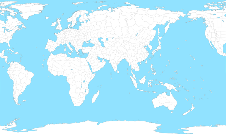
So like for example, I was thinking to have the Rockies/Continental divide as a chokepoint, where there would be a pass through Utah Wyoming and another to the South (kinda Oregon Trail style hehe) So perhaps adding a TT split between AZ and NM like this... Or similarly, say you want a few more coastal divisions for the inevitable Japanese West Coast invasion, maybe you split California in 3 to create some more interest there... Or maybe Siberia gets bisected again etc, here that's pretty crude, but you get the idea...
At various points you can just lean into the blob topography, or follow a river, or a desert, or just use any abstraction really, so the geometry can get more tactically or visually engaging in whatever way. Basically once you got some lines down you can start riffing and it's a little easier to tweak as you go. Just to block in ideas, you can then go back and make it more accurate, or adjust the labelling so it's sensible.
-
@black_elk
If this post still holds true
https://forums.triplea-game.org/topic/1726/ancient-empires-222-bc/101?page=6
24000x12000=288million px
then you have 16000x9000=144million px, so should be fine !Oooh 16:9, well engineered !
Is the line width of the baseTiles 3px-ish for the TripleA utilities.
The reliefTiles line width should be increased to 5px or more as some players will zoom out to 20% so that it shows up as this resolution. -
@thedog For sure! yeah right now it's a bit wobbly between 2 and 3 in some spots, needs some house cleaning hehe. I think it probably makes sense to draft it out and play around, then maybe stroke again just to get it a little more consistent. 1-3 and then 5 or more in the relief, sounds ideal.
-
@black_elk yea i need to try and learn the graphics part. All i can do is change some units a little bit with pinta lol
I need a beginner program

