A brief guide for making a map Relief
-
Alright this one is for Schulz... Like 3 years on, but better late than never right? hehe
https://forums.triplea-game.org/topic/2273/how-to-make-good-relief-tiles
OK so here is a quick walk-through for creating a tripleA map relief using the GNU Image Manipulation Program (GIMP) with a bunch of screenshots. You can do the same sort of thing in Photoshop, but since GIMP is free we'll roll with that. I'm going to go step by step with screenshots so you can follow along with the process. This is basically what I've been doing for theDog's 1941 Global Command Decision and the UHD World War II Global map I'm making with Beelee. The same basic principles should work for any map though.
Preliminaries: Gathering or creating the images we'll need.
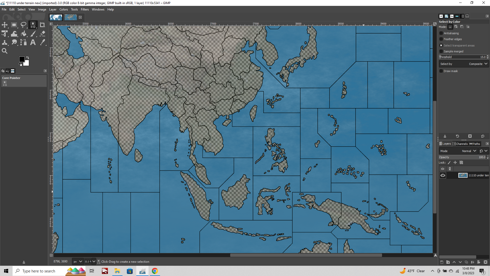
So the first thing you need to do is find a topographical, terrain, or elevation map that you like and then size it to your desired dimensions (whatever width/height you want for your game to display at 100 percent zoom). If you already have the completed baseline (say for an existing tripleA game), then you'll need to find a topo map where the projection roughly fits what you have on the baseline. So Mercator if the base is Mercator, Robinson if the map looks more Robinson etc. You can find some good topo maps on Wikipedia or the internet archive. Or you can assemble from smaller regional maps, if you're trying to create an original warp. If you're starting just from scratch you can use any map image to create a baseline.
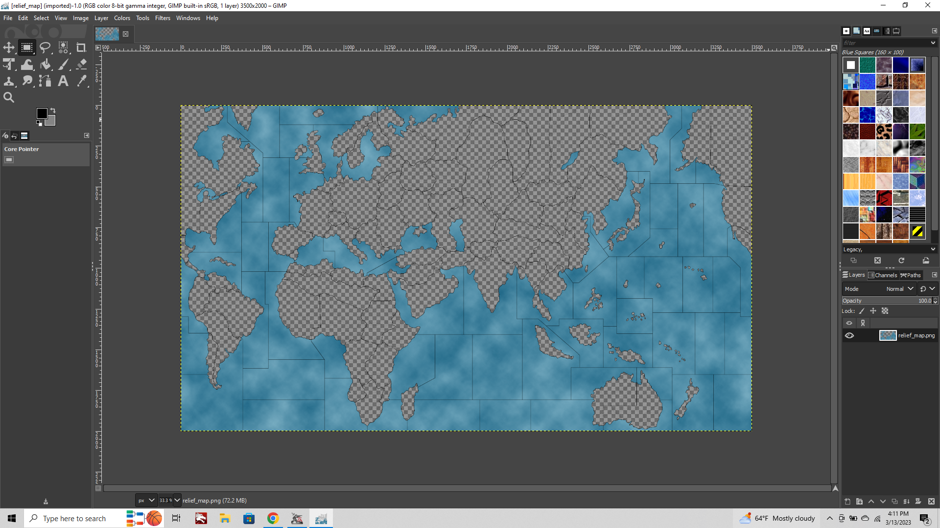
The baseline is the critical image that the tripleA map creator tools use to do all the stuff that needs doing there. What we want is an image for the baseline (baseTiles) with just 3 colors, 100% black for your borderlines. 100% White for land. And then any other other color, usually a blue, for the sea zone tiles.
To achieve this simply create a new transparency layer on top of your selected topo map and then trace out the borders you want with the pencil tool using 100% black at 1px in size. Use the Pencil tool for this, not the Paintbrush tool, cause we don't want any interpolation or anti-aliasing on our baseline.
It's not totally essential for the black line to be exactly 1px in width, but this is very helpful for creating a relief. Basically it's just much easier to size up from a 1px line later on, than it is to size down from something thicker. The important thing is that the 1px line doesn't have any breaks (no gaps), so I'd suggest a zoom of like 400-800% so you can actually see the pixels as you go.
After you are finished with your trace, delete the Topo map layer, so you're just left with the 100% black 1px lines on a transparency. Use image flatten with White as your background color or Copy/Paste this image onto a 100% white background, then fill in the oceans or large lakes with a Blue using the Paintbucket tool (make sure the Paintbucket tool has "anti-aliasing" unchecked in the tool menu to the lower left of the screen). Then File>Export png.
Now you got a Baseline! Aces!
Everything we do from here on will be to manipulate this baseline image along with your topographical map to create the relief.
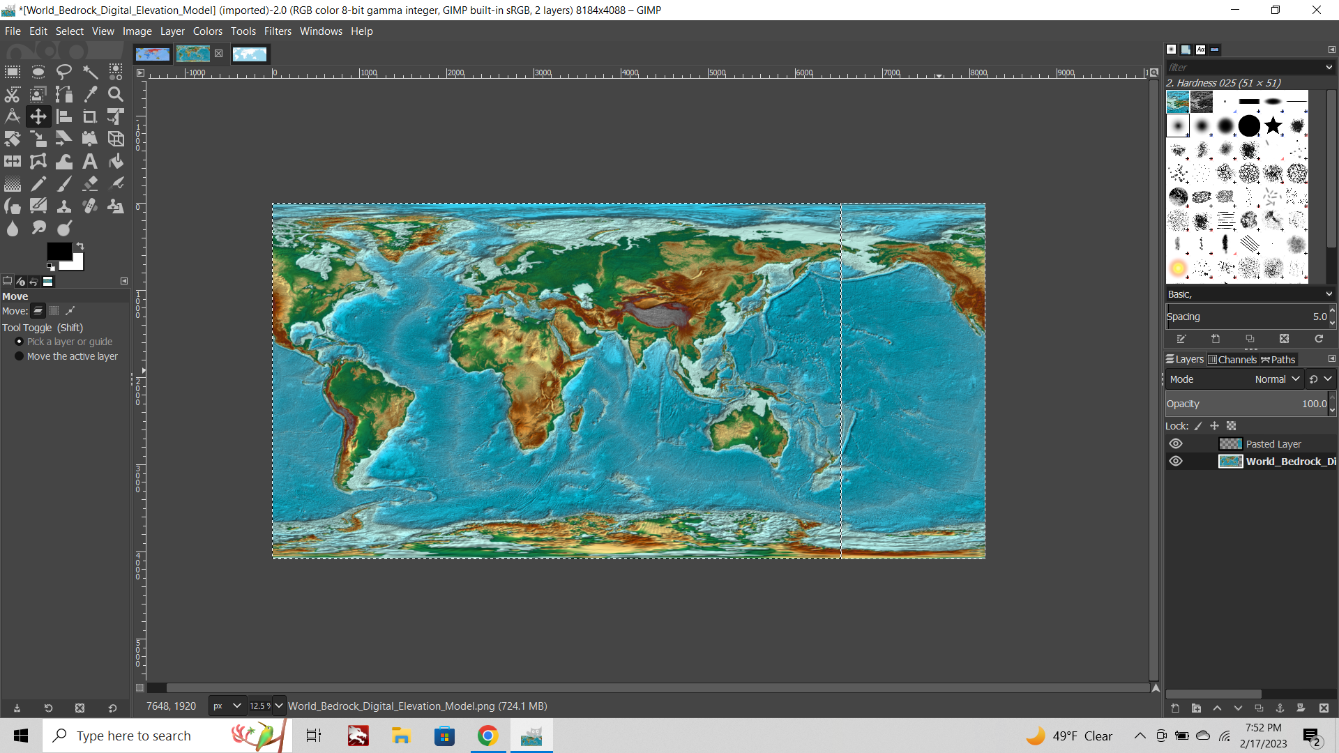
Step 1: Open your topographical map and your baseline image in GIMP.
For this example I'll be using an image that Schulz created for the baseline (it's not totally complete, the one I snagged, so I just isolated the continent shapes instead of all the sz and tt borders) but it will work for our purposes just to show the ropes.
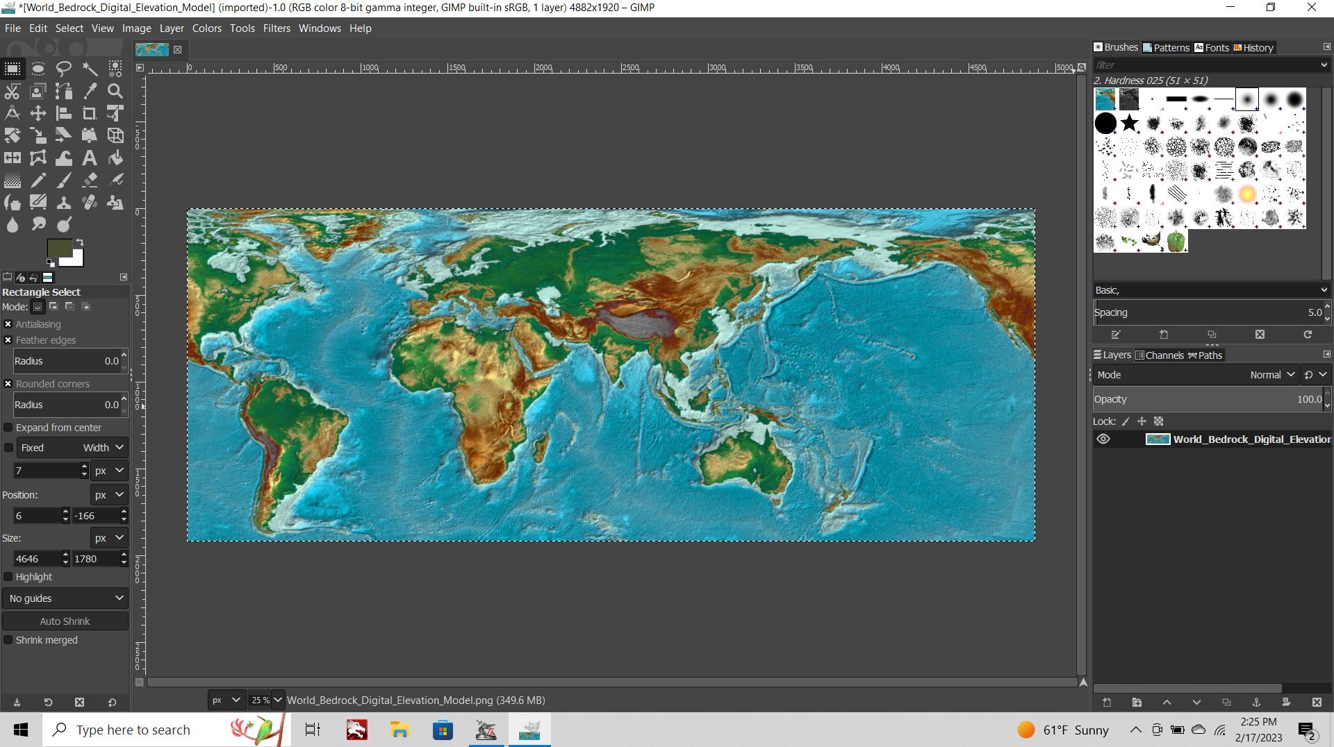
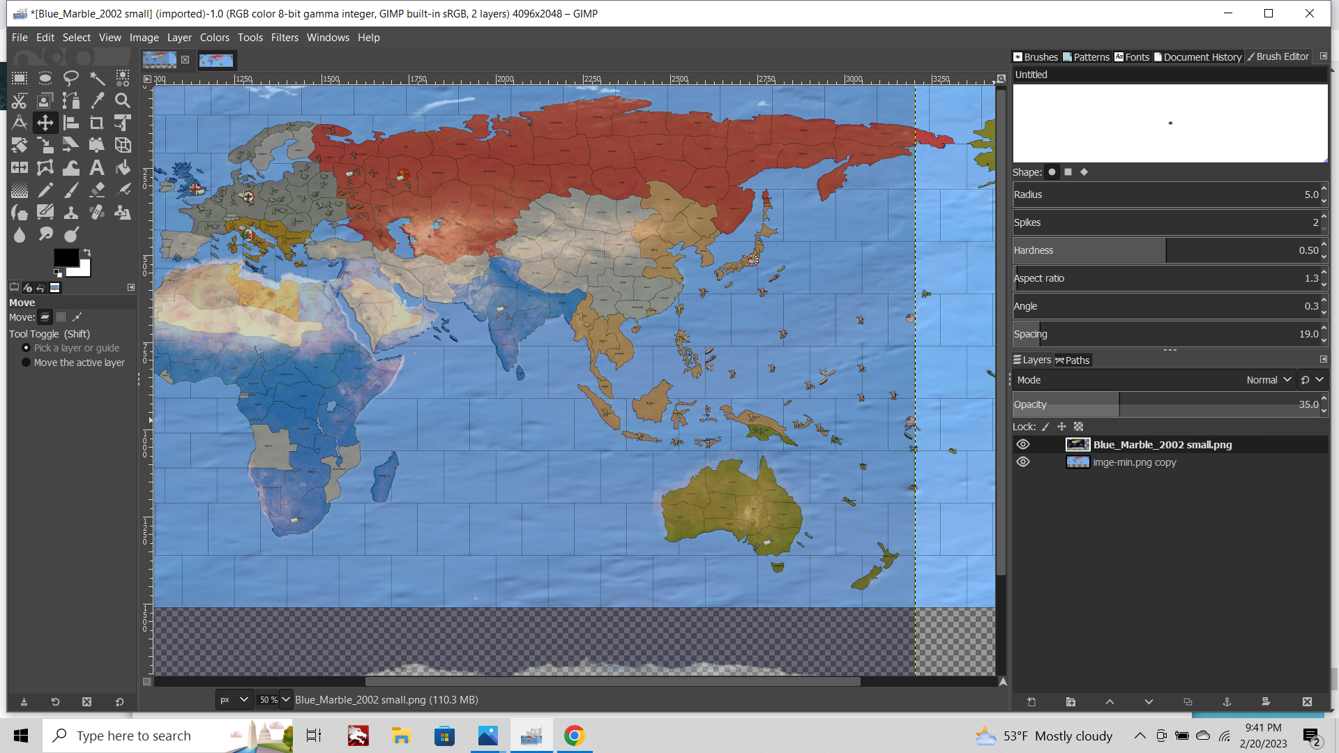
Select the Topographical map image first. You'll see a little tab off to the lower right in the layers sub-menu which says Opacity 100% We need to knock this back.
I like 25% myself, but anything between say 10% to 50% should work alright. The higher the opacity the more your Topographical under image will display in your relief.
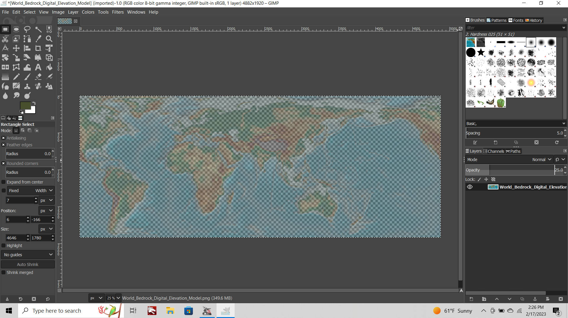
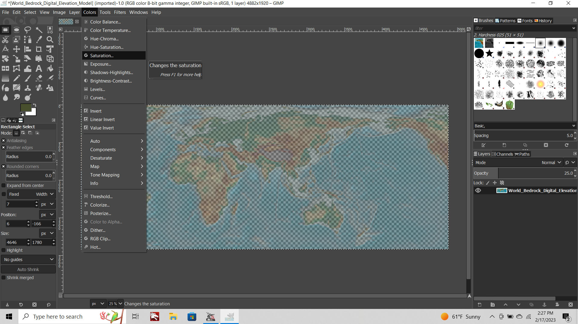
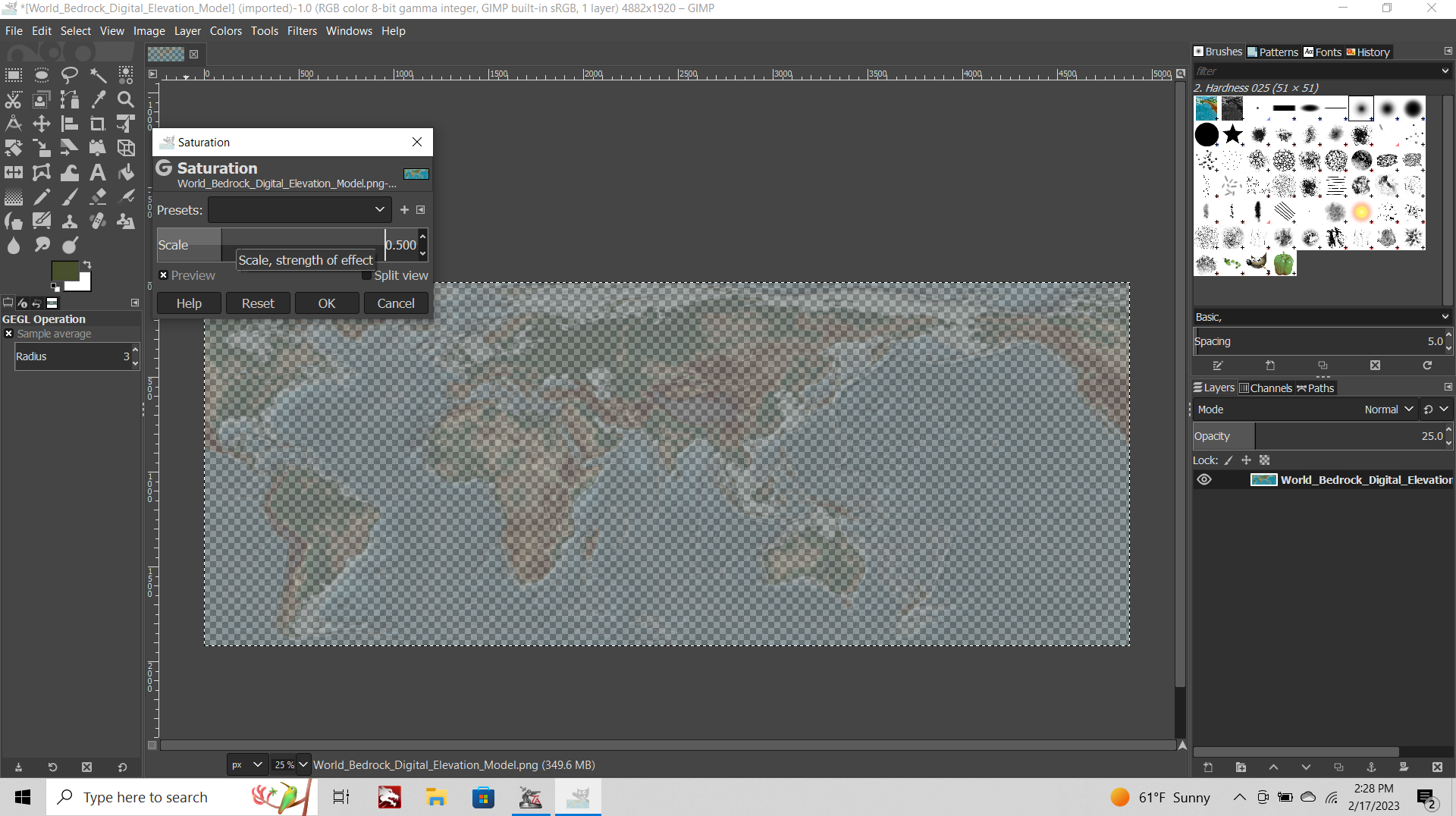
Now go to the tab at the top of the screen called "Colors" and choose > Saturation from the drop down list.
Dial this down from 100% to 50%. The lower the saturation the more the national ownership color hue will be preserved. If you completely desaturate the image, the national ownership hue will be retained and only the color "value" (the shade/tint) will vary, for the colors that tripleA will paint into the TTs in-game. I like a little splash of Topo hue to remain though, so 50% saturation seems to work pretty nicely.
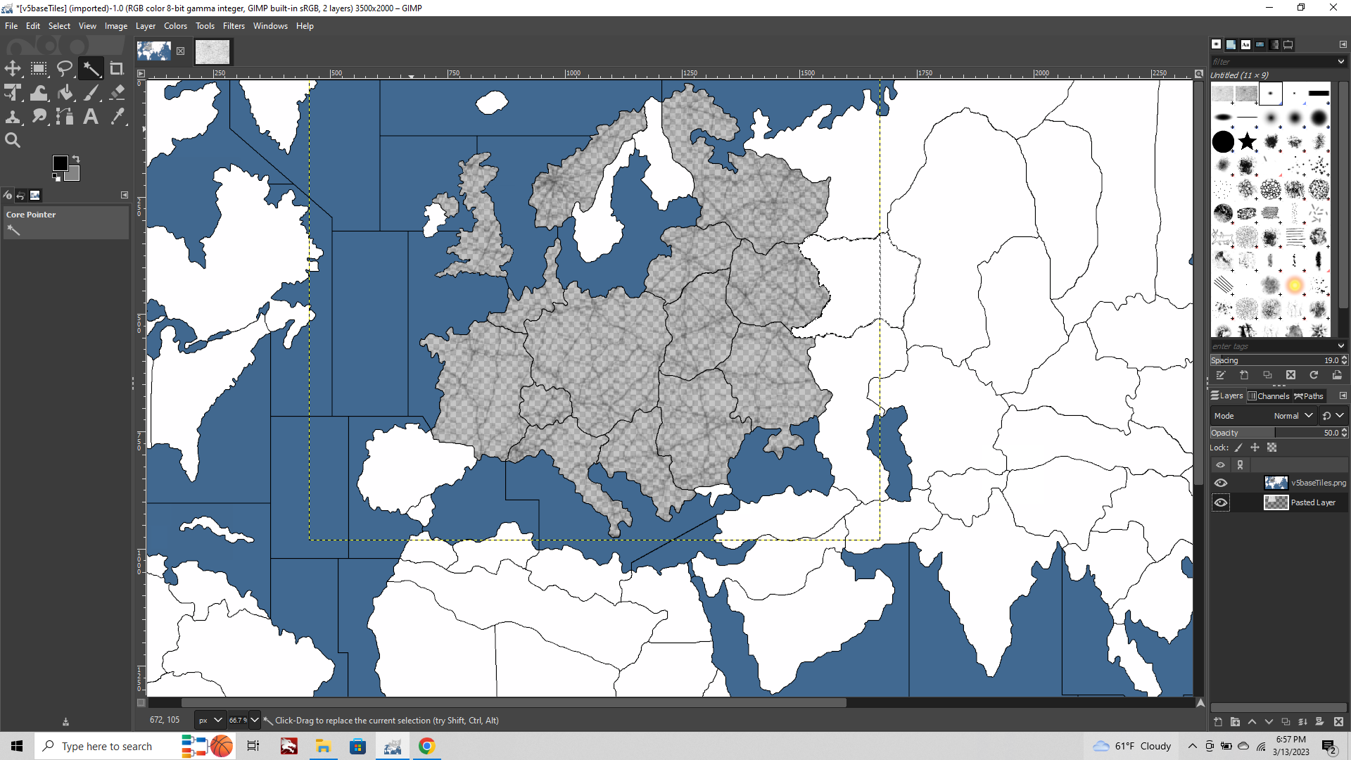
Now that your Topo map is at 25% opacity, 50% saturation, turn to your Baseline image.
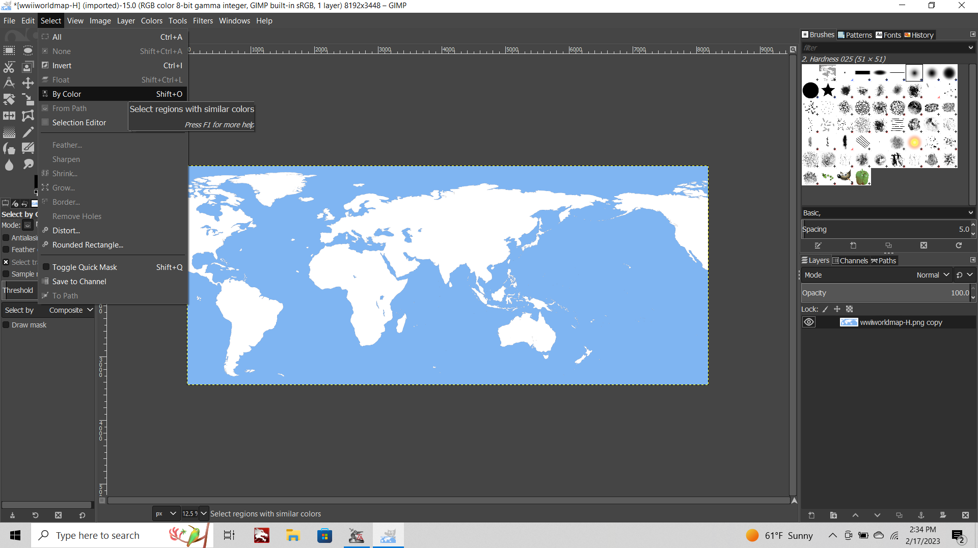
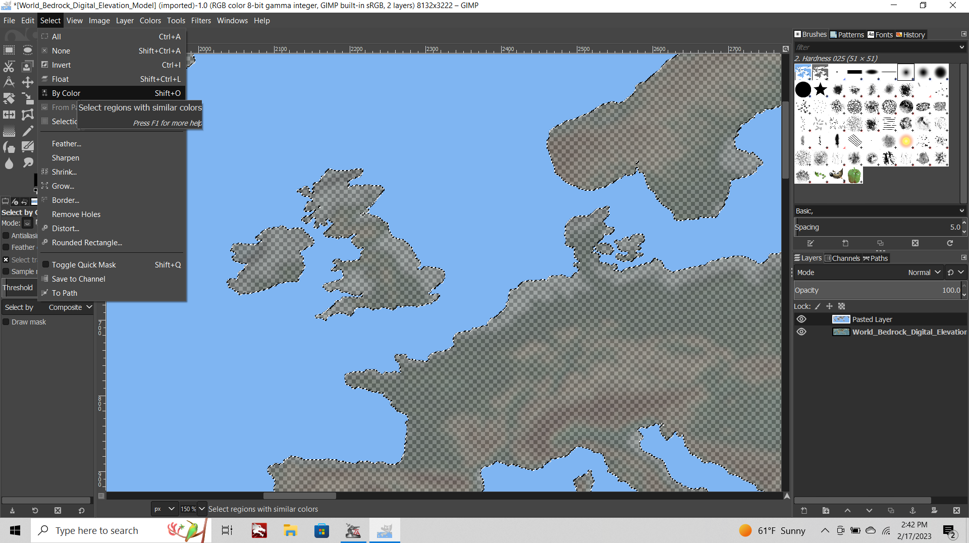
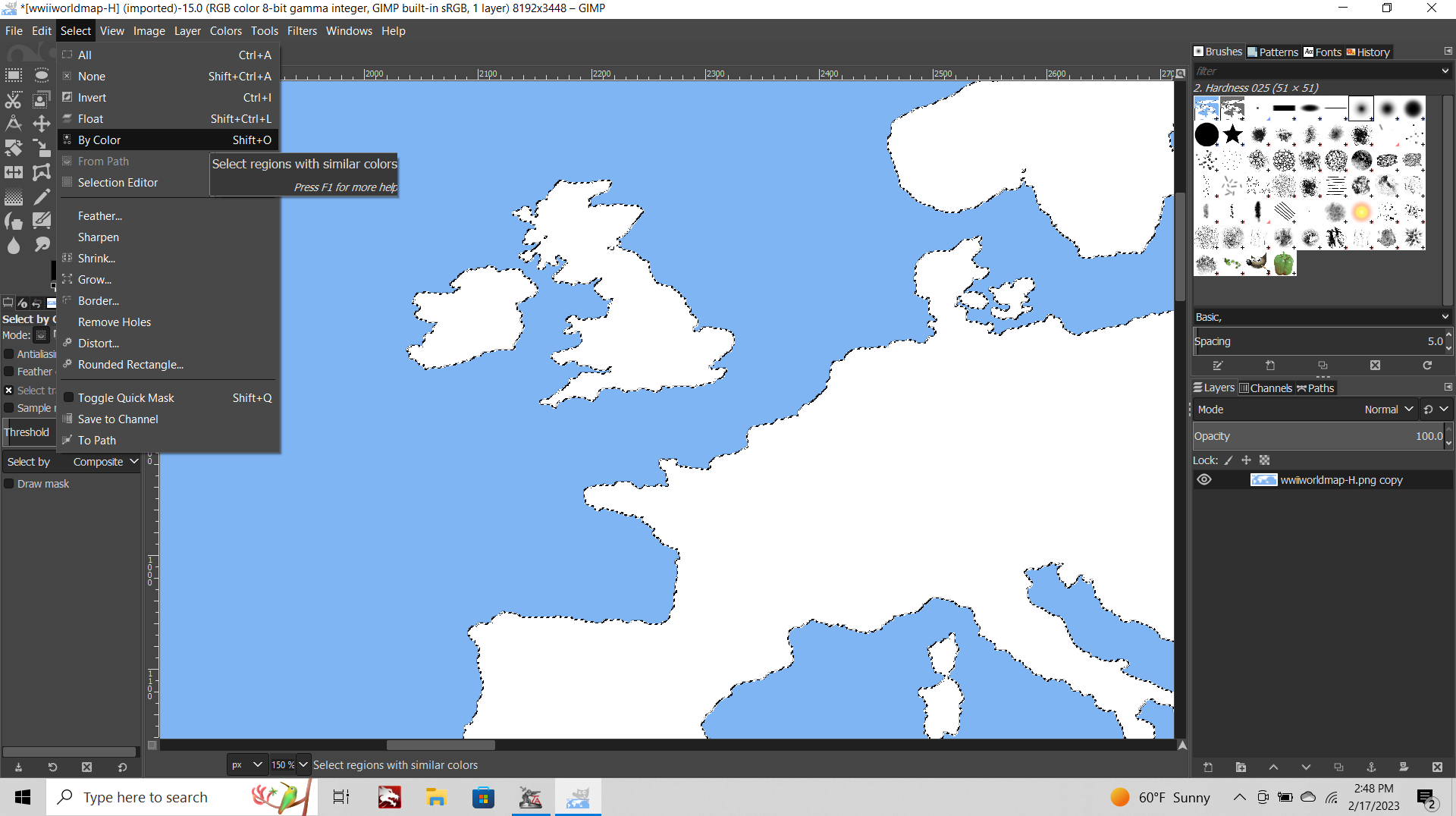
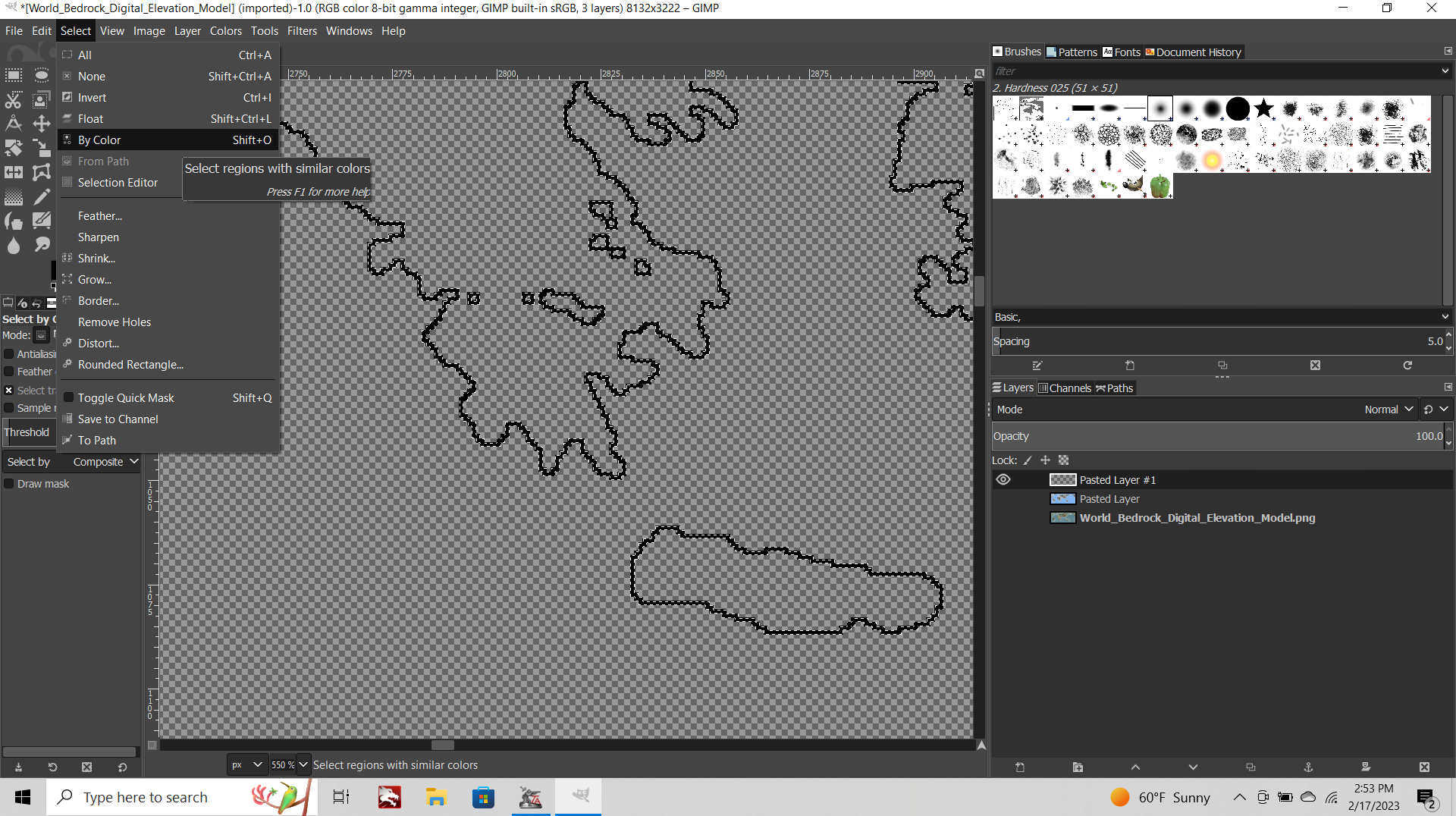
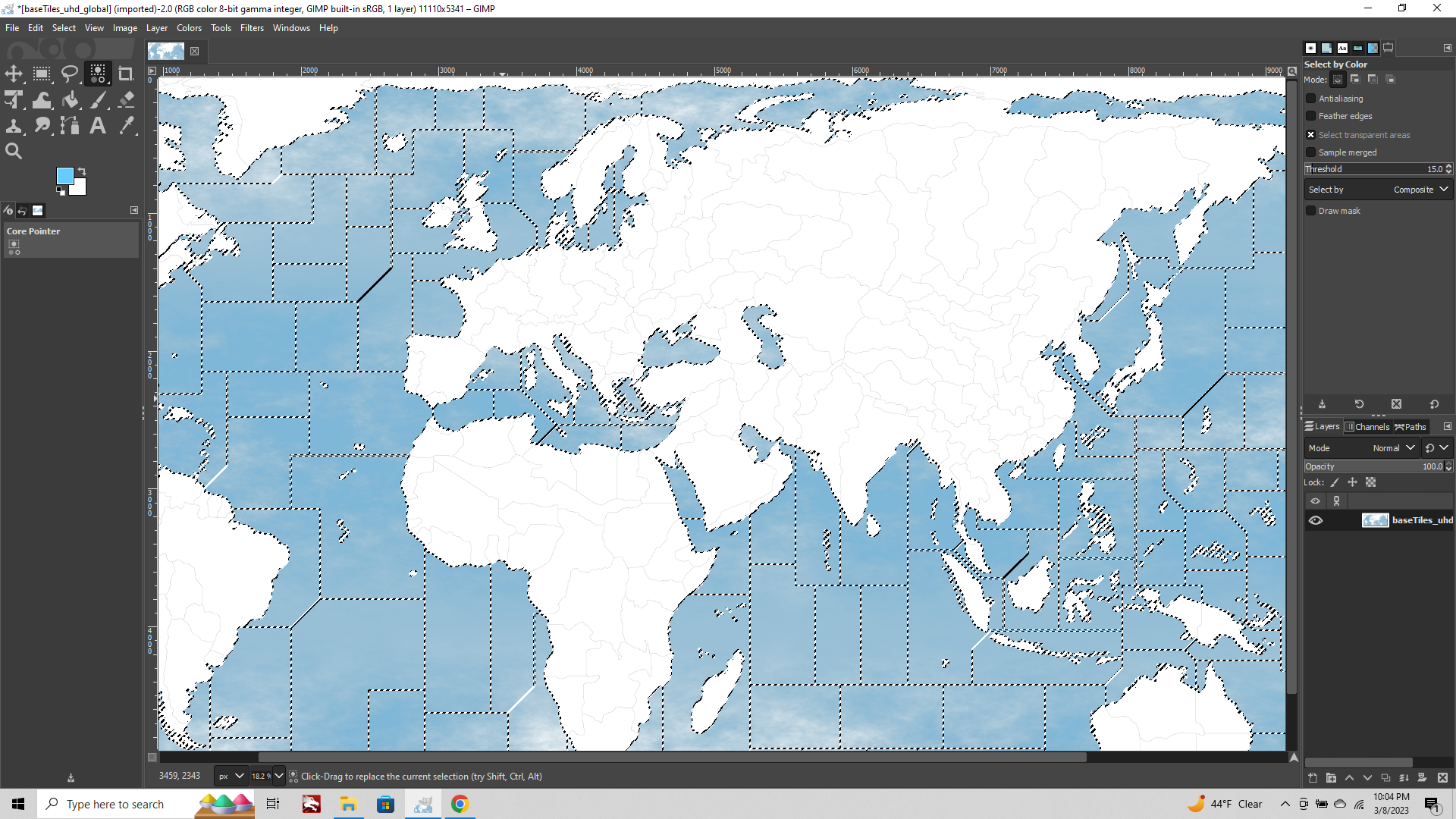
Go to the Select Tab at the top of the screen
choose "Select by Color" from the dropdown menu.
Use the cursor to select a white area of your baseline.
It will light up with a marquee around everything that's white.
Return to the Select tab
choose "Invert Selection" from the dropdown menu.
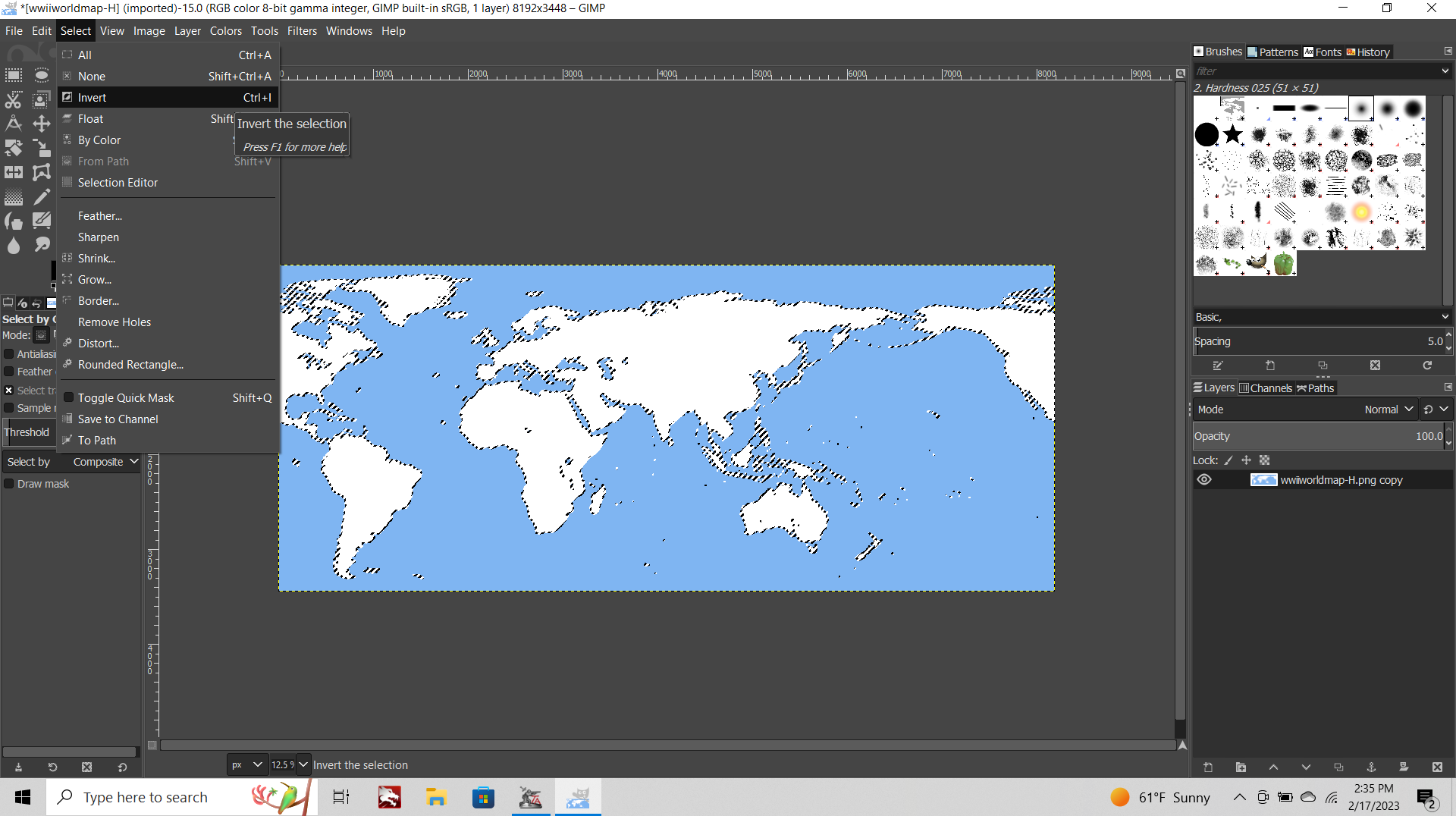
Now only the Black and Blue of your baseline will be selected.
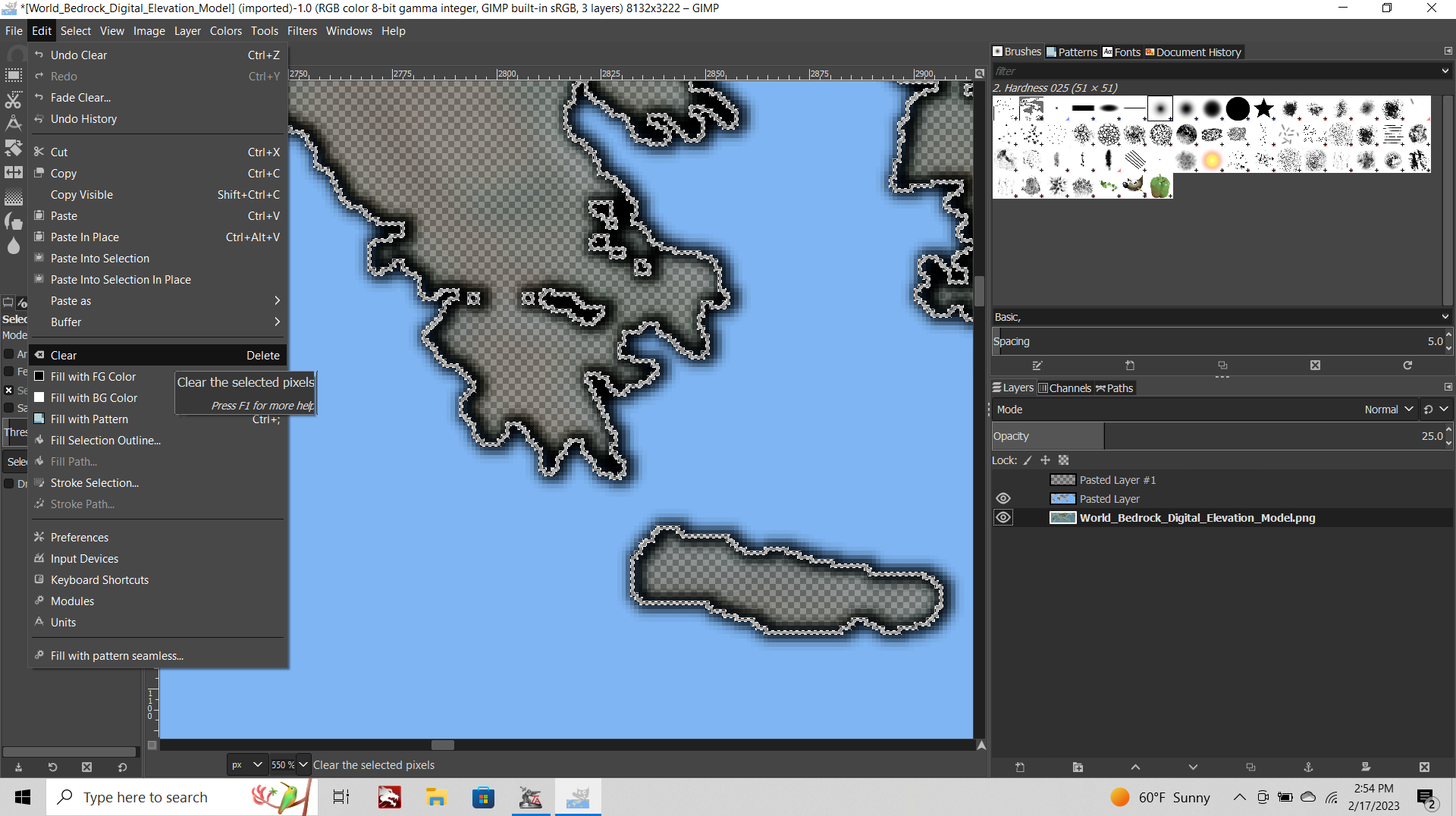
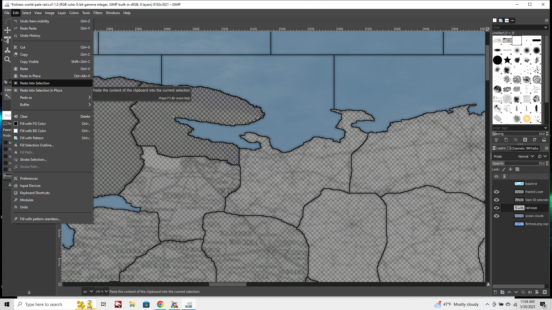
Edit tab > Copy
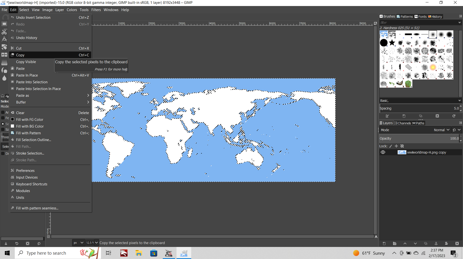
CONT BELOW
-
Click over to your Topo map again
Edit tab> Paste in Place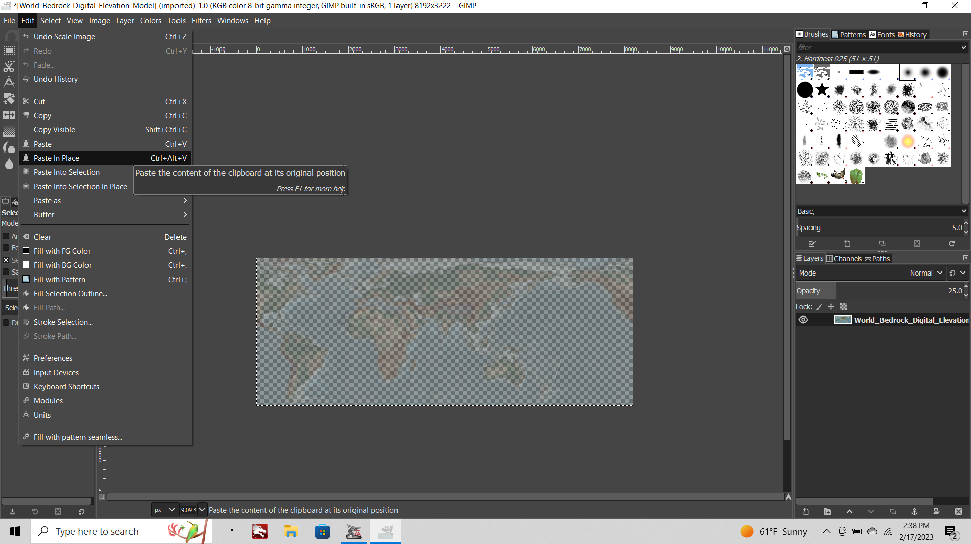
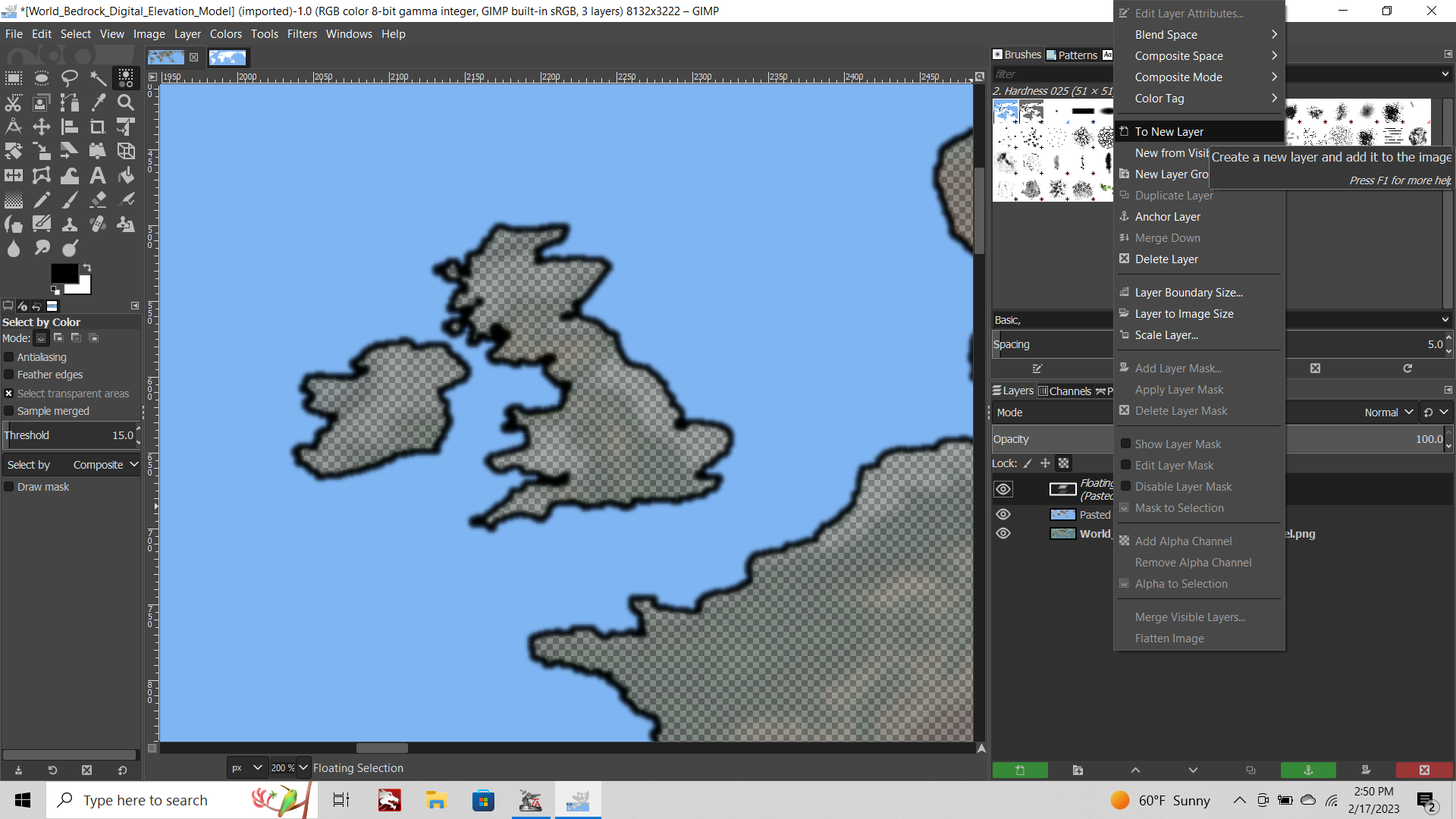
This will create a new floating selection in your layers menu (lower right of the screen).
Click that guy and select "to New Layer" from the dropdown menu. This will add a new layer, where the Opacity and Saturation is back to 100%.
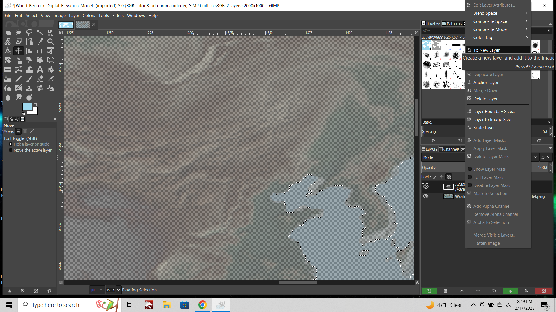
Aces! Now you got a solid layer on top of a semi transparent one.
Provided you kept the dimensions of your baseline and your topo the same, this should draw your Black borderlines and your Blue oceans cleanly on top of the Topo image. The stuff that was white on your baseline now shows as a semi-transparent, semi-desaturated image of the terrain, but the sea zones and black borders are at 100%. We will mess with these two layers separately for now. If it helps you can click the little eyeball to make one or the other layer invisible.
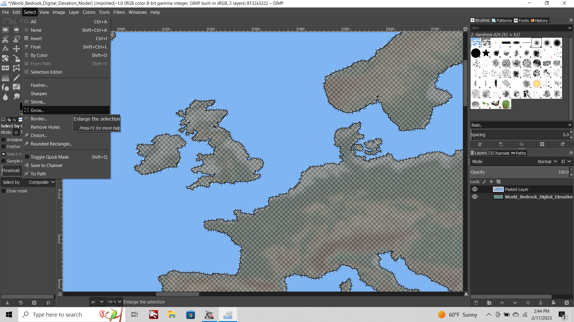
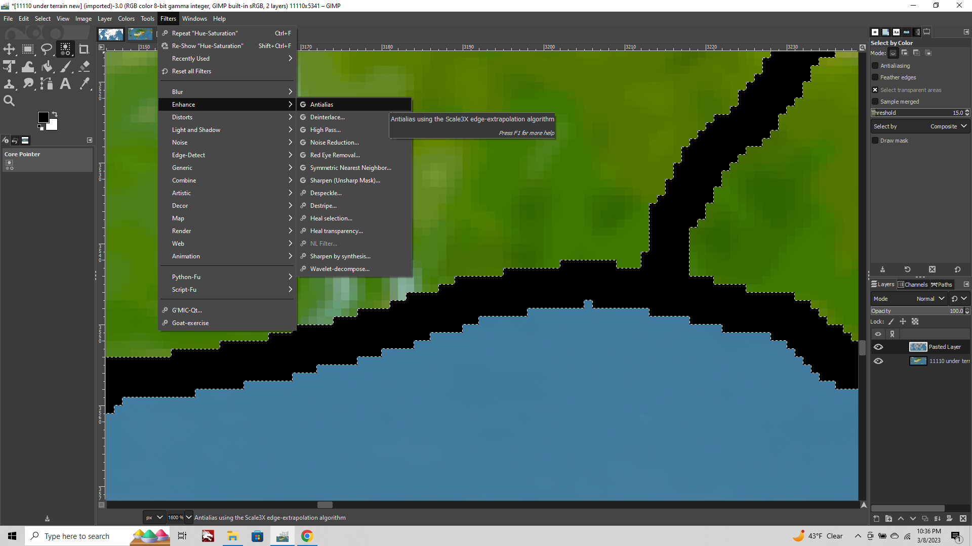
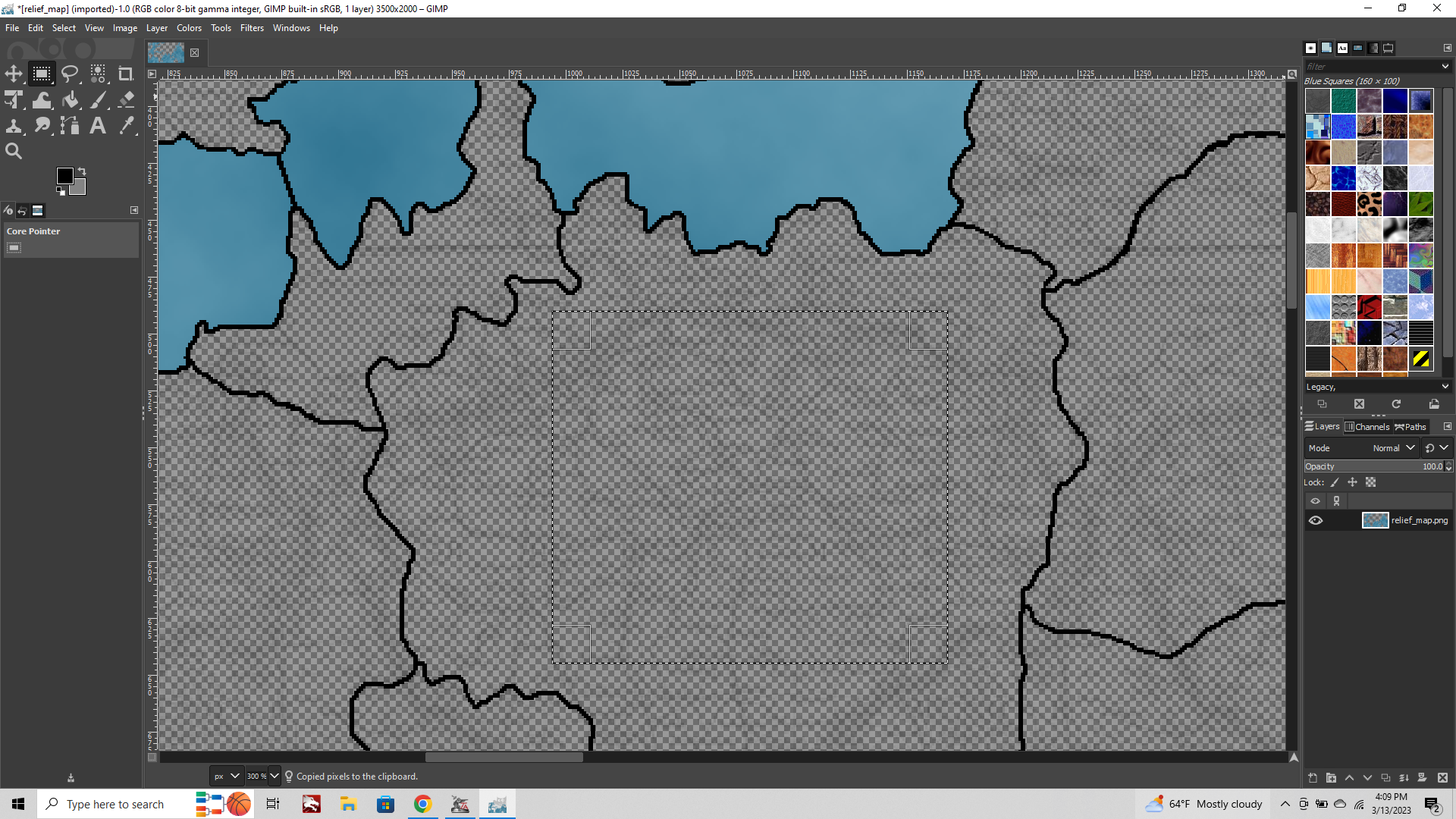
Now select your new layer with the Black and Blue from that layer menu on the lower right (the currently selected layer will show a white border around it so you know which one you're working on). Go to the Select tab at the top of the screen and choose "Select by Color" from the drop down menu, Click your black 1px line.
All your blacks will show with the marquee.
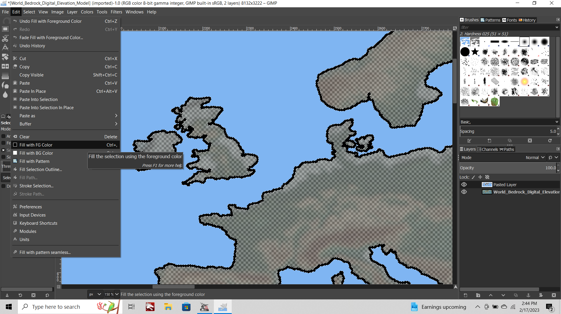
Select tab> Grow Selection > 2px
Edit tab> Fill with foreground color (100%) Black.
Now your line is beefy, 5 px instead of 1px.
Select tab> Grow Selection > 2px again
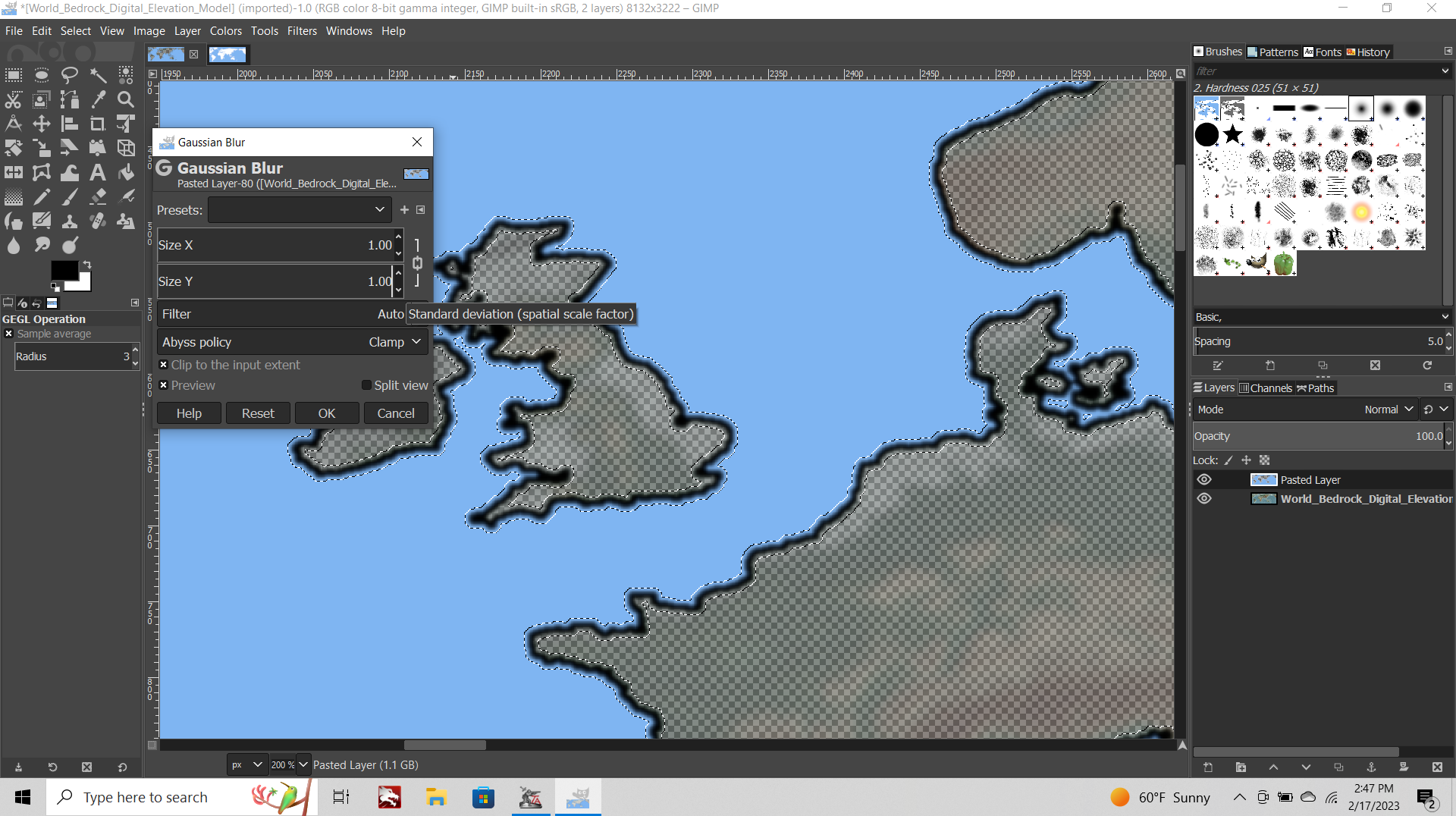
Filters tab> Blur > Gaussian Blur > Set to 1.00
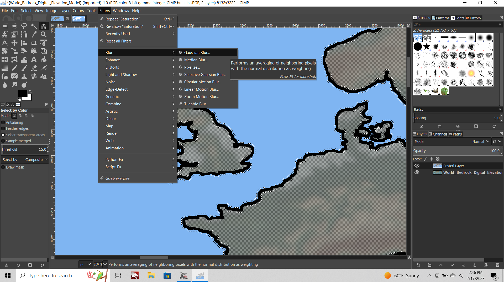
The default is 1.5 but this is a bit fuzzy. 0.5 is a bit too sharp.
You might have to enter the 1.00 Manually.
Should end up looking like this.
CONT BELOW
-
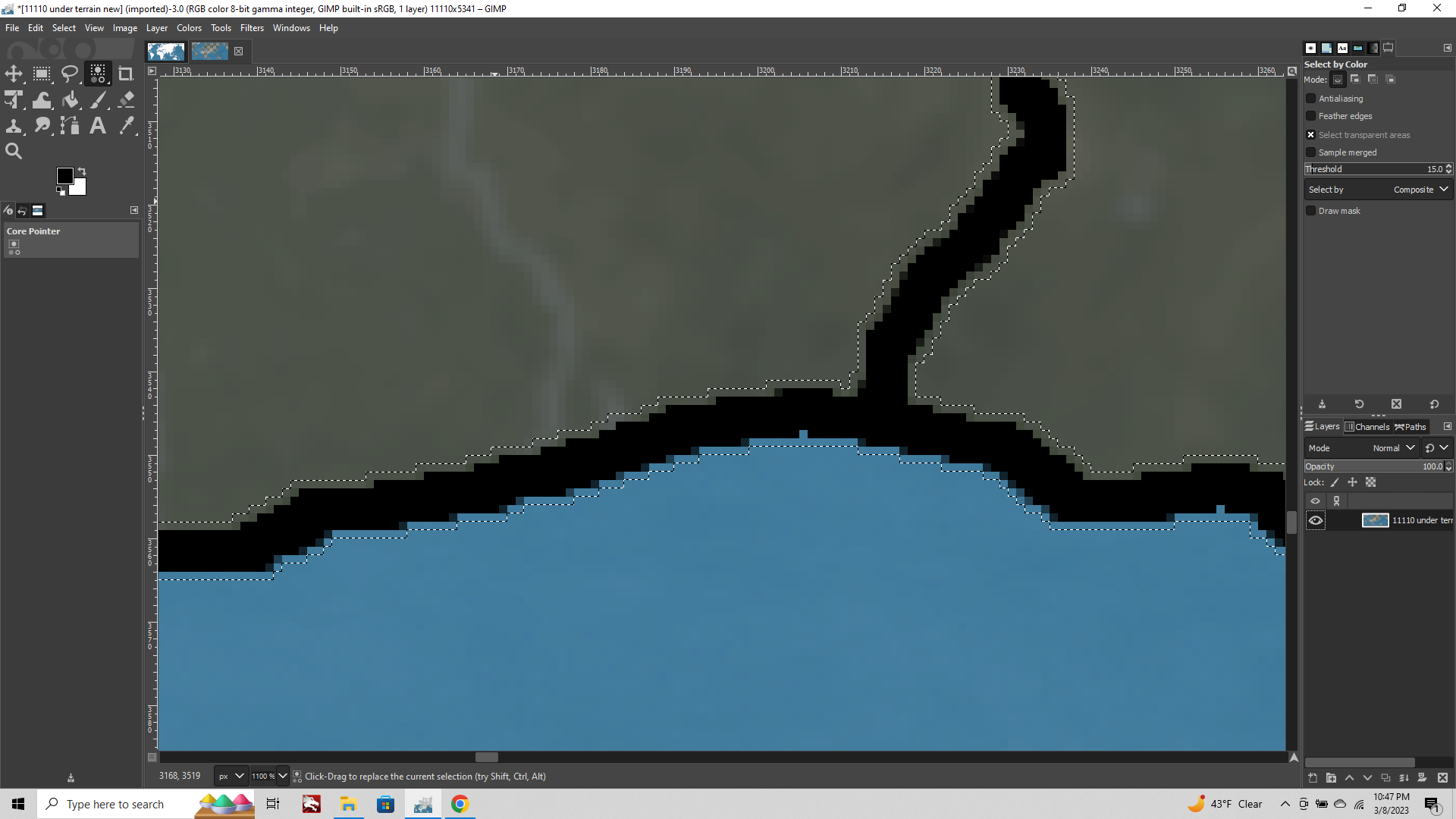
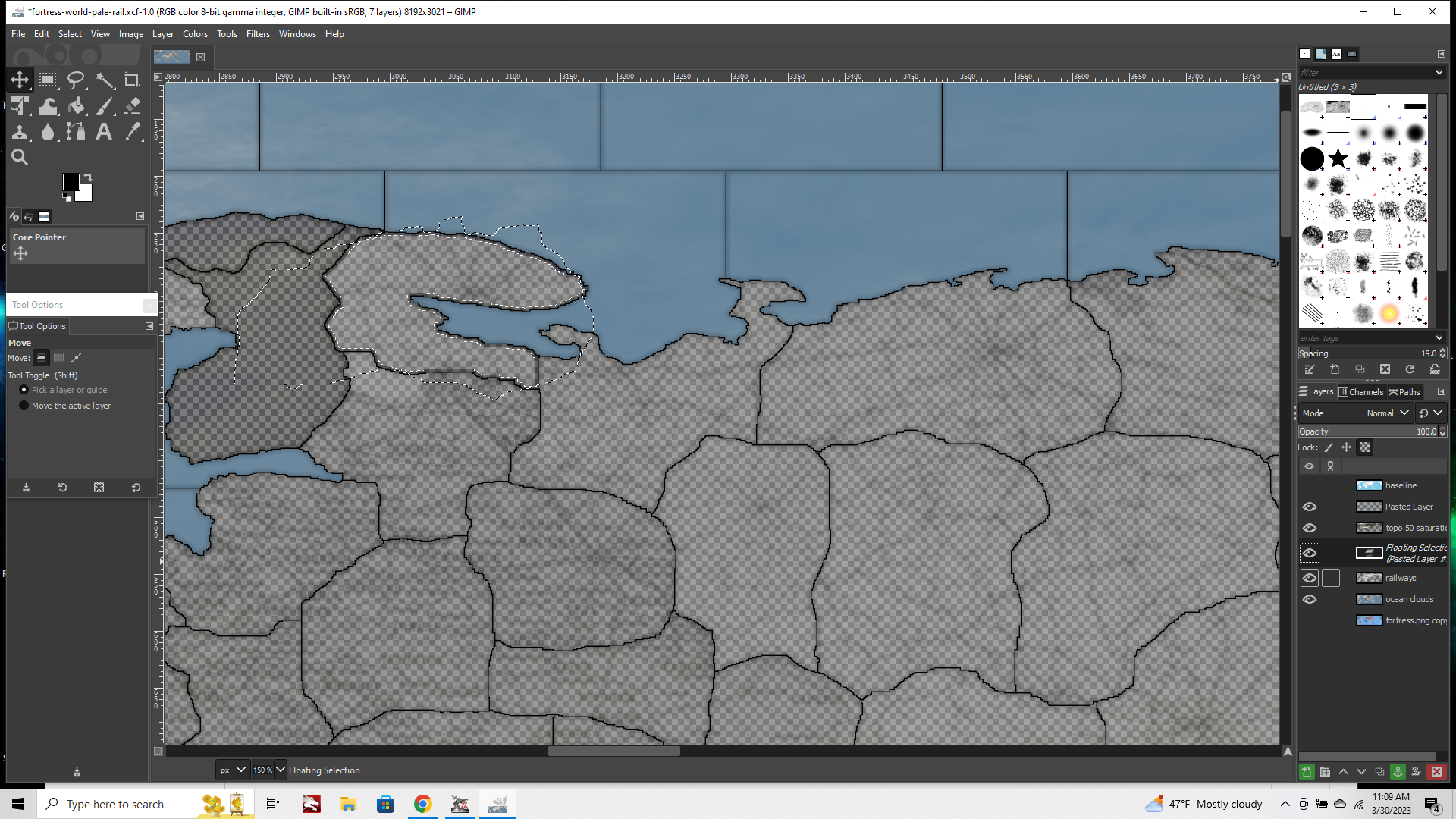
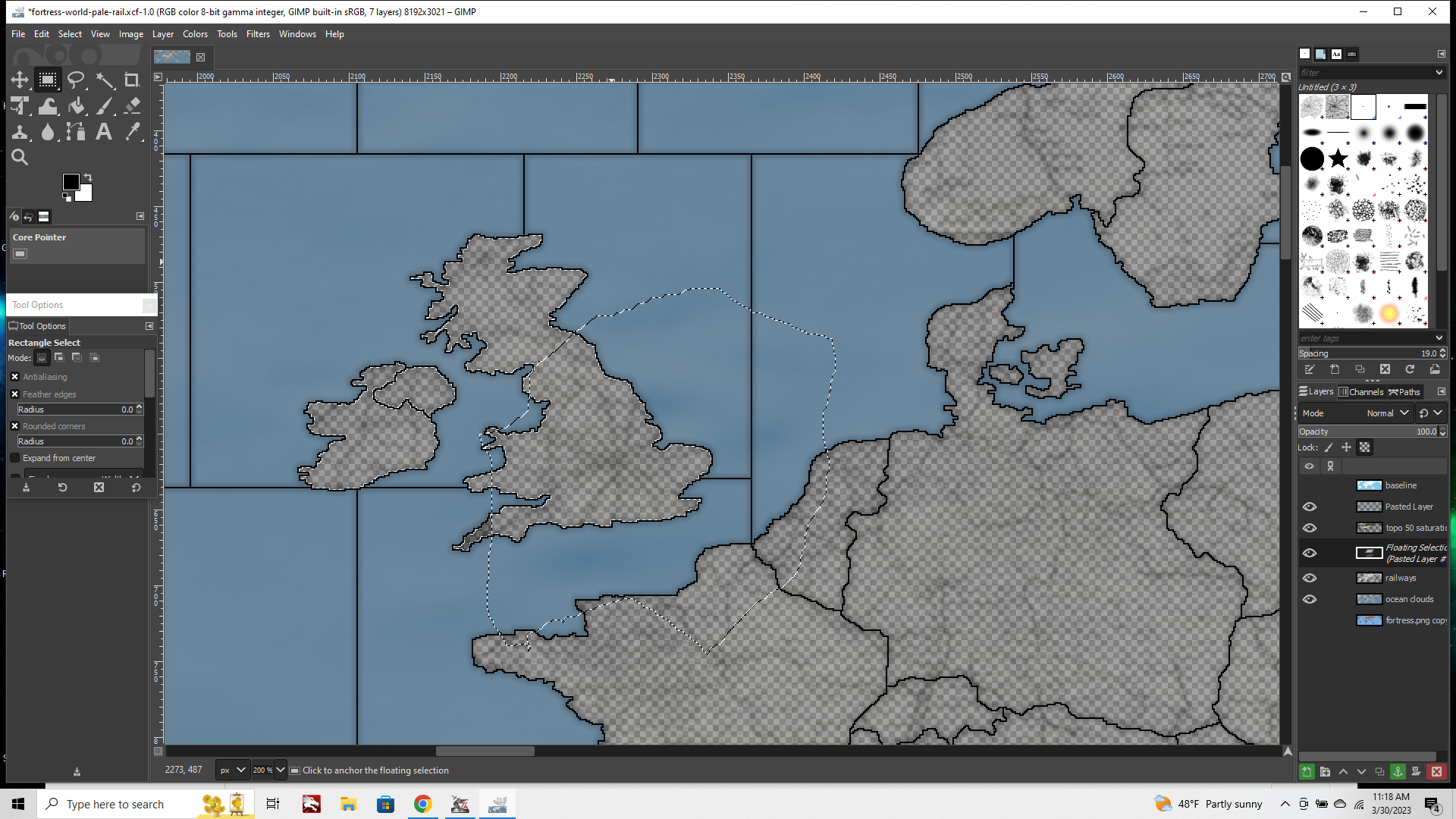
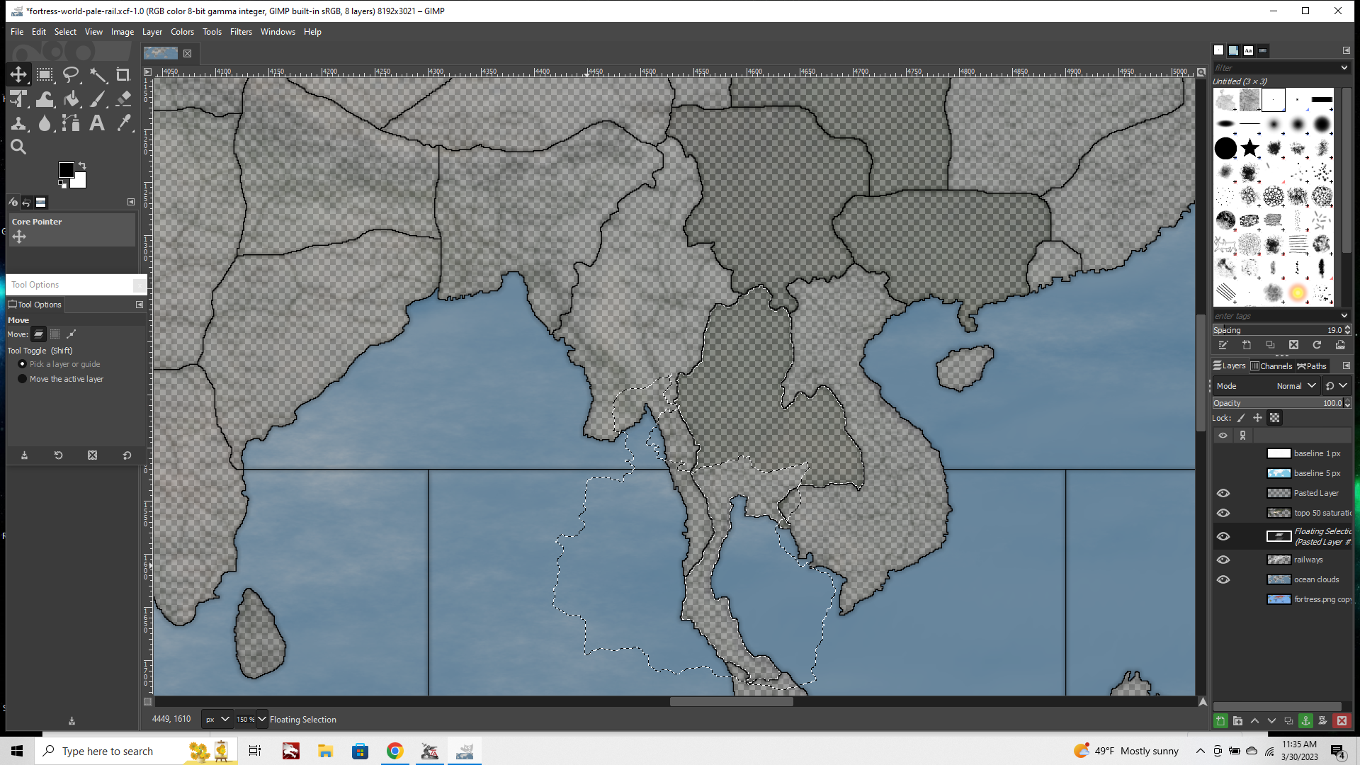
Now go back over to your baseline image again.
This time we want to select and copy paste only the 1 px borderlines. So zoom way in select tab > select by color, click the black, then hit Edit>Copy
Over to the Topo image again.
Edit > Paste in Place.
Click the floating selection, choose "To New Layer" again from the drop down. At this point you'll want to click the eyeballs beside your other layers to make them invisible, so you only see the 1px black lines.
Select tab > Select by Color. Click the black line.
Now you have the Marque selected. Click delete so the black line disappears. Now make this layer invisible, and restore the other layers to visibility by clicking the eyeballs.
Your marquee should still be displaying. Now click into those other layers and hit delete there as well.
This will clear a 1 px opening exactly where your baseline would be so that this section of your relief map is 100% transparent.
Now the TripleA TT highlight will work on your relief.
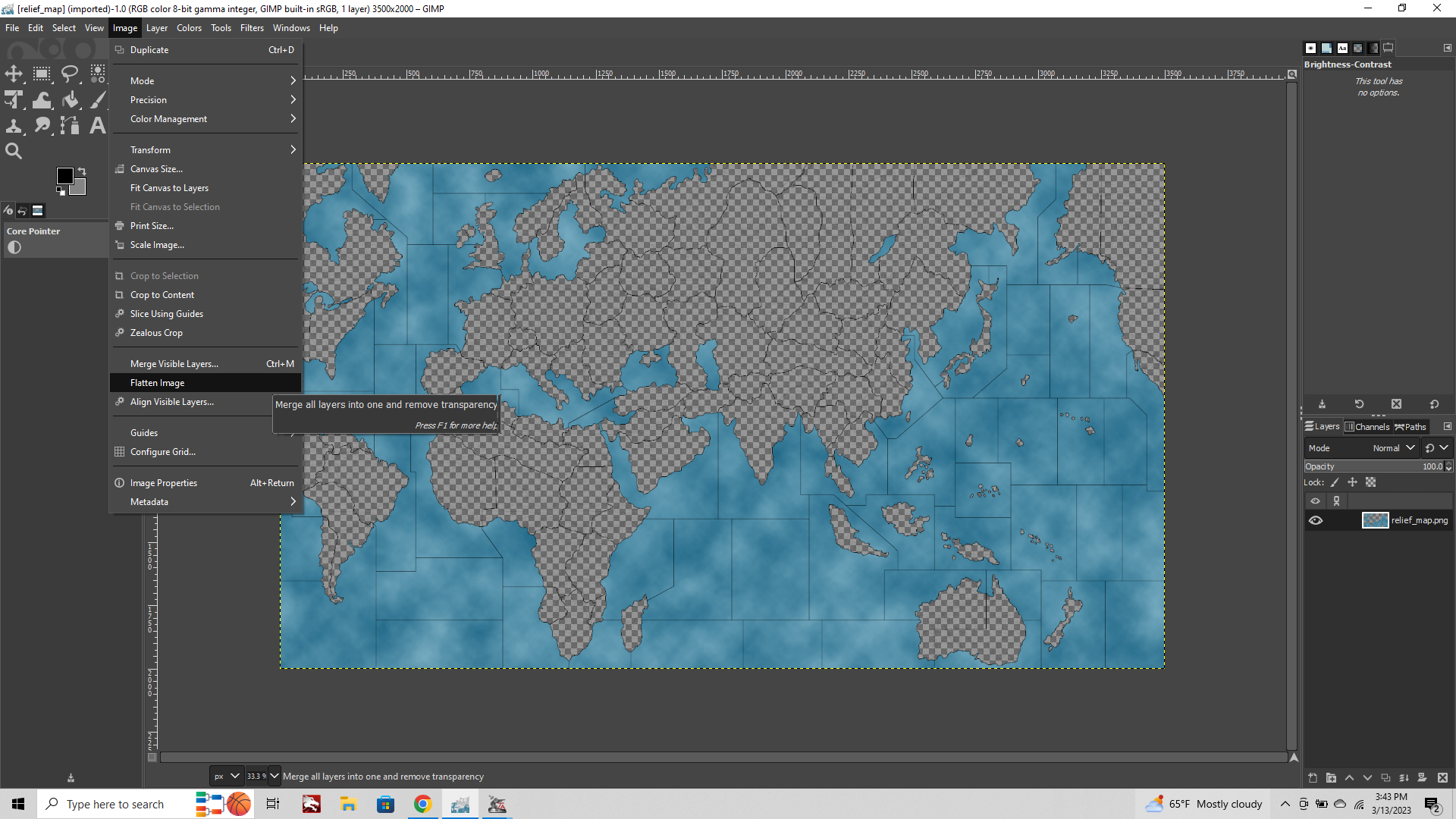
Click the Image tab at the top of the screen, and choose "Merge Visible Layers" from the dropdown.
This collapses all your working layers into a single layer.
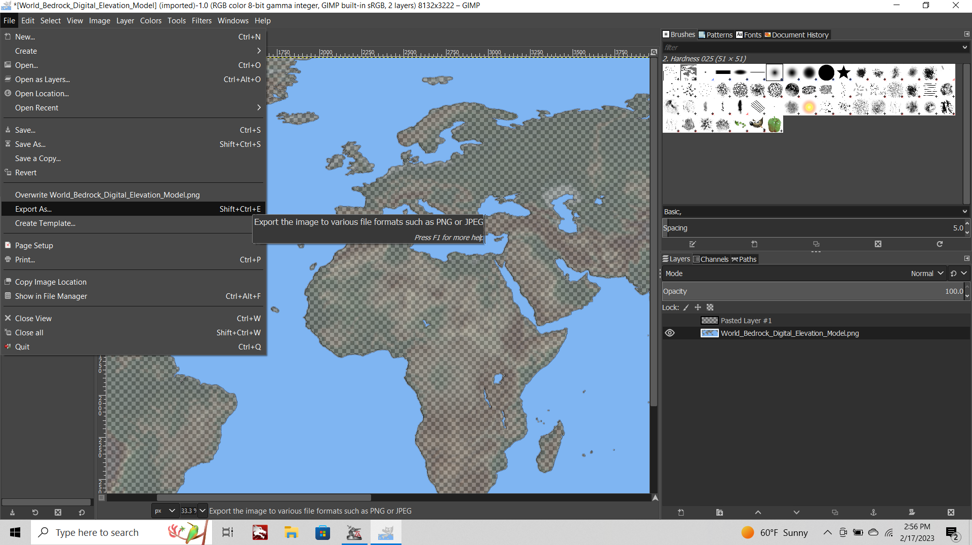
File> Export png.
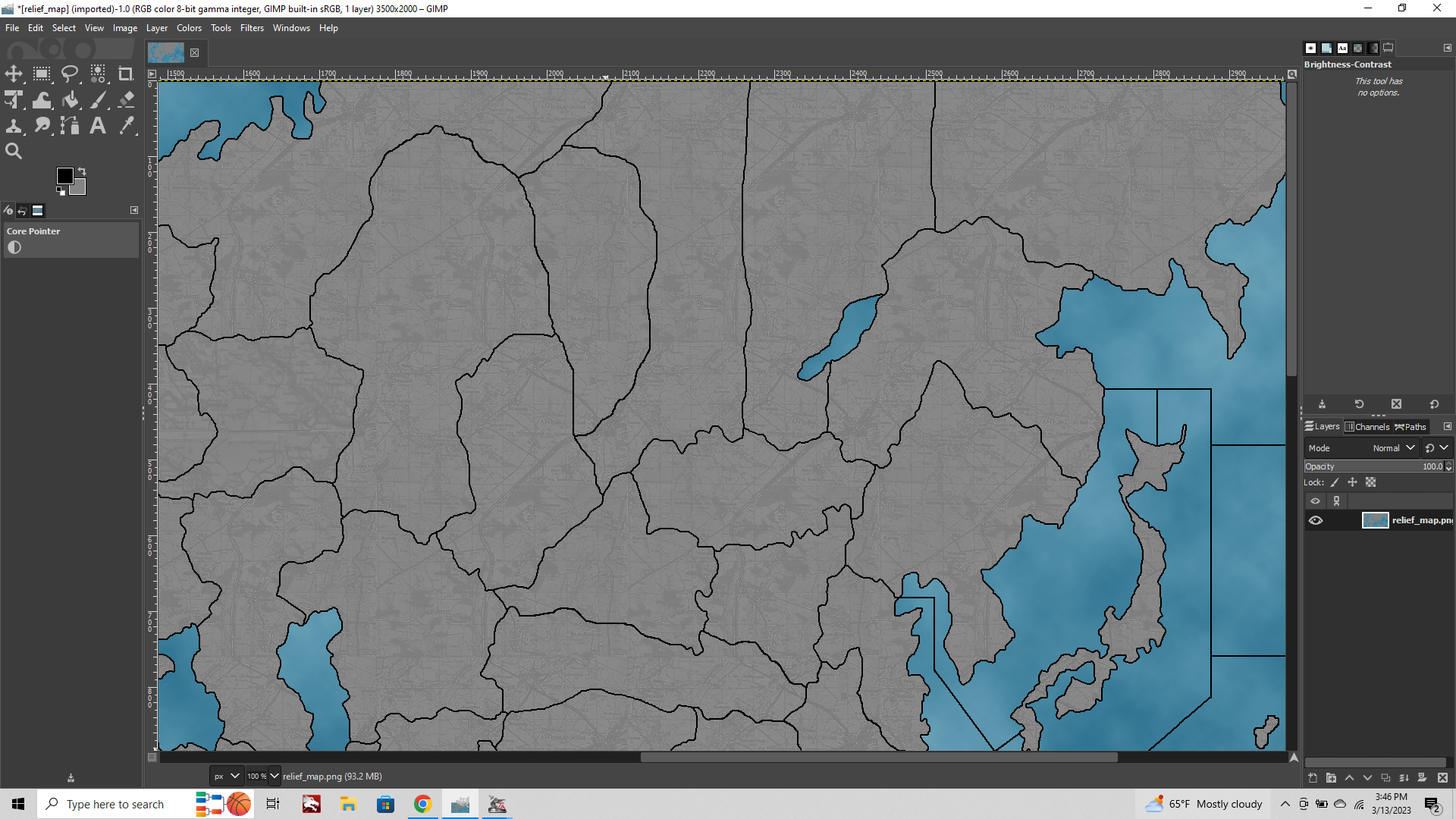
Now you got your Relief!
Go to tripleA map maker tools, Step 2, Run Image Tile breaker. You may have to navigate to wherever your downloaded maps folder is kept, or wherever you saved your Relief image. Fist it will ask where the reliefTiles folder is, then it will ask for the PNG. Let it run for a few seconds and bang, your relief Tiles should be good to go! If you want to get fancy with the oceans, basically you can do the same process using your baseline and the selection marque to isolate and then make the blue semi-transparent. Or choose a pattern you like. Hopefull this is helpful.
When I finish the UHD global stuff, I'll try to throw together a more complete guide, but just to get the ball rolling figured I'd try to bang something out.
Best Elk
-
ps. couple quick follow up thoughts and some tips to make life easier. Once you've found a terrain map you like, and the dimensions you want, make sure to save a working copy of it at 100% opacity. Especially if you have to cut and expand the canvas. Most tripleA maps have the map edge cutting through North America, but few topographical maps will do this. So you basically need to do a cut, expand canvas and then paste. So you can go from something like this... to something more like that...
Also, if you need to go back later to say move a border, it is much easier to do this on the baseline, and run through the process again than it is to actually manipulate the relief, or to tweak the relief consistently. You can do some fakey maneuvers to try and avoid going a step backwards, but it honestly just takes way less time to redo the steps I listed above than it does to noodle around with the completed relief image. Some tools in GIMP only work the way you'd want them to when the image is at 100% opacity. The clone stamp for example, it will wig out and start dodging if the opacity is in flux.
Also the color selection tool can throw you off, if say you're selecting the sea zone blue directly from the completed relief image. The same blue might be appearing as lakes or rivers or whatever, but because the image has had the opacity reduced already it can be harder to see when this might happen. It's simpler to bring in the base, and use the selection marquee to isolate the stuff you want to manipulate on the topo layer, and do the eyeball trick. Just easier when you got the two separate layers to work with. Similarly, once the image is exported, the entire image is considered at 100% opacity, regardless of whether some portions are only 25%. Once it's exported that's the 100% opacity version. So you may wish to click save and save your work in GIMP, so you can return to it later with all the layers and such still available. File > Export produces a PNG that tripleA can use, File >Save gives you a GIMP project file.
Otherwise, it's a relatively simple process, once you have a terrain image you like at 100% opacity, and the base that fits. When you need to change a border, simply go through the steps above again, only modifying the base to achieve what you want. Or if you have to clone out the terrain to fit/change a shape to do this at 100% opacity, then knock it back down, bring in the base again for the selection stuff. The 1 2 3 of it is basically copy black and blue, paste in place, grow selection, edit fill, grow selection, gaussian blur, return to base copy only black, paste in place, then delete the baseline for the 1px hole. Which is more than 3 steps, but you know, it's not that long and isn't as complicated as it seems once you've done it and seen it work hehe.
Also worth noting for time, so the larger the image you're working the more GIMP may slow down a bit during each of these steps. Going 16000px wide kinda pushed the limit of what my laptop could achieve, especially if there are many layers (why I tried to keep those limited to 3) and then also doing stuff like the Filters>Blur or adding additional decorations, this can can cause gimp to slow down if the image is huge and has many layers for say decor or text and such.
For the decorative stuff, it may be easier to use tripleA to place these after, but unless it's semi-transparent anything you draw on the relief will over-ride/cover up what's displaying inside of TripleA, so you could add stuff as you go that way like for abstract game markers and such. Or the reduced opacity thing can be used for any image really. Doesn't have to be mountain ranges or rivers, you can use a pattern or a figurative illustration/vignette in the same way. Just knock down the Opacity or Saturation on the image and paste it in last, till you got the look you're after. If you find you need to blend for touchup the smudge tool is reasonably effective. It will blend not just the colors, but also the opacity, so can noodle a bit with that one, if you need to knock something back in the final. But it's always easier to work from the terrain when it's at 100% opacity, then knock it back, rather than banging around with the smudge to fix a line after hehe.
To experiment with how the image will present in game, you can use the HEX codes and the color palette in GIMP to paint the baseline as it would appear according to the national ownership colors you envision. Just use the colors at 100% and the paintbucket to your baseline. When your relief is placed on top of that image as a new layer you will be able to see almost exactly how it would present in-game.
One final thought along those lines, which is less to do with the map, and more to do with the units in relation to the map. Right now tripleA can support units at 48px up to about 54-68px tall, and to display these up to 125% scale. I think this puts the ceiling at about 16000px wide by about 9000px tall. Like I'm just not sure there'd be much advantage to going any larger until the unit graphics can be made bigger in the display. GIMP seems to work pretty well up to the 9000-12000 px wide range, a fair bit slower above 14000px which is sorta just on the edge of doing the 48px units and still having things read. Like when the map is scaled down to say 50% in the actual gameplay view likely at 1080p. Units can of course be made smaller for smaller maps, but that's sorta the ceiling on the huge end. Anyway, if you find that you need to upscale or downscale units in GIMP to fit the map you're shooting for, when you hit image tab>scale image the default will be "Cubic Interpolation."
Switch this to "No Halo" and it will give a cleaner read for pixel art at a smaller scale like 48px. It will do less blending, so you'll see less fuzz, and the resulting image will appear a bit cleaner at scale in the actual game display (on the map at a given map view %.) So just remember that one, for unit stuff. If you scale up or down and it looks off, try going No Halo for the re-size.
Ok that's what I got for now. If you tango with it and run into questions just fire away and I'll try to reply when I can. Catch ya next round
-
How awesome this is!
This is not only a map relief-guide but gives a lot of hints and inspiration for related and unrelated image-editing, too.
Great! Thank you.
-
This is a gem! Thank you so much. I am going to try to learn it ASAP.
-
Haha right on! Thanks!
Glad it you guys are digging!
")
I'd like to bang out a similar guide for modifying unit graphics with GIMP. Or maybe doing a brief guide for the Map Creator Tools (esp. the Polygon Grabber) to compliment Veqs info, but with some extra screenshots. Just to illustrate the steps with some tips for that stuff. I only recently figured out how to do most of this stuff, so figured to jot things down while it was still top of mind.
It's a bit of a labyrinth, but if you just keep your hand to the wall, eventually you can find your way back out again right hehe.
For the UHD units, I just went through the process of tinting all Frostion's 54px stuff for use in World War II Global. For Tints we do have a tripleA colorizer tool, but GIMP allows you to be a little more nuanced, since you can use the selection tools to mask stuff. Like if you want to do a half tint, but still keep some color information for a specific area of the unit, for little unit symbols, radar and stuff of that sort. Or to do a two tone type thing, maybe a different colored hat or a flash of skin tone, some boots or a rifle etc. Along the way I had to create units to fill in the various tech slots, or do a bit of upscaling and then painting out some of our classic 48px-ers to fit the general vibe. Like I just added Joe's ANZAC infantry, upscaled to 54px. I think all Frostions artwork is pretty ace, I just wanted to crib that look pretty much, but I also really wanted to make a set that could be compatible with a potential unit flipper.
For a flipper to work, all the drawn-on unit flag roundels had to be removed, and the dropshadows removed/tweaked, so the light source wouldn't appear weird if the units flipped direction. It's a bit laborious but I have a kind of method for that now as well.
I was using https://pinetools.com/bulk-batch-flip-image to handle the basic flips with a quickness. It's fairly convenient, like you just load the bulk files up in your browser, and it'll spit out a zip with everything flipped. You can do the same in Windows (though I think only for bulk rotation.) Google Photos also has a flipper, but the pinetools one seemed pretty user friendly, so I've been tooling with that.
My ultimate goal would be some kind of dynamic built-in unit flipper within tripleA that the player can use on the fly. Or if that's too hard, maybe just some way for the TT placement to do a quick flip, so the map creator could set the orientation somehow for specific TTs. Just to make the little dudes face each other and look menacing. You know, for the about-face.
Anyhow, hopefully helps others to get a handle, just having a quickie walkthrough for some of this stuff with pics and such. When I get a minute to dive back in the kitchen, I'll try to knock out a more comprehensive guide for some of the other stuff that can be a bit tricky. But meantime if you run into any issues trying to do the relief stuff in GIMP, just let me know, and we can try to hammer it out.
Catch ya on the next round!
ps. Oh I forgot one other thing that can be really helpful.
So if you find that while you were exploring the tools and menus, that you accidentally closed something or moved it somewhere, switched one of the tool tabs or whatever and now can't find what you're hunting after, do this...
Edit >Preferences
Choose the tab on the left that says "Windows Management" and then hit the button that says "Reset Saved Window Positions to Default Values"

This will restore all the various menu tabs to their familiar positions/settings.
I can't tell you how many times I puzzled for like 5 minutes, only to find that I had just clicked over 1 tab in a little sub menu, or accidentally closed a window, then couldn't find a way to bring it back readily. There's always a way, or a hotkey for everything, but sometimes it was just easier to do a quick reset so it all went back to normal default displays haha.
Oh also so when you do Edit > Copy/Paste or Paste In Place thing (pretty common in the steps above), at first the layer will display as a floating selection "pasted layer" that doesn't yet have a home, but is just hovering in your layers menu. If you click on the little floating selection icon (lower right of screen) you can choose "To New Layer" in the dropdown, but if instead you click into current image on the screen with your cursor, this will paste the selection into your currently selected layer automatically instead of a creating new layer.
I did that a bunch of times by accident before I figured out what I was doing wrong lol. Most times you'd want a new layer, so you can say select the colors of one image/layer, without picking up colors in the other layer. Like for the1 px black line inside the blurred 7 px black/gray line) so using two layers is nice.
If you goof something or miss a click you can Edit tab>Undo or Redo pretty far. Even for stuff like merging all visible layers, you can unmerge again pretty easily. Ctr Z will keep going back like a dozen steps or more if you need to.
Another simple one, but which might not be super obvious initially for drawing on the base...
With the Pencil tool Shift+click will pull a straight line between your first click and wherever you're hovering your cursor.
If you Shift/Control+click the line will lock angles every 15 degrees, so you can get diagonals that scale nicely. It'll show with a little ghost line like this till you make that second click. You can do the same for selection reticles to lock aspect or lock radius for eliptical marquees and the like, so they'll be circles instead of ellipses etc.
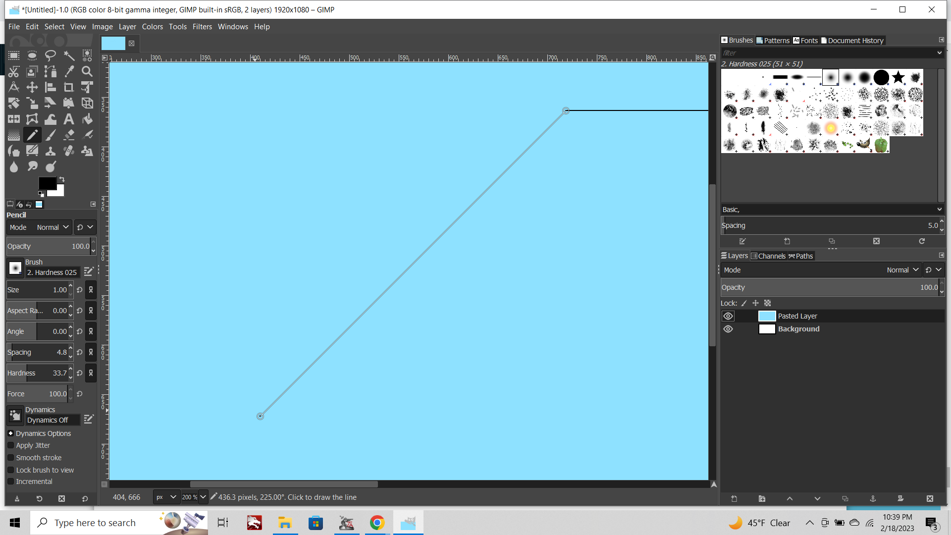
The cleanest read when the map is rescaling in-game is usually diagonals at like 15, 30, 45 degrees. But anyhow that's a helpful one for drawing the sea zones in the baseline.
Before trying to learn this thing for tripleA stuff, I mainly would use PS. Most of the same types of tools are there, but some of the tabs and the way stuff is organized can be a little different. Here's another thing I found out about while trying to help someone make a mod to the Iron War relief. It's for a transparency heal filter tool, which is something I think comes standard in Photoshop, but for GIMP needs the plug-in.
Basically if you find yourself having to remove the borders from a map that is finished/already semi-transparent, and you don't have the original image of the Topo map to recreate like the steps above (say you only have the finished relief tiles, or the reconstructed Relief image from the tiles, but not the original elements used to create it initially) what you can do is to Image >Flatten (with a midrange gray as your background color) to collapse the transparent parts. Then punch up the saturation or contrast using the stuff in the "Color tab." Basically trying to restore the relief to 100% opacity in some passing form, so you can manipulate it more easily. Then select the black base border for the marquee. Grow selection by a couple pixels to get around the fuzz, delete the whole selection from the relief layer. Now use Filter tab >Enhance >Heal selection.
When you have the plug-in downloaded, what this will do is take the area of the relief image that you deleted (the selection which is now 100% transparent) and fill this area with neighboring pixels that are opaque. You can set this to fill in randomized ways that you like by distance from the center of the selection out to some range say a dozen px or whatever you need. So you can get rid of the border, close the gap, and then fakey something back in there which is passing fair. It can be a lot faster than trying to clone stamp all over and gives a pretty consistent look for the reconstructed areas. You might have to smudge tool or noodle the refilled areas to make it look pretty enough, but that's how to do that, if you find yourself needing to doctor something back to life. Just gotta grab the plug-in and set it up. If you search youtube for "GIMP Heal Selection" or "Install GIMP Resynthesizer Plugin" you can find the vids that explain how to set it up better than I can with screens. But that's a cool one to have on hand too.
pps. also for schulz, I think this one would probably work well to fit the projection. It's the one I was warping like a madman for that big map, but here it is in equi like the base you had.
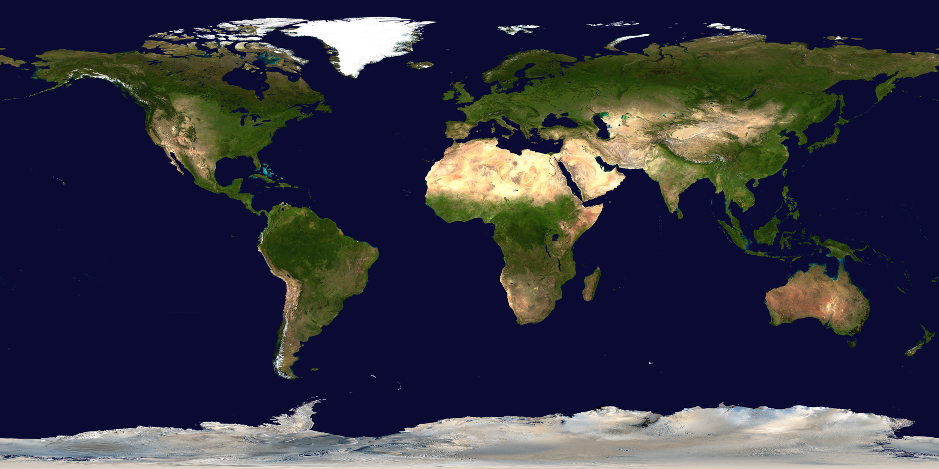
https://en.wikipedia.org/wiki/File:Blue_Marble_2002.png
"This spectacular “blue marble” image is the most detailed true-color image of the entire Earth to date. Using a collection of satellite-based observations, scientists and visualizers stitched together months of observations of the land surface, oceans, sea ice, and clouds into a seamless, true-color mosaic of every square kilometer (.386 square mile) of our planet. These images are freely available to educators, scientists, museums, and the public."
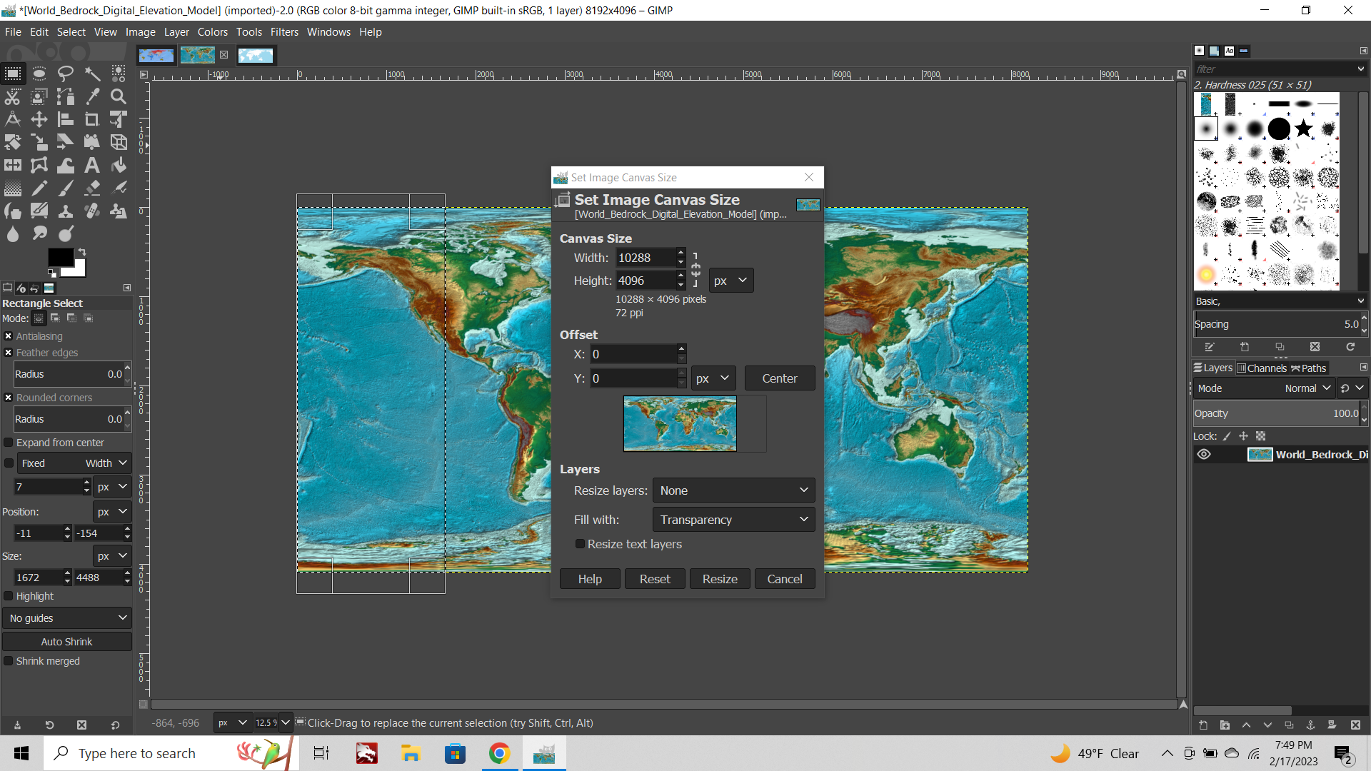
Original image is something like 43200x26000. That's a lot huger than you'll ever need though, like it'd probably take several minutes to even open the file in GIMP. What you can do instead is grab the Extra large size at 3840x1920px and upscale. Using cubic interpolation is fine for that. After you knock the opacity and saturation, paint the national color on top in game, have units on the board and do all the other stuff, you won't be losing any detail in the upscale that you'd really notice I don't think.
Open in gimp Image tab>Scale image, click the tab that gives you sizes in pixels px. Then just gotta size up to match your base. Any crops or slides you did to the base you'll want to do the same to the topo.
When you have the base layer copied over (with the white made transparent) you can use the grabber tool that looks like 4 arrows pointing each direction to slide the top layer till it's lined up. Basically shifting the black/blue layer of the base till you got the right fit, and replacing marble blue ocean with whatever color you got for your base blue at the same time.
This might be easier than trying to color select/replace the dark blue of the topo, cause the same color is likely somewhere else on the map. Instead you can use your baseline (delete the white to create the opening) and use that as like a stencil.
If you need to close a small gap beyond the expanded borders with blur, you can use the clone or the smudge tool. Select the bottom topo layer as your working layer, but keep the base on top of it in the layer order, to use that layer as a stencil.
This way if you accidentally cross over an edge while painting this will be invisible, as your base will mask it. When you're done smoothing up the transition layers, and you merge those visible layers, anywhere that you drifted across a boundary while painting won't actually show up in the final image. The base on top will cover over that part when only the visible stuff is merged.
Another option for a different look would be to find something like a historical topo atlas, if you see one in equirectangular you like, but that one would would work well for experimenting. To control the ultimate display colors, you can try different opacity or saturation levels, but the easiest I find is to adjust the Hex colors directly at the given levels and see how they present. Usually you can get the vibrancy or color values you're after by simply playing with your color palette in that last step. Hex colors in the palette, paintbucketed to baseline, to see which colors look good. Like after doing the opacity thing and laying the final relief image on top of the paint-up in GIMP. This will preview of your relief will look inside tripleA with those same colors as the national ownership colors in the map.properties.
When I get some time, I'll try to do some screens showing how to color just a portion of your relief tile instead of the entire tile. Basically it's the same sort of process I described above with selection marquees and grow/shrink selections from the baseline image. Instead of using the black borderlines from the base, you'd use the white land areas of the base to get your selection going. Then you can have the middle of the Tile at one opacity (say 100%) and a space along the border that is something else (say 25%), simply by growing/shrinking the marquee and adding a layer at a new opacity level. now when tripleA paints the colors into the image you'll only see a color change in the portions of the relief that you made semi transparent by the edges. This would be like to make reliefs more like Napoleonic Empires, where just the borders get painted up. Or you can do a fade with an opacity gradient like this effect https://daviesmediadesign.com/how-to-create-a-transparent-gradient-in-gimp/?amp=1. You do that but instead of gradient from left to right, you go middle of selection out. That opens up the fade from 100% topo at the middle of the tile to 100% national color, over whatever distance you got selected.
-
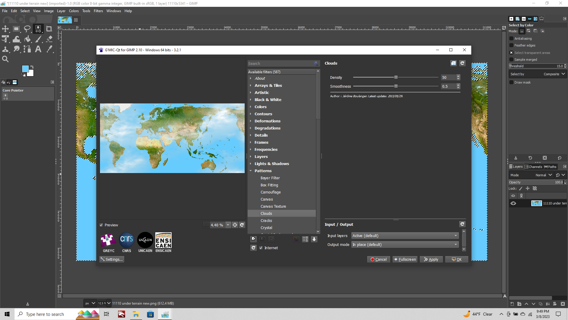
OK so for this next part we'll show how to add a simple cloud effect to the ocean tiles of our relief in GIMP using our baseline. For this we'll use a GIMP plug-in called G'MIC which adds the filter we need.
Also for GIMP itself, there was an update in Feb, so grab that if you haven't already, since G'MIC uses the latest...
Once you got g'mic downloaded and installed, relaunch GIMP and we can access these handy new tools from the Filters tab at the bottom of the dropdown menu. I'll run through the steps with some screens, but basically we're going to work with an effect that looks like this initially...
Then we're going to isolate, so it only applies to the ocean tiles, and then tint the white of the clouds into something bluer, for an effect that's a bit more water than clouds.
Fire up gimp and open your baseline image
Choose Select tab> Select by Color
Click the ocean blue with your cursor. This will light up your marquee around all the blues.
Now click the Filters tab > G'MIC-QT from the drop down menu.
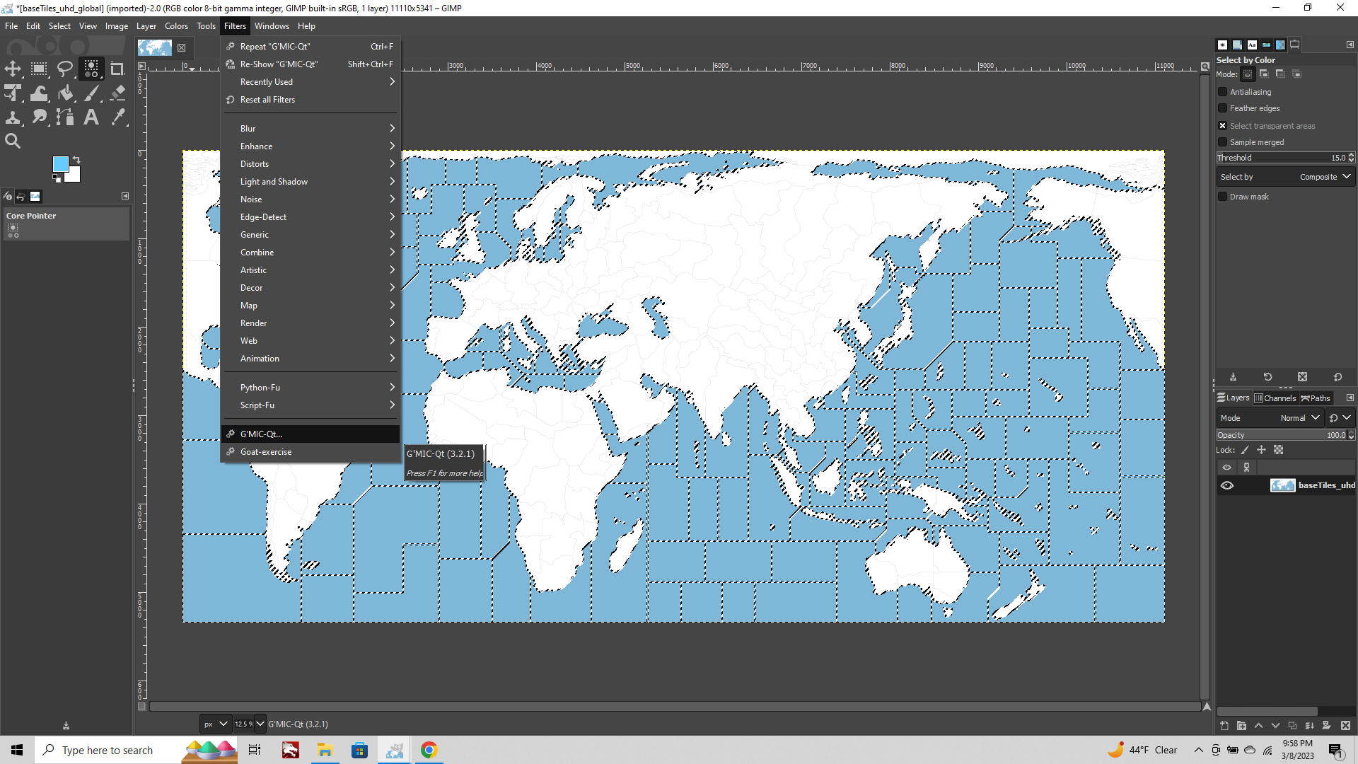
This will launch you're G'mic pluggin within gimp, choose Patterns > Clouds
By adjusting the sliders for Density and Smoothness you can choose which sorts of clouds will appear.
In the preview it will show as if the effect is being applied to the entire image, but this is just in the preview.
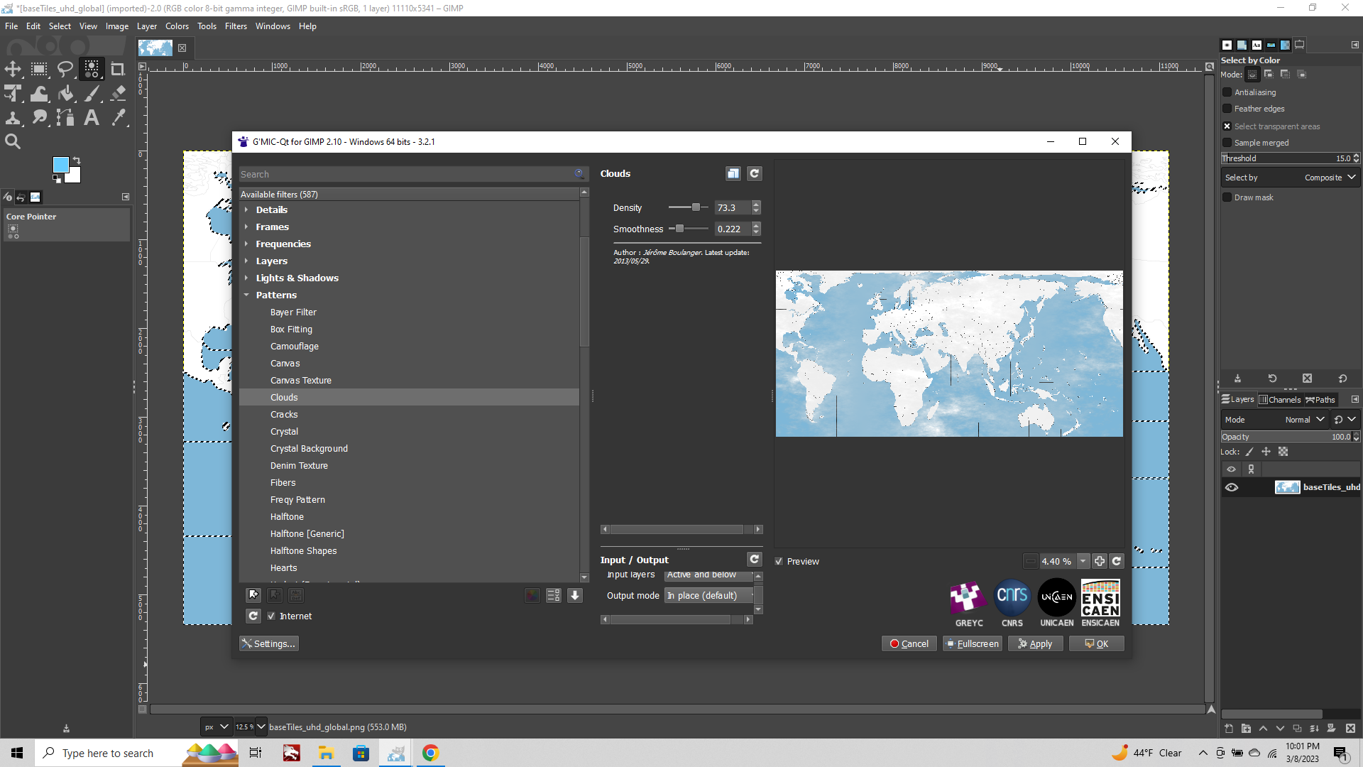
When you've got the clouds you like, hit the Apply button bottom right.
Depending on how large the image is, this will take a few seconds.
When it's finished processing you should have an image that looks like this...
Note that the clouds are only appearing in our selection area. Aces!
Now, with your selection marquee still up, go to the Colors tab and choose Hue-Saturation.
Here you can manipulate the color dimensions of the selection and tweak the hue/value/sat till you get something that feels right.
Similarly you can use the other options in the Color tab like Brightness-Contrast or Color temperature.
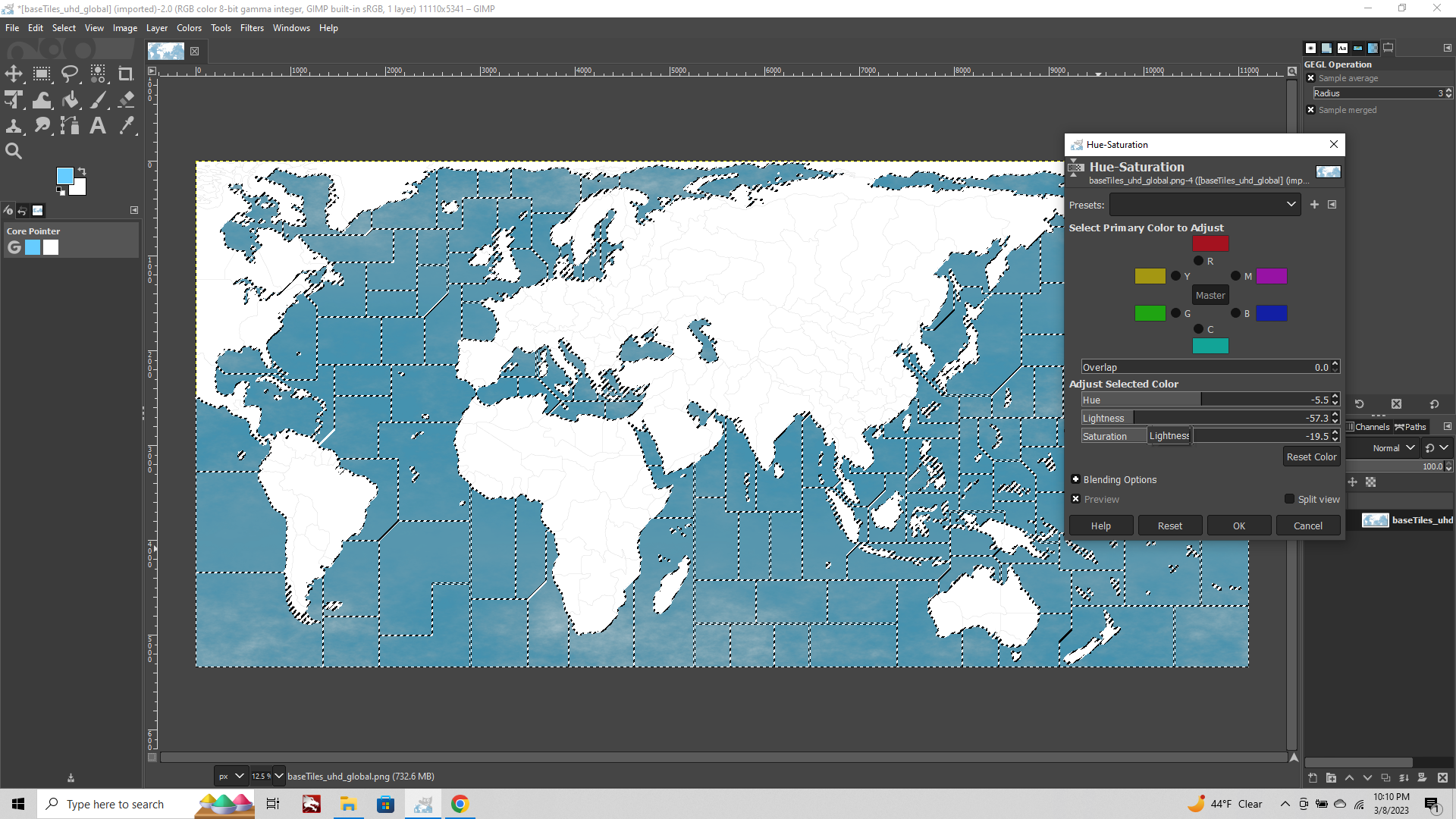
By varying the different density/smoothness of the clouds filter, or tweaking the color of the selection after the clouds are applied, you can create a visual that is either more pronounced or more subdued in terms of the cloudiness vibe.
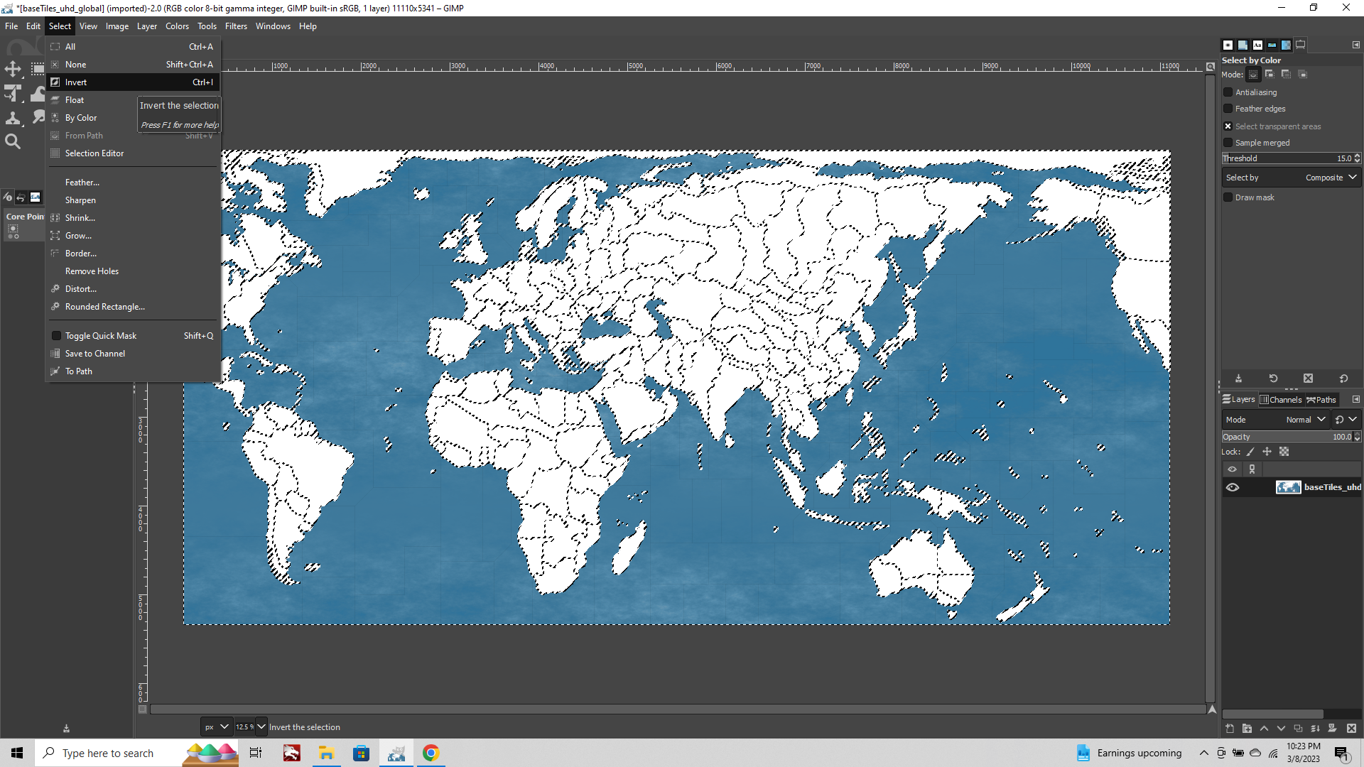
When you got what you want, go to Select tab > Select by Color
Click the white area of you map, then Select tab > Invert
Now only the Sea Zones and black borders are selected.
Now Copy/Paste in Place to your topo image as a new layer.
If you want you can reduce the opacity of this layer to something less than 100% if you want to make the effect even more subtle.
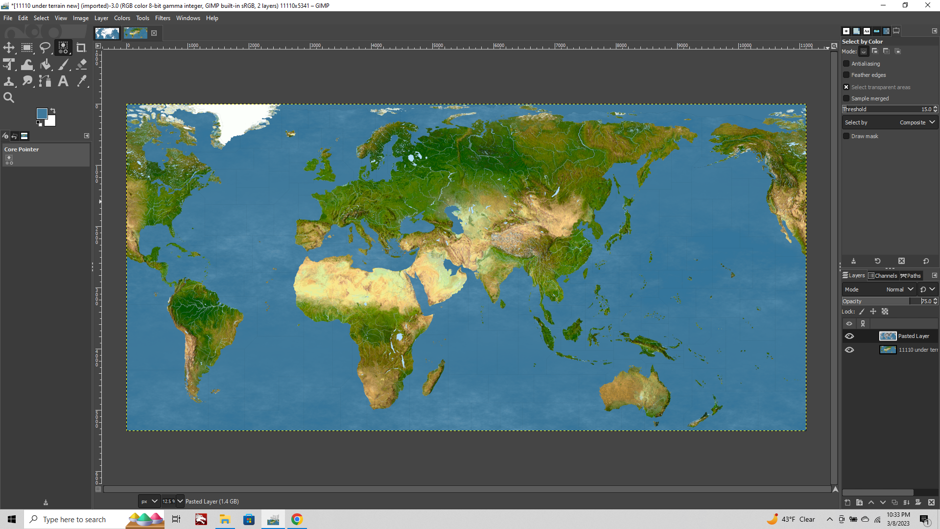
Then just remember to reduce the opacity/saturation of your topo layer like in the first post of this thread, before you export the image.
Oh also one final thing before I forget.
You always want to drop the baseline black last. Like once your land and sea tiles are all dialed. Pull the black baseline over into the relief image to create your final borders, and open the 1 px hole for tripleA highlight.
If you want to expand/smooth the borders of your baseline, another way to do this after growing the selection and filling the line at your desired width is
Filters tab > Enhance > Anti-Aliasing for your selected beefy black line.
This will smooth your line, but incrementally, so in order to get the desired effect we may have to apply it more than once.
The anti-aliasing will produce a pretty good line when you're zoomed out slightly, or to clean up the hard and fast blur.
This works best if you've already merged visible layers with the reduced opacity topo, otherwise the effect will apply unevenly.
Filters > Gaussian blur between .50 and 1.0 on the selection seems to work nicely for the final pass on smoothing the borderlines too. Like 0.75-0.85 blur seemed pretty clean when panning out while in-game.
Main goal being just to get a line that's not going to break apart or appear vary in thickness too much when the map view is scaled in/out.
A 5px line with a blend across another 2-3 pixels for smoothing seems to hold up pretty well.
Oh also, for lighter borders I'm still trying to find a way to get it to work well with the TT highlight feature in-game. If reversing from black lines to white lines, the best method I've found so far is to use an off white with some color information added (more yellow) and to knock the brightness/contrast so it's not true white but something closer to like 80% white in terms of the brightness. Then for the 1px hole for the baseline, you can edit fill with the white color and reduce the opacity till it matches the color you chose for the white when the black line is displayed beneath it. When the highlight flash actually lights up in tripleA, this will appear white. So basically you just have to get a white going for your borders that's different enough from the white of the flash that it will still register.
Note/digression: On most maps, or world maps at least, the color which you choose for the ocean tiles will be the dominant color in your final image.
If it's blue, the exact hue/value/saturation you choose for that blue will have knock on effects and may seem to change the visual impression of the rest of the colors in your image. These will appear to shift in color register, even though they aren't actually be adjusted. This is because we can't really perceive color in absolute terms, but only in relation to the other colors around it. For blues you can do a lot of tricks with this, and create pseudo blues from what are actually grays.
Probably the most famous example of someone using such tricks would be Rembrandt. Blue appears only very sparingly in his work. Blue pigment from lapis lazuli was very expensive at the time, so instead he used mainly azurite, but would save that for light washes or only the truest of blues. For the rest he'd mainly use color value in the grays (since black/dark grey has a cooling effect) which when set against the warmer ochres, umbers, and sepia hues, will create the impression of blue from what's mostly gray. Here it is in operation... https://en.wikipedia.org/wiki/The_Storm_on_the_Sea_of_Galilee#/media/File:Rembrandt_Christ_in_the_Storm_on_the_Lake_of_Galilee.jpg The blues in the sky/sea there are actually mostly grays, but they seem bluer, cause of what's happening with the rest of his palette.
Main point being, you can do a lot by playing around with the hue/value to create a different impression for the map overall just by tooling around with your blues, then setting up the rest of your color palette to work with it hehe.
Ok enough for now, hopefully that covers most of the broad strokes with steps that are fairly easy to reproduce. If I think of something else I'll add it in. Catch ya next round
-
@black_elk Do you know how to create v3 or v4 style relief tiles?
-
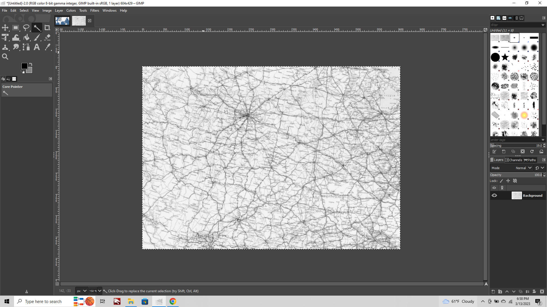
Yeah so for that what you'd want to do is find an old roadmap or railmap, and use that to create an abstract pattern.
https://thegimptutorials.com/how-to-use-patterns/
Then you'd select the white of your baseline and use Edit tab > Fill with Pattern
Reduce the opacity/saturation of that fill to create the desired effect.
For the WW2 maps I believe the pattern fill is totally desaturated. Not sure on the opacity but probably something like 25% would work.
To make it look like Bung's you'll want to invert or rotate the roadmap image being used to create the pattern, so that any text within that pattern becomes illegible, otherwise it will probably be too recognizably roadmap-y.
I don't have the image that Bung used for the World War II map pattern initially, but if you want to copy it, you can reconstruct one of those reliefs using Map Creator Tools > Other: Optional Things > Run the Tile Image Reconstructor
After you got the single image reconstructed fire that up in GIMP.
Then Image tab > Flatten Image, using 50% gray as your background color to get something more like this...
Use that to create a selection of the pattern to copy from one of the larger tiles.
You can reduce the opacity once you have an image or portion of the image to use as your pattern.
If you look closely at this v5 example, you'll notice that the pattern is repeating. Compare the pattern in Soviet Far East to Yakut S.S.R. and Archangel.
Depending on which old roadmap type image you select to create the pattern, you might use a series of flips or rotations to disguise when this occurs. Or create a couple different patterns to fill the tiles individually instead of all at once.
If the fill is for tiles that are further apart, it will also be somewhat harder to notice a repeating pattern. See Western Canada/Eastern Canada compared to Brazil and West Africa, or in Europe with Baltic States/Belarus.
Anything you copy to the clipboard can be used to create a pattern.
Check out the Patterns tab at the top right of the screen.
The first tab is brushes, next one over is patterns.
The first swatch will show as a little white square = no pattern, when you first launch GIMP.
When you use your marque to copy a selection from an area within the reconstructed relief tiles, that pattern will be replaced with whatever you copied.
So in this case you can see it's now the stuff inside the marquee that we copied from the Germany tile.
You can copy the reduced opacity image, or flatten first. Main reason to do the flatten thing is just so that you can see the image you're working with. Otherwise it can be hard to see on screen with the reduced opacity checkerboard visual, unless you're zoomed way in.
You can also vary the patterns or combine these patterns with the topo stuff to differentiate only certain tiles. Like if you wanted to have some spots more urban looking for cities and such, you overlay the pattern on just those tiles to get a vibe like that, like you see in some of Hepster's maps.
Finally you can do something pretty similar without actually needing a pattern. Just take an old rail map image and desaturate/reduce opacity. You can invert/flip if you need to disguise the text, or just find some regional road/rail maps that work for what you got going, and stitch em together. Then copy paste your Black/Blue from the baseline over that image rather than a topo. Should create a pretty similar look to Bung's, without having to worry about the image being repeated, like it would as a pattern.
Here's an example taking a period image of Soviet railways, then flipping/desaturating it.
Pasting the baseline layer on top of this, you can use the fuzzy select tool to grab the white and delete it 1 tile at a time.
This will open a window to show the railway image layer beneath. You can stick in another different railway image on another layer, and just kinda add them in as you go. This is more laborious, but you'll also have a bit more control, and you can choose different images instead of repeating the image. I think pattern is usually something like 256px squares repeated by default, but if you do it manually you can do whatever size works from your selection. You can also warp/transform/rescale the same roadway image and use it twice that way.
Once you've got what you like, you can reduce the opacity of those layers to be consistent, till it presents the way you want it to (overlay onto your colored-in baseline map to preview how it will paint inside tripleA).
Export the image and run it through the tile breaker in the map tools to get your tiles.
Oh also, just a quick note, the latest GIMP combined a few tools in the display. The "select by" color and "fuzzy select tools" now have the same position in the tools. To switch between them click the little arrow at the bottom right of the tool icon to switch to the fuzzy select magic wand.
Hopefully that helps
-
@black_elk Thank you so much. Unfortunately I could't manage to create it. I hope it will be helpful to other folks.
-
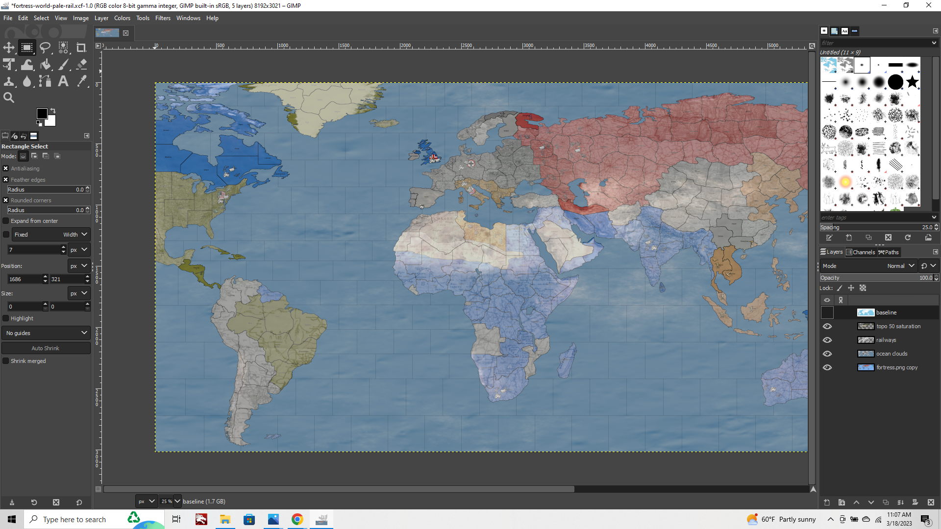
If you want to post your completed baseline, I can throw something together for you and save it out as a .xcf project file with the image still in layers, that way you can just load that into GIMP to see what I'm doing. It may be helpful just to see how it lays out that way. As you make more modifications across more layers the final filesize of the image can beef up pretty quickly, so I'd probably have to put in on dropbox. Most things we'd do in GIMP involve creating a selection from the baseline image, then creating or pasting-in/modifying stuff on a new layer. Reordering those layers, or adjusting the opacity of those layers, to create different visual effects for the relief. GIMP is pretty cool, but it can be a bit unwieldy if it's the first time learning how to do stuff like this or using a program like this. Usually for me if something goes awry with the relief, it's from having the wrong layer selected, or not having the right layer on top when I save it out to create the desired visual hehe. Still happens to me all the time even after going the process a bunch of times. Anyhow, if you got the base image I can show you how it looks before the layers get collapsed into a single image that way.
-
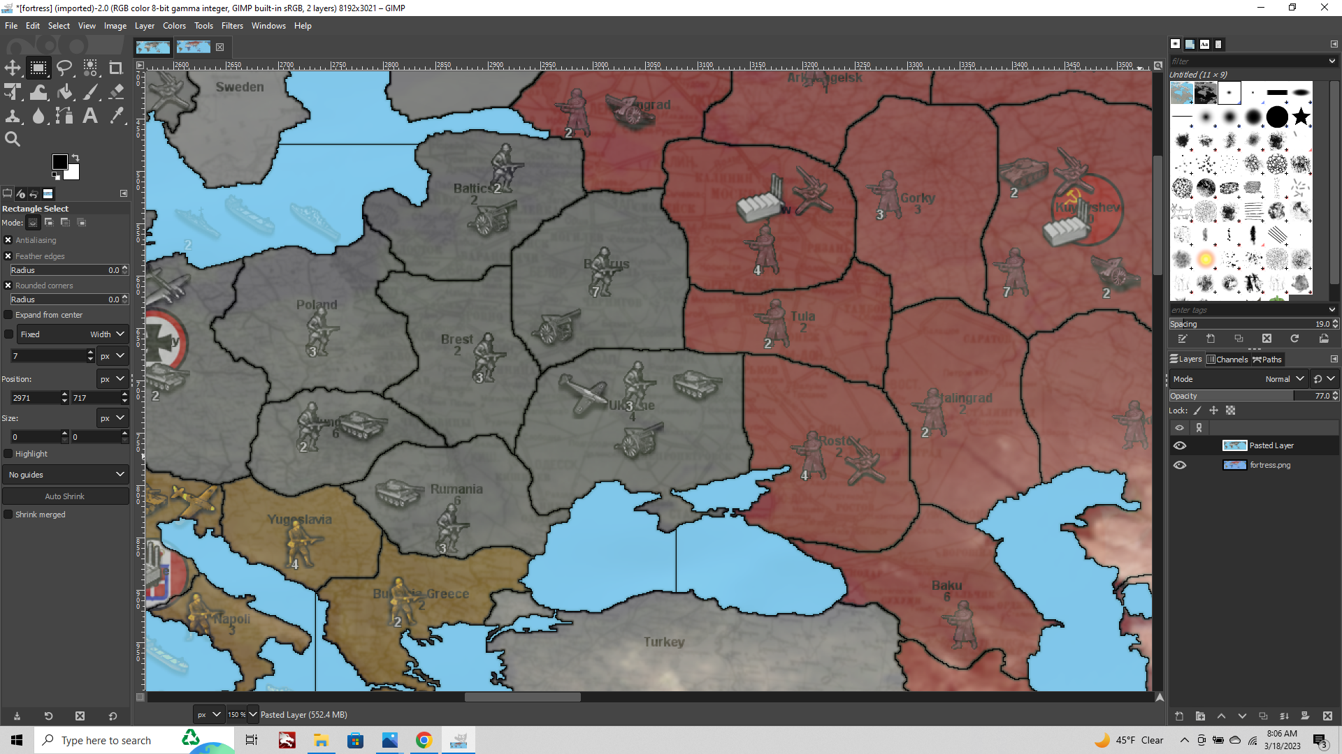
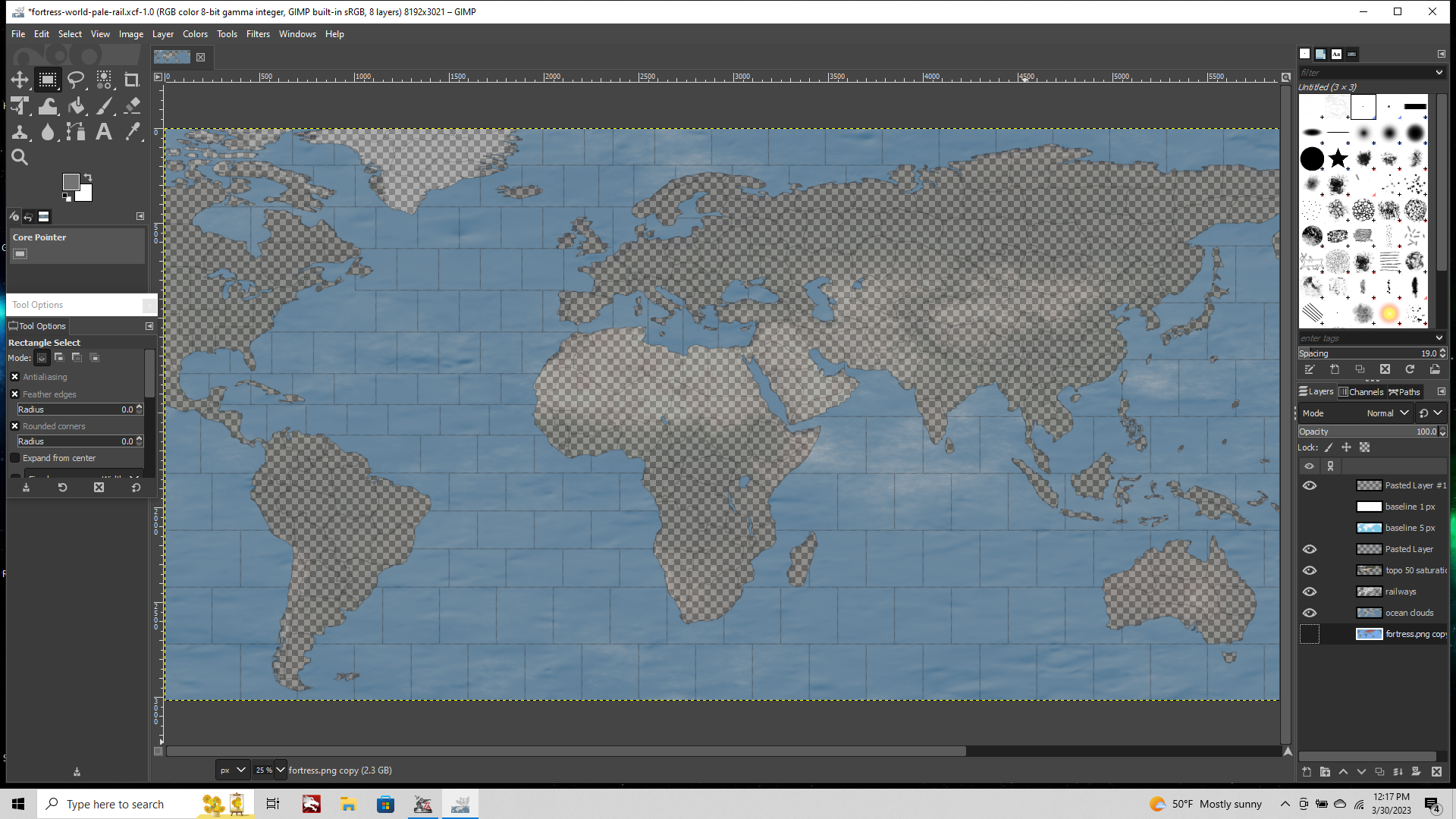
It is the base image;
https://i.ibb.co/Sw0H554/fortress-world-pale.pngIt is the base plus a sea motif which can be changed or untouched.
https://i.ibb.co/wy17q0x/fortress-world-sea.pngIt is transparent version;
https://i.ibb.co/FKX7qnz/fortress-world-relief.png -
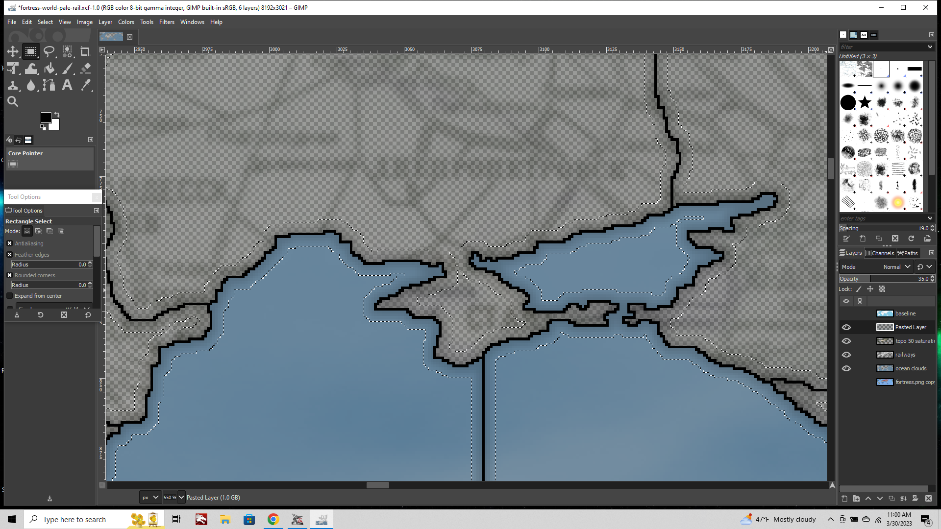
OK here's something to get you started.
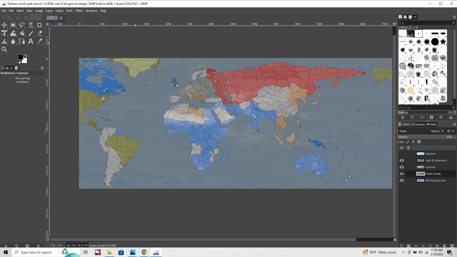
https://www.dropbox.com/s/vps6mw75i3izyt6/fortress-world-pale-rail.xcf?dl=0
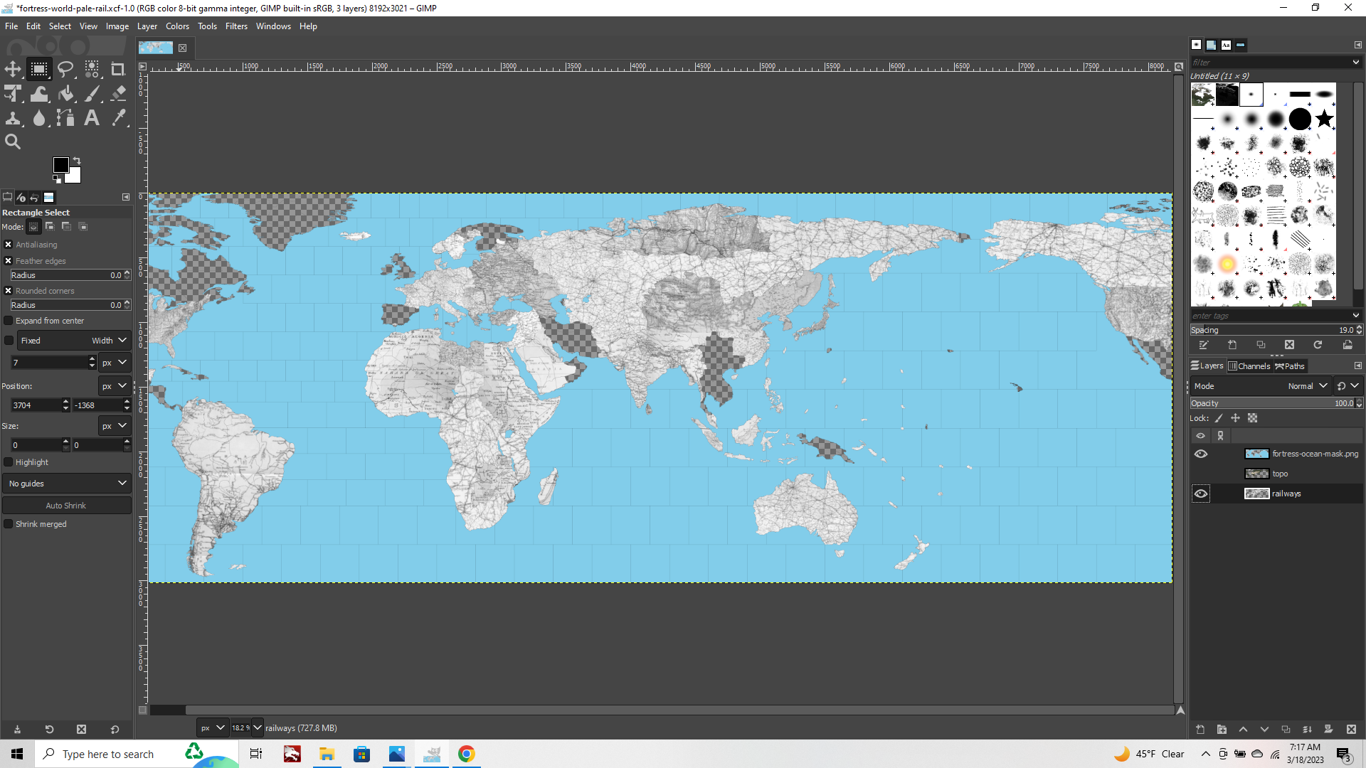
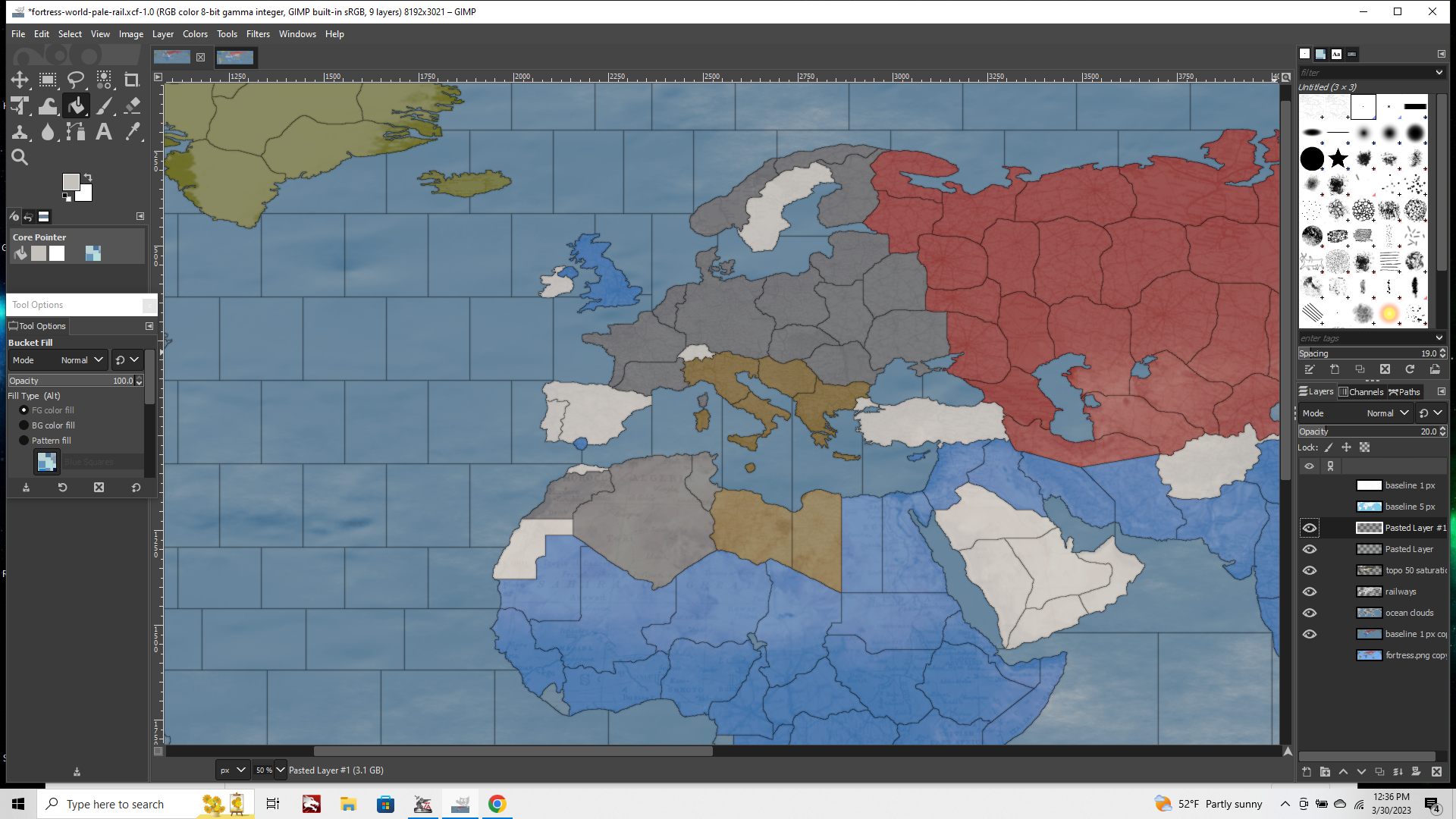
When you open the .xcf file using gimp you'll have a few layers. Your baseline, a topo, and a roughly stitched together map with a rail/road pattern going on. Putting the topo and the rail image together we can make something that looks a bit more like this... (I don't have a paintmap other than the image you posted in your thread, so you'll see the units/decor also semi transparent here, since that's the pic I used.)
To create that we're basically combining a layer that looks like this...
And another layer that looks like this...
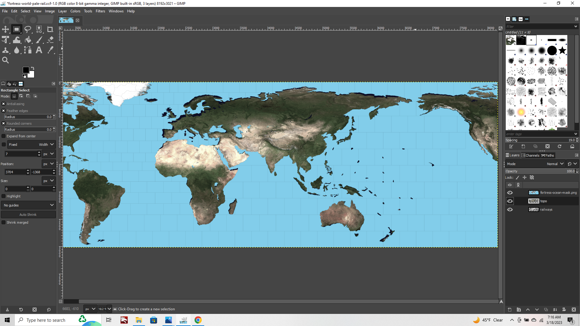
Reducing the opacity, or brightness/contrast of each layer separately, until you get something that you like.
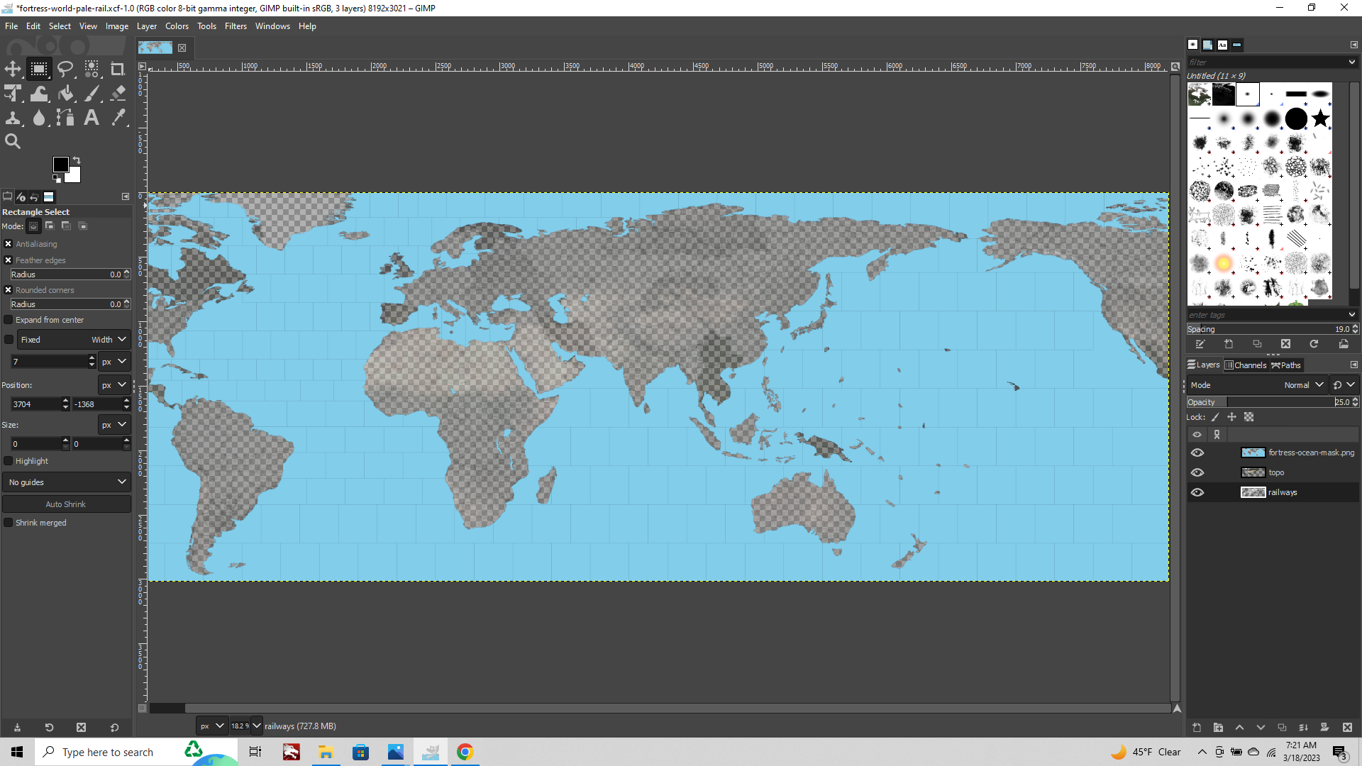
When you open the project in gimp, you'll see both layers are set to 25%, but you can increase to 100% to see what's there, which should look like the pair above when you do.
If you add to the layers or make adjustments, do this at 100% opacity, then dial down the opacity after you've made the add/change to that layer.
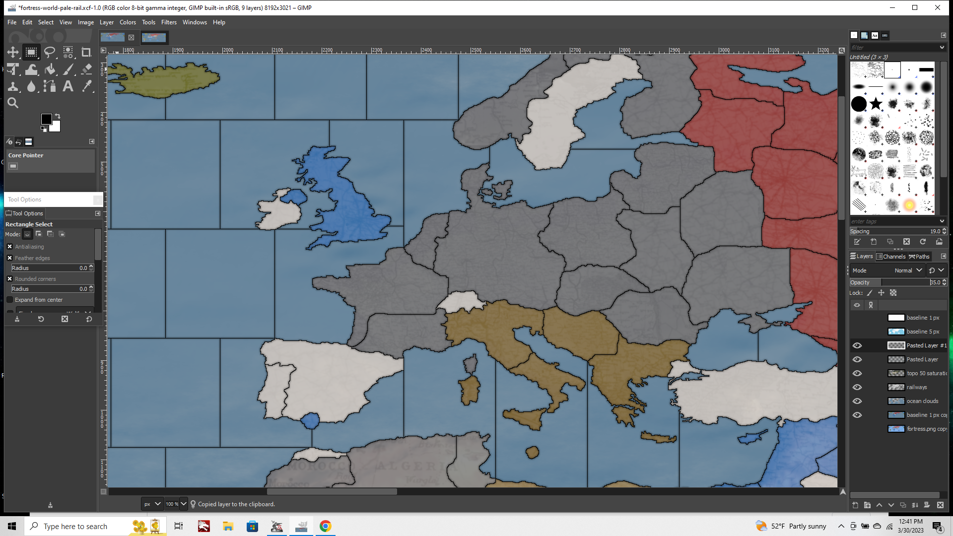
Using the eyeballs you can merge layers only by what's visible. So basically when you add a new layer/image you can merge this to the rest of rail layer by closing the eyeballs on the other stuff to make them invisible, then Layer tab > "merge visible layers." With the eyes only open on the stuff you want merged.
You can see where I lazed out a bit there on adding the rail/roads in Canada and few other spots hehe, but you can finish up those tiles or switch stuff around to suit whatever look you're trying to achieve with the fuzzy select tool.
Basically you bring up your baseline (click the eyeball to make it visible), and use it to make your selections. Click the white of a tile with the fuzzy select tool, hit the eyeball again to make the baseline layer invisible. Now when you switch to a different layer the selection marquee will still show the area you had fuzzy selected on the now invisible baseline layer. You can copy/paste stuff just into the spots you want to adjust that way, with the exact shape of the tile all ready to go.
Paste in whatever and only copy the stuff into a single tile at a time like that, to keep it simple. Using the fuzzy select tool to add to or delete stuff from that layer, then merge visible to the layer you want to tweak. Adjust the levels on these layers to get different looks, depending on how much of the under image you want to show through.
To preview what will happen in tripleA, you can use your painted baseline (just the basic national colors, without the units so they don't go ghost on ya like they did in the image I was using heheh). To see how the changes you're making to the other layers will interact with your hex colors, use that map as the bottom layer with the rest laid on top.
To change the sea zone stuff, you can use the baseline to create a selection for an ocean mask, to select only the areas that have those blues.
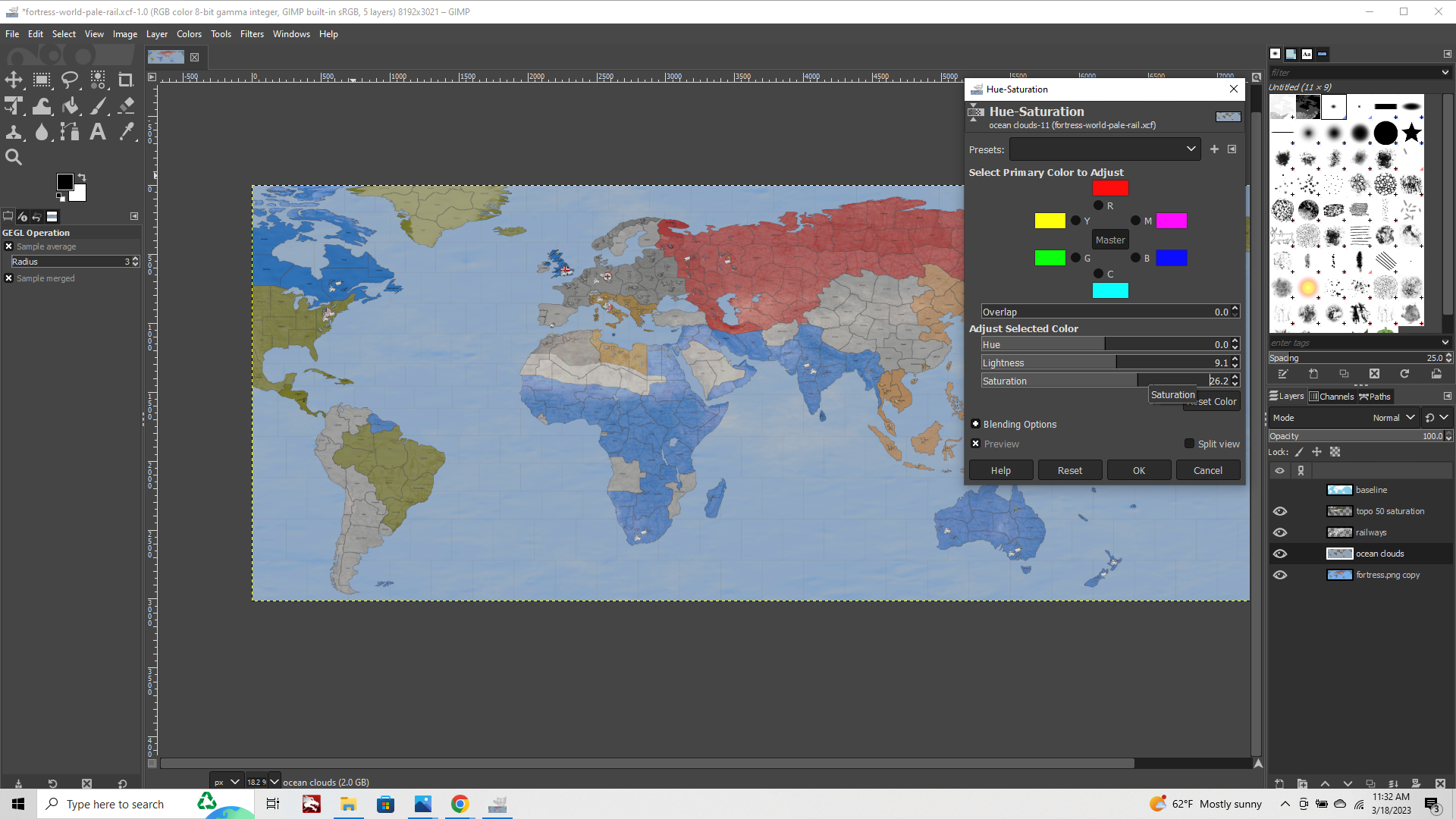
I did a layer with a simple cloud effect combined with that image you posted above. Doing that you can adjust the color values or opacity/brightness of just those areas without the effect applying to the other layers, so you can change the hue or brightness till the ocean looks the way you want. You can add in decor, labels etc. by just adding more layers on top. Using the eyeballs on off, you can see each layer in isolation.
Here's example of just adjusting along one dimension, the opacity of the layers. Showing how it looks when you go from 5% opacity on up in 3 screens. You can do a lot just with that to find the look you're after, like how pronounced you want the relief stuff to be.
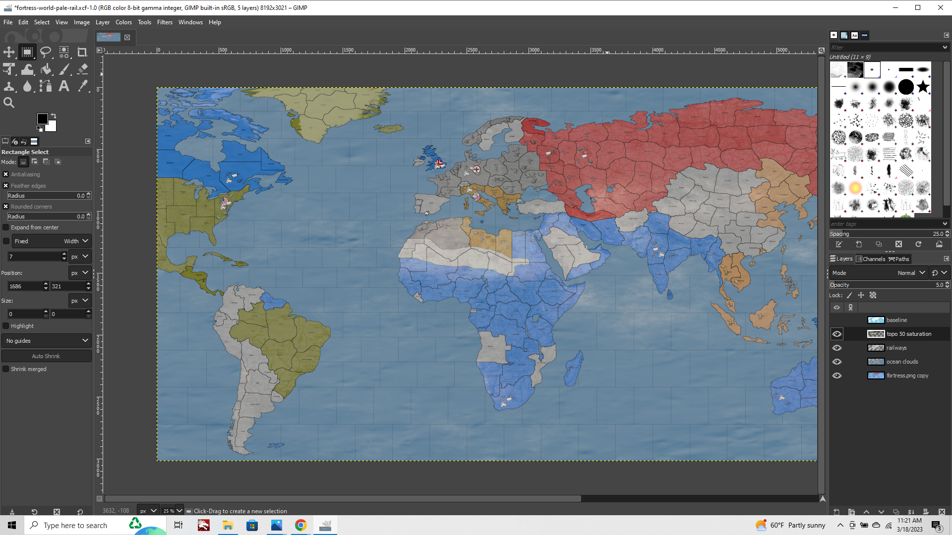

I'd start out by just playing around with the opacity and color levels of the layers till to you find a combo you're into, then use that as a jumping off point.
Oh also, here's a zip with the images I used to created some of those tile pattern abstractions...
You can open these in GIMP once you've got your project fired up and use them to fill out the rest of the rest of your board.
https://www.dropbox.com/s/f1d0o3u7kdeybep/roads and the like.7z?dl=0
Basically I found a vaguely period looking roadmap for some of the main areas, and then used those or details from them to flesh it out with some flips. Tried to give you some variety there, but you can add to it with other abstract images, any image really.
To add a new image to the mix use Image tab > Mode to grayscale/then back to RGB, to quickly desaturate what you copy over, to make it look like the other bw stuff. You can add a little gaussian blur to knock the detail back if you want to make it more subdued and impressionistic. Usually when the opacity is reduced and a little blur is added you can just add as you go tile by tile.
To create the sense of a more general pattern, use the same image multiple times, or doing flips/rotations/scaling.
When you're all done and have the opacity and such dialed the way you want last step is to put the baseline on top, to beef up your border lines, so they don't disappear when zoomed out. You can bring in just the blacks copied from your baseline and lay that on top as the final layer, adding blur if desired to smooth it, like in the post at the head of the thread.
Hopefully that helps a bit. Best of luck dude! and have fun
-
@black_elk They all looks really awesome.
Here is the first relief. I didn't use any layer yet. But I am going to try it.
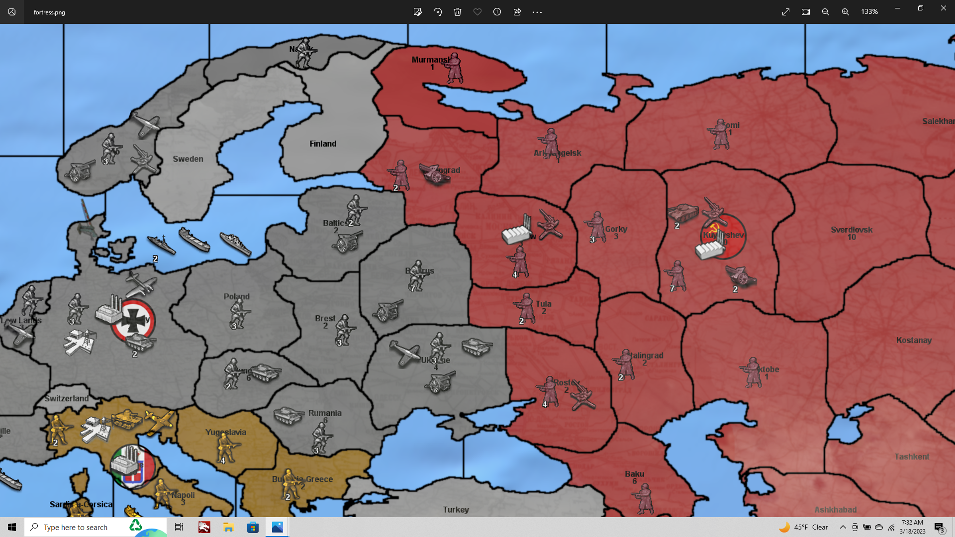
https://i.ibb.co/jHSpwX7/22.png
IMHO I tend to prefer smooth and less intense reliefs. For example, I liked Arabian relief the most. Maybe other players could prefer more busy reliefs. In the end, it is a matter of taste.
-
@schulz RIght on!
Looking good!
Haha yeah, it's definitely true, I'm still trying to find the feel I like best for G40 myself, but I can't really decide lol. I'm trying for 3 options.
So far I've got a version called Rock, which is more vibrant, with the volume dialed up. Terrain is painted over at a pretty low opacity, aiming at a tripleA classic kinda read. Like it's mostly just the ownership color. The user can change those colors, so I just wanted to give them something true to Hex for that, so it would be easy to work with. The Hex color they enter in the map.props is pretty much the color they'll see painted in-game, or at least that was the idea there.
Then I have a version called Paper which is trying to look more like the physical board. Much higher opacity for the under terrain, almost no overpaint, ownership indicated mainly by the control flag marker which functions as a roundel. I'm still trying to dial the levels on that one. To make the Paper/Cardboard what I did was to put the under terrain layer at like 90% opacity, then did a blend on 50% gray with blur around the edges of the beefed up baseline borders. Like coming out a dozen pixels or so with the gray. Then I put that layer at a more reduced opacity, so that only the edges would color over, but just a bit.
I also wanted to complete a trio with a Scissors look too, doing something a bit like the patterning styles in those posts above. Lighter hues, pushing it more pastel from the whites in those reduced opacity railroad images, but it's taking me a while to stitch together lol.
I figure having 3 looks might be cool though, like to cover the bases. Idea would be some kind of cut, where they sorta cycle one into the other like that, Paper to Rock to Scissors, and back again.
Stuff like overall brightness/saturation for the relief is easy enough to adjust, and the ocean blue can be isolated/changed pretty quickly from a baseline with the fuzzy select if people want to go wild with it. Here's an example, same Rock relief as above, but with the brightness increased and saturation decreased across the entire image.
The national ownership colors can be adjusted in the map.properties hex list.
Here's the same image, but just with a slightly different palette of Hex colors and tweak to the levels.
By starting more in the Mids, you can go either direction from there just by tweaking the levels and changing the Hexes to get subtly different looks. It's a little easier to desaturate/remove vibrancy or brightness/contrast from a midrange than it would be to add in after, so I started there. But even after you've completed the relief and collapsed the layers, you can still play with it that way. Like post processing I guess hehe. So sorta giving a starter template in the mid ranges, but where the user can can adjust the ultimate look of the relief by controlling the levels in GIMP. Pushing out to either extreme (or some intermediate sweet spot they like), then rebreak the relief image into their folder to switch looks on the fly. A skin basically. I think that'd be fun!
I'm still trying to learn how to do this stuff as I go. Part of the reason I wanted to write it down was just to help myself remember how to do some stuff, but hopefully might be helpful for others too. So if I think of things while I'm noodling, I'll try to jot a note.
-
https://i.ibb.co/jHSpwX7/22.png
Woukd it be too much work if you could do following things on this relief;
-
The Soviet reliefs are very good. However the contrast between Central and Eastern Europe is a bit too sharp imho. I think they would look nicer if they had the same prominence/color contrast with the rest of Europe.
-
Some territories missing reliefs like the UK, Canada, Papua, Murmansk, Narvik etc. I am personally fine with any reliefs that don't make too much contrast with the other reliefs.
-
-
Looking good! Right on, yeah I wasn't sure what kind of abstract pattern you'd dig most so I was just riffing, Stuff that didn't have an under pattern will show very prominently, cause there's also a change in opacity there as well as texture (if it's not being passed through that extra layer like the other stuff), will change the hue on those spots where I lazed out and make them pop for sure haha. What we can do is use the baseline and the fuzzy select tool to delete the stuff within those tiles, and switch me out for something that gives a more consistent pattern, just so you don't get a wild jump moving from one front to another. If you made any tweaks or adjustments to the relief layers, just save it out as an .xcf project file tab > save as, and I can polish it up for you. My weekend is a little slammed, but sometimes towards the end of the week I can comb over it for you. We'll get you something that feels cool and consistent for the aesthetic you're after. Catch ya in a few dude
-
OK real quick cause I just figured this out, but here's another cool way to do a border effect by using the baseline relatively quickly.
Gives a visual like this for the borders when it's painted over... Seemed to work pretty well
Basically you can get a little bit of the color to bleed into the borderlines from the ocean blue or the painted ownership Hex colors by controlling the opacity of just the black borderlines in a separate layer. This still holds up pretty well when scaling. The lines won't break, similar to the beefier black 5px line, but they'll show through with some color and more of the base, allowing for somewhat thinner borders when the opacity is reduced this way.
Mainly to get the lines to hold integrity at different mapview scales, so they don't dance too much when scaling out especially. It's kind of tricky to show what I mean there with screens, but basically it's where the borderline may appear to vary in width and dance as you drag/scroll around the map within tripleA. So to dial that back, while still allowing for the thinner lines than 3px solid black when zoomed all the way in, you can tool around with the opacity of the enlarged/blurred baseline borders as a separate layer.
Here's a quick example with screens at a couple different map view scales, so you can see what I mean about how it displays. Starting at 100% at the top and ending at max zoom out at the bottom panning out from Philippines there...
Note that in the first 3 screens the borderlines hold integrity down to about 40% mapview, but as you zoom out further you may start to see a bit of dance, as tripleA is trying to sort it's display for the lines. While you pan around in-game and some lines may present slightly thicker by like 1px when zoomed way out.
In general I think as long as you can get it so that those lines don't break or disappear when zooming/max zoom-out for the survey view that's pretty good.
For a look like that here are the extra steps....
First desaturate the under terrain image completely.
Using the method from the first post we create a 3-5px borderline, by growing the selection from the 1px black baseline on a new layer.
Then grow the selection further by a few pixels and apply gaussian blur 1.5 to it.
Paste those lines in as the top layer and reduce the opacity of that layer to like to 25-50%, depending on how dark/thick you want the border lines.
For the patterns by rail, the simplest way to fill out the tiles is just to use your baseline and the magic wand (fuzzy select tool), to create a selection, then switch the layer to the rail pattern.
Then use the wand to choose a different tile Edit > paste into selection. So like here you can see I coped a neighboring tile over into the Murmansk TT, then clicked it into that same layer. Then moved over to UK to do the same. Here's some example screens.
Or like same deal there, painting over Malaya with the stuff from Germany.
If you do paste into selection, then only that stuff will get copied into the layer. So I used the baseline, and eyeball to switch back and forth.
You can hop around like that pasting over to fill in the gaps..
I filled it out for you real quick just using some of the larger tiles. You can probably clean it up a bit if you want to make further adjustments.
To see how it will present you really need just a color map of your baseline.
Like the baseline filled in with whatever colors you plan to use, but none of the other stuff just the 1px baseline painted out. So you can use that image to preview how it'd look in game.
I tried to make an example based on your color scheme just for a quick detail. You can play with the levels opacity till you got impression like you dig. The size of your map will determine what kind of blend you can get going on the 1px line, like depending on how thick you want the lines to be overall. I would try to plan if off you max zoom in, or whatever the desired playscale in the map zoom.
Here's the relief image
https://www.dropbox.com/s/v43ikzyt4susul4/relief_fortress-world.png?dl=0And the .xcf project file again.
https://www.dropbox.com/s/vps6mw75i3izyt6/fortress-world-pale-rail.xcf?dl=0hope that helps
-
@black_elk It is an awsome work. Thank you so much. I've just uploaded the game on Github.
-
 L LaFayette moved this topic from Map Making
Hello! It looks like you're interested in this conversation, but you don't have an account yet.
Getting fed up of having to scroll through the same posts each visit? When you register for an account, you'll always come back to exactly where you were before, and choose to be notified of new replies (either via email, or push notification). You'll also be able to save bookmarks and upvote posts to show your appreciation to other community members.
With your input, this post could be even better 💗
Register Login