UHD World War II Global
-
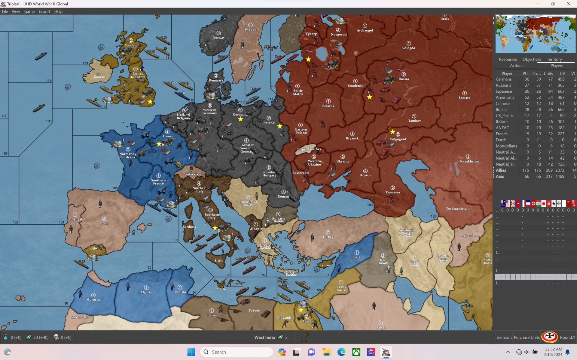
Uses @Black_Elk s Mega Map for the "World War II Global 1940 2nd Edition" that bung and veqryn made. Also uses @Frostion units.
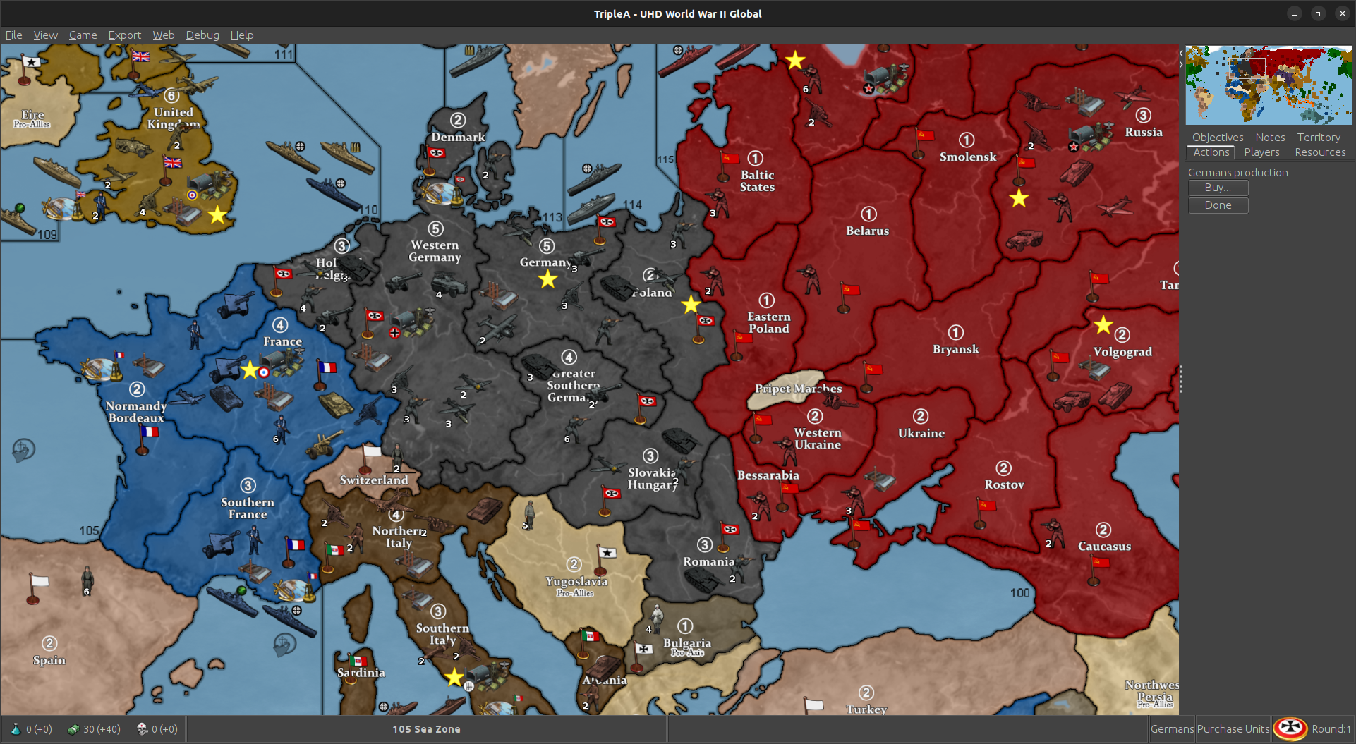
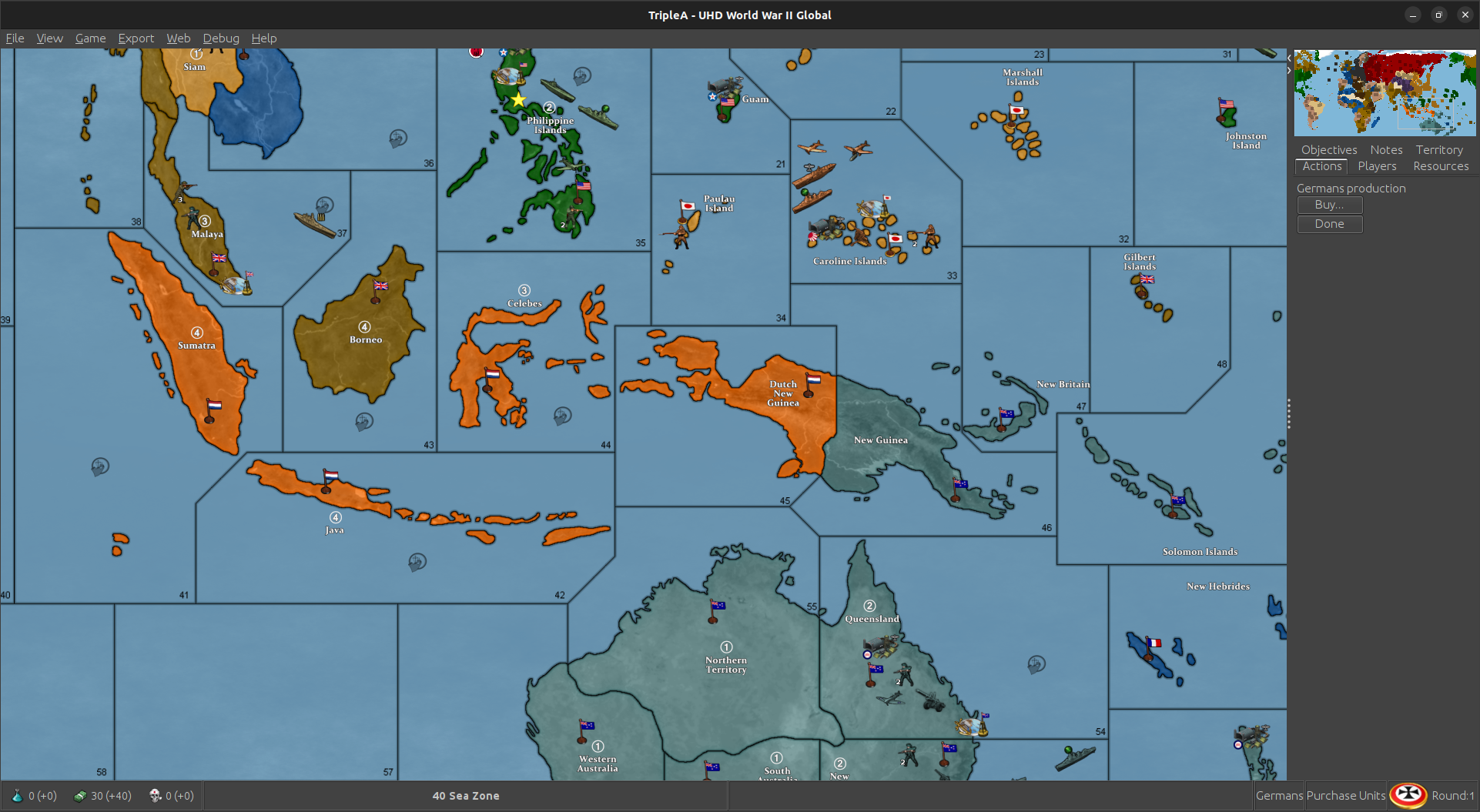
-
"The work on both the TripleA engine and the Global 1940 map will continue, until it is perfect." -Veq
High bar there, set in 2012! hehe
But if we can be all Fosbury flopping it still ten years on, Hopefully gives it some new love!

One thing I keep thinking would be awesome is if we could change the Hex ownership color on the fly.
Like even if it was a simplified palette but like for web colors at least. That'd be boss. Like if you could just hit a button to choose, or maybe randomize it that'd be great. Right now units can't be painted by hex, but that'd be a cool concept too. Anyhow, it'd be fun to do a couple alternative suggestions for the Hex colors. The default is a high vibrancy palette, but some may like a different vibe. Hopefully easy to change in the map.props just by changing the Hexes. I'll try to come up with a few ideas, or if you got a set you like could post em here. For reliefs I just have the one right now, but I think a few alternative could be fun. To change the ocean blue you can adjust the relief and run it back through the tilebreaker, but otherwise tried to give a good amount of control from the Hex colors.
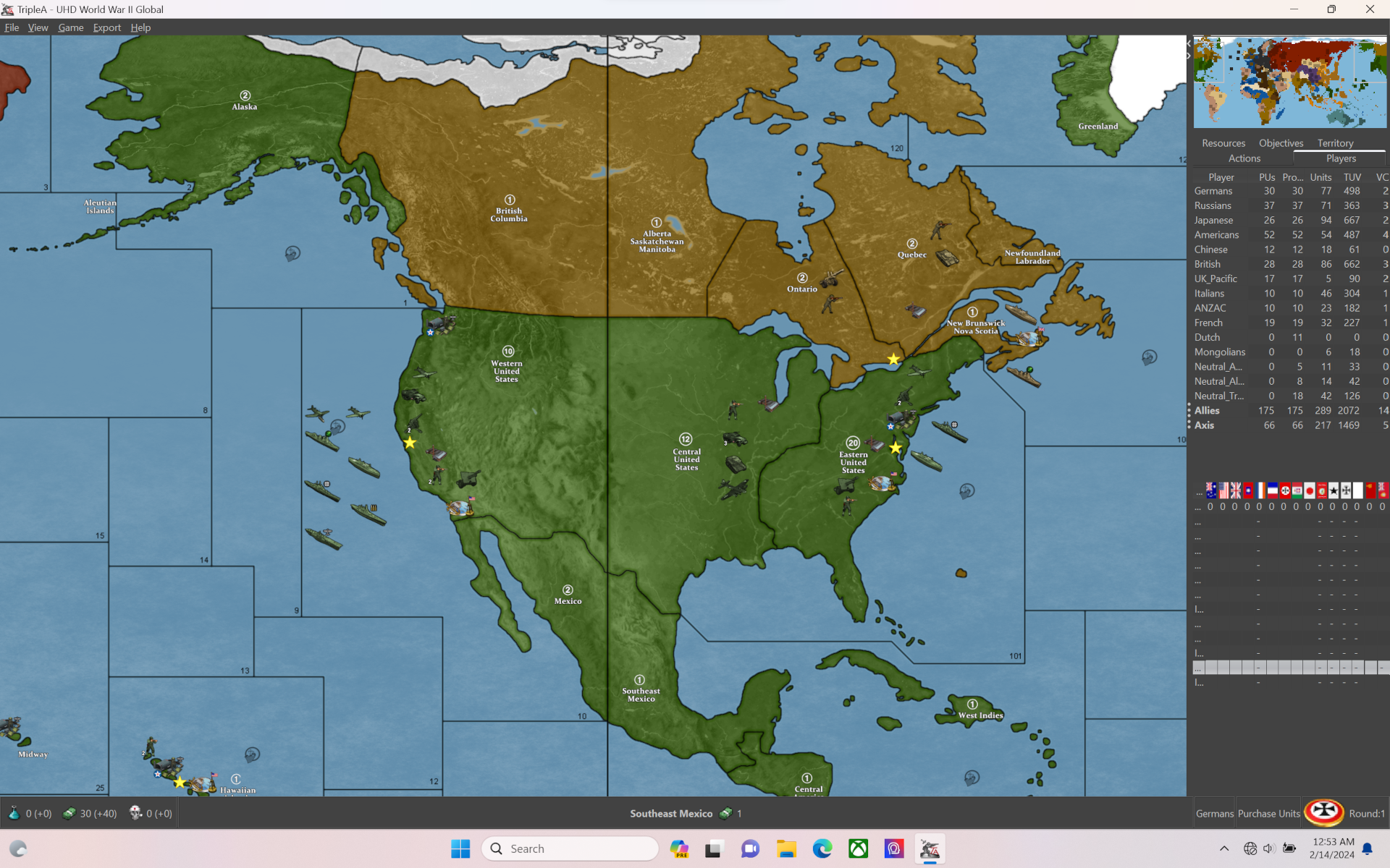
Oh and the unit flipper! So right now there are sets in there facing both directions. A button to flip units, or control orientation by tt would be my top feature request, cause I think that'd be a ton of fun. Essentially giving the player a way to pick their color and fiddle with the units, to have that extra control over the cosmetics of the board. Right now though you can at least manually make changes. There should be extras in there for people who like to mod, so hopefully it'll be a fun package that we can build on. I think the next iteration would be to allow for larger unit sizes, or upscales beyond 120% since that's still the ceiling for the overall display. This map is at 11110px wide 5341px tall, so 54px units at 120% basically. I'd be nice if we could go to 150% or 200% on a upscale for the units, but this one has basically 100% units view for size small and 120% unit view for size large.
It's in the experimental category for the X files. Probably needs some more eyes on it, just to make sure everything is sorted, like all the connections and such, but should be good to trial now.
Anyhow least it's a little basket with some goods!
Spring done sprung haha
Aces! -
Updated for corrections to Pacific SZ connections on the map.
Should be up in the Experimental section of the downloads for the X files. Looks like this now for the sz split...
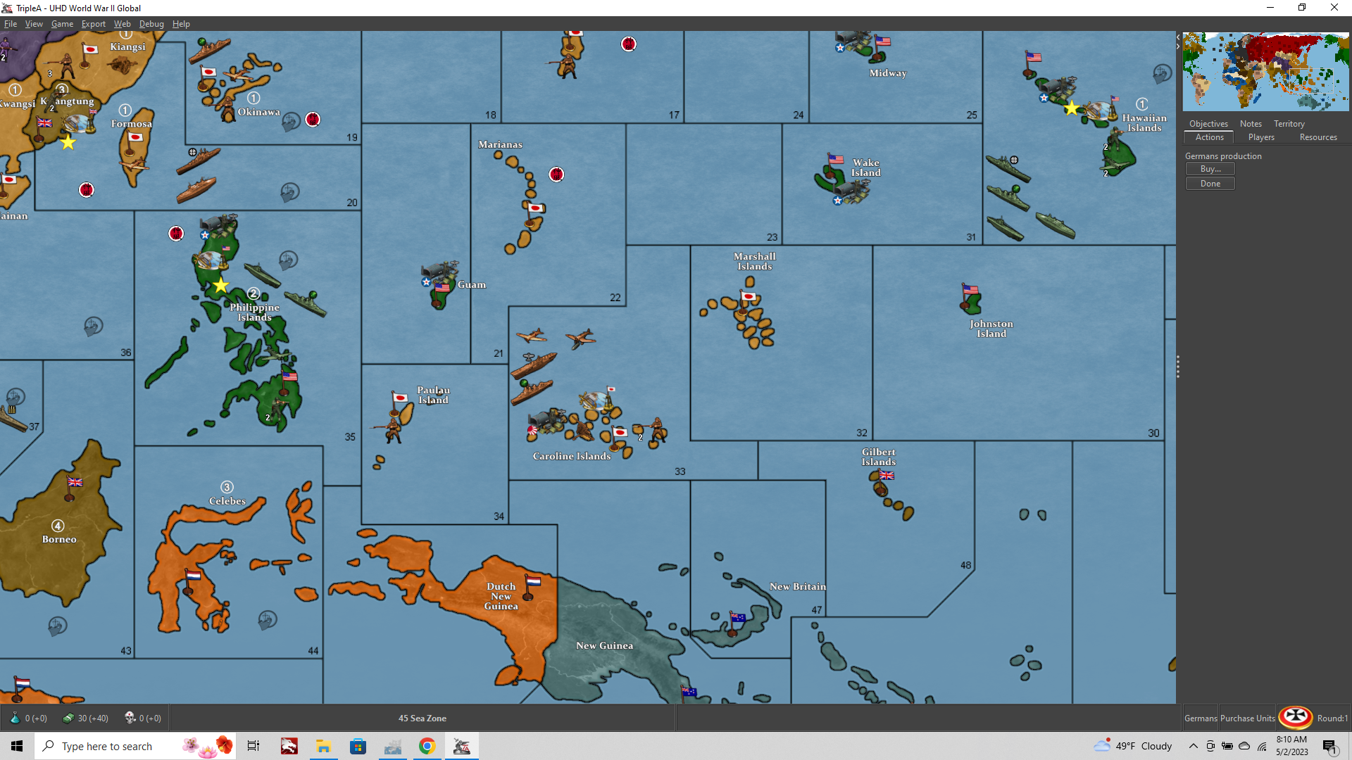
Thanks to VictoryFirst for catching that one with the eagle eye!
Hopefully should be good to go. Let me know if there's anything else I goofed for the G40 revamp haha
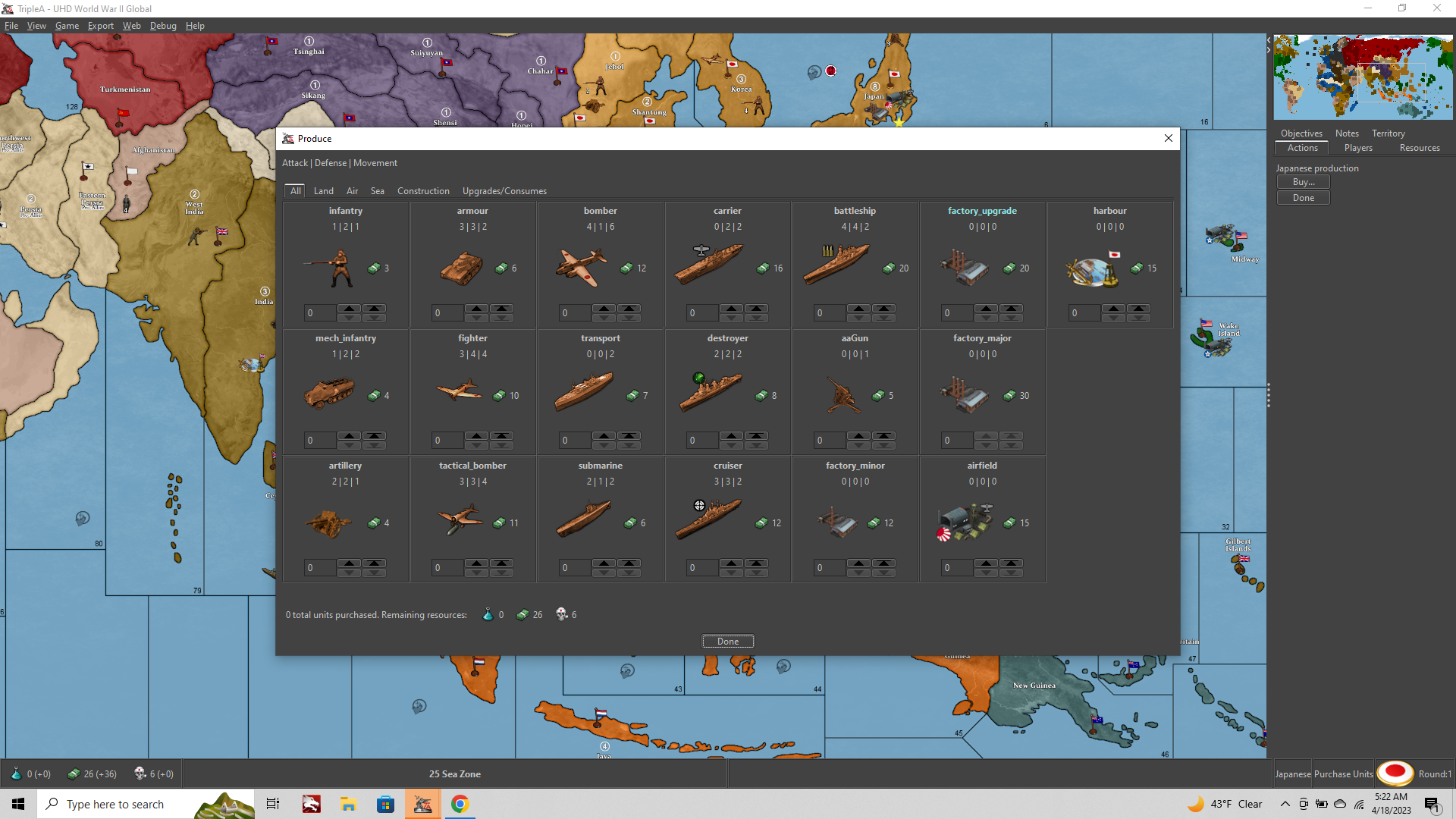
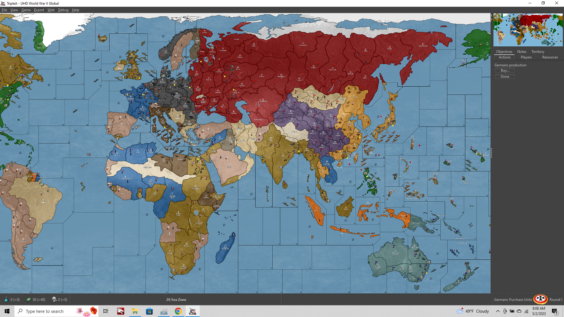
-
this is nice
few things I think could be changed moving around existing stuff-
You used Light Armour whenever replacing Armour, which works in cases of Italy, France, Japan, etc. But IMO the Armour icon for Germany, USA, UK, USSR should use their medium tank icons. I'd even say that for UK and Germany (Churchill and Tiger tanks) their heavy tank icons would be most recognizable...
-
Same thing with Arty, because France and USA both use the British 25 pdr as their icon rn
-
Frostion used suitable tank images from the game World Of Tanks when making his icons, but it was a while ago (pre 2018).
Italian tanks were added to WoT in 2018 but in TripleA they are still represented by Czech placeholders. There are also Japanese TD and SPGs added since as well, which are still rep in TripleA by German tank placeholders.
-
-
@joseph-prince
Nice! So that then is the source for the frostion tanks? This is good to know! There are I think maybe some additional armor types in the GCD or in the sub folders of this one, but I had been using the G40 as sorta the dumping ground for any graphics I had, including at one point all the 48px oldies but goodies. It's a bit of a mishmash there in the 54px. I used a couple upscales from some older sets and a few just kinda redone with images from the wiki. I was impressed with the consistency in the Frostion set so I tried to keep those except where peeps wanted something different for the timeline. My inclination would then be to replace/update unit graphics. I retinted and did some scaling, so that could be another modification, but it'd be cool to work something ground up somehow.
I think the panzer III has so many paintjobs by now I don't even know what to do with it. That was the start, cause I didn't see that one in Iron War anywhere. I think it would be slick to do entirely new graphics where we could from iconic historical images from the wiki, or maybe if someone has the cads to paint up? Whatever you got feel free to dive in a make adjustments and substitutions. I kinda figured we get the ball rolling and then it would sort just keep the momentum once the skeleton was in place hehe. I hit stride a few months back, but lately been super lazy. BG3 just kinda stormed in and took command of the war room for me lol.
Anyhow thanks for the deets! I think probably just relabel for the defaults but keep the others in a sub folder or whatever in case they're useful for other games. That seems cool
-
Looks like it's been close to a year since the last post/update; but It's been way longer than that since I was last here (in the forums). I definitely like the idea of High Def (if that's what the UHD represents).
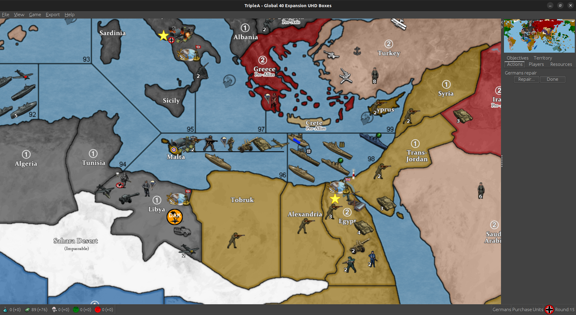
I did post a request (elsewhere) regarding this map: as I'd like to see Malta centered in the three nearby sea zones (instead of the upper corner of the one).
I am/was also hoping that the Gulf of Mexico was its own sea zone instead of split (between the 2 sea zones) the way it is currently.
I do like that the units are dark, bold and sharp (based on what I'm seeing here). I can't say the same for the territories; however, as I would (personally) prefer that they were lighter/softer on the eyes and didn't obscure the units the way they seem to do (again based on what I'm seeing here).
I'm just returning to these Forums and Triple-A, so I have yet to download this version of the game. So, I don't know if there already are other skins to my liking, but I will look into it.
In any event, keep up the good work and I see I was wrong about the 10 months. -
@stohrm
For lighter territories tick this;
View> Show Map Blends -
@TheDog Good lookin out! Hope you're doing well man!
@stohrm Thanks dude! I feel ya, even my own tastes aren't being fully reflected here. Instead I tried to set up something that would be relatively easy to modify. So couple simple methods to redraft the relief to suit your tastes...
The first, and probably easiest place to start if the map blend thing doesn't work for you, would be to reassign the HEX colors by nation in the map.properties.
This is a fairly simple text edit and it's independent of any of the other stuff with the map. So basically you just open it in notepad and there's a 6 character color code for each nation. This way you can look up HEX palettes online then copy over the code that matches the color swatches you like, without having to guess at what will show up in the final display. You can also do a few other things in the map.props like enabling or disabling the control marker flags, (shown above, but disabled in the default just to tamp down the visual clutter) and a few other things like that.
Currently the map relief displays the TT colors about as close as I could manage so that the Map itself (shown in-game) and the assigned HEX colors in the map.properties file would match each other 1:1. In other words, it's not passing through much of an opacity filter, and the relief itself is completely desaturated. So you shouldn't get a color change coming in from the relief if you change those values. As an example if you assign USA a very bright green in the map.props you should see something pretty much exactly like that in the actual map display when it fires up. If you want something more muted/subdued for the USA green you can then switch the Hex colors and this should give a pretty close approximation of the same on the map display. You can do this just for you own display, and it won't effect anyone else's default visual, hopefully making the map look a bit easier to customize on the fly.
The reason I went with very High Saturation palette was just because I hadn't seen it done really in tripleA, and because if someone wants to play with the opacity in the actual relief, it's easier to desaturate rather than re-saturate, if that makes sense. So sorta starting with the boldest and most absurdly bright, and that way it can be dialed back from there, or at least that was the thinking.
Here's a post kinda showing what I mean, since it's easier to show with the visual...
https://forums.triplea-game.org/topic/3423/a-brief-guide-for-making-a-map-relief/15?_=1707359726580
To adjust the borders themselves, or the borderline fades, little more complicated, but should be achievable with materials I left inside the map folder. You'll see an image file called Baseline, and another called Relief, but you should also have in there of the Topographical underpainting. The terrain underpainting that has all the mountains and whatnot morphed to match the baseline projection.
By combining the baseline and that topo, you can create an entirely new under layer if you want. Basically what you'd there in the tripleA map utlities is tweak the opacity of the underlayer, or even replace the topo with something else, like say a rail map or basic pattern. It's a little tricky but I tried to leave a guide in the map creation section. The most time/labor intensive part is actually creating the borderline fades, but if you have the baseline and Photoshop or GIMP it's basically selecting the black lines in the base, and then expanding them, fill with an opacity gradient.
Some stuff you can could modify just doing like a cut and paste sorta deal, provided the relief matches the baseline (like making the same copy/paste for each). It's easier if it doesn't cross one of those line breaks. Reason being that in order for the tripleA highlight feature to work (like when you mouse over the TT and it lights up) to achieve that the relief needs the black line to be empty so it will show through when changing from a black line to a white one (how the light up effect is actually conveyed.) Tricky thing there is just re-filling that area with something if a line is moved, so it doesn't show blank. I had to do that a bunch of times for the sea zones, since many were goofed along the way haha. Not the easiest thing to change, but if you got some elbow grease and the desire, it can definitely be done.
For unit contrast two methods. One would be to retint/replace the units themselves individually or the other to batch edit them in PS/Gimp so you can apply the same coloration to everything in a set at once. It's pretty easy if you want monochrome tints, for the duo tone I had to go in and isolate certain areas of the image to recolor them in sections, like for the infantry skin tones or colored hats/roundels etc. I think it's probably easier to adjust the map itself than the units en mass, just cause 1 large image is easier to work with than like 1000 tiny ones lol. Why it's taken me forever just to get that far along, but hopefully a slight bit easier now that some of the basics are in place.
There are some other additional materials inside the subfolders too. These won't display in game unless renaming the labels or making a map mod, but you can check it out just navigating to the downloaded maps folder in the explorer. I think it would be cool to just have a grab-bag in there, so whatever makes sense.
Beelee's been keeping an eye on it, and pulling me off the sidelines when we discover something I goofed, so can maybe bring you up to speed for figuring out where the bits and pieces are, or maybe some basics for tweaking borders around. Polygrabber and placement picker is one of the harder utilities to get the head around, but once you know where to point the utilities to find the images to mess around with. Sticky might help, but I'm such a rambler. We probably need someone with the gift of brevity to whittle that down and make it more user friendly hehe.
Anyhow, cool to see it caught a few eyes! Keep it rocking all!
ps. header images a little older, the current default looks like this. Mapblends will give a very light/pastel hue, probably too light I'd imagine, so I think HEX adjustment would probably be simpler. Here's a quick side by side.
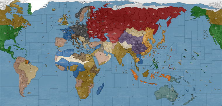
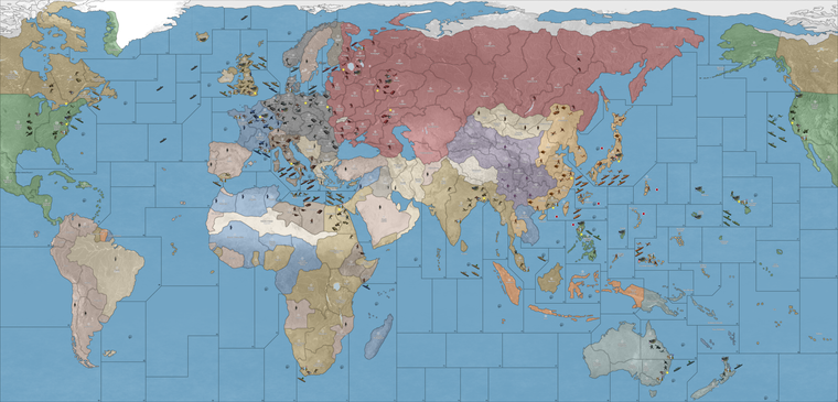
You can see it's quite bright. I think if going for a more muted palette for the map colors, this would recommend going darker (in color value for the assigned HEX colors) and then possible changing the Blue of the ocean so there is more contrast. Adjusting the ocean blue you can achieve by replace/color in the baseline image.
-
Oh also forgot to mention, so the visual effect that goes down with map blends, the reason it is so bright, is because it's blending the baseline with the relief (and the base has a fairly light blue, and 100% white on all the land areas.) This can't really be avoided, since tripleA needs the white/black to understand what's going on.
But the HEX colors in the map.props can be assigned to key off a blended map view rather than the default view. Like in that case you may try just going very very dark with the HEXs to offset that 100% white in the blend (imagine them like mixing paints, if you were to add in half titanium-white goes hardcore pastel, so gotta offset that with the HEXs.)
In a way the map blends kinda shows what usually happens when the map has an opacity/color filter that it's getting passed through. There it can very hard to guess what color you might need, so the reason I tried to do the default like 1:1 with bright colors that would be easy to choose from the web palettes. Just to give people a starting point basically.
If you are colorblind (I'm not myself, but it's pretty common) hopefully this should give an easy way to tweak at least the land tt stuff too. The units might be harder, but least gives a place to start I think. It'd be cool if anyone has that to maybe work a default display that can swing protanopia/deu/trio or just have the HEXs saved maybe.
For my own version I'd probably play with the blues just till I got them to work with the HEX colors I chose. Basically can just pick a nice blue you like in a PS or MSpaint GIMP etc and fill the entire area of the baseline with that hue. Run the same image through the tilebreaker in the map utilities and it will repaint that in-game without messing with anything else. So again two users could have different looks locally and wouldn't effect the stuff for the other players using the map. I think anyway. TripleA is so complicated sometimes, I wish it was like a built in tweak a bit easier to use, but what I really liked was just the idea to give a skeleton of something that had an ok projection and ways for the players to spec it out for their own style. Islands I think are the easiest to move if something is giving probs, like for the unit place. I haven't played in a hot minute. Let me know if it's working
best
Elkps. for the vibrancy, essentially what you see in the default is what I'd consider kinda like the upper limit. So setting the ceiling there more or less, cause it's pretty ROYGBIV full spectrum right now, like with the volume already at 11 lol. Going anymore 'neon' pop than that I think would look kinda jank. Like even for my Classic 1984 sensibility it'd probably be too over the top with any more sat than that. So the idea would be to dial down the volume from there. Cool idea might be something like a simple bright/dark preset and just have 2 sets of hex combos ready to roll. That way the user can just move a single txt file in there map folder or rename the backup for a quick switch. Just to give a range maybe
-
@black_elk said in UHD World War II Global:
like with the volume already at 11
yea you could call that one Spinal or Nigel

-
@stohrm said in UHD World War II Global:
I'd like to see Malta centered in the three nearby sea zones
Hi stohrm
Welcome back

Why do you want Malta moved ? It is geographically correct. Do you want the SZ borders moved ?
Edit
Ahh I think I see what you're saying. The overflow from Malta goes right, so , imo keeping it placed as close as to real is preferable.Anyway you can tweak it if you want as Elk outlined

It took me a few games to get used to the map and units compared to the original G 40 map.

-
I suppose moving either the island or the sea zones isn't really necessary as one can probably just adjust the links to the other two sea zones (and I might simply do that).
It's my understanding that Malta was fairly important (at least until it was captured by the Axis). So, in my mind that importance would be even greater if it was the center of those three sea zones. Granted, it could be attacked from any of the three and perhaps that's a reason to leave it the way it is. It's tough to say.
It's more about the reach of the planes than that of the naval vessels. Perhaps when the Game goes from UHD to 3D and sea zones are replaced by air zones for aircraft.
In any event, I appreciate the response(s).
-
ideas for some options / house rules versions
- a version based on the Path To Victory territory layout
some changes (mainly on side of the allies ig):
-
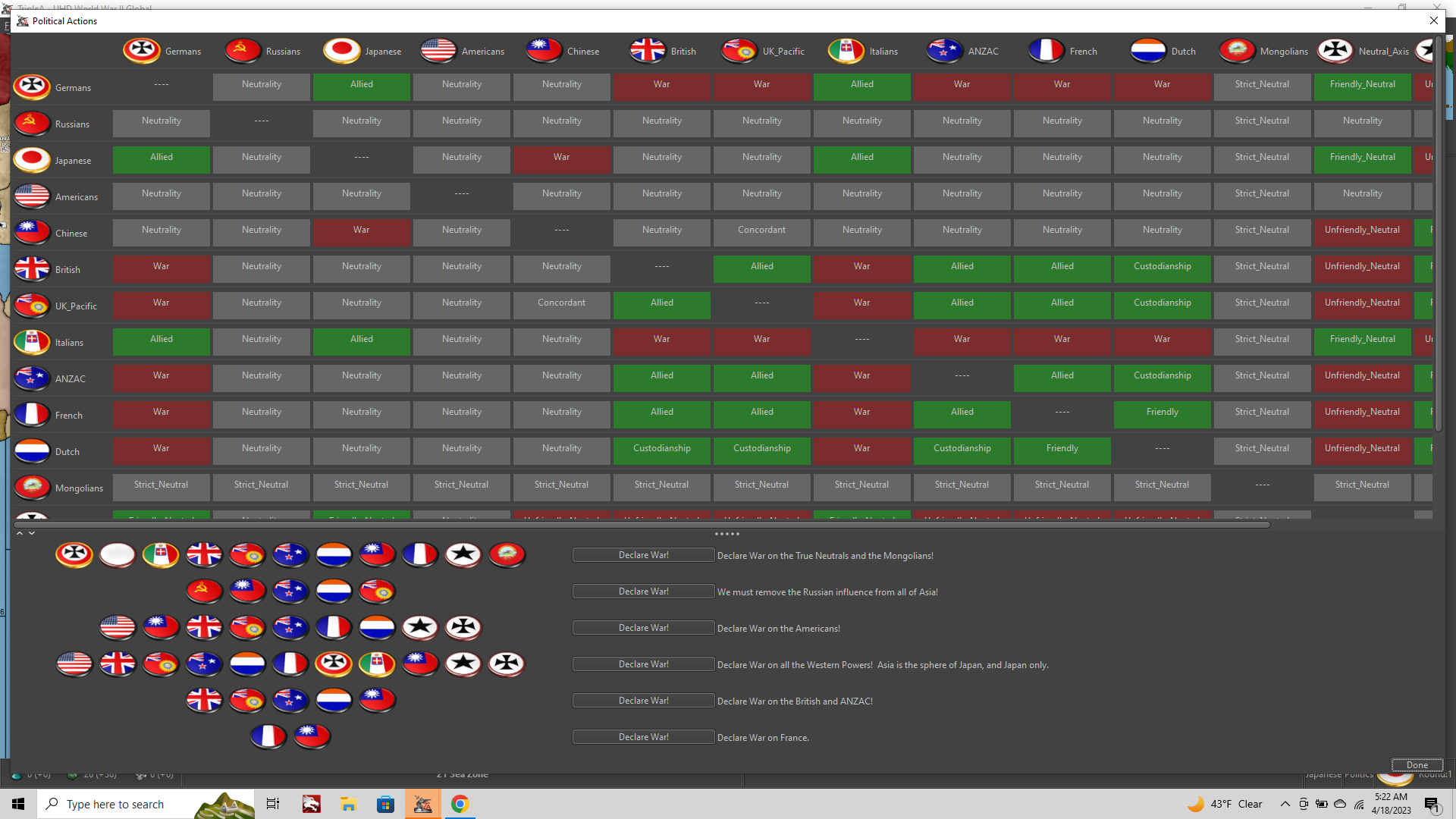
option to make it so France gets the same "Custodianship" relationship as Dutch have when Paris falls (their units do not convert, though) and they only lose it when Paris is retaken
-
option "soft underbelly" to make it so if Libya is already allied controlled and if Northern or Southern Italy then falls to one of the Western Allies (not USSR), the rest of the country + sicily will switch sides (i.e become French units) while the territories become UK owned. Territory will not switch sides if there are German non-air units in em
-
lend lease systems. All of the Allies can give units to China by moving them into Yunnan, Szechwan, Western Sinkiang, Northern Sinkiang. Allies can give units to USSR by moving them into Archangel, Amur, Southern Caucasus, Moscow. USA can give units to UK by moving them into Quebec, Scotland, Western India. and to ANZAC in New South Wales.
-
If China owns all original territories and has units in every single coastal one, their territory restrictions are removed and they get a minor industrial complex on Kiangsu and can produce any units. They still keep the previous ability to produce Arty and Infantry in any other territory as well.
-
Make it an option to make AI not declare war on the True Neutrals ever, and that Japan will only declare war on USSR if Axis own 3/4+ of Eastern India, Szechwan, New South Wales, Szechwan. And USSR will only declare on Japan if Allies own 3/4+ of France, Poland, Western Germany, Germany.
-
@stohrm said in UHD World War II Global:
It's more about the reach of the planes than that of the naval vessels. Perhaps when the Game goes from UHD to 3D and sea zones are replaced by air zones for aircraft.
yea, so to expand a bit more, Oztea's 1941 Global Mod is available in Map/Game Options before Game Start.
Malta has a Airbase, 5 damage though
 but might be more what your looking for.
Actually, I think Oz's 41 is the best OOB Mod without adding anything other than start date and Units.
Edit
Just noticed a German placement error in Germany for Oz 41 Added 5 instead of removing. It's fixed for next update
-
@joseph-prince some more options ideas
-
add options for the other Oztea setups (1939 and 1942)
-
maybe add a 1943 scenario? https://axisandallies.fandom.com/wiki/Axis_%26_Allies_Global_1943_Variant
-
finally, just for the sake of completeness, June 1944 scenario (with timed victory conditions?) https://axisandallies.fandom.com/wiki/Axis_%26_Allied_Global_-_1944_Variant
and maybe even a January 1945 scenario (Germany and Japan are first in turn orders, you achieve a minor victory as axis if you still hold a capital by the end of turn 2, major if turn 3-4??) which is set (in pacific) after the american landing on Luzon and (in europe) after the German defeat in the battle of the bulge -
options to add various additional factions (namely the ones from here: https://forums.triplea-game.org/topic/2773/churchill-s-1939-thread-2/2
and others (like Canadians house rules, etc) making sure to keep the options seperate so players can pick which ones they want ingame (since they effectively take away from existing nations i.e CCP_Chinese weakens China, GEACPS weakens Japan, Canadians weaken British, Puppet_States weaken Germany, etc etc)
is there any tutorial topics on how to use the TripleA Github? just want to know
-
-
@beelee As someone who plays many different mods, I prefer to have a separate xml if you are going to have options that make for a significantly different game play situation. For me, options are for tweaking the scenario, like bids and low luck.
-
@rogercooper I agree, especially considering certain things don't work as options super well (like the Oztea setup requiring edit mode to set damages to infastructure and ships, while if it was a seperate xml it could simply use hitsTaken)
-
yea i did separate xmls for bungs map. Thought it might be easier just having it all in one this go around.
Yea, too bad hitsTaken isn't a attachment.
Probably do 39 next. Or maybe Canada.
-
Makes sense. I'd thoroughly pass the buck on getting whatever xmls dialed cause that's always been a big mystery black box to me for the most part hehe.
Like once something's in place I can kinda get a read on it, but not really my strong suit. For map adjustments (like the actual borders) baseline is relatively easy to adjust, it's just the relief that drags cause it's a noodling process for sure. It's simpler to sort of go in and do whatever at once, but I've just been making piecemeal corrections so that it would be analogous to OOB. Kinda supped in little ways that wouldn't actually effect the gameplay, but just be more for flourish. Stuff like Sakhalin or Aden or whatever that seemed easy enough to slide in for the visual, but could just attach to another nearby zone. That said if anyone wants to dive in and clean stuff or riff with mods that's always cool!
Just real quick for the HEX color thing this was what I meant in the post above. So if you navigate to this file and pop it open in notepad you'll see all the colors for the national displays (the color that paints across the land TTs).
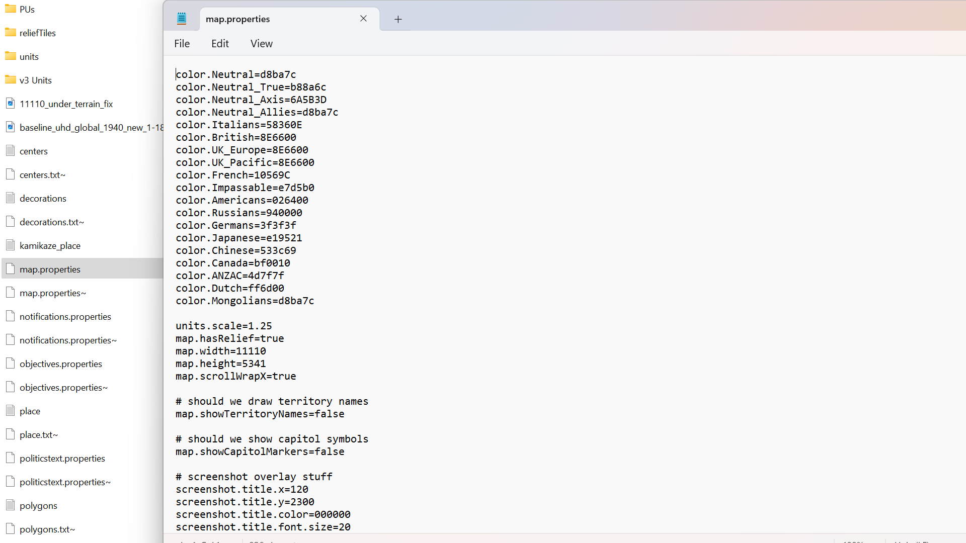
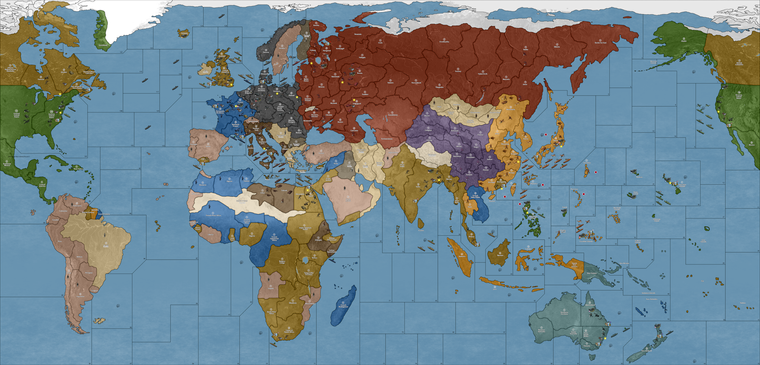
For that one I just picked 3 of the louder colors and dialed the vibrancy down like 25% so they'd be more muted, just to show how it works. The current default is like flashing lights at las vegas, so might catch the eyes or strain them, depending on your shades lol.
In this case the adjustments were to...
color.Americans=326100
color.Russians=831E00
color.Dutch=CF7E00with everything else left the same just to kinda see how a couple tweaks can push it ever so slightly. But you could hop around and tweak stuffthat way till the you get the right vibe you dig. Here's a quickie tool that just spits out the HEXs from the rainbow bar that you can plug in...
(for that you can drag around the palette, the number you want would be the topline 6 character hex by the pound # symbol.)
It's hopefully easy to change them on the fly, like by adjusting 1 color at a time or all of them to play around with that and get the desired look or overall palette, though I'm not sure how many players like going under the hood, that one is a pretty quick edit. You can just fire up the map.properties file in notepad, save new txt you changed then relaunch tripleA to see immediately your adjustments displayed.
It'd be cool if we had a maybe a basic web palette in-game, but right now gotta do it from the map.properties file. I'm not particular, hopefully the unit tints are serviceable since those take longer to adjust, but even then if it feels jank somewhere those can be tweaked too using that BIMP plugin to batch edit a bunch of images in GIMP or PS. Also if peeps got a spread that looks cool for that post what you like and then we can set up some alts. like especially if anyone is red/green colorblind and has something that feels good for that.
For the ocean blue, that's probably the next simplest edit to make, but it involves paintbucketing the baseline image and then running it back through the tilebreaker. Easiest there would probably just be to do a couple options for peeps to replace those tiles like how the old skins used to work. Doing it manually isn't ideal for the end user, but least it's workable. We can just like vote on the final look or toss out a couple defaults to choose from if the connects are all dialed now. I can give it a final pass to beef out whatever pixels for some of the stretches, but I'd redo that from the base probably first just to make sure before doing the relief, since the latter takes a fair bit longer. Anyhow, hopefully helps a bit
Have fun gang, happy Lupercalia! hehe
ps. oh also I think this one caught the slip somewhere from the darker value set.

pps. Oh and one more knock on thought, but just the idea of the 60 bid seems kinda badass to me for the vanilla. For a game vs the computer it would be clutch if the tripleA hardAI (maybe should be renamed?) might just rock a spread like that, or with 50-100 tuv with randomized unit placement, mainly to UK/China I guess? just to set something to keep it hot like that? Where the launch option just gave a bid spread to the computer general if playing team axis. Wouldn't need need to be perfect I don't think, just that idea of the big pile at the start to give it variability. Might be cool
-
quick recap for stuff to comb over. I got notes to fix up the jank or clarify the connect in these spots basically for the final pass. Like least for the map...
Units probably need some attention just to tighten things up here or there or like with the tanks mentioned. How's the ocean blue treat you? I legit wear blue blocker glasses when playing tripleA or knock my gamma so maybe another reason I went all high vibrancy but I think maybe we just toss a few spreads and then whichever feels best run with that hehe. For the clean I up I got these from the above.
Pac/Asia side:
Korea-Amur drift the border left a few px to beef it out
Novos-Tsing border same deal drift a few px to the left.
Europe Atlantic side:
Syria-sz98 drift border down so looks more like Lebanon to beef it
France-N. Italy drift border left or carve into Switz a bit to beef it
Clean the jank off that line moved in sz123 from that earlier correction
Slide Malta again? Wasn't sure if I understood that as a mod or for the vanilla position
Take the Yemen/Oman/Kuwait concept under advisement. Could maybe use a border effect to indicate non connections but that seemed like it might just make it read busier to me. My thought was that anything not labelled would then just be understood as cosmetic basically. So like the Sakhalin thing wherever it goes down if it's not listed just part of a nearby tile not technically in play.
North America:
Maybe just the tangent on sz 1 where it hits the border to drift a few px?
Otherwise let me know. The less we gotta move the easier it'll be to pull off timely but I'll try to give it a whirl this weekend/next week if Minthara isn't taking up all my attention/free time like tends to happen lol
catch ya next round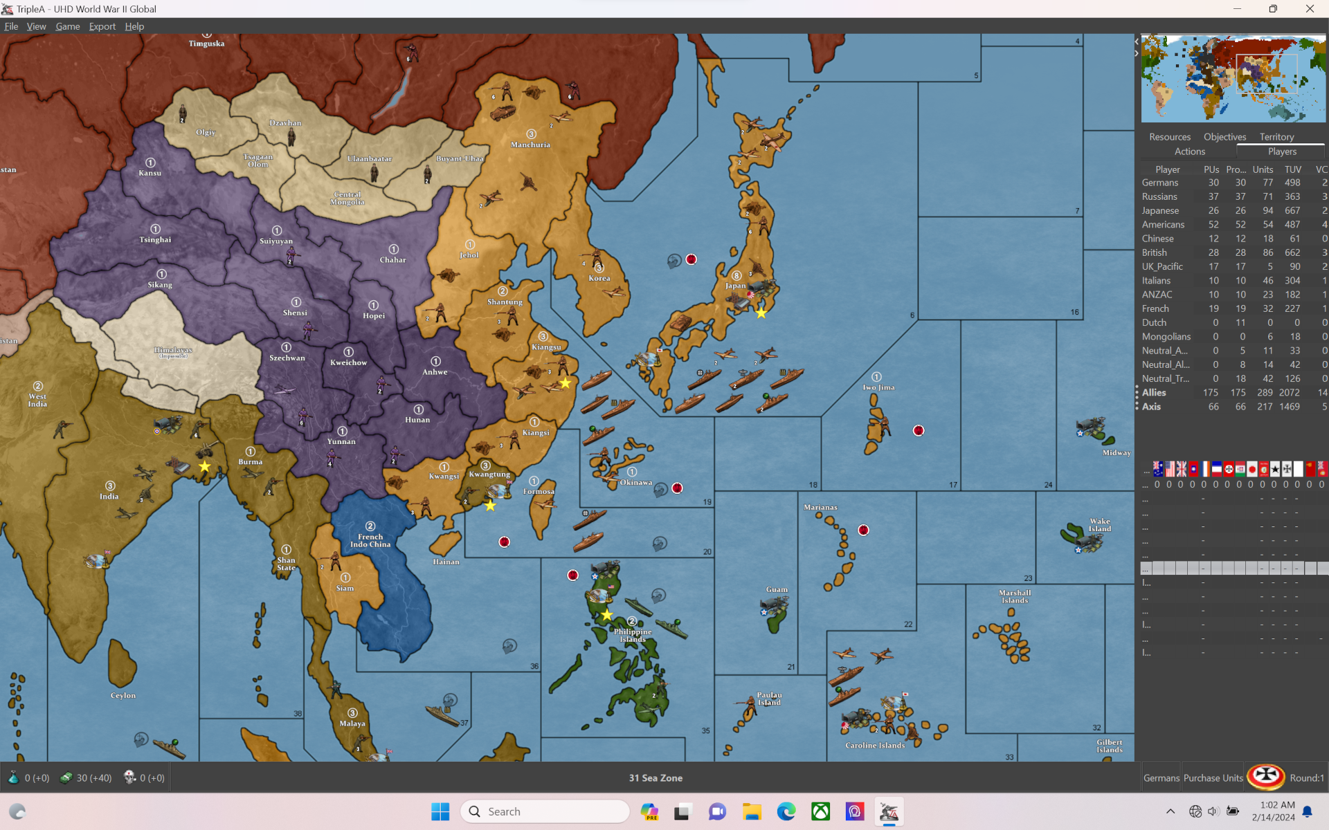
Hello! It looks like you're interested in this conversation, but you don't have an account yet.
Getting fed up of having to scroll through the same posts each visit? When you register for an account, you'll always come back to exactly where you were before, and choose to be notified of new replies (either via email, or push notification). You'll also be able to save bookmarks and upvote posts to show your appreciation to other community members.
With your input, this post could be even better 💗
Register Login