UHD map making materials
-
I just wanted to put these together somewhere, since they are very useful for making map reliefs or adjustments to baselines and such for map modifications, but they're also not the sorts of things that easily slot into a finished/playable tripleA map game. These are like the elements that I would use to create a finished relief, but it's not very easy to reverse engineer a finished relief to re-create them, so instead I just exported them as separate images. There are about a dozen map images in here, just for the most basic stuff...
Everything I do to create a relief from a baseline image involves making a selection based on color, then grow/shrink that selection and apply some kind of effect (say blur or an opacity change or things like that) before merging the visible layers into a single relief which then gets run through the tilebreaker map creator tool within tripleA to produce the final visual in-game. To make modifications it's helpful to have those layers at 100% opacity, even if the ultimate relief image will usually end up as a transparency which gets laid on top of the baseline. It's just much simpler to modify an image at 100% opacity and then make it semi-transparent than vice versa, or to have masks like stencils, where you can quickly make selections.
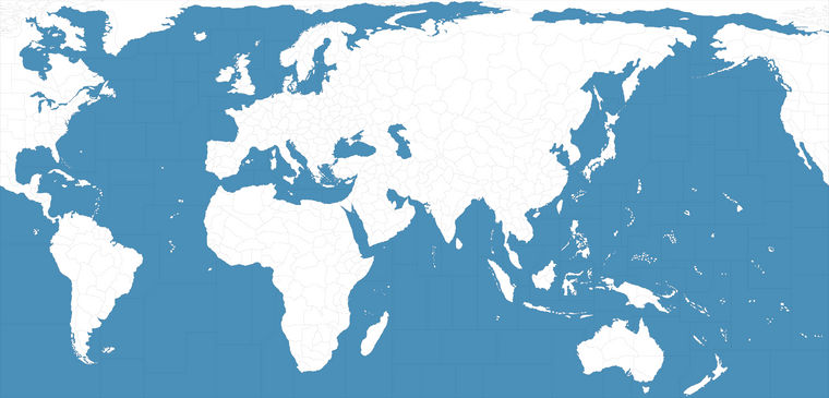
It took a little while, but I downscaled the baseline for the 1941 GCD to match the UHD projection at 11110px. I did this for a couple reasons, but mostly just because it kept the filesize somewhat manageable. Working with larger images in multiple layers is pretty taxing on the RAM depending on how much information is in those pixels. The baselines have a lighter footprint, like usually under 1mb, but the relief stuff with lots of color information or opacity adjustments, blur etc added in quickly balloons the filesize. We also still have a lot of materials for tripleA which key off units at 48px, so just seemed like it might be good to have. A matching baseline already exists at the larger size (GCD), so I just wanted to focus on stuff that would work more at the UHD global play scale. I included that a guideline for boundaries, it has the subdivided tiles and the Global Sea Zone divisions put together at the 11110px width. It still has a little bit of chop, but I managed to get just about everything down to 1px with no floaters.
Resizing a baseline is pretty difficult. There is no easy way to take a baseline image with an existing 1px line and downscale/upscale it in a way that tripleA can actually make use of. Scaling without any interpolation to preserve the shape/width of the line is challenging. Basically the lines at 1px have to be redrawn at whatever scale.
I have a trick for doing this, which is the spotted cow trick. Provided the tiles are not adjacent, you can grab the tiles, grow selection 2 px (fill with black) then shrink 1 px (fill with white) this will give a 1 px unbroken line for the rescale, but you have to do it tile by tile like this...
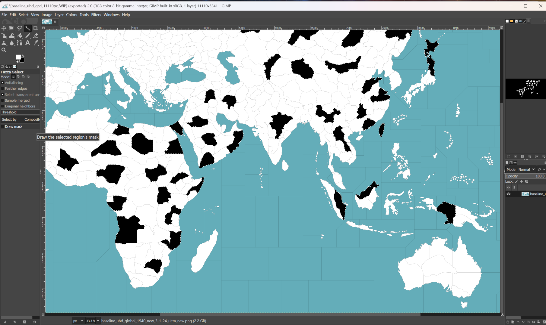
In other words you can't just grab everything that's white and expand by 2px all at once, because that will remove all the lines. The tiles can't share a border when they're being expanded like that, or it will collapse that boundary, so you gotta jump around with the magic wand to pull it off. It's doable, just very tedious, which is why I wanted to provide a guide image where the grunt work was already halfway finished. When I do this I approach it as a kind of mini-game so I don't go nuts, cause it takes a while lol.
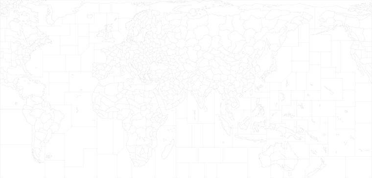
Blackline base for borders at 1px. This is like the one I would use to delete the baseline from the final relief image to allow the border highlight to show through. This one still has a little chop, but should be serviceable for a template. If there's chop anywhere (say a 1 px line drifts into 2px) you can use the magic wand and spotted cow trick. Long as it's only grow/shrink with 1 px of play, you won't notice a difference really along the contour. Goal is just to get everything at 1px or as close as you can. Every other image is just created from this image using selections and fills, on different layers of the eventual relief. You can also grow selection by 1px to create a 3px fill. If you start wider and lay the thinner line back on top you can control the blend a bit easier when applying blur. When you lay the base on top it'll display the way it would look with the 1px line in all black coming over from the polys.
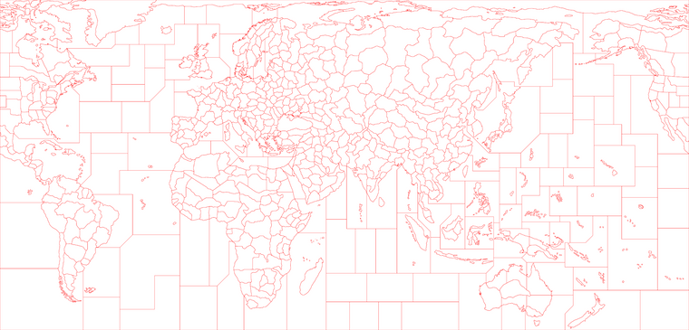
Redline base for borders at 5px. Same as the above, if the black line were expanded by 2px and filled in with red. This selection I use for stuff like creating a border fade or color pop around the border boundaries. Adding stuff like blur or trying to create a gradient. Or to manually anti-alias around the 1px line above so it doesn't look too jagged. Also so the map will scale properly without lines breaking or disappearing when at max zoom out.
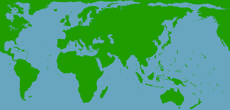
Blue Green contour mask. This can be used to fill patterns either for the Ocean (cloud fx) or within just the Land (say a topo, or a pattern fill, or some abstract design like rail-lines). Once filled in that area/layer can be made semi transparent.
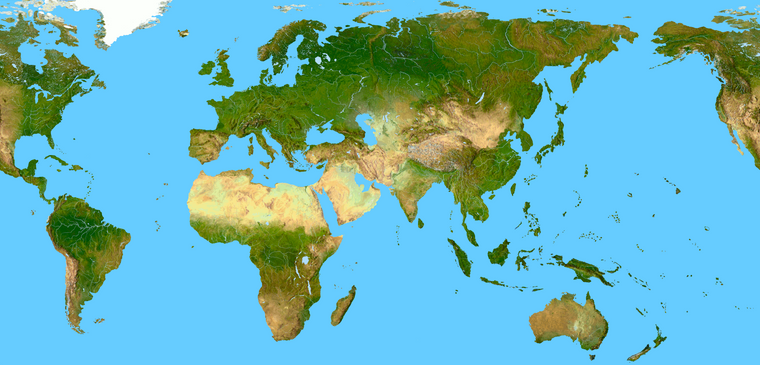
Here's one possible fill, a topo in color. To create the GCD I used one like this, but made semi transparent. Using color in your relief that way will blend with colors coming through via the HEX in map.props. When modifying the relief you want to do it here at full opacity, after you draw in the changes you can reduce the opacity. It's just easier to control when the starting image is at 100%.
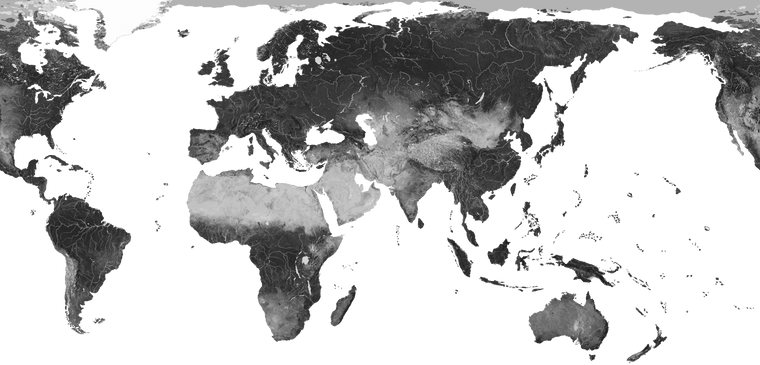
Here's the same thing but desaturated. To create the UHD global I used one like that, which will display somewhat truer to HEX color by hue, while still giving some value changes in the brights/darks. You can also go somewhere between those extremes by adjusting the saturation/opacity and then keying the HEX stuff in the map props off that. I usually apply a little blur to that image once the opacity is chosen, just to smooth over the chop and knock it back a bit.
Here's a quick key showing some labels for the extra subdivisions. It's older, but one could also reference the GCD. It's just meant to be a ballpark, so the map maker can have a starting point. Presumably one might add or collapse tiles to service the playscale for whatever sort of game, but basically just meant to indicate where stuff is in relative terms according to the overall warp of the world. You can change these shapes around provided the continent contours remain they'll still match the topo. If changing the contours just change the topo or pattern fill to match the base adjustments and you should be good.
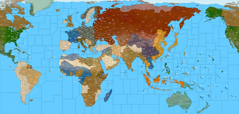
And then here is a base at 11110 which has more subdivisions for the sea zones, following the GCD just downscaled. I was going to do one for the Domination 1914 NML, but it's pretty involved. For that game I tried to label the sea zones sequentially in a vague boustrophedon starting in the upper left for the Dom maps, but I think it's easier to model them off the Global sea zone divisions and do an alpha numeric thing if bifurcating the tiles. That way sz 1 can become sz 1a and sz 1b, if you need it too, without having to reorder and relabel everything else. Seemed to make sense anyway. Again just a guideline there, people can riff on it however. I just wanted to make it easier by giving some extra information as a starting point.
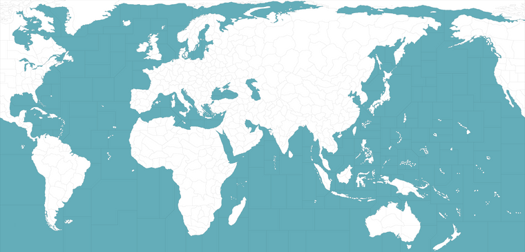
If I get the chance, I'll include some additional stuff like the rail pattern fills or different ideas for how to combined the stuff to give different presentations. All the unit and flag graphics I had assembled are basically in the UHD global and GCD packages, but the stuff for the maps and reliefs is a little harder to showcase, cause there's a bunch of stuff that just kinda weighs down the folder. It's all extraneous, right up until the point when someone wants to modify anything in the relief, then it suddenly becomes relevant to have all the bits and pieces together again, hence this thread hehe. Oh also in there I included half a dozen baselines with different blues for a control. They all key off the UHD Global boundaries.
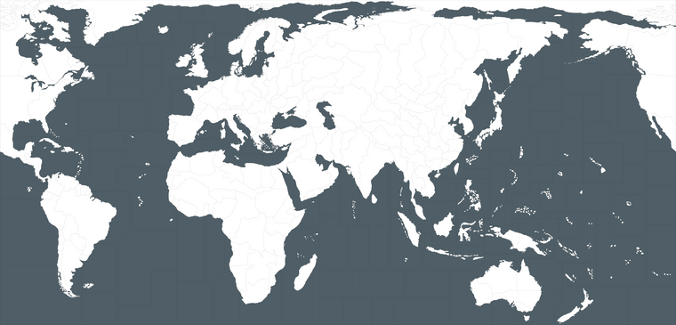
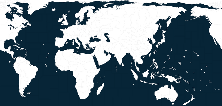
Basically the idea there is to use the color from the baseline to control the ocean color, which is hard to do without editing the actual image (it's not in the map.props like the national HEX colors) but just to give an example of how those would work I tried to set up a quick spread going from light to dark.
Anyhow, figured I'd just put what I had together. I'll add to it when I think of more, but just in case anyone wants to go to town - have at it lol
Best,
Elk -
@black_elk said in UHD map making materials:
approach it as a kind of mini-game so I don't go nuts
heh heh that's definitely the way to go about it

Well done

-
@black_elk super cool thanks for sharing

-
@ubernaut No prob
Here is the same file as the above for the map type things, but just hosted on drive instead of dropbox
https://drive.google.com/file/d/1CAymUozYeQirEmsyl4wAV2Q70QunbpA6/view?usp=sharing
These are the 54px units I had for the last couple games. Folder has the tinted and the flipped versions (switch orientation) and then a copy of the main Frostion set from Iron War, which was the basis. Along with the flags and roundels at a couple sizes. Since there are many duplicate graphics or graphics with the same labelling across WW2 games they're grouped here into folders by nation same as in-game.
Just to have them somewhere together, or in case people want to add to the 54 px stuff. I'm trying to hunt down some upscales of the 54px that would work, cause I remember I had done that with the GIMP batch tool at some point, but anyway was already at like 50 mb so figured I could do those as a separate 48px themed folder.
These are the painted up versions and the duo tone tints, but they could also be re-colorized with a batch tool like the standard 48px units are handled, or downscaled to 48px and warped into 1:1 or whatever works.
https://drive.google.com/file/d/1jPrsjcGv6iE09l7pVLC7UClam7GDnBTg/view?usp=sharing
I'll add to those when I get the rest sorted.
-
@black_elk awesome stuff love those roundels and units
-
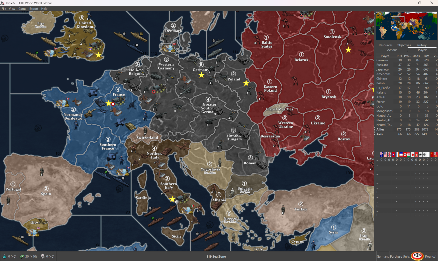
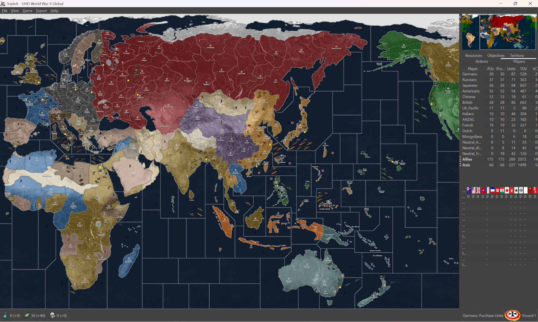
Here's a revised style version of the UHD that uses white lines in case anyone likes that visual
tile folders
https://drive.google.com/file/d/1hBnHHfP3ehfg_56RSKCV5JkRYApDql7a/view?usp=sharingrelief image
https://drive.google.com/file/d/1d22YGkcOJ_kC4KcsxWZHu6SwXKhdaR9c/view?usp=sharingTook me a hot minute to get the highlight effect to work with the white line, and so that it could also function blended. Would need alternative HEXs I think if blended, but basically does the trick, for a dark ocean variant.
-
@black_elk F yea ! Nice ! I still like the lighter blue myself, but it does look as if the dudes are easier to see. Some may like it.
So, looks like, relief and baseTiles, as well as the relief itself. Put all of them in one folder. Then people can just delete and add to map folder ?
Maybe make one of each ? Go with the default light blue and then copy/paste/delete however you do it

Backup folders of both, so ... I think that'd work. Or, maybe not lol
-
@beelee Right on! Yeah I'm really not sure what all is useful. I just wanted to show an example where the normal convention is sorta inverted. Typically it's light background darker borders (the 1 px baseline being black and all.) But then the actual v2 board is a white line board so sorta needs to do that thing where the 1px baseline becomes a midtone gray set against a lighter border for the highlight to give off enough kick in tripleA. The dessertfox on A&Aorg made a random request so I tried to get something going lol.
It's the 20th Anniversary of v2 in TripleA this year, so seemed apt to try a Global riff on that sorta visual presentation.
Here is a more simplified version of the above. It just just deletes the under topo and does a midtone grey at 20% opacity for those areas in the land tiles. To me this recalls the board a bit more, less busy visually. A simple pattern would accomplish much the same I think, but here it's effectively just running the baseline (as if map details were turned off) except that the borders are white, and the ocean has a slight bit of wave to it. To me it's a bit more Revised style that way, just sorta the color field without too much embellishment in the deets. Should be somewhat easier to match to whatever HEX colors the player might prefer in the map.properties as well, or if they want to inset different patterns for land TTs.
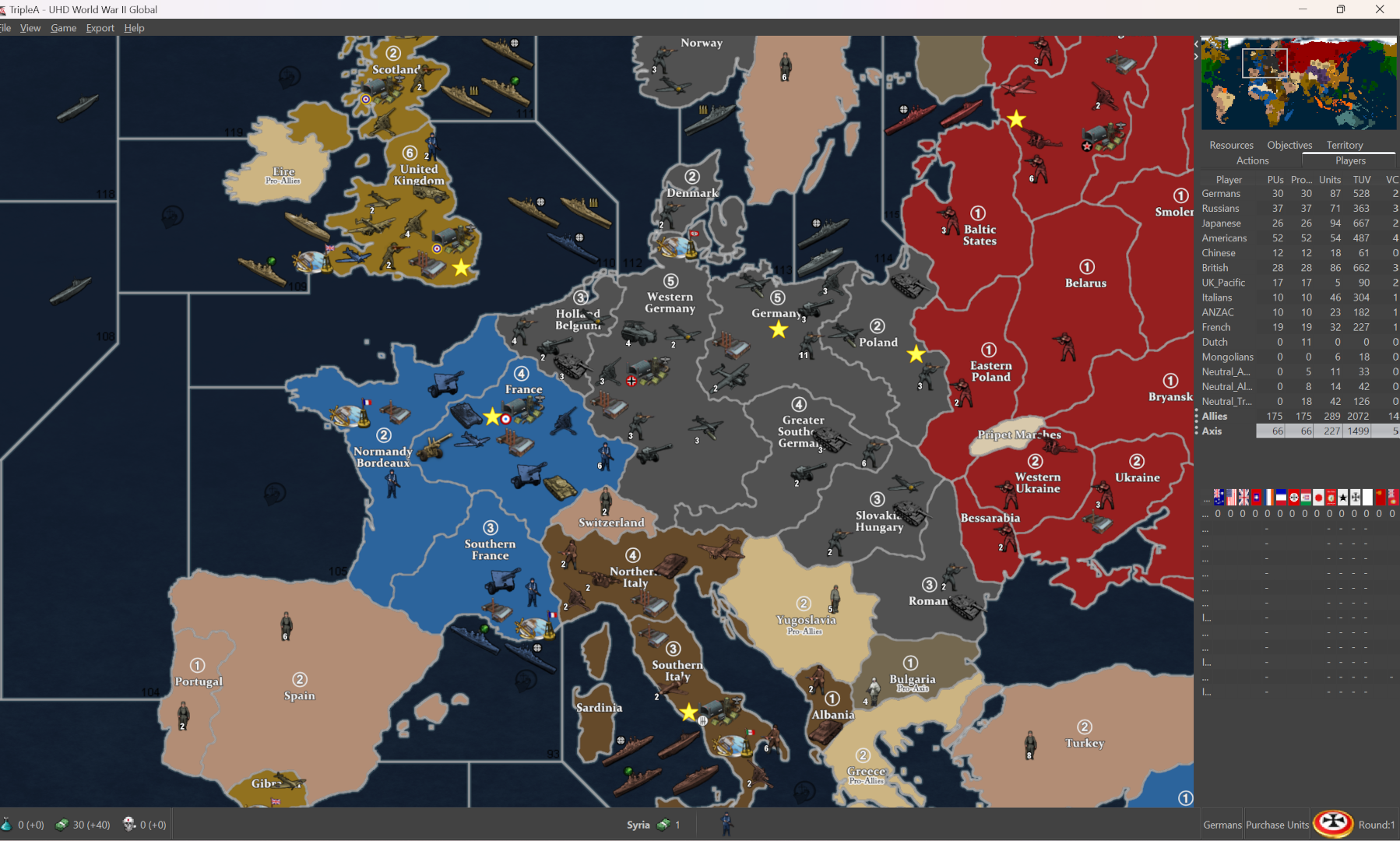
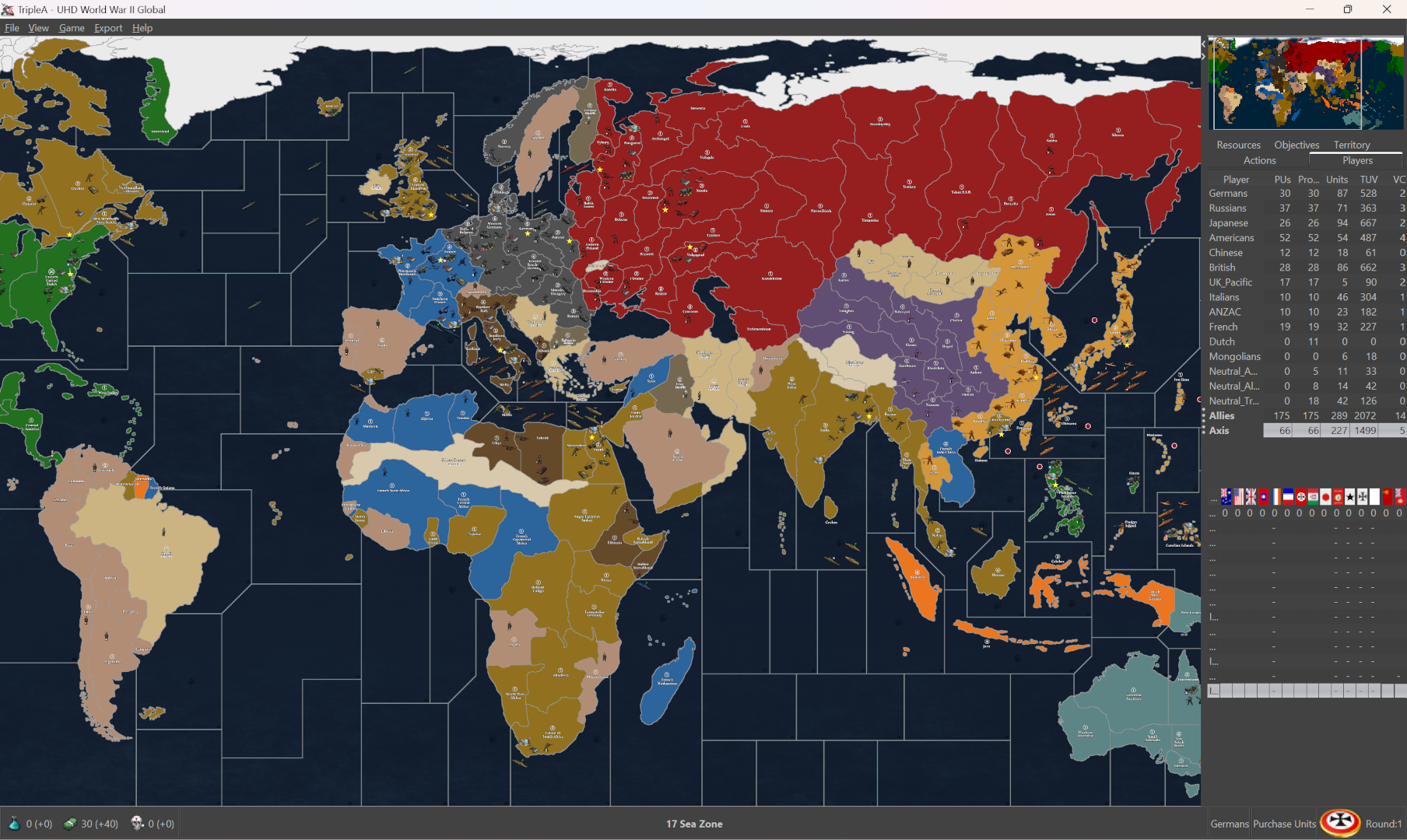
Here's the relief for that more simplified vibe (single image)
https://drive.google.com/file/d/1KbcpQA9Gq5cPjQG8u_x_vNjkbvBt91LC/view?usp=sharing
-
Ok so I put all the stuff I had into the UHD map making folder in the lead post. With the dark ocean stuff, the Units with their flips, and some of the extra stuff for layering relief clocked in right around 200mb zipped. Here is the file again, the one that has all the relief elements and such.
UHD map making stuff
https://drive.google.com/file/d/1CAymUozYeQirEmsyl4wAV2Q70QunbpA6/view?usp=sharingWhen I removed all the extraneous stuff from the UHD World War II Global folder for a lighter footprint file that one clocked in at about 81 mb. Here is the game folder...
UHD world war II global
https://drive.google.com/file/d/1e1KU3n5lwPLLRWC5_3Vcdlo7NUj2mxrK/view?usp=sharingIt has no relief as a single image, but that should be easy to reconstruct from the reliefTiles folder. Provided the other Customizing package lives somewhere people should be able to get at what they need from that, like to edit the relief, do different borders or different styles, retint the units or whatever. I removed the v3 48px units, since those can be grabbed from the regular global download. They're still compatible, so you can switch the units from one map to another (48px mono tints or 54px duo tints), but it trimmed down the overall filesize so hopefully the install/load is a bit faster.
Let me know if that makes sense for ya
Have a fun weekend!