Switch to "FlatLaf" for Look & Feel (updated skin)
-
Easy drop-in replacement that is a bit more modern and supposed to be more performant and compatible - FlatLaf
We currently use "Substance" (and have been for a long while!)
Here are some screenshots, feedback/thoughts welcome!
-
@lafayette used to the look on mac is the new one the onion the right?
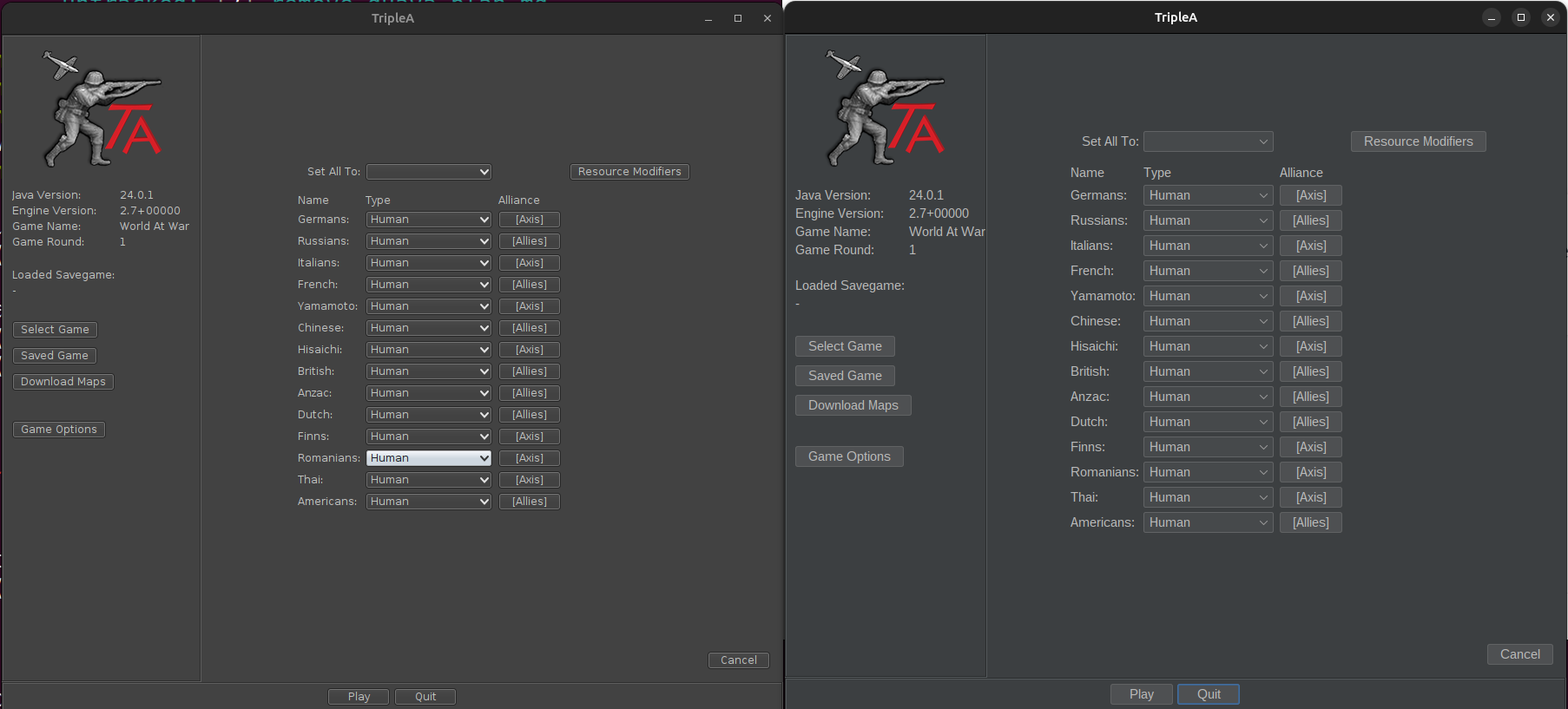
seems like some of the elements are more space efficient on the right and some on the left.
aside from that i’d say the right hand one looks slightly better to me
-
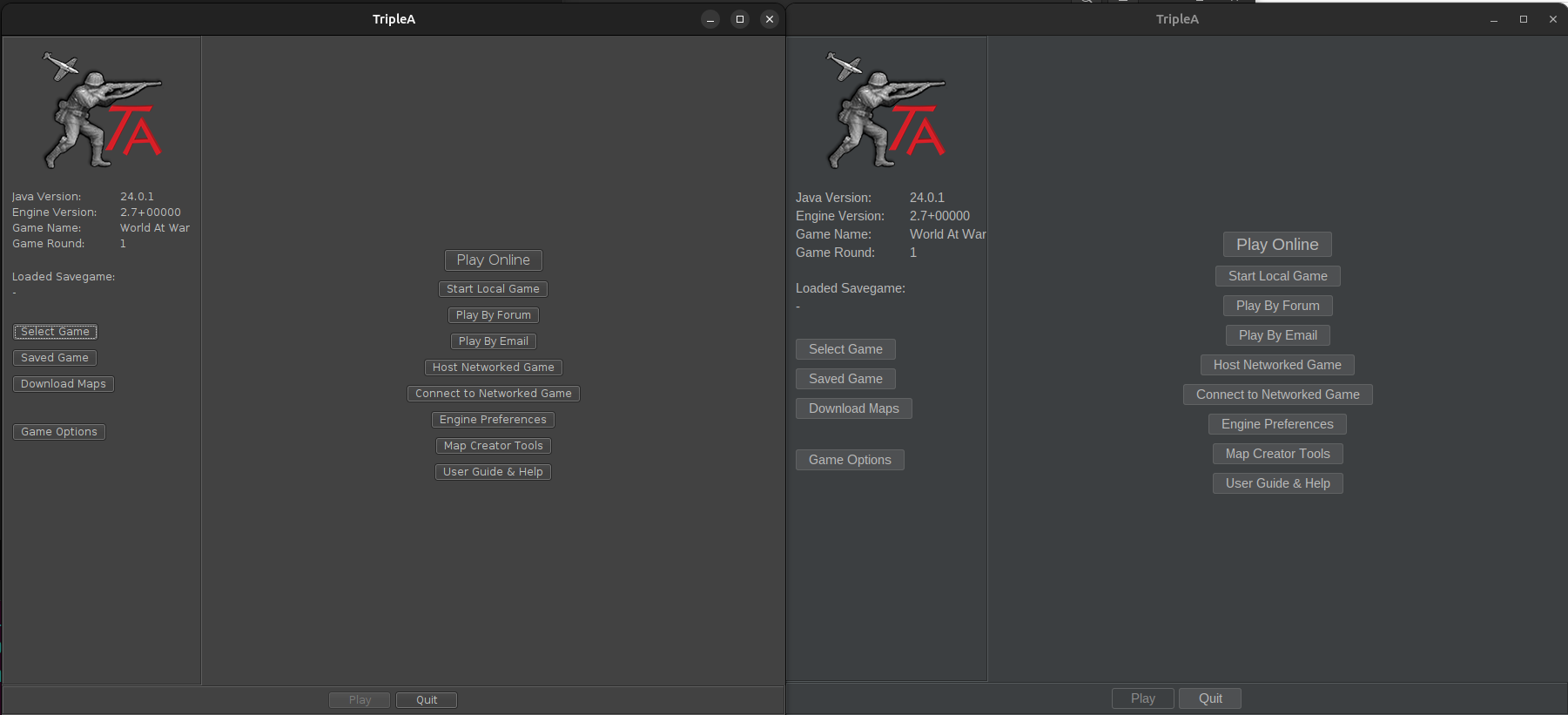
@ubernaut the first one is new on the left, the last 3 are new on the right (mea culpa, not consistent there)
-
@lafayette oh interesting yeah i think the new one is slightly less space efficient. the buttons are little clearer tho
-
Yea I think people will get used to it soon enough. The big plus for me, is the font is slightly larger than the latest.
Nice work.
Edit
I guess one can always change it to there personal preference anyway. I see nothing wrong with making it the default.The old one still be available for those that like it I assume ?
-
@LaFayette Looks good, I welcome the better contrast.
-
I can't find the thread where you changed the Home Page but I don't see anywhere to download the prerelease
-
@beelee this forum thread has the link:
https://forums.triplea-game.org/topic/4304/2-7-lobby-bots-available-early-testing-phasedownload page was updated pretty recently
-
The old one still be available for those that like it I assume ?
Probably not. This is a completely different library. Substance has served us well, but has bugs, and our current version is really old and difficult to upgrade. I'm leaning somewhat strongly to go with this new L&F library. Namely because the upgrade path is already done, with Substance (our old L&F), we'd have to do some work/efforts to upgrade.
-
@LaFayette I personally prefer the old look but that is mostly because I am used to it. But if the new look is better for long-term development then I would go for that.
-
B beelee referenced this topic
-
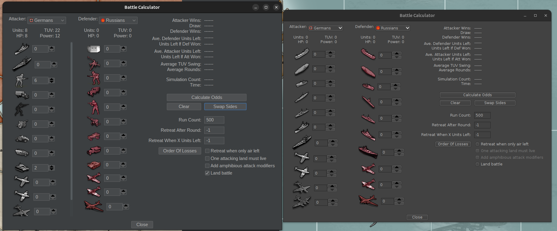
Is there a way to manually adjust the colors for the Politics Panel ? I assume this is from the new LookandFeel. I tried switching to Dracula and restarting everything but didn't notice any difference.
Kinda bright for my old eyes
") In the Global game it pops up for every Players turn, so quite frequently.
In the Global game it pops up for every Players turn, so quite frequently.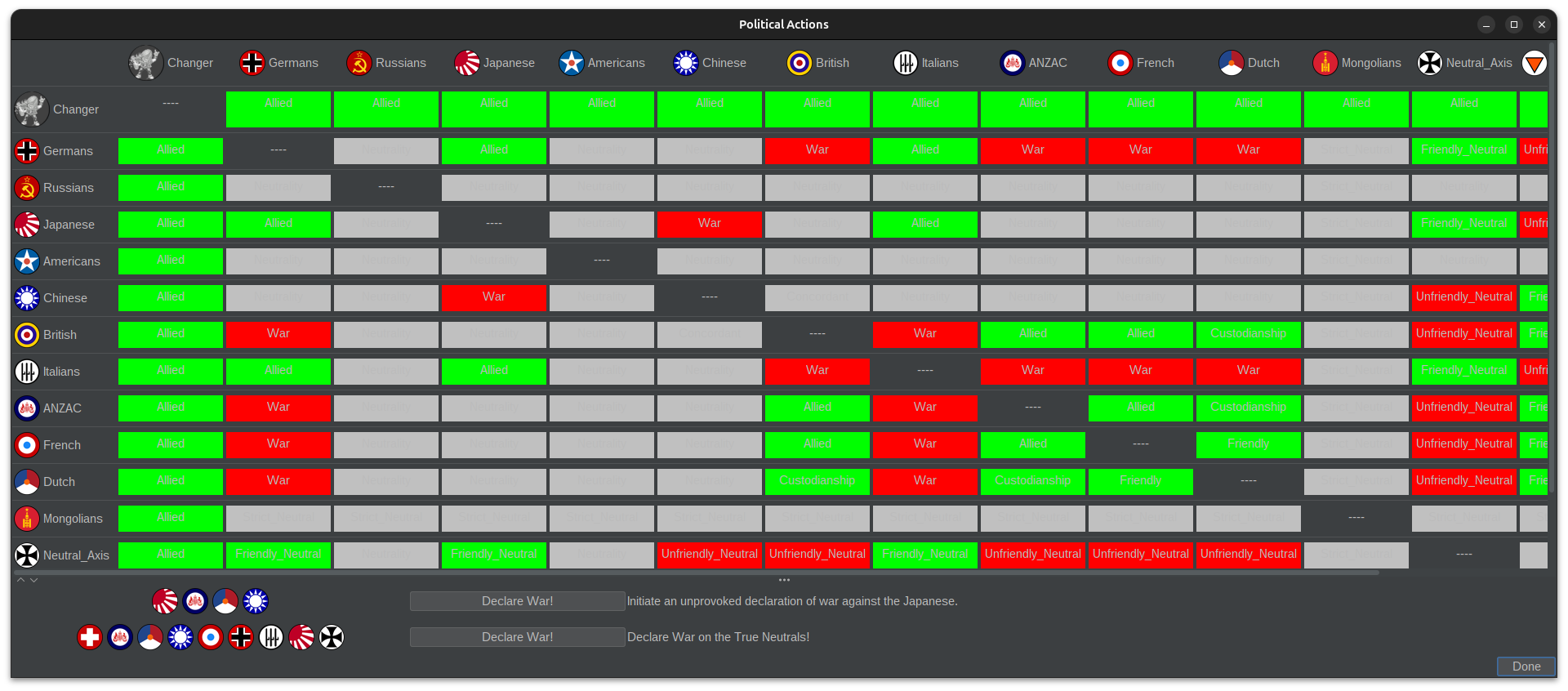
Edit
Otherwise it seems fine. -
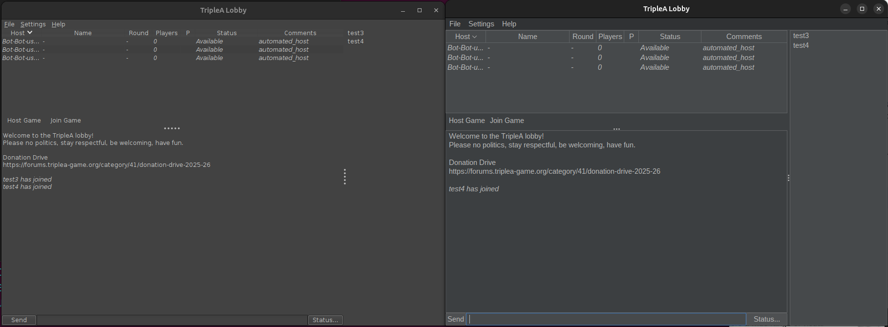
In some of the themes, when you click on one of the tabs on the first row on the right side when having a game loaded, they suddenly move down to the 2nd row, and the tabs on the second row move to the 1st row. This doesn't happen in "Metal", but it does happen in "Nimbus" and "FlatLaf Dark" (I didn't test all the themes). This is confusing me and I'd prefer if the tabs stay where they are like in "Metal" (and also how it was originally).
It would also be nice if there were more dark themes. Right now, there are only two and I don't really like either of them. There are much more light themes but those are a no go for me because they are too bright.
-
@beelee Dracula makes everything slightly more spaced apart compared to Dark. I prefer it over Dark because there everything is smaller and more cramped together
I don't like the colors from the politics panel either. They are too bright. Also, the text inside is also barely readable because it is gray. It's probably better if the text is black or white with a black outline or something.
-
Oh ? I hadn't noticed that with Dracula. I like the slightly larger Font as the latest old one I could barely read
I guess it's hardwired into the w/e it is that does it then
I just thought Dracula sounded cool so I tried it lol
-
I like Darcula - except the politics panel - those colours are a pain, indeed.
Hello! It looks like you're interested in this conversation, but you don't have an account yet.
Getting fed up of having to scroll through the same posts each visit? When you register for an account, you'll always come back to exactly where you were before, and choose to be notified of new replies (either via email, or push notification). You'll also be able to save bookmarks and upvote posts to show your appreciation to other community members.
With your input, this post could be even better 💗
Register Login