SZ color for standard WWII maps
-
Not sure if it bugs anyone else, but all the WWII baseline maps make some weird choices for color value in the ocean. I rambled about it a lot just now on the A&Aorg boards. https://www.axisandallies.org/forums/topic/33233/argo-s-middleweight-map-for-1939-1942
Just going to quote myself here again, so these thoughts are saved somewhere on the triple boards."Even people who may have trouble distinguishing Hue (red/green colorblind is the most common), will usually still be able to distinguish Value or Saturation pretty easily. I think Value is the most recognizable and easiest to work with. The quickest way to determine what Values you have is to desaturate everything and make the map grayscale. If you can still differentiate the various nations in grayscale then you are usually solid. Just note that the defaults for most nations in tripleA do a really poor job of this. Some nation’s territories are almost identical in value/saturation. Many people have a strong aesthetic preference for colors at a certain value/saturation threshold and end up just changing the hue, which can lead to everything being more similar than one might realize at first...
...for whatever reason someone changed the ocean to a mid-range value almost 50% gray, which was a weird call in my view. In the standard WWII maps it creates these strange visual ‘pops’, where some land territory colors are significantly higher value (closer to white), than other land tiles or than the sea (i.e. impassible neutrals, or lighter nations like Japan.) I think it is better to go way light or way dark on the Ocean color value."
Here is a screen of v5 with the standard ocean color (map details off) and the standard Hex colors for the various nations in the map file, desaturated to show the values. Then a couple screens of Global doing the same. Note the value of the sz tiles relative to the value of all the other colors.
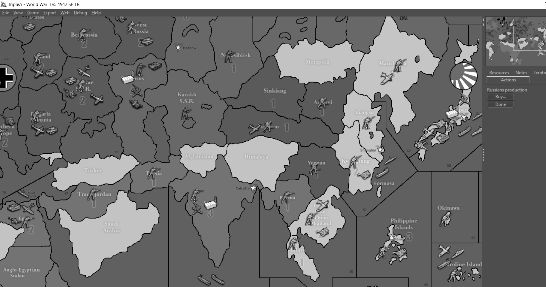
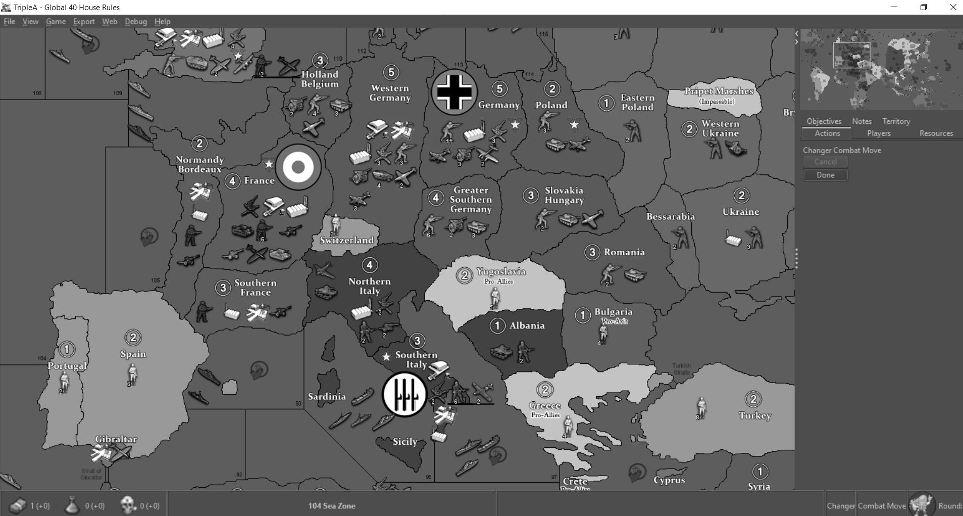
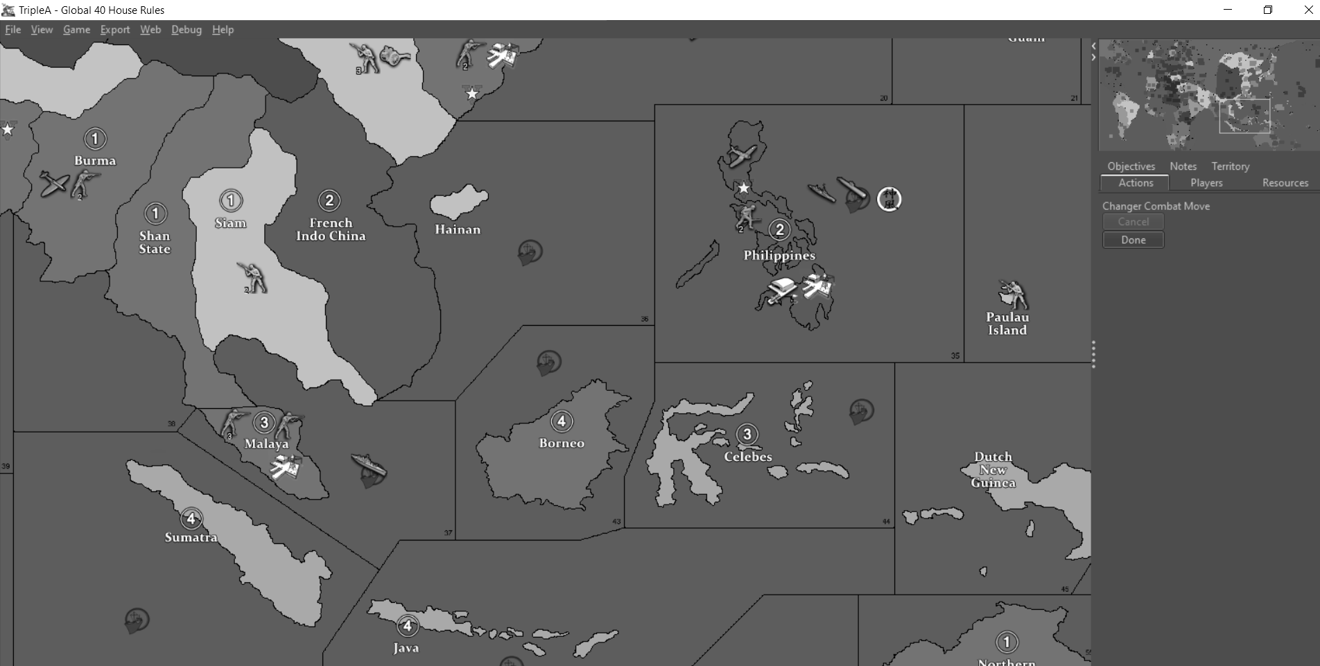
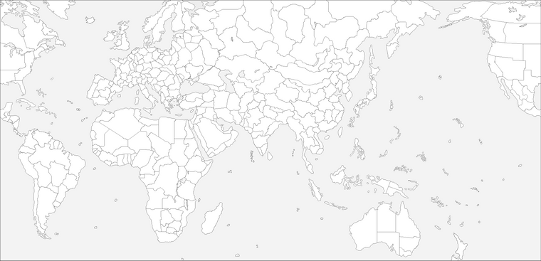
Compare to a baseline with a very light ocean color ala Classic physical board (then desaturated to show the value range of the sz blue)
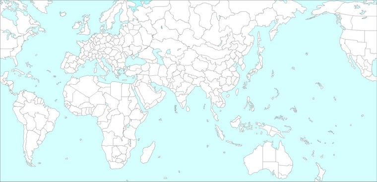
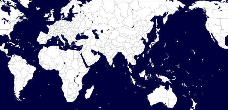
Or a very dark colored ocean ala Revised (then desatured to show the value range of the sz blue).
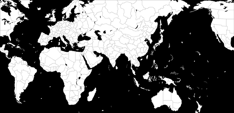
"Below I attached two versions of the AA50 baseline, the first has a very dark ocean with all the land territories at roughly 50% gray. The second has a very light ocean, again with all the land territories at roughly 50% gray.
What I wanted to show was that, we can use a lot a variation above/below 50% value for land colors, (colors with values that are still very easy to differentiate from one another), but which are unlikely to ever be confused with the basic sea zone color value. This is why I like to save the mid-dark tones for the land territories, instead of wasting the 50% sweet spot in on the ocean, if that makes sense. I think the range between 20%-80% grey can give you a lot of variation in color value for land territories, just saving that last 10-20% at either end for the Ocean, depending on whether you like it light like Classic, or dark like Revised (the physical game boards I mean.) That way you have a lot of room to work the values in mid range, while still maintaining an overall map that reads easily at a glance, value-wise, with fewer pops. In my mind neutral/impassible territories should never draw the eye, but should kind of fade into the background, which is part of why the color values for the current WWII maps in tripleA kind of bug me..."
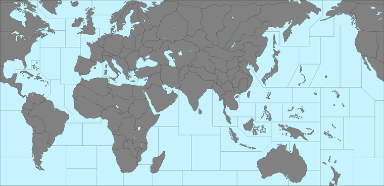
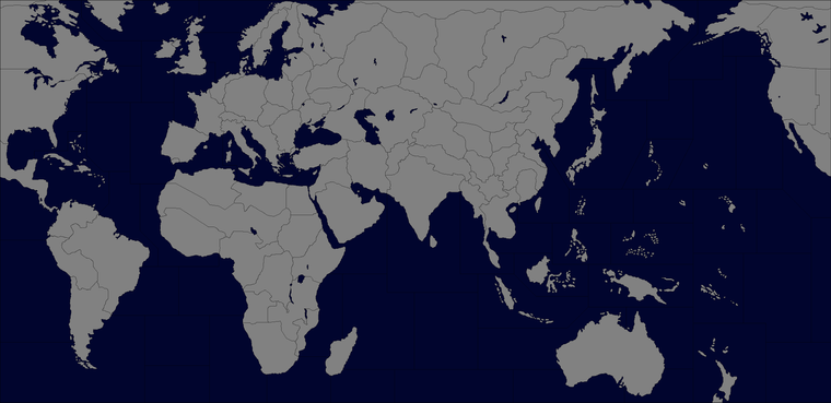
Those lights/darks went pretty extreme, granted, but just wanted to show how far we could be pushing the values if we wanted to and still have it read as blue.
I'm curious if there is a particular design reason why its better to have the color value for the ocean/sz in the baseline tiles so middle of the road? Like if it works better with mapmaking tools or something, or just to create that simple cloud effect in map details?
To me it creates a weird value range, where you can have really high highs and really low lows competing with each other on land, and then the ocean smack in the middle range, all sort of muddled. Whereas I'd think it would be a lot more visually cohesive if the Sea Zone color value was either very light, or very dark, depending on whether the player prefers a more classic aesthetic, or a more revised style aesthetic. Ideally the player should be able to switch it on the fly to suite their taste. If any of that makes sense.
To me editing hex codes in the map file is pretty standard, since I like to customize those and it doesn't affect anything else, but with the ocean it is harder. I guess recoloring the individual base tiles? Seems kind of onerous, wish it was simpler. Reskins I guess would work if the energy was there, but I kind of like the stripped down no details look otherwise.
What do you guys think?
Anyhow, just wanted to jot down the thought before it got buried. Catch you guys in a few
-
@Black_Elk Related note, I always wished you would be able to set the sea colour, in map.properties (like you can for ownerships and impassable). It factually doesn't matter, but I think it is a miss that you have to rely on base tiles for that; neither tiles should be mandatory.
-
this actually reminds me I saw on the news or somewhere recently that someone made an invention that let's color blind people see color so maybe Google it and problem solved!
But ya I understand the issue and get your point
-
Well, its just more of an aesthetic design consideration than anything to do with the colorblind, that's just a side benefit.
The issue I see is with poor value contrast overall. When the ocean is a mid value color as it is now, the point of highest contrast for the entire map is the neutral/impassible territories which jump out and yell at you.
It would be considerably better if the point of highest contrast was between the ocean and all other land territory tiles. Which is easily accomplished if the ocean color is at either end of the value scale, darkest or lightest. Save the variation in the mid value range to differentiate the land colors.
If anything, given that neutrals are not usually a hugely significant part of those games, they should probably be at the 50% value point, so they don't pop, and you can save the pop for where its more useful between the various player nations.
Contrast is clearly relative to everything else that's going on in an image. You can create significant contrast between white and almost white, if there's not much more going on, like with the light ocean map above that I desturated. In the standard WWII maps there is surely more going on, but I still definitely think it would be cleaner with the ocean color at either end of the value scale, instead of smack in the middle of it haha.
Just a thought, I know it was changed at some point to make everything consistent with global, but you can still see the older blue in some of the older map variants, which was definitely much lighter than the current.
Some people like a dark blue instead, for a more Revised or AAZ feel. It would be ideal if we could just push it to either end on the fly with a view setting or quick map file edit.
-
oh I see what you're saying and I think it was new eye contact lenses that let you see color but anyways sure ya noted on the color scheme ideas I read it!
-
makes sense to me.

-
I get entirely what you are saying... though I personally have no issue with distinguishing colours.
The other highly effective thing to combat this syndrome is textures. Adding some defining characteristics to different territories is an easy way to make them identifiable.
-
I think when it comes to visual depth and a solid read across the entire map, TWW probably strikes my favorite balance of anything I've seen so far in tripleA. Could be my personal color preferences showing here, but its got a really nice scheme overall for a WWII map, with values that feel cohesive. When something is that pretty to look at I don't find myself getting hung up like I do when I open Global or V5, wanting to tweak stuff with sea zone color or whatever hehe. Just you know, for a sense of something I think works really well.
-
@Black_Elk Thanks man... awfully nice to say.