Screen centering/cycling around map UI idea
-
Oh nice just saw this!
Gotta say I also find that the crescent moon doesn't make me think immediately of sleep. Perhaps if going for that might try something like this... Its the spell symbol for Sleep from the old Baldur's Gate D&D games.

Basically like a closed eye. Not sure if that reads in the way you were thinking?
I'd take just the word "SKIP" if need be, since that would be very hard to confuse and only 4 letters.
-
@Black_Elk Ahah, I thought about it too but didn't dare propose it. I surely like it, but doubt it will be clear to non nerds.
-
@Black_Elk That is generally the "sleep" symbol in Baldur's Gate. Also when you rest your party.
-
This is great!
") I love the idea about unit stacks.
I love the idea about unit stacks.The term "Sleep" and it's moon symbol are already well know to gamers and therefore a good choice. (Didn't we have this discussion years ago?) Anyway, if it is OK for game like Civilization, it will be OK for TripleA.
https://i0.wp.com/ladiesgamers.com/wp-content/uploads/2019/01/Civ-6-builders-icons.jpegPS: It is just a "term". No matter if the map/game intends the unit to go dormant for I hour or 100 years, Sleep just means go inactive until woken up.
-
Ok. I personally hate relating the night to sleep, but since it seems that everyone else likes it I guess go for it. What can I say?
-
The insomniac icon, just all hella bloodshot beady eyeball hehe. I'm with you I suppose, but yeah I guess it's whatever, MOON, 'that spells moon' and all. Having the feature in any form is killer. Great work
-
Code update is submitted: https://github.com/triplea-game/triplea/pull/4960, once that is merged then the feature will be included with the next prerelease and live on the next release.
-
@LaFayette That's probably going a nice boost of playability. The cycling didn't works so well, as sometimes it is hard to spot what's being highlighted.
-
@Cernel There are still some issues, see the new bug reports opened. Though, now 'm' will select previous and 'c' will center on current. Hopefully that should help. I hope also the listing of 'units left to move', having a count of unmoved units will be of use.
I've had a lot of problems personally of forgetting to move the random sub or AA gun, with luck the 'space bar' to skip and then trying to zero out the units left to move will greatly reduce the forgotten units. If things go really right, it'll help make TripleA about who makes the fewest mistakes vs who played the better game.
-
@LaFayette
In regards to shortcuts, Civilization uses
Select Next – Period
Select Previous – Comma
for the cycling through units and so does Total War and Age of Wonders series. If TripleA would do the same, I would think it would be more intuitive and make it easy to learn/control for new players. -
@Frostion Good points. That needs to be balanced against precedent, essentially re-training users to no longer use the 'n' key.
-
Notable, I found it's pretty tedious to keep 'skipping' units that are on remote islands or AA guns that are not going to be moved. With that, a proper 'sleep' button is useful. So I went with the checkmark icon to represent "skip" and the moon is now for "sleep".
The original nabble forum thread had a moon with some "zzz"'s on it, perhaps that might be a better image: http://tripleadev.1671093.n2.nabble.com/Need-Gfx-for-Unit-scroller-Left-Right-Center-Skip-Icons-tp7591477p7591506.html
I'm curious what people think. Here is a partial screenshot of how the latest unit scroller would look:

Sleep button is being added in PR: https://github.com/triplea-game/triplea/pull/5036
-
@LaFayette I would put a checkmark superimposed to the arrow button under each arrow button, to skip current and move to the next or previous, as opposed to do the same thing without skipping. Then the other button can stay centred underneath.
I still don't like the moon symbol, but I would like a "zzz" even less. By the way, now also the standby icon of Windows is a crescent...
-
@Cernel said in Screen centering/cycling around map UI idea:
By the way, now also the standby icon of Windows is a crescent...
That's okay, standby and sleep are synonymous in this context.
The arrow with checkmark is not always accurate as it does not also skip. For example you can move a bomber, if it has movement left, the 'next' + 'previous' will continue cycling to the bomber until you 'skip' with spacebar (or click the checkmark).
-
-
@LaFayette You didn't get what I said. What I meant is that under the two arrows buttons, you already have, you would have another two arrows button, but with also a checkmark superimposed, to skip and move to the next or previous (as opposed to do the same thing without skipping, that you would do by clicking on the arrows without the checkmark). That way, you only remain with the crescent symbol right under the units at the centre. This would also make more sense, as the checkmark button already makes you also move to the next group, like clicking on the right arrow.
-
@Cernel Ah, thanks for the clarification. Clicking skip moves to the next group, it's effectively the right arrow + skip. I think the suggestion is to have 4 buttons then instead of 3. I don't see the previous + skip to be really that common/used. When skipping it's pretty much going to be after moving or having skipped the previous unit already. Skip current to re-selecting the previous unit would be a bit odd.
I am really interested if there are thoughts about a wake-all feature. On revised it does not seem to be that necessary, I wonder/suspect maybe on a larger map it could make more sense though, but again maybe not. I suspect it's probably not needed, likely if a unit is to be awaken it is because a transport or enemy unit are adjacent. In those cases it's probably easy to remember when cycling to the transport or if an attack is likely to simply skip that unit for a few turns.
-
While play-testing with the unit scroller, I thought it would be really useful to have a notification prompt when all units have moved. This avoids having to check the 'units left to move' count and makes it more clear why subsequent 'next' or 'skip/sleep' presses do nothing. Curious if there any suggestions or comments to this. Below are some screenshots of what it looks liike:

If clicking the 'do not show again' button:

And a sample of the game setting for this config:

-
@LaFayette A wake up all seems logical, as a player would probably at some point forget what units are inactive. I would suggest an old school bell icon. It would implying "attention", "alarm", "wake-up" etc.
https://images.app.goo.gl/SF74QgBVg6WwXeXx5I look forward to test this feature
 I hope and wonder if it works so well that old/new players would chose to always run through all their units one by one this way, as it is convenient and easy. There is no doubt that I would like to use it as I sometimes forget a unit here and there. But it really needs to be easy, simple and intuitive.
Does the screen center on a unit/territory automatically when pressing next?
Maybe there should be an option where players can select if the system controls next/prev/center/sleep of individual units or intire territories?
Map maker of: Star Wars: Galactic War + Star Wars: Tatooine War + Caribbean Trade War + Dragon War + Age of Tribes + Star Trek: Dilithium War + Iron War + Iron War: Europe + Warcraft: War Heroes
-
Another idea, how about a "stand at ease" human figure, instead of the crescent? I think that would be much better. Tho it has to be either naked or abstract, as the game supports other historical periods than WWII.
For example, something on this line (not just this, as this is copyrighted):
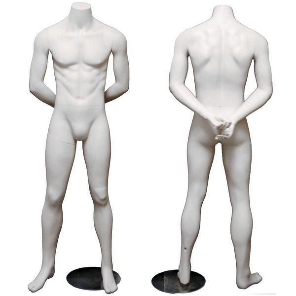
Origin:
https://displayimporter.com/products/mn-084
Hello! It looks like you're interested in this conversation, but you don't have an account yet.
Getting fed up of having to scroll through the same posts each visit? When you register for an account, you'll always come back to exactly where you were before, and choose to be notified of new replies (either via email, or push notification). You'll also be able to save bookmarks and upvote posts to show your appreciation to other community members.
With your input, this post could be even better 💗
Register Login