Screen centering/cycling around map UI idea
-
@Frostion said in Screen centering/cycling around map UI idea:
@LaFayette
I have now been playing with the unit scroller on a few maps. It works pretty well and is a nice addition that heightens the quality of game play if you ask me. A game that potentially has the players manage hundreds of units really needs this new feature.I have also seen some things that I think can be improved:
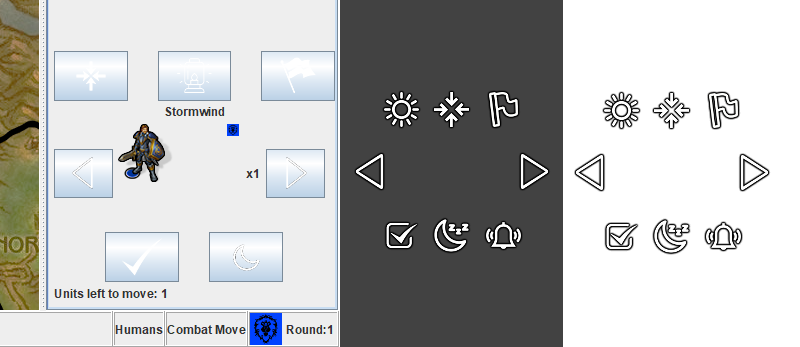
The image icons are OK but could be better (I think I made a few of them
 ) I have made a new set of icons that might improve the “uniformity” of the images. I replaced the highlight lamp image with a sun/lightsource, so that the sun can really shine on the player units when player wants to find them
  These images are also all made with a thin dark shadow so that the images might work with both white/bright UI and grey/dark UI.
I also made a “wake up” image that could be used to wake up sleeping territories. I really think this is needed. It would be a good way to let the player “reset” all sleeping units and do a new scroll through them to see if they still are to sleep.
Comparison: Old icons have trouble with bright UI, new might work?
Here is the zip with the icons - I hope they can be used : ICONS-V2.zip
Now that we clarified that means "standing indefinitely", I suggest changing the "moon-zzz" symbol with a "stop-hand" symbol (assuming adopting these proposals, I could try to do it if @Frostion tells exactly what are the settings he used for drawing those pictures; otherwise he would need to do it, in case it is wanted, to keep all images coherent).
Example (free for personal use only):
https://flyclipart.com/download-stop-hand-sign-clipart-signage-clip-art-and-sign-clipart-502467 -
I'd opt for an entrenchment tool as a symbol for the 'sentry' or 'sleep'. (really sleep, as 'sentry' in civ had specific functionality which we do not have). I'm not sure though if an entrenchment tool would be universally well recognized and/or confused as having a defensive benefit.
The problem I'd draw with a stop sign is that it implies the unit was moving. If the unit is already stationary, and then slept, it does not really make sense. For example the units on islands or AA guns, those are typical candidates for 'sleep'.
I am very curious what people think about combining the 'center' button with the unit image, whether it sounds like a good idea to combine the two and if it would be intuitive enough, or perhaps better to leave the two as independent.
-
@LaFayette Nah, the moon is at least better than an entrenchment tool, that would definitely imply units not moving are doing something to better their defence capabilities (which would be a cool feature).
A major issue, currently, is that this feature overboard for relatively thin side bars, meaning skins having narrow small maps. I like diminutive right side bars, as they leave more room for board view. You can see the issue in any games of the 270bc_variants map (but not 270bc, that has a wider small map).
-
@Cernel To address this, I suggest you remove the small flag display right to the units (which is completely worthless). That should cut a good amount of pixels.
Then, the stuff should not initally be cut to the left or right (currently partially or totally hiding the rightmost buttons), but, if still too big, the units display should be cut, initially.
You can test it with Napoleonic Empires. Currently the "next" unit button is mostly cut, there, for me.
-
That's a good scenario on Napoleonic Empires to see, I added a reminder to fix this: https://github.com/triplea-game/triplea/issues/5181
An interesting behavior, once the side bar is made larger, it cannot then be made the original size to cut off the arrow button. The Java UI rendering technology in use is about 25 years old, good times
Funny enough what's is increasing the width the most is the 'unit avatar' image.
@Cernel do you know offhand if sidebar width is a map config? Or is it controlled by the engine?
-
@LaFayette Yeah, I believe the right panel width is solely based on the minimap width for the map. Probably should just consider setting a hard minimum which the unit scroller requires. Though to @Cernel point, seeing if there are some ways to make its required width a bit smaller would be good.
-
@LaFayette In my experience, the starting wideness of the right sidebar is determined soley by the wideness of the small map (that you have at the top of the right sidebar). If anything else (like the text in the action bar) is too big for these dimensions, the sidebar cannot be brought back to the original size, if anything enlarges it (for example, clicking on "Game/Show history", then on "Game/Show current game") the minimum wideness being determined by the most encumbering of the several possible items, of which the small map is one. I see this as a problem, as the right side bar should always default to the wideness determined by the small map (that is the only way a mapmaker can currently configure the wideness of the right sidebar at a skin level), or at least should be possibly manually thinned down to it after having been enlarged.
-
Personally, I would have a right sidebar just wide enough to see the units and their stack numbers in the territory tab, that would be even a tad smaller of the wideness currently determined at start for Napoleonic Empires. I think a good small map wideness, in this case, may be 128 plus the wideness of the map's units (176 pixels for 48 pixels wide units and 192 pixels for 64 pixels wide units; the small map of Napoleonic Empires is 200 pixels).
-
Did not read all of this thread, so please excuse if the icon controversy has been resolved.
I occurred to me that it could be the term "sleeping" that is at issue.
I it were to be thought of as "waiting" and icons were made for wait, stop all waits etc, it may be easier? -
@Mahks I'd prefer the term "standing". I agree "waiting" is better than "sleeping".
-
Instead of stop, stand, wait, sleep etc. what about “Guard”. Many other games offers a “guard stance” (practically always represented by a shield) that the player can use to have selected units stop everything, hold position and guard until attacked.
Here is an example of how it could look: -
@Frostion Well, probably those games had something going on for the guarding units, I assume. It would be cool if some dynamics like this would exist also in TripleA, like only units that didn't move having some defensive bonus or being able to scramble (this last one I would really like), but nothing at all the like is currently supported, and, even if it would, that would not be the default, so it wouldn't matter for the basics.
I think that "guard" has the opposite problem as "sleep". While sleep sounds silly (will the units be attacked while they are sleeping?) and hints to something that is not really indefinite (sleeping forever in a neverending night?), but I would rather expect it is going to last at most 1 turn (even though, of course, there are usually many nights in one turn), "guard" would really make me think that those units are actually doing something, albeit static, that would give some advantage of some sort, over the units that are not in "guard" mode.
So, I'm really neutral between "sleep" and "guard". Both sound about as bad to me. But the shield image is at least better than the shovel idea, in my opinion, as at least you won't expect some trenches to eventually appear.
If "sleep" I would rather suggest a "hammock" instead of the "moon", and without the "zzz" letters.
Side note, regarding "standing", that was the nomenclature for the German "static infantries".
-
The updated images look a lot better. I tried scaling them down by 90, 80, and 70%, though the scaling made the images look kinda fuzzy/bad. Seems the image size is 39x39, which is not very favorable for scaling.
Here's a number of treatments trying to decrease the width of the unit-scroller:
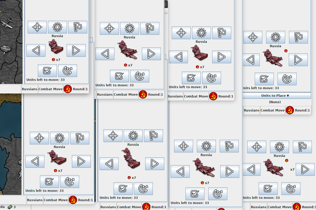
The images still about 10px wider than the WWII revised mini-map, so there is a bit cut-off still. To go more narrow, we may simply need slightly smaller images.
@Frostion would it be any trouble to create images that are about 32px instead of 39px?
-
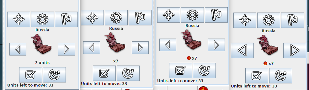
@LaFayette Absolutely removing both the flag and the stack number from showing on the right is obviously good (and also looks nicer, centring the images), especially considering that, in theory, you can have any numbers of units (thus wider an wider) and wildly huge "small" flags.
I agree with moving the stack number under the units images, but I would just delete the flag. There is no point having a flag in the moment it is always going to be the one of the turn player.
Once the flag is removed, there would be enough space to have "7 units" instead of just "x7", as that would make clearer all the units are being summed up, differently from the normal stack numbers, that are per each type.
32 per 32 pixels would make also more sense for general coherence with TripleA pictures.
-
I managed to get some scaling code to work reasonably well. To get to the target width, really needed the left/right arrow buttons to be more narrow. The layout code was really resisting it, scaling the image down a bit did get them to be narrow.
Below are some more treatments:
Before I give my 2 cents, I'm curious what feedback there is on these different treatments.
-
Lol.. I've been staring at this for too long. The "Russia" in the above, it's the territory name, not the country name!

-
I suggest having all images 32x32 pixels, except the arrows being 32 pixels wide and 48 pixels high. @Frostion would need to give any newly sized images, to keep the quality at level.
-
@Cernel @LaFayette
I can take a look at it soon and make some 32 px versions.Revised must have a very small minimap. All the maps I have made uses 250-260 px wide minimaps/smallmap.jpeg as I felt that the minimaps were too tiny if they got under 250 px. I did not want to wide minimaps either, as that would take up too much of the screen.
I am in no way advocating for a minimap standard size, but I think maps that would like to support these new buttons should not have tiny minimaps.
And can we not safely assume that the majority of players use 1920×1080 resolution nowadays?
-
@LaFayette If going with my suggestion of "7 units", then below it would be coherent the most to write "33 units left to move", instead of "Units left to move: 33".
-
Here are v3 of the icons. I hope they fit now
")
I still think that the “wake up option” needs to be implemented. The whole point of this scrolling feature is to help players manage potentially huge numbers of units. If there is a “sleep/infinite skip” option, where you can put units to sleep indefinitely, there NEEDS to be a wake up option. Otherwise one would just put these units in a state/condition as if there were no unit scrolling feature, and they are potentially forgotten, just like what could happen before. I can’t see why this is not obvious.
Hello! It looks like you're interested in this conversation, but you don't have an account yet.
Getting fed up of having to scroll through the same posts each visit? When you register for an account, you'll always come back to exactly where you were before, and choose to be notified of new replies (either via email, or push notification). You'll also be able to save bookmarks and upvote posts to show your appreciation to other community members.
With your input, this post could be even better 💗
Register Login