Proposal: Always-shown "Purchased Units" panel
-
It is not even that, actually. I have this "Purchased Units" thing everywhere, even if I go to the Notes tab!
Is this a bug, and this feature is actually supposed to stay only on the actions tab?
Anyways, movements are made based on a number of information. It is not feasible putting all such information right into the Actions tab, and I don't see why the units you have in your inventory (or, as some boardgames call it, your "mobilization zone") should have the privilege.
-
@LaFayette said in Proposal: Always-shown "Purchased Units" panel:
(largely need to account for cases where as @Cernel has tested there are a pretty decent number of different units pruchased. Some maps could get more extreme and we'd need to handle it)
That (unreleased) game of mine is not extreme, about this matter: there, I bought 11 units types, only 1 unit type more than what you can buy in "World War II Classic" and less than what you can buy in "World War II Revised"!
And 64x64 pixels units is only 33% wider and higher than the usual 48x48 pixels units.
-
Perhaps we should resize the units shown in this panel to be smaller, regardless of their source image size. Or only do that if there happens to be enough of them to actually take up a significant amount of space.
I actually think it looks quite good on standard WW2 maps where the typical purchase won't be more than say 6 unique types at a time. So perhaps by default we still show the current unit size - but resize them when they get too large/too many.
Can folks try it on a normal WW2 map (e.g. play as you would normally) and tell me how it feels for them there? As I said, in my opinion, it is actually working quite nice there - but would love to hear from others. I'd like to make sure we build something that works well for such a case, and not just for edge cases.
(The other option is to still have the split pane as discussed earlier in the thread or have it tabbed with the unit scroller. I'm not saying we shouldn't pursue those either - just trying to reason about the sizing first.)
I also have a change out to address the suggestion that it should be shown for non-local players too. When testing it myself, I was surprised how useful that is. I'll post a link to a prerelease build with that once it's available.
-
By the way, in the existing code for this, it's already asking for the non-"large" version of the icons. Whereas, for example, the standard unit placement panel asks for the "large" versions. I assume for your map (and maybe most other maps), you only have one size. So you may be able to just fix this for your map by having both "large" and non-"large" icons. For reference, the "large" icons should have an extra "_large" suffix in the filename.
-
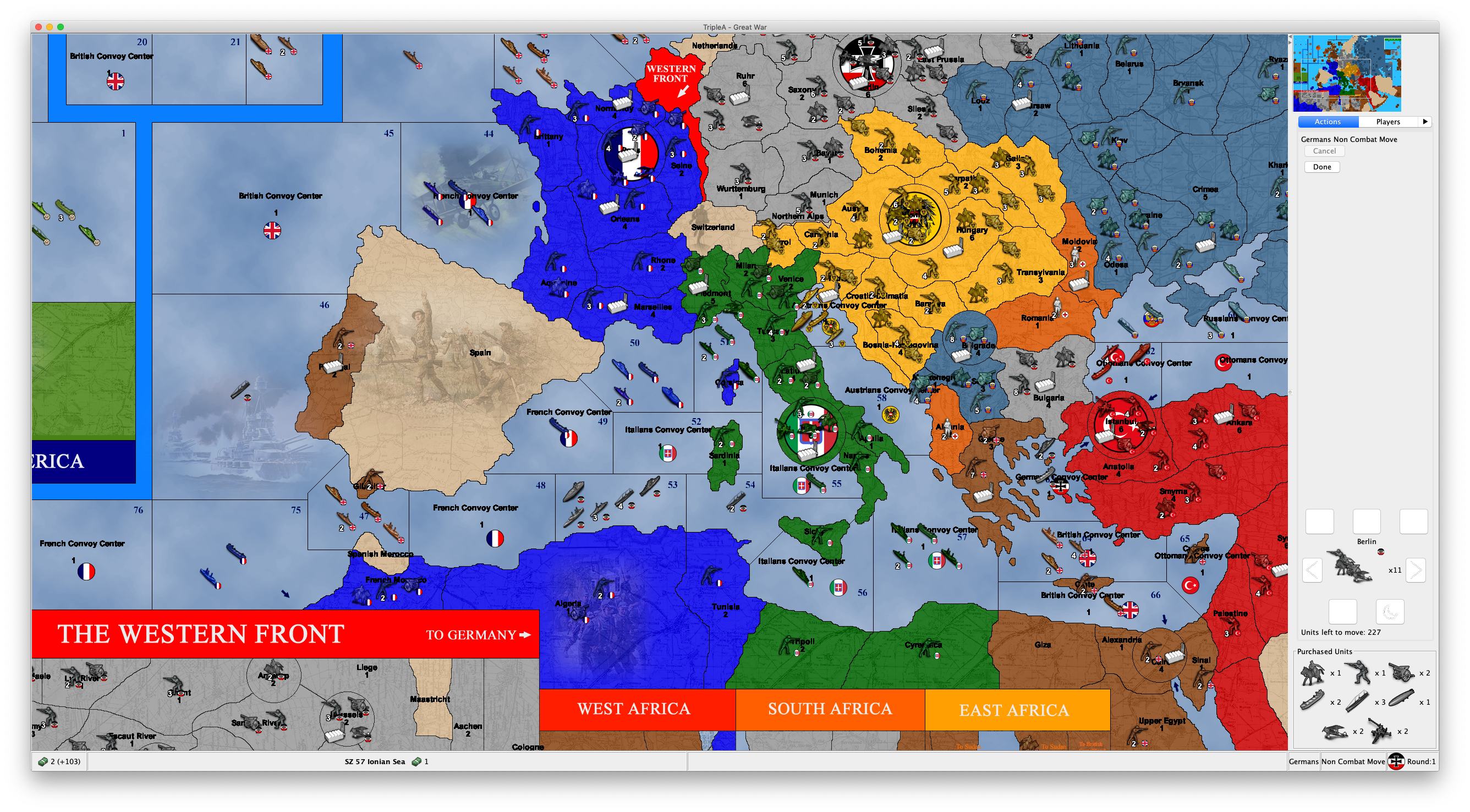
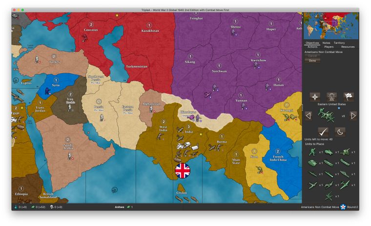
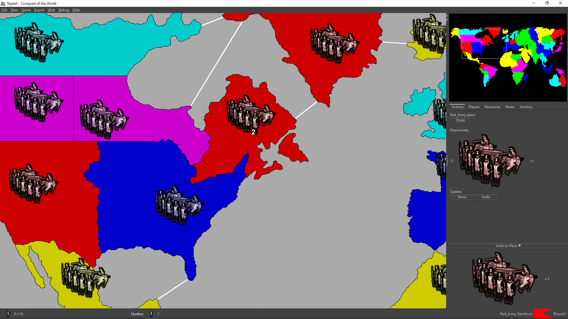
For reference, this is how it looks like for Global 40 2nd edition if the US buys nothing in the first turn and then uses its 104 PUs to buy as many different unit types as possible on the 2nd turn (13 distinct units, of which it is only allowed to place 9). And this is on my laptop screen.
So even with such a ridiculous scenario on a WW2 map, it still looks OK:
-
Cool feature, but it seems as though a solution is definitely needed as space is at a premium. Not being able to see the move history is a bigger detractor than being able to see the purchased units is a benefit. Only being able to see one or perhaps 2 moves would make playing sheer anguish. It can already be hard to isolate moves you made in order to undo them. I shudder to think what the experience would be like if you could only see 2 moves in the window.
I think something along the lines of a floating window would be ideal that opens and expands when you hover your cursor over an icon which is added to the game screen when you have purchased units...
I just pieced this together quickly as an example.
-
@Alexei-Svitkine said in Proposal: Always-shown "Purchased Units" panel:
By the way, in the existing code for this, it's already asking for the non-"large" version of the icons. Whereas, for example, the standard unit placement panel asks for the "large" versions. I assume for your map (and maybe most other maps), you only have one size. So you may be able to just fix this for your map by having both "large" and non-"large" icons. For reference, the "large" icons should have an extra "_large" suffix in the filename.
What!?
Are you telling me that there are various sizes for the units (like the "infantry", "armour", etc.)? Really?
I've never heard about this or seen any maps having this.
Is this actually documented somewhere I've missed or is it just a totally undocumented feature?
-
@Hepps said in Proposal: Always-shown "Purchased Units" panel:
Cool feature, but it seems as though a solution is definitely needed as space is at a premium. Not being able to see the move history is a bigger detractor than being able to see the purchased units is a benefit. Only being able to see one or perhaps 2 moves would make playing sheer anguish. It can already be hard to isolate moves you made in order to undo them. I shudder to think what the experience would be like if you could only see 2 moves in the window.
I think something along the lines of a floating window would be ideal that opens and expands when you hover your cursor over an icon which is added to the game screen when you have purchased units...
I just pieced this together quickly as an example.
Certainly better than in the Actions tab, but not a fan of this.
I'm thinking about a two bottom bars solution.
One bottom bar in which you have all the resources and unplaced units the active player currently has in its inventory, plus the player's name, phase's name, etc..
Another bottom bar in which you have the territory name and what in that territory (plus its territory effects, if wanted).
For example, this way:
Otherwise all can stay on a single bottom bar, if preferred:
Of course, with a single bottom bar it would be much easier to have not enough space, but I think it would still require an very uncommonly huge amount of resources and units in the inventory or in the territory. To get some more space in it, I think the information about territory effects can be removed (it should be useless anyways, for well made maps, and you can check it in the Territory tab).
As a matter of having the units small enough, my suggestion would be allowing the mapmaker to have a "small" version of them, calling the regular ones otherwise, and shrinking them down to the same height as the normal flag (keeping proportions), if higher.
p.s.: I also don't believe the current bottom bar layout is very rational. First you have the resources of the active player, then you have stuff about the territory you are hovering, then you jump back to the active player, giving its name only at this point, followed by the current phase, that player's flag, and the current round (also this disposition doesn't make much sense to me, and feels jumpy too; I would go with player flag, then player name, then phase name, then current round). Of course, this is off topic, but I'm just saying I believe my two examples above would also have the items in the bottom bar more rationally displayed, as now I'm not sure it is obvious for a new player that the resources he sees bottom left are those of the current player, since it's name and flag are on the other side of the screen, with in the middle some unrelated territory information (but I already unsuccessfully argued with @redrum that the territory information should stay on the left part of the bottom bar, as it was before he changed it).
-
Just want to throw out some options and thoughts:
- a sliding pane (similar to what we have in download maps) could perhaps be an option. I think there is a setting on it that allows for a single-click expand+collapse
- The unit scroller would benefit to be made less tall, even if that is done we'll still be short on space in the move panel. We perhaps could explore using even smaller images (scaling to half-size) to perhaps use even less space.
We do need to try and find something that can be completed in the next week or two and then IMO focus on a more ideal/longer term solution.
I'd like to make sure we build something that works well for such a case, and not just for edge cases.
@Alexei-Svitkine it's a bit of a challenge in TripleA that it's a platform for maps, the core game engine code and infrastructure really needs to be able to handle any map. The 'edge cases' need to be supported, it's not okay for a perfectly okay map to have features be unusable because of display/rendering issues. Again, like backward compatibility concerns, the variety of maps is one of the things that makes TripleA deceptively difficult to work on.
-
@LaFayette I agree that we need to handle the edge cases. My point is to not do so at the expense of popular maps. That is, we should not degrade the experience for WW2 to support an edge case. Instead we should find a solution that works well for both.
-
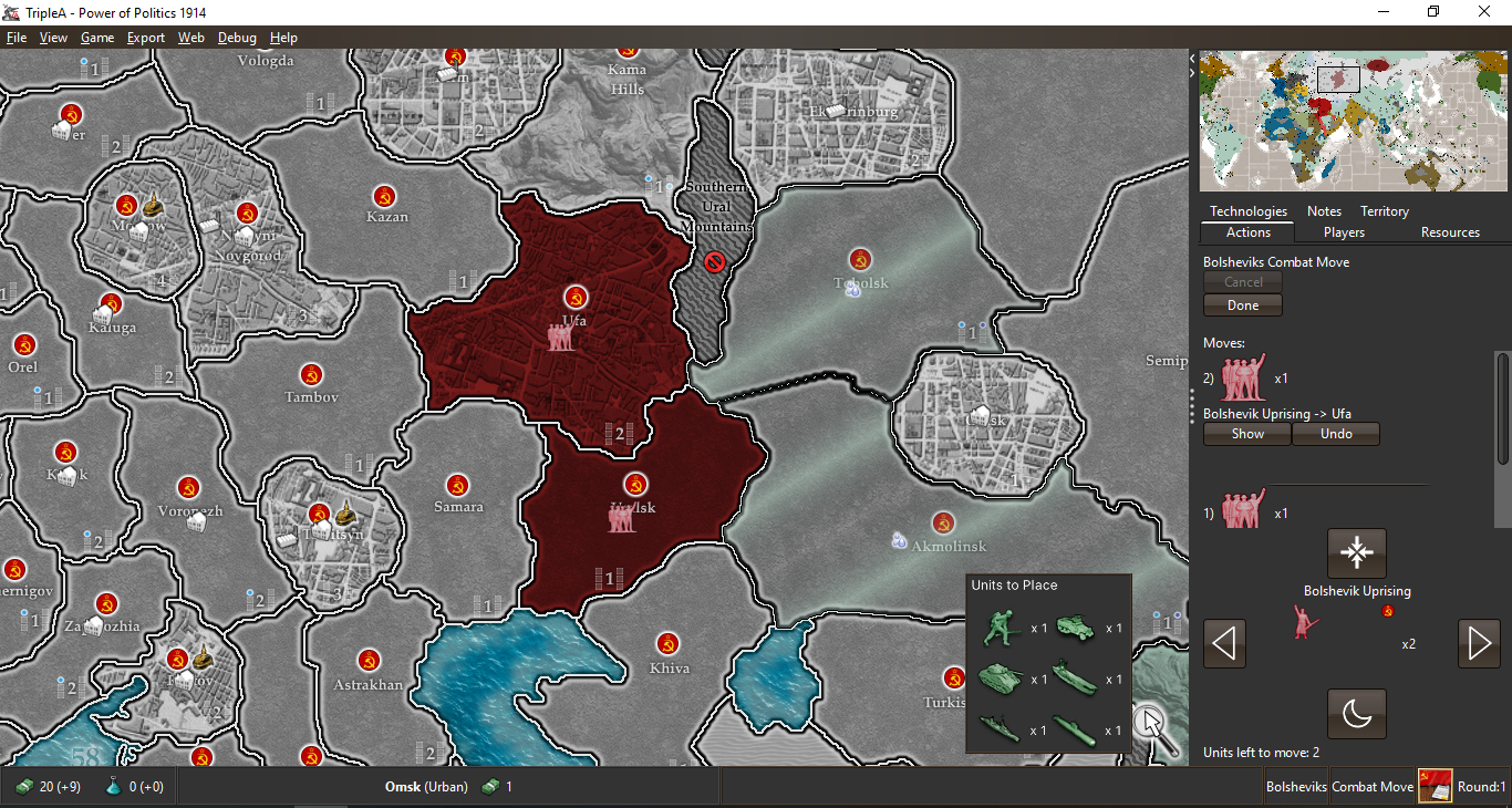
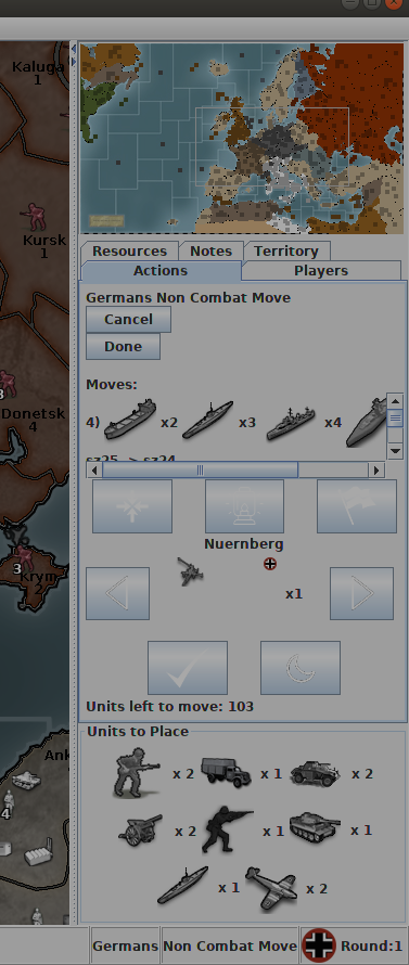
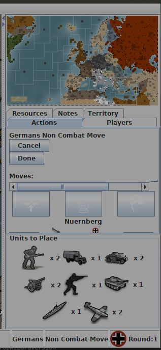
Maximized, must admit the purchase panel looks pretty good:
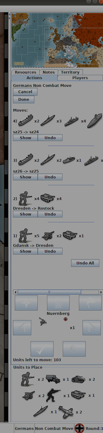
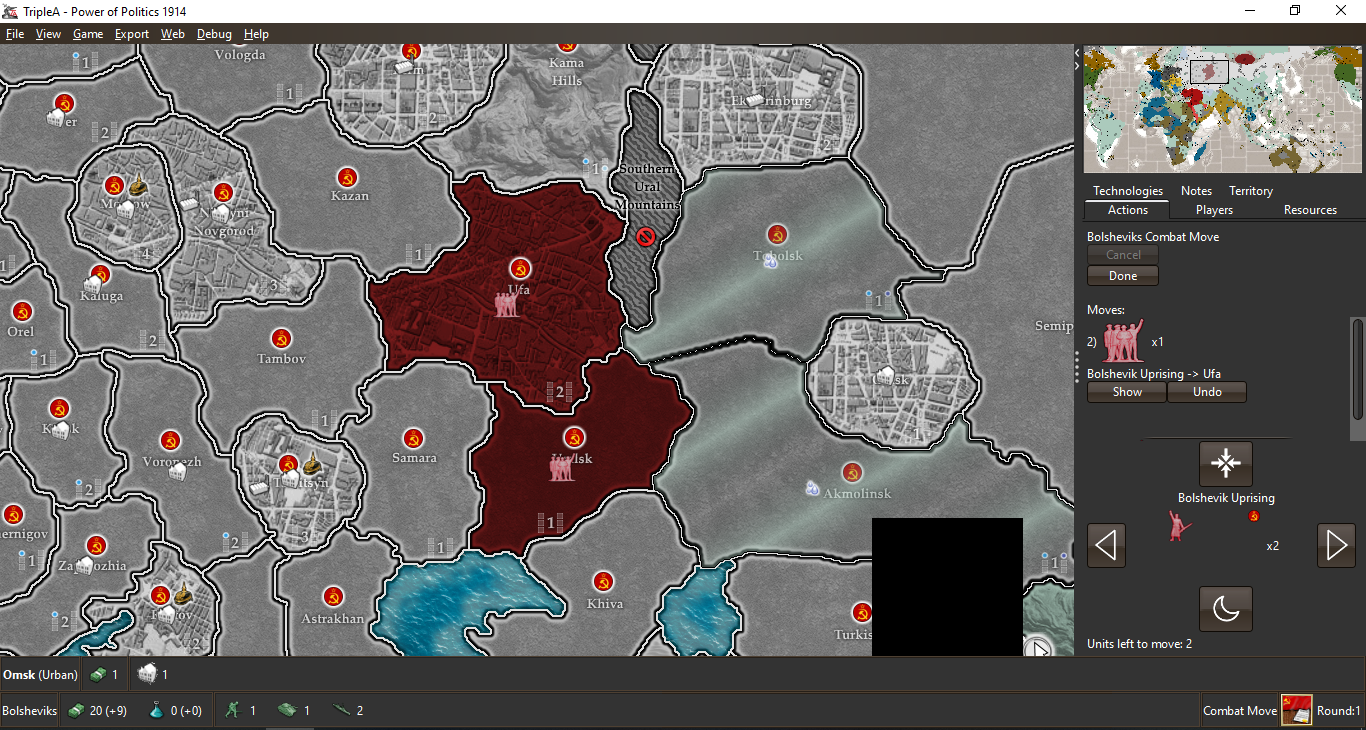
On smaller size, we may want to consider what should yield space, currently the scroller and panel yield space last:
The only other odd thing, is during the actual placement phase:
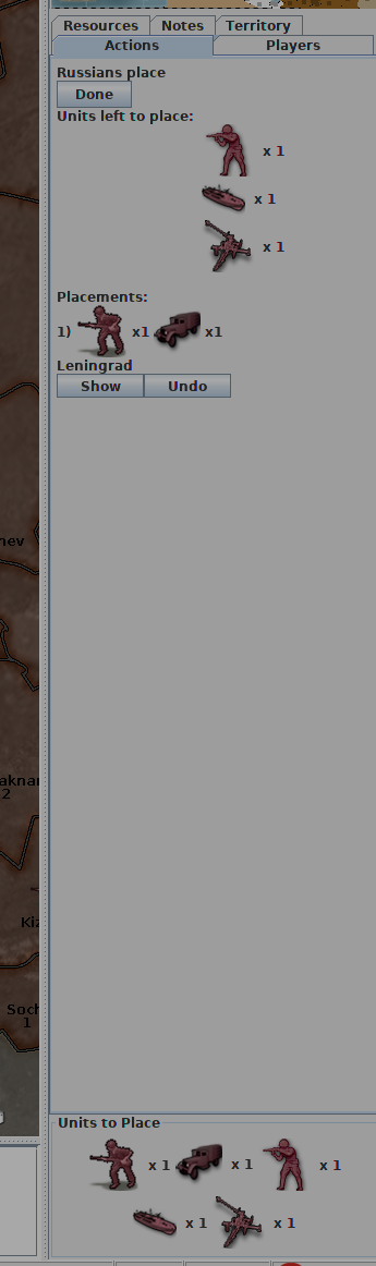
If the analogy is that you have your units lined up in the purchase panel, and you are placing those units, then one would expect for them to be subtracted when units are placed. IE: you're moving units from the 'units to place' area onto the board.
So, some suggestions:
- add scrollbars to do scrolling if there are more than 3 rows of purchase, we should consider if that should be 2 rows. (some work should be done to make the unit scroller less tall, and perhaps we'll have the space we want)
- units probably should be subtraced from the units to place panel as they are placed. If we do that, it's redundant to the 'units to place' displayed above in 'units left to place'. Perhaps we can remove the 'units left to place' and have units simply get subtracted from teh 'units to place' panel. This will keep with the analogy that those are units held to the side in a purchased pile and that they are being placed onto the board.
-
Thanks for the feedback, that's very useful.
Agree that removing units from the new panel as they're placed makes sense. We can also omit the showing the current "units left to place" view when this panel is shown as you suggest.
I'm also putting this panel be inside a split pane, so it can be minimized.
Sent PR with the above: https://github.com/triplea-game/triplea/pull/5361
-
@Alexei-Svitkine pushed a pretty major update of the 'purchased-units-panel', it's worth giving a try in the latest pre-release.
I'm really wondering about the "units-to-place" terminology and wouldn't mind seeing us go back to "purchased units".
- "units-to-place" is really wordy, no player says, oh, let me review my 'Units-to-place'. They say, let me review my bid, my purchase.
- if units are granted for free, "purchase" is still fine, they just had a zero cost.
- not all placements are units, a 'bunker' or a 'factory' is not strictly a unit. Some placements could also be upgrades to existing units.
I'd like to suggest some alternatives for consideration:
- Purchase
- Placements
- Purchased Units
"Purchase" or "Placements" I think are perhaps my preferences.
-
@LaFayette said in Proposal: Always-shown "Purchased Units" panel:
- if units are granted for free, "purchase" is still fine, they just had a zero cost.
Definitely disagree. That might apply to actual cost 0 units, you purchased without income related limits, or to units you held since the start of the game, you might argue were purchased before the game started, but not to units you got directly (in some limited numbers) during the course of the game. I don't think anybody would see such units as "purchased".
-
While they were not 'purchased', they were 'added to the purchase' and are part of the 'placements'. To another extent, the terminology just needs to work well enough so it's easily understood. Inventing brand new terminology is not a good way to go.
"Placements" I think is maybe the best contender. "Purchase" is a good alternative too, the current is worse than either of those as it's wordy and assumes that all purchases or placements are units (not the case, so it's even worse than the scenario where a unit is granted).
-
Here's the prerelease to try:
https://github.com/triplea-game/triplea/releases/tag/2.0.16278The panel is now collapsible, so it should address the feedback about it taking too much space.
Other changes:- It's shown for other players' moves.
- Units are removed from the panel as they're placed. There's no redundant "to be placed" section in the tab anymore.
Modulo the discussion on the best text to use, I'd like to propose to enable this by default (not behind beta features) since I believe all major points of feedback are addressed.
Please try it out and let me know what you think. Thanks!
-
@LaFayette said in Proposal: Always-shown "Purchased Units" panel:
While they were not 'purchased', they were 'added to the purchase' and are part of the 'placements'. To another extent, the terminology just needs to work well enough so it's easily understood. Inventing brand new terminology is not a good way to go.
"Placements" I think is maybe the best contender. "Purchase" is a good alternative too, the current is worse than either of those as it's wordy and assumes that all purchases or placements are units (not the case, so it's even worse than the scenario where a unit is granted).
Well, I already explained my point of view, but, if we talk about being true to existing terminology, in the moment we have a purchase phase (
<delegate name="purchase" javaClass="games.strategy.triplea.delegate.PurchaseDelegate" display="Purchase Units"/>), purchased units can obviously only mean units you got into your inventory by purchasing them in the course of a purchase phase. Since in TripleA you can even have games without any purchase phases at all, units you have in your inventory should not be called "purchased", as that would be wrongly assuming that you can have units in your inventory only if they have been put in there in the course of a purchase phase.For example, if TripleA would have Risk, wouldn't it be wrong to see those units you got (without any purchase phases) identified as "Purchased Units"?
No idea if maybe "held" or "to be placed" may sound better than "to place", as English is not my native language.
Also, from the name of the property "Unplaced units live when not placed" I understand that all units you have in your inventory are considered "unplaced units", not only those you already retained in it during the course of a placement phase, otherwise the property should have been named simply "Unplaced units live" (instead of "live", I would actually say something like "are kept in inventory").
-
Good point on the different contexts, in light of that suggestion I would lean towards the "placements" suggestion I made earlier. What are "units-to-place" other than "placements?" I think it's a more direct name for the same.
At this particular moment though we probably should put a pin in the naming and agree if the feature is ready to move beyond beta-testing, or if there any problems with the latest that must be fixed first.
On a larger scale, the next set of fixes/problems I think are probably with the unit scroller, for now we should focus on this new feature to be sure it's ready.
-
@LaFayette I think "Placements" would be very unclear, and actually makes me think you are referring to your placement actions.
Strict pos2 terminology for what at this feature would be "Units held in the inventory".
-
Other ideas:
"Reinforcements"
"Produced"
Hello! It looks like you're interested in this conversation, but you don't have an account yet.
Getting fed up of having to scroll through the same posts each visit? When you register for an account, you'll always come back to exactly where you were before, and choose to be notified of new replies (either via email, or push notification). You'll also be able to save bookmarks and upvote posts to show your appreciation to other community members.
With your input, this post could be even better 💗
Register Login