Revisiting an old project
-
@Hepps the WAVES the Sands!

-
@Hepps Love all the units so far. I'm not convinced on the map change though. Given that there aren't any territory effects, I think it would be kind of confusing to have different visual terrains. A good example is Napoleonic Empires where the vast majority of players prefer the non-topographic map.
-
Seleucid I almost done.

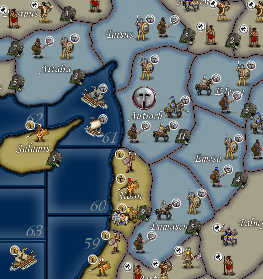
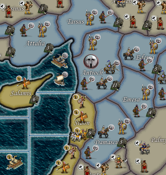
With water effects

-
@redrum I was just fooling around. I had already figured the map is pretty busy already.
The only thing I plan on doing is the sea zones. You can see above just how much better it looks.
-
I like texturing, as you can see on my maps. But I think this map should be careful with texturing. It's kind of hard to explain, but it seems to me that this map should not over do texturing. Maybe it is because of the cartoon stile units.

If I was you I would choose to texture both land and sea. But I would texture sea more subtly, less sharply, more discreet than what you have shown in the picture. Also I would do the exact same thing to land. I guess it would end up being like the classic look, but with a discreet texturing.
At least I hope you try it out. Maybe it would please both conservatives, who do not like texturing, as well as people who like textures, like me and you
 @Hepps
 -
@Frostion Yah, want to find a happy medium.
-
BTW if anyone who actually plays this and has some skills.... there is a fair number of things that need to be done to improve play. If anyone wants to jump on in with some of the placement files and what-not.... I probably won't do them if its left to me.
-
@Hepps What is it you are thinking of changing?
-
@prastle Well Im now almost complete.
What Ive done is...
-
Changed the game to use the Rome Total War map.
-
Redone all of the unit placements manually.
-
Centered all of the names in the exact center of every territory.
-
Done the placements so that the name in each territory is never covered by units. (2 exceptions for really small territories)
-
Over sized the placements to ensure there is no unit overlap.
-
Created artwork for the menu box at the bottom left of the map.
-
Added custom dice to the map.
-
Created new PU markers to suit the theme of the map.
-
Added wave textures and SZ borders to all SZ.
-
Added new Border colouration to all Territories.
-
All round sexified 270BC without actually changing anything about the game-play.
Should be ready by the end of this evening.
-
-
@Hepps lol i should have asked more clearly canuck
what was it you wanted changed that you needed help with?it appears you have done a fine job!

-
@prastle Well it won't be done tonight... the whole name place system is a complete and total waste of time and energy. Whom ever devised this hellish system without having a step in the map maker where you can plug it in... is a satanic demon from the 11th pale of hell. And when I'm done being a scourge to this planet I will torment him for an eternity when I finally get to hell.
-
@Hepps off topic but Rolf was in the lobby this morning!

-
@prastle What!?!?!? Awesome.
-
@Hepps Sounds like an enhancement request for the map maker tools...

-
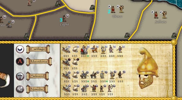
Almost 100% done. The Name placements and a few last unit changes are all that are left...
... here's a little taste.

-
@redrum said in Revisiting an old project:
@Hepps Sounds like an enhancement request for the map maker tools...

Yes... I suppose in my hostile venting way... that was a request to make an improvement to the tools.
It would be ideal if there were a step that functioned exactly like the manual placement picker... but when you ran the name placement picker and clicked on the territory it then loaded the shape of the territory name from the "territoryNames" folder to the corresponding name... Creating the red outline box of the exact size of the image to be imbedded. That would be an addition that would encourage map makers to actually bother doing names in this manner... as currently it is an extremely laborious process that yields absolutely no results other than to allow other people to change names after the fact... which IMHO is still a wasted effort since even if someone wanted to do such a thing they'd still have to create a new image (or all of them) and then have to make changes to the XML and numerous other folders as well. So I remain thoroughly confused as to why we ever instituted this process initially as it offers no real value over just imbedding the names in the relief layer when the map is drawn.
-
@Hepps said in Revisiting an old project:
Just a late hour update...
@prastle Well Im now almost complete.
What Ive done is...
-
Changed the game to use the Rome Total War map. 100%
-
Redone all of the unit placements manually.100%
-
Centered all of the names in the exact center of every territory.65%
-
Done the placements so that the name in each territory is never covered by units. (2 exceptions for really small territories)100%
-
Over sized the placements to ensure there is no unit overlap.100%
-
Created artwork for the menu box at the bottom left of the map.90%
-
Added custom dice to the map.100%
-
Created new PU markers to suit the theme of the map.100%
-
Added wave textures and SZ borders to all SZ.100%
-
Added new Border colouration to all Territories.100%
-
All round sexified 270BC without actually changing anything about the game-play.
Should be ready by the end of this evening.
- Redrawn all units.85%
Obviously some of these tasks were more challenging than I first anticipated.... should be 100% ready in the next couple of days.
-
-
@Hepps Me Tinks? I'm driving North with a lot of Kieth's soon ...

-
So close to being done.
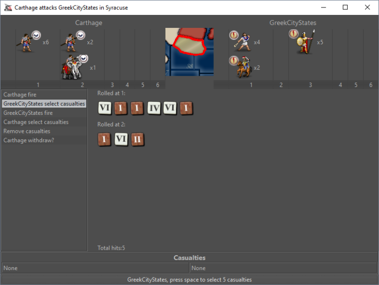
Here's a look at the game specific dice...

3 more units to draw and a handful of name placements.... then the fresh and sexy 270 bc will be complete.
This is going to have to be done as a totally different release since it will not be compatible with the earlier version.
-
Nice choice of colors. They really fit the theme. I like it
 But why do the dice use Roman numerals while the territories use normal numbers? Have you made a version of dice with normal numbers also?