Revisiting an old project
-
@Frostion I gave the neutral Barbarians a very none descript Battle Axe silhouette as their national Roundel.
-
@Hepps Ahh OK. That is a good choice, like the barbarians in Civilization
 Maybe you should make the neutrals have access to all unit types so modders can make neutral territories everywhere and place the units everywhere without them being out of place culturally.
 -
@Frostion I think you over estimate my involvement with this mod....
I am doing this because everytime I watch a match I feel like somebody is committing buggery to my eye sockets.... I simply want to be able to watch a game without my visual sense feeling dirty afterwards.
-
-
@Hepps And the barbarian.

Also, I suggest you close the circle and tweak the Neutral city too, tho it is not used, except you can see it in Unit Help.
I actually almost totally like how the current units look when they are zoomed under 100%, but definitely they look too pixellated and generally not of good quality at 100%. I'm guessing you keep the Unit Size at 100%? I never keep them at 100%, because blurring the image with the zoom is really needed to make them watchable.
-
@Cernel They could be 2% and it would still offend my senses.

-
Greece is now done.
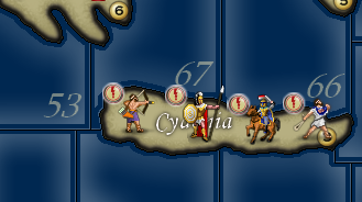
Onto the Macedonians... Probably going to make slight changes to some of their units just to break up the repetitiveness of some of the units that are common to multiple nations.
-
@Hepps As said, maybe make the hoplite of them, as well as Seleucid and Carthage, look like a Macedonian phalangite. It would not make sense with the name (but it would be possible to switch it from hoplite to phalangite or whatever anytime), but it would make some more sense with the setting. Of course, you are not going to represent the sarissa in all its lenght, but maybe this is something you may want to do not to have the Macedonians etc. looking like having hoplites, which is so silly.
https://en.wikipedia.org/wiki/Pezhetairos
Just a suggestion; I know this game is silly fantasy anyways.
On the other hand, I've no idea what the "swordman" of Macedonia might be representing, if anything at all. -
@Cernel That's exactly what I was looking at. Makes very little sense that all look like the Greek unit.
And I could make the sarissa realistic for the longer versions of the weapon if the unit images were anchored at the bottom left instead of the top left. Otherwise we just assume they are carrying a Dory.
If placement code was changed we might dare to see something like this....
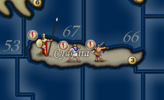
-
@Hepps said in Revisiting an old project:
And I could make the sarissa realistic for the longer versions of the weapon if the unit images were anchored at the bottom left instead of the top left.
Sadly, this is not viable, as it would still turn silly in the other places in which you see the image (territory tab, the battle window, battlecalculator...). In general, I think it is better all images having the same dimension, and just leave a lot of unused space for the smaller ones, instead of having units of different sizes (here it would mean like having all units with a lot of unused space just to allow a bit longer spear for the hoplite=phalangite (you are not going to fit in a 6+ meters long one anyways)). Duno if you want maybe to consider to expand all units to 64x64, with a lot of unused space, just for allowing an about 3 metres spear to show up for the hoplite=phalangite; probably it would look not that justifiable, since anyways, at under 4 metres, that would not be a sarissa either (you would need to go to 128x128 to have something the like, while keeping the dude centred, but this is definitely not advisable for many reasons).
-
@Hepps said in Revisiting an old project:
@Cernel That's exactly what I was looking at. Makes very little sense that all look like the Greek unit.
And I could make the sarissa realistic for the longer versions of the weapon if the unit images were anchored at the bottom left instead of the top left. Otherwise we just assume they are carrying a Dory.
If placement code was changed we might dare to see something like this....

Yah, but not really viable because, in that case, assuming only the hoplite there is bigger than the other ones, then you would have it very differently spaced in the territory tab and in the battle window etc.. So it would need all of a serie of other changes beside an option to draw from botton-left. More sensible would be to make all images the same dimension, and the others just having a lot of transparent unused space, but you would still take away space in territory tab etc. to not very good reasons; so it would need a setting for cutting the image down, as wanted, when shown outside of the board (in this case, cutting the spear out when the image is shown elsewhere). The problem is that doubt a developer would be on board for that.
-
@Cernel Yes... that is what I'm saying... it would make a hell of a lot more sense from a design standpoint if all anchor points were from the bottom left.... every unit has to "stand" some where.... if all unit images were anchored from the bottom left... in every aspect of the game mechanics... then it would improve designability tremendously. Because you could leave the visible area starting from the bottom and then simply have the upper edges of the max viewable window size (55 x 55) would be cut off.... in this case... the top of the spear.
-
@Hepps Yes, this may be a cool feature request. But it would still need to be integrated by other tweaks in other areas because, for having experimented with big images, I can tell that there are several issues, in that you would have the full image in territory tab and the image would be equally cut up and down in the combat windows and other things that would make a setting to draw from bottom-left alone not enough.
Personally, I would prefer to solve this by having the dude always about at the centre of the image, with like a 128x128 image, and then assure that, outside of the board, it is always cut down to size. -
@Cernel Center is not a good spot. Especial if you have images of varying sizes...
As I said... everything has to "stand" somewhere within a territory... so if you use the bottom of the image as the anchor point... you are always guaranteed that the image will be where you want it to be relative to the territory borders. If the nchor point is the bottom... you can then plan you placements to make sense where you might want to utilize an overlapping placement plan to make it look like a bunch of guys standing together.
Like so...
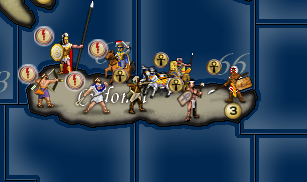
As far as the other windows.... I don't know how that would be ideally handled... I feel like if you use some scaling technique... the shrunken images would just end up looking horrible.
-
@Hepps said in Revisiting an old project:
@Cernel Center is not a good spot. Especial if you have images of varying sizes...
As I was saying, centre would be a good spot; you just would need all images to be exactly the same dimension, and just make sure to centre them accordingly.
Meaning I would rather prefer it to be possible for the image to be like this, as per the black square:
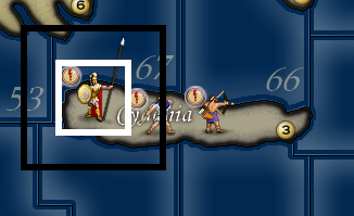
With a lot of transparency around to accommodate the spear, but the dude still at the centre of the whole.
Then, making sure that in territory tab, battle window, etc. the image is cut down to size as per the white square.
So, basically, this way you could have the black square stuff for the board view and the white square stuff everywhere else, to avoid getting silly big just to show a long spear.
The other images not needing more space would be still that big as per the black square, and all the space in the black square but not in the white square would be just wholly transparent, for the image.
This would be better than defining a corner from which to expand, since having images drawn from bottom-left is still a bias; for example, you may want some to face right and some left, with the long spear protruding one way or the other.
Again, maybe I should make a feature request, but I very much doubt any developers would take up this task (maybe I'm wrong).
And, yes, I agree that the engine should have a setting for overlapping images based on coordinates, so that you can set images having a bigger Y placement coordinate should always stay above the other ones (default can stay random as it is). -
@Hepps said in Revisiting an old project:
@Cernel That's exactly what I was looking at. Makes very little sense that all look like the Greek unit.
For this project, as I very much doubt any developers will volunteer to solve in any sound ways the need of having images with 6 metres long spears, my suggestion is to just go for showing up a phalangite in all except keeping the spear short. My suggestion is to have it holding the spear with two hands, so that at least it will hint that is not really supposed to be a true spear. You can also try to have a pose that will allow the spear to be some long.
-
@Cernel Except that the implications of such improvements are much more far reaching beyond 270 BC.... they could impact all games.
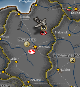
Being able to depict flying planes.... as an example
-
@Cernel said in Revisiting an old project:
(default can stay random as it is).Placements are not random. They are ordered.
-
@Hepps The case of the plane is in a way the opposite of the case of the pike, as (aside from putting a flag there) you would have the mostly transparent part of the image on the lower part, instead. If you would draw it from lower-left, and have the placement taylored for other smaller images, then you would have the issue of the plane itself overlapping some land unit image above it, while in the case of the pike that is what you would want to happen.
-
@Hepps said in Revisiting an old project:
@Cernel said in Revisiting an old project:
(default can stay random as it is).Placements are not random. They are ordered.
What I was saying is that in your example like this:

currently, for example, the chariot can 50% end up overlapping the axeman, thus, to be sure such a situation to look like you presented it (with the images drawn lower appearing in front of those drawn higher), you would need to add an option so that images having a bigger Y placement coordinate stay above the other ones.