WW2 - Revised Map
-
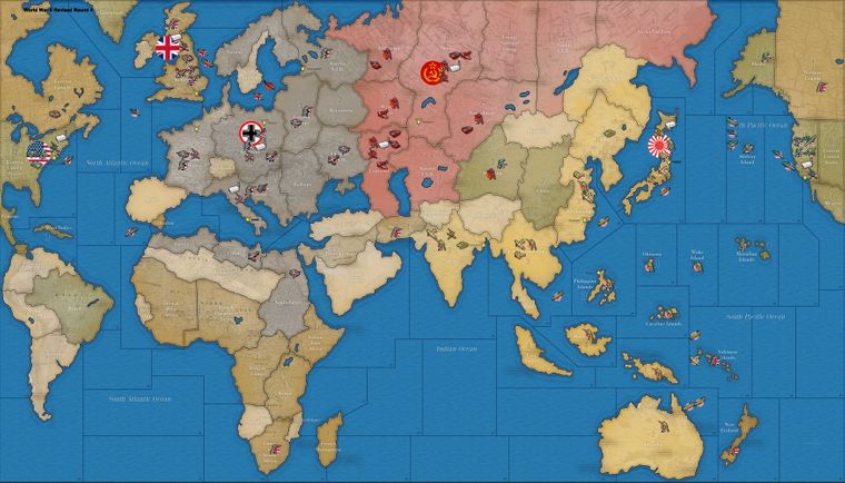
I have made my very first redesign of WW2 Revised. I don't Know where I can upload the file of the tiles. If anyone is interested just let me know. I attach here a screenshot of the game we are having.
Regards,
-
@mirkobruner
Nice mapskin. Did you ever upload it? -
@general_zod @MirkoBruner yeah that looks very nice

-
@general_zod havent'!
Let me know how and I will upload it somewhere!
Cheers,m.
-
Since I assume you want to upload a map-skin, its name should be "aaa-bbb_skin", where "aaa" is the name of the map and "bbb" is what you prefer. For example, you can call the repository (and therefore the map) "world_war_ii_revised-mirko_bruner1_skin".
Since this is Revised, maybe it is opportune to stick with the default TripleA flags. You can ask to change those, I guess. Besides, I have some considerations on your choices for the flags, however:
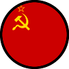
- They are conceptually inconsistent, as you have the political country flags for Americans and British but not for the Soviet Union (which doesn't have the laurel of wheat).
- The hammer and sickle for the Soviet Union looks to me more similar to the post-Stalin version than to the WW2 one, though I'm not sure since the flag is not the one of the Soviet Union (having the laurel of wheat).
- They are conceptually inconsistent, as you have political flags for Americans, British and Russians, whereas Japanese has the War flag of the Imperial Japanese Army. The country flag for Japan has not changed since WW2, even though back then it was supposedly a civil ensign, but it is to all purposes what is closest in concept to the flags that Americans and British have.
- Obviously, I realize that for the Germans you are using the emblem of the German armed forces in order not to have the swastika. However, why adding a red circle around it?
@LaFayette The fact that someone can rework a map to this quality yet have no idea on how to share it for 8 months or more I think may highlight how the documentation on the process for adding or making changes to maps to the repository has scarce visibility.
-
I think whatever flag you would use, they look better with black circles. Though Rising Sun wasn't Japan's national flag but it is so much iconic, I am skepcial if it is better to replace it with the current Japan flag.




-
@cernel You are right, but after all this is only a game and all the symbols and flags on the map make clear who is what.
-
@schulz The Black border around the flags would make the roundels too strong on the crayon colours I have adopted for this map.