Achievable improvements to the Triplea User Interface
-
@thedog
I expect some of the features discussed in this thread are achievable, some may even make it in a future TripleA release. Some have likely been tried previously and have failed. It's good to consider alternatives.
From a technical standpoint, the right hand side menu is an easy to add feature, my question is can it be useful, what can be put in it ?
A dynamic menu would be more difficult to handle, but maybe not impossible.
It's possible to add hotkeys:
https://github.com/triplea-game/triplea/pull/9296/files
but the interface shouldn't overly rely on them.I will make a test build of my screen layout demo once it has progressed a bit for feedback (it is still in the early stages).
-
I agree with putting the menu headings in the the right hand panel, as this would not change the space used in the the right hand panel, but with modifications as below;
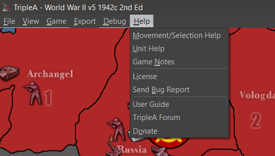
- Web & Help should be merged into one heading Help. Missing from here is About with the TripleA version and Java versions.
- Export & Debug should be merged into one heading Export
Then the menu heading will be short enough to not expand the right hand panel.
-
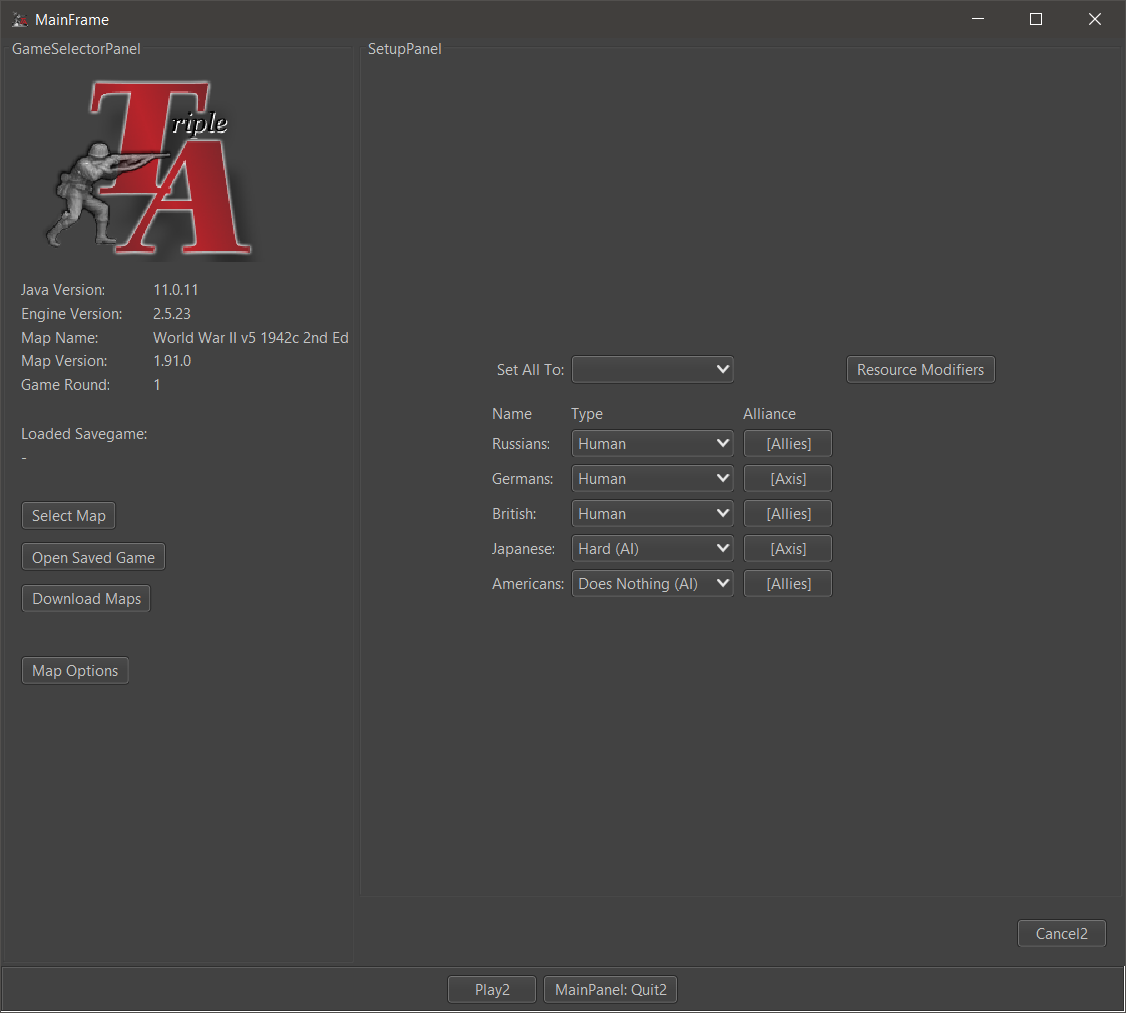
Remember Players feature
This not yet implemented feature would add a checkbox to remember the players set during the same session (until the map is changed).
This is useful when testing maps locally. Currently, each time you leave a game you have to setup the players again (they go back to the default value specified in the xml. This default value isn't specified in most maps, in which case the default value Human is used).

- Web and Help menus should be merged.
-
@butterw
Debug needs to able to Export, hence it should go under the Export heading.At the moment for Debug you have to Ctrl+A and Ctrl+C to Select All and Copy to a text editor like Notepad++.
-
@thedog
Debug Menu seems to be empty but still present in v2.6. So I'm not sure what the current plan of the dev-team is with regard to the Debug menu and console
-
@butterw
I think you have to do Game> Engine Settings> Testing Tab> Show Beta Feature = TrueTo see the Hard AI logs, you will need a restart of TripleA.
I think it will become a feature, as map makers use it to debug their scenarios and to work out what the AI thinks is of value to purchase in the purchase phase.
-
@butterw Re: remember players
A checkbox is unnecessary, the game could just remember the last setting.
The remember players was built into a swing based rewrite but we then opted to try and stick with an attempted JavaFX rewrite which then was put to the side.
One issue is the select players screen is written 3 times in the code. You could implement the feature thrice if you really wanted.
3.0 would very likely rewrite the initial UIs. I don't think there will be a 2.7, so it would make sense to focus UI redesign of the launch screens to be folded into 3.0. This is something to be debated in the 3.0 thread that is up.
-
@lafayette
Correct, the checkbox isn't needed, the game should just remember the current players (the players can be set to default to reset, and a new map will load its own defaults).
This is a useful feature, I'm hope it is included in v3.0, when the code for the launcher finally gets refactored. -
@butterw Hard to say, the goal of 3.0 is going to be to rewrite the engine. It would be logical to have, the main priority is getting the design right so that we can update TripleA in a reasonable manner and get 3.0 launched before 2023.
-
Correction/clarification, the main goal of 3.0 is going to be to massively restructure the engine without rewriting it all, FWIW.. there is a significant difference in the two approaches.
-
A checkbox is unnecessary, the game could just remember the last setting.
The remember players was built into a swing based rewrite but we then opted to try and stick with an attempted JavaFX rewrite which then was put to the side.
One issue is the select players screen is written 3 times in the code. You could implement the feature thrice if you really wanted.
Do you have any pointers on how to achieve this ?
Does the TripleAFrame need to pass the player info to the panel with the player types or can the launcher just remember it ?If you are playing a local game and leave the game (ex: maybe to reload a save game) the current player setup should be remembered.
-
@butterw See
settingPersistencefield inJMenuItemCheckBoxBuilder. Something similar could be done for a combo box.I don't know to what extent it makes sense to start this unless you think you can be done very quickly. I'd like for us to start focusing on 2.6 QA and get that released and then tackle 3.0.
-
Menu update
- I can submit a pull-request for merging WebMenu with HelpMenu in v2.6.
In the Help menu, my proposition is to shorten the title
"Movement/Selection Help (Keyboard & Mouse)" to "Movement/Selection". The full title would appear in the dialog window. - What about merging Debug with Export as suggested by @theDog ? The Debug Menu currently has a single entry (AI log).
- with v2.6.231 I'm getting a null pointer exception when I try to save Engine Settings/Testing.
- I can submit a pull-request for merging WebMenu with HelpMenu in v2.6.
-
@butterw Debug and export are quite different. Having the AI log appear in 'help' might be more appropriate. Not sure though offhand.
The "movement/selection" menu item title change sounds good.
-
@lafayette
The Debug menu shows one subMenu "Hard AI" (only if Hard AI is playing) with only one entry show AI logs. My suggestion would be to rename Debug to something else and bring in some features which don't really fit their current location (in View, Game Menus).
It shouldn't be in HelpMenu IMO.EDIT: "Debug" Menu could be renamed to "Tools".
These are the menu entries I suggest moving to "Tools":- Game / Battle Calculator
- Game / Game statistics
- Game / Show Dice Stats
- Game / Roll Dice
- View / Find Territory
-
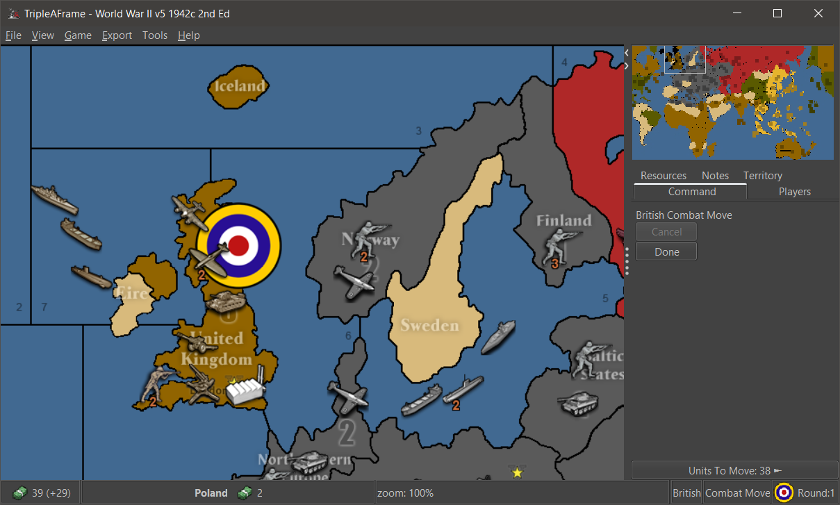
Display map zoom level on screen when hotkeys are used to change it.
I've implemented this feature suggested by @Cernel using the status bar display.

-
@butterw Zoom menu in status bar has a few considerations:
- One would expect to be able to click it to toggle it. Why else have it listed? OTOH this would be inconsistent with the other status bar displays that are all read only
- status bar can get crammed on maps with lots of resources. The civil war maps are good test candidates. Is this info that important to compete with the other info presented?
- One would also probably want other map rendering details to be displayed in an option, maybe, like turning on and off map blends.
How about the zoom level were printed as temporary text on the screen? I'm picturing how "EDIT MODE" renders, but instead it'll be for zoom level and would disappear after a second or two.
-
- Having a zoom display when zooming is a useful feature.
- The status bar display isn't permanent, it only stays from when the zoom hotkey is pressed until the status bar Label gets blanked or overwritten.
- Map zoom could be displayed at startup, but it isn't that useful.
View Menu > Map zoomcan be used to know the zoom at any given time. - The GlassPane used to paint "EDIT MODE" on screen could potentially be used instead of the status bar, but there may be issues with this. The display would need to be smaller and anti-aliased (are there performance issues ?) and you would also need to handle the case where you are zooming in Edit mode.
- Adding zoom display from keyboard hotkey or View menu is simple to do, the mouse wheel hotkey may be more difficult.
-
More UI suggestions
Players tab: On the current Players tab, it would nice to have smallest flag displayed against each player and the faction colour is the background colour of the text of that faction.
Tech tab: On the current Players tab it would be nice to have a Tech tab, but with the axis's swapped, with the player listed vertically and the Tech horizontal.
Currently the tech can get in the way when then there are say 16 players listed. The tech is currently listed in alphabetical order, but should be in player turn order.Tool Tips: The placement currently says Placement Restrictions [ ] and should actually list the terrain restrictions.
Tool Tips: Can modify unit movement should list the units affected, currently if there 3+ units affected it just says Can modify unit movement
.End of turn summary: Needs a little attention so the numbers are listed, one to line.
Unspent PU from previous turn xx <-- New and needs adding
Blockade PU lost xx
Player collects xx
Units generate xx
Player end with xxAt the bottom of the frame the Blockade should list the territories that are being affected.
-
Regarding end of Turn Summary:
- The end of turn summary is written the way it is because it is currently also used for history log entries.
- The player has the option of turning off the summary pop-up.
- If someone wants to try create a custom summary it probably doesn''t require great programming skills to do so, but it may take some time to get the exact desired result.
The Territory Panel could use some improvements IMO, with a lot of space wasted/not so useful stuff. I would get rid of the buttons for instance.
Unit tooltip issues should probably be discussed in a separate thread.
