💥 1941 Global Command Decision - Official Thread
-
Base-Camp in game for the next release and even better bought by the AI to defend a VC in Borneo on Turn 2 and in production on Turn 3.

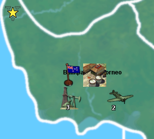
Currently its called Base-Camp, so what to call it?
Currently it is 0/1/0 has some AA defence and produce 1 infantry / turn, costs 9pu.
It does not generate, nor does it consume PU (no maintenance/upkeep, no rail links, so no move 3)
Its a base, camp, army training acts as a supply depot, but does not actually supply anything in game. -
I have caught the flashing, you can see it on the image below on the factory, the white "n" shaped arc.
It did not work as hoped. Does it matter? How many players search for a TT ?
I only found out because I wanted to find 200+ forest TT, otherwise I would not of found out, and then I had a work around.
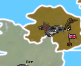
For reference its linked to this file
https://www.dropbox.com/s/vndy8p710hm1yu6/Domination 1941 relief 25 opacity gray borders.png?dl=0 -
Right on!
Base-Camp works for me as a name. I also like Army Base, Troop Base, Garrison, or Barracks, but Base-Camp seems fine. I think they're all sufficiently generic and would probably convey the basic meaning/gist of what the unit is meant to do hehe.
Yeah, it's a trip there with the flashing highlight thing. I think tripleA just wasn't really designed with white borders in mind, since it seems to be built around the assumption of black line borders. It also wasn't really designed to support reliefs either, or at least not initially, since that was added along the way hehe, so it might just be that I haven't fully understood the opacity requirements for the border lines and need to iron out the kinks.
It would be better if that flashing highlight was like bright neon green or something, so it'd still show through against either black or white, but not sure if it can be changed. I guess the question is also whether it's just a color thing, or a transparency/opacity thing.
From a usability standpoint, not sure how much it matters. There are a few other instances where that flashing line is helpful though. In the Edit Mode for one, the highlight will indicate which tile is being selected, and I think it's used as well for the "unmoved units" cycler. Might have some other uses as well.
I think I prefer white lines over black lines for a basic visual, but probably black lines over gray if it's a choice between those two. I'm still not sure if it's maybe a relief layer opacity thing.
If that's the case, either color border with the opacity dialed down may yet work, but this would also have the base 1px line borders showing through. Likely displaying as a gray for the interior line. So sort of a 2 tone effect if doing that. Basically skinny black/gray line inside a thicker white/white-ish line at like 50% opacity or whatever. Might look decent, but I'll have to try it to see. Worst case we can just go black borders, since we know that can work, and it's fairly standard on most maps. But I think I might have to tweak it so the black isn't truly black, but more of a transparent black, to show the baseline borders through the thicker relief borders.
-
Might a dark silver work like;
Silver Filigree #7f7c81
Sonic Silver #757575
to replace the white line, like I know what I'm talking
-
Here is a black border relief which should work, since I carved out the 1 px base and allowed that to line show through the relief at 100% opacity.
https://www.dropbox.com/s/swym3w2j27mr95x/Domination 1941 black line relief 1px open.png?dl=0
The same could be done with a light gray, or a silver although the visual effect there is to make the borders appear somewhat more muted overall. Basically the skinny black line, set against a light or off-white backdrop, will just make the whole border line appear to be a midrange gray when zoomed out. Our eyes doing the blending there.
If it's a choice between black borders that still pop and which have that highlighting functionality vs grayish borders that sort of recede into the midrange, I think I'd go black. Like we'd want to prioritize readability and functionality probably, over the novelty of a white/light border. The prob with doing the same thing with the thicker white borders, is that the 1 px black line from the base will show a harder edge, whereas when set against the thicker black that edge appears softer, cause it just sorta blends into the blur. Like you probably wouldn't even notice the 1 px line, unit it was being highlighted to turn flashing white when the TT is selected. I'd say we just go Black Line for now, until I figure out if there's an optimal way to do a white border motif without losing that highlighting functionality.
Anyhow, give that one a shot and let me know if it worked. I can clean it up and add the canal stuff in once we know if it'll do the trick. I'll keep experimenting with the white/gray/silver combos to see if I can get something clean by playing with opacity of the 1px opening too, cause there might be a way to pull that off.
-
Yes that works with find, but visually I have been spoilt with the white border, it looks so much better.
Keep researching the darkish grey/silver/middle ground colour to see if the middle ground works or is just the worst?
-
Yeah I'll keep chipping away at it, cause I'm rather partial to the white lines as well, now that I'm all used to them haha.
I can think of a couple options. I'm looking at other maps right now to see how the problem has been approached elsewhere.
I noticed in TWW by Rolff and Hepps that the relief will block the highlight flash in the SZ tiles, so it is only displaying there for the land TTs (where the border lines are yellow/black.)
In Redrum's WAW the highlight effect works, but the borders there are all brown-ish gray and the overall aesthetic of that one is kinda muted for the color scheme.
In the Shogan Advanced I wasn't able to confirm, but I think in that one the highlight doesn't display. I've been using Edit Mode to check the TT selection thing, but that map has the Edit Mode blanked out as an option. I tried the TT finder, but didn't catch a flash.
Frostion's Iron War works as normal, but that's cause it uses the black line.
In Domination NML the highlight effect does not work, as the border lines there are white. I know the original had black lines for everything, cause that's what I drew initially, but I think Imbaked changed it to white lines at some point, or maybe it was Redrum.
Oil and Snow uses the 2 tone thing, black 1 px line set against a lighter gray. That works reasonably well, but again the visual effect is to make all the borders appear rather more subdued compared to the white borders which really pop. In general I think if going Gray or 2 tone for borders, this recommends an ocean Blue with a darker color value so the quick read remains reasonably clean.
There are definitely a few maps floating around which don't use the highlight feature at all, so I'm not sure if it will be missed? I'd hate to bend over backwards and compromise the overall visual for a feature that people don't even notice, but again, it's a bit of a bind. Like ideally you'd want a situation where the highlight was some color other than white for the flash. Or if that's like 1 line in the code to set the color value, it could be just about any bright or neon color with a lot of vibrancy, especially since the highlight appears only briefly. A white highlight flash is problematic, because white may be used elsewhere too, like for text or decorations. But more relevant, the 1px black line of the base is kinda unavoidable. Like you can either cover it entirely, let it show through entirely, or let it show through but tweaking the opacity of the layer that it's riding into. Those are the 3 options I think.
If I open the relief to let it show through then you got that black in the middle. If I change the opacity so that the black appears gray against the white line, then the highlight would also be dampened by the same transparency I think. So it wouldn't really do what it was supposed to. If the lines were 50% gray (black at 50% opacity inside white) you could probably disguise the 1px line but then you're stuck with very midrange gray borders with not much pop. And of course everything will change, if changing the Sea Zone color, since that's so much of what you're seeing at a glance. I think changing the hue on the blue may be necessary if going with light gray relief lines, but you'll instantly notice the change in the overall palette. Like other colors might need to get a tweak to make it look good. But I think I'd try just going up like 5% or 10% in value for the blue. Just a little darker, to see if that works without upending the entire slant of the overall color palette.
Here, real quick, give this one a shot and see how it feels...
https://www.dropbox.com/s/47lqoi54k9bmkn4/Domination 1941 gray line relief 1 px open.png?dl=0
If that one works (like where you can still see the highlight flash) then perhaps a way to do it is simply to expand the relief line by a couple pixels in width, so that when it's zoomed out those 2 tone lines won't appear quite so midrange. Basically using a 7px Gray border line (instead of a 5px border like you're seeing in the relief posted above), so the relief borders would be a bit beefier, but also brighter. Like appearing more white-ish, relative to the 1px black line, when zoomed out. That might do the trick, provided the flash still shows against that color gray.
-
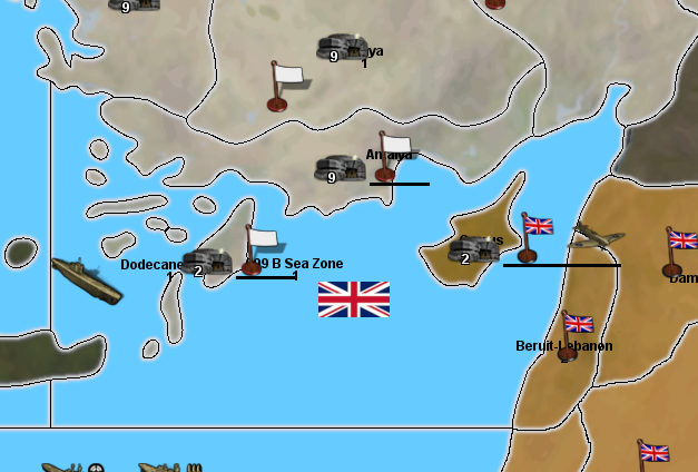
The image below is at 100%, the land border is black, the SZ border is red, yes I can see the flash of the Find TT in both cases, this is a reasonable compromise or variation thereof.
To land aircraft after combat I realise sometimes I have to use Find a TT, so I think we need accommodate Find a TT as it has a lot of new TT names.
ps. Im off to bed.
-
Ok cool I'll work with that concept then. I think what's needed is a combination of a slightly thicker relief line, but also a blend for the one that shows through from the base. So instead of seeing just the 1px black line, you'd have another pixel (a 50% gray-ish pixel) coming between the black and the white-ish line. This would be on the relief itself. Basically so we can put some anti-aliasing or blur on that 1px black line. Otherwise it's a bit choppy. But that should be relatively easy to do, now that I know how it's working.
We'd have the 1 px hole in the relief to display the baseline at 100% opacity, then another 3 px hole where the opacity is at 25% or 50% or whatever looks nicest. This should produce a line that I can blend with the gaussian blur so it looks smooth. So a soft edge rather than hard edge, and less pixel-y lookin. To make it work the white/gray relief just needs to expand by like 1 or 2 px on either side, so fairly similar. I'll cook it up tomorrow night
-
yea Base Camp seems a good name. That's where reinforcements would show up
-
Ok here's another relief to test...
https://www.dropbox.com/s/pvyu2jj544jcxo5/Domination 1941 relief 2 tone borders.png?dl=0
I beefed up the white lines, then did a blend near the center to soften that 1px black line. It's a little tricky to get a good blend going across just 2 pixels, usually it takes 5 values to get a decent gradient going from White to Black, but we want more Tint than Shade I think for the read at a glance, so I tried get the out of what I had to work with, without making the borders too gigantic lol.
The idea was to get the whites to still pop when zoomed out, but where the black line wouldn't be too choppy when zoomed in, also where the overall register wouldn't appear too midtone. My solution for this last was to dial down the color value on the ocean blue, basically to play up the contrast there lightly, but without changing the overall hue too much. It's a little steelier, but doesn't upend the general sweep of the palette hopefully. I think it works.
Let me know how that feels for you, and if it seems good I'll start detailing in the canal stuff.
ps. I noticed just now that edit mode is also disabled here in the 1941 command decision. Not having Edit Mode definitely removes some critical tripleA functionality. I'd say not having it would basically make the map unplayable in a PvP context, since players would have no way to get around mistakes or errors short of loading an autosave. This isn't always practical, especially where a quick edit could fix something on the fly. I'd suggest including it here and in the Shogun map as well, for PvP. But even if the intention is only to allow play vs a Hard AI (like as a purely single player experience) the Edit Mode can still very useful. It allows users to adjust stuff quickly without having to close tripleA to go under the hood in a txt editor, and you can alter and save out the game state quickly, which would probably be helpful at this stage. Like where we're still iterating. Really it's useful at every point along the way, just as a QoL convenience, but as a design tool it can be used in cool ways too. Like to activate certain options in-game via the edit tech menu, rather than just from the launch screen. Anyhow, just a thought. Hopefully the new relief does the trick hehe. I can keep noodling it if not
Oh also here's the baseline, with the correct blue and those tweaks.
https://www.dropbox.com/s/xnvwl23sf092dia/Domination_1941_baseline.png?dl=0
The additional tiles are West Texas and E. Colorado. The connection between Boston and Hudson-Delaware would also need to get nixed, because now New York comes between them. I'd also rename that tile from Hudson-Delaware to just Pennsylvania or Philadelphia-Delaware, or something like that, since the TT no longer includes the Hudson river really, that one is in the New York-New Jersey tile now, since I got rid of the blob and the weirdness in favor of a more state-lines look. Otherwise it should be the same across the rest of the board.
I'll work on the Base-Camp unit graphic when get a chance. Base-Camp works for me as a name, since you could abbreviate BC. The way Industrial Complex (factory) can be abbreviated IC. So it has a sort of parity. I like Army Base, but then we already got AB for Air Base in G40, so I like the BC shorthand. Also as a name that's sufficiently generic enough that if you wanted to spawn other units besides just infantry in a limited way, you could still have that idea that it's like a forward base of ops. Sounds cool to me
See ya next round!
-
SZ 099 B caught on a flash at 100%
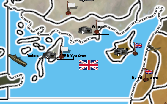
caught on a flash at 50%, 4K screen would see this
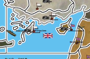
Its working, hopefully this helps?
.
On my TripleA 2.5.22294 Edit Mode is fine, I have 3 versions installed and Edit Mode works on these three fine. AFAIK you cannot disable it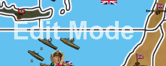
-
Nice! Well that's good to hear!
I can always tweak the gradient a bit for the black line, I went pretty dark gray for that one, so I might lighten it up just slightly for the blend off the black, but as long as the flash is visible when it's actually flashing, we should be gravy.
Strange, I'm not sure why I was having issues with the Edit Mode earlier. I just tried again and now it works. Weird. I was messing around some stuff and had a few instances open, with multiple games, so perhaps it just caught a weird snag. Anyhow, that's good. If it's just me duncing out, that's not to worry, long as it's in there for the rest of the gang, I'm sure I can figure out what's up on my end eventually lol.
Seeing the little screens I think I actually prefer that blue, so that's some serendipity!
Oh, different topic, but similarly regarding colors. I wasn thinking we might want to re-tint the ANZACships a bit. I find it can be pretty easy to mix them up with the USA. Unit flags might help for that, but not sure if many even use the option, or if it would even look good with our square flags. It's too bad the small flag has to do double duty. If we could set a separate flag graphic for the units we could probably come up with something nicer probably that was specific to the units. But absent that, I was thinking they might just need a little more vibrancy or a slight shift in hue, so they aren't so easily confused with USA warships. Like where the player might not realize and think the USA had more stuff to attack with, but it's actually ANZAC stuff. Anyhow I might have a look at that as I delve back into the units to do that base camp.
Also speaking of flags, I like that look! Size feels good to me!
Nice work! -
Today, my Windows Snipping Tool was working then it wasn't, a first, so a restart fixed it, wyrd sh1t.
So for the next release, released hopefully before next weekend, I would like;
- Base-Camp icon
- ANZAC retouched, (they have a tech upgrade that uses most of the units, not just the current sub set)
- Find TT, flashing border problem fix
.
If they are ready the new base & relief Tiles, but Im not expecting them, so dont rush, as you are adding at least one new TT, as I need time and patience to add it in.Yeah I prefer the smaller flags.
-
I have been busy working out how a Japan & USSR Non Aggression Pact (NAP) could work.
Currently in game
Turns 1-12 NAP is in force, they will not attack each other
Turn 13 (1944-4Q) each nation gets a skirmish popup sayingSkirmish popup

Turns 14+ there is a 1 in 3 chance of changing NAP to War
War popup

.
If there is no War/War popup (both sides can attack each other) then the Skirmishing popup appears.In my test on Turn 16 War was declared.
There is always 1 turns notice, maybe more before war is declared
Will it or a variant do?
-
Right on, I can get it all handled tomorrow. For now I'm just basking in the warm afterglow of a 49ers win over the Cowboys hehe.
Regarding the NAP, I shot you some messages the other day with some ideas I like, but then I probably buried it under some other random ramblings lol.
I think the primary question is whether you want to frame this as something that the player has some control over, or which they can influence in some way, or if it's just a random event type situation? Also probably depends on how much you value the Multiplayer or PvP aspect of the game, as opposed to just trying create an entertaining experience for the single player vs an AI. This may recommend different approaches depending on the goals there, as there are things which may fly in a solo, but which may be a bit frustrating in PvP. Like if it doesn't involve enough player agency or isn't deftly handled in a way that at least makes the player feel like they're still participating somehow. I will lay out a quick example using the above.
So a trigger/prompt which has a 1 in 3 chance of activating after a set number of rounds... In a solo vs the AI, the player may be content to have this happen under the hood with the result being automated as a time saving expedient. But in PvP especially I think the player wants to roll the dice.
33% chance of a trigger firing, is basically the same as having Japan and USSR both roll 1d6 (hitting on a 1) during their actual turn. Of the two approaches, I think the latter is going to be a more satisfying, because a big part of the appeal of A&A (or the A&A framework that tripleA is built on) is it's transparency. There are a lot of other grand strategy computer games, map games, which are a lot of fun, but where the player is kept largely in the dark on why such and such is happening at any given point in the campaign. You know where rolls are happening, but happening under the hood (invisible, behind the GM screen, however you want to frame it) basically where the player is sort of clueless and in a constant state of surprise or trepidation about which results the computer is going to throw at them. This is basically the approach used in the Total War series, or a lot of 4X type games built around the scrub reload principle, all of which I enjoy don't get me wrong hehe, but the reason I'm drawn to A&A (and it's admittedly simplistic systems) is that everything here happens way out in the open. If something random is going to go down, we at least get to see some dice rolling on that. I felt the same way about the sub spawning thing for Germany. Even if the results are largely similar/identical, I think it would be more fun for the German player to actually roll the dice during some kind of special sub spawn gamephase. Basically to be an actor rather than a spectator. Rolling a dozen dice, is just always going to be more exciting than clicking a dozen prompts. For me anyway hehe. I did turn off the notification thing, so I'm not clicking prompts anymore, but you know what I mean. Rolling vs an autospawn basically.
I think the same could be said of combat systems generally, where what I really want as a player is to be able to parse and prognosticate and understand how forces measure up, or what's actually happening with the rolls, so I don't feel like I'm too at the whims of fate in the middle of a given fight hehe. Basically swingy combats aren't a huge deal for me in a game meant mainly to be played primarily vs an AI and conceived as a single player experience. In such games a rogue surprise or stunning upset can be pretty entertaining, but in PvP they'd probably have me banging my head on against the wall lol. If stuff is too variable or where I just don't understand what's actually happening because so many dice are rolling simultaneously, I start to tune out. The impression I get is that watching rolls and hits that are happening so fast, they become nearly incomprehensible, I'd almost rather just click some kind of auto-resolve button (like as if this was a total war game), even though that's sort of anathema to my whole A&A vibe heheh. At this point I'm really still trying to learn the unit interactions, so I don't want to get too ahead of myself here, but I do find myself wishing I could sort of slow down everything about the battle phases, to really understand what's going on. Here's a screen just to use for an example....
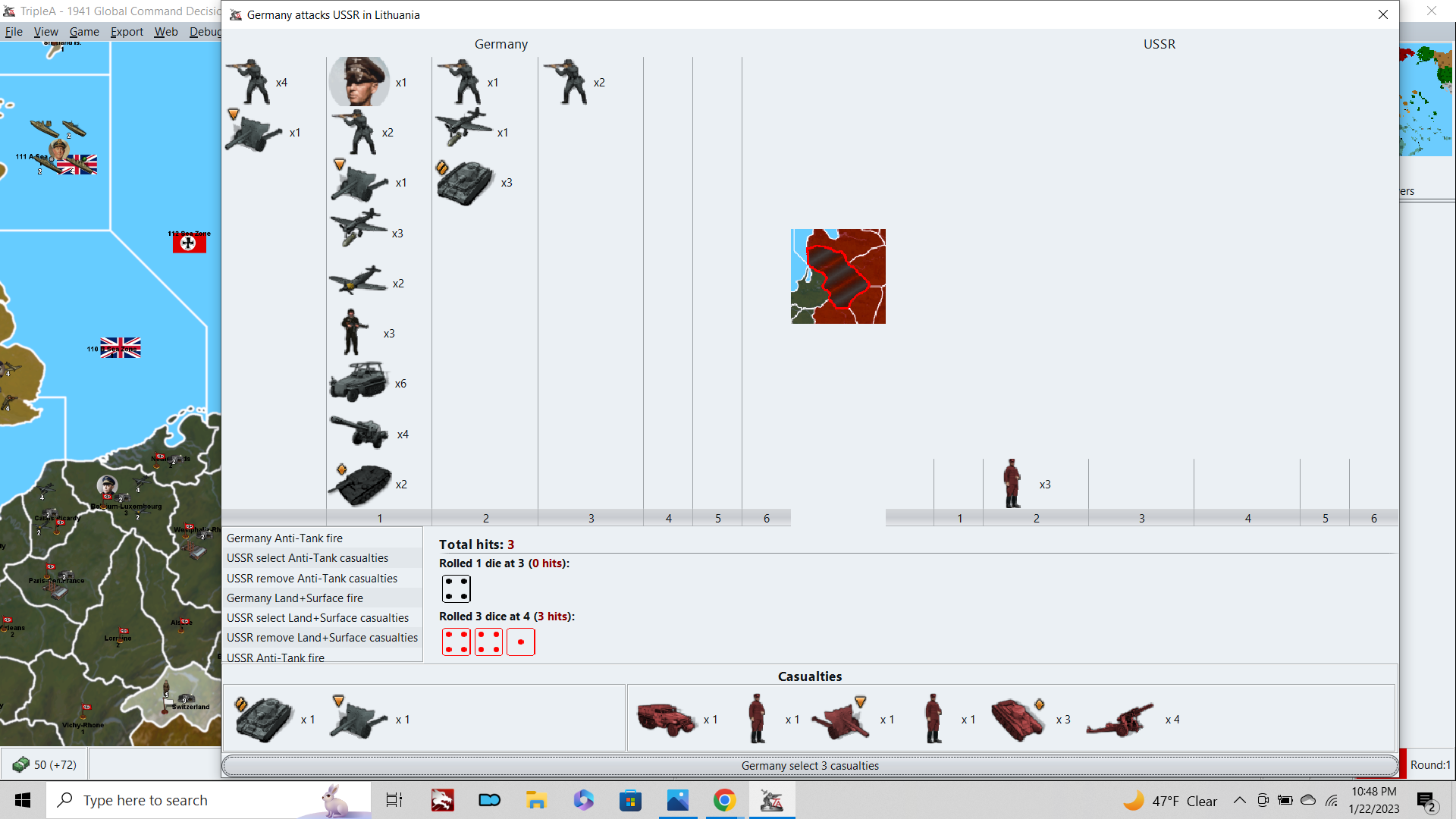
So that is like midway through Germany attacking USSR in Lithuania, but looking at the screen, I really don't know which of those battle phases I'm currently in, or like which units just fired those shots that are displaying. What the dice I'm seeing actually mean, in terms of the step by step process. I'm used to a situation where the Attacker fires, then the Defender fires, then casualties are allocated and cleared. I'm familiar enough with AAfire and First strike, but again, where it shows which units are firing, and where there are pauses between these battle-phases, so the player can take stock and get a sense for how it works. In the current game however, these knock into each other, it cycles through like 8 different battle-phases, and the only pause you get is at the end where I'm basically confirming the casualties that have been auto selected for me. The sense I have is that I'm just an observer of the battle, more than a participant, since the rolls blast by so fast and the input I'm providing during this process as a player is sorta redundant in terms of casualty selection. So really the only real choice to be made is whether to continue or retreat, when we get to that part. So I don't know, a lot of times I'm bemused by it, but still confused it, if that makes sense hehe.
I worry a little bit about the AA shot mechanic as the backbone of a general combat scheme, since the AAgun shot is the most swingy of all the combat schemes in A&A. What I mean is a situation where a single unit can fire multiple targeted shots (as the standard aaAgun does in A&A) but where those shots are all at lower values, like say 1d6 or 2d6. Even where the odds might be roughly similar in terms of how many hits might be scored on average, there's just so much more that can crack off when multiple shots are being fired that way, and it becomes almost impossible to predict the likely attrition rate.
Thus far I have only played the game using regular dice, but I might try LL next time, just to see what that looks like here. Anyhow, that's a bit of a digression, but I wanted to mention it as well, because one of the things that adds to my sense of confusion (within the battle, when dice are rolling) is that the battle phase is spread across like 8 different units pairings. This all occurs pretty quickly, so it can be very hard to determine which units are actually firing at any given point, and casualties are being removed at many points in the process (owing to the targeting, first-strike, sneak attack stuff). So I just feel kinda lost. Not as lost as the first time few times I played, but still pretty uncharted territory for me.
Anyhow regarding the NAP again, I'm a bit torn, because while I do like the NAP for the historical play pattern, particularly in PvP, I think in a solo game this is probably something where I'd want to have a game setting/launch option on it. Basically because I think a USSR/Japan war could be fun in a solo, where the goals are pretty different than in a PvP match. I think in a Solo, the demands on the endgame change quite a bit, and the player is more likely to play past the point where a human opponent would already have thrown in the towel. You know like Invasion USA by Axis coup de grace, or in this case a crazy Japan vs USSR war. I think I'd prefer a scheme where the Japanese or Soviet player could initiate the War at their own discretion somehow, but with clear tradeoffs that make the decision more interesting/challenging and where it's not necessarily obvious what the best move would be. It's relatively simple to just do a hard restriction and just remove the choice altogether, but then I'm not sure if that really makes for the most engaging gameplay necessarily hehe.
Still, assuming a hard NAP, one that is basically in place for most of the game, and which can't be broken until the point where the game is likely almost over (13+ rounds), I think it's worth considering what else might need changing to support that. A really important one may be preventing the Western Allies co-locating in starting Soviet territories. If it's Axis' game's to lose, and Germany/Italy are the only powers capable of attacking into Russia, I'd consider not allowing Britain and the USA to operate in the Soviet backfield. If this is allowed to occur, and even if Japan and the USSR are not at War, then the way to win the game as Allies will always be sending hitpoints directly into Russia towards the center of the board. The best strategy for USA/Britain is to shoot as many fighter aircraft as they can to support Moscow, and then start funneling units to the center of the board. In PvP under the current set up, I would rate the board Allied advantage, because it's relatively easy for Britain to stack into the USSR.
It's basically two turns from UK to Archangel. So all they have to do is direct 100% of their energy/production towards propping up Arch, and I'm not sure Axis could ever overcome that on attack. So like on UK1, Britain sends 6 fighters to Svalbard to reach Arch on UK2. Then they starting launching transports along the Northern route to just wall the USSR. From Arch they can cover the whole northern front from Leningrad to Moscow, with the turn order advantage to ice it (Japan could not disrupt them, under NAP conditions). USA can do the same launching directly into Russia, with a 3 turn delay, if this is allowed. I expect the result would be much like A&A Revised (and most A&A boards since really) where it is just a better play to have the Western Allies support the Eastern Front directly with that center wedge, than it is to open a second front in France. In Revised/v5 etc, the push on Berlin leads through Baltic States over France, pretty much every time, for that reason. And the Allies really don't have a great incentive to open a second front in France, unless/until they've already secured Moscow and then Leningrad. Basically winning as Allies, not so much by killing Axis, but just by making it impossible for Axis to kill Russia, if that makes sense hehe.
Anyway, I'd consider not allowing the USA or Britain to move into the USSR's starting territories, especially if Japan isn't routinely invading the USSR the whole game. I'd consider the same restriction for Japan and the European Axis too. Basically trying to keep the co-location thing to a minimum, so it doesn't result in gamey (but very potent) strategies like sending Japanese units to prop up Italy/Germany. Also helps for those smaller TTs, where you'd otherwise see a lot of spillover from multinationals co-locating if it's allowed. By limiting that co-location, you can keep the board a bit tidier on the quick read.
I would have the original owner of the TTs match the starting owners, in all instances, for maximum clarity. So if Germany starts the game occupying Bryansk or whatever, that territory should be original owner Germany, not USSR. Otherwise the player doesn't have a ready way to tell how the liberation of the TT will work. Basically going by the ownership of the start date, and not some prior timeline like what was Soviet or Germany territory in 1939 or 1940. It's just easier to read that way I think across the board. This allows the Allies or Axis to co-locate in conquered lands, but not their home turf, so you can still have some points of convergence, just not on all the capitals and homeland regions and such.
Anyhow, just some ramblers before I dive in on this Base Camp unit. I think I got an idea, but still tooling about. I'll shoot you something tomorrow when I get my head around it.
-
@black_elk said in
 1941 Global Command Decision - Official Thread:
For now I'm just basking in the warm afterglow of a 49ers win over the Cowboys hehe.

-
@beelee lol ya I only read the first line too
WOW DEJA VU FROM AXIS ALLIES . ORG 2015 and the thread link becomes the G40 redesign thread Black Elk just linked here that was 73 pages no wai so surprised:
"1942.2 New NAP, Soviet Japanese Non Aggression Pact House Rules
Black_Elk Black_Elk '22 '21 '19 '15 '14 Aug 22, 2015, 4:15 AM Edited based on feedback: I’d like to create a NAP that works for all World War 2 boards. New NAP: Japan and the Soviet Union begin play with a Non Agression Pact in effect. The relevant nations may not attack into or fly over the other’s territory. At any point, during either nation’s turn, before their purchase units phase, they may elect to “Break the Pact” with a simple declaration, for a cost in IPCs. These IPCs are immediately removed from the players treasury and returned to bank The exact amount is still under consideration, but I am suggesting 20 ipcs or half (50% rounded up) of the nation’s total cash on hand. Whichever is greater. If a Nation does not declare their intention, but attacks anyway during the combat phase, then this is considered a “sneak attack” they will incur the following penalty: The aggressor may not collect income for that turn. Seem reasonable? 😄" -
Relief is almost done
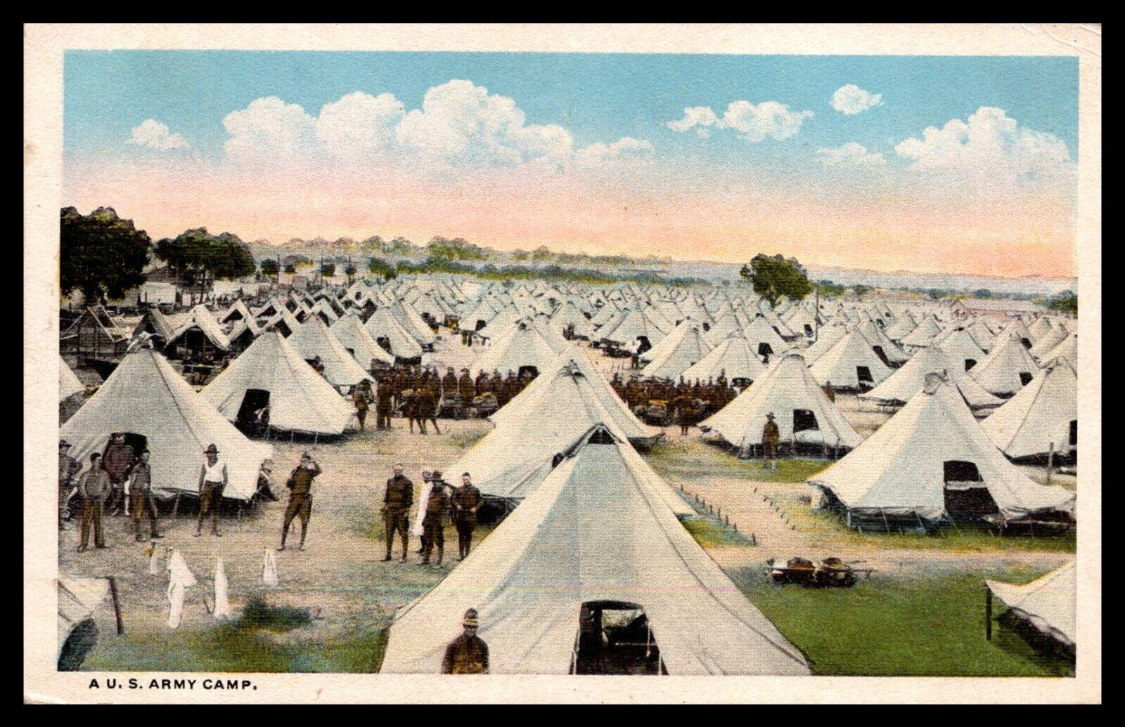
For the Base Camp, I feel like something with like a simple tent or cluster of tents that evokes M.A.S.H. more or less lol. Or like just sorta the classic visual familiar from any war, with the troops round their tents hehe. Here's a random postcard from WW1, but you could imagine that sort of a tent in olive drab or whatever. Perhaps with some ultra tiny dudes like ants and a tower. Not too dissimilar to what Frostion did, just more compact I think.
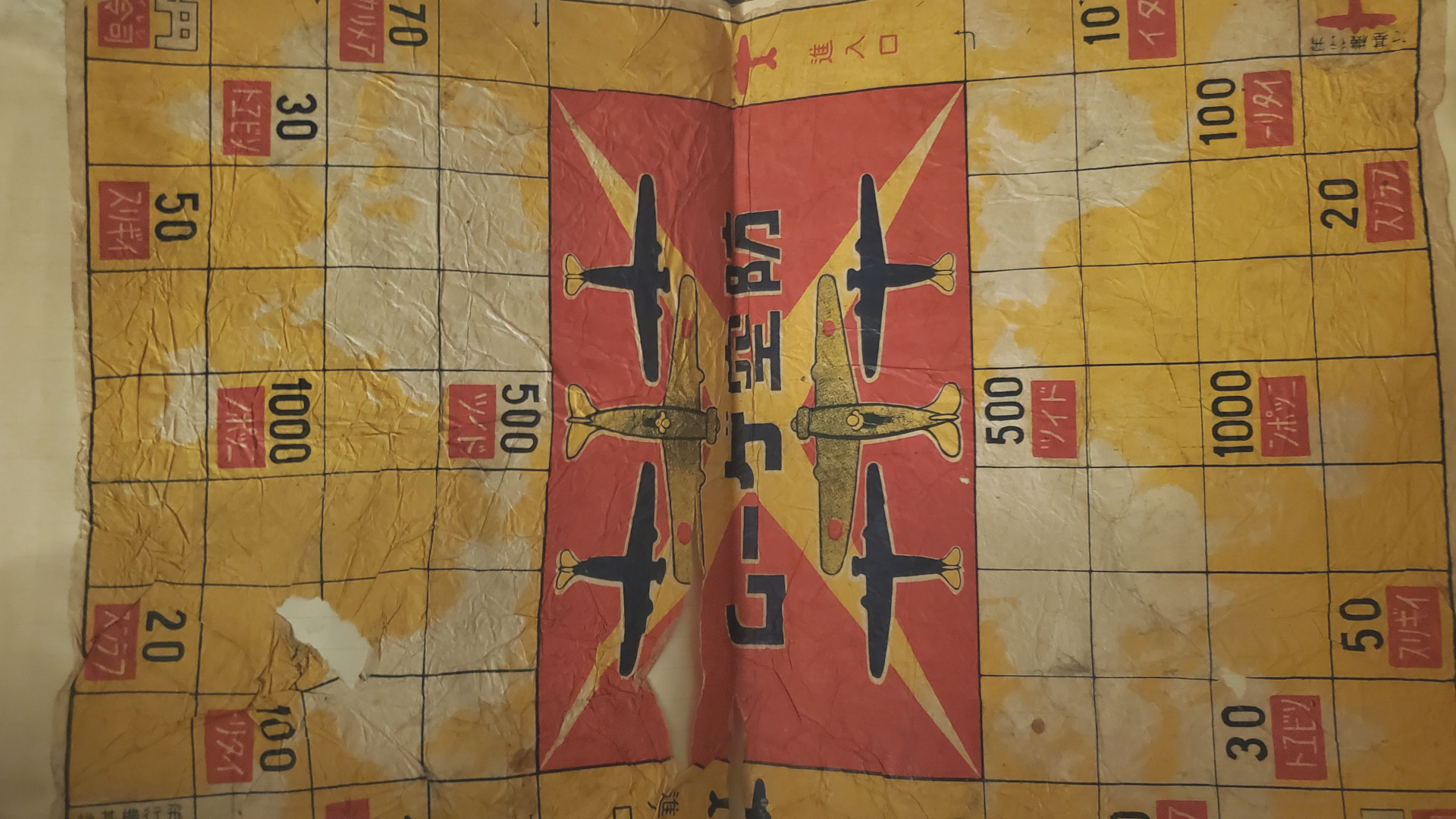
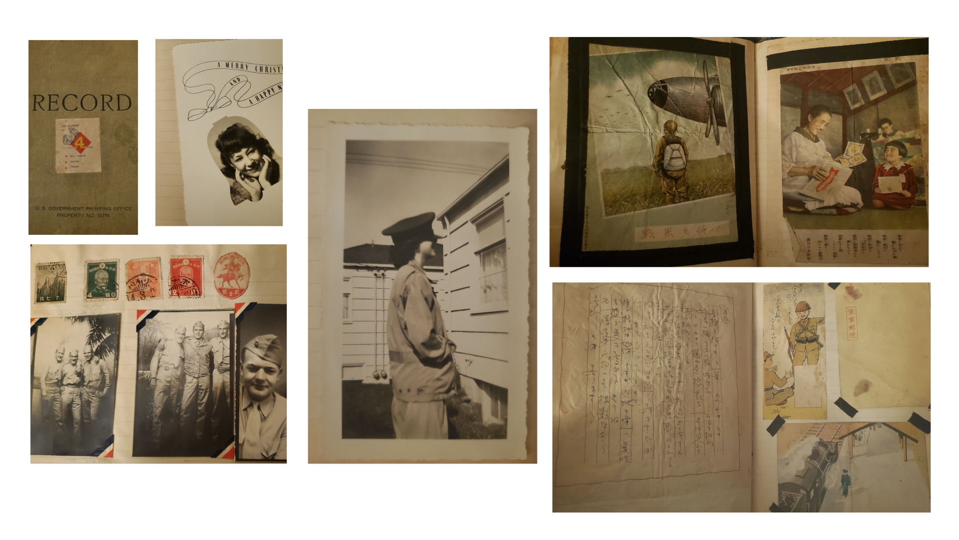
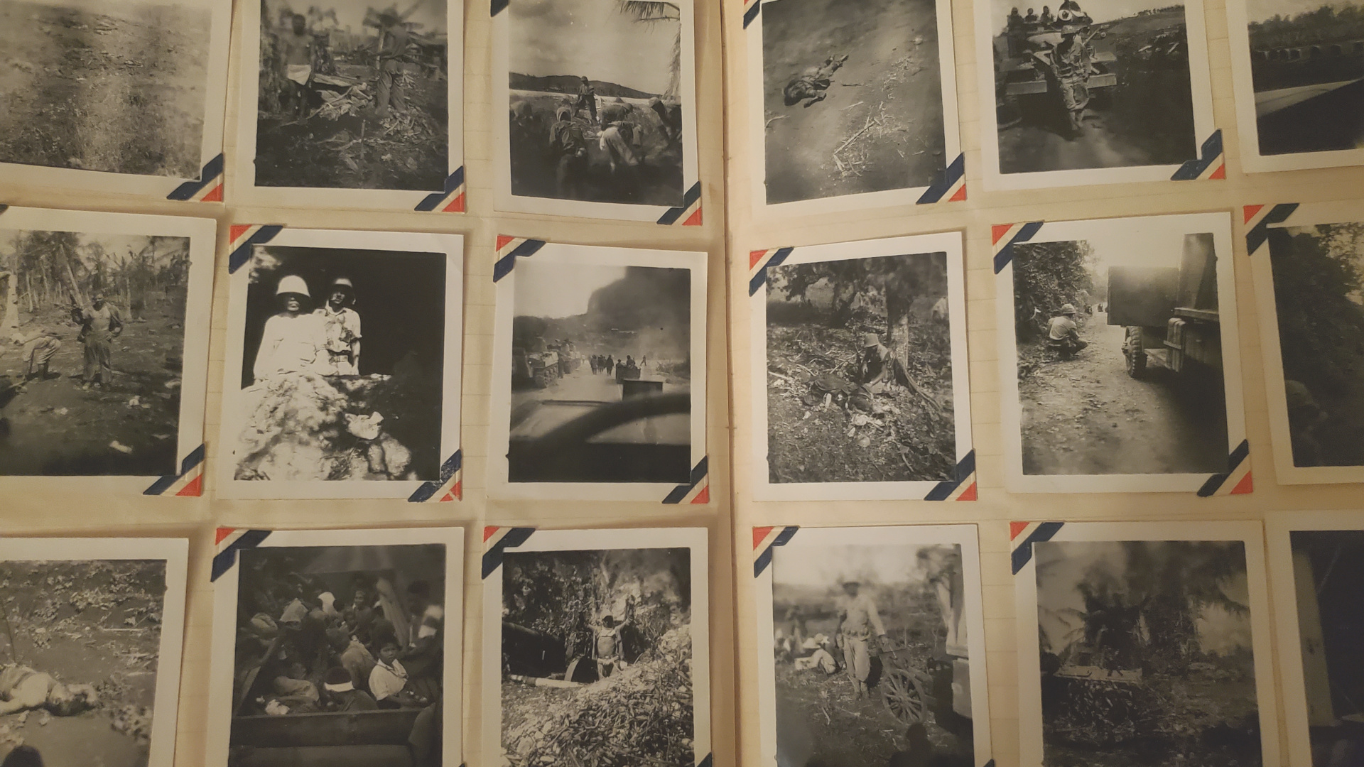
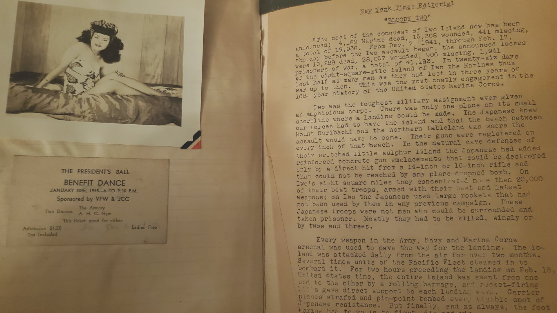
Also unrelated, but I was flipping through my grandpa's old war book to come up with ideas. There are about 500 pictures in there, many pretty small, like you can see the a lot of those 2x3s. Just random scenes and curious ephemera from the Pacific. My grandma is the babe who crops up occasionally lol. Anyway the images are all pretty unique. I feel certain that there must be millions of similar archives in the world, but this is the one I got handed down. So I don't know, but I was looking to see if there might be something cool I could yank for a misc graphic to just toss in randomly somewhere. Like that badass fighter from the leaflet drop. Maybe that very last one lol
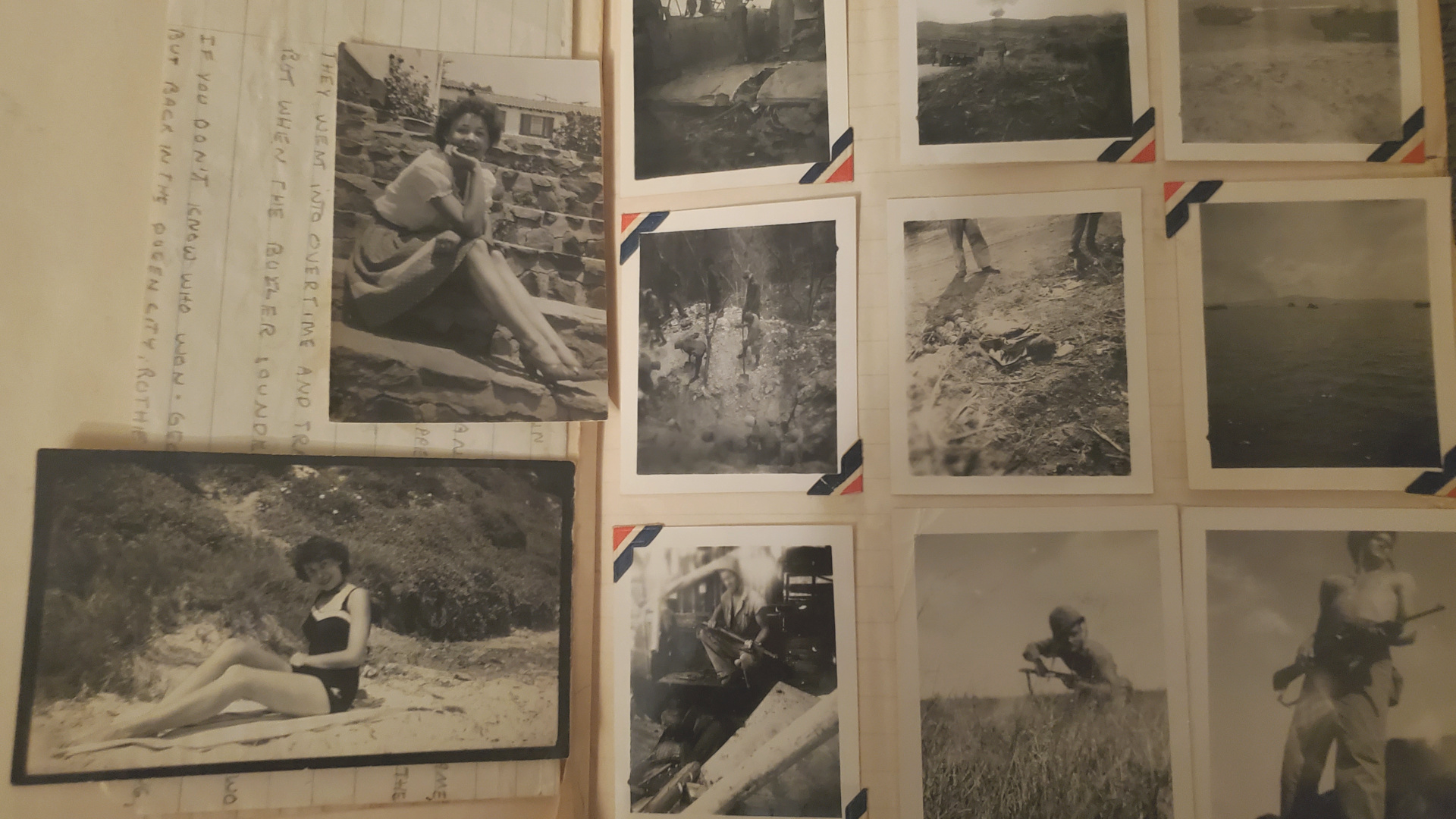
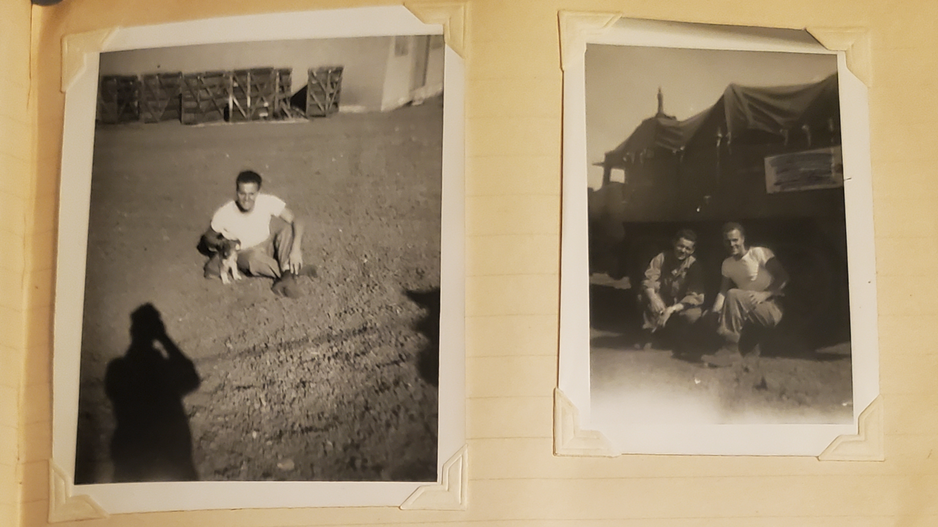
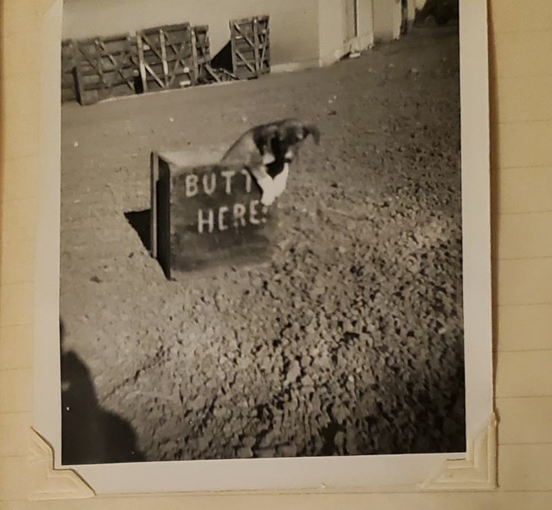
Anyhow just for kicks, had to look at something else for an hour to get back in the groove! haha
Like if Hepps can have his rocker unit, I think I want that crate, to just be all chilling in the misc unit folder with no real explanation or reason to be there, other than my own amusement lol.

-
Oh also quick Q for the Anzac units tint
So in the boxed game they are basically gray I would say, like just basically a straight 50% gray. I tried to keep a bit of that vibe initially, but doing a fairly desaturated tint. In tripleA they're basically a muted Cyan, you know like a teal or sea foam I guess in bungs Global. I prefer the Cyan I think.
I thought I might punch that up and make the units a little more vibrant so they read more into the Cyan range than the Greens. For me it's mainly the ships, as the digi sculpts for the ground and the aircraft are fairly distinct, but because the ships are generic I think the color value is more important for them probably.
This is the current tint for Anzac and USA...


When I see them next to each other in isolation they seem pretty distinct to my eye, but when they're on the mapboard with the ocean blue, they end up looking very similar. Like if they're alone in a sz and not right next to other stuff.
Here it is with the vibrancy kicked up like 15%


Does that seem better to you?
If so I'll rework the unit set to use something like hex 4c9c9c for the ships.
I think the Anzac TT ownership color is fine, it's really just their naval units that get lost in the mix for me.