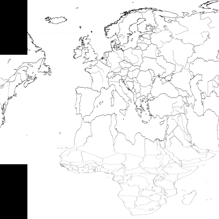
WW1 contour baseline map 4000px
-
So what I did here was to rotate the diamond board 45 degrees, then stretched the field again by half to create a rectangle that would be more usable in tripleA for the zoom.
I used the last base I'd made for the large map and then warped and contorted it so it would roughly match what's going on in the 1914 presentation. Basically Europe is telescoped and rotated by I about 20 degrees, Africa has an even more extreme rotation and a much deeper stretch, the Mid East is stretched and warped to match, with the little strip of North America from Nova Scotia to New York, stitched onto the top of the board. Could probably be tweaked a bit more, but it's pretty consistent so the relative contours held up reasonably well. I think an easy additional morph would just be to stretch Africa and Scandinavia again to fit the extra space. Add back in the Caspian since it flew off the edge of the layer, or a few things like that. Basically slide and redraft some of that stuff by hand till it feels right from there. I think it's possible to widen the Med further, or compress or redraw the Arabia to push the edge, but least it's mostly there hehe.
https://drive.google.com/file/d/1MFP-JHdcUc5_BhEIFuetEycrqMloeA0z/view?usp=sharing
Here's how it looks (reduced to fit the boards)
You can see it only has the basic contours, but drawn in a 1 px black line. So the sea zones divisions and land boundaries would need to also be drawn back in at 1 px.
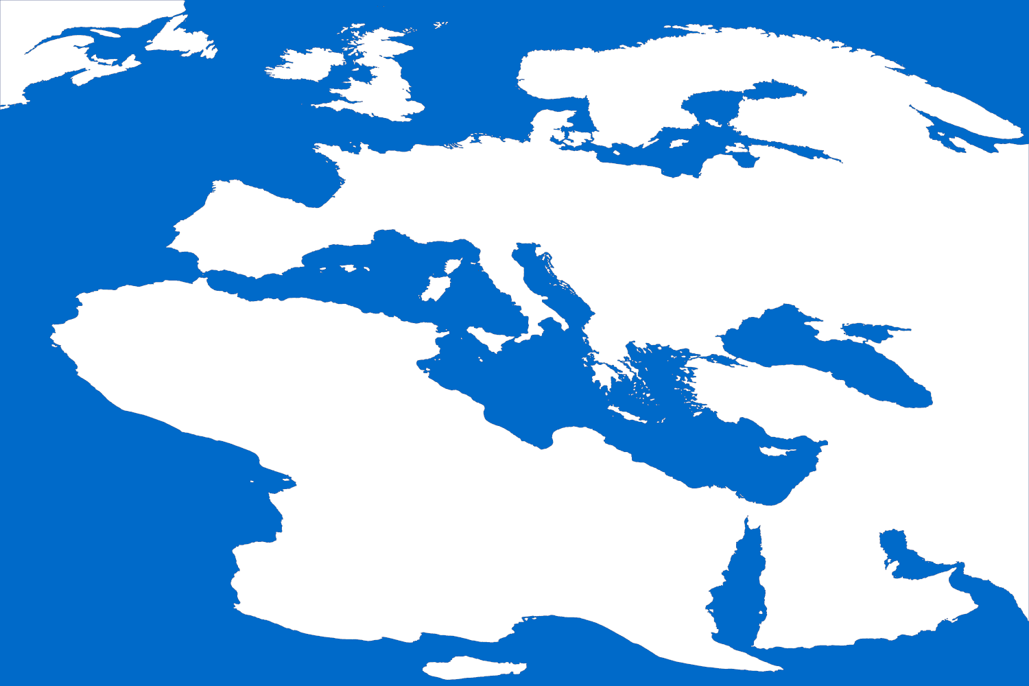
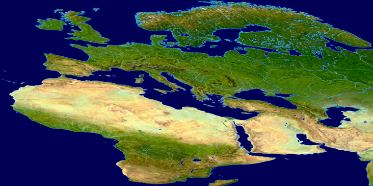
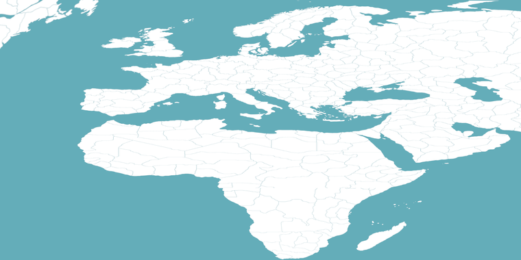
Here is a png image of the current 1914 baseline, rotated by 45 degrees and stretched to the same aspect. To give a sense for what I thought we might try.
That second image has anti-aliasing even at the full size, because of the transformations I did, but basically one could just sorta trace out the lines or block in the TTs to create the same geometry going on, or something analogous. If anyone feels like giving it a whirl. I think the tricky part is just sorta capturing the overall morphs, but that's mostly in place, so might not be too tough to just add in TT and SZ breaks where they gotta go.
Alternatively, it's possible to stretch even wider like to 2:1 or similar to the other standard maps. Why I stopped at this point with the continent contours, cause it easier to stretch those before drawing in the lines. Wasn't sure what peeps might be into, but anyway, that's where I got with it.
-
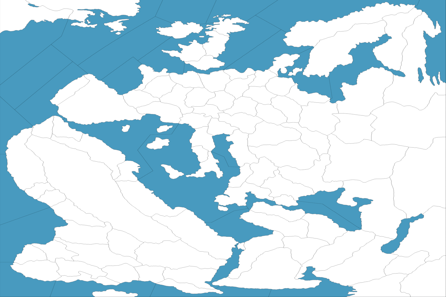
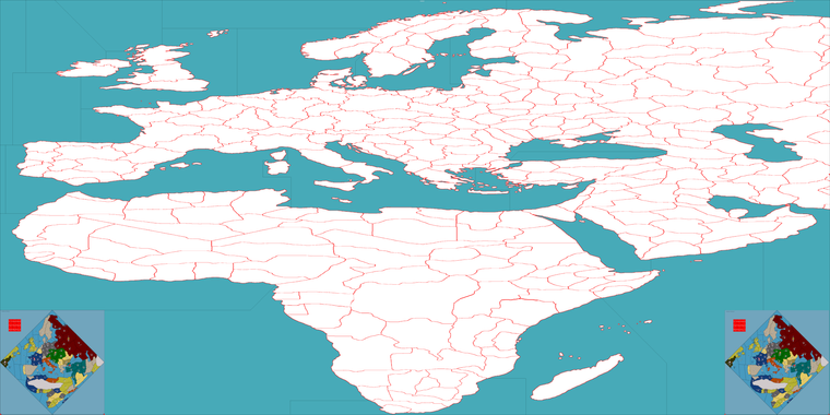
Here is another example. This time I took the above and made a couple more stretches, then widened again to 8000px, so basically a 2:1 version, which might look better for unit housing.
https://drive.google.com/file/d/1tEnZ8Gcyuj4A_5WYBngFabfX_Gyi0aCr/view?usp=sharing
Double Wide (reduced to fit the boards)
If it seems decent, I can just go ahead and start inserting some interior borders to match.
@wc_sumpton 's talk of tanks inspired me to try and mess around with the map baseline. Some sorta call me al move, with the diamonds on the soles of my shoes hehe, but I think I just about got the stretch to work for Africa. Main thought was that the oob diamond/square is kinda rough on a screen that's now 16:9-10. Also like to put the thing on an actual table, I don't know what others do but I'm usually aligning the edge of my map with the edge of my table, but then everything sorta always looks off kilter to me. The labelling and such as well. Figured if I could get something that works for tripleA maybe I could make my own board from that that would suit my desire to have a more regular orientation for the map. An upside I think would be that in tripleA units are always having to fit in that square for the unit place, so reworking the land to be wide would give extra room for unit graphics before spilling over.
Main dilemma I guess would be how to approach the sea zones, perhaps this might be a chance to try curved sea zones rather that angular/geometric. Like basically they just need to match, or have the 1:1 analogy, then all that needs to be redone is the polygon.txt and the unit place, and the regular game file could be ported over to double wide sorta map.
-
And then carried a bit further along.
I used my sub-divided map to get a similarly warped draft going. From something like this we can use the spotted cow method to approximate the boundaries and then restore the 1 px lines. Takes a while going that way, but it's doable.
Would first need to divide/erase the extraneous stuff, so that the boundaries match whatever is going on OOB, then block in the sea zones to match. So basically putting this one together with the image above to get something that resembles the actual board, but following basic the contours of the warp.
Not totally there, but ballpark I think it might work.
I think it's easier to just do Europe and then stitch Africa back on, cause the contortions OOB show a lot of rotation and rescaling there. I think it would like nice to try and preserve the shape of the Med and the Baltic to the extent possible. The dilemma I think is how wide to push the stretch. I feel like the boxed map is basically trying to fit along the diagonal, what might have just been printed in profile, but tripleA cannot handle maps that are taller than they are wide for scaling with zoom regardless so sorta stuck there.
6:4 might end up looking cleaner with less distortion down south. Or we could just stretch it taller at above the midpoint so Europe has more room, then scale back out again to a 2:1 once the distortion is sorted. Thing is we really only want to go in once to do the interior lines cause it's a pain to rescale them at 1px hehe. For sz boundaries it is advantageous for the unit place to avoid having diagonal lines everywhere. Anything other than a 45 degree angle on the diagonal doesn't scale very well in tripleA, and then we'd have to run the place like a ziggurat, which either loses pixels for the unit place, or the units will spill into a neighboring tile. Curves sorta the same problem there. I think the sea zones are arranged such that most of them could have the geometry altered to be either vertical or horizontal or 45 degrees without losing too much of the vibe. Unlike the printed thing labels in tripleA will always orient on the horizontal. On the home board I'm constantly banging my hip on the table corner lol
Anyhow that was the idea. Here is a topo with similar morphs from where I began.
https://drive.google.com/file/d/1hzdrRVcdiiDyVu-PviVTh8jpykeS0r0u/view?usp=sharing
This was how it was achieved, using a rotation and then sorta putting everything in deep perspective until it roughly aligns.
You can see some of it is pretty extreme to fit the tilt that's going. I think from there it is transformed even further with slides and more rotation the closer we get to the edge. Then with N. America added back on in the upper left also with a fair bit for rotation or stretch going on.
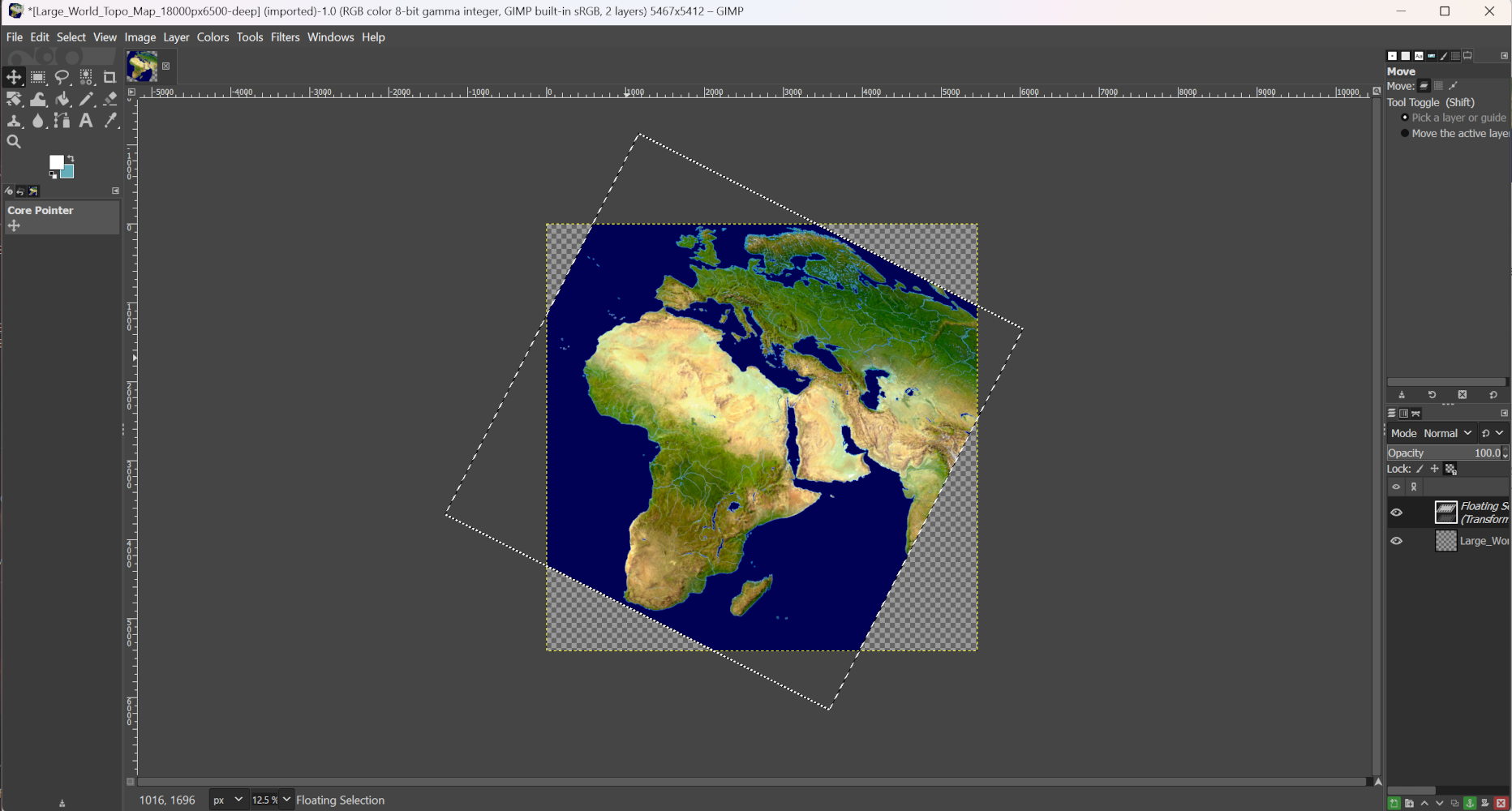

Or something along those lines using transforms until it gives the basic gist.
It doesn't need to be perfect, since it can be resized into the tiles once the base is complete. It can be helpful to resize in section if the map has heavy distortion. Then desaturated and with opacity reduced, pattern overlay etc, but can also be helpful if using natural boundaries rather than political for some tiles. Or just when trying to trace out the contours for a base that could match.
-
Well I got this far with the double wide variant, before running out of gas again lol
https://drive.google.com/file/d/1JBjEoEzlUVHAc03nCXWZs_sVLQBLMhwb/view?usp=sharing
I think I just have more difficulty accepting the WW1 1914 map than any of the other standard A&A maps. Having to bend the compass rose to such an extent, it just doesn't really do anything for me. Then, whether the map is oriented in the diamond or the rectangle, I still find myself wanting to tilt my head or walk around the table, or feeling like I've somehow got vertigo climbing a staircase or crawling up a driveway with a steep incline hehe.
The amount of work required to redraft the sea zones is a particular dilemma. I think many players will simply want a TripleA map view that is a facsimile of the OOB board, you know so they can have a way to practice for actual Face to Face games - as opposed to something analogous but where the sz geometry there is very different. I keep finding myself wanting to make adjustments to the vibe, so that maybe we could create something that is serviceable for a physical release too, since OOB is kinda small for sculpt housing, but again I think players would balk at the necessary changes for that. In short just not sure if it's worth the elbow grease I'd have to put in for a game I've barely played. I think I would have taken a different approach initially, to avoid having to rotate Europe or rescale it so much, since it's such a familiar map, the standard map of Europe I mean.
Then there are some minor awkward things, like the 4 point between Kiel, Berlin, Denmark and sz 11, or the handling of Finland, which again to create solutions for that would require redrafting that may just confuse players if it departs from OOB, even where the accuracy is in doubt. I suspect the original was created using some morphs similar to what I did, but then probably redrawn again by hand afterwards to disguise some of the wonkiness there by reshaping the tiles.
Not really sure what's best. The current map for tripleA is certainly serviceable as a learning tool, so I'm not sure how much we'd gain trying to create a new standard there. I think it would take Renegade actually releasing an Alternative map composed within the rectangle from the ground up, but their enlarged mat keeps the same dimensions and such.
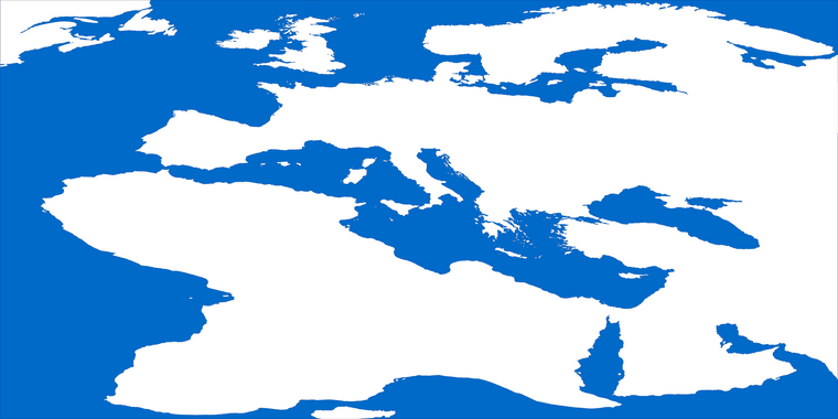
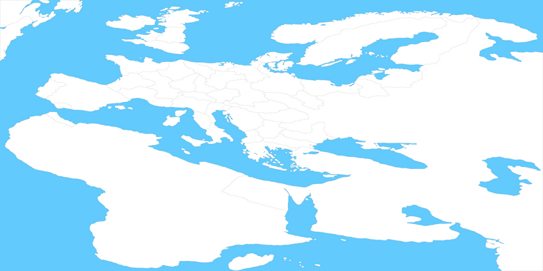
I would rather play on a board that looks more like this...
I think even a very extreme stretch like that is more sensible than a rotation where the only purpose in a tripleA context is to crop out some ocean at the corners.
Even if the space for sea zones is not the most economical, it still just has a better overall read to me. The extra space could be used to house Themed graphics or the battle board or the rules.
I will wait to hear what others think. If I'm going to go through the effort, I'd like it to be something that hums.
-
@black_elk
I am so used to seeing the world view as shown in most geography & history screen/books that it is ingrained in my psyche.Unless a map is simulating say a nuclear war between USA & Russia that would/should centre on the arctic as this is the shortest distances missiles would travel, the view should be the usual world view.
So I agree even an elongated/stretch view as the last view is IMHO the best view. It also has the advantage the current territories will be even bigger to accommodate say 9+ units.
So no to tilting, yes to usual view.
-
@thedog Right on
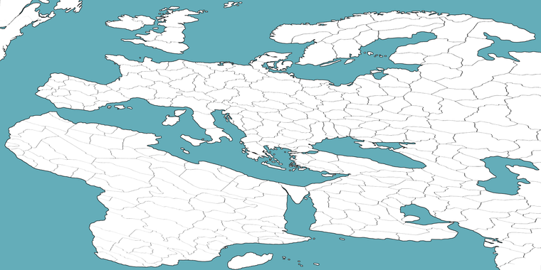
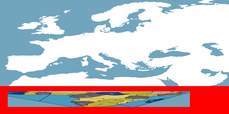
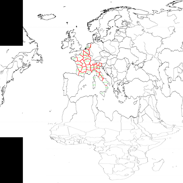
In that case I blocked in some quick sz divisions to show how might translate. I did the interior land contours with beefier red line so it can be isolated out and retraced using the OOB connections. The whole thing can be morphed again to create a less extreme stretch overall which may be preferable. 16:9 would allow for a zoom out view that doesn't require dragging to see the entire map field. The image attached below is a 2:1 draft, but just cause I already had that one saved out.
I inserted the standard diamond board into the corners as a placeholder, but you can imagine that rather than these, it might have some sort of WW1 themed montage images with Biplanes and Trenches and Dreadnaughts. Or again the battle board or unit roster with descriptions and images just built into the map display in those areas. North America can be stitched back on to upper left, or with the ocean field extended to suit the overall dimensions etc. This is just trying to create a visual impression for a WIP.
If trying to work up a redux, this would be the sort of thing I'd do.
OOB there is more compression on Russia so basically the whole thing could be slid over slightly to make room for the North America stuff.
I think morphs from a more regular orientation, sans tilt, it will be easier to create in those areas near the edges of the board. If it seems agreeable I will keep going in this direction and see if we can get a port going.
-
I don't mind the tilt, but yes, the rectangle looks better than the diamond. But this last map seems to focus on Africa then Europe.
My two cents
Cheers...
-
@wc_sumpton Agreed
I think the problem is trying to include sub-Saharan Africa at all, or rather trying to dedicate so much board-space to that area. I think instead, the dozen or so territories and sea zones that comprise that front might be abstracted into more simplistic or even basic geometric shapes. To create something that works more like a checkerboard down there. Here's a concept, pretty vague. But the idea being to somehow fit it all into that more narrow band of red at the very bottom of the board.
-
Unlike WWII, WWI was more centrally located around the Mediterranean, Middle East, central Europe and Asia along with Great Britain. The United States can be abstracted to the left, with the southern portions African condensed/abstracted at the bottom.
This was all I'm saying.
Cheers...
-
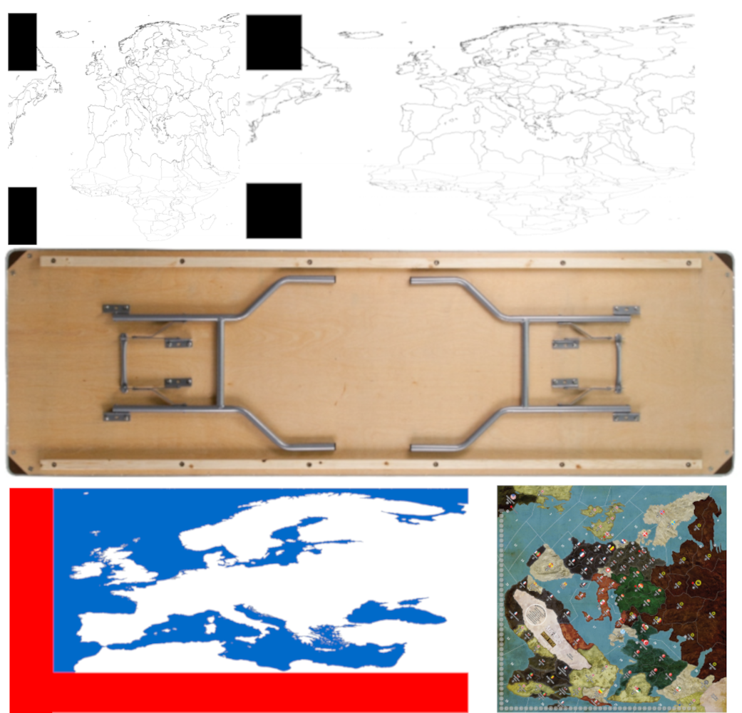
For units I think we should use some of the stuff Hepster made for the Central Powers, then do something similar for team Entente.
https://drive.google.com/file/d/1pj6MNXUTrhYvvh3hVIDkbwtEf6Zh2efx/view?usp=sharing
These could be tinted, redrafted or reworked to display at 54 px with the colors for Austria and the Ottoman Empire for example.
Some of those unit graphics wouldn't have a function in the normal game, but could possibly be used for stuff like WW1 technology or mods.
-
@wc_sumpton said in WW1 contour baseline map 4000px:
Unlike WWII, WWI was more centrally located around the Mediterranean, Middle East, central Europe and Asia along with Great Britain. The United States can be abstracted to the left, with the southern portions African condensed/abstracted at the bottom.
This was all I'm saying.
Cheers...
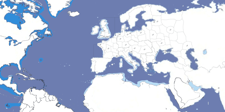
How about something like this?
The black spaces can be used to put something in them like the title of the game, units legends or things like WW1 propaganda posters. They are actually there to hide South America and the fact that Iceland would be right next to Baffin Island.
(Anyone feel free to use this image.)
-
@cernel yeah, I think something of that sort would be the way to go, with an abstraction clearly delineated in the design. In tripleA there are a number of solutions that wouldn't be available for a physical map, since we can zoom in and out or scale the sculpts. The challenge I think is to create a map image that is exactly analogous in terms of the connectsion/tiles, but which might also work on a standard dining table.
This image may help to get a ballpark going. Using an 8ft banquet table for comparison.
Goal would be to ensure that the areas of highest activity (or which must house many units) be larger relative to the tilted OOB board in the same spots. I think the only way to really overcome the tight space for sculpts is to do some sort of very wide stretch for Europe to max out the space there, at least along the horizontal axis. We can get pretty close to matching it I think, the space of the OOB in Europe, while still preserving a somewhat familiar sweep. Though it may be simpler to go more abstract if using very heavy distortion, since retaining the contours can be tough. I like the idea that the map would indicate that the bottom portion is very telescoped, perhaps using design elements like you mentioned, so period posters or little images to help accent the transition, which would basically be right below the southern portion of the med. Since the Ottoman's are a main faction in this one, it makes sense I think to try and get enough of the Persian Gulf and Arabia into the main Europe display without so much distortion as I used initially. I had been using an already highly tweaked map of Europe and the Med for drafting, but since a stretch might look better than a tilt for that, I think we could get closer to using a very standard map or Europe like the one you provided. Will also help when trying to do fancy stuff for the relief.
")
-
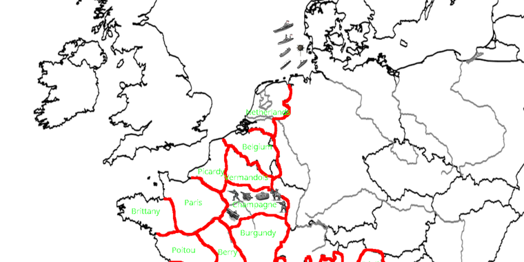
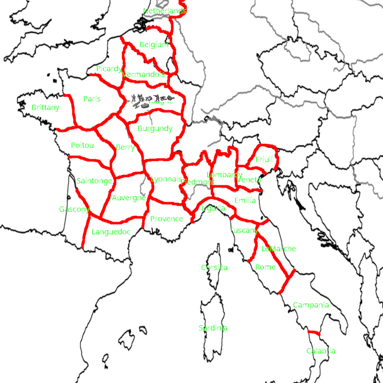
This is an attempt I just made to depict territories for Lowlands, France and Italy to replicate WW1 while keeping territories as big as possible but also fairly consistent (and have a fairly big territory for Paris).
-
I upscaled from 4000px to 6000px, using the units at like 48-54 tall with some example ground in Champagne and off Jutland for some Naval units. Gives a sense for the unit place at that scale. I think it should work there for height, or pretty close. I tossed an extra cavalry dude in there and one of the larger fighters to see what it might look like for place before overflow. Here's a quick detail to fit the scale of the image attachments here on the forums...
Taking basically that same warp you provided and going double wide I think is another nice option if we need extra room. Maybe between 4:3 to start and see how it looks before trying 16:9. Ideally where most TTs can fit like two rows at least a couple unit types deep. Width varies a little in hepsters units from about 60-80ish px but still pretty manageable I think from that starting point. Any extra tile divisions can be drawn in at 1 px, then collapsed back down into larger regions or yanked out to make it OOB at the last step where the connections require. Seems cool to me!
We'll go with that sort vibe for the contour and then if something needs to be tweaked after we can just keep reworking it in the base till it feels good, before I try to go too ham with the relief stuff. But I like the idea of a WW1 that's maybe a little gilded up with cool period illustrations or something on the margins, or a nice battleboard style presentation for quick overview like unit notes. Having the notes with graphics drawn onto the map they might scale somewhat better than within the UI for a quick glance, or at least for the higher resolution displays. I'll try to key it out at 1080 and 1440 to make sure it's ok for both. Good times!
-
@black_elk It looks to me that those units are about 48 pixels wide. I mean the ones which you uploaded in a single image in this thread.
The image is 4,000 wide simply because of this forum's limits (and because this topic says 4000px). I would go with it being 10,000 on both axis.
This is how it would look with those about 48px units.
As it is traditional in WW1 games, I assume the game would have frequent stalemates, with enemy units sharing the same territory across turns, so I guess it would be normal to have German, French and English units on the same territory for some rounds.
Actually, the original which I made was 6,000 on both axis, but I shrunk it because forum would not allow it.
-
I like maps that are aesthetically pleasing to look at.
Map rotations, curves, extreme squeezings/stretches, and abnormally big Scandinavia, Eastern Europe, or Africa are just not good. Standard maps aren't suitable either because they make Europe too small.
It’s better to use an equirectangular projection, get rid of all the unpleasant stuff I listed, and subtly shrink non-European territories.
Hello! It looks like you're interested in this conversation, but you don't have an account yet.
Getting fed up of having to scroll through the same posts each visit? When you register for an account, you'll always come back to exactly where you were before, and choose to be notified of new replies (either via email, or push notification). You'll also be able to save bookmarks and upvote posts to show your appreciation to other community members.
With your input, this post could be even better 💗
Register Login