WWII Revised - Facelift
-
So I propose we give WWII Revised map a much needed facelift.
Would be very nice for this classic, much loved map. Which brings in many new players. Both hardcore and newbies alike, to have a nicer map.
I'm willing to redo the baseTiles image by reshaping the continents , territories and sea zones. But I'm hoping I can recruit someone to do a new map skin. I suppose it can even be the same pattern as the current map skin.
Just to clarify, this is just a facelift. I'm not proposing any changes here.
It could use a simple game notes too.
-
@general_zod I think that would be great. Given the popularity of revised, this would be pretty beneficial.
-
@redrum @General_Zod Making Meth more more accessible and appealing to the masses.... Seems like a good pursuit to me.

-
-
@general_zod Sounds eerily familiar... almost like something my dealer said to me.
-
I'm trying to not deviate to much from A&A revised map. But it is an improvement. Let me know what you think. And then I'll run the map utilities
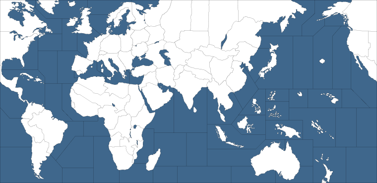
Btw, make any changes you want.
-
@general_zod said in AA revised - possible upgrades:
Just a reminder I do have a new map for revised.
 I wish I had it ready for your tournament.
https://forums.triplea-game.org/topic/423/wwii-revised-facelift

Suggestions welcome. Also proofing my territories borders for accuracy of connections is welcome.
-
Here's what I have so far. Skin and decorations are next.
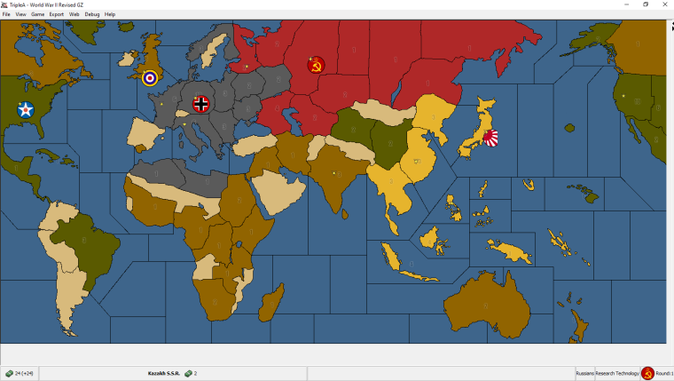
I'm trying to keep it similar to the original Axis & Allies version. Just so it doesn't look like something unfamiliar. Yet less deformed.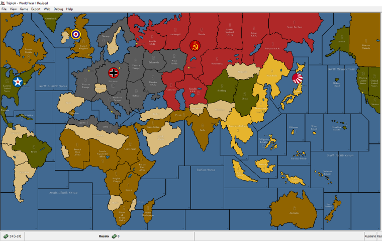
Here's the original TripleA version for comparison.
-
well done!
-
@general_zod Seems like a step in the right direction. I would recommend trying to get some of the veteran revised players to give thoughts as they tend to not like change...
@Panther Thoughts here?
-
I appreciate much the love and the work that has been put into the redesign.
This map is in context with every wwII map - so are we going to change the design of wwIIv3, wwIIv4, wwIIv5, wwIIv6 and wwII_1940_global (together with pacific_1940 and europe_1940), too?
And at least on axisandallies.org some of the maps mentioned by me are way more popular than the revised (wwIIv2) one, which actually is rarely played there.
Personally, I don't care too much about cosmetics, but maybe others do. And changing habits, changing things one is used to, is always difficult...
... but maybe it is not much of an issue.I see of course the argument of the map looking more similar to the original.
All in all I don't share the impression that a change is "much needed".
Sorry, I don't want to sound like a grinch... but I have been asked

-
Here's how the map skin is coming along.
New
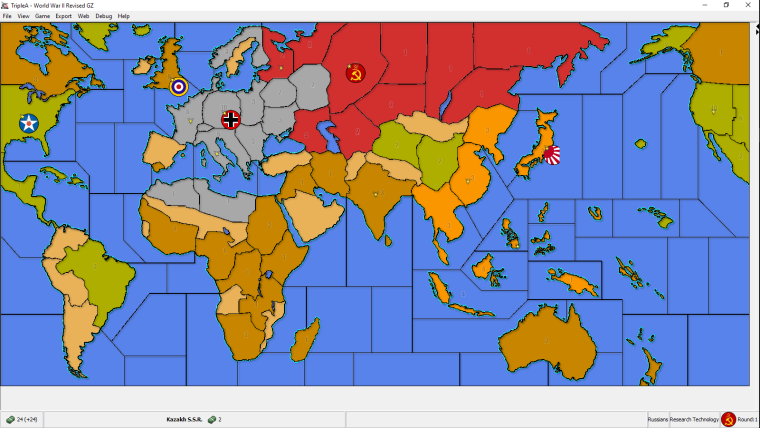

OriginalUnless, some one has some constructive suggestions, this will be the final version once territory names, PU values, sea zone names, vc, capital markers are all positioned.
And maybe I can redo some of the auto placements, since some are really bad.
-
@general_zod Out of curiosity: What is your reason for turning away from the more decent color scheme?
-
@panther Those color schemes are nearly exactly same as units. The units don't have very much contrast if placed on indentical colors.
However, the original color scheme will be available with map details off.
-
@panther It's not a big deal as, involving no game's changes, they all can be made into alternative skins (a really neat and much under-utilized feature, I best most people don't even know about).
A good idea, when a new original skin is made, is to keep the old one available in download list as a mapskin, and opening a poll about if the old one is preferred.
Maybe the poll should be made before changing the original skin, but I'm guessing it's hard to get enough people to give their opinion, if you don't throw the new version at their faces first.
Not being a Revised player, I'd abstain on this one. -
@cernel I'm not sure, but I think it's possible to place all map skins in one game folder. But the zip will be much larger since it will have double the files.
Since xml is same, unless I tweak game notes for noobs.
I ve done multiple map skins in one folder in past. But they were all the same base image files.
-
@cernel Indeed, good point. I would very much welcome keeping the old (=today's) skin aside (not a habit, but my eyes prefer more decent colors). More then ever in case the new look should become a prototype for all the other wwII-maps.
-
@panther No worries, for colors. The original color scheme will be available too.
-
Colour scheme being what it is.... and I understand your reasoning.
I like the fact that you made many land features far more recognizable and realistic. One question. Why are so many of the territory dividing lines now so geometric? It feels much more blocky now. The old version the lines were more organic. It made them feel more natural.
-
Yeah I used more straight borders than my previous attempts (^^). They just looked like something was badly skewed in that area. So I tried to fix that skew and during the process it seemed that the adding curves here and there was causing it.
So figured. I'd give something more basic a try. That also was supported by the reasoning to just go for maximum placement space in that, most active area of the map.
The territories that looked strange no matter what I did were, Germany, Belorussia and West Russia. And actually those still pop out, hehe. To make those look nicer (more curves) in proportion to rest of the map, seemed to leave those territories on the small side. Because my continent proportions are more in line with real world than the original map, space is at a premium in that area.
Since the graphics process is extremely tedious, I really don't wanna reshape continents or enlarge the map on this project. But I am open to changing those inside borders if you have a drawing.
0_1522350905168_World.War.II.Revised_new.base.image_3773x1830_v.1.0.0.0.13.0.0.7.zip
On the colors, I do use the original colors so I can have the map with 2 color schemes. Traditional scheme with map details=off and vivid scheme with map details=on.
Aesthetically, it seems to give a nice friendly board game feel as is. It seems to say... hey, try me, "I'm easy and put out on the first date. Haha
