Taking your suggestions for a new UI
-
@general_zod Static works.
-
@general_zod Thanks for the quick response.
- However clicking the arrows on the left and right panels only minimize them for the rest of the turn.
- I am either doing something wrong or the 'make default' button does keep when you create the next game.
-
@hepps You are probably right. To some extent it is the monitor and video card as well. Some maps are too big and I use the zoom to reduce map size. Some maps are too small. But most are the right size, but still I want to zoom in on an area that has a lot of units to get a clearer picture of what is there. (270BC is such a map)
-
Yes the left panel always pops back up when opponents turn comes, it displays game history. The right panel can be minimized but it's also the primary interface, so it really can't stay minimized all game, if that's what you mean.
As the "make default" goes, it should reload those settings whenever you reload the same map/game from scratch. So you just need to check the options you want all the time and click said button. These settings will change from map to map, so you will need to do it again on new maps.
-
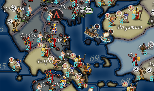
@admiral-barca Right. 270 is a great example of a map being far to small in comparison to the size & number of the units in a terr.
Here is the original map at 100% zoom...
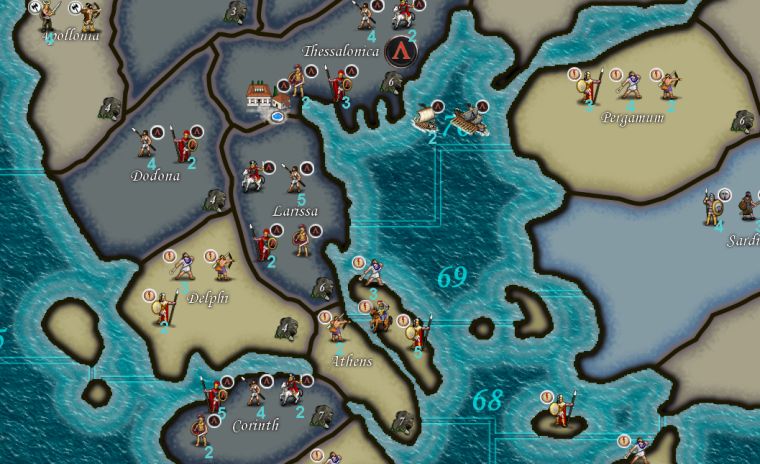
Here is the same game redesigned with the map sized increased and the placements done properly....
Here is that same redesigned map but using the zoom feature to zoom out so you can see more of the map...
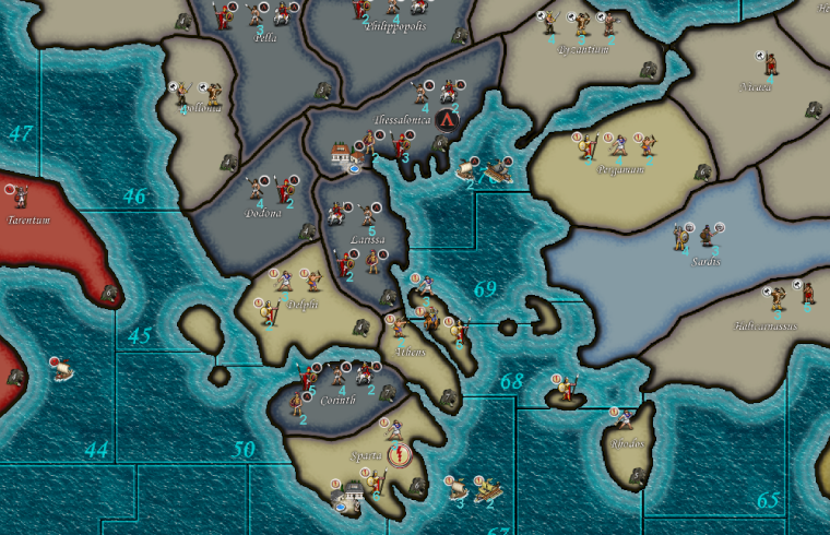
As you can see. By redoing the map you can make better use of the zoom feature while also making the game much more playable. Furthermore in this example the units could be designed much bigger to allow you to dramatically increase their size when you zoom out.
The entire point here being that a higher level of customization by the player can be achieved if the maps are designed with more foresight.
-
@Hepps Are you guys planning on redesigning the in-game interface as well. Because there is definitely some areas that can be improved there. Namely the right side interface could use an overhaul.
If that right panel interface wasn't such a space hog, the maps would have more display area..
Also the territory tab is less than ideal.
The scrolling of units is a pain, if there was multiple columns would be nice.
Also the territory information is displayed badly, it uses so much space pushing the units down even further, causing more scrolling.
Moving it to top or bottom may help in these areas. But should be able to hide it and even moving it would be nice.
-
@hepps is there a easy way to do this for existing maps ? Oops forgot the easy way is usually NOT the best way : )
Some day soon I need to tackle this but am still struggling with basic xml stuff currently.
Gen Roi ever pulls your unit out for some R&D your suggestions on "boot camp" mode on how to proceed would be welcome : ) -
@general_zod Yes. At the moment we are attempting to get the entire Menu section done. The in-game interface definitely could use some attention. The when and the how of it is an entirely different question.
-
@beelee Unfortunately there isn't really an easy way.... in the example above it was easier because Frostion had already enlarged the map for his Rome Total War.
That being said I still had to redo all the placements manually.
Redraw all the units.
Plot all the centers for the names.
Redraw all the SZ.
Replot all the PU markers.
Replot all the Capital markers.
As well as other things I'm sure I am forgetting.So on an average map that is already done... this kind of thing is basically like starting over almost from scratch.
-
@hepps and you didn't release it to the map repo why? evil artist withholding gorgeous maps ?
k i wont mention why
-
@prastle Well I never released it because it still has an issue with the SZs in the Aegean.
While the map is playable, the change of the 2 SZ creates an issue with the original balance.
-
@general_zod So here is a sample of what I think would make a good in-game U.I. up-grade.
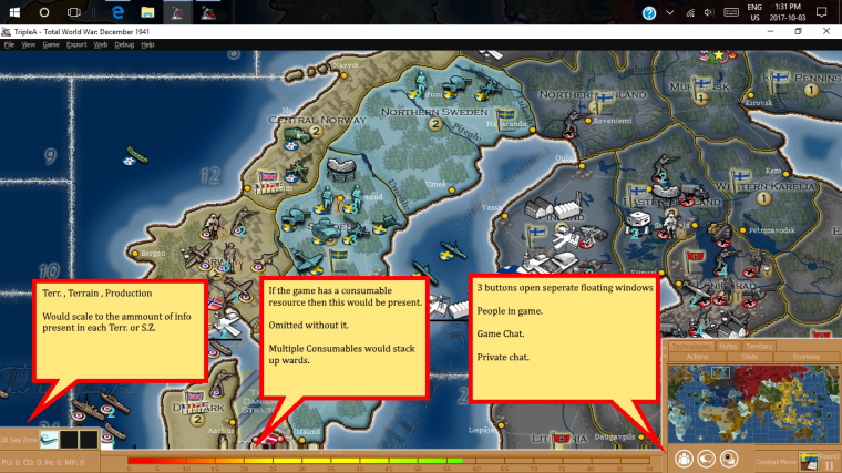
Now the colours and design of the frames and borders could also get far more attention and improvement. For this example I just made them bright so that the area is distinctive.
the other thing to note is that the tabs above the mini map would slide upwards if you want to view them.
"A joyous heart sours with the burden of expectation"
Hepster -
@hepps Can I have your children?
I totally agree with the general layout (aligns with most modern TBS games). Not sure on the whole consumable bar concept though and I hate the color
") I'd also like to consider redoing the top bar and push that primarily into a pop-up menu. We could consider putting resources and such along the top then.
I'd also like to consider redoing the top bar and push that primarily into a pop-up menu. We could consider putting resources and such along the top then.TripleA Developer with a Passion for AI: https://forums.triplea-game.org/topic/105/ai-development-discussion-and-feedback
-
@redrum Tell you what... 2 things need to happen.... First science needs to allow us to meld the DNA from 2 males.... second you need to get me Jessica Biel to carry our child.... I reserve the right to be the one who inseminates here the old fashion way.... and I want a clause that requires at minimum 100 attempts.
-
I like the direction your taking it in this example. The main thing on my wish list would be a highly functional efficient territory tab. Many including myself like to play mostly from a zoomed out perspective, thus highly relying on scanning the map details/units via use of the territory tab.
The scrolling of territory tab is the most bothersome component of playing with this perspective. So I wonder if the panel could expand to the left across the bottom of display if the territory tab is selected. As well as expand up for the other tabs.This would allow plenty of room to see all units in a territory. Maybe even sorted into 2 ,3 or even 4 rows.
Row A: all infrastructure
Row B: all territory owners combat/non infrastructure units
Row all allied units
Row if room all enemy units
All the usual pertinent territory details can also be displayed here, just more efficiently. And with no scrolling required.
Maybe a fast battle calculator can even be worked into this panel just displaying the main figures here.
Then I envision a more detailed battle calculator for more manipulation of units and saving results of multiple calculations, and changing terrain, etc..
-
Even the area were you placed the resource meter, can be used for display of territory units and using minimal space. And place resource meter on a vertical axis along left or right.
I can imagine a row of units in that space, and multiple rows if needed. Just I think this row would require the whole bottom width, bumping up the other items on top of it.
-
@Hepps
However, all that being said, it can be done on the left/right as well if in multi columns.Or a frame around all sides, with a very small footprint, right, left, top, and bottom. Each displaying dedicated details.
Each side of the display frame should be capable of minimizing though, so a player can gain more room if desired.
-
Expanding on the display frame concept, how about if the entire frame changed.
So, if the territory tab was selected the whole frame was dedicated to displaying the units and other pertinent territory details. Then if you click on the stats tab button the whole frame displays all info pertaining to stats and economy. If click on actions tab the whole frame displays all pertinent action buttons, information etc..
If this concept was accepted, I would propose one frame be called the "Map Survey" frame, with zoom buttons, mini map, and all territory tab info.
-
Ideally you could have all the expandable tabs set to either expand vertically or horizontally based on their design parameters.... then each time you open one it closes the other.
ie a territory tab would expand in place of the Consumable (fuel) bar...
Furthermore you could make each tab/window capable of being a pop up or simply expandable to a preset spot and dimension.
Or some combination there-in.
Oh and I added a fourth button.... as a way to pull the main menu of options within the game.
@redrum Is that colour more palatable?
-
@hepps I just want to know about the children Biel thing
Great stuff !
Hello! It looks like you're interested in this conversation, but you don't have an account yet.
Getting fed up of having to scroll through the same posts each visit? When you register for an account, you'll always come back to exactly where you were before, and choose to be notified of new replies (either via email, or push notification). You'll also be able to save bookmarks and upvote posts to show your appreciation to other community members.
With your input, this post could be even better 💗
Register Login