Navigation

    TripleA Logo

    TripleA Forum

    • Register
    • Login
    • Search
    • TripleA Website
    • Categories
    • Recent
    • Popular
    • Users
    • Groups
    • Tags

    Image Icons

    Feature Requests & Ideas
    12
    228
    140525
    Loading More Posts
    • Oldest to Newest
    • Newest to Oldest
    • Most Votes
    Reply
    • Reply as topic
    Log in to reply
    This topic has been deleted. Only users with topic management privileges can see it.
    • CrazyG
      CrazyG Moderators @Frostion last edited by CrazyG

      @frostion said in Image Icons:

      This is because I think that it may be good to have at least one place that reminds the player what the icons actually symbolize. We wouldn't like to have player in chats and forums beginning to call fuel "drums", PUs "cash", Food "Apples" or "Steaks" ... calling the resources what they see in the icons instead of the real definitions. I don't think explanations in the notes would be sufficient and we cant expect player to intentionally use the tooltips to investigate what the icons represent. I think the real resource definition should be repeatedly and visually printed into the player's mind.

      In civ 5, its very common for players to call production "hammers", to call science "beakers", so this is definently a thing.

      Can I ask a quesiton about PUs real quick. Are we pretty much stuck with that as the default resource because of old code? Anyway to rename it, at least for appearances? I would much rather have a map spending gold or something

      1 Reply Last reply Reply Quote 2
      • Frostion
        Frostion Admin last edited by

        Yea, I hope we are able to create a full set of the standard Icons in good quality? Is it @Hepps who is the keeper if the original artwork?

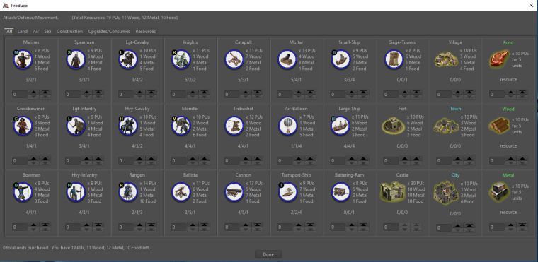
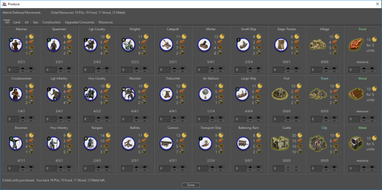
        @redrum We see in you example pictures how it looks when a unit cost 4 different resources. I would think going larger that 16 might be too much as the whole row of unit/cost display is expanded in hight. But no harm in trying ☺

        1 Reply Last reply Reply Quote 0
        • Hepps
          Hepps Moderators @redrum last edited by

          @redrum Still need those resized images?

          redrum 1 Reply Last reply Reply Quote 0
          • redrum
            redrum Admin @Hepps last edited by

            @hepps Yes, please. I think at least posting a few screenshots with 16x16 and 20x20 is probably worth the time. I'm fairly sure we have consensus that 12x12 icons are useless.

            Hepps 1 Reply Last reply Reply Quote 1
            • Hepps
              Hepps Moderators @redrum last edited by

              @redrum So then what are we thinking 16 x 16, 20 x 20 and 48 x 48?

              redrum 1 Reply Last reply Reply Quote 0
              • redrum
                redrum Admin @Hepps last edited by

                @hepps I'm just focusing on the small resource icon at the moment but here are my thoughts:

                • Small - either 16x16, 20x20, 24x24 - used for areas with text like purchase costs
                • Medium - either 24x24, 28x28, 32x32 - used for bottom bar, other main UI areas
                • Large - 48x48? I think that is the most used unit image size? - used when displaying them as a 'unit'
                Hepps 1 Reply Last reply Reply Quote 1
                • Hepps
                  Hepps Moderators @redrum last edited by Hepps

                  @redrum Yah that looks ideal. Allows for some individual customization.

                  I'll work on those for you now that I am home.

                  redrum 1 Reply Last reply Reply Quote 0
                  • redrum
                    redrum Admin @Hepps last edited by

                    @hepps Right, though I'd like to pick the 'best' and make that what we include in the engine for each size as well as our 'recommendation' to map makers.

                    Hepps 1 Reply Last reply Reply Quote 1
                    • Hepps
                      Hepps Moderators @redrum last edited by

                      @redrum I just moved a few things around and included the resources as a 32 x 32 size image, increased the font for the quantity to 16 and made it bold.

                      0_1519158112873_Snap.png

                      1 Reply Last reply Reply Quote 1
                      • redrum
                        redrum Admin last edited by redrum

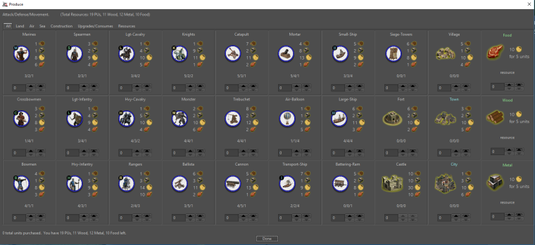
                        Alright so here are some options with other image sizes. My initial thoughts is I prefer 16/20 over the 24 as they seem identifiable but don't take up as much space. No real preference on not bold vs bold as I think bold looks better but then it makes me starting wondering what else should be bold 🙂

                        16x16
                        0_1519160311515_42dd8caf-e372-4d3a-b150-599d877496a8-image.png

                        20x20
                        0_1519160389848_066402ed-dbf9-44b7-86f4-278a90c96ea7-image.png

                        16x16 with Bold Quantity
                        0_1519161034991_fd060da1-9d95-43a6-9e7d-2518fcab6feb-image.png

                        20x20 with Bold Quantity
                        0_1519160964858_f92b7860-0a85-4961-addc-cdb98c6b532a-image.png

                        1 Reply Last reply Reply Quote 0
                        • Frostion
                          Frostion Admin last edited by

                          @Hepps - Hmmm … I don’t think I like the bold resource numbers. And I think it’s a little “off” having the units and the resource cost pictures almost the same size. its all just a bit too much.

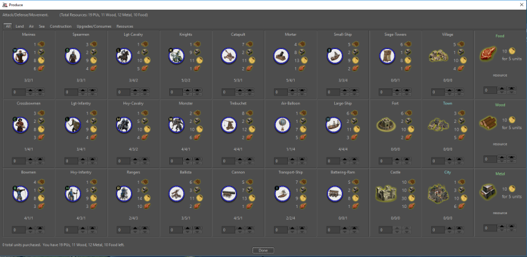
                          Anyway @redrum here is a collection of Dragon War pictures that you can play around with. Also there is an XML of Dragon War where the players start out with a random bunch of resources, making them able to purchase from round 1. I contains unit size, 32, 24 and 16.

                          Mind you that these pictures, unlike the standard TripleA resource pictures, have a yellow backdrop and more transparent space around them. That also goes for the smaller pictures. I have not made a “clean” version. I might do that. You so you know that a Dragon war 16x16 might not give the same impression as a standard TripleA picture 16x16.

                          0_1519161178942_DragonWarResources.zip

                          1 Reply Last reply Reply Quote 0
                          • Frostion
                            Frostion Admin last edited by

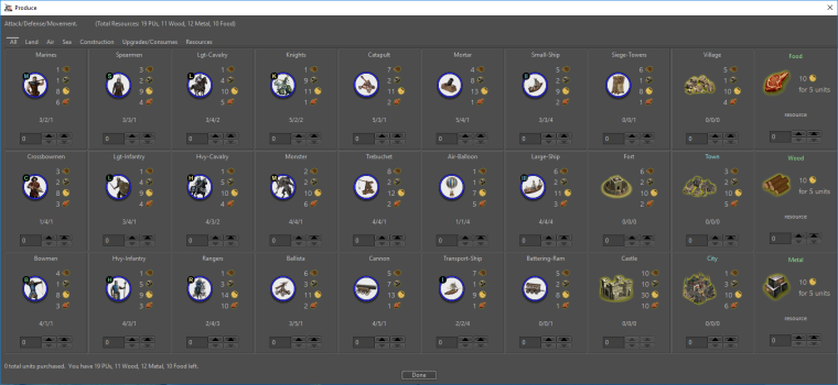
                            @redrum I like the 20x20, I just wish we could see the same preview with 1 size larger font instead of bold font. 😉

                            redrum 1 Reply Last reply Reply Quote 0
                            • redrum
                              redrum Admin @Frostion last edited by redrum

                              @frostion Ask and thou shall receive:

                              20x20 with larger font quantity
                              0_1519162057875_99e52ad5-d99b-4734-b0fa-290af6f5800c-image.png

                              24x24 with larger font quantity
                              0_1519162217867_5690cc02-d91f-4730-a8e3-1a3622e4d700-image.png

                              Dragon War @ 24x24 with larger font quantity
                              0_1519163117132_24ecc51b-63f9-43ac-8cf2-2fa7ffbdadf1-image.png

                              1 Reply Last reply Reply Quote 1
                              • Frostion
                                Frostion Admin last edited by Frostion

                                Nice. I like the “20x20 with larger font quantity” For me at least it seems to represent a good balanced display.

                                Here are Dragon War 20x20 icon.

                                I will try to make some Iron War icons and post them for you to test. I will include some 20x20 also.

                                0_1519162984264_DragonWar20x20.zip

                                redrum 1 Reply Last reply Reply Quote 1
                                • redrum
                                  redrum Admin @Frostion last edited by redrum

                                  @frostion Yeah, only thing that worries me is font size inconsistency and whether that opens up a can of worms. But to be fair good UI design often uses different size fonts/images to highlight different areas. My initial guy reaction is either 16x16 with normal size font or 20x20 with larger font.

                                  DW Pre-Icons (Death By Text!)
                                  0_1519163251013_25a919d6-21a7-4ac8-a283-4e2d0583cdfd-image.png

                                  DW 20x20 larger font quantity
                                  0_1519163392425_57bb0419-388e-4288-a423-74b327c3ab3e-image.png

                                  DW 16x16 larger font quantity
                                  0_1519163454720_c96e9de3-3e5c-4153-9026-aa6e5f23fb18-image.png

                                  DW 16x16
                                  0_1519163499394_69d9d99e-762d-4b4f-93ad-1ed860bb2fe6-image.png

                                  1 Reply Last reply Reply Quote 1
                                  • Frostion
                                    Frostion Admin last edited by

                                    The 16x16 with normal font also looks good, but the icons are on the verge of being unrecognizable.

                                    Taking the civil war version in mind, I am still for “20x20 larger font quantity”.

                                    I am eager to know what other people think.

                                    Did the first work for Iron War icon set, but you will have to wait about 22 hours till I finish them 😜 Good night!

                                    1 Reply Last reply Reply Quote 0
                                    • redrum
                                      redrum Admin last edited by redrum

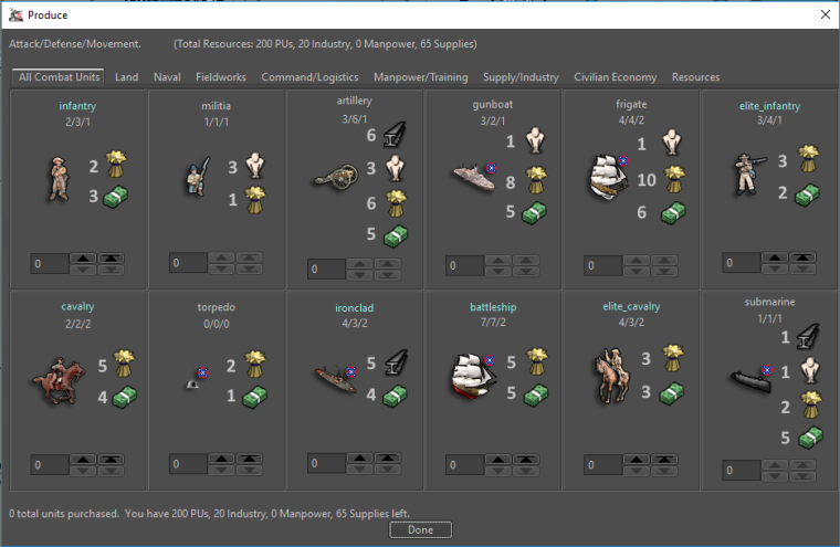
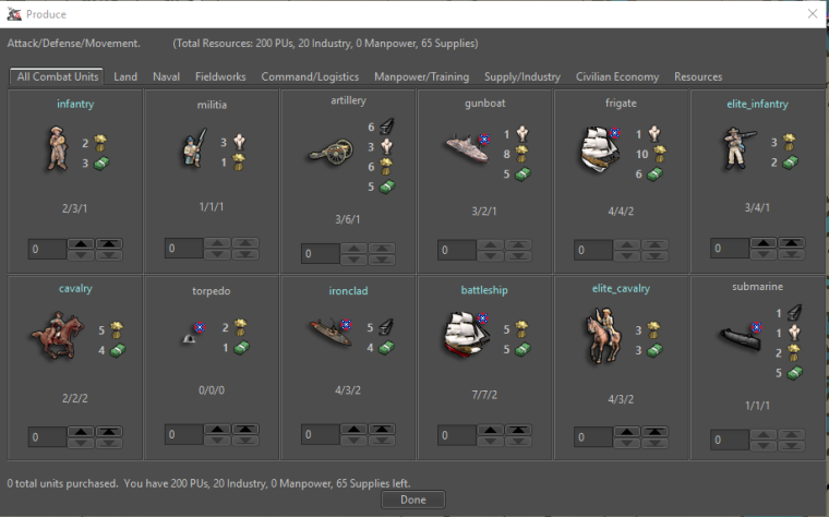
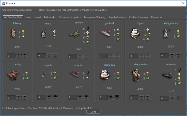
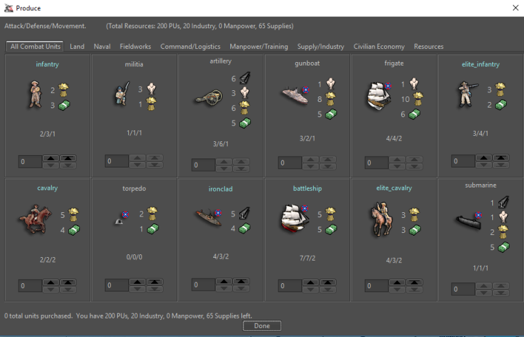
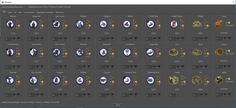
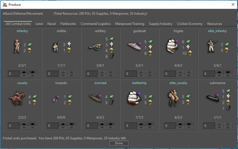
                                      So for now going with the 20x20 and larger font, I adjusted some spacing and now enforce resource ordering based on the XML to get the following:

                                      Dragon War
                                      0_1519172099101_d30ef3d2-c3c1-4d5e-9971-5be5ed709799-image.png

                                      Civil War
                                      0_1519171891791_068bc02e-1609-41fd-8e00-446c40a90acc-image.png

                                      Hepps 1 Reply Last reply Reply Quote 2
                                      • Hepps
                                        Hepps Moderators @redrum last edited by

                                        @redrum I think you found the sweet spot. All looks great!

                                        1 Reply Last reply Reply Quote 0
                                        • redrum
                                          redrum Admin last edited by

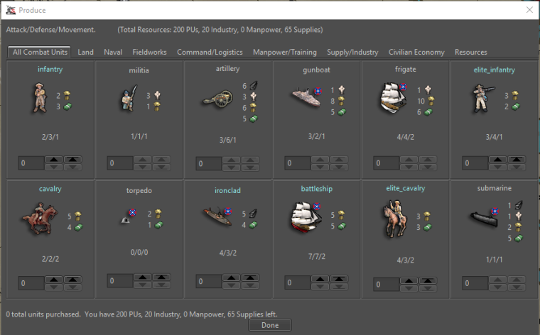
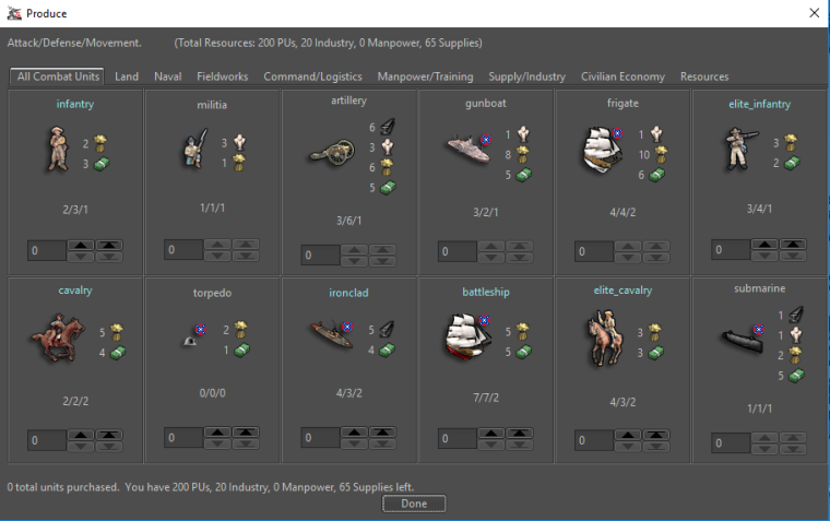
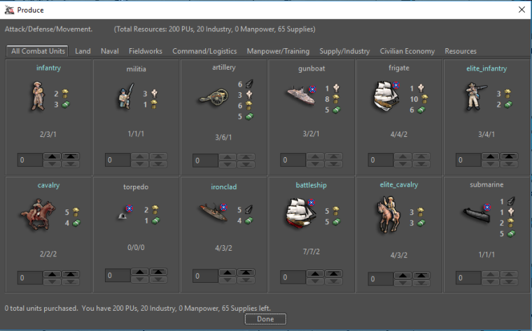
                                          Alright, I think we'll go with the 20x20 with larger font for the purchase window. Next up is resource bar!

                                          20x20
                                          0_1519183959421_9708ad4a-8eaf-4295-af34-3f737e5b2229-image.png

                                          24x24
                                          0_1519184083162_78e37eb7-6eb2-47ce-8fb3-3d5ccf0f4e90-image.png

                                          28x28
                                          0_1519183992458_472c7133-fbdc-48d1-b5c9-9842c1bd668d-image.png

                                          32x32
                                          0_1519184035877_1aa102a8-fa1c-41c9-a736-3657571b16c1-image.png

                                          Hepps prastle 2 Replies Last reply Reply Quote 0
                                          • Hepps
                                            Hepps Moderators @redrum last edited by

                                            @redrum Would probably be best to show the examples with the entire window... maybe with the purchase window open at the same time. Since a comparison is an important part of the concept.

                                            We have to bear in mind that the quality of the resource image is also a factor. I did the larger images quickly by expanding the existing images... which yields blurry results without a great deal more work. So it is important to evaluate the sizes based on how they work comparatively rather than on the quality of the icons themselves.

                                            1 Reply Last reply Reply Quote 0
                                            • 1
                                            • 2
                                            • 3
                                            • 4
                                            • 5
                                            • 6
                                            • 11
                                            • 12
                                            • 4 / 12
                                            • First post
                                              Last post
                                            Copyright © 2016-2018 TripleA-Devs | Powered by NodeBB Forums