Image Icons


-
He is a little something as a concept for the traditional games....
PU =

-
@hepps pizza... yum...
-
@Frostion Here is Iron War. Pretty awesome looking IMO.
-
@redrum That looks awesome!
-
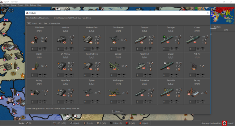
So I think for this iteration I'm going to stick with 20x20 (small) and 48x48 for units version (large). I am leaning more towards font size consistency and either going all larger in the purchase window and bottom bar or leaving it standard size.
So focusing on the purchase window, here are my latest takes on it:
-
Standard size font:
-
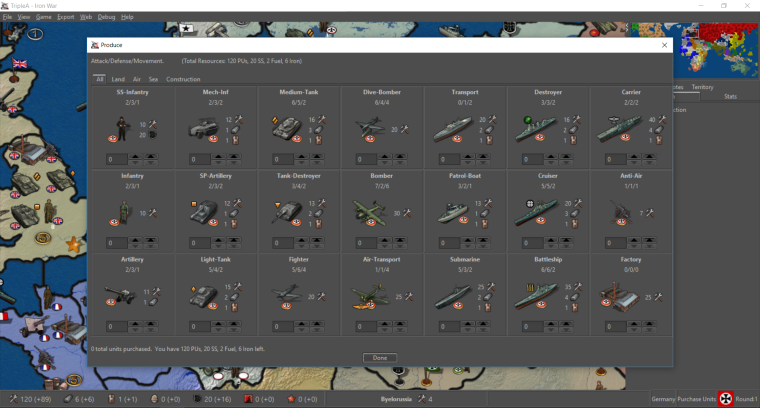
Larger size font:
TripleA Developer with a Passion for AI: https://forums.triplea-game.org/topic/105/ai-development-discussion-and-feedback
-
-
@redrum Both look great to me. I have nothing but thumbs pointing up. I like the bigger but either is sheer bliss.
-
They both look great

 , but to me the larger font seems best. The matching size of the icons and numbers/text makes them look more as part of the same font, therefore more easy to accept as belonging together and more easy to read as a whole.
If this 20x20 was to be chosen for the purchase window bar and main window also (like if purchase window was like: You have 10 PUs (
 ) and 14 Food (
 ) left to spend.) then the text should also be this same size. The bars would benefit from having font size / icon size coherence.
In the screenshots I can see that the territory info has been moved and no longer seems left aligned. I would think it best to keep it left aligned so it did not get close to the bank account info in the center, just like the player/step/turn info is right aligned. Especially if the territory was to have 20x20 territory effect icons as well as resource production icons, it would be good to have the infos separated physically. Also it just seems more orderly

Edit: I can now see that the territory info is moved to the right of the bank info. That's also nice. But then it should maybe be right aligned so that it sticks to the player/step/turn info. Then its icons could in that way be as separate as possible from the income info. Would be worth a screenshot comparison

-
Images:
20x20 looks good they are identifiable and not too pixilated for bar and purchase.Text Size:
They both look great. As text goes, I understand the @frostion coherency viewpoint. But if it saves room for future expansion, then the standard text helps there, even if a little. Plus why go bigger if we all can read it. But either way is fine in the end.Info Bar:
Is it possible to have them all left aligned with territory info, a small break space, then resource info.Text Format and Colors:
What do you guys think of the text for unit abilities either larger size, bold or different color. One of the primary reasons for this suggestion is that it helps distinguish the values apart. To a noob they may get confused, about what all the values are if they are all the same size and format.Oh and maybe the unit abilities can be different colors for A/D/M too, (red/blue/black). Assuming the UI themes don't screw them up.
Since on topic of color, it might also be cool to have the projected incoming resource values another color. Maybe a nice vivid green. Another thought on this one is regarding the triggers. Maybe should just exclude anything that has chance from projected incomes, so it only displays sure things.
Great job!
-
-
@redrum Just tooling around. Having some fun.
-
The following is actually a reply to @redrum redrum 's newest post in the Fuel Enhancement thread. I just think that it has more to du with Image Icons
 :
:The changes look nice
I hope it is still the plan to add icon explanations to the purchase window bar. We can't be sure this explanation will be in the map notes, and can't be sure the player knows about or uses tooltips, plus we would maybe like to have all players on the same page when it comes to finding words that describes and names the resource, like:
Resources remaining: 120 (PUs), 23 Beers ( ) and 6 Fuel (
 )
)
If not, an Icon free purchase window might be preferred.Considering most, if not all other, information the player get in-game is preceded by a specification or explanation, in form of a menu or tab text, or : like by the Player, Round info of the bottom bar, would it not be a good idea to have the bottom bar also include short explanations like:
"Resources: 120 (+32)"
"Belarusia: 5"
"Territory type: "
" -
@frostion I understand your concerns but I would like to at least start with the direction of minimizing text on the main UI. Given that most maps only have 1 resource (PUs) I don't think it really matters at all for those maps and that's probably 80-90% of the player base. The rest of the players that tend to play more advanced maps, I'd consider most of them a bit more open minded and probably have experience playing other strategy games. Looking at what I would call other lead TBS games that have done way more research/testing than we ever will, most of them use icons fairly extensively and don't tend to have much text around them as it tends to clutter the overall message and how quickly people can interpret the information. Examples:
- Civ 5: http://images.akamai.steamusercontent.com/ugc/541899155249193781/32326AE698D836B1CA51233D34F6C5A059305C24/
- HOI4: https://cdn4.dualshockers.com/wp-content/uploads/2016/08/HOI4-9.jpg
For this first iteration, I'd like to release with minimal text and see what feedback we get. If players are confused or ask for more text/context then I can quickly add it in. I'm hoping after people play a few games with just the icons that it becomes second nature.
-
@redrum I suggest an improved tooltips.properties file. So if shifting towards image centric style. Would be nice to fix that bug gap that I reported. As well as add more than units to the properties file, maybe territory tooltips as well. (And the "I" hotkeys.) So a map maker can decide what is important information to display if needed.
The only other thing that comes to mind is use of different colors in the various values. Specifically the abilities and incoming resources. I see civ uses colors extensively. Although I do have mixed feelings of emulating those games too much. I think our niche or bread and butter so to speak, are games that can be completed fairly quickly. As well as customizability and creation of games ofcourse.
Late addition: Also resources should have customizable tooltips. -
@general_zod Agree. I'd like to improve tooltip customization and consistency. Using colors is a tough one since we have to support so many different maps that I don't want to force much default coloring on map makers as they might use certain colors to highlight other things that would then conflict with the defaults. Example would be they use say red border on unit images to indicate a 'defensive' unit then we make all the attack value text appear red.
I think there may be some cases where it makes sense to have certain thinks highlighted with certain colors but we need to be careful. We'd need to probably have some separate threads to discuss specific items that we'd want to consider adding default colors to and what those colors should be. Also whether we'd want map makers to have the flexibility to override them.
-
I think we can have a tendency to over think things... I was just looking at the example for Iron War from the other thread. Bear in mind I have only played the game once or maybe twice.
In looking at the example I found it very intuitive to get the meaning of 100% of everything displayed in the example. This includes the things that have never been explicitly defined to me... such as the sonar scope in the Destroyer unit image which is meant to define it as a destroyer unit. Or the geometric icons that differentiate the assorted distinct mechanized unit types.
Don't get me wrong...I think revisiting the tooltips is an awesome suggestion.
But I also think we need to give people enough credit to be able to work some of this out in their heads or at least show enough wherewith-all to read the game notes. If a maps iconography is so muddled, indistinguishable, or convoluted that a player cannot translate the images meaning... well then perhaps that has as much to do with the game design than it does with the engine needing to spell everything out explicitly.
-
I just want to apologize if my comments seem harsh or abrupt. They are really just meant to serve as a reminder about how fixated we get on the details of things despite having EXCRUCIATINGLY LIMITED resources. When you look at this objectively we currently have a handful (or a partial amputees handful) of individuals working on features, feature requests and engine improvements at the play level of the game mechanics. Then we seem to dissect the improvements being worked on as though we have inexhaustible resources to throw at them.
So using this as an example.... we are pursuing this as a method of cleaning up and condensing the display mechanics in an effort to support the further development and usability of consumable resources within a game. Then, even though this represents just one branch of the over-all objective.... we are now getting bogged down in details that are already usable in their current state. Even though there are still several other components of the over-all objective that need to be addressed in order to make this feature truly usable.
So if I seem argumentative or abrupt... then please accept my apology and understand that it is just the project manager in me that focuses on the prioritization of completing a broader goal over getting bogged down in the details of one specific component.
-
@redrum I just loaded 9220. The new features look great, nice job.
-
Cool. And yeah, the pre-release now has the changes. Next step is updating all the default icons we include in the engine to have a 20x20 and 48x48 size. @Hepps Is starting to work on it
")
-
@redrum using right now as well good stuff!
-
The following are some of the suggested 20x20 resource icons to add as default options to the engine. The existing ones can be found here and could consider resizing some of those as well: https://github.com/triplea-game/triplea/tree/master/game-core/assets/resources. Goal is to provide a base set of resource icons but map makers can always override with their own. Feedback welcome!
@Frostion I added a few of those from your maps to the list. I'd like to keep the base set simple/consistent though so if you'd like the DW ones to be considered then I'd need a version without the yellow glow.
Wood:


Tools:

SuicideTokens:

Stone:

TechTokens:

PUs:


Oil:


Metal:

Manpower:


Leadership:


Iron:

Steel:

Gold:

Food:


Hello! It looks like you're interested in this conversation, but you don't have an account yet.
Getting fed up of having to scroll through the same posts each visit? When you register for an account, you'll always come back to exactly where you were before, and choose to be notified of new replies (either via email, or push notification). You'll also be able to save bookmarks and upvote posts to show your appreciation to other community members.
With your input, this post could be even better 💗
Register Login