Image Icons


-
The 16x16 with normal font also looks good, but the icons are on the verge of being unrecognizable.
Taking the civil war version in mind, I am still for “20x20 larger font quantity”.
I am eager to know what other people think.
Did the first work for Iron War icon set, but you will have to wait about 22 hours till I finish them
 Good night!
 -
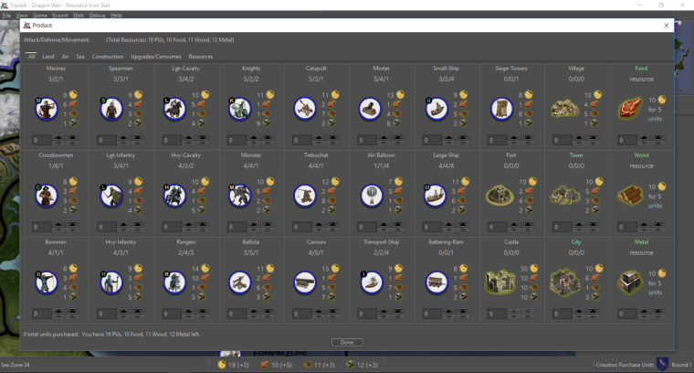
So for now going with the 20x20 and larger font, I adjusted some spacing and now enforce resource ordering based on the XML to get the following:
Dragon War
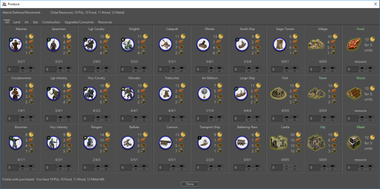
Civil War
-
@redrum I think you found the sweet spot. All looks great!
-
Alright, I think we'll go with the 20x20 with larger font for the purchase window. Next up is resource bar!
20x20

24x24

28x28

32x32

TripleA Developer with a Passion for AI: https://forums.triplea-game.org/topic/105/ai-development-discussion-and-feedback
-
@redrum Would probably be best to show the examples with the entire window... maybe with the purchase window open at the same time. Since a comparison is an important part of the concept.
We have to bear in mind that the quality of the resource image is also a factor. I did the larger images quickly by expanding the existing images... which yields blurry results without a great deal more work. So it is important to evaluate the sizes based on how they work comparatively rather than on the quality of the icons themselves.
-
@redrum sexy
")
-
@Hepps Good point. Here are screenshots with purchase window open. After we narrow it down I can try some different font sizes as well. I also need to fix the right part of the bottom bar so its height scales with the rest.
20x20
24x24

28x28

32x32

-
@redrum 24 does it for me.
"A joyous heart sours with the burden of expectation"
Hepster -
Here is 20x20 with larger font (same as purchase window):

-
@hepps WHAT about the old blind guys?
24 is fine
bigger is better
")
-
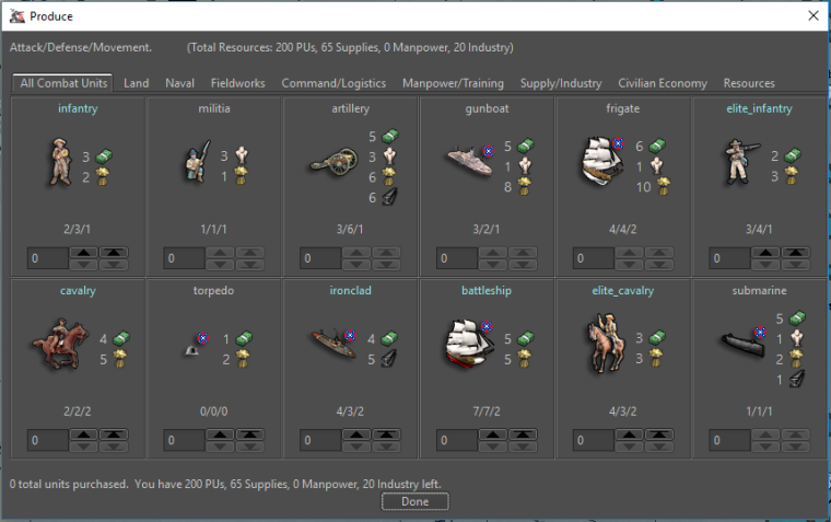
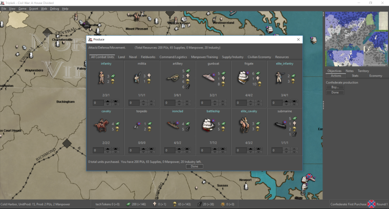
Purchase window with A/D/M above unit image and larger font size:
DW:
-
@redrum all improvements are amazing! You guys pick what looks best to you. Don't forget I am an old colour blind bastd with spectacles
either way all great stuff! TY for all the work @ all -
@prastle We will introduce a braille version for you when nano technology is incorporated into LCD screens.
-
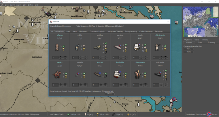
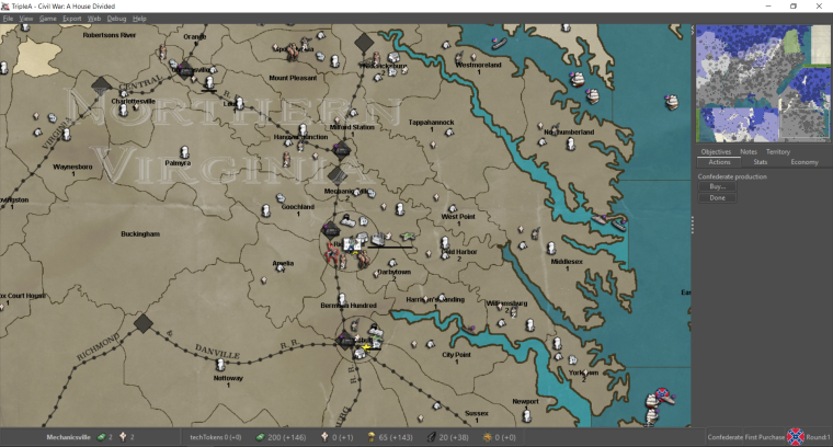
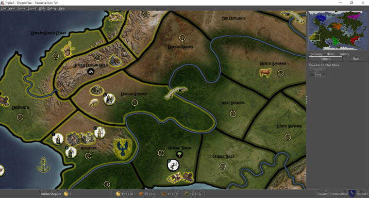
With updated territory info in bottom left corner to use resources.
CW
DW


-
@redrum i can read it and its a vast improvement from none. I just wish it was slightly larger. Even if all disagree. GREAT WORK! @ all
-
@prastle Please tell what exactly you disagree with and what it does for the game experience. I think it is important as others might think the same. We might as well take any criticism up front, and we must not be carried away by ourselves.
Also, I would say that the next stable release would be a kind of BETA in regards to reactions towards the resource icons. We will see what people think.
@all This made me think! (about something specific
). Maybe there should be a safeguard against maps using the icons if the maps icon set was not complete. Meaning if all the resources could not be displayed as icons, then the resource display would only be in text. No mixing of text and icons. It might look weird and unprofessional if mixed, and also give a bad impression about the use of icons.@redrum
I don't like the territory effects being displayed as icons. First of all it would really challenge the mapmakers with figuring out how to symbolize them. Also, I think it would be best to challenge and inform players ONLY about the condition of resources being displayed as icons, something that player are probably used to from other games. Then when players see icons, they know it is something valuable that can be used to purchase and not anything else. Edit: If used, should the engine support a fixed set of territory effects with engine icons? What would the standard mountain terrain effect be, for example? (It would be weird to have an icon from the engine used for one terrain effect on one map and another effect on another map.)I like the 28x28. It safeguards against a mapmaker doing a 32x32 resource picture that has the icon picture's top and bottom touching the top and bottom of the bar. But I think it is also important to both allow, and in instructions state, that sizes up to 32x32 is possible. I could imagine a mapmaker using 32x32 or smaller maybe squared icons, with Maybe coloured backgrounds, as alternative to small symbols and transparency. Something that might not look bad if they fill out the bar leaving no space around the icons.
In regards to sizes. I can see your concerns about font sizes not being consistent. It kind of looks strange to see the unit names in smaller font size than the count/numbers, both in the bars and by the units. Especially it might not look good if we had large numbers and large resource texts in place of icons if no icons were available. And even worse if we had large numbers and small text mixed with icons.
Maybe you should try to post a preview with 16x16 purchase icons and 28x28 bar icons, with non-enlarged text? It will take up the least space, compress the windows the most, not look weird if icons are missing, and leave any text enlargement of UI (if needed) to future development projects. The reason I ask for 16x16 here, is because large icons alongside standard size text makes this unwanted looking mismatch. Also, if both the main window bottom bar and the purchase window bottom bar displays distinctively and large 28x28 icons, then the player's recognition of small 16x16 images might not be that hard. (It is here that colors of icons mean a lot
) PS: I dont think that it is that problematic to have larger text in the bottom bars as long as all text there was the same size.Map maker of: Star Wars: Galactic War + Star Wars: Tatooine War + Caribbean Trade War + Dragon War + Age of Tribes + Star Trek: Dilithium War + Iron War + Iron War: Europe + Warcraft: War Heroes
-
Alternatively you could maybe try to enlarge all text of the purchase window and all text in the bottom bar? Maybe this will help both with the better icon recognition that the 20×20 gives compared to the 16x16, as well as keeping the resource numbers in a fair size compared to the icons?
-
@frostion 20x20 or 28x28 will be fine. Prefer 28 for my old eyes
I love the addition of the terrain! I do ? if it is nec tho. Since the terrain is generally pretty obvious once ya get used to the map. -
Like @prastle, I also prefer the 28x28.
Cheers...
-
@frostion said in Image Icons:
@prastle Please tell what exactly you disagree with and what it does for the game experience. I think it is important as others might think the same. We might as well take any criticism up front, and we must not be carried away by ourselves.
Totally agree. Clear and concise input is critical to development.
Also, I would say that the next stable release would be a kind of BETA in regards to reactions towards the resource icons. We will see what people think.
Since there are only a few maps that utilize multiple resources... and fewer that use multiple terrain effects... I feel like the sample pool of people giving feed back may only include those of us engaged in the conversation to begin with.
")
@all This made me think! (about something specific
). Maybe there should be a safeguard against maps using the icons if the maps icon set was not complete. Meaning if all the resources could not be displayed as icons, then the resource display would only be in text. No mixing of text and icons. It might look weird and unprofessional if mixed, and also give a bad impression about the use of icons.Given the examples already provided I don't see an issue with a combination of text and Images where something is missing. If we are really being honest about this then I think it is safe to assume most if not all of the map makers capable of executing these features are going to do it to completion. I think the level of professionalism for the finished product is really the responsibility of the map maker. If you look at the monster share of the maps already available on Triple A, we already have an incredible number of maps with "quality control" issues. It is the job of a mapmaker to take a project to completion, not the responsibility of the site to cater to half-assism. If we imposed a certain degree of professionalism (which is a highly subjective thing) then as much as 80% of our repository would have to be removed.
@redrum
I don't like the territory effects being displayed as icons. First of all it would really challenge the mapmakers with figuring out how to symbolize them. Also, I think it would be best to challenge and inform players ONLY about the condition of resources being displayed as icons, something that player are probably used to from other games. Then when players see icons, they know it is something valuable that can be used to purchase and not anything else. Edit: If used, should the engine support a fixed set of territory effects with engine icons? What would the standard mountain terrain effect be, for example? (It would be weird to have an icon from the engine used for one terrain effect on one map and another effect on another map.)This goes back to the preceding point. We already have multiple images styles and unit images used for the same things from game to game. I think this could be handled in the same way we deal with resources. We create a solid "default" repository for terrain images. Then allow the individual map maker the ability to include a custom set of images for terrains within the map folder. Triple A is reasonably unique in the sense that there is not a single theme or style. Personally I think that is a strength of the platform in that it allows mapmakers to truly define the style of a map to suit their individual tastes. If anything I would suggest we add 2 new controls to the map property folder allowing the map maker to define whether or not they want things like resources or terrain images to be used. Then you (as the map maker) can set how you want the info to be displayed, icons or text.
I like the 28x28. It safeguards against a mapmaker doing a 32x32 resource picture that has the icon picture's top and bottom touching the top and bottom of the bar. But I think it is also important to both allow, and in instructions state, that sizes up to 32x32 is possible. I could imagine a mapmaker using 32x32 or smaller maybe squared icons, with Maybe coloured backgrounds, as alternative to small symbols and transparency. Something that might not look bad if they fill out the bar leaving no space around the icons.
I am flexible over sizing... since again the individual map maker can simply use less or more of the available space upto what ever the maximum is set at.
In regards to sizes. I can see your concerns about font sizes not being consistent. It kind of looks strange to see the unit names in smaller font size than the count/numbers, both in the bars and by the units. Especially it might not look good if we had large numbers and large resource texts in place of icons if no icons were available. And even worse if we had large numbers and small text mixed with icons.
I like the idea of making text... whatever it is and wherever it is, being more pronounced. I find a lot of the info is so minimal when there is no spacial concerns limiting it to be at least slightly more visible.
Maybe you should try to post a preview with 16x16 purchase icons and 28x28 bar icons, with non-enlarged text? It will take up the least space, compress the windows the most, not look weird if icons are missing, and leave any text enlargement of UI (if needed) to future development projects. The reason I ask for 16x16 here, is because large icons alongside standard size text makes this unwanted looking mismatch. Also, if both the main window bottom bar and the purchase window bottom bar displays distinctively and large 28x28 icons, then the player's recognition of small 16x16 images might not be that hard. (It is here that colors of icons mean a lot
) PS: I dont think that it is that problematic to have larger text in the bottom bars as long as all text there was the same size.Experimentation is always good!
Hello! It looks like you're interested in this conversation, but you don't have an account yet.
Getting fed up of having to scroll through the same posts each visit? When you register for an account, you'll always come back to exactly where you were before, and choose to be notified of new replies (either via email, or push notification). You'll also be able to save bookmarks and upvote posts to show your appreciation to other community members.
With your input, this post could be even better 💗
Register Login